
Don't wanna be here? Send us removal request.
Statistics
We looked inside some of the posts by the-ss25collection and here's what we found interesting.
Average Info
Notes Per Post
339
Likes Per Post
214
Reblog Per Post
125
Reply Per Post
0
Time Between Posts
2 days
Number of Posts By Type
Text
17
Last Seen Tumblr Blogs


Fun Fact
The Tumblr app for Google Glass was released on May 16, 2013.
Text
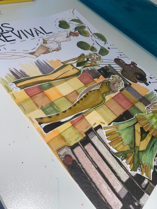
Once we concluded the final designs we mounted up our development pieces to display our inspiration, annotations and the progression within our work.

1 note
·
View note
Text
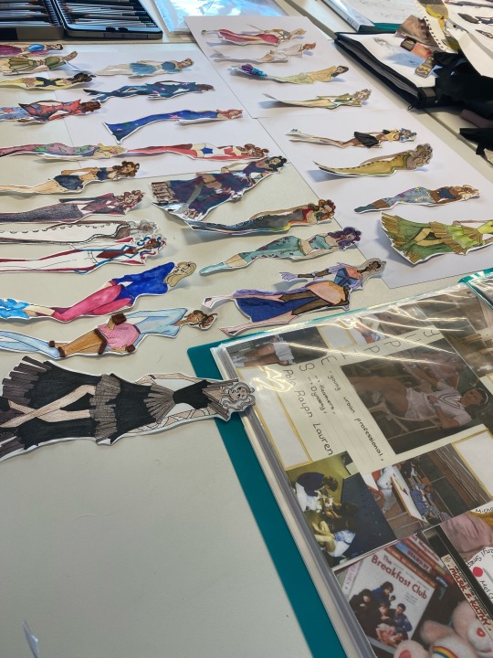
I needed to decrease my 25 finalised designs into only 16. However in doing this I found some designs that where perfect for the collection however due to the media used they contrasted the overall look therefor I made the executive decision to redraw 5 different designs with the same colouration but in a more cohesive medium of alcohol marker and pencil.
2 notes
·
View notes
Text
When presenting the finalised designes I decided to order my outfits within the run way lay out as it would provide the best colour story from a spring morning to a vibrant summer night.
Within this design I wanted to encapsulate the high tend sensations of summer with a vibrant day and night.Inspired mainly by my arcade and movie mood boards (due to kids being out for the summer providing a youthful air) these looks are less practical and more to show of creating ability and fashion innovation with light up skirts, neon fabrics and tight latex. For the back ground I use a mixture of pro markers, Posca pens and collage.
1 note
·
View note
Text


When presenting the finalised designes I decided to order my outfits within the run way lay out as it would provide the best colour story from a spring morning to a vibrant summer night.
Within this design I wanted to encapsulate the blooming beauty of mid spring with pastels and large contrasts of colour that blooming flowers possess . Continuing with the themes of warmth and life this section portrays work and formal wear showing how diverse of an audience this collection is appealing to. For the back ground I use a mixture of pro markers, Posca pens and collage. I also created a close up face to show the make up and stylistic choices made with the hair falling in distinct curls with high amount of volume at the roots to reflect budding petals.
1 note
·
View note
Text
When presenting the finalised designes I decided to order my outfits within the run way lay out as it would provide the best colour story from a spring morning to a vibrant summer night.
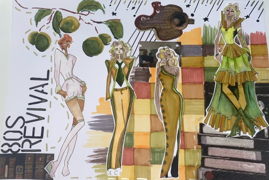
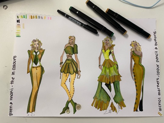
Within this design I wanted to encapsulate the early blossom of greenery within a spring setting. Continuing with the emerging trend of olive Green and khaki these warm toned garments show a wide range of both work and formal wear showing how diverse of an audience this collection is appealing to. For the back ground I use a mixture of pro markers, Posca pens and collage.
1 note
·
View note
Text
Within fashion once we concluded our final designs I cut out each individual design and attempted to find the most coordinating colour story along with a strong 80s narrative while displaying a wide range of media experimentation. Within this collection I wanted to display the wide range of my clients everyday as being a content creator of there calibre will bring occasion from casual day wear to high class couture. There for I decided to start the collection with pastels and causal wear with all the looks displayed left to right as they would walk out within a runway giving the customer a full colour story of a relaxed spring day into the bright night life of New York.
1 note
·
View note
Text

Within fashion we began our media experimentation upon our copy’s of our 12 piece collection. Within this page section I focused on developing my skill and usage of alcoholic markers and coloured pencils. I ensured to utilise a wide range of skin tones and hair types/colours as my clients haven’t got a specific skin tone I wanted to make sure that my collection would be diverse.
Within these designed I intentionally used the projected colour scheme of 2025 of olive Green and khaki. All these ensembles would be created through the use a range of sturdy and structured materials. The models would have a range of skin tones depending on the main body colour of the outfit with sprites of colour through their hair.
3 notes
·
View notes
Text
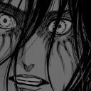
Outside of class I decided to further develop my stylised faces inspired by artists like snottiesnot and clairkie on instagram I decided to soften sharp edges and construct a visually interesting portrait of both face and torso of Sarah Michelle Gellar within Buffy the vampire slayer within season 1.
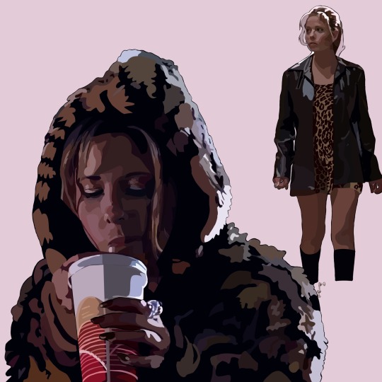
Buffy <3
“I may be dead but at least I’m pretty”
310 notes
·
View notes
Text

Within fashion we began our media experimentation upon our copy’s of our 12 piece collection. Within this page section I focused on my use of brusho inks and water colour. I ensured to utilise a wide range of skin tones and hair types/colours as my clients haven’t got a specific skin tone I wanted to make sure that my collection would be diverse. Within these designed I intentionally allowed the inks to bleed and work against one another to represent the flowing and spirited aura around these looks as they would be used in recreation activities where my client would be having the most fun and feeling the most like themselves.
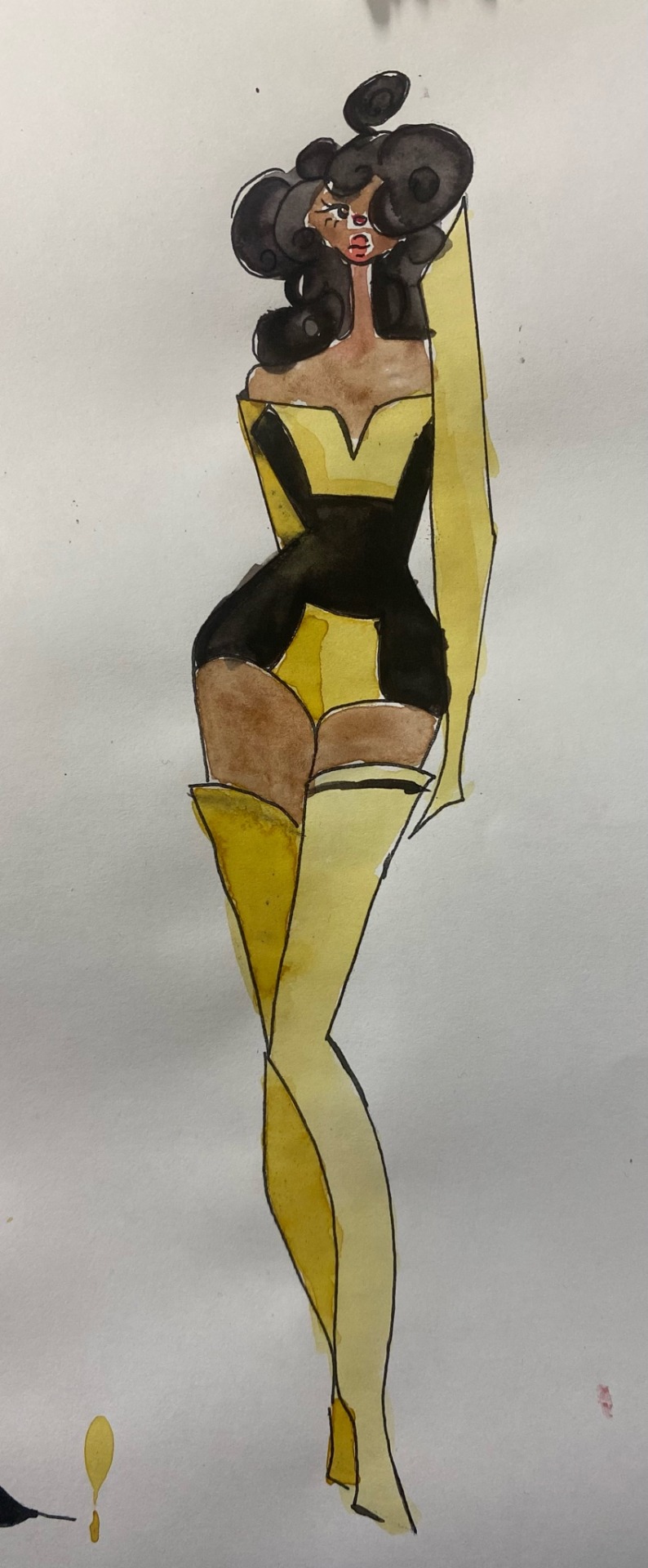
Within the first piece I wanted to create an inverse look inspired by black light with the broth and bold uses of red and blue. The patterning is also inspired by carpets created within the decade that would have been utilised in recreational spaces for children ( places that often had bright colouring and modified lights. Within the second look I was inspired by the acid wash trend of the decade with a teal leaning denim adorned with purple accent patches to provide interest and customisation to the look. The third look was inspired by tie dye and the advances it has made through the decades with talented artists creating intricate designs through intense skill of rubber bands and twine to create a personalised fabric. The final look is inspired by the ever iconic bumblebee from the transformers franchise utilising a black and yellow colour scheme with sharp robotic like design to resemble machinery and the transformation one may got through. This is significa to both my clientele and brand identity as they would preach equally, ethical sourcing and cruelty free and by association with this iconic symbol known for being in the correct side it also implements those ideals onto my company.
2 notes
·
View notes
Text

Within fashion we began our media experimentation upon our copy’s of our 12 piece collection. Within this page section I focused on my use of oil pastels, watercolour, acrylic paint and collage. I ensured to utilise a wide range of skin tones and hair types/colours as my clients haven’t got a specific skin tone I wanted to make sure that my collection would be diverse.
With the first look I wanted to use the mix of feminine and masculine styles to embrace the changing of the times and the subversion of gender rolls as seen in popular media of the time. The colour scheme of white, pink and blue is influenced by the transgender flag in support of the lgbtq community and the powerful message they uphold. The second look is inspired by the game of PacMan; specifically when he consumes the power pellet and colours get inverted. The bright pinks illuminated by reds display the reversal of power rolls within the game however the blue top shows the short time that this takes place for. Furthermore the previously golden rings have been devoid of colour in representation of their now lack of meaning to the protagonist. Thirdly, the second look is constructed out of bright mixes of tule within the shades of pink blue and purple, also represented within the carpets of the time an a common colour scheme of the time. The final look is inspired by the wonders and new creative outlooks within this decade with the powerful generation of MTV allowing music artists to create a visual representation of their music in an accessible sphere across the globe.
2 notes
·
View notes
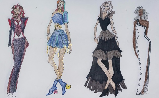
Text
Within fashion we began our media experimentation upon our copy’s of our 12 piece collection. Within this page section I focused on my use of tissue paper, coloured pencil and alcohol markers. I ensured to utilise a wide range of skin tones and hair types/colours as my clients haven’t got a specific skin tone I wanted to make sure that my collection would be diverse.
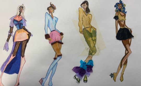
The first look is inspired by the aesthetics and shape of SheRa while the colouration is inspired by the filters and popular colourations of the time with an extensive use of pastels, pinks and galaxy type patterns. With a focus on the colour purple for armour and artillery it protrudes a royal aspect into the look with a feminine energy injected with the use of pinks and creams from the shoes skirt and chainmail. However this is largely contrasted (yet blended) with the blue chest plate to represent the strength and inner power of the wearers heart. The second outfit is inspired by frills and fluidity within the yuppie style yet adding a much needed pop of colour with the mostly beige style. It is brought together by the fluffy hems displaying that it is a complete ensemble able to work without her outfits but meant for this coordination. The third outfit is a play on the beige and camp look used within many sports wherever it is heavily offset by the bright and eye catching leg warmers as to say “you can hide me but you can’t change me” a representation of how community’s across history have been forced to be hidden in fear of crucifixion but are now able to be expressed more with a more accepting society. The final look is inspired by the lavish looks and frippery of the decade with large jewellery, mass use of gold and big hair to represent a bigger ego.
1 note
·
View note
Text
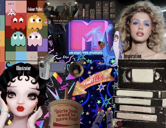
Within fashion we created our final digital mood bored showcasing our largest inspirations for our 12 piece summer/spring2025 collection. I endeavoured to include bright neon colouring as well as muted tones, video game influences, large curly hair, academic styles and VHSs. In putting my largest inspirations into one place I have now generate new ideas for new colour combinations, improved patterns and accents as well as more avant guard looks for my client is they so want them.
7 notes
·
View notes
Text
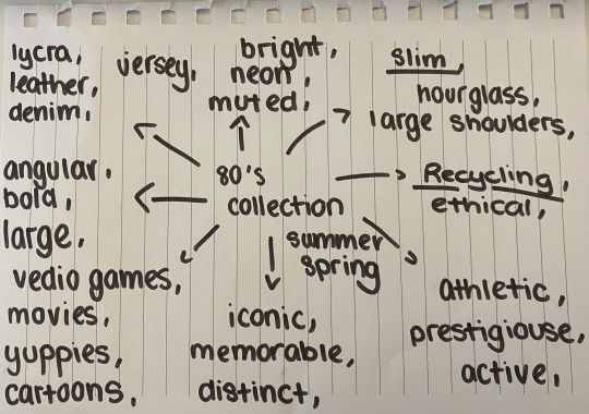
Within fashion marketing we are beginning to generate our press releases beginning with a mind map of distinct attributes of our collections falling into the categories of silhouette, fabric type, and inspiration, texture, feeling and colour pallet. This is ensuring we are constantly keeping in mind our client, the season we are dressing them for and the running theme of the collection.
1 note
·
View note
Text
Within fashion we began our media experimentation upon our copy’s of our 12 piece collection. Within this page section I focused on my use of coloured pencils. I ensured to utilise a wide range of skin tones and hair types/colours as my clients haven’t got a specific skin tone I wanted to make sure that my collection would be diverse.
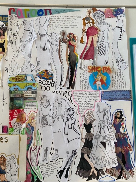
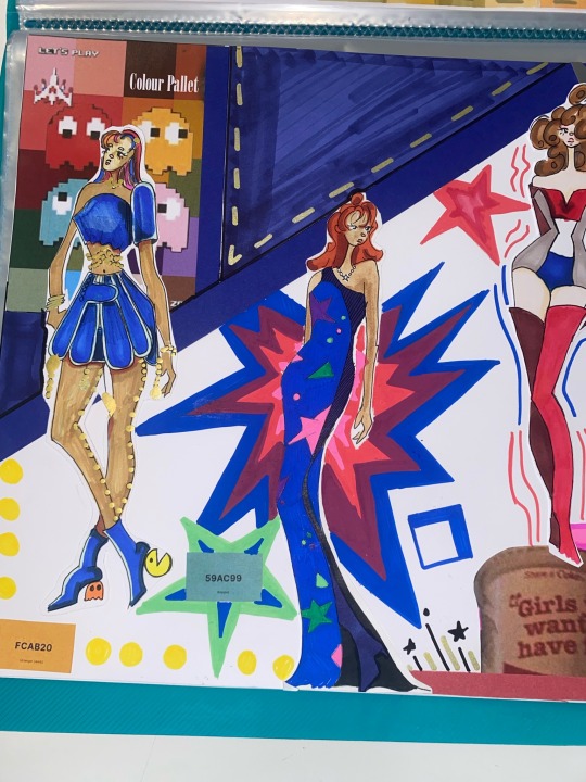
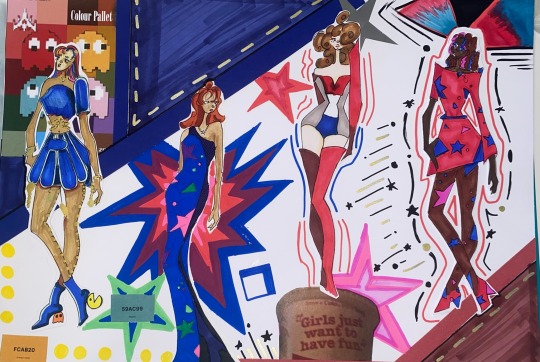
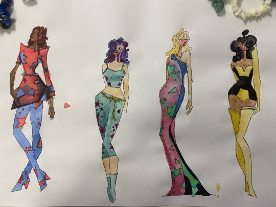
These looks are designed backed off of different iconic video games and to take into account the range of situations you could find these outfits i associated a unique colour scheme to each that emulate the essence and vibes of the game. The left most outfit is designed backed of the iconic game John wick that has since had 4 movie adaptations featuring Keanu Reeves. This game is known for its mature themes and distinct characterisations and as such I chose a black and red colours scheme often associated with the macabre. The second garment reflects the well known and icon game Pac-Man from the shoes containing a custom Pac-Man heel to the intricately place 4 tone money pieces each one a colour of one of the iconic ghosts. The cascading circular gold embellishments and statement jewellery are representative of the yellow pellets that Pac-man absorbs within his ventures escaping from the ghosts. The third look is inspired and reusing old VHS tapes popularly rented and owned within the time period reflecting the movie category of the collection. The final dress (on the right) also follows this theme with a long real of film framing the hems of the dress and acting as an accent. The main body of the dress would be made of a white latex as to hug the form while being a representation of the images captured within film.
1 note
·
View note
Text
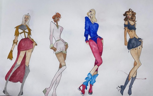
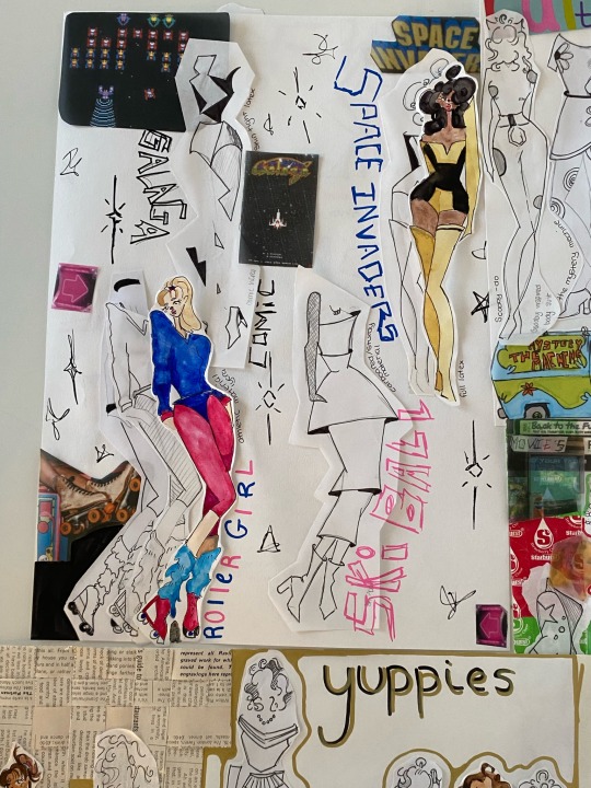
Within fashion we began our media experimentation upon our copy’s of our 12 piece collection. Within this page section I focused on my use of water colours. I ensured to utilise a wide range of skin tones and hair types/colours as my clients haven’t got a specific skin tone I wanted to make sure that my collection would be diverse.
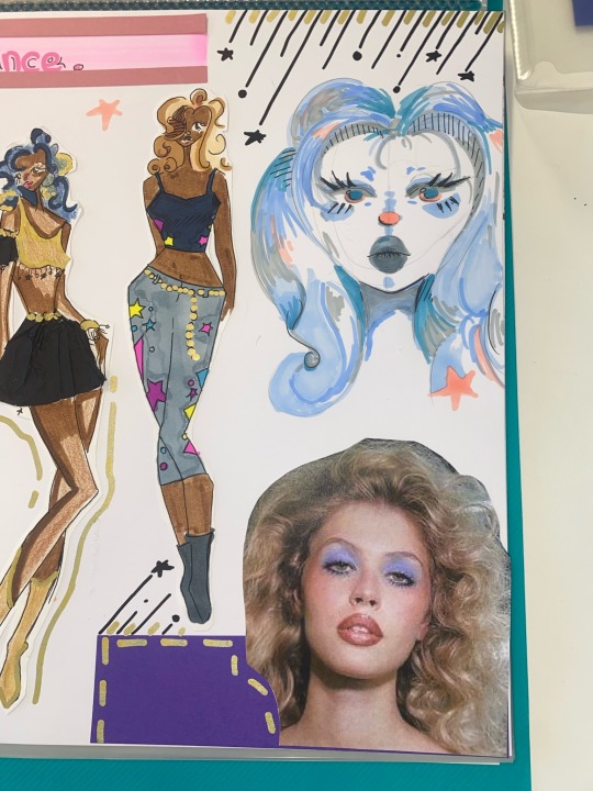
These looks are designed for athletic occasions and to take into account the range of situations you could find these outfits i emulated a unique colour scheme to each. The left most outfit is designed backed of the iconic cartoon SheRa so I attempted to embrace her blond hair against the red and gold colour scheme. The second look is largely inspired by the yuppie trend and in turn I embraced the popular sport with pastels, tennis skirt and knee high socks/ shoes. The third look was inspired by the roller scene of the time with bright neon colours and leg warmers often seen when exercising within the time. The final look is back of the disco dance scene that reached an all time high within the 80s. The navy blue is representative of the midnight sky ( a time they would often party much later than ) with a large amount of silver tassels, star accents and beading.
1 note
·
View note
Text
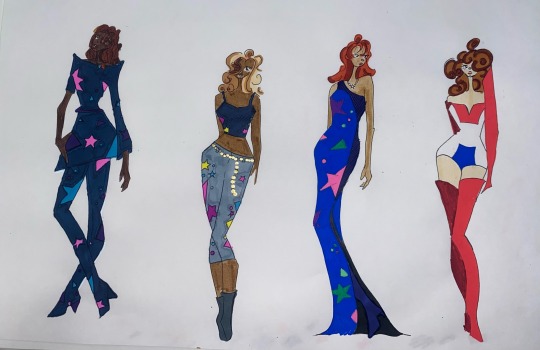
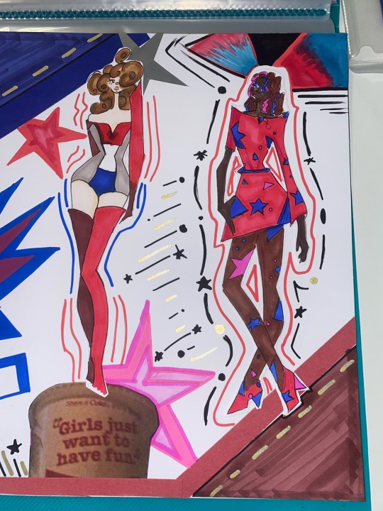
Within fashion we began our media experimentation upon our copy’s of our 12 piece collection. Within this page section I focused on my use of alcohol markers and posca pens. I ensured to utilise a wide range of skin tones and hair types/colours as my clients haven’t got a specific skin tone I wanted to make sure that my collection would be diverse.
Within the first three (left to right) I attempted to emulate the icon patterns of the time with bright neon colours contrasting the deep navy blue providing a unique and lively ensemble for a range of occasions. Within the right most look I attempted to emulate an enemy ship with an icon 80s video game.
1 note
·
View note
Text
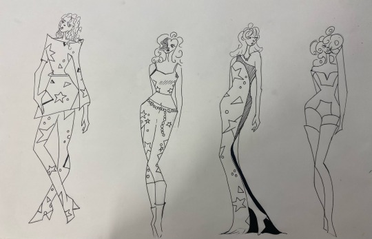
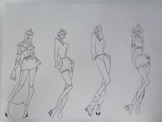
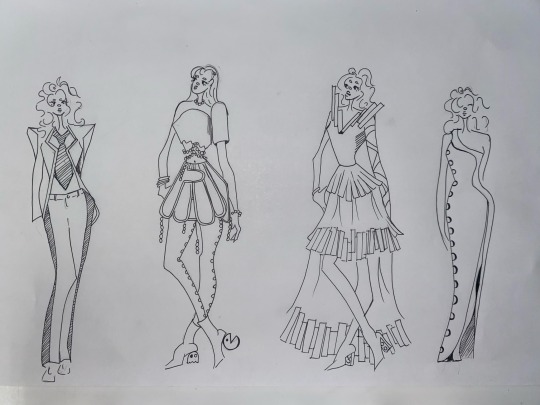
Once I had completed my initial 25 total designs had to edit it down to my best 12 designs, and add personalised: faces, hair, expressions and poses. We conducted this in order to create master copy's we would be able to use in photocopying onto drawing paper for extensive media exploration.
3 notes
·
View notes