
theinnermonologueblog
[the inner monologue]
c3335693 // briannah berne // desn1002
18 posts
Don't wanna be here? Send us removal request.
Last Seen Blogs

rollercoaster59
Diamand D

minyards-pipedream
I’d Probably Die For Neil Josten

overlourdes-a-blog
( ap. ) cruel and unusual
overlourdes-a-blog
( ap. ) cruel and unusual

versegm
Verse's main-ish blog


Text
week nine. space photography - a review.
For my second peer reviewed Pecha Kucha, I have decided to review Sharon’s presentation regarding Space Photography.
Knowing Sharon from outside of this class, I already knew how passionate she is about her chosen topic which came through strongly in her presentation. It was evident that she had thoroughly researched this topic and had compiled her research into a concise engaging format.
It was clear that she was confident in what she was talking about as she progressed away from reading strictly from her notes. Throughout the duration of her presentation, it began to feel like Sharon was having an organic conversation with us, it was comfortable and natural.
The slides Sharon presented with were highly aesthetically pleasing and visually stimulating due to her graphics and imagery selection.
It was clear that her presentation had been throughly rehearsed. In addition to this, if anyone asked any questions she did not hesitate to answer them confidently and full of grace.
Overall, this was an incredible presentation that I engaged with and would not hesitate to watch again.
0 notes
Photo

image reference: https://www.instagram.com/spell/?hl=en
0 notes
Text
week eight. sustainable fashion - a review
For my week eight peer reviewed Pecha Kucha, I have chosen to review Caitlin’s topic that is also of importance to me being Sustainable Fashion.
In regards to the visual presentation, I absolutely loved the slides. The minimalism in combination with the colour scheme and graphics provided a relaxing and engaging presentation. They got straight to the point and worked well in cooperation with her spoken arguments. When speaking about the economic costs of fashion, she simply used three dollar signs. Whereas, in terms of the environmental impacts she used a humpback whale infographic. I found that this put a personalised tough to the talking point.
When it came to the verbal aspect of the presentation, like a majority of us, the arguments presented were clear and structured but there was a sense of urgency to not fall behind our slide which in turn made her rush through the presentation.
There was an immense amount of research put into this presentation, which evidently was conveyed very clearly. I loved the incorporation of Spell & The Gypsy Collective as I know that they are extremely involved in minimising their carbon footprint and keeping their business local.
0 notes


Text
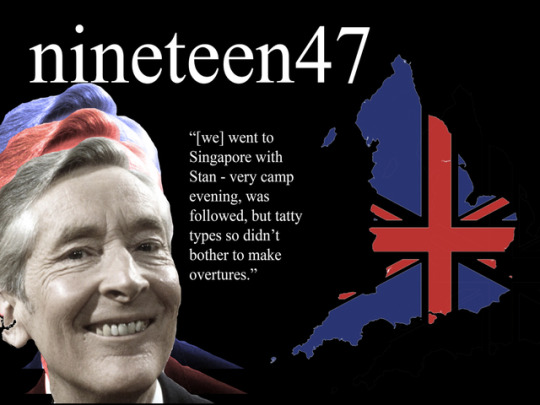
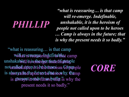
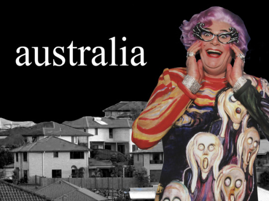
week eight. how camp-y.
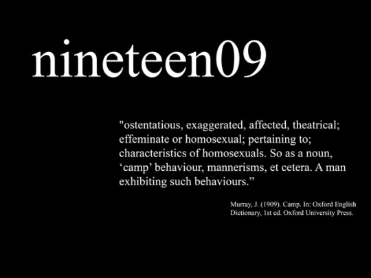
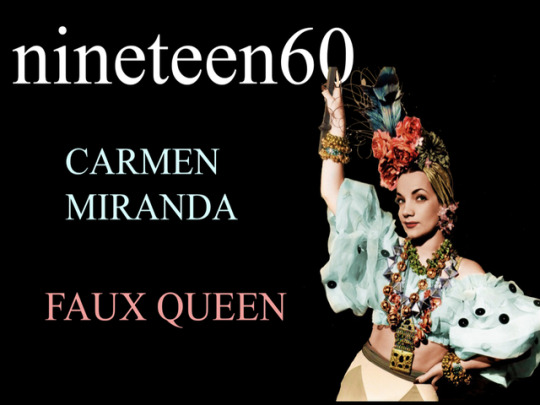
This week was when we showcased our Pecha Kucha presentations. Due to its overwhelming influence within society and design, I chose to do my topic on “CAMP”.
The three subtopics I chose to discuss were the history of camp within Europe and America, the most notable representation within Australia and how camp is represented in the mass media today.
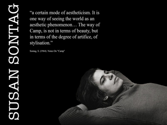
So what is ‘Camp’? In her 1964 Essay, Notes On Camp Susan Sontag describes Camp as being, “a certain mode of aestheticism. It is one way of seeing the world as an aesthetic phenomenon... The way of Camp, is not in terms of beauty, but in terms of the degree of artifice, of stylisation.” Therefore, it is the love for the perceivably unnatural.
Camp is considered to be the indirect reflection of our society and the way in which we perceive popular culture.
//
Overall, I think my presentation was a success. The only feedback to improve my presentation was to not look at my notes as much when presenting. I have taken this feedback onboard and am looking to increase my confidence in regards to public speaking so I do not feel the need to consistently refer back to my notes as much.
0 notes
Text
week seven. the trade of convenience for isolation.
Cultural Interface can be defined as the ways that the digital age is spreading different cultural ideals through the way that humans from different cultures gather and distribute information on a variety of digital platforms. Essentially, society is no longer interacting with a technological device but rather a culture encoded into a digital interface.
From this weeks reading, I came to the concussing that within the digital age that isolation has become an increasing phenomenon. Our parallel to the film The Matrix may be perceived as a dystopian vision, but rather the idea of human bodies being attached to machines feeding them energy is obviously a hyperbolic statement referencing how connected we are to machines. If everything is available on a digital platform, such as information, work, shopping, it is theoretically unnecessary to communicate face-to-face. A majority of the population spend a vast amount of time on technological devices to the point where it becomes their medium of reality. Thus, trading convenience for isolation.
0 notes
Text
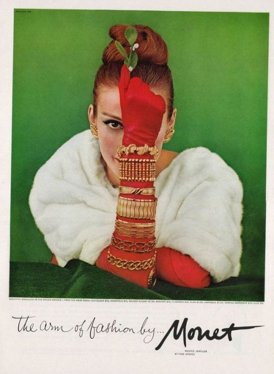
week six. has the way society sees removed the privilege of great art?
Whilst analysing the John Berger’s Ways of Seeing, I was interested to further research what it means for an artwork to embody a way of seeing. At the beginning of the text, Berger states “how we see things is affected by what we know or believe.” (Berger, 2008). He used the example that an individual from the Middle Ages with a strong understanding of heaven and hell would perceive fire differently to what we presently do. They may see it as a symbol for hell. Whereas, we may see warmth or even the chance to toast marshmallows.
From what I read, what Berger meant by ways of seeing is that our way of interpreting objects is culturally determined. He uses the example of artworks by master artists. At the time of creation, they were used to convey the wealth and power of their owners. They were not necessarily used to evoke feelings of envy due to the highly stratified society of eighteenth century England, for example, ‘ordinary’ citizens had no expectation that they could be nor have what the aristocracy did.
Evidently, this changed with the production of mass consumer culture within the twentieth century. Within that time, masterworks of art were used to mass sell products that anyone could possess, such as perfume or cologne. The same artworks that once held a status of wealth and privilege were now used to advertise products. They were seen differently and in turn, motifs were used to sell jewellery and home appliances.
With technology advancing, great art ceased to be something that was impossible to possess. People started to realise that if the could not have the original, they could have a replica which looked so similar to the original that there was almost no differentiation. An example of this mentality is the Mona Lisa being reproduced into prints, postcards and other two-dimensional replicas, on tee shirts and other items of clothing, and on coffee mugs.
Berger argues that art is now deployed to sell the illusion that we can all have the good life. This being due to the fact that our consumerist culture has conditioned us to see life differently to past generations.
Sources:
Berger, J. (2008). Ways of seeing. London: British Broadcasting Corporation.
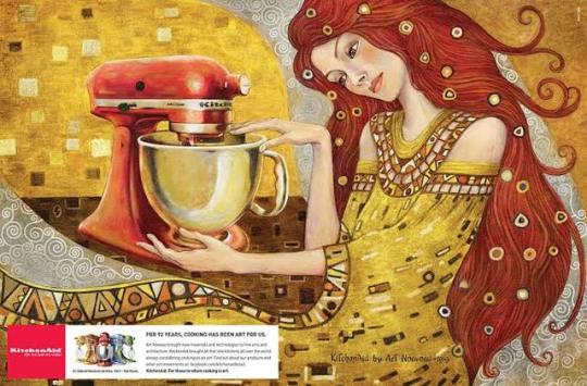
Chernow, M. and Chernow, J. (2019). Monet Jewelry. [Photographic Advertisement] New York.
Valente, S., Versolato, M., Zanatta, C. and Almeida, R. (2011). KitchenAid. Sao Paulo.
0 notes
Photo
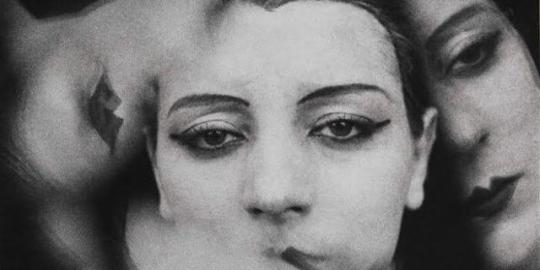
Ray, M. (n.d.). Kiki de Montparnasse. [Photography].
0 notes
Text
week five. objects of melancholy.
Within her third essay entitled Melancholy Objects from her anthology On Photography, I found that Sontag predominantly explored the role of loss and commodification in photography. She states that photography received triumph as a true surreal art form as it created “a duplicate world… a reality… narrower but more dramatic than the one perceived by natural vision.” Despite photographers such as Man Ray (1880-1976) intentionally framing images to twist the perception of reality, Sontag believes that these manipulated images do not actually begin to grasp the actual surrealism that photography as an art form truly represents. Due to the artists attempting to intentionally surreal.
Photography rewards the audience access to moments lost in time that have since disappeared, therefore providing a surreal experience that juxtaposes two evident realities, that of the past and of the viewer’s present. It can be noted that the fantasy world the surrealists were attempting to link to the present does not necessarily exist anymore. Photographs indulge people in the fantasy that they have that ability to hold onto time, which is evidently impossible. Due to the society we live in, we keep trying by taking photographs of every experience we have and publishing them.
The aspect of photography that Sontag found particularly distressing and predatory is the holiday photograph as it is an intrusive tourist activity that takes advantage of peoples’ ownership of their own lives nor their privacy. Photographs of ourselves can evoke emotions such as sadness and anger by means of documenting the passage of time and morality surrounding ageing and death. Sontag writes, “[the surrealism of seeing photos of people later meeting their death elicits shock and discomfort in addition to pity.]”
I found Sontag’s conclusion particularly interesting as she states that photography fools individuals into thinking that the have somehow mastered the past, when in reality, it is actually it is actually gone.
Sources:
Manray.net. (2019). Man Ray - photography, paintings, biography of Man Ray. [online] Available at: https://www.manray.net/
Sontag, S. (n.d.). On Photography. p.Melancholy Objects.
0 notes
Photo
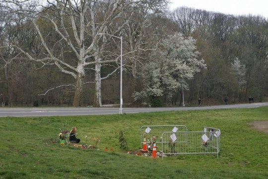


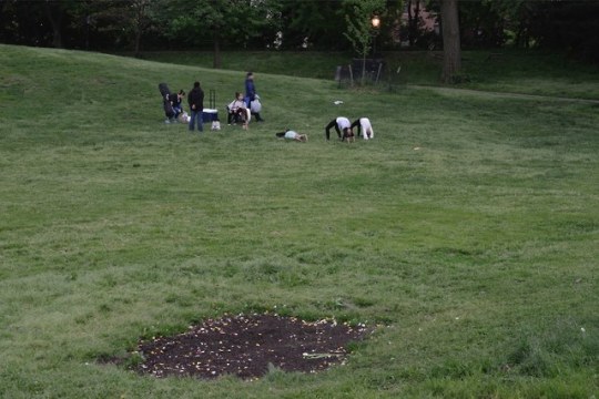


The New Yorker stated, “a Saturday morning in the spring of 2018, an environmentalist and former L.G.B.T.Q.-rights lawyer named David Buckel stood on a berm of grass in Prospect Park, doused himself in gasoline, and set himself on fire. Minutes before, he had e-mailed prominent media outlets a lengthy cri de coeur against the environmental devastation we are daily wreaking on the Earth. “Most humans on the planet now breathe air made unhealthy by fossil fuels, and many die early deaths as a result—my early death by fossil fuel reflects what we are doing to ourselves,” he wrote.” (Wiley and Wiley, 2019)
I found this particular source interesting as I noted that it derived an aspect of post-mortem photography but put a spin on it as it showed the environment following the deadly act of protest.
Sources:
Wiley, C. and Wiley, C. (2019). The Site of an Environmentalist’s Deadly Act of Protest. [online] The New Yorker. Available at: https://www.newyorker.com/culture/photo-booth/the-site-of-an-environmentalists-deadly-act-of-protest
0 notes
Text
week four post. what was there before the emoji?
Before the eggplant, smiling sun and pile of poo (or the chocolate ice-cream - depends on your perception?), there was an entirely different visual language that assisted in guiding the world. Prior to the emoji, the was the influential pictorial language invented in the 1920s. This being the isotype.
Isotype is an acronym for International System of TYpographic Picture Education. It is a method of conveying information that is accessible to everyone, despite social, economic, educational and cultural barriers. The “pictorial statistics” proceeded to have an ineradicable impact on public space and way finding as well as infographics, according to Isotype: Design and Contexts, 1925-1971.
Steven Heller described isotype as “the foremost influence on data visualisation, but many of today’s designers may not realise that there was humanitarian, utopian ethos underlying the languages creation.”
Viennese philosopher Otto Neurath founded the Isotype Institute in the early 1920s in order to recruit designers to create a graphic language. At the time they worked on producing maps, charts in addition to other visualisations of which interpreted and dissected complex ideas about Austrian life, including civic, industry and science. This was as well as contemporary icons that were simple graphic elements that could represent bigger ideas so simple that children could understand them. Neurath’s idealism was founded in socialism, with the objective to improve healthcare, working conditions and daily life. Therefore, his goal was not the assist people find restrooms in foreign countries.
Despite isotype’s interesting origins, not all designers are fans. Edward Tufte, an infographic guru, actually criticised isotype by stating that he believes it lacks data richness. This is despite there not being a reason for isotype to be particular glamorous nor sophisticated.
The contemporary company, The Noun Project has been working on updating the language of iconography since 2010 and have successfully designed icons for same sex marriage and solar panels, to name a few.
I will place their sites link below as it is interesting to look through their site and see icons for modern ideas, but also illustrates the importance of simple graphic design. It is obvious that they draw a parallel to the original isotype vibe as they visualise new ideas of which can bring about social change.
This does not dismiss the emoji as being a somewhat distant cousin of isotype, of course. In 2019, the global count for emojis has surpassed 3,000. Who is to say that in the future we won’t be able to express ourselves and share common ideas without the use of actual words?
Sources:
Buchholz, K. (2019). Infographic: In 2019, Global Emoji Count is Growing to More Than 3,000. [online] Statista Infographics. Available at: https://www.statista.com/chart/17275/number-of-emojis-from-1995-bis-2019/
Burke, C., Kindel, E. and Walker, S. (n.d.). Isotype.
Edwardtufte.com. (2019). The Work of Edward Tufte and Graphics Press. [online] Available at: https://www.edwardtufte.com/tufte/
Noun Project. (2019). Noun Project. [online] Available at: https://thenounproject.com/
0 notes
Text
week three post. typing into modernism.
Within Europe, Modernism was a trend of thought which sought to affirms the power of humanity to rejuvenate and remould their environment with the aid of technology and practical experimentation. Therefore, Modernism details a series of progressive cultural movements focused in art, music and literature as well as a core influence on design and architecture of which emerged in the decades before 1914.
Due to what is known as the second industrial revolution that had an emphasis on mass production, designers were forced to strategically re-think their practice which has had a ripple effect into contemporary design.
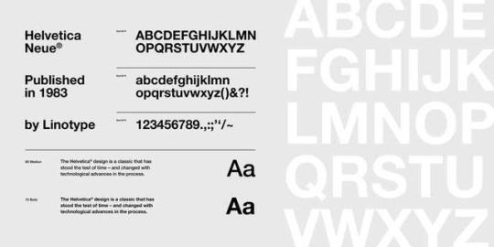
A core interpretation of the Modernist era in design was the development of different styles of typeface. The two most notable typeface styles of this era which are still used today are Futura and Helvetica Neue.
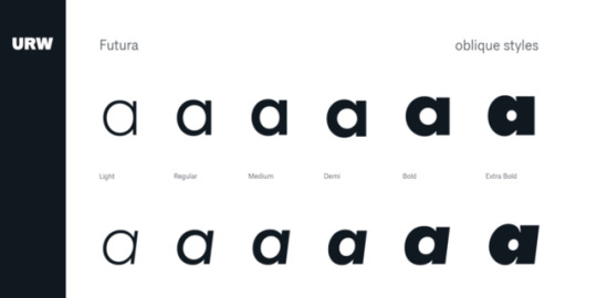
Futura was designed by Paul Renner in 1927 and was produced as a contribution to the New Frankfurt project. As seen in Renner’s designs, the typeface’s simple geometry that became representative of the Bauhaus style. Similarly to Bauhaus but not a direct reflection of, rejected the style of the past, the lack consistency of flow and weight forms. The design of Futura aided in introducing a new Modern age and indicative of the era. This style had been appropriated in contemporary mass culture, with the most notable being the cover art of Stanley Kubrick’s 2001: Space Odyssey, and inspiration for the minimalist logotype projects for high fashion companies such as Calvin Klein, Louis Vuitton and Dolce & Gabbana.
The first known version of Helvetica Neue was created in 1957 by Swiss typeface designer, Max Miedinger. Miedinger’s core goal was to design a new sans-serif typeface that had the ability to compete in the Swedish market with the main objective being to be neutral and offer no additional meaning. He stated that he wanted a font of which was clear to the eye and had the capability to be manipulated in a variety of ways. The font was initially called Neue Hass Grotesk but was changed to Helvetica, English translation of ‘Swiss’, in the 1960s as it was deemed more marketable on an international platform. In a contemporary setting, Helvetica has also been used by major companies including Microsoft, Jeep and across Apple’s iPod and iOS platforms.
European Modernism was a pivotal moment in history as it changed the way that artists and designers responded to and reflected upon a society that was further developing technologically and socially. The most prominent way in terms of mass media was to develop typefaces that would be continued to be used continuously in the future.
0 notes
Text
week two post. nineteenth century design - boom or bust?
What do the Great Exhibition of London, the Californian Gold Rush and Paris’ inauguration of the Eiffel Tower all have in common? Ostensibly, nothing. Other than one thread that runs through them all - the Nineteenth Century. A time of technological development, social change, and urban advancement lead to the largest boom of mass production, profit and prosperity the world had ever seen.
No longer was farm work the only secure source of income. The Industrial Revolution was a pivotal moment in design as it drew focus to metropolitan areas due to the increase of factories mass producing goods.
The inventions of new technology, including movable type, photography and various printing techniques, accelerated the spread of the Western democratic society at a pace that had never been previously witnessed. Pictorial newspapers became one of the influential types of publication as they were a key conduit for mass culture, combining news, entertainment, fiction and poetry in a format easily accessible and understandable for a mass majority of the population. The poster quickly became the most inexpensive mass-printed form of advertisement and were often displayed across any and all surfaces of streets and avenues in major cities such as New York and London.
Additionally, this time had a profound impact on women allowing them economic independence through factory and retail work. It can be argued that the Industrial Revolution was a fundamental shift in women’s rights which in future would lead to political and cultural change.
The ‘Arts and Crafts’ movement was developed by William Morris in the midst of the chaos of the Industrial Revolution as a somewhat cultural statement about the depersonalisation of furniture and art. Morris stated that, “I do not want art for a few any more than I want education for a few, or freedom for a few.” The movement was highly influenced by medieval art but was appropriated to fit within the society. On a fundamental level, Morris wanted people to enjoy what they created rather than churning items out for the sake of profit and to take away the stigma that art should not merely reserved for an elite few of the population and that it should be universal.
Despite the technological advancements, it seems as though the early Nineteenth Century was praised for its prosperous revival movements in which designers embraced diverse styles including but not limited to Greek and Roman Classicism as well as various medievals encompassing both the Gothic and the Romanesque. Whereas the latter part of the century has frequently been dismissed as a lacklustre era for design in the practical and theoretical realms. Designers of the time have been critiqued as being blissfully ignorant of the visual chaos provoked by the Industrial Revolution, therefore practicing eclecticism and lacking a set of principles core to design.
0 notes