
Statistics
We looked inside some of the posts by themojishop and here's what we found interesting.
Average Info
Notes Per Post
15K
Likes Per Post
8K
Reblog Per Post
7K
Reply Per Post
10
Time Between Posts
2 months
Number of Posts By Type
Link
1
Photo
16
Last Seen Tumblr Blogs


Fun Fact
70% of Tumblr users say the Dashboard is their favorite place to spend time online.
Link
Pages printed by Caxton in the 1470s have been discovered at the University of Reading. The “trademark blackletter typeface”, layout and red paragraph marks, suggested in could be something special.
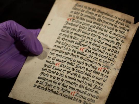
112 notes
·
View notes
Photo
Typography Tuesday
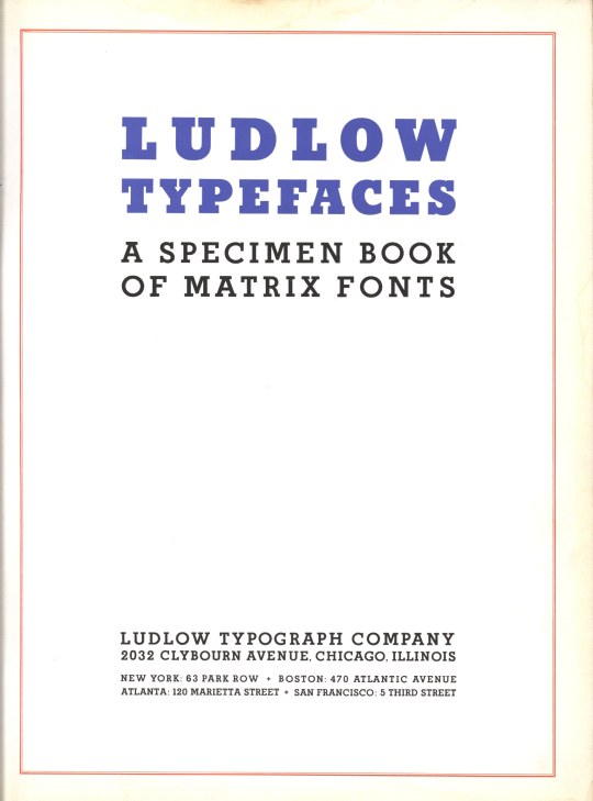
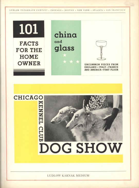
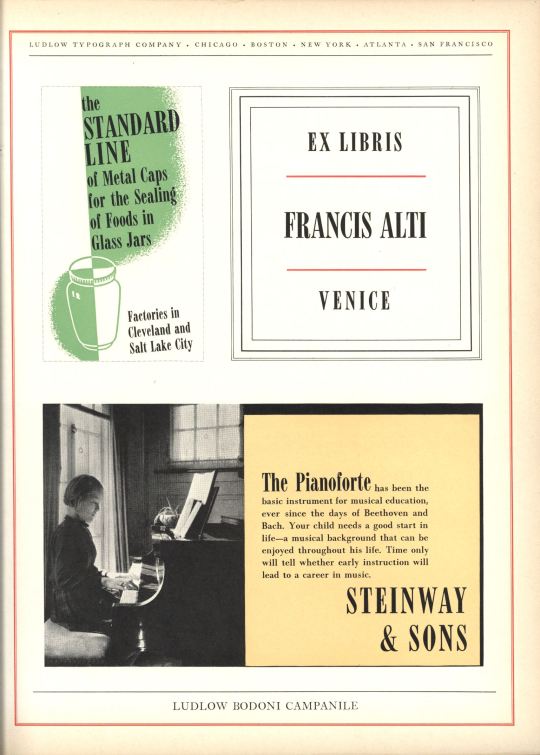
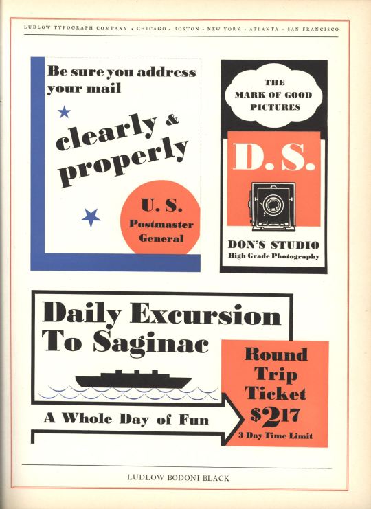
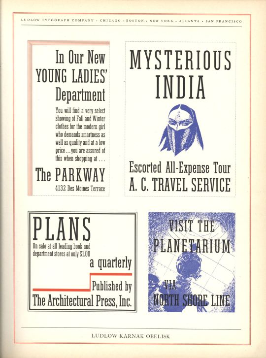
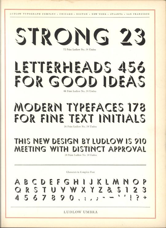
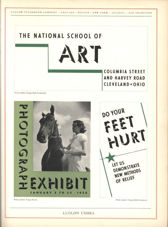
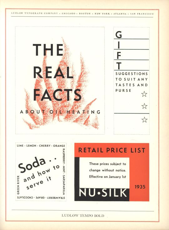
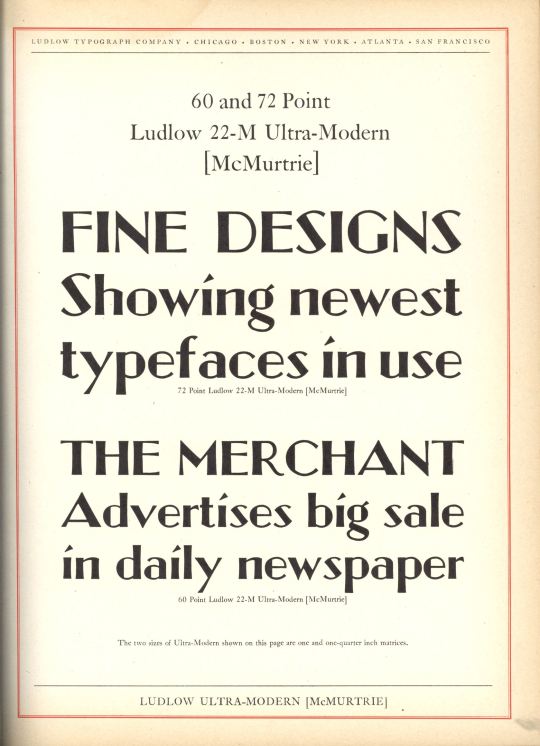
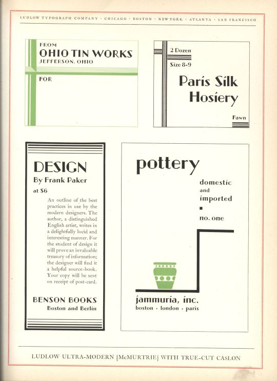
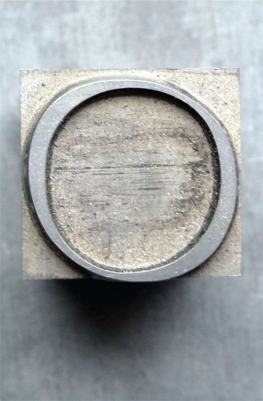
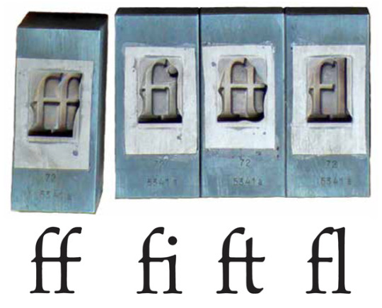
Today we present Ludlow Typefaces: A Specimen Book of Matrix Fonts, circa 1940. The Ludlow Typograph Company was founded in 1906 by William I. Ludlow and William A. Reade to manufacture and distribute a typecasting and composing system to compete against Linotype. Unlike the Linotype machine, which used a keyboard and a complex conveyance system to compose and cast each line of type, the Ludlow system was simpler and cheaper, using hand-set molds (called “mats,” short for matrices) in a special composing stick that could then be cast as a line of type in the Ludlow casting machine (view this excellent vimeo of how the Ludlow Typograph process works). The other advantage of Ludlow over Linotype was that ordinary Linotype was limited to typefaces smaller than 24 pt, whereas Ludlow faces reached 96 pt, with some special fonts as large as 240 pt. Manufacturing of the Ludlow Typograph began in Chicago in 1912. It proved to be a very successful system, and the company continued operation into the late 1980s.
All of Ludlow’s typefaces were proprietary. The company’s principal typographer was R. Hunter Middleton, who served as director of type design from 1933–71. Other notable type designers for Ludlow included Ernst F. Detterer, Robert Wiebking, and Douglas Crawford McMurtrie.
Shown here are the uses of Middleton’s designs for Karnak Medium and Karnak Obelisk (part of the Karnak series of eight faces developed between 1930 and 1941), Bodoni Black and Bodoni Campanile (part of Ludlow’s Bodoni series developed between 1930 and 1942), Tempo Bold (part of the Tempo series for which Middleton designed twelve faces between 1930 and 1942), and Ludlow Umbria, a shadowed, san-serif display face developed in the early to mid 1930s. Also shown here is Douglas McMurtrie’s Ultra-Modern, part of the only series he designed for Ludlow between 1928 and 1930. Although pricipally a designer, McMurtrie was Ludlow’s director of advertising from 1928 until his death in 1944.
96 notes
·
View notes
Photo
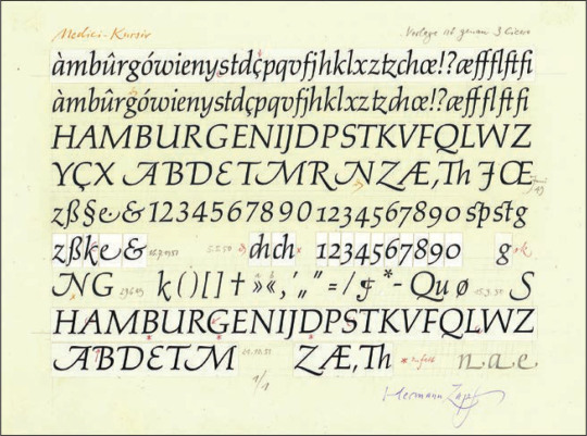
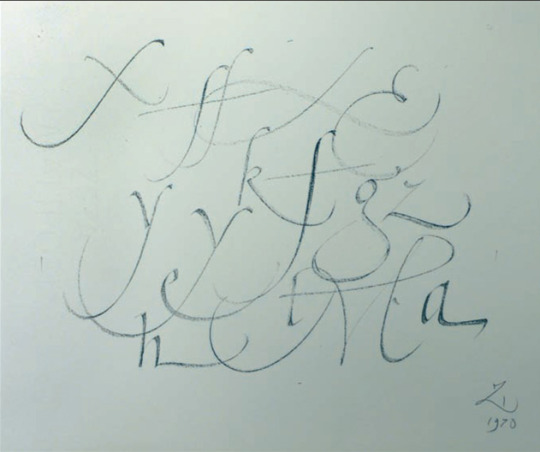
Palatino: The Natural History of a Typeface
Robert Bringhurst, author of the classic book on Typography, The Elements of Typographic Style has written the most in depth history of a type family ever.
A decade in the making and almost 300 pages long, it is a definitive account of Hermann Zapf ’s most ambitious and enduring design project: Palatino.
The collection include sketches and drawings never seen before that Bringhurst discovered in the Zapf’s studio, the Zapf Archive in Germany, the Stempel Foundry, the Linotype archive and at the Zapf collection at Rochester Institute of Technology.
A limited edition of 300 is being published as a fine press from The Book Club of California. Portions of the book will be letterpress printed in 2 colours from handset foundry type and Linotype metal. Pre-order information here.
165 notes
·
View notes
Photo
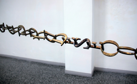
The piece Link spells out the word 'deseo (desire)' over and over again | Iván Capote
0 notes
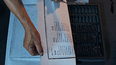
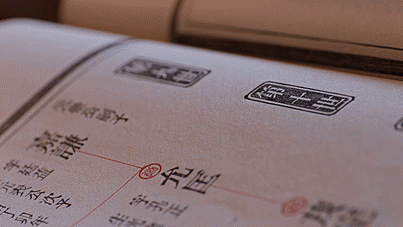
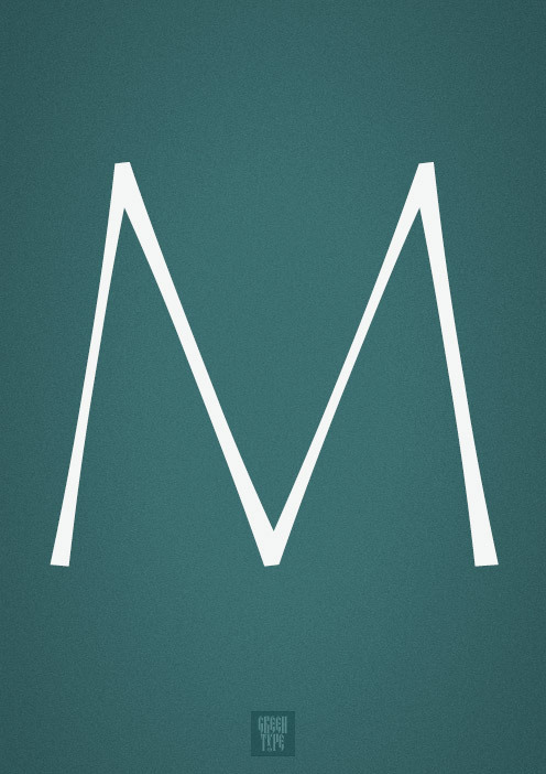
Photo
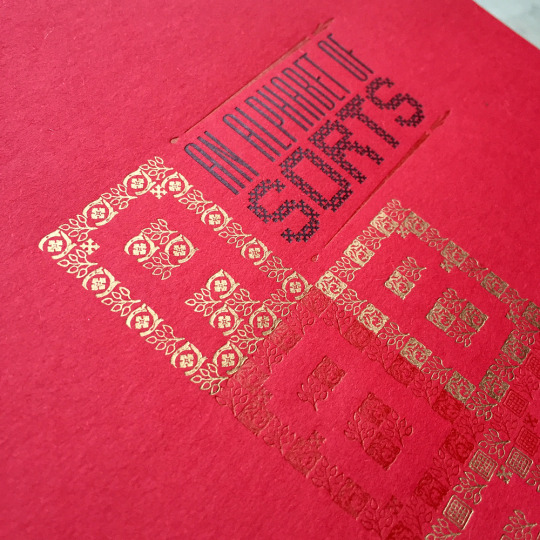
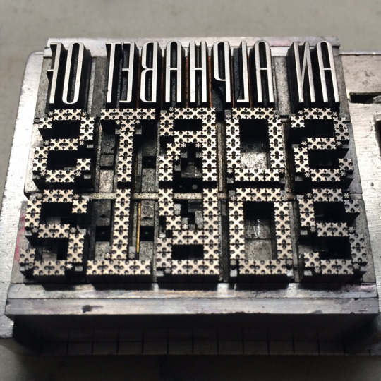
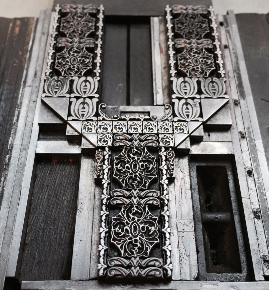
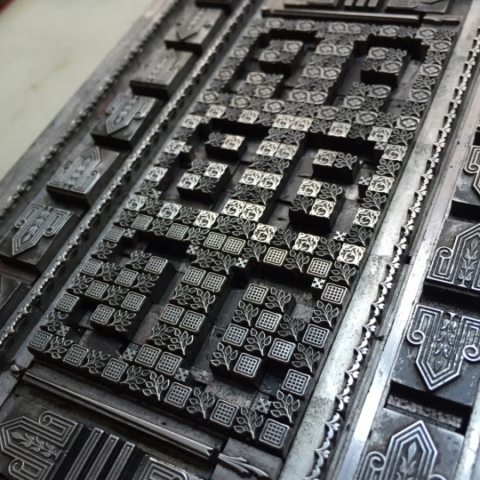

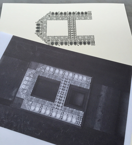
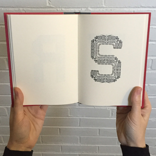
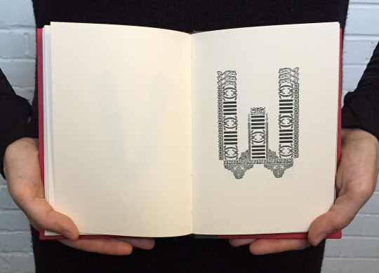
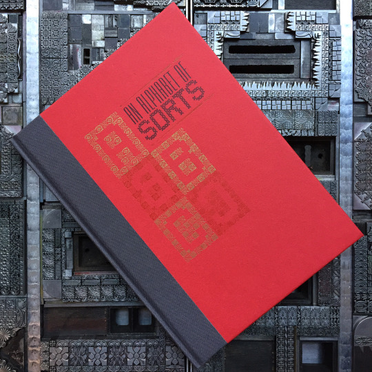
An Alphabet of Sorts
Last year letterpress printer, Jennifer Farrell, designed and printed a beautiful decorative M constructed from almost 100 metal printers’ ornaments.
After hesitating to break-up the forme, she had the idea of producing a whole alphabet using the same method. Eventually this thought galvanised into producing a limited edition book which she has printed at her Starshaped Press, in Chicago, and has bound at Wells College Press.
The process has resulted in some stunning imagery, especially of the metal forms which have been photographed after printing, still with silver ink clinging to the ornaments.
The edition is almost sold out, but there are a handful of copies still left. Most will be ready to ship in mid-May. Get one here.
786 notes
·
View notes
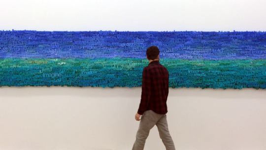
Photo
Yael Kanarek
Imagine Horizon, 2014 wood, silicone words in six languages: Arabic, English, Hindi, Hebrew, Japanese, Portuguese 33 x 240 in / 83.8 x 609.6 cm
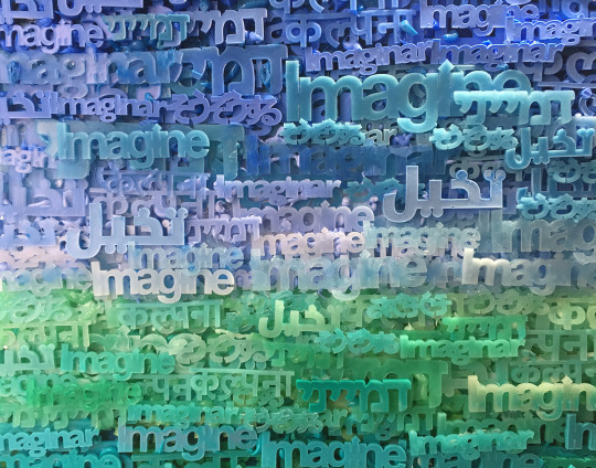
53 notes
·
View notes
Photo

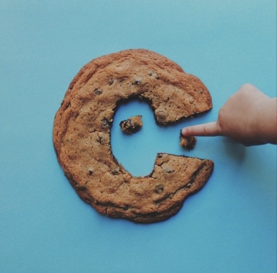
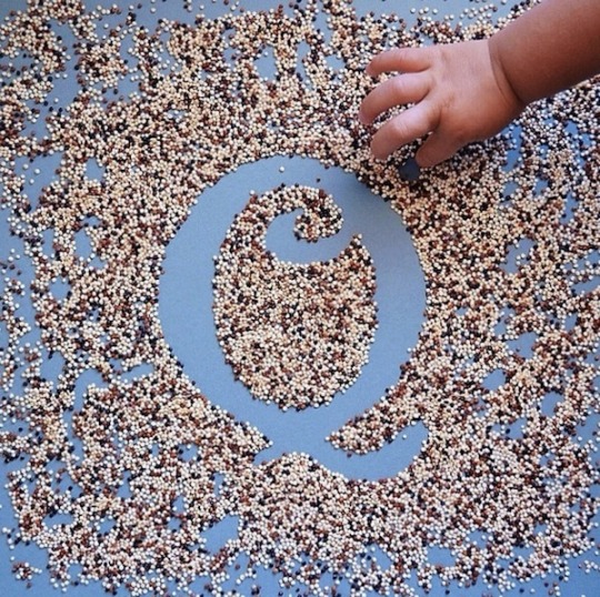
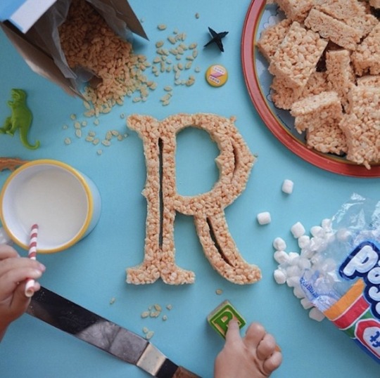
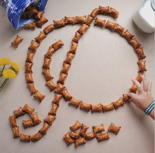
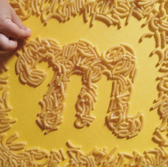
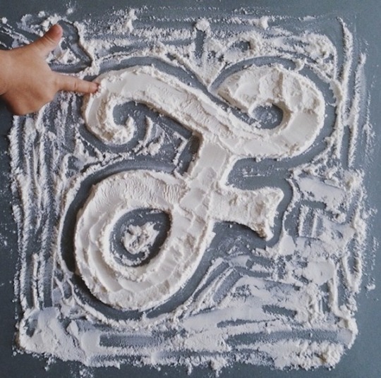
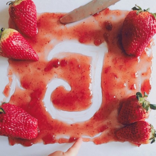
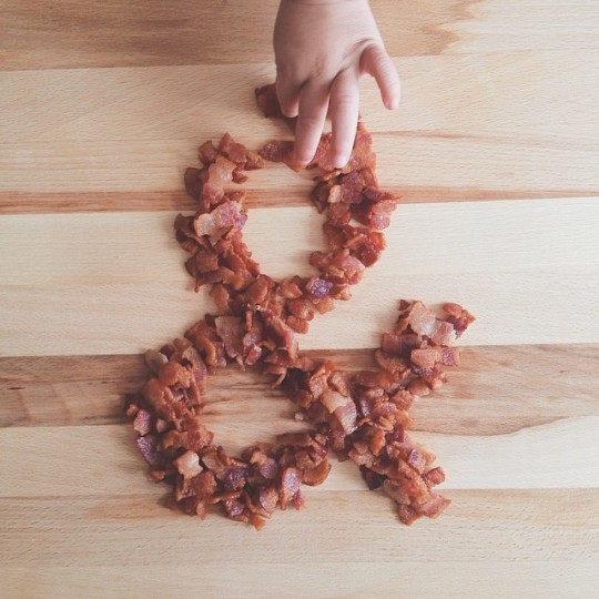
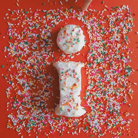
Dad and daughter
How proud a dad and typographer can be about his daughter are showing these pictures of Tommy Perez teaching his daughter some playful type. They both shape various characters with food. Taken on instagram this shows a perfect realationship and even that design can make a lot of fun!
Follow Typostrate on:
465 notes
·
View notes


Photo
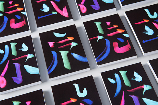
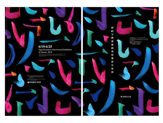
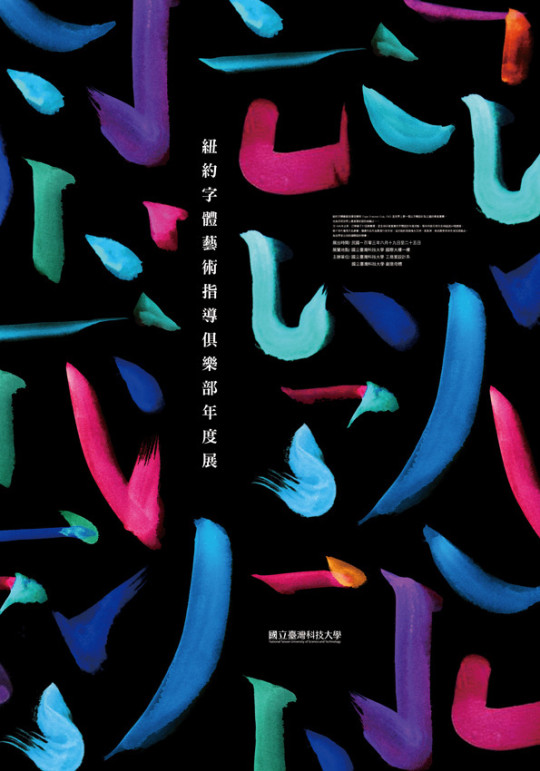
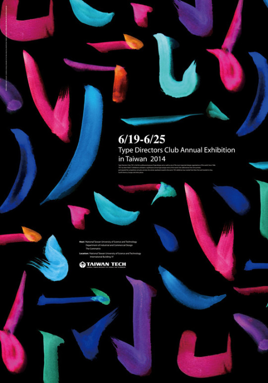
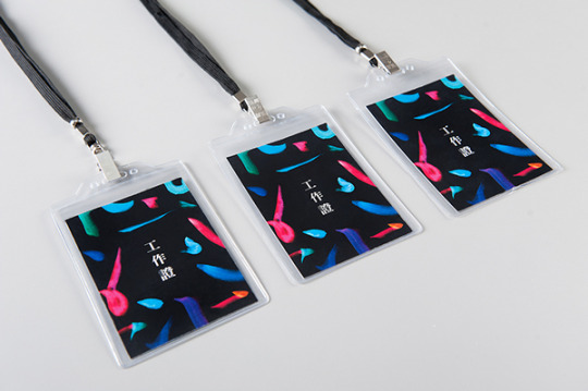
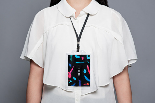
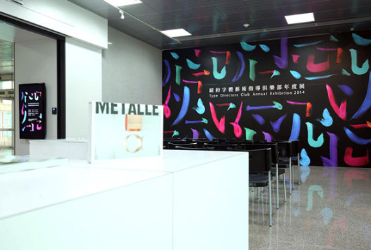
Visual Identity of TDC Annual Exhibition in Taïwan by ken-tsai lee
689 notes
·
View notes
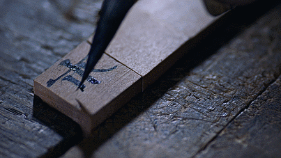
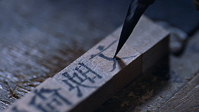
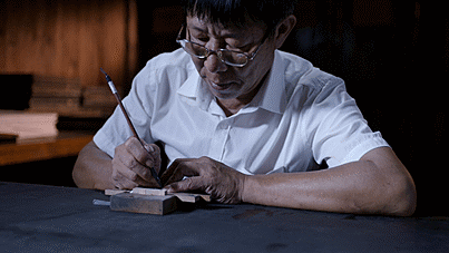
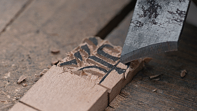
Photo
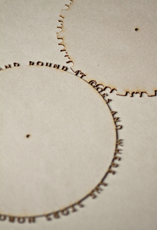
ohilikeart:
Wow! carving and #lettering by Sandra Llopart… typophile
46 notes
·
View notes
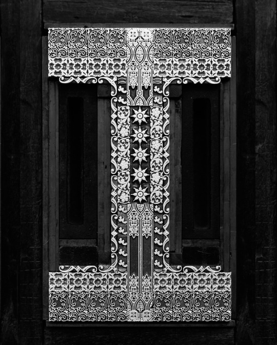
Photo
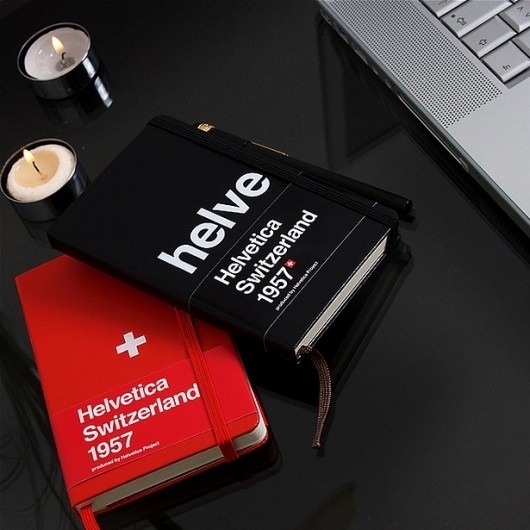
WANKEN - The Blog of Shelby White » Helvetica Moleskin
0 notes