
tumblngianni
Visual Literacy & Culture
Basking in beauty, cultivating creativity & deepening our discoveries✨ ..there isn’t such thing as getting too deep but don’t mentally combust yourself
3 posts
Don't wanna be here? Send us removal request.
Last Seen Blogs

andyramona17
Andy Ramona

theatricalstudies-blog
Theatrical Studies

leaf-veins
wench!

amaya-chwan
A Mellifluous Melody

aitarose
goodbye :0
Text
『*. Semiotic Analysis *.』
In today’s blog post we are going to be entering the world of semiotics and all that it entails. Before proceeding, with any piece of art there is meaning that can be recognized, depicted and interpreted in unique ways. These indicators of meaning can be expressed through “signs” and more likely than not, all images possess some sort of sign - no matter how obvious or obscure it may be. These “signs” enrich & deepen our understanding of the images being presented and unlock the theme/ meaning of them, to do so, the concept of semiotics is used.
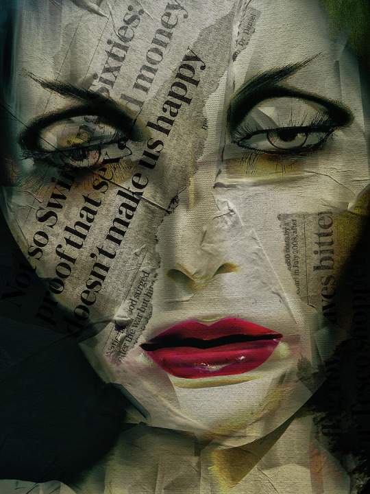
Moving forward, regarding the picture that I chose, I feel that it reads more analogical. My reasoning for stating this is because I feel that the image holds a much deeper meaning than what meets the eye. With a closer observation of the image, our eyes are instantly drawn to the emotionless, uninspired woman whose face is fabricated of newspaper articles. Once reading the text displayed on the newspapers, I feel that this image is trying to convey a visual representation of how we can fall into the trap of unconsciously masking ourselves with the things that we read, in this case, the perceptions/ truths in newspapers, hence why this digital art collage is titled, ‘The Woman with The Newspaper’. Adding on to this statement, I also feel that this image is depicting a societal ideal, of obtaining/ creating the “perfect household” which doesn’t showcase the reality of an actual family but merely paints a façade of how a unit should be.
There are two primary “signs” that I hone into when viewing this image; the first being the larger, bolded text situated on the upper left-hand portion of the woman’s face and the actual face of the lady, more specifically, her eyes and the exhaustion and dullness that translate from it. Further elaborating on the first key sign of the text which reads, “Not so Swinging Sixties: proof that sex and money doesn’t make us happy”, pieced together the meaning slightly more. Upon reading that statement, I instantly associated the image to the time frame of the 60s and the way of living during that era. The ‘Swinging Sixties’, was a period where majority of families would dedicate much time to watching television and reading newspapers. There was quite a bit of external influence subconsciously and even, consciously shaping these families and reinforcing certain “norms” or “ideals” in their society/ homely environment. With regards to the meanings that I drew, families of that time absorbed these articles with a strong sense of agreement. Being that it was a vital part of where they received their information, I would expect it to, in a way, form their viewpoints on certain issues or outlooks. It’s as if their ideologies and opinions are created by what is being said in newspapers, subsiding their ability to form their own authentic perspective without the tampering of outside chit-chatter.
The secondary sign that I find significant in this image is the woman’s eyes. It’s as if her eyes are being weighed down by something, perhaps by a realized truth of reality. Nevertheless, when viewing them, you can sense the presence of fatigue and dullness. In correlation with the alternative meaning that’s grasped from this image which is of a pre-defined expectation/ illustration that’s casted of how a family unit should be, with respect to the time period, I felt that during the Sixties many families had idolized the concept of having that “quintessential” family and strived in creating that. Regardless of obtaining financial success/ stability and acquiring a love-filled partnership, there’s still a sadness... an emptiness. This may be an unfortunate awakening of how things aren’t always how the media describes/ portrays them to be or on the contrary, how by possessing all these qualities to this ideal life, that there’s still this unhappiness/ void within. Further looking into this, this can be linked with our previous meaning and that a conditioned/ pre-determined mindset of what should derive joy, ultimately limits the individual to feeling that there are only certain things created from life that can fulfill this sensation.
Utilizing Saussure’s method and returning to the first “sign” that we mentioned, the “signifier” is the bold newspaper text and its “signified” is how these articles can massively influence the family members who are reading it and are relying on external, informative outlets to define/ built their reality. The overall message is that people can fabricate their identity and have their perspectives primarily constructed based from different media sources, in this case, newspaper articles.
The objective significance that’s being represented is a statement regarding that era and how “sex” and “money” aren’t always factors in bringing joy into peoples’ lives. Another note to make of this is the large font size and boldness of the text, we can connect this to the harsh, abrupt awareness of pre-constructed expectations of life being opposed to what they originally were associated with; a fulfilling relationship + an abundance of funds = a positive life.
When viewing this image with a more subjective perspective, we can say that there’s a sadness, “let down” of this pre-conceived notion of what goes into making a happy household. When viewing the woman, like I had said earlier, it’s almost as if she’s created by newspapers, making it seem that her guiding system or source for validation comes from what she’s reading. Essentially, perceiving life with the ideals and standards of others who dictate what is massively consumed by the public - theirs’ a reliance on other people’s words rather than her own.
Delving into the secondary “sign”, which is that of the madame’s eyes, the “signifier” is her tiresome eyes and its “signified” is this mundaneness, almost spiritless approach to life where we let external media sources control our outlooks more than we realize. Adding to this, by investing time in reading these articles without questioning the validity/ accuracy of it makes us become a victim to this tailored reality/ truth.
The objective is this “unknown”, mysterious, unclear recipe of what truly is the foundation to a satisfying, fulfilling, joyful life. We can support this thought with the immense darkness that’s casted across the crease of her eyes. Objectively looking at this, we can clearly depict a more lethargic, defeated expression linked to something... an absence of some kind.
In relation to its subjective context, we can extract from this “sign”, how her eyelids are halfway shut, demonstrating that’s she’s been in this “dormant” stage where she has placed her happiness in what she has been reading and seeing with regards to exterior outlets and is now awakening to an unmatched, dishonest reality. With more of a subjective perspective, we can add, as well, that despite the droopiness/ deadness of her eyes, there is a sense of beauty found within her eyelashes. It’s as if they’re distracting this raw, authentic, and at times unattractive reality/ view of the world (her eyes) with a slightly more appealing, pleasant one (her eyelashes) which can create a false perception of reality.
To conclude, I feel that this digital art collage conveys a very powerful, important message that needs to be digested and made aware to as many as possible. Although, this image ties itself to the world of the Sixties, this still is a relevant message for our present world where we need to be mindful of the content that we’re processing and absorbing daily. We live in a society where they’re tons of truths and a plethora of information and it should be essential to be selective with what we put our time and minds into. Gratefully, we live in a world where knowledge is in the power of our fingertips and we have the capability of truly discovering what is legitimate and what ultimately, feeds our lives with authentic, true happiness. Referring to the era of the image, although the Sixties was a time where the television was making great strides in expanding and becoming an item found in many households alongside the importance of newspapers, these were two main sources to inquiring knowledge - there was a limitation with information and more of an unquestioned uniformity with how individuals/ families were supposed to live their lives. This collage can intertwine itself with the 1975 video titled, ‘The Semiotics of the Kitchen’ where Martha Rosler is making a powerful statement of how woman is confined to this pre-expected standard and role in their household and society altogether. This brilliant, simplistic video brought to light the association of the woman being linked to “a system of food production”② and that of “a system of harnessed subjectivity”②, conforming her to a limited reality and to an undeniable exposure of a definite role of her reality. It subsides the woman’s personal ambitions, dreams and goals as society is forming their reality/ expectations of them for them, they place an imaginary constraint on the woman herself as she is guided through life believing that there are only certain places where she truly belongs. Overall, I believe this image is a reminder – a reminder at how far we have come as a civilization, as a society, as humans. Although, there is still the need for improvement on aspects of our world, it does not deny the fact that there is progress that is being made and how we are living in a reality where indeed, we do consume massive amounts of information on the daily. We have awakened to the understanding of letting that knowledge affect our reality, I feel that we aren’t bound by what the world wants us to be but more so, letting our authentic selves continue to fill this world with more unapologetic, beautiful ways of life.
Works Cited
1. Hampe, Gabi. “Faces and Mixed Media.” digital art by Gabi Hampe, international copyright https://www.gabihampe.de/english-2/faces-and-mixed-media/ . (Location where image was found)
2. Iabel, Gallery. “Martha Rosler Semiotics of the Kitchen 1975.” MoMA, Gallery Iabel, 2019 The Museum of Modern Art, 15 September 2010-14 March 2011, https://www.moma.org/collection/works/88937
• Date Submitted: Sunday, October 13th, 2019 @ 12:55 AM
0 notes
Text
『*. Ideological Analysis of an Advertisement *.』
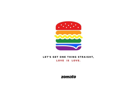
At first glance at this advertisement, we can depict that the hamburger with its rainbow-coloured layers is the subject matter. Taking a moment to fully absorb the media text, my initial take-away is that I feel that this establishment (restaurant, bistro) is visually presenting that food sees absolutely no boundaries and that it should be savoured and enjoyed by every individual. With that previous statement in mind, although all individuals of different socio-economic levels, ethnicities, cultures, races should all have the liberty of eating what they please with the acceptance and comfortability of these public domains of where they’re purchasing from. I feel that the advertisers really geared this towards the LGBTQ+ community. From the first few seconds of looking at the image, this becomes evident from each of the hamburger’s layers, representing a colour from the rainbow which is immensely, almost instantaneously connected with the Pride Flag, which correlates itself to the wide range of sexual orientations, gender identities and can signify the presence of unconditional love for all.
Not only can we support this thought with the brightly coloured hamburger but also, through the caption that reads right under it, “Let’s Get One Thing Straight, Love is Love”. This utterly clever slogan is not only confirming that this is in regards towards individuals who fall under the pride umbrella but that love, a love for food, should be experienced by all.
Delving in with a keener eye, I’d like to highlight certain elements of art and principles of design that I believe the creators of said media text used, in order, to bring to light this message.
Although, there aren’t any visible lines when looking at this advertisement. I feel that there are non-existent ones that form on either side of the hamburger. Regardless of the vivid yellow wavy line that’s mimicking either an ingredient of the burger (potentially lettuce) or a condiment, it slightly breaks past these imaginary lines. Nevertheless, I feel that these fictitious lines guide our eyes along the burger and in some way, frame the burger quite nicely.
The theme of shapes is another relevant element in this advertisement, our iconic hamburger is sporting an assortment of different shapes. For instance, the buns (red, violet) are molded into these dome-like, free-formed shapes, the patties or thickly cut vegetables (orange and green) can be depicted as rectangles with rounded edges, the slice of cheese (blue) and the lettuce/ condiment (yellow) are seen as more organic, free-flowing shapes.
In correlation to our previous element, we have another discreet shape that takes on the name of negative space. Negative space is made extremely pertinent due to the fact, that there is so much space surrounding our focal point and the texts. This naturally draws our gaze to the centre of the ad, aiding the hamburger in standing out that much more. We then, bring our attention to the slogan underneath it, followed by what I’m assuming is the company’s/ restaurant’s name, ‘Zomato’.
I would also like to mention the amount of space between the burger and the texts, with relation to the burger and the slogan, there isn’t a large amount of space dividing the two – I feel that this is made to reinforce the viewer of what’s trying to be conveyed with the burger and how both are key factors in further understanding the message. In comparison to the ‘Zomato’ text and with how further away it is from the subject matter, it shows how it might not be as significant with what’s trying to be portrayed and how it embodies a new idea/ meaning.
Another vital element to this media text is the use of colour. Firstly, there’s the contrast of the crisp white backdrop with the black text, especially with the darker font of ‘Zomato’, the white background really assists in making the black text protrude more. Also, the use of white beautifully separates all the ingredients found in the hamburger making the image more aesthetically pleasing.
The hamburger is made up of all the primary and secondary colours and with the alignment of all seven shades, are minds instantly associate the bright array with the rainbow. Being that there’s the use of all primary and secondary colours, evidently, we are exposed to all the complementary pairings (red and green, orange and blue, yellow and violet).
Also, the use of red for the font that reads, “Love is Love” really emphasizes part of the slogan and grabs the viewer’s attention when their eyes descend from the focal point of the burger. In regards with what’s being said, it gives more warmth and sincerity as oppose to the more straight-forward, serious line above it in a lighter shade of black. To note, as well, the word “Love” is in red which I feel is commonly associated with the theme of romance, passion and admiration – the colour may have been chosen, do to, its natural connection with the realm of love and the colours tied to it.
Another more subtle element that I feel is illustrated in this media text falls under the element of texture. When first looking at this image, this isn’t a visual display that embodies multiple textural features, but I feel that the sesame seeds sprinkled on the surface of the red bun give the hamburger more of a realistic feel as oppose to seeing a standard 2-D drawing. Further elaborating on this “realistic feel”, when looking at the red bun, you get a better sense of the burger in which you can almost feel the softness of the toasted dough with the slight prickliness of the sesame seeds scattered over top.
Switching gears slightly, I’d like to touch upon the principles of design that I believe are the most apparent in this advertisement. Balance is the first factor that I’d like to discuss more about. In this image, symmetrical balance in used throughout, primarily we’re able to say this because of the identical proportions on either side of our focal point. Once again because of this balance this guides our eyes to the rainbow-coloured burger. Another more minute factor is that of the sesame seeds on the hamburger and how if we were to draw a line in the center of the burger, we’d be able to depict that these sesame seeds were thoughtfully placed as what’s done to the left of the burger was also done to the right.
A dominant principle that’s used in this media text is emphasis, as what’s being greatly accentuated is the hamburger. The advertisers brought emphasis to the subject matter by making it larger in size, it truly stands out when compared to the texts placed under it. Another supporting aspect of this is due to the amount of negative space that surrounds the burger, being that there’s white empty space that’s floating around it, our eyes instantly move to the subject matter as there are no obstructions/ distractions that are created anywhere else, apart from the text. The burger is extravagantly flaunting the colours of the rainbow, which also aid it in gathering more significance. It’s also the only thing on the media text that’s an item which is formed by different shapes and has the addition of a textural element tied to it.
Another principle that can also be drawn from the advertisement is that of proportion. Throughout this image we can see that there is an assortment of unique proportions between the focal point and that of the texts – the proportions were sized respectfully and bring visual interest and a sense of symmetry to the image. Going in further depth with the sizing of the two bodies of text, there is a minuscule difference between them. The slogan written right under the hamburger is proportioned slightly smaller than that of the text that reads, ‘Zomato’, where we can see that there’s a mild increase in its size.
Unity is another principle that is present in this advertisement as when looking at this image everything flows quite seamlessly. There’s a level of simplicity that aids the eye in distinguishing what the purpose/ meaning of the media text is trying to convey. The amount of negative space, the contrast between the white and black, the pop of colours, the sizing are all supporting attributes for creating this unity. Another point that I’d also like to mention is that regarding the texts, there’s also a sense of unity and purposefulness. When viewing the slogan and how it’s in a different font than that of the text that reads, ‘Zomato’, it assists in creating more of a connection between it and the burger as oppose to the other body of text. Also, being that the slogan is in more of a lighter black, it better associates itself with the meaning of the rainbow hamburger and creates a sense of unity between the two.
The advertisement’s message is broadcasting that all individuals should have an equal plain field when it comes to all parts of life but specifically, the arena of love. Although, all individuals deserve to have the freedom and ability to love whomever they want, the advertisement is specifically honing to those who are part of the LGBTQ+ community.
The media text’s objective was to express its opinion/ stance on Section 377 of the Indian Penal Code, where it states that any individual that independently participates in intercourse/ sexual activities with someone of the same-sex, thereby goes against “the order of nature”. This exchange between two partners is seen as an illegal act and can lead to severe consequences, such as a decade of imprisonment.
I feel that ‘Zomato’, a food delivery app, is trying to peacefully rebel against Section 377 in reinforcing the idea that individuals with same-sex partners should feel accepted by their government and society, as love is meant to be experienced by all.
I feel that this advertisement leans more to a negotiated reading as although, there may be a clear global message that’s being brought to light, I feel like it can be interpreted in different forms. There is the resounding message that “Love is Love” and how there isn’t a defined way of loving or how love is amongst a pre-selection of individuals who should be able to pique your interest, but more so the beauty and undiscovered wonders that come with it. The advertisement’s intent can further be interpreted as being a stand-up against the inequality and inhumanity of Section 377 or how the ‘Zomato’ company is an online business that caters/ welcomes people of the LGBTQ+ community and how their app wants to reinforce a space of inclusivity for them.
Regardless of how it may be interpreted, I feel like its main message is being communicated beautifully and is done so with a very simplistic, creative and ingenious design. I feel like this media text is geared more towards individuals who are part of/ in support of the LGBTQ+ community. Personally, from first seeing this advertisement it brought me much warmth to my heart and I enjoyed knowing that a company with an influence and a following is strengthening a message in equality for all. I feel that the slogan that they used was not only humoristic but powerful, really capturing the attention of the viewer reading it. All in all, I feel that it was an extremely effective media text and would hope that it continues to aid in developing a world free of negative criticism towards individuals in a same-sex partnership, as love is simply love & one’s journey with it should be an approved go-ahead at self-discovery, which no one should tamper with.
• Date Submitted: Friday, October 4th, 2019 @ 4:33 PM
0 notes
Text

『 ❶ Description 』
The subject matter of this image is the ‘Chicago Water Tower’. I believe what’s meaning to be portrayed in this image is one of Chicago’s most iconic infrastructures, the ‘Chicago Water Tower’, during the later hours of the evening in a still very alive and awakened city.
I am inspired by this picture, first and foremost, of the crisp detailing of the ‘Chicago Water Tower’ and of the neighbouring surrounding buildings; I personally enjoy how the subject matter isn’t as recognizable or obvious as it should be. I’m also, very intrigued and fascinated by the different forms and intensities of objects emitting light (ie. the street lights, the traffic lights, the orbs, the moon).
『 ❷ Formal Analysis 』
≫ Elements of Art ≪
Line:
• Vertical lines of the top half of the building are more thick, creating dimension and drawing the eye to that emphasized section.
• Horizontal lines of the buildings beside bring more attention to the ‘Chicago Water Tower’ and accentuate the length of it.
Shape:
• I, primarily see rectangles expressing length.
• I spot triangles for the formation of some of the roofs, expressing width.
• Circles, expressing width.
• Free-formed circles made up from the orbs, expressing width.
• Squares, expressing both length and width.
Forms:
• I can only spot cylinders.
Space:
• The space around the surrounding items and infrastructures are mostly, in the shape of rectangles and in some areas, parallelograms.
Colour:
• Hue: I feel like the hue is made of intermediate colours, specifically the colours red and orange; these colours are made more evident in the negative space. The hue is also, subtlety made of the secondary colour, purple, more towards the bottom of the image, in front of the tower.
• Value: I would say the negative space is more light while the buildings have more of a darker value.
• Intensity: Although, we can say that this picture was taken at night, I feel like the infrastructures have a brighter intensity while the negative space has more of a dull intensity.
Texture:
•Being that the image is more crisp, it’s texture reads more hard.
≫ Principles of Design ≪
Balance:
• I feel like the balance in this image is a mixture of ‘radial balance’ and ‘asymmetrical balance’.
• Radial balance because the central point that is being focused on is the ‘Chicago Water Tower’.
• Asymmetrical balance because the right side of the image is filled with many large infrastructures while the left side is made up of fewer, petite-looking ones. I find what unifies & brings ultimately balance to the image is the land post that goes from the top to the bottom of the image on the left side.
Emphasis:
• I believe the emphasis is being put on the ‘Chicago Water Tower’ and specifically, the top half. I feel like the photographer achieved this by making the top half of the tower lighter.
Movement:
• I feel like the movement in this image is represented with lines, edges and the addition of light.
Pattern:
• I believe the patterns being used are the other infrastructures around the subject matter and through the pops of light.
Repetition:
• I believe the repetition is shown through the traffic lights and the size of the windows on the buildings.
Proportion:
• I feel that the proportions in this image is represented through the sizes of the buildings; the left side, the building is closer, looking smaller while the one on the right, is situated behind the ‘Chicago Water Tower’, looking slightly bigger.
Rhythm:
• Rhythm is created with the faded, thick purple lines appearing in front of the tower, the traffic lights all being on green and with the street lights.
Variety:
• Different types and sizes of buildings.
• Street and traffic lights.
• Land posts.
• Orbs and other free-formed circles.
• Sky and moon.
Unity:
• The negative space making the infrastructures pop more.
『 ❸ Interpretation 』
• My personal reaction to the image is that although the subject matter blends in with the other buildings, there are ways that the photographer captured/ edited the image to where the tower is still being centre of focus.
• What I personally drew from this image is how meaningful and intentional it is, with the traffic lights all in green and the hazed purple lines at the bottom suggesting that Chicago is a city that is constantly in motion.
• Yes, I do believe my reaction changed towards the subject matter not being as “recognizable or obvious” because after looking at the image more closely, in a way, there is this sharpness being put on the ‘Chicago Water Tower’ while the surrounding buildings have this slight blur.
Date Submitted:
01/09/2019
4 notes
·
View notes