
Don't wanna be here? Send us removal request.
Statistics
We looked inside some of the posts by wongwoanxiu and here's what we found interesting.
Average Info
Notes Per Post
0
Likes Per Post
0
Reblog Per Post
0
Reply Per Post
0
Time Between Posts
24 days
Number of Posts By Type
Text
11
Last Seen Tumblr Blogs


Fun Fact
Hackers stole 65M passwords from Tumblr in 2013.
Text
Week 12 Summative
This is my current artistic vision statement:
1. What is my design strength?
I think my design strength lies in photography, as I enjoy being behind the camera capturing moments that tells a compelling story.
2. Who do I want to become in 5 years?
In five years, I want to be a successful videographer and photographer.
3. What do I want to do between now and then? Why?
I will build my portfolio, experiment with different photography styles, refine my skills and gain experience. This will help me develop a distinctive style I like as a photographer.
4. How will I do it?
I will achieve this by participating in photography projects, and dedicating time to observe how others do it and continue being inspired by many of the photographers out there
I think my artistic vision is clear and aligns with my passion for photography. I try to outline both a goal and the steps I plan to take to achieve this dream. Similarly to week 3’s topic on social engagement, what truly inspires me in photography is having the ability to control what goes behind the camera and create to convey a message to the public. Take director Pat Boonnitipat’s movie ‘How To Make Millions Before Grandma Dies’ film for an example.
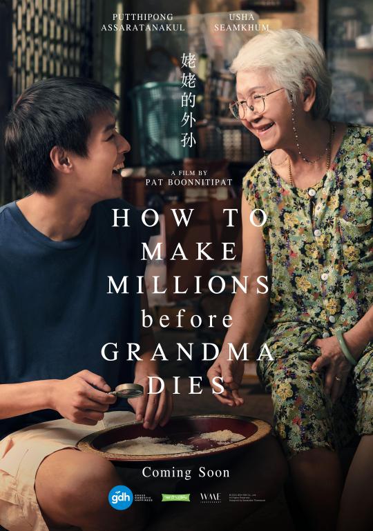
This movie explores themes of valuing relationships especially family, over superficial success. I was very touched by the movie and like many others that have watched it, we felt the need to be much more appreciative of our family members. Strongly inspired by this impact this director made, I carry this motivation with me striving to create art that evokes these emotions to be felt, conveying meaningful messages to the right audience, sparking reflection and encouraging to see beauty and value in their own lives and relationships.
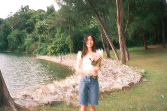
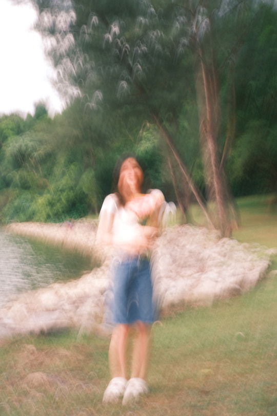
Recently, I also worked on a project for my image specialist replicating the experience of being a dementia through a photobook. Aiming to visually capture the disorientation, fading memories and moments of clarity that defines their journey. In doing so, I wish to not only share the struggles of a dementia but also the pain of losing a loved one to this illness they did not choose. While bearing the pain of watching a loved gradually lose touch with reality, I wish my photobook would bring comfort to those and bring awareness to this illness as well.
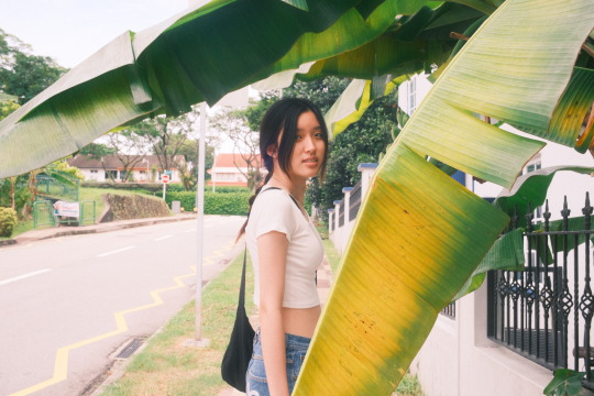
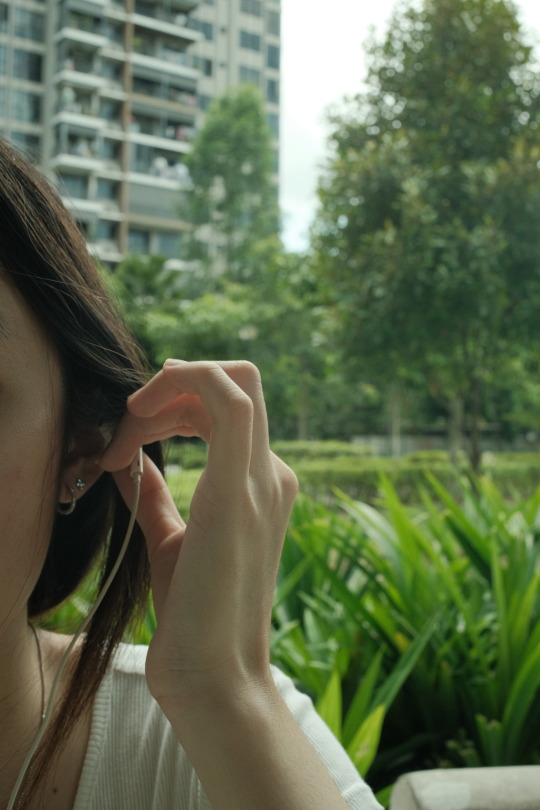
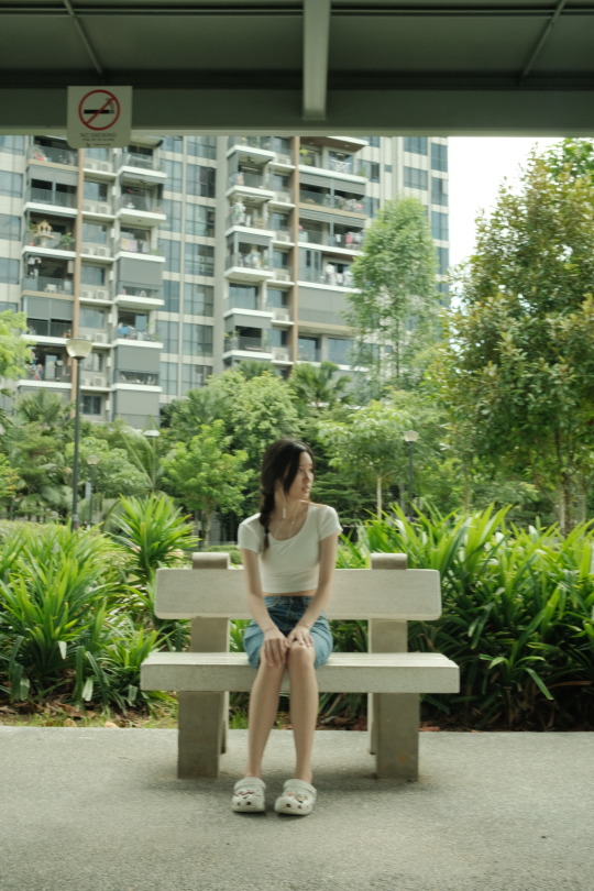
Some photos from the project:


One work of design that felt really inspiring and resonates with my artistic vision is this short film ‘to(get)her’. The storyline follows the song ‘White Ferrari’ By Frank Ocean, interpreted into a short film. It felt so authentic and there was definitely a distinct style of filming, though short there was a powerful storytelling that emerges from each moment. I could see how creative this video was made with moments where they synced scenes with the music beats on 3:28. Additionally, there was also this transition at 3:35 where it transits from her removing water on his face to wiping away his tears in the present that signifies an end of a relationship. It is these pocket of inspiration that really motivates me, keeping my vision clear, constantly reminding myself to what I really want in being a photographer/filmmaker. All while staying authentic to myself, and connecting with audiences inspiring a deeper reflection on humanity.
youtube
heechan lim. (2024, November 2). “to(get)her” | a short film scored to white ferrari [Video]. YouTube. https://www.youtube.com/watch?v=TOjTt40cvjE
Wikipedia contributors. (2024, November 14). How to Make Millions Before Grandma Dies. Wikipedia. https://en.wikipedia.org/wiki/How_to_Make_Millions_Before_Grandma_Dies
0 notes
Text
Week 11 Summative Question 1
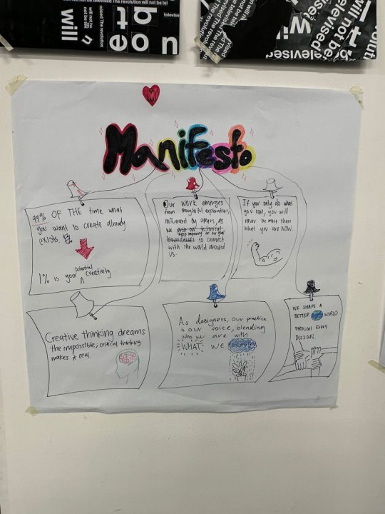
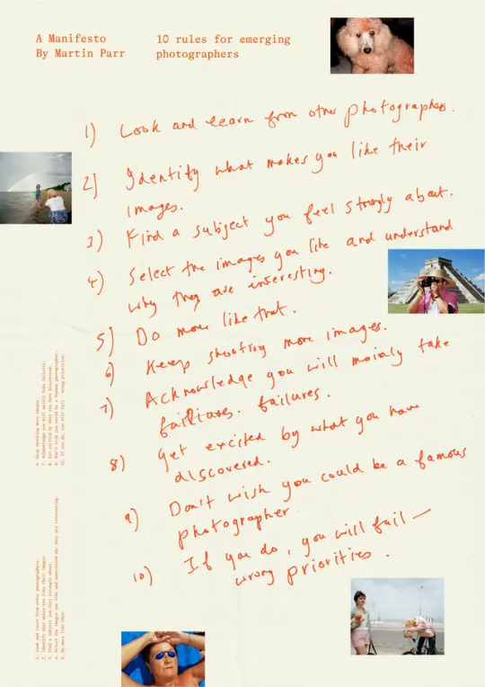
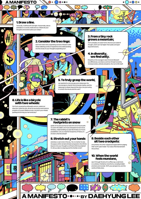
Reflecting on the class activity doing the manifesto, I found the exercise to be thought-provoking, especially while trying to link our personal and artistic beliefs with this module. My group’s manifesto is heavily inspired by Photographer Martin Parr’s ‘10 Rules for Emerging Photographers’ whereby it is highly personal expressed through the handwritten style, unlike other formalised manifestos. What we got from his manifesto is that it should be deeply rooted in our personal beliefs as well, and that it reflects who we are as a graphic designer.Like those corkboards people have at home to easily pin notes as reminders, we want our own manifestos to be ‘reminders’ for ourselves in this graphic design journey. We developed the manifesto by reviewing the lessons from each week, identifying concepts that best align with our own beliefs and selecting key ideas to represent each part of the manifesto. For my part, I wrote “If you only do what you can, you will never be more than what you are now.” To represent week 6’s lesson of critical self reflectivity, this quote helps me recognise that growth requires us to push beyond our current limitations and that staying within the comfort of what we “can” do might be holding back what we can do to expand my potential. I also find myself applying this to my studio work where I challenge myself to explore a new style or medium and push boundaries of my design practice.
If I were to revise my group’s manifesto, I would introduce a direct and concise manifesto by simplifying the language to make each point clearer and more actionable such as, “Each of our design should challenge and improve something in the world.’ rather than “We shape a better world through design.” If this was my personal manifesto, I would love to add in a personal element to emphasise a personal experience and importance of understanding my own approach such as “my instincts will guide the camera” to remind myself that sometimes it’s not just technical skills, it’s also about feeling the moment and responding to it. Like in my image project where I tend to embrace the unplanned by stepping away from the storyboard
I originally planned for the shoot, which helped me capture moments that felt more organic and genuine for me.
In this module, today’s lesson felt significant because it allowed me to explore various manifestos from different artists so that we could come up with our own. These manifestos revealed how each artist’s unique values, perspectives and creative processes shape their work. For example, Daehyung Lee’s manifesto emphasises the importance of personal growth, critical reflection, and the evolution of an artist’s identity. However, Martin Parr has a more action driven and practical approach with the ‘no nonsense’ kind of manifesto. Though the differences, both of these resonated with me in different ways. The variety of manifestos helped me realise that every creative journey is unique. As artists, we should embrace these differences as our individual experiences and processes shape the art we create. It acts as a reminder not to conform a single standard and to trust my own voice and defne my creative identities in ways that feels authentic.
Additionally, the class on analysing artistic traditions in week 5 highlighted the importance of how our progress and understanding are often made possible through the knowledge of those who came before us. This reminds me of a quote by Isaac Newton; “If I have seen further, it is by standing on the shoulders of giant.” As we develop our own manifestos, we referred to many manifestos from other artists. This is a great example that our creative practices is built upon the legacy of past designers and artists. Similarly in our school module Craft, we were taught the technique ‘weaving’ whereby we delved into the origins of this craft and saw how it has evolved over time to right now.
WePresent | Martin Parr’s ten rules of photography for emerging photographers. (2024, August 20). https://wepresent.wetransfer.com/stories/manifesto-martin-parr
Lee, D. (2023, November 16). WePresent | A Manifesto by Daehyung Lee. https://wepresent.wetransfer.com/stories/manifesto-daehyung-lee
0 notes
Text
CTS B - Week 6 Critical Self-Reflectivity: How Do I Think About My Thinking Processes?


For today’s class, my group went to Sim Lim Square to identify a design problem to solve as a group. We picked ASRock’s signage as the sign is slanted which made it difficult to read and even notice. Furthermore, there was no location to redirect their target audience to, to purchase the gadgets. Our solution was to include more images of their products and the location of the store for effective advertising.
I made a significant personal discovery during this activity regarding the importance of teamwork in the context of self-awareness. As someone who generally dislikes collaboration, I realised how essential it is to be self-aware during group work. Self-awareness allows me to recognise my feelings about teamwork, particularly my discomfort or frustration to manage those emotions more effectively. In the group activity, I found myself becoming more conscious of how my reluctance to collaborate will impact the group’s performance. Understanding this enabled me to reflect, and adjust my approach.
What I would have done differently is to embrace collaboration more openly by communicating my thoughts clearly. Instead of withdrawing due to my personal dislike for group work, I could have used empathy to better understand my teammates' perspectives and foster a more cooperative environment. Similarly to Studio right now where teamwork is inevitable, by acknowledging my initial discomfort with collaboration and actively regulating my emotions, I can contribute more positively to outcomes. Daniel Goleman’s insights on emotional intelligence, particularly self-awareness and empathy, are what I will use to guide me moving forward in such situations while constantly reminding myself that there is also beauty in teamwork, an opportunity to work together and create works I would have never created with just myself.
(283 Words)
A Milestone of Intelligent Development: Daniel Goleman’s Emotional Intelligence Theory - Experianta. 7 July 2023, experianta.com/directory/concepts/a-milestone-of-intelligent-development-daniel-golemans-emotional-intelligence-theory/.
#danielgoleman #emotionalintelligencetheory
0 notes
Text
CTS B - Week 4&5 Field trip + Analyse Artistic Traditions and Lineages
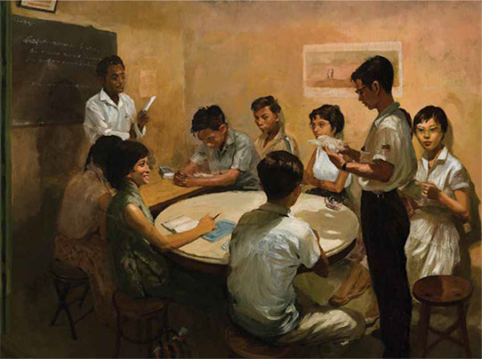
Chua Mia Tee’s painting of the “National Language Class.”
Through today’s class, I gained several insights related to the analysis of artistic traditions, particularly how to critically engage with a subject matter in art. One key discovery was the importance of examining the intent behind a work, digging deeper into the work contextually. As seen in Chua Mia Tee’s painting of the “National Language Class.”, which reflected the political climate of Singapore during its transition to self-governance in 1959. It portrays a group of students, representing diverse ethnicities, attending a Malay language lesson—a symbolic scene reflecting the country's search for a unifying identity. Alongside the phrase on the board ‘Siapa Nama Kamu’ (What Is Your Name?) evokes questions of identity, not just personal but as a nation that is yet to be. The medium of social realism also aligns with the intent of giving us an accurately represented glimpse to the era of 1950s.
Reflecting on the class discussion, I could have approached my analysis of the artworks by incorporating more interpretations of how the use of medium supports its message. An example would be the artwork ‘Chinese Puppet Theatre’ by Lim Mu Hue. The medium ‘woodcut’ is a traditional printmaking technique in Chinese culture which aligns the artwork with historical and cultural traditions, reinforcing its connection to the heritage of Chinese puppet theatre.
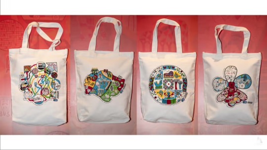
The lesson highlighted the need to integrate history into practices, which I now understand how I can apply these lessons to my future work. For example, when designing for a National Day tote bag, I should put into consideration of Singapore iconography and historical context into my work. Focusing on the diversity of cuisine; kaya toast, roti prata, chicken rice and nasi lemak could be used to design the tote bag as a representation of the nation.
(292 words)
“National Language Class.” Www.roots.gov.sg, www.roots.gov.sg/stories-landing/stories/the-singapore-story-through-60-objects/art-historical/national-language-class/story.
https://www.channelnewsasia.com/singapore/ndp-pack-2023-pack-tote-bag-feature-artwork-people-disabilities-3563861
#chuamiateenationallanguageclass #importanceofhistoryheritage #graphicdesign
0 notes
Text
CTS B - Week 3
Connecting Practice with Society


In today’s class, we covered the concept of connecting artistic and design practice to society, using Sep Verboom as an example. Quote ‘I asked myself, if I would want to spend all my life and career in a design office or a factory doing things for aesthetics and sales’ prompted me to think critically about my own potential as a designer to contribute to social causes. Verboom’s works showed how design can influence a positive change by engaging with the needs and well being of people which expanded my knowledge of a ‘socially engaged practice’, of one that creates awareness.
My group created a video skit inspired by silent films to raise awareness about giving seats to the elderly on public transport, to demonstrate how artists can address social behaviours through creative expression. The exercise helped me understand how art tools can be used to influence behaviours and mindsets, additionally, I felt like the video could have been approached differently by including interviews of people on their thoughts to create a deeper empathy and care for the elderly. A practice of this reflected in real life is the ‘gracious commuting’ campaign designed with different characters that helps remind us of good practices in a public setting. Such as ‘stand up stacey’ which aligns with our topic of giving up seats to those in need.
The lesson reinforced the importance of consciousness — being aware and keeping up to avoid risk of designs being superficial or disconnected from people we aim to help. Moving forward, I want to embed more care, understanding of cultural, social and economic conditions into my practice ensuring it resonates and contributes to society.
(276 Words)
“LTA | Gracious Commuting.” Www.lta.gov.sg, www.lta.gov.sg/content/ltagov/en/getting_around/public_transport/a_better_public_transport_experience/gracious_commuting.html.
Seng, Sabrina. “Woman Sits with Feet on MRT Seats, S’poreans Say She Looks like Stand-up Stacey.” MS News - Independent News for Singaporeans, Must Share News, 5 Sept. 2022, mustsharenews.com/woman-stand-up-stacey/. Accessed 19 Sept. 2024.
#sepverboom #graphicdesign #sociallyengageddesigner
0 notes
Text
WOII - Phenomenology
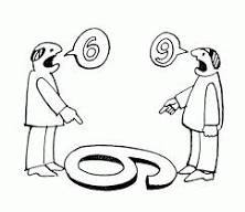
To me, Phenomenology is about perceiving artworks in different ways. One example would be, the picture of the duck and rabbit. Some people sees it as the duck whereas others sees it as the rabbit. To me, this means that everyone perceives things differently, hence as a designer I should be able to perceive things differently in many ways possible to understand our audiences deeply to create a design that benefits all. It offers a framework for understanding and designing for human experiences which fosters empathy, authenticity and meaning in the art. For example, the ‘6 & 9’ joke, in our perspective, we could understand why both of them were arguing that the number is 6/9, however they cannot. This is when we should come in to come up with a solution that benefits all. One takeaway this lesson has taught me that helped me in my studio work is to learning how to evaluate my work in different ways. While I understand that everyone has styles of their own and have different types of artwork that they may like, it helped me decide what works the best for my design. It has also helped me keep my options open when choosing my materials/medium, I would reconsider my choices and that has helped me learn much more new things and be authentic.
0 notes
Text
WOII - Reflections
Initially, when I first started taking World of Imagination & Ideas lessons, I found it hard to understand and thought it did not relate to what I was learning in school. Overtime, I felt like it has helped me broaden my design knowledge, getting to know more techniques, artists, art styles, philosophies to research on that could help give my work more variations instead of always sticking to one style. Learning how to analyse artworks helped me breakdown works structurally that could deepen my understanding on the Artist’s motive, the steps taken, and the materials used for the work that may be related to the motive behind it. It deepens my understanding of graphic design which I now feel is so much more than just communicating through elements and words. World of Imagination & Ideas has taught me to enlarge my ideas and think differently where I could get inspired by things easier. I keep myself open to new ideas even if I think it does not relate to what I am doing because I know that it can help me learn one thing or another that I can apply in my work.
0 notes
Text
WOII - Semiotics
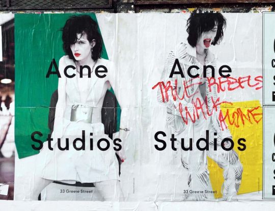
I learnt about pictorial representation and how it appears in our daily lives. Three types of signifiers would be ‘icon, index, symbol’ whereby icons are straightforward representations, index are icons that people would easily relate to a certain word, eg skull - danger. Symbols are this universal icon that all of us will learn since young, an example would be numbers. Some important elements that plays a part to pictorial representation, such as: point, line, plane, pattern and texture, space, time & motion, value, colour, balance, rhythm, scale and proportion, emphasis, unity. This lesson has helped me identify more varieties of ways to represent an idea I want to show. For example, in craft visual narratives workshop, I wanted to represent eeriness and the rat race culture. I used a caution tape to paste across the HDB flat to represent ‘danger’ and desertedness of the place. Using a dying heart rate to represent emptiness in humans. I chose this poster from Acne Studios to analyse on. Acne Studios promotes themselves as a ‘mystical world’, with poisonous vines and roots. The crumpled texture on the paper represented veiny branches. The scribbled red letters gives it a grunge look, and acts as a ‘warning’ and rebellious. The monochromatic clothes on the model have a contrasting look against the vibrant green/yellow on the background. The elements complement each other that gave it a chaotic and wild vibe that represented their clothes.
0 notes
Text
WOII - Post Modernism
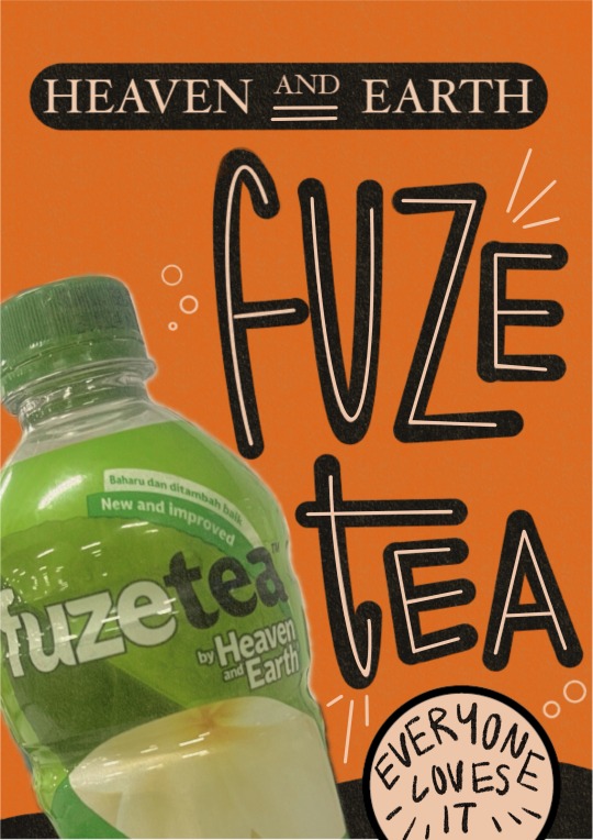
What I like about Postmodernism is that it encourages us to be bold and playful in our art. It makes us think out of the box, experiment new styles and break design traditions. Some takeaways are, adding pluralism to my work, multiplying the object or learning to group objects of the same style to make the poster loud. Secondly, combinations of 2 different styles together and using of historical references. Postmodernism has integrated into my school works in ways such as using embroidering chinese characters on my work, combining with modern art. It taught me to always explore in various ways, like using different methods (burning, cutting, crumpling, sewing) or different styles like grunch + swiss. If we had more time, the things that I would improve on for the poster I made with Joyce would be making the combination of 2 different styles more obvious. We were going for a retro poster so we could have added in some elements of futuristic, adding in more variations of colours, making it 'conceptually weird' by playing with the concept of 'heaven & earth'. We could have added in exaggerated photos of heavens or the earth, fragmenting the photos then putting them together. How Postmodernism was effective in the poster on the right was that there was some balance in the messiness of the poster, and that the design created this warp effect that felt out of place which drew me in to read more about the poster.
0 notes
Text


WOII - Analysing Artworks
Today’s lesson about analysing artworks could be broken down into 5 parts: processes & purposes, subject matter & meanings, choice of medium, aspect of form, lastly context of piece. Some main takeaway of today’s class would be analysing works through their texture, how the texture plays a part to the function of the work. What was interesting about what was taught was being introduced to the different textures people creatively thought of. Eg. batik, crochet, tarps (freitag), and from plants (ratten and bamboos). There is this aesthetic about a work that the texture of it can help further group it and helps us to analyse. During the group discussion, we were able to group different items into different categories we made up of, eg; materials, daily life, time, vintage. Today’s lesson helped me deepen my understand with narrative visuals craft workshop whereby I understand what different textures communicate, and being able to group subjects together that communicates a clearer idea. Some interesting works I saw at the museum helped me practice analysing artworks. Eg. upcycled keychains, combs, earrings. From the texture and the fact that each item has a completely different swirl and mix of colours, I could tell that these were made from upcycled plastics. Also note that these are daily items that we are able to use daily, which then could be a daily reminder to ‘reduce plastic waste’. Another example; stilt house.
There is 2 textures communicated in this artwork; wood and paper. I think the choice medium really reflects an accurate 3D representation of stilt houses in real house which helps to to touch on the purpose and context of the piece, communicating this rundown and authentic vibe to it. The aspect of form communicates this realistic layering of the houses, and the background, both of different medium that helps us imagine being at a place with stilt houses and to understand the culture deeply.
0 notes
Text

WOII - Aesthetics
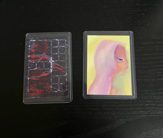
Some key takeaways from today’s lesson would be ‘form’ and function’. We were to digest the 'crystal goblet' paragraph and understand what the content is about. The essay speaks about this metaphor comparing typography and a crystal goblet, whereby type should be simple for the readers to focus on it easier. One of the few slides showed the essay with serif typeface, another with san serif type, and another with this permanent marker texture font. All fonts are definitely readable, but this is when form and function comes in. Comparing the font and the context of the essay, the permanent marker font definitely does not align with the aesthetics of the essay, as this type of fonts are normally comedic. As for the san serif font, it is readable but it does not bring out the classy and elegance of the essay, which means the last serif font would suit this essay the best. I think this lesson helped me with choosing a font for my studio work for the trading card, helping me narrow down my choices to ensure that both the form and function are working together to communicate the idea I want to portray. We went around Sim Lim Sq to look for logos to discuss further about form and function; here is one example:
Dalgona coffee: This is a coffee candy and I could tell that the designer was going for a cute illustration style to communicate the product. I think that the form and function worked together well as it attracts the correct target audience, and the image sells the product, I feel is very straight forward that it is a coffee flavoured candy.
0 notes