yasmincowenbcu
YASMIN COWEN
// ILLUSTRATION BCU
311 posts
Don't wanna be here? Send us removal request.
Last Seen Blogs

ri1nedjdkgg
Untitled
apocalyptic-batman
No Regrets. No Tears. No Anxiety.

femaletwstsupremacy
爱...是什么?

tp3691
Untitled
Photo
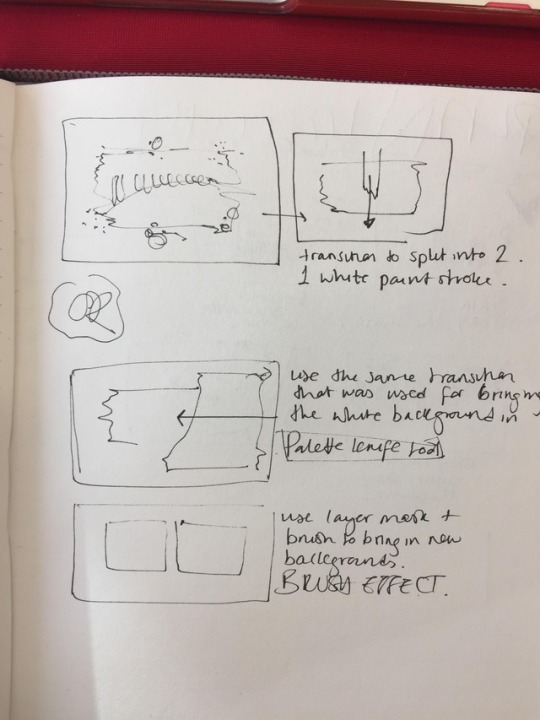


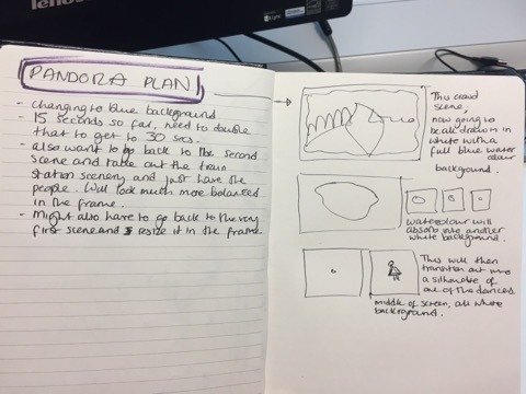
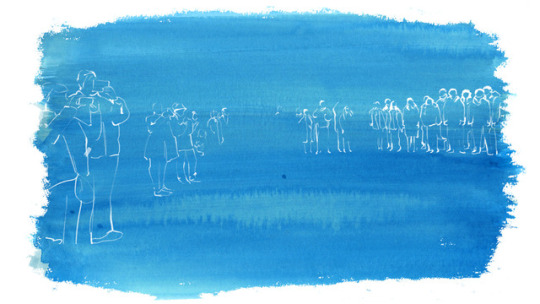
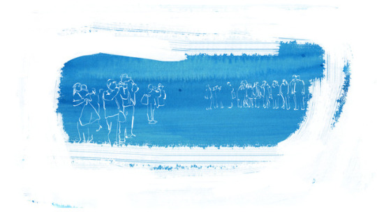
Leading on from the last section I really wanted to split this rectangle shape I already have into two sections, leaving two smaller shapes with white lined animations happening in them of the dancers and crowd.
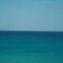
I tried to do this a couple of ways, but after attempting these two versions I realised I don’t like the composition on the page and the idea wasn’t working. This is a slightly darker blue than I had used before but I think the tone is wrong when looking at it with the rest of the scenes.
1 note
·
View note
Video
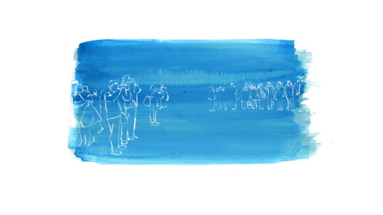
Finished this section for now and incorporated it into the background I’m using in the animaiton. However I don’t want to keep it like this as I’m going to create all the scenes that I want and then move everything around at the end into a different order.
1 note
·
View note
Photo

Tried to use a layer mask for the highlights on the crowd to stop them from moving so much. It still jumps about a bit but it’s much better than before.
0 notes
Photo


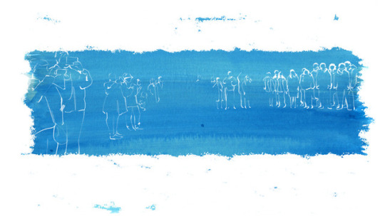
I've kept some of the raw edges of the watercolour and used the paint Photoshop brush on the edges, which I really like the look of, and am much more confident in how this is turning out than the previous experiment.
I've tried to render the people in the crowd a bit more so that they are more visible on the blue background, I've done this frame by frame with the same paint brush as the edges, just with an opacity of 20%. I don't think this is working as well just because everything in the scene is animated, so it might look better if this element is still. I'm going to go back and do a layer mask on this part to see if it the textures look better still.
1 note
·
View note
Photo
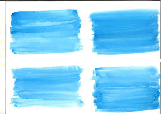

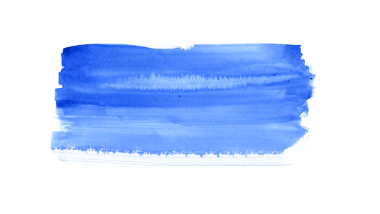
Since the last experiment with this scene I've decided to change the idea and try this instead. I looked back and realised that I don't necessarily have the time and skill to learn how to animate the shapes in the way that I wanted it to look, but I also thought this idea would look much better. I've been trying to think of subtle ways to bring in colour for this animation, but now I'm just going to transition into a full blue watercolour background. I've created these test frames to see how I can blend the watercolour into a white background, as I don't want it to fill the entire frame. I've used a range of 'wet media brushes' on Photoshop, and also looked at the scale and positioning of the animation on the frame.
At the moment I think the bottom two images are working the best, the very bottom image doesn't have any brushes used on it, only the watercolour edges which I also think works quite well. I think I'll find a way of incorporating the two since I really like the effect of the brush, which will be used to transition this scene in.
I also might render the characters in a bit more so they stand out more on the blue background.
1 note
·
View note
Video
vimeo
Unexpected Discoveries
‘A young fellow finds himself stumbling upon an ordinary flashlight that allows him to explore other places. Unexpected Discoveries reminds us to always be present. You never know what is around the corner or what is directly in front of you.’
Here I really like the way that space is used within the frame, and how simple the execution of the concept is, but still fully conveys the message. I think sometimes I can over complicate my work when it doesn’t need to be, so watching this has inspired me to take a simpler approach sometimes.
1 note
·
View note
Video
vimeo
Rooms - Studio ADZ
Here I’m interested in the transitions that are used, but also how the background colour is incorporated into the scenery. I also like the flashing textures that are used which is something I always try to do in my work, but want to do it in a more refined way, like in this animation. This background colour is similar to the one i’m using in my Pandora project, so I want to see how I can also incorporate it into my images for a more consistent feel.
#Vimeo#animation#film#illustration#design#2d#3d#poetry#motion#billycollins#textural#painterly#cell#handdrawn#independentfilm#independentanimation
2 notes
·
View notes
Video
vimeo
IMMERSION - Lalita Lupina
‘Tommy's trip to the indoor swimming pools. As he struggles he produces a pool filled with his anxiety.’
I really enjoyed watching this animation even though I don’t normally like this cartoon style. I liked the different take on the theme of dealing with anxiety, in a different setting to how it can normally be portrayed. The changes in perspective are really interesting, how they’re all separated in different shapes but on the same frame, but it’s still easy to follow the narrative. It’s similar to how comics are constructed but in an animation sense, which I haven’t seen before. Some of these techniques could be interesting in my Pandora project, if not, one of my editorials.
#Vimeo#2danimation#animation#2d#framebyframe#digitalanimation#cartoonbrew#hslu#graduationfilm#cartoon#cbfest#hochschuleluzern#2016
5 notes
·
View notes

Photo


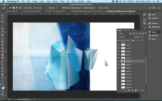

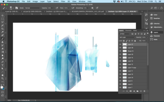

Starting to create the abstract shapes that will be in place of the dancers in the crowd scene I last made. The shapes and colours were inspired by the work of Francois Berthoud that I looked at earlier in the project. As shown roughly in the storyboard, these shapes will transition in first, outlines of the dancers in white will flash in every few frames, and then the crowd will transition in in a drawn motion.
I wanted to finally introduce some colour into the animation at this point, so I want to find a transition that doesn’t make it seem too sudden, as there still needs to be a level of continuity.
I used the first frame of this scene in the original video to find how big the shapes needed to be, and then worked on a separate document to add the gradient to each shape. I then layered watercolour textures with different blending modes to get the effect that I wanted. I’m happy with how it’s looking so far, although I’m going to change the composition from the original video as these shapes will be the first to appear in the scene and I don’t like how they’re placed at the minute.
1 note
·
View note
Video
Final walk cycle experiment.
I enjoyed making this as it’s the first time I’ve tried a different kind of animation, and it only took about 5 minutes to construct. I used the puppet tool to make the character walk, first on each leg, then I went back and did the rest of the body. It’s been a good test because I can see more how I can apply these animating techniques to my work to get things done faster, but also to more of a professional standard.
0 notes
Photo

After Effects
https://www.youtube.com/watch?v=ZYLvCjP0Qnw&t=554s
Deciding to learn after effects as I think it will aid some of the animation techniques that I already try to do in Photoshop, by watching the above tutorial.
I attempted a simple walk cycle of a character, to get used to using the timeline and puppet tool. I’m finding that there’s a lot of similar tools in After Effects to Pemiere and Photoshop, so It’s becoming quite easy to get used to.
Here I’ve created this simple character, with all the components on seperate layers. There is 2 versions of each as I wanted the character to flicker as it moves, giving it a hand drawn feel. I’m also doing this to see what the difference in movement is to doing things frame by frame on Photoshop.
0 notes
Video
30 frames
I’m happy with how this is looking so far. I decided not to crop into the original frames like I have done in other sections because I like the space at the top and bottom of the frame, and how it works with the panning effect. I’ve left space where the dancers will be for now but I’m going to experiment with using some more abstract shapes in their place.
1 note
·
View note
Photo


A still from the next sequence I’m working on now, which I want to last a bit longer than the ones I’ve already done. Theres about 5 seconds left until the music changes and the choir begins to sing, and so far each sequence lasts on average 2 seconds, so this one will be about 3/4 seconds. I’m going to outline the people in the crowd in the drawing style that I used in this frame from the second sequence, since I really liked how the lines flicker when it’s animated.
Up until now I’ve only drawn the dancers in silhouettes or outlines, I’m not sure how I’ll incorporate them into this sequence. I’m thinking about using abstract shapes with some colour flashing and then the outlines of the dancers flashing in 2 or 3 frames in white.
1 note
·
View note
Video
vimeo
In Other Words | במילים אחרות
This is a really good example of a similar drawing style to mine. Tal Kantor has combined film and animation here seamlessly. I also like the subtle watercolour backgrounds which are still paintings, which is actually quite nice since the line work of the characters flows even when they are still.
#Vimeo#film#animation#short#shortfilm#mixmedia#2d#drawn#inotherwords#bezalel#kantor#student#talkantor#hebrew
1 note
·
View note
Video
Trying to include the watercolour gif I made a couple of weeks ago into the next part. I placed it in the same position that the white figure ends and made the grey paint transition out, although I don’t know if that happens a bit too fast and if it’s time to bring the watercolour in yet. I might just outline the dancer here instead. From this point theres 5 more seconds before the audio changes and the choir starts singing, so I might wait until then to bring in colour.
1 note
·
View note
Photo

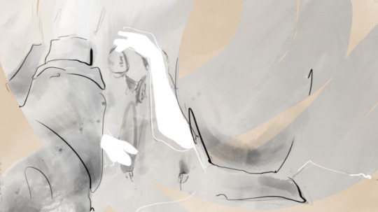
Frames showing the details in the new transition. To get this effect I scanned in acrylic paint textures, used a white overlay on top as it was too dark, then layer masked it with a watercolour brush on Photoshop. I think it works so well because it draws the eye to the white elements in both scenes.
1 note
·
View note