
zaebucca
Zaebucca
29 • he/him • ITA/ENG pixel art • zaebucca.carrd.co/ •
35 posts
Don't wanna be here? Send us removal request.
Last Seen Blogs
ferngle
☆☆☆
starberryblues
starberryblues

mowe
MoWePhoto TheBlog
lacedjuul
cig eater

oatunderscore
Oaats🇵🇸
Text


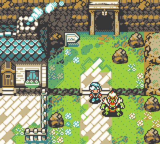
Animal Village - my piece (of heart) for Koholint Redrawn!
Ko-fi - Prints
Patreon - itch.io
#pixelart#gameboy#gameboycolor#pixelartist#16bit#retroaesthetic#adventure#gbc#zelda#the legend of zelda#link's awakening#marin#animal village#animation#pixel animation#ballad of the windfish#koholint
1K notes
·
View notes
Text

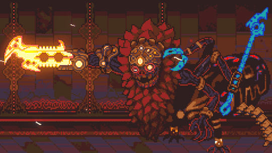
Three more mockups, with more big baddies from my asset collection. You can get Adventure Begins for your projects on Patreon and itch.io!
#pixelart#gameboy#gameboycolor#pixelartist#16bit#gbc#retroaesthetic#adventure#zelda-like#topdown#monsters#boss battle
311 notes
·
View notes
Text

Adventurers & Adversaries - mockups for fantasy arpg games from a not so philological past
You can get these asset packs for your projects on Patreon and itch.io!
#pixelart#gameboycolor#gameboy#pixelartist#16bit#gbc#retroaesthetic#adventure#rpg#arpg#topdown#top down#boss battle#monsters#hero#gryphon#kraken#dragon#antlion#golem#fantasy rpg
229 notes
·
View notes
Text
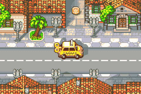
Demake collab with Those Awesome Guys - their iconic Yellow Taxi... goes handheld? On the elusive Vroom Boy Advance¹?
... If only! But you can find more about Yellow Taxi Goes Vroom in all its lowpoly glory on Steam!
¹Chartridges sold separately.
202 notes
·
View notes
Text

Final showdown between the Legendary Pink Vacuum Cleaner and the Unknown, from the beloved classic "Kirby: Nightmare in Dream Land" (2002?)
I am so sorry.
#pixelart#gameboy#retroaesthetic#kirby series#kirby fanart#pixelartist#glasgow willy wonka experience#niche meme#the unknown
2K notes
·
View notes
Text

Finished my previous February batch, so commissions are officially opening to the public again! Here's an updated commission folio with my range and price indications! In case you're interested and want to know more, you can send me a mail or a DM!
Ko-fi - Prints
Patreon - itch.io
#pixelart#gameboycolor#pixelartist#16bit#retroaesthetic#commission art#commissions open#commission work#commission#art commisions#pixel art commissions#character art#tileset#sprite art
149 notes
·
View notes
Text
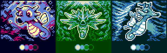
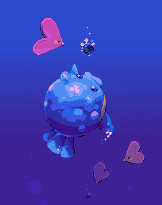
Little collection of #pixelart warmups done with #GBC pokemon Trading Card Game palettes, 4 colors, 64x48pixel each
Ko-fi - Prints
Patreon - itch.io
#pixelart#gameboycolor#gameboy#pixelartist#16bit#gbc#pokemon#pokemonfanart#pokemontcg#horsea#kingdra#seadra#sea dragon#underwater#ocean#sealife#retroaesthetic#retro aesthetic#limited palette#sprite art
292 notes
·
View notes
Text
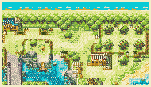
Cozy palette changes by the lagoon - these asset packs are now available on Itch and Patreon!
Support me on ko-fi - Prints
Patreon - itch.io
#pixelart#gameboycolor#gameboy#16bit#gbc#pixel background#pixel illustration#indiegamedev#cozy#itch.io#waves#hillside#adventure#arpg#indie rpg
362 notes
·
View notes
Text

Celebrating Indigo Disk relase day with a pixel animation of Terapagos ~
Can't wait to delve into Area Zero once more!
Ko-fi - Prints
Patreon - itch.io
#pixelart#gameboycolor#gameboy#pixelartist#pokemonfanart#terapagos#pokemon scarlet and violet#indigo disk#gif#animation#crystals#area zero#paradox pokemon#glimmet#glimmora#pokemon
4K notes
·
View notes

Text
About scale, process, palette and canvas: a few considerations on pixel art as a medium
User moredogproblems answered an interesting and legitimate question by another, DiscountEarly125, regarding my work and canvas size. He also perfectly isolated two central concepts of pixel art, which are scale and process. Canvas size, which was the theme of DiscountEarly125's specific request, is more of a dependent variable to those two aforementioned concepts, rather than a starting point. I hope the following considerations I shared may help or prompt some other ideas, but this is what I could come up with 15-ish years of experience with pixel art (and a few more years of art and media studies). I was quite in the mood of writing down these few thoughts that have been floating for a while. I apologize as this may also result in a confusing wall of text, but it is all part of a my work and research, and I would love to polish all the material, hopefully with some thoughts, insights from other colleagues, as well as pictures and materials!
A. Scale and canvas size
It is true that the bigger the canvas, the more distance one may visually create from pixel art, but I personally think this is to be possibly considered a matter of perceiving pixels, rather than a fundative problem of the medium. In fact I concur with the idea of "process makes the medium" rather than identifying pixel art as how (evidently) pixeled the result feels. The general picture, or the sum of pixels, though, is a really important matter to the medium nonetheless! Pixels themselves work in relation one with another, so it's their overall result that gives context and makes the subject recognizable. This relationship between pixels links back to all the art fundamentals that each artist is taught, from color theory to shape and composition - and so on.
So, the canvas size debate usually boils down to a matter of scale or necessity of your subjects.
As long as the dimension (canvas) of your subject (as in: a drawing of an apple, a character sprite, a mockup environment) allows you to operate, control and keep an eye on the quantity (number/area of pixels together) and quality (color, shaping of multiple pixels, texturing obtained through color and shapes) of isolated single pixels or pixeled areas, you're in the pixel art universe.
The other way around to define the matter of scaling: in order to be operating pixel art fundamentals and techniques, your subject has to be on a scale that allows you to apply principles of pixel art within the space of your canvas and your personal style.
These very same principles, or basics, can be applied with different results and extent to bigger and smaller canvases alike, each with their own specific difficulties and variables. It is important to adapt your scale when learning, and trying classic canvases per subject like "16x16px" (standard tile or character sprite unit, tied to older consoles and screen ratios, it's a bit complicated there) is always a nice idea - they also tend to be industry benchmarks and necessities so in case you'd like to consider a professional output, that's very useful.
Scale also applies to the array of colors, and there lies the concept of palette: a number of single hexadecimal hues we are using for each single pixel. Any single pixel can have one hexadecimal color only.
Consequentially it is absolutely true that either a huge canvas or a palette too broad may prevent a viewer from perceiving immediately the "nature" of your medium, namely seeing square pixels, recognizing a certain amount of color - or more thoroughly recognizing that you made some choices for each subject on a pixel level. What could possibly happen on a huge canvas (without zooming in) is that you can't really grasp the pixels, but just the "overall picture" - and that may not differ too much from digital, raster art, which is of course also based on pixels. Therein appearently lies a sort of threshold that is really hard to pin down for us pixel artists, as it depends on screen size, visualization methods, distance, filters and lots of other inherently subjective parts.
This kinda is my case sometimes: I make big environments (possibly too big, and too detailed in each part I tell myself) that are a sum of many lesser parts: both tilesets and sprites that relate (but not strictly adhere) to a basic space unit that is 16x16pixels. You can indeed consider scale in a broader sense as a subdivision or magnification issue, much alike squinting your eyes to focus on a picture's overall contrast or, conversely, analyzing its fundamental parts with a magnifying glass, and then a microscope - an analogy as follows:
a. the picture as a whole is like a colorful rock that you can analyze by magnifying its grain.
b. the characters, geographical elements and textures, works like the different substances that compose the rock and give its visible characteristics grain and complexity,
c. single pixels constitute the very atoms of those previously recognized substances.
I mean "atom" in the traditional, classical meaning of indivisible, fundative object. That's a "quantized" part of information, which for pixel art is ultimately color (or a binary value, like yes/no black/white).
If you were, for example, to crop some parts of my work - let's say 160x144 pixels (a gameboy screen resolution in pixels) you would see the substances that are characters and elements of nature, and when you zoom in again, every atom becomes visible as a single entity of color. There are 29 different type of "atoms" in Ruin Valley as in different, singularly hexadecimal colors that work together in different combinations and shapes to create different substances and characters. 18 of them are used for the different qualities of the environment, and 11 more for extra hues for characters and other elements to pop out a bit.
It's really interesting to see how many pixel artists push this "threshold" of pixel art canvases to the extremely small or the extremely big, whereas, notably, palettes are less open to growth: it is indeed my opinion that pixel art tends to quantize color (quality) over than dimension (quantity). Palettes, notably, do not grow exponentially, but tend to a lower, fixed, controlled amount of individual values instead. This usually gives the artist the true possibility and toolkit through which is possible to think about/with pixels. In other words: color (or its absence) is the founding unit and identity of pixel art as a digital medium.
B. Pixels as process or pixels as objective?
Pixels themselves (as strange as that may sound!) are not to be considered an objective of pixel art, I think, but the founding matter of its research as a medium instead. I think that making pixel art is not just devoting oneself to show those jagged, squarey areas or blunt edges that we all know and love: this is just one of the possible aesthetics that pixel art conveys or adopts - especially on small canvases. Pixel art is not about denouncing itself as pixels, but, rather, embracing the square, atomic unit to build an ensemble that conveys a content or a style. That's the important part of the discourse that emancipated pixel art into being a medium, and not just an aesthetic choice or style of representation. Again: process makes this medium. Speaking of that, I consider pixel art as part of a broader family of "quantized art", namely media that operate on/with "indivisible, founding bricks and unities" that can assume a certain quality (color, mainly) within a certain quantity (palette, canvas size) and in relation to its surroundings to describe something.
This puts pixel art, with its specifics and with a certain degree of semplification, among other mediums such as cross-stitch, bead art, construction sets, textile art (on a warp and weft basis), (micro-)mosaics and others.
A classic threshold example of process vs objective: oekaki art. Oekaki art - which I love and also happen to make from time to time - doesn't really work or "think" specifically on a pixel base: it doesn't place pixels per se, but uses pixel-based areas and textures on bigger canvases with a certain degree of freedom, like one would normally do with brushes on raster digital art programs (adobe ps, gimp, clip studio and so on) in order to convey an aesthetic with fewer colors and a certain line style and texturing. That way, oekaki uses and knows pixels in a deep way, but doesn't see them primarily in a quantized way. As a result the "overall picture" shows pixels to a certain extent, and it's possible to recognize distinct pixels for each part, but the objective is not an analysis and use of pixel and quantized information, but the use of an aesthetic based upon accessibility of resources, their control and a certain rendering style.
A huge part of pixel art is its absolute accessibility: everyone with a fairly outdated computer or screen and a basic drawing program can study the medium.
To be fair, it's indeed considering accessiblity that I highly support an inclusive approach to the term "pixel art" and I think traditional oekaki is a close, beautiful relative that builds upon the rules and techniques of pixel art and pixel rendering, yet keeping its identity as its very own medium - somehow like a dress may be built around/upon textile design. Anyway, boundaries are meant to be crossed and I think there definitely are lots of oekaki and pixel-based art that meet traditional pixel art mid-way - or further.
I also think the "is it pixel art?" discourse possibly ensuing - and generally speaking any media belonging purist ontology - is a treacherous, slippery terrain leading to excesses, and this is not my focus today, neither am I able to tackle that subject extensively at the moment.
C. Conclusions and a few good exercises
Everything above may be farfetched or too complicated as a starting point. I tried to write all down as orderly as possible. The point of this (possibly discouraging) analysis and the reasoning between scale and process is that (pixel) art is about trying different canvases, and reasoning on one's subject and objective, rather than limiting oneself to presets sizes or styles. It's important to choose something that resonates with us and, in doing so, thinking about other, more interesting limitations: that's the discourse about quantity of space and quality in color. Limiting is the best possible exercise and one I wholeheartedly encourage: by doing so we are progressively delving deeper on the basics, as we learn the fundamental relationships between shapes and colors that we can achieve through pixels.
A few good exercises that I too implemented in my own workflow come to mind:
1. Trying different canvases (or sizes) for the same subject (sprite, character art, illustration or so on). This helps a lot finding a comfortable size to apply pixel techniques, as well as getting a hold over fundamentals such as aliasing, linework, conventional representation and so on.
2. Trying different palettes for the same subject, both by varying colors themselves (therefore learning about values and contrast and readability, as well as atmosphere and mood!) or singular hues and their components, in order to discover possible relationship between them. Have fun!
3. Reducing the width of the palette progressively for the same subject: reducing the number of singular colors forces a reasoning on shapes, rapresentation. You may go from 1-bit art (just black/white) to 3 colors, 4, 8 and so on. We'll not talk about transparency as a singular color there, but if you happen to be interested in retro art, transparency counts to the palette size. This exercise is very useful in rendering, and possibly tricky. And definitely fun. :')
4. Choosing an objective and usage of our work: for example trying to learn about old pixel art limitations for games, in order to reason within specifics. Get inspired by traditional games (spriters-resource is your best friend here, in case you have a specific retrogame you're thinking of)! I will probably talk about limitations and style on another post.
5. Four eyes (and other multiples) are better than two: try to talk with people and friends and other artists you trust and feel comfortable with to get their point of view. This can be scary, I know, especially at the beginning. You're not forced to, of course, but if you do (in a safespace) there's lots you can learn about concepts such as readability, subject recognition, rendering and composition. Our eyes and brains get accustomed to something, and pixel art being a rather analytic medium made of synergies, subtle changes, limitations and conventions is especially tricky on the artist's eyes on the long term.
Either way, the important thing about pixel art is understanding that this medium is about recognizing and enjoying the process rather than the eventual aesthetic and in order to do so the best choice is to start simple, small, with few colors and techniques at a time!
Have fun and hit me up with your progress and considerations. :')
335 notes
·
View notes
Text
The world of pokemon is full of mystery
An ode to adventures past
Ko-fi - Prints
Patreon - itch.io
#pixelart#gameboycolor#gameboy#gbc#16bit#pokemonfanart#pixelartist#ruins#ancient ruins#game boy advance#fire red#leaf green#pixel background#pixel illustration#explore#archeology#ドット絵
2K notes
·
View notes
Text
Repost with some old #fakemon sprites in gbc fashion + mockup game screen #pixelart #ドット絵
812 notes
·
View notes
Text

Tears of the Kingdom, but it's (almost) for gameboy!
3K notes
·
View notes
Text
Sidescrolling Calamity Ganon, animated by my friend PixelSword94!
#tloz#breath of the wild#tears of the kingdom#pixelart#pixel animation#calamity ganon#the legend of zelda#boss battle#side scroller#age of calamity#nintendoswitch
3K notes
·
View notes
Text
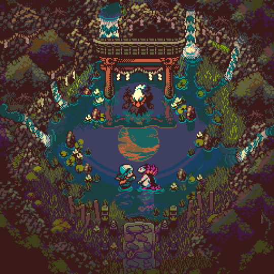
Mythical Encounters in ancient Hisui: the Shrine at Newmoon Island Grove
#pixelart#ドットの日#pokemon#hisuian typhlosion#pixel background#pokemon fanart#japanese culture#yokai#nintendo#retrogamer#super nintendo#game boy color#8 bit aesthetic#16 bit games#legends arceus#darkrai#pokemon legends arceus#mythical pokemon#dark type#torii gate
7K notes
·
View notes