
Don't wanna be here? Send us removal request.
Statistics
We looked inside some of the posts by 210-tatump and here's what we found interesting.
Average Info
Notes Per Post
3
Likes Per Post
3
Reblog Per Post
0
Reply Per Post
0
Time Between Posts
5 days
Number of Posts By Type
Text
17
Last Seen Tumblr Blogs


Fun Fact
The Tumblr office adopted Tommy, an 11-year-old Pomeranian.

Text

Manifesto #6
This week I went back to a simple design based on my statement “one day it will be you”. I took my dads glasses and took a photo of them reading “graphic design” and blurred the background a bit.
0 notes
Text
Summary #6
With life expectancy getting higher as the years go by design doest seem to keep up. Don Norman writes how design seems to be created without elder in mind at all despite elders being great customers often with more free time. What elders need starts at the utter most basics with design; the text. Don states how reading labels is near impossible without a flashlight, magnifying glass, or holding the object unnaturally close to his eyes. Next he talks about hearing, and how him and his wife chose public restaurants based on its noise level instead of the food quality. Something with bad accessibility that nearly everyone has in their pocket is their cellphone. Small text, touch sensitivity, and tucked away or hidden options in order to keep a clean or minimal aesthetic. Don touches on how he doesn’t think design should be changed just for elder, but for every user. Inclusive design is exactly what you think it is, it doesn’t exclude any party and it truly benefits all customers.
In access-ability RGD it shares tons of tactics for designers to follow in order to make their design inclusive. It starts with cognitive considerations to be aware of. For example; eyesight, hearing, and multi-modality. To help with these, it compiles a list of things to follow in order to make the end product assessable. Stuff like language usage it suggests making it scannable, short, literal, proper pronunciation, etc. Next is colour usage, colour used needs to have tonal contrast. Another thing touched on is typography, which needs to follow the same rules with legibility and readability. All of these and more have to be carried into digital media. When working in web design these are all still relevant issues but now you add the difficulty of interactive navigation.

For the real world example I chose this Aveeno lotion bottle. As someone with good eyesight I even had trouble reading the print on the back. The blue type tends to blur together and is difficult to read due to low contrast. To fix this I would choose a darker blue that would have high contrast with the white bottle. It also has no safety precautions ie: what to do if someone were to ingest the product or get it in their eye. I would add this with the chances that may happen.
Statements:
Are we really worried about accessibility?
Club accessible (exaggeration of accessible traits)
Do we really need a guide for this?
Forget or just not care
It will be you one day
0 notes
Text

Revised
Overall I simplified the design. Got rid of some text and clarified the rest by adding a check mark and making the circles into squares.
0 notes
Text
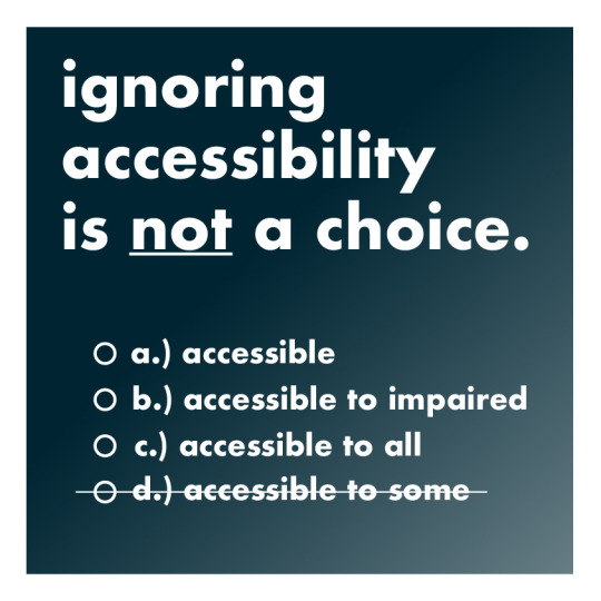
Manifesto #5
For this manifesto I chose a simple font, and looked up accessible colour combinations and this dark blue with white text was one of my favourite. I added a slight gradient to add some dimension. The idea of the whole thing is to be multiple choice with the last option being crossed off since it shouldn’t be an option at all.
0 notes
Text
Summary #5
Accessibility should never be an “if” yet it lacks in the world around us. For example the very common pill bottle. Designed horribly with important information either illegible or covered while less important things take up half the bottle. Due to this issue, Student Deborah Adler took it into her own hands to re-design the bottle. She not only focused of accessibility but also safety. She chose to use hierarchy for the important information of the drug, dosage, and instructions to cut any confusion when it came to know which medication you’re taking and the amount you’re supposed to ingest. Going even a step further she made colourful rings that attach to the neck of the bottle so if you have multiple house members with medication, the chance of a mix up is cut drastically. This is an example is bitter-sweet, with the excitement of seeing the change but the frustration that something so common isn’t made this accessible in the first place.
Minorities are often overlooked when it comes to the design of the world, and accessibility is applaud when used in urban scenarios. But as a designer it should be an obligation to include anyone and everyone to be able to interact with your design. Not only does it improve quality of life for many, but it's also good for the business itself. By having an inclusive brand, you expands your potential audience.
The challenge when it comes to producing accessible design is the communication or lack of with your clients. Through surveying, 4.4 our of 5 designers saw the importance of visual accessibility where as clients were averaged at 4.1 out of 5. Poor communication is what may be preventing visual accessibility from even being considered in the first place. As a community, tools need to be readily available to aid designers in effectively communicating to their clients. Acknowledgment of these issues in both parties needs to improve and become the new normal.
-Not an “option”
-do better
-invisible does not equal lack of importance
-improve lives with inclusivity
-no excuses
-accessibility over budget
0 notes
Text
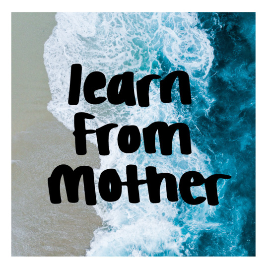
Manifesto #4 revised
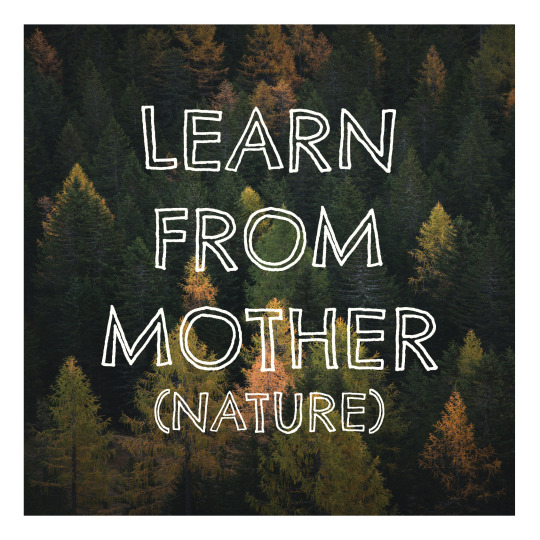
For the revised version, I hand lettered the type on my iPad and transferred it to my illustrator file. I chose to do an ocean for the background as it gives off a strong yet calm emotion much like a mother figure.
0 notes
Text
Manifesto #4
I chose the constraint hand lettering. I wanted the message to be simple and clear, so I put the text in the centre and didn’t play around much with colour or an over complicated background photo.
0 notes
Text
Summary #4
As designers our products and choices reflect who we are and our priorities. Perfection isn’t necessary when it comes to introducing yourself with sustainability, but small steps are required to make a big difference. Your responsibility is to first educate yourself and then start practicing sustainability in your everyday life. Once you are at that point or already there it is then your job to help educate others and bring awareness to the situation. Accessibility needs to be looked at the same way. “Designing for all”, design shouldn’t just be “doable” for some, it needs to be truly inclusive to all regardless of age, culture, or ability.
There is huge importance immediacy and ethics, as well as pledging to the principles and efforts of making a change. Sustainable graphic design doesn’t just end at the design itself but as-well as the impact of raw materials, manufacturing, transportation, and disposal. Paper production has one of the biggest impacts on deforestation. The type of paper you choose to use is important to sustainability, same goes for inks.
Another question you could ask yourself is “does it need to be printed?”. You could make a massive impact by choosing a digital route when it comes to your design (eg: e-book, email). If this is not an option, recycled paper is the next best thing. More sustainable habits start with your workspace. Unplugging devices, recycling, not buying new equipment frequently etc. Ultimately we need to learn from mother nature and produce more “nutrients” rather than disposables, this process is called “cradle to cradle”. This means designing and producing things than are biodegradable and do not release any harmful substances.
-learn from mother (nature)
-small starts lead to big change
-change the details
-what is normal is not normal
-good design comes responsibility
1 note
·
View note
Text

Revised
After some feedback I simplified the design by removing “always”, rearranged the letters to be more eligible, and changed the background colour to a more neutral grey/beige.
0 notes
Text
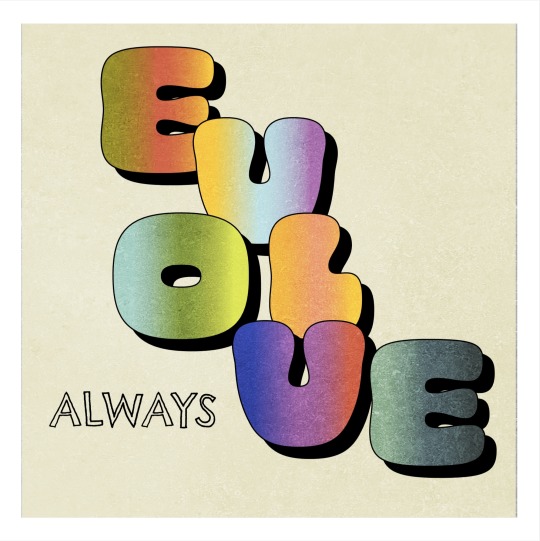
Manifesto # 3
For this manifesto I chose my statement “always evolve”, with the constraint being type + texture + colour. I wanted the word “evolve” to purposely be different gradients, and in a random yet eligible order to signify the word evolving itself.
0 notes
Text
Summary #3
We don’t only have to think of design in an ethical way but as well as an accessible way. Most of us use objects in our daily life without even thinking about the object itself. Every item we see throughout the day was designed the way it was so you don’t have to think about it. That is an example of good design, good design should seem not designed at all. A problem with modern design is clarity and guidance. Compared to an object in the past, the form does not always match the function.
Designers need to be hyperaware of their design and the process it takes. Very few know what it takes to be a designer. Not only do you have to be aware of the consumer’s and how they use the product or view the design, but the toll it takes on our environment. In the modern day it becomes more difficult to be mindful in this process. Supply and demand push for the newer and better version of what came before, putting the importance of sustainability on the back burner.
Sustainability is a much larger task the some may think. For a design to truly be sustainable, every aspect of it must be throughly thought about. In order to achieve this a technique of systems thinking is extremely useful. This includes determining project goals, mapping out the design problem, brainstorming the design outcomes, and finally evaluating each possible project outcome. Working this way can help designers work more fluidly rather than in a linear line.
-Form =/= function
-Always evolve
-Design for our future
-Have mother nature in mind
0 notes
Text
Revised
Larger and rearrange text
Minor changes in colours and side of shapes
0 notes
Text
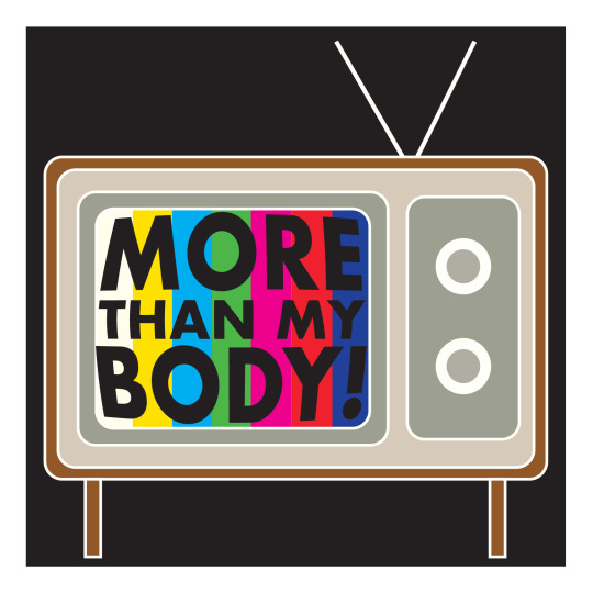
Manifesto #2
For this manifesto I wanted to go more illustrative. I decided to design this one based off the exploitation of women and their bodies in the world of design and advertisement. For my constraint I chose the “make up your own”.
0 notes
Text
Summary #2
Design and ethics go hand in hand. Although graphic design is a wonderful career with many opportunities, bringing awareness to the problems design has on the world need to be addressed. With that being said, designers have the option of using their skills for good and educating the world about major issues. One way they can achieve this is the professionalism of their company/brand. The more organized and professional someone’s work is the more trust the public will have. Graphic designers also have the ability to make lives easier with clear instructions and signage.
Likewise there is also a “bad” side to design. Graphic designers need to be aware of the materials and vendors they work when it comes to producing their products. The lifespan of a design can be timeless, but the life of the packaging that design is on is very short. Another flaw with design is the message they put can put out. For example; promoting cigarette companies to communities that are predominantly poor. A common targeted audience is young women and teens. They are flooded from a very young age with images of slim models with desired features. Brainwashed to believe this is normal and achievable without putting your physical and mental health at stake.
Adding on the topic of the exploitation of women, the media never falls short of doing so. Whether it be subtle or blatantly obvious, women’s bodies are used for the profit and consumption of many products and brands. This creates stereotypes and damage to your subconscious mind.
These tactics have over-run society, promoting addictive and toxic behaviours to impressionable audiences. Many pick up these habits with no sense of the harm it is doing the them and others. As designers we have the power to change this normalized scheme and promote healthy habits both mentally and physically. We see the changes we can make with movements like BLM, and body positivity; bringing light to just how confining the media is.
Sexualization and exploitation of women
Normalized behaviours
Ethics being stretched for profit
Humans being used and treated with no more respect than objects
We need to have better intentions
1 note
·
View note
Text

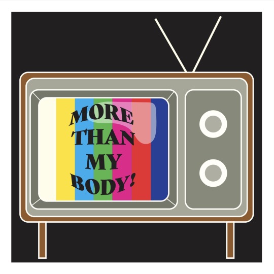
Revised Manifesto
For the revised manifesto, I chose to reduce and simplify even more. The horns themselves give the idea without the need for more detail.
1 note
·
View note
Text

Manifesto #1
“Corporations demonizing design, marketing, and advertisement”
For this design I was aiming for simple yet still having the message present. I chose a “graffiti” look, hoping it comes across as a disrespect towards those large companies that use design and advertisement for only their benefit. The constraint I used was type + image.
0 notes