Text
Ugh, a relatively small thing, but I hate when tabs are designed so you can't tell which tab is active:

The design of the inactive tab (Dota 2, in the above screenshot) makes it seem like the active one. It's brighter and the bottom of the tab seems to connect with the content below.
I see more modern tabs designed like this:

A simple underline and color change that indicates the active tab. So simple...
0 notes
Text
What could be the benefit of telling the person what they can't do? If I'm told to "Pull" then I'll know to pull not push?

And, aside from all that, I'm sure we've heard of the Norman Door.
"A Norman door is a poorly designed door that confuses or fails to give you an idea whether to push or pull. It was named after Don Norman, the author of The Design of Everyday Things which explored the phenomenon." [link] (There's a video of Don Norman talking about his door in that article.)
This, of course, applies to more than just doors.

This sign shouldn't need to exist at all, I should be able to visibly tell from the design of the door how to use it (and my assumption should be correct).

#The Design of Everyday Things is essential UX reading I highly recommend it#bad ux#bad design#design#intuitive design#uxuidesign#a-ux-person#user experience#uxui#user interface#ux design#norman door#don norman#the design of everyday things
1 note
·
View note
Note
I imagine this is the same reason Spiderman 2 on the PS2 was always held up as an exceptional game as well. Movement alone was fun and rewarding.
Not every game can allow players to swing through cityscapes, but there are a lot of creative ways to use movement so that it becomes more enjoyable than just walking.
Breath of the Wild does this well with giving players movement options with things like the glider, sledding, and horse riding.


A common issue I feel in open world games is that traversing the landscape feels like a chore. How do you make even just moving about in the landscape fun?
I give you exhibit A:
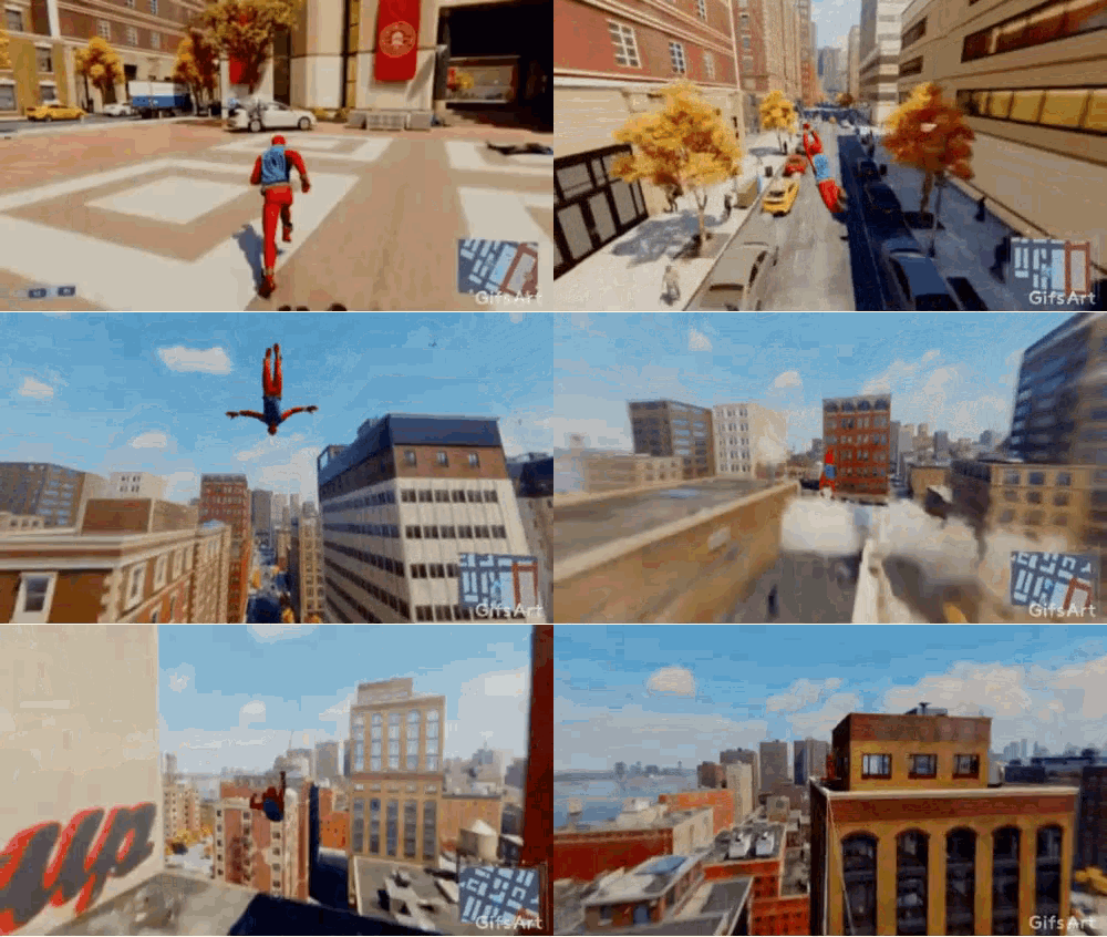
If I had to try to reduce fun locomotion into a recipe, I would say that the journey must feel (not necessarily be) fast, responsive, and flow.
Fast
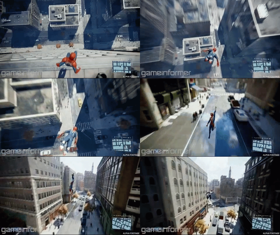
The player must be able to get to their destination within a reasonably short time frame. The longer a player has to do a specific activity without interruption, the easier it is to get bored of it. Humans have an innate enjoyment of moving quickly. Added touches like motion blur, doppler-directional sound effects, visual effects, and the like should combine to create a sense of speed.
Responsive

It’s extremely frustrating when a player desires to do a thing, but cannot do so at the precision that they want. It’s the sense of frustration we get when we picture an image in our mind’s eye, but our physical attempt to draw it looks hideous in comparison. That gap between expectation and actual results result in frustration. The control scheme for the character movement must allow for players to be precise as the game makes them feel they should be. Animations should not only capture the desired speed and directionality of the player, but should also direct the player character to locations the player wants to go.
Flow
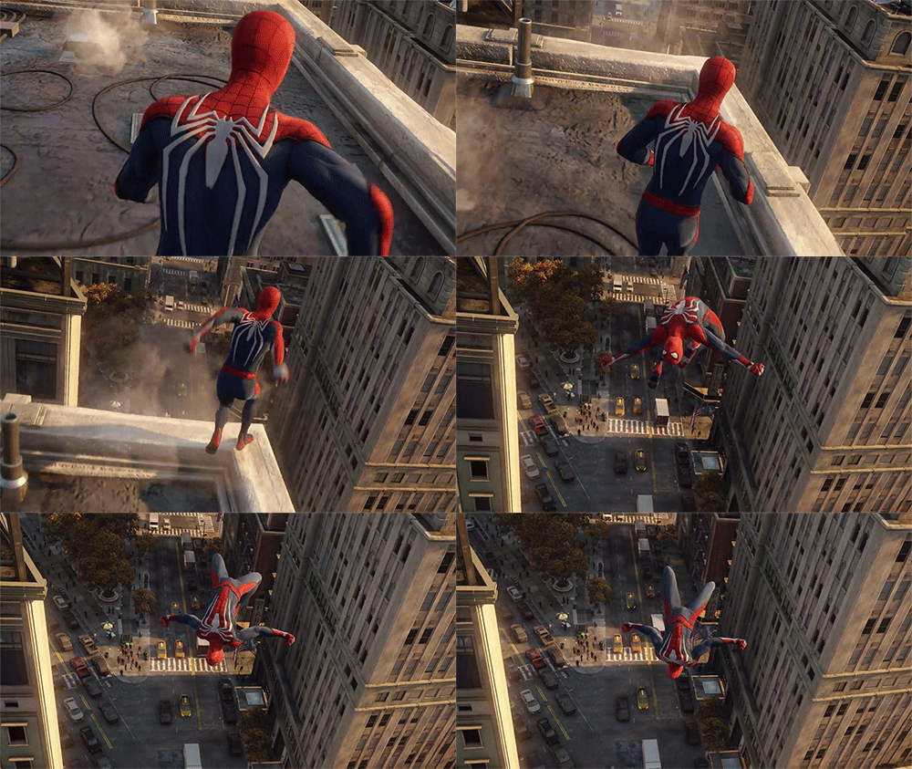
Flow here means that the experience of moving should feel smooth. Avoid hard turns, large camera angle changes, or sudden changes in speed. Movement of both character and camera should be done in smooth arcs. Hard angle changes feel like impacts, breaking the sense of speed and hurting the experience. Each motion should smoothly blend from one to the next. Acceleration should ramp up and down, starting off slow, ramping up sharply, and then easing off again once the desired speed is reached.

These core qualities combine to form a fun, engaging navigational experience. Players need to feel a sense of speed so they don’t get bored with traversals. Locomotion must be responsive, so players feel like they are going where they want when they want. And finally, the experience should flow pleasantly and smoothly, without any jarring impacts or interruptions to the feelings of movement.
[Join us on Discord] and/or [Support us on Patreon]
Got a burning question you want answered?
Short questions: Ask a Game Dev on Twitter
Long questions: Ask a Game Dev on Tumblr
Frequent Questions: The FAQ
#user experience#uxui#game ux#ux design#spiderman#video games#video game design#video game ux#movement
77 notes
·
View notes
Text
Every time I go car hunting, I am met with some absolutely terrible filter design.
If I want cars with less than 100,000 miles, I need to select all the checkboxes under 100,000?? That's what this implies!
It goes up by 999 miles each time. That's insane! No one needs this. Just do a dropdown that goes up a certain number of miles at a time and says "or less" or a "between [ ] and [ ]" field!


#bad ui#bad ux#a-ux-person#user experience#uxui#user interface#uxuidesign#ux design#design#form fields
10 notes
·
View notes
Text
The little plus may look like you click it to expand the menu, but it actually brings you to the upload video screen.

We have so many great icons for uploading videos...


why use a single plus with a circle around it when it can be confused with other actions??
Test your shit!
I would be curious to know if uploading a video is indeed the most common action for users? I imagine a significant amount of users don't necessarily upload videos to Vimeo, but I don't really use the platform so I can't be sure.
Regardless there are better places to put this functionality.
It's not a bad idea to steal from competitors (YouTube), particularly if they're heavily used (YouTube) and therefore will be familiar to most users.
For instance, the top right of the toolbar, away from other functionality yet always visible and available for those who care about it.

#bad ux#bad ui#uxuidesign#uxui#ux design#user interface#user experience#vimeo#video upload#youtube#icons
0 notes
Text
Kia updated their logo in 2021 and months later they still have people searching "KN Car" trying to figure out what make the car was.

Rebrands are scary. People rarely respond well to change regardless, but apparently for some there's also a terrible risk that people won't recognize your brand anymore.
I'm honestly pretty surprised this got approved. Surely they user tested the design? I remember the first time I saw the logo I had to google what car it was for as well. From a distance especially, I was thinking I missaw a new Nissan logo.
That's an important detail, many people are seeing these logos small and at a distance. It needs to be quickly identifiable (and readable).
I've also heard people compare it to the Nine Inch Nails logo.

Who knows they could have started making cars during the pandemic.
#bad ux#uxuidesign#uxui#ux design#user experience#logo design#logos#kia#kia logo#kn car#nine inch nails#a-ux-person
0 notes
Text
An old example but a good point about surveys.

NPS (Net Promoter Score) surveys are a pretty classic metric for most companies, but how often do they provide valuable feedback from consumers?
It's a nice number to have, and I won't argue that it should be tracked, but it the NPS needs more context to be valuable, and the above is a good example of that.
The user is caught up in the language of the question (literally recommending a OS to someone), and isn't answering the the question the company is actually asking: How do you feel about Windows 10 and explain your response.
This one is cluttering up the NPS for Windows 10, when in reality the user may enjoy the OS. We'll never know for sure.
A good lesson: Nitpick your survey language and always test the survey!
#bad ux#uxuidesign#uxui#ux design#survey writing#survey design#nps#user interface#user experience#surveys#a-ux-person
1 note
·
View note
Text
"No surprises!"

My god if I thought I was paying $900 (already pricy for 2 nights) and then they slap a surprise ~$1900 cleaning fee on me? I'd be off that site so fast.
These surprise fees that you don't see until after you've selected a place are a major turn-off. What was this person planning to do with the place, pig wrestling?
How can anyone afford to travel anymore?? If I don't know someone in the city that I can stay with, hell, I'm not going.
#shit is too expensive these days#we're not allowed to enjoy anything anymore#unless we're rich#bad ux#uxuidesign#uxui#ux design#user interface#user experience#a-ux-person#booking sites#hidden fees
1 note
·
View note
Text
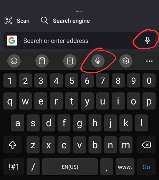
Every time it's a test.
Can you remember which icon records voice audio and which one is speech-to-text?? Because the interface gives you no clues.
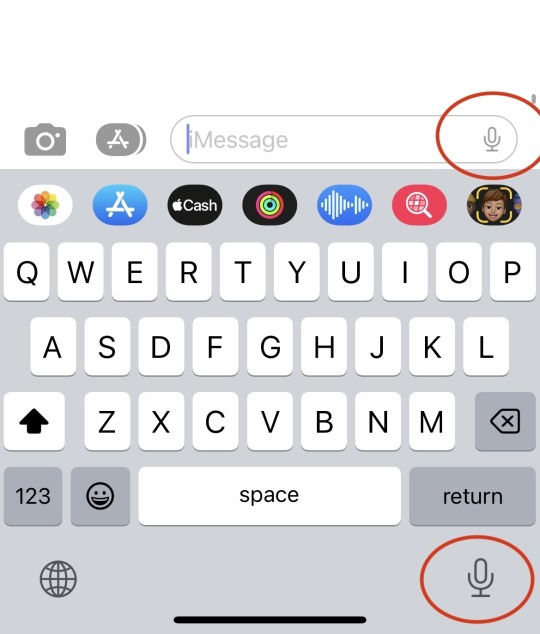
#bad ux#uxui#uxuidesign#a-ux-person#user experience#user interface#icon design#intuitive design#design thinking#design#ui design#phone design#andriod#iphone
6 notes
·
View notes
Photo
What a weird question.
What are they hoping to learn with this field? The user already told them their preferred method of contact. That's not going to change regardless of what is entered in the field.
Don't ask questions if you're not sure how you'll use the answer.
And as a user is be frustrated I was asked at all. It's not your business why I can't take phone calls!
(Of course, I have no context here. )

#meme#memes#uxui#ux#user experience#survey#bad ux#relatable#relatable meme#funny#funny stuff#a-ux-person
526 notes
·
View notes
Text
Very interesting thread on the bird app about the design of the screens for GDQ (Games Done Quick).
GDQ is a very popular charity speedrunning event.

Specifically, this thread goes into the unique ways they plan to display the donation totals (which is the most important metric for the event) to make them more "interactive" and exciting. The goal, obviously, is to motivate viewers to donate.
They used Oregon Trail, Metal Gear Solid 3 (the ladder part), Desert Bus, and Monkey Island to show donation progress. An interesting read!

Really, I love seeing the process for how designers (and developers) devise creative design solutions. Excited to see this in the next event!
It kind of reminds me of the "gifts " in TikTok lives, and how, in some streams, you can send a certain gift and it will affect the stream. For example, in the "keep me awake" streams, sending a gift will play a sound that will "keep the person awake". Users can do something (buy a digital item) and have an immediate result (sound happens and the "sleeper" is disturbed):

#uxuidesign#uxui#ui design#user interface#user experience#ux design#gdq#games done quick#design#development#video games#charity#agdq2023#a ux person#a-ux-person
0 notes
Text
This area of the Mac email client gets me every time.
So many times I have clicked the "Move to..." field when I wanted to search. It's right by the search icon.


The idea that organizing your inbox gets more real estate than search is insane to me. All I ever see are screenshots of mailboxes with hundreds or thousands of unsorted emails, many unviewed.
Yet Apple thinks "hey, they're going to come up here to sort emails individually? Madness!


What it actually does is show your folders so you can decide where to organize the email you're currently looking it. I have only ever dragged emails into folders. Never have I ever used this functionality.
I only click on it when I forget it isn't search.
This seems like an obvious UX mistake, how has it gone live and how has it lasted this long?
1 note
·
View note