
Don't wanna be here? Send us removal request.
Statistics
We looked inside some of the posts by aaronjlandicho and here's what we found interesting.
Average Info
Notes Per Post
0
Likes Per Post
0
Reblog Per Post
0
Reply Per Post
0
Time Between Posts
2 days
Number of Posts By Type
Video
2
Text
12
Photo
3
Last Seen Tumblr Blogs


Fun Fact
There were a total of 171.5 billion posts on Tumblr in 2019.
Text
Reflection of Presentation
I think the presentation went well! There were somethings that I forgot to mention due to nerves but I do think that they liked our work. Some of the feedback that was given was about the lack of cohesiveness between our work and that we should’ve maybe done more rehearsals of our presentation, this was probably due to a technical issue that we had when trying to display the flythrough video of the shop but overall it was good.
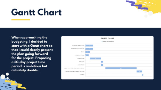
They liked my inclusion of a Gantt Chart and were hoping that I would talk in more depth about the various tasks; but they were extremely impressed with the station entry and exit data that I included. I think it went pretty well!d
0 notes
Photo
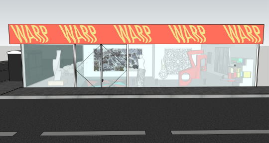
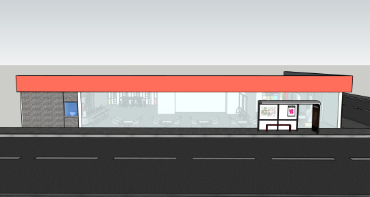
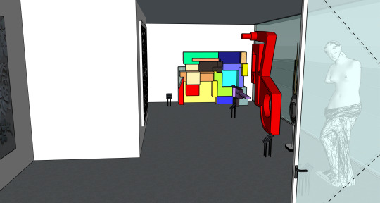
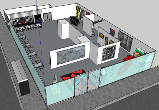
This is the final design for the shop. I have included front, side and bird-eye views of the shop as well as some shots from inside of it, showcasing the route that is taken through the shop as a customer would. I have also done a render of how the shop would look on the actual location, the original image being sourced from google maps’s street view.
0 notes
Text
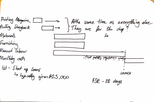
Budget Slides

Now knowing the style of the presentation, I used the same design elements to keep everything uniform. This part of the presentation was to use the dark navy colour from our brand colours, each of our individual parts of the presentation is coloured according to what we are talking about.
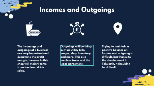
I started by presenting a Gantt Chart. When presenting and showing a Gantt Chart, it shows the viewer that you have thought about the steps going forward; this along with my knowledge of the budgeting will be a good way to show that I really know what I am talking about. Following this is the incomings and outgoings which, as I mentioned, I’ll be able to talk about. I will then go on to talk about Charlotte’s email which shows their proposed floor plan for the location that they have already put down a lease for. This is important as it makes them aware that I understand the current situation they are in and how I have considered it into the budget.
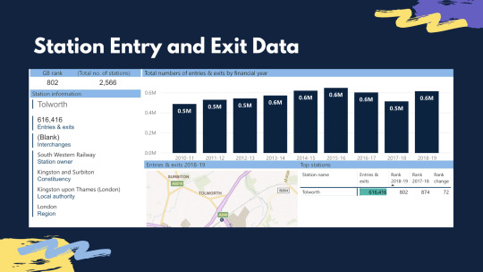
Lastly I have gathered data from Tolworth’s Station data from National Railway, it shows that, last year, the station had 616,416 entries and exits which calculates to around 1,688 entries and exits daily through Tolworth Station. If we assume that 2 of these entries and exits are done by different people, it calculates to 844 people coming in or out of the station. This, in turn, shows that there is enough traffic in this station to be able to entice people to come inside and buy a coffee or pastry etc.
0 notes
Text
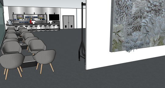
Layout Change
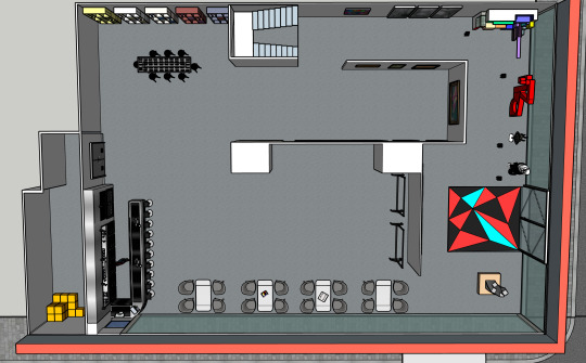
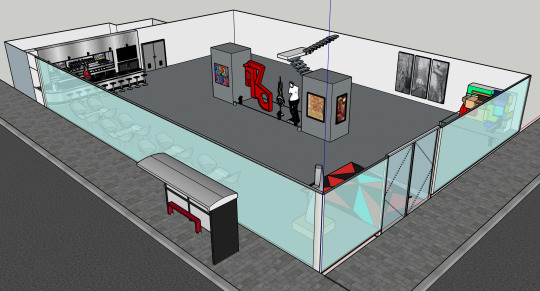
After receiving feedback from my group, I went about trying to design the layout in a different way.
By asking for their input directly, I received some constructive feedback into how to make the shop much better looking and to enforce the idea of a customer journey. Joe recommended for me to put up dividers similar to the role the shelves play in The Flying Tiger. The customer can now decide if they want to go to the cafe, left, or take the artsy route through the store to the cafe, right. By putting sculptures next to the window, it serves as display for people to see from outside and would make them more interested to see what’s inside.
When conducting some research, I looked at the way people are seated in restaurants and cafes. In places where staff allocate seats for customers, they always try and put customers next-to windows so that people outside think the place is busy and therefore is popular. They associate busyness and popularity with a good experience and therefore are more inclined to go inside. By placing the seating area next to the window, I entice this sort of customer pulling into the store. In addition, the seats are in clear view of the bus stop and will allow customers to see buses coming towards the bus stop; those who are inside as a pass time will be able to see this and leave at the right time for their convenience.
Joe wanted me to separate different areas using the walls, so that is why the sculptures and large art are near each other, followed by photography down the right-hand corridor, art through the doorway and product design stuffs near the end. There are also clothes racks near the seating area that would be used to display the shop merchandise and/or clothes that have been designed by students to be sold.
Next to the sculptures are little plaques similar to museum labels, these would contain information such as the name of the piece, it’s creator and the price it is being sold for.
0 notes
Text
Slides summarising Geography Students’s Findings


Above are the original slides that I had designed to show off the statistical data that I wanted to present from the findings of the geography students. I tried to follow the brand guidelines and was using the purple as a colour that would represent all factual and statistical information. But, my slide design wasn’t uniform with the rest of the presentation so Valentina helped me to match the design with the rest of the presentation as shown below:


0 notes
Photo
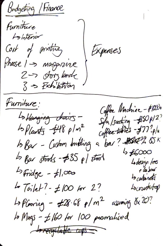
These are some of the notes I took when trying to figure out the budgeting of the shop. I realised that the focal point of the budgeting was making sure that the income was more than the outgoings. I referenced Valentina’s shop design (below) to estimate the cost of the furniture and fitting of the shop. Looking at various websites and shops to find prices of furniture; I even looked into the cost of making custom bar inside of the shop. On average, a professionally-done custom-fitted bar can cost up to around £10,000 but this cost can be reduced drastically if the building of it is done manually, meaning that the only cost would be for the materials to piece the bar together.
Seeing as the location we are trying to use is already planned to be used as a cafe, the fitting of things such as the fridge, coffee machine and other kitchen appliances can be taken out of the budgeting. This leaves the furniture itself which costs around £6,000, this takes into consideration manual labour to have things moved into the shop. Tilling systems are priced at £200 each when using a simple square terminal, which works on contactless payment.
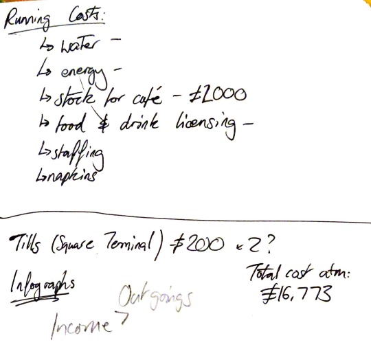
The main concern when budgeting is the running costs of the place. Since the Community Brain have plans already on taking out the lease for the location, I do not need to include it when budgeting as they would already know the figures on that.
When looking at appliances for the shop, it was important that I researched the energy consumption of appliances. Let’s say that the shop has 20 lamps at 100w which would cost around 30p per hour; these are on for 12 hours a day, 7 days a week, meaning yearly, would cost around £1250. If these are replaced with 5w LED bulbs, the cost per year is cut by 95% meaning that these bulbs would only cost £62.50 per year, saving a lot of money on the outgoing. Water bills would also have to be accounted for, but these rates can vary depending on postcode so I will not be able to include such figures.
Inventory is another running cost of the shop, on average it costs chain coffee shops around £2000 a month for their stock. For this smaller A4 establishment it will more likely be half of that price. To make this a cafe where drinks can also be taken away and consumed outside of the premises, cups will also be need to taken into account and getting custom printed, biodegradable cups will cost £100 per 125 cups with lids.
Staffing should also be considered. The London minimum wage £10.75 per hour and seeing as Tolworth is on the outskirts, it will be at £9.30 per hour in the area. Different positions such as managerial should also be considered.
Typically, people looking to open up their own cafe or coffee shop would ask for a figure of around £25,000 as a start-up loan and in this case, we are looking at something nearer to £15,000 thanks to the savings that I have talked about.
0 notes
Text
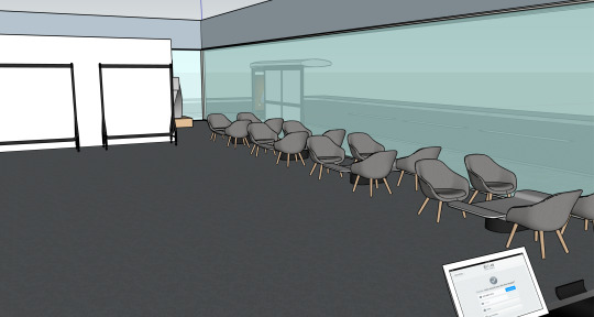
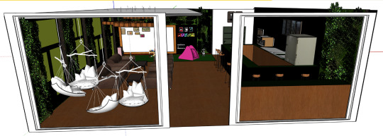
Designing the Shop
My previous post shows the shop as it currently looks, but above shows a but of a revamped version that would make for a better aesthetic. I have made two sides of the shop out of glass to allow for natural light to come in as well as visibility for passersby to see what’s inside. To maximise the space and make it look bigger, I have gone with white walls and concrete flooring to give it a gallery-esque feeling. This was influenced by a recent visit to Tate Modern. I also changed the staircase design to something much more modern and sleek.
I have also put in the road outside of the shop and have incorporated the bus stop to give my design more realism, this way it would be more of an accurate representation of how the shop looks. I placed the cafe/bar at the back of the store and designed it so that there is a window from the cafe to Brook Street which would make a ‘walk-thru’ service; passersby would be able to buy a coffee through the window and receive it quickly.
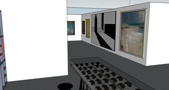
Shown above is the inclusion of a seating area and art pieces. By referring to the sketch shown below, I was able to lay out some things to show off the route-system a little. I will try to include some walls or shelves similar to those seen in The Flying Tiger to enforce the idea of a customer’s journey around the store. The sketch below is a very rough one, I used the layout I had originally drawn in my sketchbook and drew over it in pencil to try and depict what I was imagining.

0 notes
Text
Small Update and My Thoughts
During today’s session, Jonathan said, “In terms of the deliverables, it must be edgy, distinctive and different, and it needs to be able to entice students and adults alike.”
Seeing as my role in the team is to create the shop floor layout and to design the shop, I will take Jonathan’s wisdom into account and try and make the designs as appealing as possible for anybody.
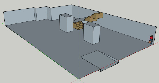
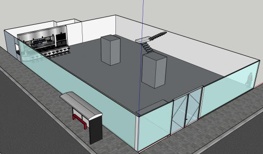
I have started using SketchUp to design the shop; above is a very rough representation of how the shop currently looks with nothing in it. This will serve as the base for my design; laying this out properly with the correct dimensions is fundamental to my designing going forward.
I was thinking about the kinds of things that would be showcased in the shop, and from what we gathered from the Student Union, the majority of items that students would like to sell would be things such as sculptures, clothing items, art, photography etc. Hearing this means that the shop would be more like a cross between a gallery and a cafe, that would be run by students, made by students.
0 notes
Text
Budgeting Considerations
I recorded a Q&A with the Student Union a while ago, and for some reason it won’t upload onto this blog post but here are the main points from it:
- The Student Union is a registered charity and can definitely look at charitable rates for renting. When looking into this, kingstonstudents.net has all the information about the charity number. Search it into google, and it should come up with the articles of incorporation and those articles will say what kind of charity it is and what it would be allowed to do, so it would be used to check that they are in fact allowed to sell things.
- There was no idea on budget and they are relying on the ideas themselves to gain an insight into how much would be need.
- There’ll be an operational budget based on how many people need to man the store and run it, that will identify how many people would be needed; but also look into the opening times to see a monthly cost. Rent also needs to be considered but if there are no figures it can be left as an unknown as well as the rates and insurance.
- Public liability insurance for Kingston Student Union is set at £10 million and it is separate from the universities’s.
- When considering wages, we should estimate towards the London minimum wage, and for managerial roles looking towards £10.70 per hour or more.
0 notes
Text
Starting to Design
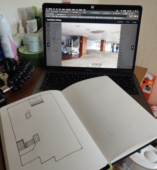
I’m happy with the amount of research that has been done and have started on trying to layout the shop floor. I have started by drawing out the general shape of the building and have included the stairs, the ramp from the front door and also the positioning of the pillars.
I think the most challenging part will be trying to layout the ‘journey’ around the pillars, as they pose as an obstacle into freely making my own route through the shop.
0 notes
Text
What’s Next - Tolworth
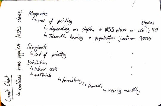
I’ve been assigned to take on the budgeting for the Tolworth project. My job is to make a rough estimate for the budgeting and to also make an infograph to present the findings of the geography students.
I started by collating some of the information from the geography students’s presentation that could be important and would be relevant to our target audience.
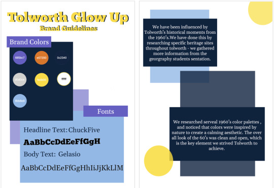
After collecting that information, I am going to work on the infograph. Valentina posted these Brand Guidelines and Colours, above, into the documents section of our Basecamp group; and to keep the uniformity of our work, I will use the same colour scheme and fonts as those shown above. In addition, I will also follow these same guidelines when creating slides for my part of the presentation on Budgeting.
I’ve also emailed Charlotte from the Community Brain asking about the unit next to Tolworth Station and found that it is actually available for use. Charlotte’s reply said, “We have recently taken out a lease on the unit next to the station to create a community hub and kitchen. It is currently being fitted out but will be available to use shortly and it designed to be a flexible space so we look forward to hearing your ideas. I've attached the plans.” In addition, she also provided a document showing the floor plan of the unit:

This document is a proposal to a construction company which shows the ways that they want to set-up their community hub/kitchen. The biggest thing to note is the Front Elevation proposal in the bottom-left of the document. This proposes the idea of the door frame being made taller as well as a signage zone. Having these windows as opposed to the small door that is there now would make the biggest difference to the interaction with the unit.
0 notes
Text
Images of Eden Street Location


Jonathan took a visit to the Eden Street location and managed to take a few pictures of the space. Since this is our chosen location, it is very convenient that he has done this. Unfortunately the owners of the location do not have any documents that show the floor layout and plan, so when designing the shop floor, I will have to refer to these images to get a good guess of dimensions etc.
0 notes
Photo


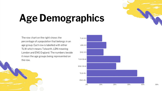
I was assigned to summarise the geography students’s presentation, and these are the notes that I took when trying to pick out the key information from it.
This helps us as a group going forward as we are then able to understand key elements such as our target audience, statistics about them and also the main heritage sights that we should focus on talking about when we present. I will have to present these statistics and figures for when we do the final presentation, so I made sure to try and pick out key facts and figures that would of significance.
0 notes
Video
youtube
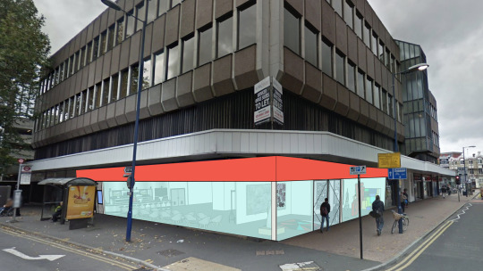
After our lecture, we decided to go to the locations that we potentially want to use for our shop. Our first stop was to 38-40 Eden Street which is located just on the outside of the town centre, down the road from McDonalds. We tried rto contact the owners of this location and asked for documents such as the floor plan or layout but we received no response, so we took matters into our own hands. This location is a 10 minute walk from the Knight’s Park Campus and 5 from Penrhyn Road. This spot has two floors and they are of a generous size.
Russell mentioned that the spot in the bottom of the Bentall’s Centre was up fro grabs so we decided to check that location out too. Although this is a beautiful, large space in a prime location, having something student-run in this location would be very hard to maintain in the long-term.

After consideration, we decided to go with our original location of 38-40 Eden Street as the location is extremely good. The building’s ground floor is surrounded with windows that allow the inside to be seen from outside, making it perfect for our shop and trying to draw people in. We’ve been thinking about ideas such as projecting things through the window onto the pavement outside at night, to attract people or to create a buzz. In addition, Brook Street bus stop is right outside of it; this is a very well-used bus stop as it is the first stop on the 65 bus’s route, this would make it an ideal location for a cafe as people may want to buy a coffee for their morning commute.
0 notes
Text
Group Meeting

Today, we all met up in Town House and were discussing our initial designs and our developed ideas. Above shows a double diamond design process model. This is a model that helps a user to come up with better ideas and refine the process down into a better final idea at the end of it. It works by listing out all of the designer’s problems; and then by focussing on which problems are the most important, you then start to try and come up with ideas that solve the focussed problems. And lastly refining the ideas into final ideas.
0 notes
Text
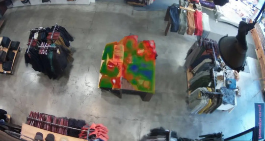
Customer Behaviour in Heat Mapping
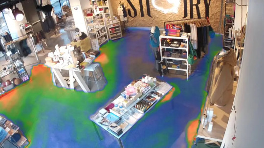
The above image is an example of the heat mapping of a shop. Seeing this kind of heat map would mean that customers tend to take the same route and a lot of the shop goes unseen.
Heat mapping is a great way to visualise how customers interact with the shop, Red coloured zones mean that, on average, customers spend more time going to those spots and blue zones mean the opposite. How the zones are distributed depend on variables such as the thing being displayed there and the amount of time a customer spends in the shop.
Seeing as our store is going to be a cafe as well as a shop, our heatmap would probably be hotter towards the counter and seating area and the rest of the store would probably be blue. If I use the journey-type layout when designing the shop floor, the hot zone would be more consistent throughout the rest of the store due to customers being forced to take a route.
Above is a different kind of heat map, it actually looks more into the interaction between customers and the things being displayed, red means touched more and so on. This was done by Prism Skylabs in San Fransisco, and it really does give an insight into shop owners into what kinds of products are more popular and how their visual merchandising effects how much something is interacted with.
0 notes