
Don't wanna be here? Send us removal request.
Statistics
We looked inside some of the posts by abpettiford-blog and here's what we found interesting.
Average Info
Notes Per Post
0
Likes Per Post
0
Reblog Per Post
0
Reply Per Post
0
Time Between Posts
20 days
Number of Posts By Type
Text
11
Photo
6
Last Seen Tumblr Blogs


Fun Fact
Average visit duration of Tumblr.com is 10 mins and 25 secs.
Text
Professional Practice
COURSE 1: MASTERY: PERSONAL DEVELOPMENT & LEADER
How did this course contribute to my personal and professional development as a media designer?
Personally, this course gave me direction regarding my individual mastery journey based on my Life’s Purpose and passions. Professionally, this course gave me the tools necessary to begin a strategic and disciplined mastery journey.
How did the techniques in this course help me complete my thesis project? The main technique in this course was research and graduate-level writing. Both of these elements allowed me to write a well-researched, sound and thought thesis presentation that successfully answered each of the Degree Learning Outcomes.
How would I describe my most outstanding personal triumph in this course? My most outstanding personal triumph in this course was reading more than I have ever read in my entire life in months’ time while enjoying the subject matter.
COURSE 2: DEFINING CLIENT NEEDS
How did this course contribute to my personal and professional development as a media designer?
Personally, this course helped me build confidence in my research and sketching skills. Professionally, this course introduced me to rapid mind mapping and logo concept development.
How did the techniques in this course help me complete my thesis project? The major techniques in this course were pre-production techniques, which included research, mind mapping, and sketching. These techniques helped me complete my thesis project by giving me experience in rapid sketching/wireframing which was useful in completing my thesis project due to the accelerated timeframe.
How would I describe my most outstanding personal triumph in this course? My most outstanding personal triumph in this course was sketching for 9 different concepts (3 different cites with 3 different focuses for each city).
COURSE 3: BRAND DEVELOPMENT
How did this course contribute to my personal and professional development as a media designer?
Personally, this course helped build my confidence concerning decision-making. Professionally, this course helped me on my mastery journey of Photoshop, Illustrator, and InDesign as I cleaned up scanned sketches, creating vector logos, and created vision boards for each concept.
How did the techniques in this course help me complete my thesis project? The major techniques in this course were using the tools Photoshop, Illustrator, and InDesign to complete the project tasks. Using these tools/techniques helped me complete my thesis project by furthering my knowledge and confidence using Photoshop, Illustrator, and InDesign to produce all the screenshots and examples shown throughout my Thesis Presentation.
How would I describe my most outstanding personal triumph in this course? My most outstanding personal triumph in this course was successful arriving at and producing vision boards for each logo execution, which included color, typography, and imagery research.
COURSE 4: EFFECTIVE COPYWRITING
How did this course contribute to my personal and professional development as a media designer?
Personally, this course taught me how much I needed to pay attention to grammar and how to write persuasively. Professionally, this course taught me how to construct effective headlines and taglines for any advertising and marketing campaigns. I also learned how to write concise and effective body copy aimed at motivating viewers to action.
How did the techniques in this course help me complete my thesis project? The major technique in this course was writing effective copy and it helped me complete my thesis project by giving me the tools needed to write effective and concise copy.
How would I describe my most outstanding personal triumph in this course? My most outstanding personal triumph in this course was creating an ad campaign for ACCESS College Foundation which consisted of 4 testimonial ads.
COURSE 5: DESIGN RESEARCH
How did this course contribute to my personal and professional development as a media designer?
Personally, this course gave me insight into how every decision matters when creating. Professionally, this course taught me about how supporting design elements including theme and narrative play a big part in the direction for a project. Knowing this information can help build a better presentation when trying to get others on board with an idea.
How did the techniques in this course help me complete my thesis project? The major techniques in this course were using InDesign to develop a vision board and Illustrator to develop an infographic for the tourism branding project. These techniques helped me complete my thesis project by furthering my competency in the software which allowed me to meet the thesis criteria and deadline comfortably.
How would I describe my most outstanding personal triumph in this course? My most outstanding personal triumph in this course was creating all of the supporting creative assets for the tourism branding project in such a short amount of time.
COURSE 6: ORGANIZATIONAL STRUCTURES
How did this course contribute to my personal and professional development as a media designer?
Personally, this course was satisfying because I am a motion graphic designer and animator. Professionally, this course helped me grow in creating storyboards, understanding the full breadth of video production and motion design, and my competency in After Effects.
How did the techniques in this course help me complete my thesis project? The major techniques in this course were storyboarding and motion design. These techniques were not helpful in completing my thesis project because the thesis presentation did not contain any video or motion graphic components.
How would I describe my most outstanding personal triumph in this course? My most outstanding personal triumph in this course was mastering using After Effect’s camera for dynamic movement in 3D space.
COURSE 7: DESIGN STRATEGIES & MOTIVATIONS
How did this course contribute to my personal and professional development as a media designer?
Personally, this course made me aware of the user’s and the people I design for. Compassion and empathy are the names of the game. Professionally, this course challenged my current design process and introduced me to the design thinking process which puts the audience’s needs at the forefront of the design process.
How did the techniques in this course help me complete my thesis project? The major technique in this course was exploring the design thinking process and more specifically the research phase. This portion of the community branding project helped me complete my thesis project by providing me a project with which to build research, SWOT analysis, empathy map, and problem statement which all supported the Connecting, Synthesizing, Transforming DLO.
How would I describe my most outstanding personal triumph in this course? My most outstanding personal triumph in this course was getting out in the community and talking to real people by way of conducting in-person interviews.
COURSE 8: DESIGN INTEGRATIONS
How did this course contribute to my personal and professional development as a media designer?
Personally, this course helped sharpen my problem-solving skills. Professionally, this course gave me practice in developing potential design solutions/solution statements based on primary and secondary research conducted.
How did the techniques in this course help me complete my thesis project? The major techniques in this course were skill-based competencies which were used to develop both a static and dynamic vision board and create a final design brief. These techniques were used extensively in creating the content for my thesis project.
How would I describe my most outstanding personal triumph in this course? My most outstanding personal triumph in this course was using InDesign like a pro and being able to quickly produce professional-level work.
COURSE 9: MULTI-PLATFORM DELIVERY
How did this course contribute to my personal and professional development as a media designer?
Personally, this course helped me reduce procrastination in my life. Professionally, this course challenged me to create a logo, a slew of media assets, and a fleshed-out brand guide.
How did the techniques in this course help me complete my thesis project? The major techniques in this course were sketching, skill-based/software-based competency, and problem-solving. Using these techniques allowed me to create the assets and screenshots needed for my thesis presentation.
How would I describe my most outstanding personal triumph in this course? My most outstanding personal triumph in this course was getting everything completed prior to the deadline. I learned how to work super efficiently while keeping quality high.
COURSE 10: MEASURING DESIGN EFFECTIVENESS
How did this course contribute to my personal and professional development as a media designer?
Personally, this course helped boost my confidence as a professional designer. Professionally, this course challenged my design choices by surveying my designs with the target audience. This course also helped me build tough skin regarding the survey responses.
How did the techniques in this course help me complete my thesis project? The major techniques in this course were writing and administering a questionnaire and it helped me complete my thesis project by providing the analytics needed to help prove mastery over the Solving Problems DLO.
How would I describe my most outstanding personal triumph in this course? My most outstanding personal triumph in this course was designing a static and motion infographic based on the design effectiveness survey results.
COURSE 11: PRESENTATION OF DESIGN SOLUTION
How did this course contribute to my personal and professional development as a media designer?
Personally, this course tested my work ethic and attention to detail. Both of these are very important as a professional media designer. Professionally, this course challenged my time management skills, problem-solving skills, and persuasive writing skills.
How did the techniques in this course help me complete my thesis project? The major techniques in this course were persuasive writing, wireframing, and web design. Mastering each of these techniques allowed me to satisfy the content and design requirements for my thesis project.
How would I describe my most outstanding personal triumph in this course? My most outstanding personal triumph in this course was being able to write a concise and persuasive argument satisfying the four DLO’s, which were Connecting, Synthesizing, Transforming; Solving Problems, Innovative Thinking, and Acquiring Competencies.
MDMFA EXPERIENCE MAP (hi-res version here)

Image Caption: This experience map details my journey through the Media Design Master of Fine Arts program at Full Sail University.
Thanks, Bernard Pettiford
0 notes
Text
Thesis: Presentation of Design Solution
A takeaway from this month’s class was the importance of only including content crucial to the story in a presentation. Sykes, Malik, and West (2012) discuss how many presentations have too much content that is not relevant to the decision or change being proposed. This suggests that the content included must be relevant to the story being told and the decision or change being suggested. As a media designer, this is crucial to consistently apply because it will ensure that the project will engage and deliver the intended call to action of the viewer, reader, or user of the design.
Another takeaway from this month’s class was the importance of using a grid and hierarchy to establish a sense of harmony and order to a layout (see the images below). Houston-Smith (2018) discusses how using a grid to inform the position of elements on the page, provides a sense of order to the layout giving the reader clear structural reference. As a media designer, it is absolutely critical that harmony and order are prevalent in a design. Both will ensure that a design easy to navigate and clear to understand the overall structure.

The image above shows the 12-column grid used to align objects on the Connecting, Synthesizing, Transforming Degree Learning Outcome page.
One last takeaway from this month’s class was the importance of process in a creative project. Over the course of, not only, this class but others we had to detail our process and how it satisfies the Degree Learning Outcomes of the program. After creating and completing my thesis presentation and portfolio addition, I plan to make sure I complete the following steps in future projects:
Use human-centered empathy-led research to inform the design problem (problem statement) and design solution(s) (design statement(s)).
Conduct primary and secondary research, mind map, and sketch iteratively.
Make sure my rationale shows innovative thinking through competitive analysis.
As a media designer, being able to do these steps consistently will separate my work from other designers. My work will be critically thought out and researched with citable rationale to help verify the efficacy of the design solution(s) presented (see the images below).

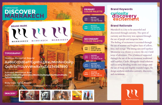
The image above is the mind map created for the Traditions Concept during the Ideation Phase of the Marrakech Tourism Project.

The image above is the Round 1 sketches for the Traditions Concept created during the Sketching Phase of the Marrakech Tourism Project.

The image above is the Round 2 sketches for the Traditions Concept created during the Sketching Phase of the Marrakech Tourism Project.
The image above is the vector logo for the Traditions Concept created during the Production Phase of the Marrakech Tourism Project.
References: Hampton-Smith, S. (2018, September 26). How to create balanced page layouts. Retrieved from https://www.creativebloq.com/netmag/create-balanced-page-layouts-7-pro-tips-121310009
Sykes, M., Malik, A. N., West, M. (2012, December 17). Stories that move mountains: Storytelling and visual design for persuasive presentations [Safari Books online]. Retrieved from http://ce.safaribooksonline.com/book/communications/presentations/9781118423998/2-cast-and-the-visual-story-map/c02_1_html?uicode=fullsail
Thank you, Bernard Pettiford
0 notes
Text
Measuring Design Effectiveness
Good day! This month was all about measuring design effectiveness by surveying the target audience. I found it very interesting to complete this process and get real feedback from real people who would consider moving to or visiting my community. Below is an infographic which summarizes the questionnaire/survey results. Link to hi-res infographic

Thanks, Bernard Pettiford
0 notes
Text
Class 9: Multi-Platform Delivery
How It Started This month was very fast-paced and the most challenging month I’ve had so far in this program. The month started immediately with logo design concepts, rough, and final versions being due all within the first week in a half. I had to quickly research, concept, and sketch out ideas, I ended up with a few ideas and only a few days to iterate and choose a final logo.

Logo Sketches
Once a direction was chosen, I immediately when to digital creation in Adobe Illustrator.

First Logo
After feedback was given and I continued to tweak the size of the wordmark, a final logo was produced.

Final Logo
We then had to complete an asset delivery schedule and were responsible for staying on schedule for the next week and a half. After getting slammed at work, I was 2.5 days behind my classmates in producing first drafts of my assets. I was able to play catch after a few long long nights.

First Draft of Assets
After receiving feedback, I iterated and produced my final first assets introducing Community Village North to the world.

Final Draft of Assets
Our last and final task was producing a brand guide. Thankfully, all of the research and work I’ve completed over the past 3 months helped quickly pull the brand guide together. I had some challenges tweaking all of the research and rationale down to bite-sized bites, which I know is crucial for the success of the brand guide.


Connecting/Synthesizing/Transforming I conducted a lot of research regarding logo design that would help communicate the communities brand characteristics of authentic, easygoing, and entertaining (listening to and performing live music). This proved quite difficult so I ended up researching logos that represented community and togetherness. I found inspiration which led me to the winning logo concept.

Final Logo
My research led me to the area of abstract marks. I was able to connect the fact that instead of using a culturally specific image to represent my community an abstract logo could be crafted that symbolized the brand characteristics. I then used additional research regarding shapes, form, and color to help connect the abstract mark and wordmark to the brand and to finalize the combination mark.
Problem Solving The design problem solved this month was creating a brand identity and brand awareness assets that would clearly introduce Community Village North to both community locals and visiting guests. The design problem that the medium I designed for solve according to the industry is creating effective brand identity, strategy, and awareness using a design thinking methodology. The design problem is community locals are looking for an authentic, lively, and distinctive experience unique to this area because currently, one does not exist. Design thinking addresses this problem by putting the community locals first. Conducting interviews with them providing the insight needed to solve the problem efficiently. It also uncovered additional insight that can be used to help craft effective marketing campaigns that will get the target audiences attention.
Innovative Thinking Compared to others in the industry who have solved a similar problem, I’ve taken a slightly different approach when creating the initial set of assets to help role the branding out. It was decided to use the Florida heat as inspiration and produce branded bottled water and branded umbrellas that would help initiate brand awareness. By using these particular assets, the community locals and target market will have usual promotional products that improve their life while promoting Community Village North. This strategy specifically speaks to the brand characteristic of authentic by providing an engaging, thoughtful, and authentic product that is useful beyond “getting the word out”.


Acquiring Competencies I learned how to under promise and over deliver throughout the process this month. Understanding that I almost lost my customer (and grade) because I overpromised what could be done in the length of time given, especially because I didn’t buffer in time for the unknown. On a technical side, I’ve definitely increased my skill level, efficiency, and mastery of Adobe InDesign, Illustrator, After Effects, and Photoshop. This was a result of the mixed media I had to produce for various media channels. I had to think quick on my feet as to not spend a super long time on one asset, technique, or problem. One instance of this was when I couldn’t figure out how to properly mock-up and show the photo/video carousel ads that would be used on social channels. I thought I would have had to create all elements within After Effects, which would have taken a very long production time. After doing research, I discovered that Facebook has created a tool that allows you to insert video and information and mock-up a real Facebook page or mobile instance of your carousel ad. With QuickTime armed to record my computer screen, I was able to record a real mock-up that played in real time. This will definitely be useful as I work with clients and need to mock-up and test carousel ads.

Lasts Thoughts My experiences in this course were pretty challenging because of the sheer amount of work that needed to be reproduced. I definitely plan to use the research skills, problem thinking skills, technical skills, and business acumen that I have attained to help me with my current job as a graphic designer for Pearson as well as in my freelance work. I have obtained a really good and applicable understanding of brand strategy and how it relates to every touch point of a brand especially the media/marketing mix.
Bernard Pettiford
0 notes
Text
Design Integration: Mastery Journal
Month Overview
The month 8 class was Design Integration. The month began with research and exploration in creating the characteristics, voice, and tone sample for our chosen community. We quickly moved into the creation of a static vision board which combined the collective knowledge discovered up to this point in a purely visual format. From there, a dynamic vision board was created to show the look and feel of the brand using motion graphics and audio. We then wrapped up the month by creating a media plan and designing a final design brief that will be used to guide all creative design from this point forward. Continuing to delve into research was a core skill exercised and strengthened over the course of the month. I am still having trouble researching using Full Sail’s library databases, so I always end up returning to Google and beginning my search there.

Connecting/Synthesizing/Transforming
The research completed during the course of Design Integrations was focused on several areas. The areas of research included crafting several solution statements; brand characteristics, voice, tone, tagline, and mission statement development; static and dynamic vision board development; media plan creation, and design brief creation. Several resources provided detailed information as to “the why” more than “the how”. This allowed me to synthesize solutions that would solve the design problem effectively based on the research.
A great example of how this was used can be found in the discovery phase of the solution statements. During research, it was found, according to Curren, that creativity can drive a place brand and bottom-up branding can really work (2017). These strategies rely on the strength of the community to help determine the direction and influence the vibe of the community’s brand. This bit of research helped me understand how to bridge the gap between solving the design problem and including the target audience in its formation. This solution will effectively solve the problem by engaging and allowing community members to be a part of the overall narrative.
Another example of how the research was synthesized and helped transform the work was in the choosing of the primary color for the brand. The primary color chosen to represent the brand is orange. In the research Sutton and Whelan discuss how orange is a stimulating, energizing color that appears friendly, outgoing, cheerful, and adventurous (2004). This directly corresponds and conveys the brand characteristic of entertaining. Orange also projects an inviting message. Using these type of connections within the framework of the brand helped solve and convey the necessary voice, tone, and feel even through the use of color.

Problem Solving
The design problem we are solving for is community locals are looking for an authentic, lively, and distinctive experience unique to this area because currently, one does not exist. The design problem is usually solved by increasing community awareness and recognition through community-focused events. Branding may or not be the driving force of this effort when others in the industry complete this type of work. I solved the problem by using the design thinking process which places the target audience’s needs and wants to the top of the list of priorities.
Innovative Thinking
When researching how other communities solved design problems regarding community brand awareness and identity design, my approach is similar but unique in one respect. Using design thinking methodology has led to crafting an empathetic, target audience- focused solution. This approach keeps the target audience at the center of all design choices. Using this framework ensures that the solutions crafted to solve the problems meet both the client and target audience needs in an authentic way. The subject of innovation was approached in the way the design choices tie into the audience preferences and overall brand aesthetic. The information gathered using in-person interviews and insights help define an aesthetic and strategy that will resonate with the target audience on an emotional level.

The work is innovative in the way the design process was approached using design thinking versus the traditional design process which doesn’t put empathy as a priority. This important difference can dramatically shift the focus and scope of the design problem and solution.
Acquiring Competencies
The challenges faced this month resulted in a few new research skills being acquired, a deeper understanding of efficient motion graphic workflows using After Effects, and a deeper understanding of grids and hierarchy in page layout. Because I continue to have issues finding relevant research using Ebscohost and the other research databases available, I have begun mastering conducting relevant research using other resources such as Google. Being able to search using specific keywords has been a skill I continue to develop as the program has progressed. The development of completing the dynamic vision board required me to research how to create the logo reveal effect and scene transitions. I learned about using advanced shape layer animation to create the line grow effect, how to tweak the graph editor to create particular ease in and out combinations that reflected the brand voice and tone, and how to use adjustments to create blended effects affecting multiple layers in a unique and interesting way.


During the development of the design brief, I learned how to maximize custom, asymmetrical grids to ensure that all elements were aligned for visual consistency. The grids changed from page to page and I ended up with a variety of custom templated pages that I could use. Using this approach helped me keep the design brief interesting. I also researched typography and hierarchy and now I could maximize the hierarchy for the greatest visual impact. The competencies learned and improved in this month will help me become a more efficient and proficient media designer during both the discovery (pre-production) phase and production.


Reflections
The experience this month was very filling for the analytic and creative part of me. Refining gathered research and putting it into an aesthetic format was pretty challenging but fun at the same time. After completing the voice and tone sections, the design brief was ready for design. I had an interesting research and trial and error phase while designing the cover. Originally the research led me to a solution that had 60% whitespace on the cover. I re-evaluated this after putting the rest of the design brief together. The solution I ended up with matches the overall brand voice and aesthetic of the design brief. Creating interior pages for the design brief was also challenging because the brand voice encourages variety and new experiences. These characteristics need to be conveyed through the design brief as much as possible to present a unified presentation.
This course was challenging but has forever altered my approach to new projects. I’ve had the opportunity to incorporate the knowledge I’ve learned this month (and last month) into new client projects. I’ve found that when you present to clients from a place of research and consumer insight they are more likely to accept your problem and solution statements. More importantly, providing them detailed insight into their target audience shows that you are intent on solving the real problem. The problem may be different from what was originally considered. I hope to build upon this knowledge going forward as a media professional and continue to sharpen my research, problem and solution defining skills, and technical mastery with the programs and processes used to complete creative projects.
Final Files Dynamic Vision Board YouTube link Community Village North Design Brief
References
Curren, D. (2017, July 17). 8 Lessons in Place Branding from City Nation Place Americas. Retrieved from https://aboutdci.com/2017/07/8-lessons-place-branding-from-city-nation-place-americas/
0 notes
Text
Design Strategies and Motivations
Connecting/Synthesizing/Transforming
The research completed this month is a mix of data/statistical and in-person/questionnaire interviews. The process of interviewing people who represented the target audience provided unique insight. Based on the interviews, I moved from a place of hypothesizing about the target audience to actually beginning to understand the target audience. I still would like to interview a few more individuals to round out the data gathered. Information gathered from the interviews allowed me to synthesize and transform my initial data-driven research and come to a few conclusions. The most powerful insight was how the target audience felt regarding the unique and distinctive vibe not present currently in the community. Secondly, was the absence and semi-negative reaction to social media. This debunked my initial thoughts and research regarding the target audience’s reliance on social media and its’ importance in their life. Thirdly, a recurring theme in the research was the need for honesty, transparency, and community across the board. These nuggets of important insights helped me frame the design problem specifically and more relatable.
Problem Solving The design problem that is being solved is the lack of awareness and focus brought to this area of Waterford Lakes and UCF. More specifically, the problem statement is community locals are looking for an authentic, lively, and distinctive experience unique to this area. A branded identity can help bring focus to this area as authentic, lively, and distinctive. The industry would solve this problem by crafting an identity followed by a marketing campaign. These elements would work in concert to produce a visual communication strategy aimed bringing focus to this area as authentic, lively, and distinctive.


Innovative Thinking This work could be considered innovative because of the process used to gather data and generate the empathy maps and SWOT analysis. When compared to other communities in the area such as Downtown Orlando and Winter Park, it is not clear how they came to the conclusions which informed the design and business decisions. By conducting in-person interviews and surveys, a more accurate and detailed picture of the wants, needs, pain points, and opportunities of the target audience strongly informed the research and design problem for this community.


Acquiring Competencies I learned how to conduct primary, secondary, qualitative, and quantitative research. Before this class I had no experience conducting interviews, collecting data, and synthesizing a design problem that was relevant and could give strong focus to the design process. I also learn how to find and qualify socioeconomic data for a target audience. Learning to create a problem statement that is aimed at solving the real problem was a challenge, but I learned how to do it. Devos discussed how a clear design problem creates a concise statement rooted in your team’s collective thinking (Devos, n.d.). This brings clarity for both the team and client/stakeholders. I also learned how to write an effective elevator pitch and deliver it within a specific time limit. I continue to learn how to more efficiently use After Effects, Premiere Pro, and Adobe Media Encoder to produce quality video content. This is a great skill to master as creating, producing, editing, and delivering video content is becoming a must-have skill set for media and graphic designers.

YouTube link to video pitch
Reflection This month was very hands-on and research centered. There were several tasks that were not guided by instructions which left an opportunity for me to take control and decide which direction the project proceeded in. At first, it was jarring I admit. Over time it started to become easier to move forward without assistance.
I learned a great deal this month and am very interested in continuing to learn how to make qualitative data-driven design decisions. Introductions to concepts such as creating an effective survey/questionnaire and writing effective elevator pitches will come in handy for every project that I work on as a media professional. The biggest takeaway from this month is reinforcing the importance of the design brief. Stone emphasized that creative briefs provides several benefits for both the designer and client including being the common language between you and your client, linking creative to business goals, summarizing client expectations, measuring and defining success, guiding the decision-making process, evaluating the appropriateness of design solutions, and making approvals clearer for the client (Stone, 2013)
References: Devos, J. (n.d.). Design Problem Statements – What They Are and How to Frame Them. Retrieved from https://www.toptal.com/designers/product-design/design-problem-statement
Stone, T. L. (2013, September 12). Creative briefs as strategic tools. Retrieved from https://www.lynda.com/Design-Business-tutorials/Creative-briefs-strategic-tools/114320/148434-4.html?=fullsail.edu
0 notes
Text
Organizational Structures Reflection
Project 1: Overview This month’s class covered motion design in detail. There were two major projects worked on regarding our chosen city. The first project was the dynamic vision board. This assignment required us to conduct research regarding motion graphics, history, and trends and apply it to our static vision board from last month’s class. Static into motion was the focus. The project details were pretty broad and general with only the time limit of 30 seconds being a major factor. It was very challenging to figure out how to tell the story of most or all of the vision boards elements within such a short time limit. What helped the process was completing research on the process of motion graphics and then creating storyboards. This allowed me to flesh out all of my ideas and figure how they’d worked together given the 30 second time limit. The text Animated Storytelling we were assigned to read this month also gave great insight on the process from conception to final deliverable.
Project 1: Process The screenshots below highlight the initial draft completed of the storyboards and narrative.

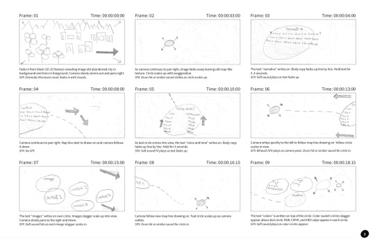
Revisions were completed and the final story was fleshed out. The screenshots below highlight the revisions of the story and the additional research completed.
The screenshots below are frames from the final dynamic vision board.


YouTube Link: https://youtu.be/Ynlmh2Snjxg
Connecting, Synthesizing & Transforming Correctly timing the text shown throughout the video benefited from research. Taylor emphasizes as a rule of thumb you need to be able to read text three times out loud at a regular pace (Taylor, 2018). Due to the time limitations of the video, this meant that the text shown on the screen should be short and to the point. Aldredge discusses that when working with text in video, you’ll need to make sure the text isn’t obstructing the image behind it (Aldredge, 2018). As a result, I edited the narrative copy and typography section in order to maximize the time limits of those sections while keeping the text on a legible background that didn’t interfere with itself or the background. Utilizing this principle, the text retained maximum legibility and readability normal pace.
Problem Solving The design problem was to position the city of Marrakech so the audience would see themselves as explorers instead of tourists. The work solved the problem by placing the audience in the shoes of an explorer. The motion piece features a map for exploration, map lines, location stops, and local imagery. Using these elements transforms the audience from mere voyeurs of a series of information bits into true explorers who are exploring this motion map and discovering new treasures around every corner.
Innovative Thinking Against similar videos in this style, this animation utilizes movement either by zoom and pan camera moves throughout enhanced by sound effects and background music. Vossen concludes that sound effects should be used to enhance motion graphics (Vossen, n.d.). Combining camera moves and transitions with sound effects throughout the video keep the viewer engaged while providing a novel experience.
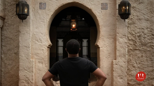
Project 2: Overview The second project this month was a motion piece marketing the chosen. The project offered the opportunity to work with several different motion styles including kinetic typography, cinemagraph, 2.5D parallax imagery, animatic, motion poster, and general motion graphic. The decision was made to use the 2.5D parallax motion style. In this style, the background image usually moves more slowly than images in the foreground, creating the illusion of depth and immersion (Techopedia, n.d.). This depth pulls the viewer that much more into the narrative which allows them to more intimately engage with the brand. Sherbin discusses how the parallax motion style technique is immersive. Sherbin also discusses how using layers gives your viewer the feeling that they’re moving through the page in 3D (Sherbin, 2013). In the case of this motion graphics piece, it is the screen that the viewer is moving through instead of a web page. This style accentuates the authentic depth and intimacy needed to resonate with the target audience, which is millennials. Due to time constraints, only one motion piece was able to be completed. The parallax motion style can easily be transformed into a series of motion pieces.
The story the motion piece will convey to the audience is that of daring exploration. As an explorer in Marrakech, there is adventure around every corner. Marrakech is an exciting adventure igniting fearless exploration in those who dare to navigate its endless passageways with an underlying don’t let fear paralyze you theme.
Project 2: Process The screenshots below highlight the storyboards for this motion piece.
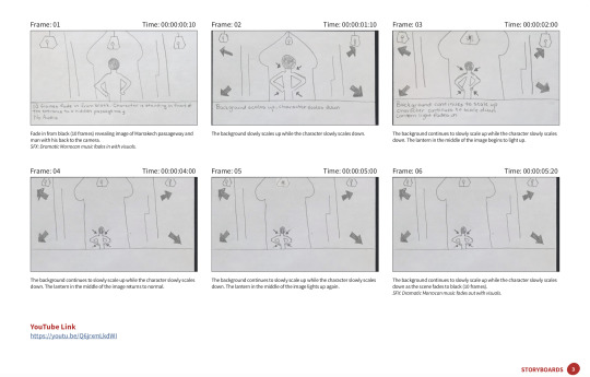
The screenshots below are frames from the final 2.5D parallax motion piece.


YouTube Link: https://youtu.be/Q6jrxmLkdWI
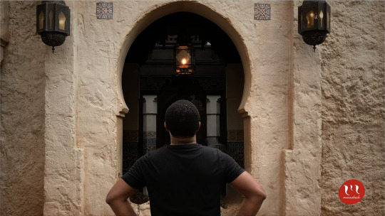
Connecting, Synthesizing & Transforming The researched used to arrive at the design conclusion was to explore the different motion styles presented. The motion styles included kinetic typography, cinemagraph, 2.5D parallax imagery, animatic, motion poster, and general motion graphic. After reviewing all of the styles, 2.5D parallax imagery was chosen to be the motion style for this project. The parallax motion style was selected because it introduces depth into a static image which further engages and immerses the viewer into the narrative. The narrative speaks to daring exploration. The depth really allows the viewer to experience the exploration in an intimate way.
Problem Solving The design problem the motion piece is attempting to solve is to allow the viewer to identify themselves as an explorer in Marrakech and not just a tourist. The motion piece solves this problem by showing a man boldly and confidently ready to daringly explore the unknown passageway he is standing in front of. Because of this, after watching the parallax video, the viewer has an intimate view of what it will be like once they are in that place in Marrakech ready to experience their own adventure and daring exploration.
Innovative Thinking The approach the motion takes is innovative because the secondary motion was introduced through the blinking light of the central lantern. Adding the secondary motion extends the depth of the motion piece beyond simple parallax motion and into a more complex, visually interesting, and defining narrative. Driving innovation in this motion piece using secondary motion will resonate with the audience as it further extends the tone and personality of the city of Marrakech, which is dramatic, exciting, and energetic.
Audio Identity The established brand audio identity has been used to further excite and dramatize the brand’s tone and personality. The music provides an upbeat, melodic backdrop which allows the visuals to be curiously and playfully explored. Using the brand audio in this way helps to create a connection between the feel of the music and message in the visuals.
Acquiring Competencies Throughout this month I leveled up my skillset and confidence using After Effects. By storyboarding the motion piece prior to jumping into After Effects, I was able to conceptualize easy methods of building the projects and Pre-Comping certain elements to make the animation cleaner, smoother, and more engaging. The elements I pre-comped included the text writing effect for the headlines in Project 1 and the ending screen elements in Project 1. I also learned how to animate in Photoshop to produce parallax image animation. I continued learning how to research topics deeply traditional books and Internet sources. I am also continuing to become better at managing my time. I still procrastinate concerning certain assignments but I do it a lot less now. I contribute this to having so many assignments due at once that I am unable to wait until the minute to get everything completed. This has also brought my weekly stress level down consistently.
My Experience In Organization Structures This class proved to be challenging. I associate this with the amount of research needed to be completed in order to make logical and sound design decisions. Graduate-level research for design work continues to prove difficult with certain specific subjects such as 2.5D parallax effect. There were a lot of resources available regarding using 2.5D parallax in web design but very few sources discussing its use in video production.
I also had a difficult time keeping my story journal. I didn’t start it until Week 3. Once I started it, it was fairly easy to keep but the assignment requirements introduced additional work that made it pretty cumbersome. I am grateful that I did not have to learn After Effects during this month because I don’t know how I would have done that and keep up with all of the assignments.
Overall, I feel like my time wasn’t well spent in this class over the month. I would have liked more time to work on the second project. Perhaps splitting the time between the two main projects equally would have provided me sufficient time to get everything done unto perfection. From here, I plan to continue mastering After Effects, 2D, and 3D motion graphic design so that I can offer better creative execution on both graduate and work-related projects.
References Aldredge, J. (2018, April 04). 5 Things You Should Consider When Adding Text to Video. Retrieved from https://www.premiumbeat.com/blog/5-considerations-adding-text-video/
Pettiford, B. (Photographer). (2019, March 1). Bernard at the Moroccon Pavillion, Epcot [photograph]. Orlando, FL.
Sherbin, M. (2013, December 09). The Ups and Downs of Parallax Design for Content Marketing. Retrieved from https://contentmarketinginstitute.com/2013/10/visual-content-potential-pitfalls-parallax-design/
Taylor, A. (2018, June 28). Taylor, A. (2018, May 01). The benefits of storyboards. Retrieved from https://www.lynda.com/After-Effects-tutorials/benefits-storyboards/625942/734737-4.html
Vossen, C. (n.d.). The importance of audio in video. Retrieved from https://www.522productions.com/the-importance-of-audio-in-video
What is Parallax Scrolling? - Definition from Techopedia. (n.d.). Retrieved from https://www.techopedia.com/definition/29141/parallax-scrolling
0 notes
Text
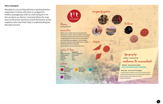
Design Research Reflection
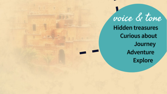
The assignment this month was to create a theme, narrative, supporting design elements, vision board, and an infographic for the branding of our chosen city, which in my case was Marrakech. The theme I choose was daring exploration. The narrative began to take form as I researched adjectives, thoughts, and phrases that described and encouraged daring exploration. The narrative states,” Boldly uncover hidden treasures through fearless exploration. Unearth trends of tradition at the hand of the fast-paced hustle and bustle of the city. Curiously navigate tapestries of color, texture, and novelty as you tread endless passageways. Journey bravely beyond the well-worn path of adventurers and into hideaways of timeless tranquility. Dare to explore. Dare to discover. Dare to live.” The narrative speaks specifically to the exploration of the souks (or markets), mosques, and gardens of Marrakech. The hidden treasures to be uncovered through exploration refers to the unique and rare finds and trinkets of the souks that are usually only discovered through intense exploration. Passageways refer to the winding alleyways of the medina which hides certain stores where novel tapestries can be found. The hideaways of timeless tranquility refers to the mosque and gardens known for their sanctuary, peacefulness, and tranquility.
Synthesis Two concepts that I identified and synthesized through research the use of red as a primary brand color. Steph, the Mediterranean Traveler, relives the Marrakech experience and states, “The more I tried to make sense of the city, the more it evaded me. The more I tried to find my way, the more I got lost. This is what makes it a thrilling destination, but not an easy one. It’s a place of soaring highs and crushing lows.” (Steph, 2018). According to Sutton & Whelan, red expresses excitement, speed, power, joy, danger, and passion. Red also telegraphs energy and courage, giving one a sense of power to get things done (Sutton & Whelan, 2004, pg.156). I decided to use red to represent the excitement, danger, passion, energy, and courage one will experience as they fearlessly and authentically explore Marrakech. The example image from Spet.info’s Migrants campaign uses red of the soda cup to convey the excitement, passion, and danger of the migrant’s floating in the soft drink above it. The second image illustrates the use of red on the vision board as the dominant logo and top-level heading color. Using red this way immediately connects the viewer by pulling them into the excitement, danger, energy, and courage of the brand’s theme and narrative.

(Sept.info Migrants Campaign)

Completed vision board)
Problem Solving A design problem that was encountered during the design process was how can the imagery be used as a visually interesting background texture while not detracting from the readability and legibility of the sections of information. Kliever suggests applying a blur effect — either subtle or more significant depending on how busy the image is — can help create an uncluttered background that won’t distract from your content (Kliever, N.D.). The first example shows how using a blur on the background image can increase the legibility and readability of the copy.

(Vision board before)

(Vision board after)
Innovative Thinking A common design practice is to stick to common grid styles and alignment when laying out a design. Ambrose and Harris states unstructured designs can be some of the most visually creative and, by definition, are more difficult to control in order to achieve the desired results (Ambrose & Harris, 2011, pg. 144). I decided to continue the theme and narrative by using a different alignment of the second and third column sections that mirror the zig-zag path one might see on a map. This provides the vision board with added visual interest that speaks to exploration.

(Vision board with purple marks showing the map path alignment used for the 2nd and 3rd column sections)
Acquiring Competencies I improved at several competencies during this month’s class. The first was research. This class required more research than I had ever done before. Being able to sift through an unlimited amount of research results and stay focused on the research goal at hand was a big help during the second and third weeks of class. I also feel more confident in using APA style in-text citations. A second improvement is in my Photoshop skills. I specifically learned how to blend textures, colors, and the blur effects in different ways to create the background for the vision board and infographic.

(Vision board and infographic background image created)
A third competency that I have continued developing is my layout and composition skills. This is directly related to having to develop the vision board. I challenged myself to keep the dimensions at 8.5 x 11. This meant type size and images had to be optimized for space while remaining legible and readable against the image background. I decided to play around with different column arrangements for the sections and settled on a zig-zag map-like arrangement which speaks to the theme and narrative.

(Layout and composition focus of the vision board)
References: Ambrose, Gavin & Harris, Paul (2011, March 2). Basics Design 02: Layout (second edition). [Safari Books]. Retrieved from https://ce.safaribooksonline.com/book/graphic-design/9782940447169
Kliever, J. (N.D.). 10 expert tips for designing with a blurred background [case studies]. Canva. Retrieved from https://www.canva.com/learn/blurred-background/
Steph (2018, October 11). Exploring the Red City: A Snapshot of Morocco’s Magical Marrakech. The Mediterranean Traveller. Retrieved from https://www.themediterraneantraveller.com/marrakech-medina-exploring-streets/
Sutton, T., & Whelan, B. M. (2004). Complete color harmony: Expert color information for professional color results. [Safari Books]. Retrieved from https://ce.safaribooksonline.com/book/design/9781592530311
0 notes
Text
Reflections on Effective Copywriting
This month in Effective Copywriting has been the most challenge month of class so far in the degree program. At times I felt defeated because of the challenges of time, quality research, and the commitment needed to complete all assignment objectives. This month’s reading came from Advertising: Concept and Copy (3rd Edition) by George Felton. Felton’s text was full of wisdom and tried-and-true industry standard techniques. I finally understand the difference between strategy and execution. As Felton states, the “what” is your strategy and the “how” is the execution (Felton, 2013). Creating strategy is all about knowing the product/service, consumer, and the marketplace. Felton also discuss several ways of crafting effective headlines, body copy, and call to actions. Of the techniques Felton discussed for crafting headlines, balanced parallelism was the most valuable to me. Felton expresses how the technique of balanced parallelism allows you to raise an issue on one hand and complete it nicely with the other (Felton, 2013). These structures also add resonance and authority to an expression. Regarding body copy, I learned several ways to write compelling body copy that sells and not describes. I learned the importance of translating features to benefits. Felton expresses that features belong to the product, but benefits belong to the people (Felton, 2013).
The assignment given this month revolved around selecting a nonprofit organization and creating an ad campaign aimed at a clear strategic objective. I choose to work with ACCESS College Foundation, a South Hampton Roads area Virginia-based nonprofit organization. This organization provides financial and advisory resources to middle school, high school, and college students and parents. Before developing a strategy and execution, I first explored their competition. Felton concludes that when researching the competition, two key issues should be in focus. The first is, “Who is your competition, exactly?”, and second, “What product category(ies) should your client’s product compete in?” (Felton, 2013). My research included the Hampton Roads Community Foundation, The Lincoln-Lane Foundation, the Peninsula Community Foundation of Virginia, and The Southeast Virginia Community Foundation (SEVACF). All of the competitors offer their own scholarships and/or scholarship resource access. ACCESS College Foundation is the only organization that offers both financial, including scholarships, and advisory resources. This is their key differentiator factor and acts as the main big idea within the campaign’s strategy. Felton expresses, “Link features to benefits. Complete the argument.” Doing this allowed me to brainstorm and conclude that by ACCESS offering a complete solution of financial and advisory resources, they help their target audiences reduce the fear, anxiety, and unpreparedness associated with preparing for college.
I then explored the organization’s primary and secondary target audiences. Their primary target audience is students and secondary target audience is parents. Additional research led me to interesting data that influenced the campaign’s marketing mix. The research conducted showed that the primary target audience, Gen Z, are mobile first, they use Instagram and Facebook to follow brands, and they believe YouTube ads are more trustworthy than any other source of advertising, including television, print, radio, and social media (The Center for Generation Kinetics, 2018). I developed personas for both the primary and secondary target audience. This allowed me to get into the head and shoes of the typical consumer. This perspective was invaluable to the creation of the ad campaign, Operation Preparation.
Persona #1: Sean Bryant

Persona #2: Gary Mitchell

Operation Preparation is the ad campaign that was developed in response to the project’s strategic objective of raising brand awareness. The campaign’s overall concept developed focuses on ACCESS College Foundation being part of your team and ready to help you get prepared. The screenshots below detail the ads developed to fit within this concept.
Ad #1: Half The Battle The first ad concept, Half The Battle, uses the testimonial type “employee”. Felton concludes that this type “gives the brand a human face.” (Felton, 2013). This connects to the both the primary and secondary target audience by giving them the comfort that the companies has their best interest at heart from the words of one of the ACCESS advisors.
Sketch:

1st Draft:

Final Draft:

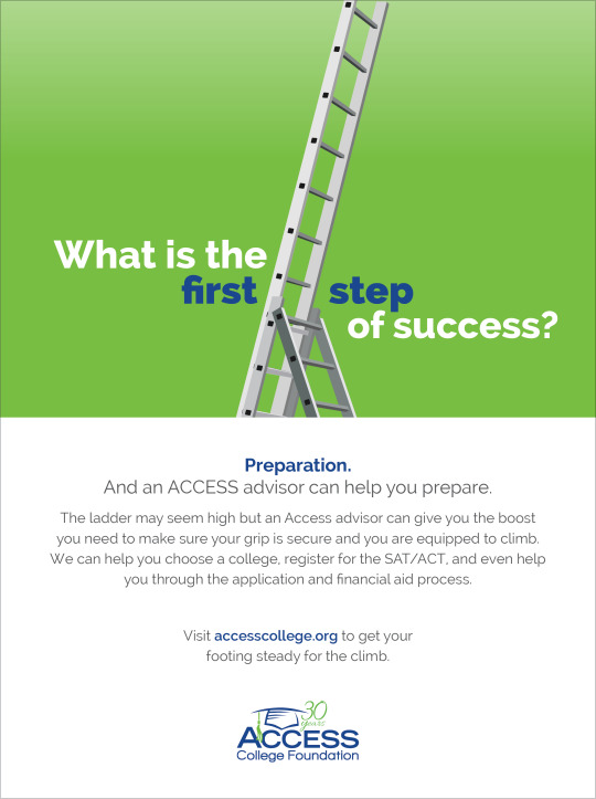
Ad #2: Steps Of Success The second ad concept, Steps of Success, uses the testimonial type ”not the person but something associated with the person” or a metonym (Felton, 2013). The ladder’s steps represent success and it’s asking a question directly related to the organization’s service. This twist on the traditional use of a metonym was challenging but provides an interesting perspective to the ad and how it is conversing with the reader.
Sketch:

1st Draft:
Final Draft:

Ad #3: Fun The third ad concept, Fun, uses the testimonial type “normal people”. It speaks in a conversational style similar to that of the reader’s friend, or someone they would trust. Felton points out that when people want to buy something, they often ask a friend with knowledge of the brand (Felton, 2013). Using this style allowed the voice of the writing to stress benefits in the body copy.
Sketch:

1st Draft:

Final Draft:

Ad #4: Mission Accomplished (generic image ad) The fourth ad, Mission Accomplished, uses the testimonial type “regular user”. This ad operates as a generic image ad. The image used was chosen because it is aspirational to the primary target audience. This image aims to associate the successful and happy student with the organization’s services. The emotional connection formed with the viewer is designed to stay in the front of students minds and strongly influence their decision-making process. This ad also allows for flexibility as the image can be swapped out to represent other genders and ethnicities.
Sketch:

1st Draft:

Final Draft:

The headlines were developed using balanced parallelism and posing a question while answering it in the body copy. The body copy word choices focus heavily on driving benefits. This smoothly connects to the call to action, which remains in the voice and tone of the individual ad while highlighting the brand’s authenticity. It was decided originally that each ad would have it’s on look in order to help convey the flexibility of the campaign. After reviewing the feedback received, it was determined to use the organization’s existing color palette and typography in order to reinforce their branding throughout the ad campaign. This simple change unified all of the ads and improved the design solution proposed to create a cohesively branded ad campaign.
Three takeaways that I’ve learned from Effective Copywriting are: research is the foundation of all effective copywriting; continue refining headlines, body copy, and taglines by using the many literary devices and techniques discussed throughout the course; and write, rewrite, and repeat because writing is a valuable skill that can be mastered and used effectively by media designers.
References: Felton, G. (2013). Advertising: Concept and copy. New York: Norton & Company.
The Center for Generational Kinetics (2018). The State of Gen Z 2018 [PDF File]. The Center for Generational Kinetics. Retrieved from https://genhq.com/wp-content/uploads/2018/10/State-of-Gen-Z-2018.pdf?inf_contact_key=fad917d2cb9dfc836819ae377966fed21f2ec1408dae4e33a6024925c4e64d81The second ad concept, Steps of Success, uses the testimonial type ”not the person but something associated with the person” or a metonym (Felton, 2013). The ladder’s steps represent success and is asking a question directly related to the organization’s service. This twist on the traditional use of a metonym was challenging but provides an interesting perspective to the ad and how it is conversing with the reader.
0 notes
Text
Brand Development: Mastery Journal Entry
Personal SWOT Analysis #1
My strengths include good listening skills, experience in working with a team to concept, create and execute a creative project, strong layout and typography skills, and project management skills. My weaknesses include procrastination, being uncomfortable in giving critique’s of colleague’s work, a lack of traditional drawing skills, and a consistent focus on the task at hand. An immediate threat is other graphic and motion designers who have more experience in traditional art and animation than I have. To overcome this threat, an opportunity would be to use Lynda.com and other Full Sail resources to begin a drawing course and commit to finishing it. I would also consider my location and the competitive landscape as a threat. An opportunity to overcome this would be to use resources such as Meetup.com, Facebook, and LinkedIn, and Instagram to connect with other artists and began to survey the Orlando landscape.
Final Brand Vision Boards: The Work


Final Brand Vision Boards: SWOT Analysis
This month was full of growth for me as a Media Designer. A few strengths that I realized was that my design skills continue to grow and evolve. I find it easier to make final design decisions once I have thoroughly researched an idea and its’ details. I also discovered that I like deep research dives into new areas of knowledge I’ve never explored. I found that I really like geography almost as much as I like architecture. Researching for my geography concept for Marrakech, took me to some really interesting websites and videos.
I also discovered a few weaknesses that I’d never came across until this month of assignments. I realized that I can be indecisive which makes me late for deadlines at times. I also realized that when I am not clear on instructions or objectives, I need to ask more questions and become more curious.
One of the threats that presented itself during this month’s work was my location in relation to the brand I am creating. Not being near Marrakech makes it hard to really get a sense of the soul of the city so that my concepts can accurately reflect it from first-hand experience. Also, being siloed and not being able to talk to or work with a team to brainstorm ideas and run creative decisions across was a threat.
An opportunity that can help solve my location threat is to reach out to Marrakech natives and individuals who have traveled to Marrakech via social media platforms. While I would not be there physically, the experiences of other could help fill in my gaps of knowledge and understanding. Another opportunity that could help with the threat of isolation is to engage more with my classmates to get their feedback sooner. Another opportunity that I recognized was the use of Lynda.com and other FSU library resources to help improve my understanding of brand, typography, and advanced layout techniques. I found myself going back to courses I had completed only to retake certain sessions for a more solid understanding before moving forward. References:
All-free-photos.com. Palace of Bahia - Marrakech - Morocco. http://www.all-free-photos.com/show/showphoto.php?idph=IM5959〈=en
All-free-photos.com. Ménara gardens - Marrakech - Morocco. http://www.all-free-photos.com/show/showphoto.php?idph=IM5959〈=en
Axon, A. Koutoubia Mosque. 14 Jan., 2010, https://www.flickr.com/photos/statto7/4282402445/in/photostream/
calflier001. GARE DE MARRAKECH MOROCCO APRIL 2013. 24 April 2013, https://commons.wikimedia.org/wiki/File:GARE_DE_MARRAKECH_MOROCCO_APRIL_2013_(8694650375).jpg
Free-Photos. Pixabay. https://pixabay.com/en/camera-vintage-photography-old-1246655/
Free-Photos. Pixabay. https://pixabay.com/en/binoculars-looking-man-discovery-1209011/
Free-Photos. Pixabay. https://pixabay.com/en/people-girls-women-friends-smile-2596150/
Free-Photos. Pixabay. https://pixabay.com/en/journey-travel-hike-path-ireland-2406354/
Ligero, J., and I. Barrios. Patrón Geométrico Islámico -- 2014 -- Museo De Marrakech, Marruecos. 19 Jan. 2014, commons.wikimedia.org/wiki/File:Patrón_geométrico_islámico_--_2014_--_Museo_de_Marrakech,_Marruecos.jpg.
Public Domain. Ardabil Carpet. https://en.wikipedia.org/wiki/Islamic_art#/media/File:Ardabil_Carpet.jpg snicky2290. Pixabay. 24 March, 2015. https://pixabay.com/en/adventure-friends-young-hipster-842584/
Tulane Public Relations [CC BY 2.0 (https://creativecommons.org/licenses/by/2.0)], via Wikimedia Commons. https://commons.wikimedia.org/wiki/File:Students_in_sculpture_class_(5537568658).jpg
Viault. Le jardin des majorelle 21. 25 April, 2010. https://commons.wikimedia.org/wiki/File:Le_jardin_des_majorelle_21.JPG
0 notes
Photo


TASK 1: Document the Design Process
The diagram that I most identify with is the first one. The description from the book refers to it as being focused on the creation of a singular artifact or campaign (O'Grady & O'Grady, 2009, pg. 68). Because of the turnaround time associated with this assignment, it became easier to focus on a single idea or group of ideas without much worry of continual reassessment.
Research became the most powerful phase of this process. It became the catalyst for multiple idea generation. I found that during this phase I could freely explore concept ideas, word associations, and list additional references that could become important during the creative, sketching, phase. The next phase, concept development, was the hardest part for me to complete. We were asked to create a minimum of 100 sketches. I found this as a hindrance because I was continually counting and looking at how many more I needed to do.
Prototyping came into play as I created variations off an initial idea. I found this phase to be relaxing because as I sketched more ideas for variations came to mind. The design and production and completion phases have not been completed. As I move into the design and production phase, I plan to have strategic executions for the chosen sketches that will be digitized through Illustrator.
References: O'Grady, J.V., & O'Grady, K. (2009). A Designer's Research Manual: Succeed in Design by Knowing Your Clients and What They Really Need (Design Field Guide). [Safari Books online] Retrieved from https://ce.safaribooksonline.com/book/graphic-design/9781592535576
The feedback I received on my initial sketches was very helpful. The reviewers felt that select sketches were reasonably simple and were executed both memorably and with relevance. Constructively, some of the logo ideas don’t focus on one thing very well and as a result, incorporate too many ideas or ideas that don’t work well together. From this feedback, I plan on focusing on single, discrete concepts as I work through sketches and ideas. I believe this focus will bring clarity to the concepts presented in my work. This will help me on my journey to mastery by allowing me to fully explore concepts and ideas and show that in the quality and quantity of sketches produced during this phase.
0 notes
Text
A brand new class to start a brand new creative month
The first GoTo Meeting video was very informative. Overall, I’ve gained some understanding of the MDMFA program and what I am expected to bring to the table. My key takeaway from the session is that I will need to develop my skills of critical thinking, deepen my appreciation for and my ability to complete research on an academic level, develop mastery in my areas of expertise, be proactive and show initiative, and manage my time. All of these have never been my strongest attributes so I am planning to start work early and ask questions often.
I am concerned that some of the classes I will take on this journey may not directly help me become an attraction or themed entertainment designer. I need to review how to align my career goals as close as possible to the program goals so that I can maximize using what I’ve learned. I am not familiar with connecting, synthesizing, and transforming my work to the point of innovation. I am interested in learning strategies on how others have achieved this and how I can benefit from achieving it in my career. One of my biggest weaknesses right now is drawing. As a working graphic designer, I have been able to bypass hand drawing up to this point in my career. To be honest, I sometimes don’t go for certain opportunities because drawing, illustrating, or creating storyboards are usually necessary. I am committing to completing the Drawing Workshop available through FSO. I plan to start this weekend which will give me time to purchase the materials needed to complete each session.
My overall vision for this program is to become a much stronger, research-driven, collaborative, and well-of-ideas designer ready for a career in themed entertainment design. I am expecting to gain in-depth knowledge of brand design and strategy which is at the heart of any creative endeavor for world-class companies. I am committed to spending the first hour of my morning on assignments as well as Tuesday, Wednesday, and Friday evenings; all day Saturday and Sunday as needed. I believe my long-term career goals of becoming a themed entertainment designer for an attraction design firm or themed entertainment/experience company will happen if I take action and stay the course.
0 notes
Photo

Reflection from a beach in Negril, Jamaica
Last week I spent time in Negril, Jamaica with my brother, our family, my soon-to-be sister-in-law, and her family. As we traveled 2 hours from the airport to the hotel and I began to see the poverty-stricken areas, I couldn’t help but feel super grateful. Often times, I complain about what I don’t have or have not yet accomplished. I had to stop myself and give thanks to God who gives me health, strength, and the ability to take care of myself. I took this image of the beach on a peaceful morning when the water was calm and the beach was practically empty. It is during this quiet and peaceful moment that one can revel in the beauty of this earth and simply be grateful for another day.
0 notes
Photo

Mastery Journey Timeline
Course 12: Professional Practice This course will help define legal and ethical issues on a global scale and how to navigate through these to achieve success as a media design professional.
0 notes
Photo

Mastery Journey Timeline
Course 11: Thesis: Presentation of Design Solution This course will help me refine my presentation skills. It will help me gain experience in presenting my projects and explaining how my research influenced by final design solution.
0 notes
Photo

Mastery Journey Timeline
Course 10: Measuring Design Effectiveness This course is essential, as it will introduce me to the metrics and marketing strategies used in my industry to evaluate the effectiveness of my designs as perceived and interpreted by the target audience.
0 notes
Photo

Mastery Journey Timeline
Course 9: Multi-Platform Delivery This course will provide the tools to develop a plan for creating professional-quality deliverables from the research and exploration completed in my last few courses.
0 notes