Don't wanna be here? Send us removal request.
Statistics
We looked inside some of the posts by ad7000 and here's what we found interesting.
Average Info
Notes Per Post
0
Likes Per Post
0
Reblog Per Post
0
Reply Per Post
0
Time Between Posts
1 day
Number of Posts By Type
Photo
4
Text
1
Link
12
Last Seen Tumblr Blogs


Fun Fact
US Tumblr user growth rate is estimated to slow down to 4.1%.
Photo


There’s Something and Bugger All of It - Lisa Richards
Selection of photographs.
View pdf’s of printed book here: https://issuu.com/snappography
Checklist of final submission:
-Printed and bound photobook containing 25x postcards in presentation box with coversheet.
-Usb containing file with research document link, back up pdf files of research document and digital pdf’s of book.
Research document as follows, reverse chronological order.
0 notes
Text
Evaluation
The title, There’s Something and Bugger All of it, comes directly from the transcripts and does appear in the book. It’s a phrased that stuck with me and I kept coming back to for title ideas as i really thought it summed up the themes in the book well and also worked in a literal sense. It appears in the book in context, describing one of the first towns we come to, however not only does it also describe most the places we went to and the general mood of the trip, but also some of the heavier themes. My mother was the subject of my last book, Thunderhead, which explored a connection between the personal/biographical and the factual, in that case it was the weather (although i didn’t make it obvious in the book that there was a family connection between myself and the subject). The book revealed small sections of information ranging from early childhood to early teens, and then a small section of her current stage in life. it did not expressly talk about events in a chronic logical order, nor did it mention every significant event, or dwell much on any events mentioned. It was, i think mentioned that she was brought up by her grandparents, not her parents.
This book is about many things, but primary her Father.
About 5 months prior to the start of this project my mother got on a coach from Gloucester the Carlisle and spend 2 weeks travelling around the north east and Northumberland coast in a little blue van with her (until recent years estranged) father, his best friend Mary, and their 2 dogs. When she got back she told me about the trip and i was invited to the next one in September. I have never had a relationship with my grandfather and until this day am not allowed to call him anything other than Tony (despite the fact that his name is Glen) and have only met him a few times. I found this entire situation peculiar and i wanted to initially go on the trip to document the areas they visited, however i also decided that since Tony knows a lot about the area and had been living there for a very long time it would be worth recording audio and video of him speaking..
On the 7th September 2017, Me and my mother (52, visually impaired) got a coach from Gloucester the Carlisle and were picked up by Tony (maternal grandfather, late 70′s, chronic obstructive pulmonary disease), Mary (tony’s best friend, 82, perfect health but ‘age related wear and tear’ as she puts it), and their two dogs, Shadow and Toby. We spent 15 days travelling in a little blue van along the north west coast, the Northumberland coast, and the north midlands. Along the way I kept an audio recorder and a go pro in the front seat of the van with me.
In my previous project, Thunderhead, I’ve focused a lot on the personal. I wanted to present in it a way which wasn’t overwhelmingly biographical, but presented as factual with elements of biographical information. That project ended up having a lot more of the personal than anything else, however for this project I want to take from that one some elements but leave it remaining mostly as a documentary narrative only with some undertones of the personal. Again, with this project i think it has developed to allow much more of a biographical tone, but unlike the previous project, it is balanced out with other themes. Geography, geology, history and transience are all main themes which I intended to encompass, and i don’t think in the final outcome they are presented with equal weight, but i do they they are all present. I think there is a good correlation in this project between the biographical aspects and the photographic narrative, they are interlinked but again, they are not overwhelmingly connected. In other past projects, I've played with the idea of narration (Mavis’s Grand Day Out/Compendium) and complex text (Compendium) but only in my previous project (Thunderhead) I began to look at the personal as part of documentary and i think it was a strong element that i also had the potential to incorporate into this project. This was a project about land, the division of land and nature, relationships: man and land, but there was the potential to make more personal, to add to it. In my proposal of this project I didn’t focus on the personal elements much as i first imagined this to only be a small element, possibly presented as a video. The idea developed in the early stages of the project, and further so in the post production when i decided to transcribe. I think this diversion from the brief served the project well and has lead to much stronger final piece. Other than this shift in themes, or rather particular development of one central theme, i think the project has been in line with the proposal and final presentations are very much representative of the ideas i first pitched. The execution of the project heavily relied on the research and planning before the trip. A lot of the research i did ended up not entirely relevant to the final produced outcome, however it did greatly influence my shooting on the trip and my forward planning of the trip which inevitable made the final product possible. I found shooting and creating a project in this way quite difficult as I've never completed a project before where the shooting and post production were so separated, and a chance for a re-shoot wasn’t possible. However, i think i did well at it as i was prepared and i can’t think of anything about the trip which i would have done or shot differently. My method of post production as well was a bit overwhelming as i had never had such a bit edit to work with and based on this, i do think there is room for development of the project given more time on the project, however again i am extremely happy with result and i do think this was the best outcome and that i made the best decision for the time frame and resources available. I think if i had time to work on this project of a longer period of time i would attempt to visit more locations, record and produce a video, and possibly create a series of smaller book narrative which come together in a slip case. I would also possibly present the project with a video on projector, and prints. As for the final design and edit of the book, I am really happy with the printed and digital version, i think the text and image edits i made within the book were critical and thought out, and i think that the book as a whole really comes together and both looks good and is impacting. The only other thing i am considering for the final design is possibly introducing it with a short text insert, however this is still a possibility as it’s removable. Whilst post production was challenging, i faced some very different challenges when shooting. Travelling in a small van with 3 other people, all elderly or disabled, and 2 dogs, in bad weather was a challenge on its own. But carrying my equipment, keeping it charged and files backed up and overall reaching my destinations in the daylight, that was probably the most stressful thing. I think however that under the conditions i was staying in, i couldn’t have hoped for a better outcome of images and audio. I did have concerns earlier in the trip about not being able to get enough media, but by the time it was the last day and my hard drive was almost full, my concern now was the edit. I think in the edit and design of the book a lot of my influences have come through, particularly Alex Webb and Rebecca Norris Webb’s Slant Rhymes, Taryn Simon’s An Index of the Hidden and Unfamiliar, Masahisa Fukase’s Ravens, and Jack Latham’s Space Cowboy are all projects i kept returning to. Although some of these may seem dissimilar, it is elements of their design, concept or central themes which i particular draw from.
To conclude, this project has been challenging both in the physical aspect of shooting and in utilizing post production to convey themes. I think the project as a whole though has been critically thought out, has gone through many staged of development and reformation as documenting in the blog, and has ultimately resulted in a final printed book, presented as a finished piece which the realization and development of ideas presented first in my proposal.
0 notes


Photo


Final Presentation pt 1
The book and postcards have arrived and i’ve put everything together in a presentation box. Here are a few images of the final presentation, including the postcards in envolopes not yet stuck down. I’m really happy with how this looks, if i would change anything for a reprint it would be to order alternative dust jackets so i could try differnt ones on the physcial version, and to further lighten a few images, however as it is i am extremly happy with it. I would have like to test printing inserts on newspaper as i didnt get to see what it would have looked like however i think chosing to go with the postcards insead was still the best decision.
0 notes
Photo


Post card/ insert update
When trying to plan out how to design and print out my inserts i discovers that it’s actually quite hard to find somewhere which will print onto newspaper (single sheets) and that it isn’t something i could try to do myself at uni. I emailed 5 or 6 local printing companies, 4 of which replied. All were a definite no, except the dark which which responded with this. Due to the risk and time limit i decided that i to might be a better idea to try something different with the inserts. I did find one company willing to print a 2 page brochure type insert on newspaper and deliver in time however i’d need 6 of these and the non negotiable price for these were £25 each, before shipping. Well out of my price range.
After looking into prints, i decided to try and get post cards printed as i think they’s also have a similar effect and would be easier to print. This mean the presentation had to change slightly, whereas before i had imagined the newspaper insert to be large and folded, these would be smaller and singualr object. I’ve decided to present them in envelopes stuck into the book. I think i actually prefer this to my original idea as it ties in more with the theme of travel, trancience and they are more interactive, they are removable and the order is subject to change. I liked the idea of the post cards so i looked for a postcard writing company which would print matte, and print the postcard blank on the back. I found a company, MOO, which would do this so i have designed and ordered the postcards in place of the inserts. Whilst i am sure this has been done before, i have struggled to find a similarly designed photo book to research presentations on, so i want to try to keep it simple and in theme with how to inserts were originally meant. I want the envelope stuck on the blank page meant for the insert, and the same edit of images in each.
The only book that came to mind when thinking about this idea was Yoshikatsu Fuji’s Red string. It does not use this design but does have personal and creative methods of presenting separated images. The them, again, is not similar, but i think the design serves a similar purpose, to separate but include images and to provide an opportunity for the viewer to rethink the narrative. I first saw this book at the Bristol Photobook event 2016 and then again in exhibition 2017. http://www.yoshikatsufujii.com/red-string-book

https://vimeo.com/102344549
https://vimeo.com/161564397
0 notes
Link
Final version of body - no cover,no inserts. Text and text layout finalized, images retouched and edit finalized, blank pages left for inserts. File brightened, sharpened, and resized for print.
0 notes
Link
This insert reflects change and transience. The section of images previous does this also more subtly, there is a change in location, a change in the personal, the trip is rounded off by returning to a location near the starting point of the project. This is the final part of the book, and the insert is supposed to show all of this. The insert is very different, it is sectioned within one page. The image are scans of slides taken during the trip, small details of such large landscapes. The images are of the small amount of film i shot underwater, this embodies and returns to a crucial part of the project; water, the elements. These are supposed to contextualize the landscapes, taking away for a moment the personal and focusing on the details of land and sea. This project has a lot of different and sometimes opposing themes which when presented together and intertwined, can hopefully stand together to show this project of a document of land, of water, of the personal, and of border lands. This insert is not a pause like the other sections, but more of a break in narrative, and a chance to revisit the rest of the book having reconsidered the themes. This is presented before the final images, which are meant to conclude the previous themes . Pages 186-187
0 notes
Link
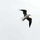
This is another short insert, mainly because there weren’t enough similar images or fitting images to include here, i do however really like the images a lot both separably and together. These images are more picturesque and correspond with location, however i think they also make a good steady decline in bird exposure from the last insert due to the slightly pulled back frame and colours. these go on pages 130-131 introducing the following section.
0 notes
Link
This insert is very bright, in your face, contrast to the other inserts. This is in reflection of the section of images and location, but also it is about midway in the book where there has been so far limited exposure to the bird images, here i wanted to have this insert to really hit a peak of exposure, as if they have been withheld. this insert goes on pages 90-91, only shortly after the previous insert. This is partly because i wanted a stark contrast, and partly because it is where the section begins.
0 notes
Link
Insert 3 is only 2 pages, the images correspond with weather changes and a general gloomy tone following some heavy text in the book and introducing a singular image on the next spread. these images although they are less than the other inserts, they take over the majority of this section of images and definitely have a more dramatic tone. this insert goes on pages 84-85 of the book.
0 notes
Link
This insert follows the same theme and purpose of the previous one, however as you can see I've included more images and they are brighter, more colorful. They have a different mood. These images are coastal whereas the previous ones weren't, these ones show a change in area, a change in atmosphere, transience. I think this is also reflected in the image edit in the book, however the insert is there again to set aside the bird images and to create a natural pause, and space for reflection. It marks the end of a chapter. As well as this the introductory image and the final image in the insert have energy, they gain momentum and this meant to reflect the upcoming sequence of image, where there are more and the inserts are more regular,there is a higher speed to the next section of the book. This insert goes on pages 62 - 63 of the book, following an out of focus image of the birds in the first image before they took flight. This again is meant as an introduction to the insert.
0 notes
Link
I’ve designed the inserts with the intention of printing them as separate, A3 scale pages onto newspaper of tissue paper or something of a similar feel, and folding the sheets to form a booklet where each page would be half an image, printed double sided. I think this would be an interesting way to present my inserts as you’d be able to unfold them and see the whole image or view them as halves. I’ve presented them this was for viewing on issue but the booklet wouldn’t look like this. I’ve chosen the size as it will be a bit smaller than the book and should fit nicely in the blank pages. This is the insert for the first set of blank pages on pages 20-21 of the final book pdf. The idea for this insert is to be separate from the book and to present the bird images as a removable but interlinked aspect. The previous image in the book is presented differently to the rest, being on the left hand side, and is the first and one of the only images in the printed book which does contain a bird as the central point of the image, yet it is very small. I wanted this to act as an introduction to the insert. I also wanted to have the inserts full bleed, as all of the images in the book are bordered, this sets them apart further and makes the inserts seem much more independent.
0 notes