
Don't wanna be here? Send us removal request.
Statistics
We looked inside some of the posts by ahmadazimmm and here's what we found interesting.
Average Info
Notes Per Post
1
Likes Per Post
1
Reblog Per Post
0
Reply Per Post
0
Time Between Posts
8 days
Number of Posts By Type
Photo
7
Text
1
Last Seen Tumblr Blogs


Fun Fact
Mobile Tumblr US users spend an average of 4.04 minutes per session on the app.
Photo
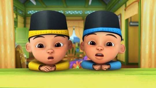

Hey everyone welcome back to my blog ! During my mid break, i have a task assigned by my lecturer which is called Upin Ipin Raya Challenge! At first i have lack of knowledge on using Adobe Photoshop. Believe it or not this is my first encounter using Photoshop. I got to admit that i am enjoying using PS and learning new skills on PS.
On top is the original picture of Upin Ipin that i need to crop. And below is the final result of my product. The concept of the picture is that i am having a feast for Hari Raya with Upin and Ipin. To make it look like Hari Raya situation i also have included some raya foods such as rendang, ketupat and some desserts to get the raya vibes.
Besides Upin and Ipin i also learn to crop the tables, the foods, the object placement and many more shortcuts that i could find on PS which before this i had no idea about how to use it.
0 notes
Photo


Hi everyone welcome back to my blog !
As we all know last week i have posted my sketches. But there are a few changes to my final font poster design after consulting with my lecturer as he mention that my sketch is too simple. So i sketch a new design and he likes it even better.
The first process of designing i need to recall back what i had learned during last week. First i need to do a few sketches to get a rough idea. This is because it will help me to choose on what type of font that is suitable for me to use for this font poster design. Next i started to create the design on AI. I started to choose the colour scheme available on Google for my design.
Here is my two final design that i have finalised. I have a hard time in choosing which design i should submit to my lecturer. The reason why is because for me both looks interesting. But finally i have decided to submit the blue design. This is because the colour tone has different contrast compared to the orange one. Even though the orange has a two tone colour but the colour range is almost identical.
0 notes
Photo


Hello everyone !
It’s been 5 week already since i have been an advertising student. Currently i have started doing the first assignment for the subject ADV451. For this first assignment i need to create a font poster. This assignment takes about two weeks to be submitted. The first week we need to submit our first sketches. The reason why we need to submit the sketches first is because to get the approval from our lecturer. In order for the poster to get approved we need to submit two sketches so that our lecturer would approved which one that he prefer.
Here are my idea for the sketches. The font that i’ll be using for this font poster is Hakuna Sans.
0 notes
Text
Bad Typography
In today’s blog review i would like to explain about bad typography. Typography plays an important role in marketing and advertising. This is because the typography must matched with the design of the product. The reason why it must matched the design is because it will attract the target audience or customers to be attracted and stimulate positive feelings towards the brand which will also enhance the brand of your business.
Here is two product that i had found around my surroundings which in my opinion have bad typography :
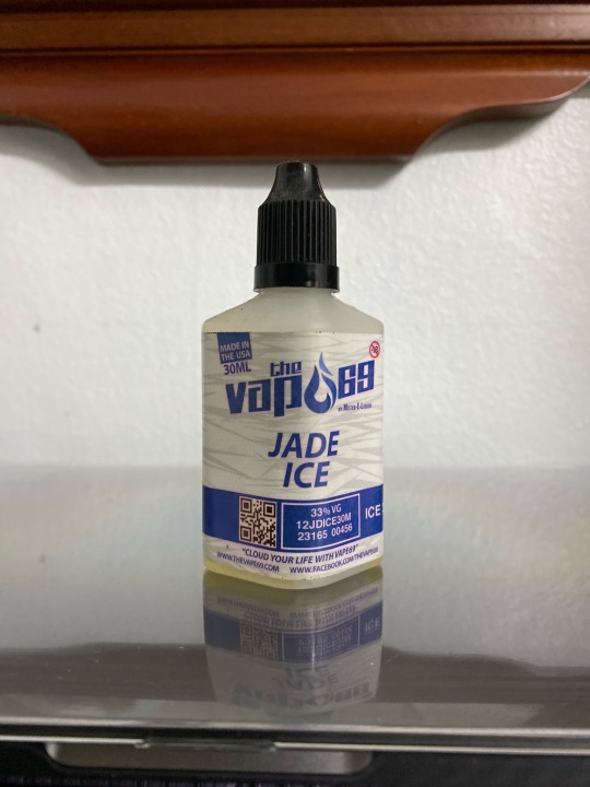
The first one that i found is a bottle of vape e-liquid. The reason why i think it has bad typography is because the font design of the packaging does not fully showed the brand name. The brand name is actually ‘The Vape 69′. If people doesn’t know about the brand they can misread the brand name that are stated on the bottle. For example, people will misread ‘The Vapo 69′ instead of the ‘The Vape 69′. For me this does not suits the design of the brand because it will make the consumer feel confused.
The second product that i found is a drink packaging. The reason why i think this drink packaging has bad typography is because the kerning of the font is close to each other. Next, the size of the font is also being mixed up.

0 notes
Photo

The movie poster that i have chosen for this post is 127 Hours. The movie was released on 2010. It was based on true story about a man going hiking and end up getting stuck between the stones of the mountain for 127 hours.
1. LINE
The small mountains below potrays line.
2. SHAPE
There are two big mountain stones in the movie poster. The two big stones shaped like a triangle.
3. SIZE
In the movie poster there are various shapes. There are small and large - size stone.
4. COLOR
In the movie poster uses a lot of colour to attract the audience. The element colour in the poster is contrast to each others element.
5. VALUE
The man in the poster who stucks between those two big stones is the main lead. In the movie focused the most on the man. So the value of the movie is based on the man.
6. TEXTURE
There are some texture on the big mountain stone.
0 notes
Photo


The local movie that i have chosen is Sangkar. This movie is released on 29 August 2019. The original movie poster potrays about mixed martial art in the Octagon. But the hidden message about this movie is about a friendship between two fighters. Hence it is the reason why i chose to sketch the handshake is because it potrays the relationship in the movie.
Next, the international movie that i have chose is The Call. This is a Korean movie that was lead by Park Shin-Hye, Jeon Jong-Seo and Lee El. It was released on Netflix. The genre of this movie is sci-fi / thriller. The reasons why i have the idea to sketch the old telephone is because the main lead communicating with the villain from the past through an old phone.
0 notes
Photo
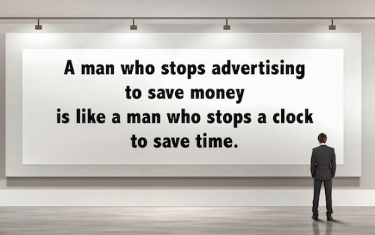
Henry Ford’s Quote Review
Since i’m on my second semester in UiTM Shah Alam majoring in Bachelor of Mass Communication (Hons.) in Advertising my first task for subject Advertising Art And Intelligent Design (ADV451) is to review a quote by the founder of Ford.
The meaning of Henry Ford’s quote it is impossible to save money in business by not investing money in advertising. In my opinion it will bring big losses to the company if not much exposure are given to the public. I also think that it is better to spend some money and effort on advertising rather than saving the money for no advertising at all, because by doing so it will automatically boost up your brand, sales and acknowledgment to your target audience and among people. So the conclusion is i think spending a little bit of money in advertising won’t bring any harm to your business.
0 notes
Photo

Here’s a lil sneak peak of Azim ;
Hello, my name is Ahmad Azim Bin Ahmad Azlan but most people call me Azim! I’m currently pursuing study in UiTM Shah Alam majoring in Advertising.
The purpose of this blog is to keep the thoughts and ideas of my advertising journey here as well as gaining new experience and knowledge!
Enjoy my blog content :)
1 note
·
View note