
My name is Ahmad Sobirin. Welcome to my blog! :) In this blog you will read about my opinion on things about advertising and also my journey of being an advertising student in UITM.
Don't wanna be here? Send us removal request.
Statistics
We looked inside some of the posts by ahmadsobirin00-blog and here's what we found interesting.
Average Info
Notes Per Post
2
Likes Per Post
2
Reblog Per Post
0
Reply Per Post
0
Time Between Posts
9 days
Number of Posts By Type
Text
5
Quote
1
Last Seen Tumblr Blogs


Fun Fact
Celebrities use Tumblr as well.
Text
Font Poster Design
Hi, so this week I had been assign to make the font poster design from my sketches in the previous post. So below is my first design before the consultation:

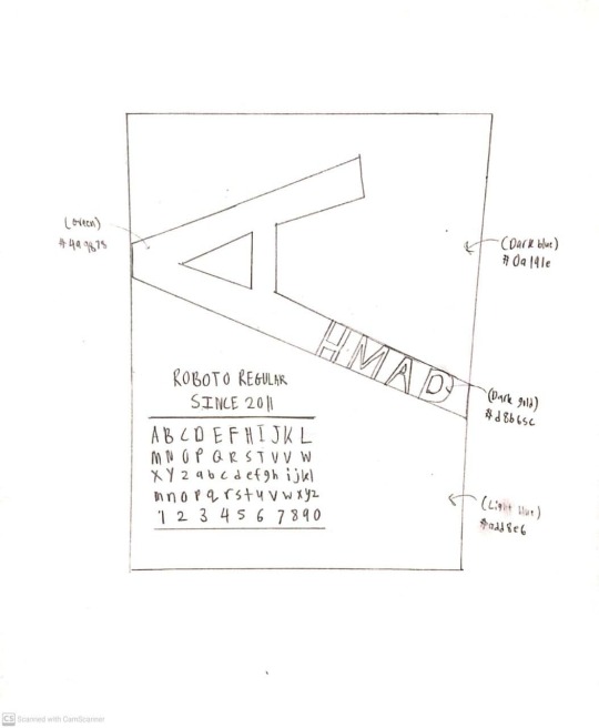
From the consultation, my lecturer advice to decrease the size of the font group, try other 3 color combination and amend ‘hmad’. So below is my final design after the consultation:

In this poster, I sue Century Gothic font. I use light green, light yellow and black as the 3 color combination. ‘a’ is the focal point so I use light green color to make it contra with those 3 color to make it more stand out. To be honest, I had no idea to amend the ‘hmed’ letter so I just adjust it as simple as that because for me it look more neat and well placed compared to my first design.
0 notes
Text
Font Poster Sketches.
Hi, for week 5 task i have to sketch 2 font poster which is part of my project assignment. These are my two sketches:

For the first font poster sketch, I use Century Gothic Regular font. For the background I use yellow color. The first letter I use green color so that it have color contra with the yellow color. Also I use dark blue color for the font description and also at ‘hmad’ letter. For me these 3 color have a good combination.
For the second skecht I use Roboto Regular font because it is a font that Youtube use. It is commonly use and familiar to many people. For the color I use 4 color combination. The background I use light blue and dark blue. For the ‘A’ letter I use green and ‘HMAD’ I use dark gold to look the contrast between the background so it is more stand out.
0 notes
Text
BAD TYPOGRAPHY
Hi, for this week task I have to search any 2 bad typography in my surrounding, so this is what I found that for me considered as bad typography:
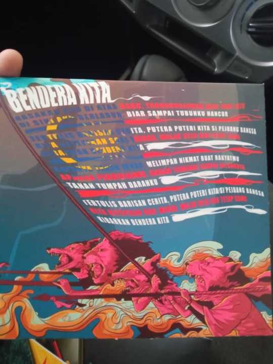
Picture above is from Hujan band latest physical album which is Pelangi dan Kau. Inside the album cover it have the lyric of all track in this album. Image above is one of the song lyric which is Bendera Kita song. For me the lyric is a bad typography in term of color. As we can see that there are so much color in the lyric and it is hard to read especially when it come to the blue, red and yellow color. The lyric design is really artful but for me when it come to lyric people prefer it to be readable rather than artful.

This is the second image that for me considered bad typography. This is a front cover of a novel which is Lelaki dari Entah Mana Mana. Written by Nami Cob Nobbler and Publish by Lejen Press. For me this front cover novel is kind of messy with the font that too fancy for me and make it hard to read. Also we can see that the writer name size is quiet the same as the title which is for me unnecessary because it make the front cover more messy. For me they can make it more minimalist so it look more tidy and easy to read.
0 notes
Text
ELEMENTS OF DESIGN.

This is Disko Senyap gig poster . It was organized by Alam Bunyian and held on 11 April 2021 at Ruang, Subang Jaya. It was an independent gig that take ‘silent disco’ concept which the performer perform with electronic set and surround with some visual effect. It is a live show and provide online live streaming too. The performer are local musician from hip-hop and independent arena. I think this poster have all 6 of the design element.
6 elements in this poster:
LINE
The white line in between the date and the time, also the live online platform and the price.
SHAPE
The bottom logo of TapauAsia with it circle shape. Also the disco ball in the middle with circle shape.
SIZE
The size of the ‘Disko Senyap’ typography and also the ‘disco ball with headphone’ is place in the middle and in big size use for the main attractor for the poster.
COLOR
The color of the gig name ‘Disko Senyap’ is colored black, white and blue and it look like sky color type which represent cloud as white, blue as blue sky and black as a night sky.
The white color for the performer name and the gig information is contrast from the background so it is easy to read.
VALUE
The contrast between the background texture with the gig title and information make it more appealing, easy to read the information given in the poster.
TEXTURE
This poster is using star texture in the background could represent this gig ambience or mood of music.
0 notes
Text
Minimalist Movie Poster.
Hi, this week I had given a task where I must draw 2 movie poster international and local but keep it minimalist. I did not have the talent or skill to draw but i am trying my best to sketch it and keep the minimalist theme.
For local movie poster I choose Ejen Ali The Movie. I choose this movie because it is one of the best animation film our local have created. Ejen Ali: The Movie is a 2019 Malaysian computer-animated spy-fi action film. The film follows teenage agent spy, Ejen Ali as he has to uncover a mystery technology that threatens the city of Cyberaya, and risking loyalty to his secret agency, MATA.
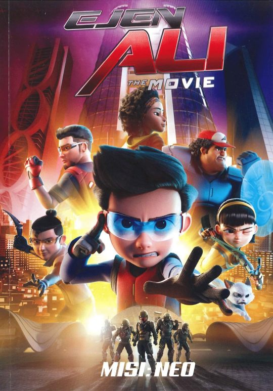
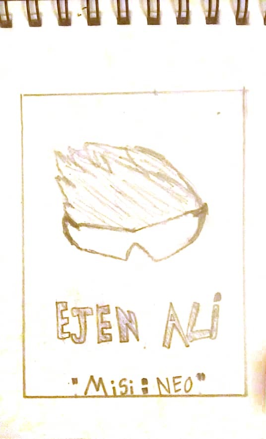
Above is the original poster and below is my sketch for the minimalist style poster. If you see the original poster there is so much going on and there is many character but in my poster it is just IRIS and Ali hair. I keep it that way because to highlight Ali which is the main protagonist in this movie . So it represent the main character itself. The Iris also represent the story itself because throughout the movie, Ali and other agent using Iris while fighting and the final fight Ali manage to override IRIS and gain special ability. So for me this poster might capture the movie as a whole although in a minimalist design.
Next for international movie, I choose Mid90s. Mid90s is a 2018 American coming-of-age comedy-drama film The movie set in 1990s Los Angeles, story about a 13-year-old spends his summer navigating between a troubled home life and a crew of new friends he meets at a skate shop. He then skate and socialize everyday with his friend but at the same time he got problem at home where his brother always bullied him and his mother is having affair with many men.
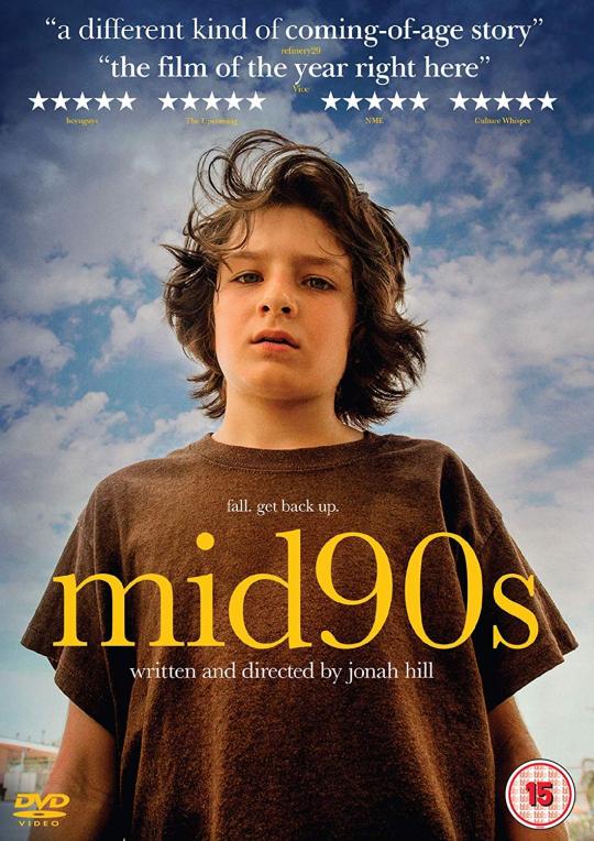

Above is the original poster and below is my sketch. The original poster itself for me is already minimalist so I did in a different style. The original highlight the main character which is the whole story is about him. So in my sketch, I highlight the skateboard that has been broken half. In this movie they highlight the skate culture in Los Angeles and throughout the movie, the character development for the main character is base on his skate friend and the skate culture itself. The skateboard is broken to half because it represent the pain of the main character because of the problem he had with his family and his mum did not want him to be friend with his skate friend anymore since they encourage him to start drinking and smoking. The road on left and right represent one of my favorite scene because of the scenery and cinematography. *Image below*

So that are my 2 sketch movie poster. I'm sorry because my sketch is really amateur - primary school level of sketching. It is my first time sketching a movie poster. I will try improve my skill time to time. That is all from me now. Thankyou.
0 notes
Quote
"A man who stops advertising to save money is like a man who stops a clock to save time."
Henry Ford
Base on my point of view about the quote above, the meaning of this quote is if a business stop or did not advertise their product to save money, the business is actually losing money then saving it. This is because advertising is one of the main factor for consumer to know about our product and it also a medium to persuade consumer to buy it.
The business will losing customer that might want to buy their product and losing opportunities to expend the business to another level. Even we can see that globally well known company such as McDonald, Apple even Ford had invested so much in their advertising to push sale on their product. This example shows that how important advertising is. If these internationally well known company invest so much in advertising, why would ‘a man think that stopping advertising can save money?’
So what I think the main point Henry Ford trying to said in this qoute is, when a business think that they should stop advertising to save money, the result is actually the opposite, same like a man thinking to stops a clock to same time. The action just not gonna work and did not even give you any changes or benefit.
2 notes
·
View notes