
Don't wanna be here? Send us removal request.
Statistics
We looked inside some of the posts by alexmartinuniblog-y2-tri2 and here's what we found interesting.
Average Info
Notes Per Post
0
Likes Per Post
0
Reblog Per Post
0
Reply Per Post
0
Time Between Posts
1 day
Number of Posts By Type
Text
10
Last Seen Tumblr Blogs


Fun Fact
Tumblr Inc. is funded by 13 investors.
Text


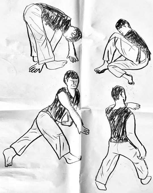
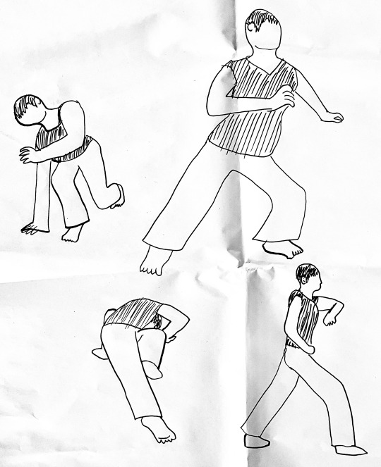
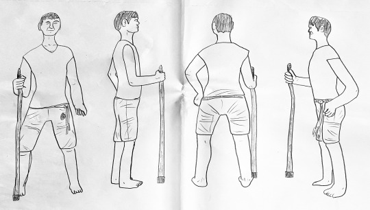
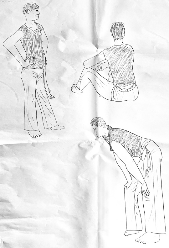
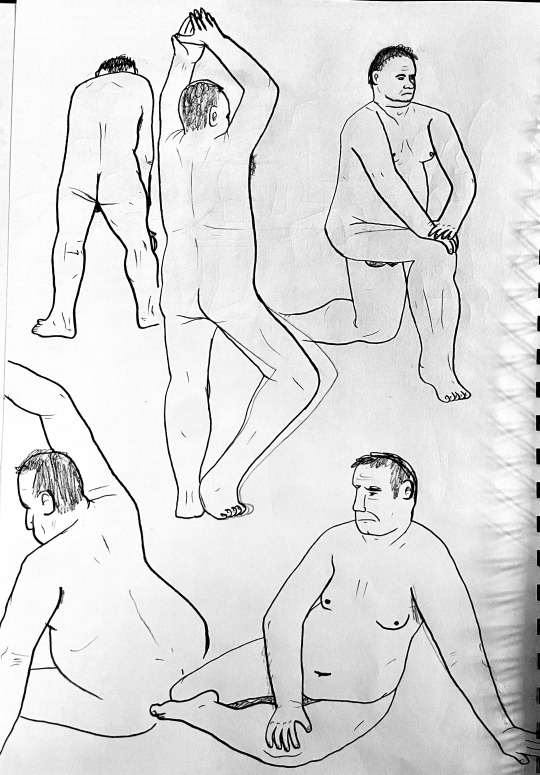

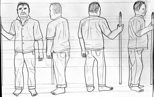
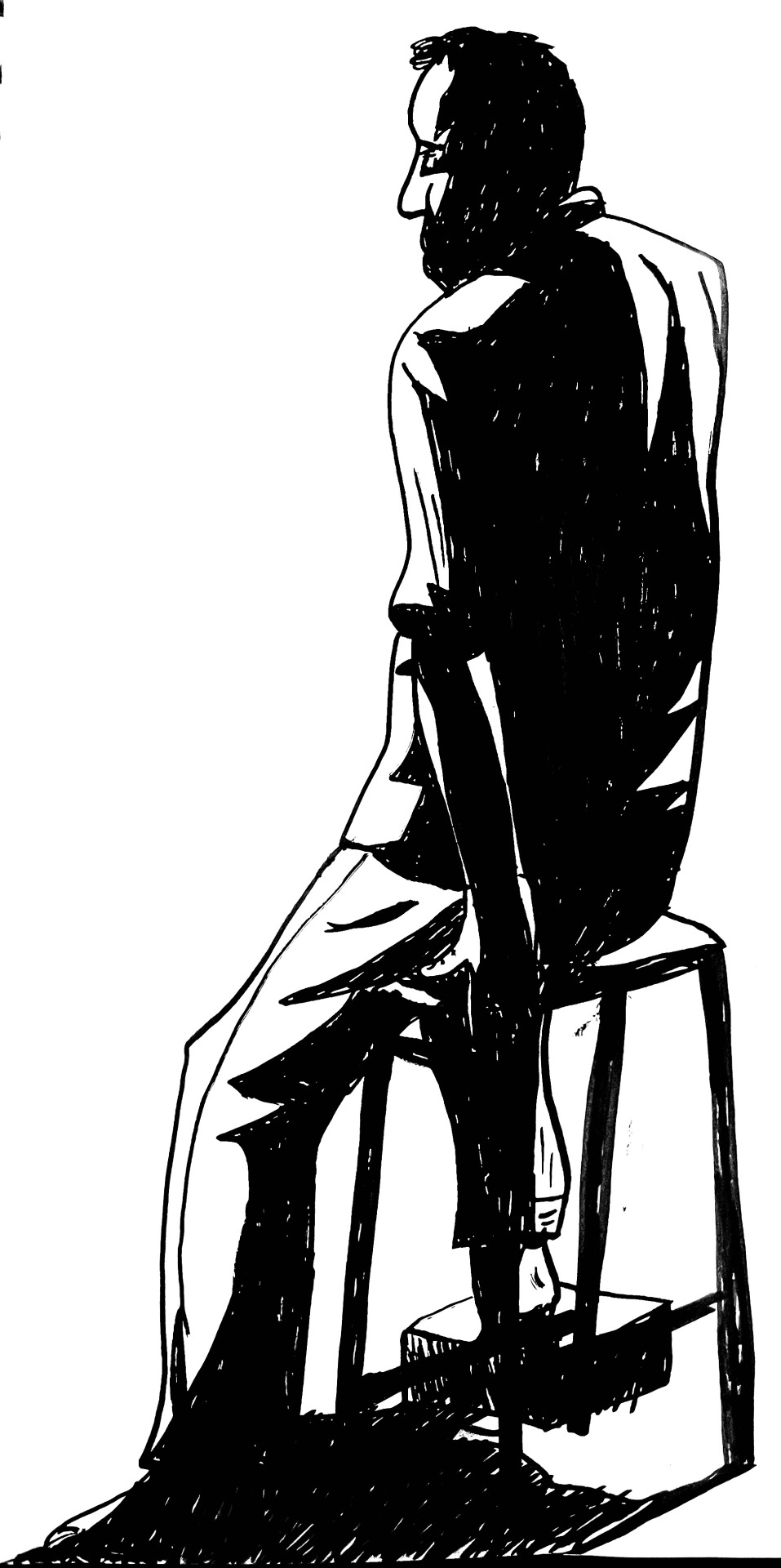
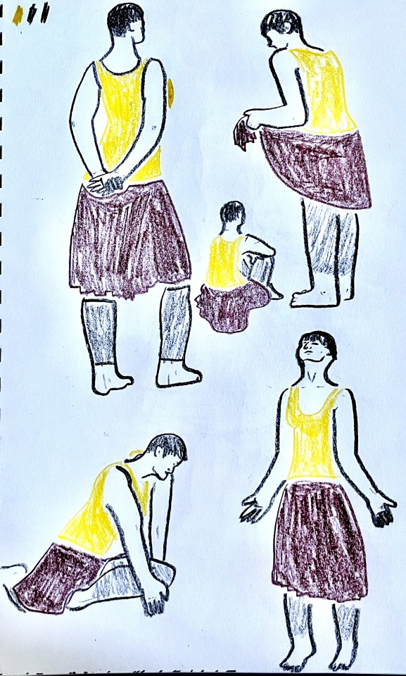
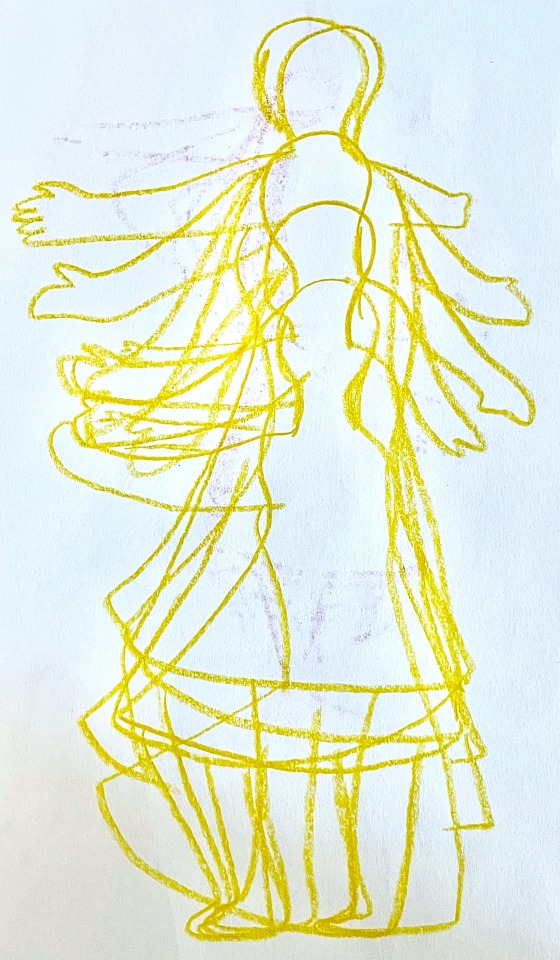


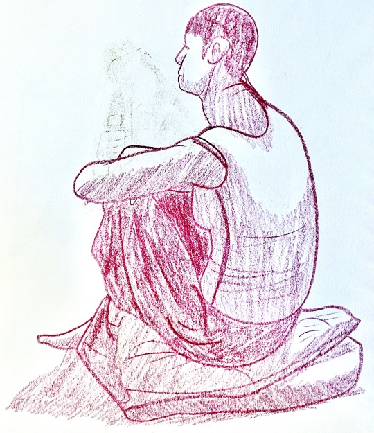


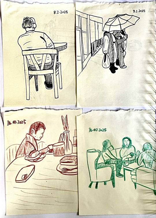
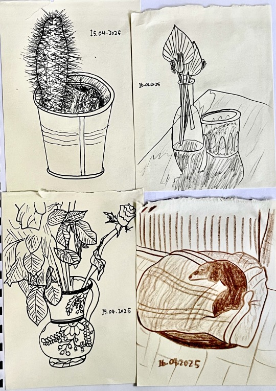
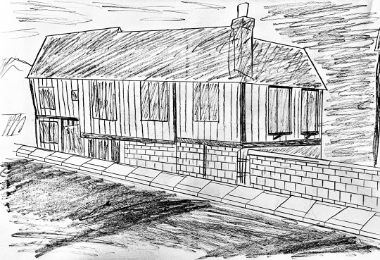

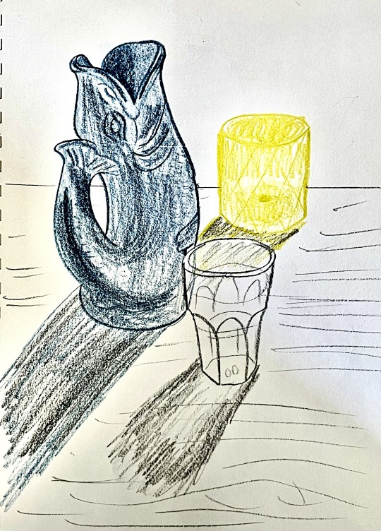
Animation Practice – Life Drawing/Observational Drawing
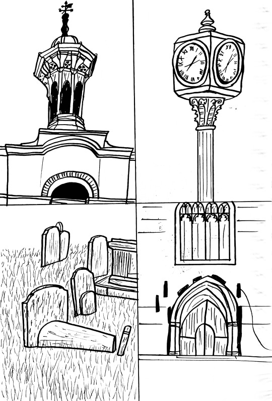
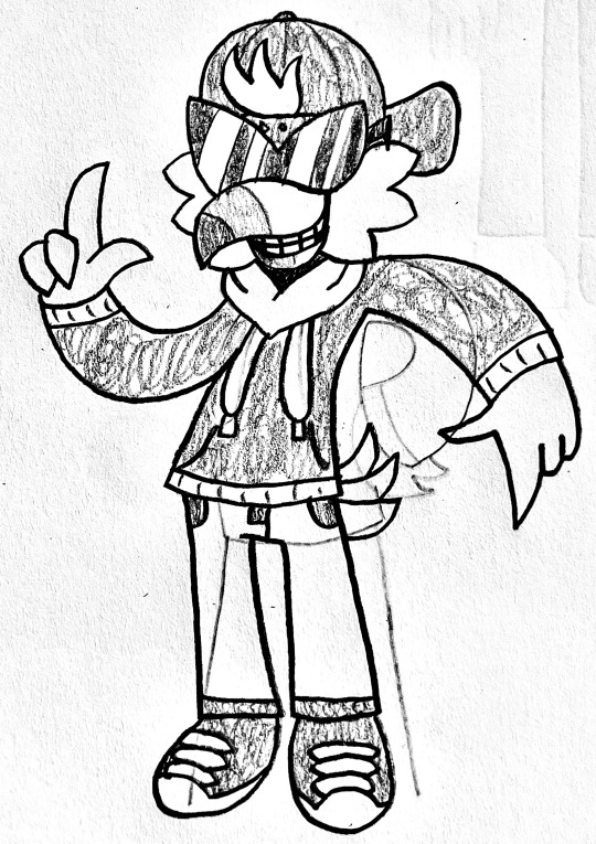
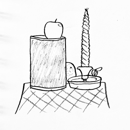
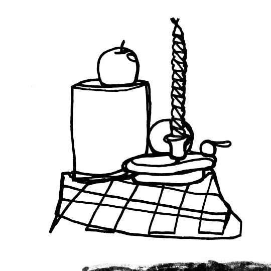
For the entire duration of this trimester, I was tasked with creating drawings from observation as well as attending life drawing sessions with models. I drew a variety of things such as nature, people, objects and structures, and from the model, I drew various still poses and in-motion poses as well as “character turnarounds” using the models as a reference.
While observational drawing has never quite been my strong suit, I feel as if this trimester has helped my skills improve. I explored various ways I could fill out pages, although I wish I had taken the time to experiment with more mediums and perhaps draw more of particular types of things such as structures. Overall, however, I am pleased with what I had accomplished in terms of observational drawing and life drawing.
0 notes
Text


Animation Practice – Weeks 7-12: Live Project
During the remaining weeks of this trimester, I was given the task of working with a team to create a 30-40 second animated advertisement for the Benton End House and Garden in Suffolk.
My team was given a theme to centre our work around, that being queer ecology, and submit our own pitches with concept art, a mood board and a storyboard to be chosen by the client. My own pitch, while it ultimately was not chosen, took influence from nature artists such as Ernst Haeckel, as well as nature-inspired floral and leaf wallpapers, motifs found in existing queer ecology posters and general illustrative LGBTQ+ advertisements. It centred around people of various backgrounds coming together in a room to watch as multiple wallpaper animals form a heart shape. I believe I could have done further research into the intricacies of queer ecology to get an idea of what I wanted to make, but I am still pleased with what I made.
I feel as if the pitch that ended up being chosen, created by another member of my team, does a far better job at conveying queer ecology in the simplest way possible. The ideas me and the team came up with involved a grassy field with a house and tree atop a hill, as well as simplistic flower characters gaining colour from pollen particles flowing smoothly in the wind. I was in charge of creating assets such as the tree, and I had an influence in the design and motion of the characters. I gave the characters a simple facial feature in the form of ovular eyes, and I decided the best way to animate them was to make their eyes move and blink, then use the wave warp tool in After Effects to make it look as though they are standing in place but being blown by the wind. I am somewhat pleased with the result, but I feel as though I could have taken the time to learn how to use the puppet tool in After Effects to make them move more dynamically.
0 notes
Text


Computer Generated Imagery – Weeks 7-12: 3D Character Creation
During the remaining six weeks of this trimester, I was tasked with creating a 3D character model in a 3D modelling program.
I decided to base my character design and model on video games and 3D renders of video game characters from the late 1990s and early 2000s, as well as modern indie games that take influence from that era of gaming. I wanted it to be aimed at young people who are getting to the age where they are feeling nostalgic for these kinds of games, and I felt it was necessary to get as close to accurately recreating those types of graphics as I could.
I repurposed a character I made for a previous game design course I partook in to make a 2D illustration, as well as a simplistic black and white turnaround to use as the basis for a low-poly model of the character. I based the 2D illustration on pre-rendered visuals seen in video game cutscenes and promotional material around my chosen era, and I intentionally wanted my model to be low poly in order to capture the appeal of those types of games and streamline the modelling and texturing process.
While the focus of the project was primarily on Maya, I decided to use Blender to make my character and renders as we had the option to use it instead of Maya, not to mention I have more experience with Blender compared to Maya. Some things I was able to achieve in Blender that I may not have been able to do in Maya were vertex painting to create fake shadows on the model, as well as a rendering technique to make the model appear as though it is being displayed and rendered in real time on consoles such as the PlayStation 1 and Nintendo 64. One thing I found challenging was rigging, as I created segmented body parts for the model making rigging almost impossible. I decided it was not worth it to rig the model, but I could have tried to in order to animate it. Two other things I could have done are create the final renders with sharper pixellated edges and use different colours for the fake shadows to make the model’s colours more vibrant.
0 notes
Text


Computer Generated Imagery – Weeks 1-6: A Tale in Three GIFs
During the first six weeks of this trimester, I was tasked with creating an adaptation of an existing fairytale in the form of three animated GIFs.
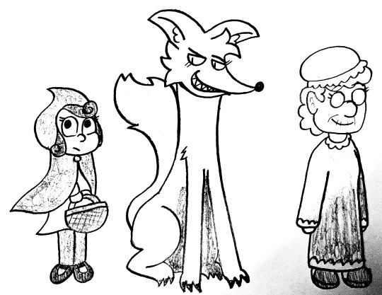
The fairytale I chose for this project was Little Red Riding Hood, as I felt I could create interesting enough character designs and tell the story through a somewhat unique lens. There are multiple different endings to the original fairytale, all written by different people throughout the centuries, but I figured that the original ending, written by Charles Perrault, would be more suitable for a darker-tone retelling of the story.
I then got to work creating a storyboard for the GIFs, starting with the girl encountering the wolf in the forest, then moving onto the girl finding the wolf in her grandmother’s bed disguised as her grandmother, and ending with the girl being eaten by the wolf. I devised an art style reminiscent of medieval artwork and Tim Burton-inspired visuals within three style frames, which is where I also decided which parts of the GIFs would be animated. Of course, I knew I had to figure out how to make high quality looping GIFs, so I created observational drawings of a rotating assortment of objects with different materials and arranged them in a looping GIF.
The final step of the project was the animation phase. The colour schemes I went with were balanced, mainly using warm and dark colours, but I decided to still keep them interesting using some cold colours like pink and blue. At first, I was not going to add finishing touches to the background and foreground, such as the forest, the cottage wallpaper, the vignette overlays and the leaves blowing in the wind, in fear of not having enough time to add them in, but I ultimately decided it was worth it to add them in. I am very pleased with the end results, but I think one thing I could have done differently is spend more time on the character designs. Another thing I could have done is try and stick closer to the medieval styles I was inspired by rather than slightly putting my own influence into the style.
0 notes
Text
Animation Practice - Concept Art Panorama Video
0 notes
Text


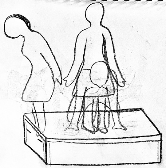
Animation Practice – Weeks 3-4: Concept Art Project
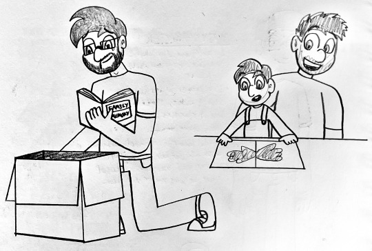
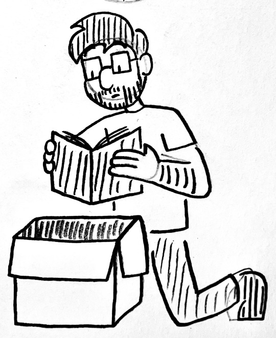
During the middle of my audio animation project, I was set another task where I had to create a piece of concept art with a camera pan based on my audio animation.
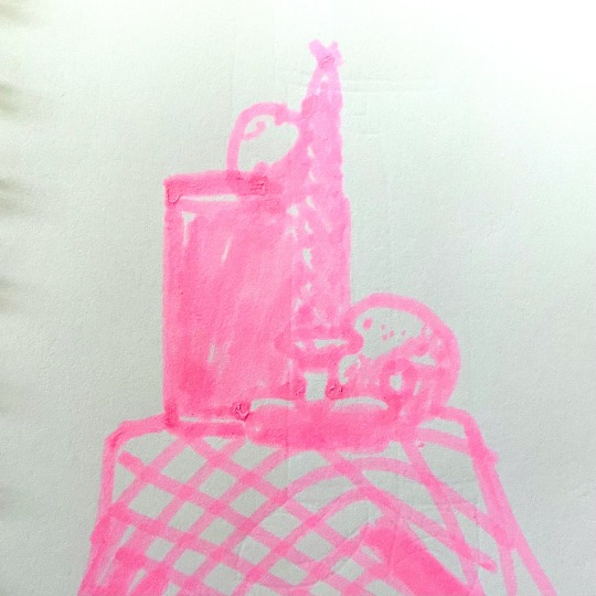
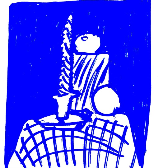
Seeing other examples of camera panning concept art, I knew it was not going to be easy to make one based on my audio animation with the style I chose for it. However, in the end I feel as if I did an alright job. I created simple assets for the background, cardboard boxes, the two central characters and a white watercolour-like border to allow the viewer to focus on the elements of the piece. I took slight influence from children’s drawings and attempted to imagine what an adult illustrator/cartoonist would draw if given the same materials and tasked with coming up with a simplistic style. I also took influence from a multitude of children’s books and television shows which have simplistic styles similar to the one I was going for.
One thing I could have done is add foreground elements and perhaps extra background elements to add more depth and liveliness to the scene. Another thing I could have done is spend more time on the elements I chose to create to make them slightly more detailed than they normally would be.
Final panorama video: https://www.tumblr.com/alexmartinuniblog-y2-tri2/780613757907959808/animation-practice-concept-art-panorama-video?source=share
0 notes
Text
Animation Practice - Audio Project Final Animation
0 notes
Text


Animation Practice – Weeks 1-6: Audio Project
During the first six weeks of this course, I was tasked with creating initial ideas for a 40-50 second contemporary audio animation based on an existing portrait.
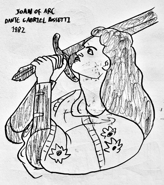
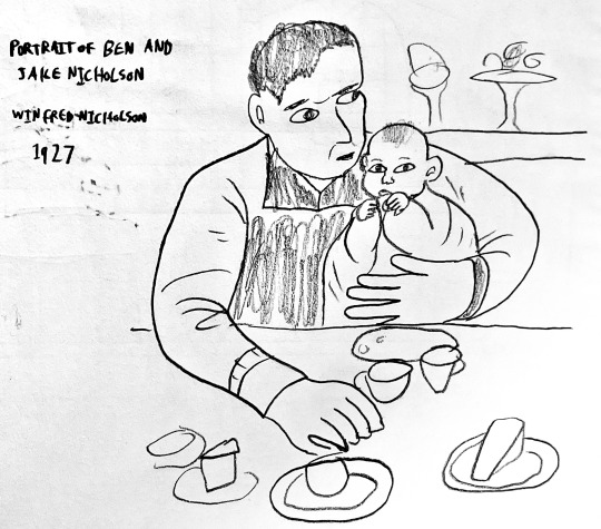
The first week involved visiting the Fitzwilliam Museum to choose a portrait which I would use as inspiration for my final animation. I took photos of various portraits I liked and created sketches of two that I wanted to choose between, those being ‘Joan of Arc’ painted by Dante Gabriel Rossetti in 1882, and ‘Portrait of Ben and Jake Nicholson’ painted by Winifred Nicholson 1927. For a while, I considered basing my animation on the former portrait, as I wanted to try and make an interesting contemporary character design based on the woman in the painting. However, I ultimately decided that it would be more suitable to base it on the latter portrait, as it would allow me to tell a much simpler and more personal story within the 40-50 second timeframe.
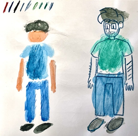
During the following week, I began conceptualising the synopsis as well as experimenting with the style I wanted my animation to be in using various materials such as coloured pencil and watercolour. The original portrait by Winifred Nicholson uses a muted colour scheme that evokes a dreamlike, nostalgic mood, and I figured the best way to replicate that feeling was to combine watercolour and pen/pencil to make it appear as if you are viewing the animation as a memory in one’s mind. I feel as if I could have done a better job with the physical experimentation by utilising more materials and techniques. However, considering that I wanted to produce the animation digitally, I feel as if creating digital experiments using tools that replicate those materials was a good call.
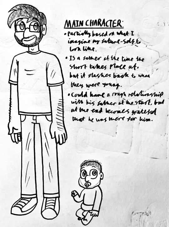
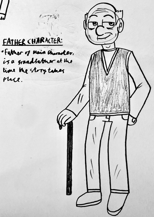
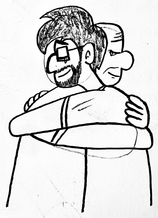
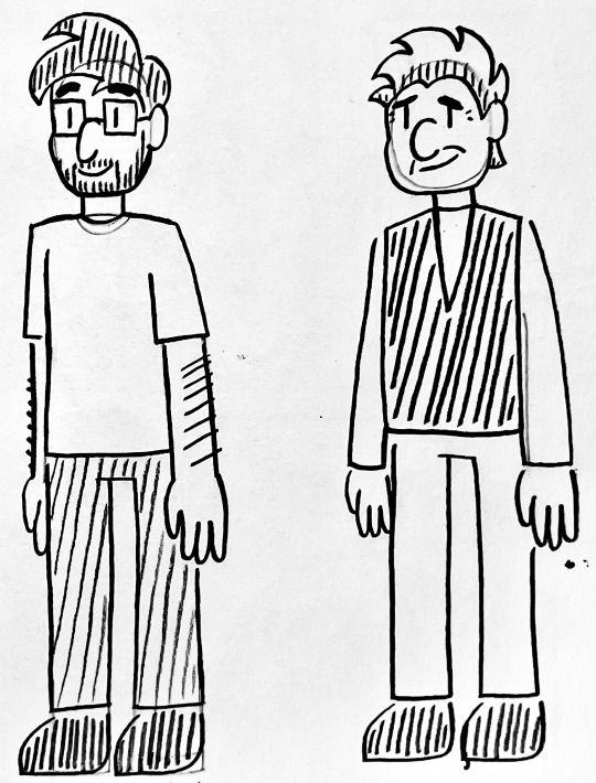
The next phase of the project was, of course, the animation. The film is titled ‘Reminisce’, and the story follows a married man moving out of his old home, who uncovers a scrapbook of family memories after his wedding ring slips from his finger. He is taken back to a time when he was young, sitting at a breakfast table and being fed by an ambiguous parental figure. He is transported back to the present when the hand of his father touches his shoulder. He shows his father a photo of the moment he was taken back to, and the two embrace for a hug. The final shot is a zoom-in of the photo the man was looking at, revealing the parental figure to be his father.
I wanted to tell this story because not only did I want to pay tribute to the portrait, but I feel as if I am at a point in my life where I seriously appreciate my parents and everything they did for me growing up. I wanted to properly portray the emotions that come with looking back at my childhood memories featuring them, and I would say I did that well. However, I feel as though I could have had more time to polish up the animation and add additional keyframes to make it a lot smoother. Another thing I could have done is record my own sound effects and make my own music for the film, rather than using royalty free music and sound effects from the internet.
Animatic: https://www.tumblr.com/alexmartinuniblog-y2-tri2/780458095087403008/animation-practice-audio-project-animatic?source=share
Final Animation: https://www.tumblr.com/alexmartinuniblog-y2-tri2/780613476086382592/animatio-practice-audio-project-final-animation?source=share
0 notes