
Statistics
We looked inside some of the posts by anacoding and here's what we found interesting.
Average Info
Notes Per Post
0
Likes Per Post
0
Reblog Per Post
0
Reply Per Post
0
Time Between Posts
2 hours
Number of Posts By Type
Text
17
Last Seen Tumblr Blogs


Fun Fact
Kazakhstan’s Minister of Communications and Informatics has blocked the Tumblr site because it contained 60 sites of terrorism, extremism, and pornography in 2015.
Text
Final Submission + Exhibition
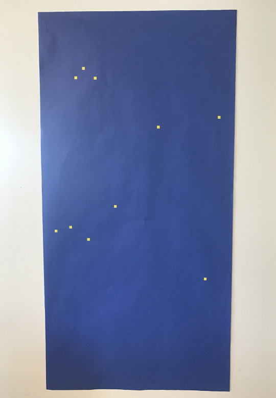
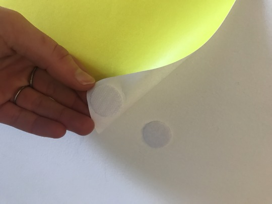
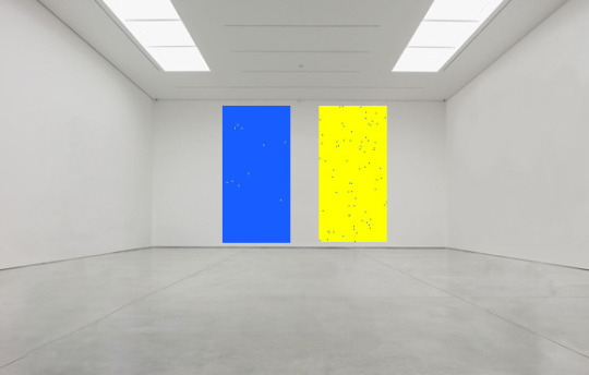
This is the final outcome of my ‘Pakeha VS. Maori’ prints as showcased in the space during our exhibition. I am very pleased with the result as I feel it encapsulates many factors I wanted to achieve with it; scale and contrast, data visualisation, a clear link with my artist precedents + research and the bridging of the gap between the world of code and the world of fine arts/design in my own twist. It’s stark and simple nature is powerful and engaging to viewers. I hung the prints side by side on the wall to show the comparable data, with removable Velcro stickers, and alongside my purpose statement for the works. How it has been showcased looks alike to how it would be presented in context; in a gallery as a piece of fine art.


Entourage
0 notes
Text
Purpose Statement
This is the statement that will also run alongside my prints during the exhibition. The purpose of doing this is to position it as fine art piece seen within the gallery, this being the works description to inform my viewers/audience the who/what/why behind the context of the prints.
Pakeha VS. Maori
‘Pakeha VS. Maori’ is a visual representation of the incarceration rate of Pakeha, or NZ European, vs. Maori by the end of the year 2016. In 2016, 3,478,000 of Aotearoa’s 4.7 million population identified as NZ European, or 74% of the total population. Of the 4.7 million, 700,300 individuals identified with the Maori ethnicity, or 14.9% of the total. At the end of 2016, 3197 individuals who identified as NZ European had been incarcerated vs. 5060 individuals who identified as Maori. Of the total population of Maori, 0.7% were imprisoned vs only 0.09% of the total population of NZ European. ‘Pakeha VS. Maori’ highlights the racial disparity and injustice within our Justice system by utilising these figures, the squares representative of these percentages of each ethnicity in prison, comparable to their total population size. The colours and pattern are a link to the chequered pattern or Sillitoe Tartan/Battenburg markings that adorned the side of NZ’s police cars and uniforms, a link to our crime sector and imprisonment rate. The stark nature of this pieces design and inversion of colours is to highlight the powerful social commentary on NZ’s inherent racism within society and further into our injustice system. This is a fine art piece reflection based on our generalised views of what ‘black vs. white’ is.
0 notes
Text
Final Code
This is my final code for both print outputs. I will print each to an A0 scale and at Ink in Wellington:
NZ European/Pakeha
void setup() { size(300, 600); beginRecord(PDF, "euro5.pdf"); background(24,93,255);
import processing.pdf.*;
float squaresize = 0.007;
//0.007=pop. of incarcerated maori as decimal (0.7%) float percent = 0.0009;
float percentarea = width*height*percent;
float squarearea = (height*squaresize)*(height*squaresize);
for(int i = 0; i < percentarea/squarearea; i++){ fill(255,255,0); noStroke(); int x = int(random(width)); int y = int(random(height)); rect(x, y, height*squaresize, height*squaresize);
} }
void draw() {
}
void keyPressed() { if (key== 'Q') { endRecord(); exit(); }
//width*height*0.007 // divided by //(height*0.007)*(height*0.007) //= amount of squares }
Maori
void setup() { size(300, 600); beginRecord(PDF, "maori5.pdf"); background(255,255,0);
import processing.pdf.*;
float squaresize = 0.007;
//0.007=pop. of incarcerated maori as decimal (0.7%) float percent = 0.007;
float percentarea = width*height*percent;
float squarearea = (height*squaresize)*(height*squaresize);
for(int i = 0; i < percentarea/squarearea; i++){ fill(24,93,255); noStroke(); int x = int(random(width)); int y = int(random(height)); rect(x, y, height*squaresize, height*squaresize);
} }
void draw() {
}
void keyPressed() { if (key== 'Q') { endRecord(); exit(); }
//width*height*0.007 // divided by //(height*0.007)*(height*0.007) //= amount of squares }
Due to the Random Position Generator code, this meant whatever physical print output i chose to display, this would be 1 of 1,000,000 possible outcomes. I ran approx 10+ sketches and chose my favourite two outcomes of both data sets that I felt further communicated the context of my prints, and showcased my artist precedents accordingly. These were the chosen two finals:
NZ EUROPEAN/PAKEHA

MAORI

0 notes
Text
Refinement of Input Variables to Output
To further refine my prints, I decide to refine the colour of the yellow and blue I have used in the print tests to this point. After looking into the imagery of the NZ Police vehicles, I used the ‘Adobe Kuler: Colour Wheel’ to accurately pinpoint the RGB most similar to those depicted in my research to make as accurate a relationship between the chequered pattern and my prints. The original yellow was accurate so this remained the same. The blue was changed, and I did this a few tones lighter than seen on the research images because when printed CMYK this would darken a few tones.


Thinking into the message I was concerned with showing in these prints, the racial injustice within the crime sector and the reflection of society’s inherent racism and treatment of Maori compared to Pakeha, I decided to reflect these generalised views of ‘black n’ white’ as the data conveys. I chose to invert the colours of the Maori print. The background now yellow, the squares blue. By doing this, the principle of contrast is heightened phenomenally, and the message even clearer to be consumed. Side by side, this holds stark and strong impact. This was a successful decision and change.

0 notes
Text
Further Refinement: Scaled Printing
After thinking of how to refine my print(s) further, I considered playing with the idea of proportional printing + scale i.e printing the NZ European sketch proportional to its population size and thus the Maori sketch proportional comparably. Considering what sizes I had accessible to print these sketches physically and considering scale was of key concern for myself, A0 was the best starting point.

NZ Europeans accounted for 74% of the total population, thus the scale of this print had to be to about ¼ less than the size of an A0 if A0 was to represent the total population size. By this relation, 14.9% accounted for the population of Maori, which to the scale of A0 was about relational to the size of an A3. A3= 12.5% of an A0.

Scaling the Maori print down meant that the area the squares took up would look significantly smaller to the area/size of the NZ Euro print squares, which would sit just under an A0 size. Considering this, I multiplied the NZ Euro float sqauresize of 0.007 x 0.125 (12.5%) = 0.000875 (this was the new float sqauresize) to make the size of the squares the same scale size of the Maori square scale size.

This was the result.

Although the ratio of yellow to blue has remained the same and representative of the percentage of data, the surface area of the squares has been split into more and smaller squares. By this result, the print looks to visually communicate the opposite of what the message is about behind this print. It visually argues more NZ Euro’s are incarcerated to Maori even though it remains mathematically correct.
Due to this occurring, and the visual contrast of my prints being key to communicating the racial injustice within the crime sector, I decided to abandon this idea and print both at the same scale on A0. A0 for chosen most impact and scale.
0 notes
Text
Entourage/Context Images
Thinking back to the brief of this project, a design principle had to drive our final creative output. I can say confidently at this stage Scale and Contrast are the key principles that will make my print and the context behind it successful. In any space, scale is key to how my print will hold impact. The bigger it is, the more impact it will hold when understood. Exaggerating scale will be key for me, and thus hold stronger representation of population sizes.
Contrast is also key in my print. Contrast highlights the disproportion in size and incarceration rate between my two visual statistic prints, highlighting the racial disparity between Maori and NZ European. I’ve done this through size of my inputs. Contrast also plays a part in the use of colour and its influence of the chequered police pattern. This form of contrast is what makes my prints stark, bold and graphically impactful- key to my message and to its scale.
Considering these factors, this is how my print would appear physically outputted: Entourage
Gallery Space: Fine Art Print/Exhibition (Link to strengths/focus display of mine)


Advertising Screens/Bus Shelters (Putting message across to public)

Streets

Installation on Police Building

0 notes
Text
Interim Deliveries + Test Ouputs
Unfortunately I was unable to attend this class due to a hospital appointment. Nonetheless I still looked into the process of exporting my print for printing as a PDF. Looking into this tutorial; Processing to Illustrator: Exporting a Vector Based PDF From Your Sketch (https://www.youtube.com/watch?time_continue=157&v=54a01rdjB0A) I was able to export my print by adding this code: BeginRecord(PDF, "maori.pdf"); import processing.pdf.*;
void keyPressed() {
if (key== 'Q') {
endRecord();
exit();
}
When the sketch is played, at any point I press “Q” the sketch stopes, closes and saves a PDF titled “maori.pdf” (or whatever I want to save it as). Using this, I can then place into illustrator and size accordingly to a poster format, and then send to be printed physically.
0 notes
Text
Further Exploration and Refinement
After many test trials of figuring out the correct formatting of my code to reflect my figures, here are the two correct sketches: NZ European


(Should state *incarcerated NZ Euro’s not Maori in line 7)

Maori


I used the standard RGB of yellow and blue for my colours to reflect the NZ Police chequered vehicle patterns. Due to the Random Position Generator code, this has created a far more interesting output. The percentage of each ethnicity is scattered about in squares, referencing the chequered vehicle patterns, while holding a stronger visual impact and accurate visual representation of the figures at hand by ratio. The Random Position Generator code also means that every time the sketch is played, the resulting output of the positioning of the squares is different every time. To the naked eye, this visual representation of data might not draw a clear relationship to input and output, but this is key to what I wanted to achieve in my generative art. Stark ambiguity that holds impact when not understood on first impressions, a want to know more, and further impact and realisation when read/explained on 2nd and 3rd impressions. This is the power of modern and contemporary art; the impact of ambiguity and abstraction of known sources and figures, which is key to my fine art and design practices. What is the meaning behind the content? Here, it is a bridge of code to fine art; a post Internet discipline.
0 notes
Text
Data Exploration and Development
To reference without direct copying the chequered pattern and to move my variables from isolation at the bottom of my canvas, I looked up a Random Position Generator code;
void draw(){
fill( random(255), random(255), random(255) );
noStroke();
int x = int(random(width));
int y = int(random(height));
if( get(x,y) == color(0) ){
ellipse( x, y, 5, 5);
}

Taking this source code, I implemented it into my existing code and changed the variables relative to my figures.
These were the varied results;
Test One


This test run seemed to indicate that there is a higher percentage of NZ Euro’s incarcerated to Maori. This was on the basis of the Euro sketch still running its numbers of 0.0009 relative to a percentage of 0.007, thus indicating a greater number. Test Two


The same output occurred on my second test run. I needed to change how the float values reacted to the surface area of the background to the ratio of the surface area of the squares.
Test Three


This test preempted far better and representational results. The main factor that still hindered this code was that if the square size/height/width + heigh/width of it as whole was to be changed, this would throw out the ratio of ‘blue to yellow’ and lack correct representation of the percentages. I needed to correct this relational representations so that if the areas were changed, the ratio would still be of a correct respectable output true to the stats.
It took me a lot of playing around to get the correct representation using the Random Position Generator Code. All these are failed outputs, but pushed me to rewrite and figure out my mistake. All in all, processed development.
0 notes
Text
Further Inspiration
After experimenting with my first test input variables, I realised I hadn’t a strong connection between what my data is about and what I want its aesthetic output to be. I decided to research further into key symbols or signifiers of the Ministry of Justice and Crime Sector. We tend to link racial injustice within the crime sector with police brutality or the key people involved with the “protection of our people” and discovered their use of the checkerboard print or Sillitoe Tartan pattern known as dicing.
The pattern is originally associated with the police in Scotland, but which later spread to Australia, New Zealand, and the rest of the United Kingdom. Sillitoe Tartan may be composed of several different colours and number of rows depending on local custom, but when incorporated into uniforms, or vehicle livery, serves to uniquely identify emergency services personnel to the public.
“General law enforcement in New Zealand is the responsibility of the country's national police service. The New Zealand Police wear a blue uniform, similar in colour to those found in Australia, and share the same three-row Sillitoe Tartan of blue and white. The pattern is also borne across stab vests and elsewhere. Unlike their Australian counterparts, New Zealand police vehicles do not display Sillitoe Tartan markings, but instead are usually marked with Battenberg markings.”


I then explored Battenberg markings, a pattern of high-visibility markings used primarily on the sides of emergency service vehicles. The New Zealand Police use yellow/blue Battenburg markings on some vehicles. Until October 2008 general duties vehicles were marked in orange and blue, with yellow and blue for highway patrol units; orange and blue was phased out in 2014.


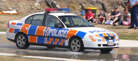
Most people connotate NZ police to the distinct and iconic yellow and blue that adorned our police vehicles. This chequered pattern and use of colour I will explore in my tests of my variables and print outputs showing a clearer relation to data and artist model influence.
0 notes
Text
First Test Inputs + Outputs
Looking at my artist influences, this is a simple sketch I’ve drawn up for how I want my output data to look. Almost mathematical, structured graphically to reflect visually the comparative difference relative top population sizes.

Running with the figures I calculated in 2016, I have created these very basic sketches in black and white in Processing. Both float values are the percentages I have calculated, turned to decimal. The size is a setup that is aesthetically pleasing to my demands as the percentage outcome will always be relatively to the size of the canvas and thus remain representative to each population.


NZ Europeans:
void setup() {
size(300, 600);
background(255,255,255);
float percent = 0.0009;
fill(0,0,0);
noStroke();
rect(0, height-height*percent, width, height*percent);
}
void draw() {
}


Maori:
void setup() {
size(300, 600);
background(255,255,255);
float percent = 0.007;
fill(0,0,0);
noStroke();
rect(0, height-height*percent, width, height*percent);
}
void draw() {
}
As seen, both outputs are very empty and lack showing the distinct difference in percentages of Pakeha vs Maori and do not succeed my idealised and perceived output of my sketch. I will investigate further to explore a more creative and impactful output that combines artist influence and visual effect.
0 notes
Text
Further Input Data Research
I have decided I want to create two comparable prints; Pakeha vs Maori to highlight the racial injustice of the crime sector. To do this, I will take the total number of people who identify as NZ European and those who identify of the Maori ethnicity. I will then take the number of each of those ethnicities, and divide their respectable prison populations by this total figure to gain what percentage of each ethnicity are imprisoned. I will then create a print(s) that highlights this percentage difference to the total.
After looking into census data and demographic figures of NZ, I am only provided with figures from 2016, and the 2013, 2006 and 2001 census’. The Ministry of Justice only provides prison population figures as far back as March 2012. Due to this limited offering of data available on my focus, I purely looked into the year of 2016 and 2013.
Here is what I calculated for 2013:

To calculate the number of individuals who identified of the ethnicity of NZ European and Maori as of 2013, I used the 2013 Census provided by NZ Stats.


Here is what I calculated for 2016:

To calculate the number of individuals who identified of the ethnicity of NZ European and Maori as of 2016, I used the Wikipedia page, ‘Demographics of New Zealand’.


Although our total population has increased in the past 3 years and resultantly the figures of both NZ Europeans and Maori ethnicities, and the number of each ethnicity’s incarceration rate, this has done so respectively. By result the percentage of those incarcerated for both parties remains (rounded) the same. This is due to such a small time period between each sets of figures. Due to this, I will create two comparable prints based solely on the 2016 figures to highlight the racial disparity of our society that still exists to such recent months. Recent and relevant.
0 notes
Text
Workflow
Example Print Workflow Input temperature data from thermometer > Generate imagery in Processing > Export PDF from Processing > Print PDF > Mount print onto foam-core board
My Workflow Decide Conviction Data statistics > Input data into Processing > Export PDF of Print from Processing > Scale to appropriate size in Illustrator > Print at Chosen Printers > Hang/Assemble in space.
After looking through the Conviction Data Statistics available, I have decided to look into the Prison Population Snapshot tab. Within this space I can explore stats of prison populations from March 2012-December 2016, any gender, any sentence, any ethnicity, and more. Initially I chose to explore the racial injustice within the crime sector. I will keep to this, and explore the disparity and incarceration rate of NZ Pakeha (European) to Maori in our prisons. I want to highlight our inherent racism that is prevalent within our social circles, society and government of the indigenous people of Aotearoa and considering they are our country’s largest minority. This print will be a message of awareness surrounding this issue.
Concept: Incarceration Rate of Maori to Pakeha Input: Data records of prison populations based on ethnicity. Need to decide what period of time. Output: Physical print, likely of a poster format.
0 notes
Text
Coding Artists and Artist Models
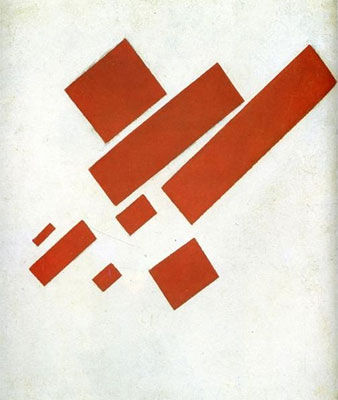
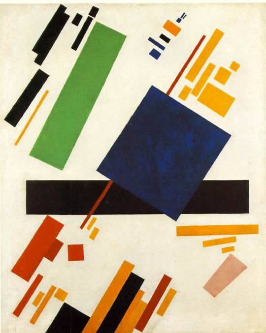
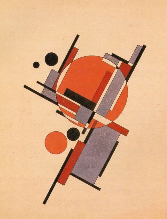
Looking into artist precedents and models for inspiration on how to approach the aesthetic I want my print to undertake I looked toward the coding artists Casey Reas and Rafaël Rozendaal and the modernist movements of Suprematism + Constructivism. For myself, simple graphics from the use of bold shapes, lines, colours and symbols, the whole, “less is more” precedent, is a key foundation within my creative practice. These artists successfully implement such an approach.
Casey Reas is an artist whose conceptual, procedural and minimal art works explore ideas through the contemporary lens of software. Reas is best known for having created, with Ben Fry, the Processing programming language, a natural suit for myself using Processing. Reas's software generated images derive from short text instructions explaining processes that define a network of actions. The instructions are expressed in different media including natural language, machine code, and computer simulations, resulting in both dynamic and static images. Each translation reveals a different perspective on the process and combines with the others to produce continually evolving visual traces (Wikipedia).
Reas’ process of natural language than manipulated into dynamic images through the use of simple shapes, colour and random generations is what I want to explore in my own work. The act of simplicity in colour, shape and form speaking levels. Reas’s works almost remind me of Pixel art, these featured below in particular, another form of computer generated art methods.

AYFABTU (Followers 1K) 2015 Custom software (silent, color), digital images, computer, screen Dimensions variable, portrait

RGB-056-006-080-823-715 2015 Lithograph on paper 25 × 21.5 in / 63.5 × 54.6 cm Edition of 14, 1 BAT, 1 AP, 1 PP
Rafaël Rozendaal is a visual artist who “uses the internet as his canvas.” Rozendaal’s artistic practice is most well known for his moving images and websites. His work is described as: “researching the screen as a pictorial space, reverse engineering reality into condensed bits, in a space somewhere between animated cartoons and paintings. His installations involve moving light and reflections, taking online works and transforming them into spatial experiences.” I enjoy the graphic simplicity and qualities Rozendaal employs into his work through the use of code as his tool. The works stand on their own, strong and bold yet carefully crafted and considered to create impact upon the viewer. They resonate with you. The interactive and moving images make his works playful and humorous, taking you into a new space of extension and exploration. These elements of resonation and simplicity of graphically bold forms I want to implement into my own work. These are a select few of Rozendaal’s works that reflect what I am inspired by;
Websites: http://www.nearnext.com/ http://www.newoldhotcold.com/ http://www.thisthatnow.com/ http://www.everythingalwayseverywhere.com/
Exhibitions:

COMPLEX COMPUTATIONAL COMPOSITIONS RAFAËL ROZENDAAL UPSTREAM GALLERY AMSTERDAM 3 SEP – 8 OCT 2016 Photos by Gert Jan van Rooij


Abstract Browsing RAFAËL ROZENDAAL Steve Turner, Los Angeles January 9 – February 6, 2016


Anti Social RAFAËL ROZENDAAL Postmasters NYC 2017
Suprematism + Constructivism are both modernist art movements of the early 20th century. Both movements of the time were revolutionary, focusing on abstraction through bold graphics, and constructive elements. To each art movement I will take inspiration, implementing their processes of simplified abstraction for representing ‘data’ and their use of bold shapes and lines that were juxtaposed, layered, aligned and constructed to create organised chaos or randomness. These movements also draw my bridge between fine arts and coding.

0 notes
Text
Output Processes
The output of a print with this type of data input holds a possible range of possibilities. This includes posters, stickers, cards (business, post, celebrations etc) wrapping paper, book covers, gallery prints, calendars, signage, billboards,etc.
These formats provide the opportunity to take directly what you have produced on screen to a 2D physical format that can interact with objects and spaces around you. Prints are an additive process, highlighting or accessorising what is already there and can be implemented in a number of everyday interactive scenes. Prints are a key format to data visualisation, which I will be exploring in my final work. Prints are limited by their inherent 2D nature however dependent on how you want the print to interact with its surroundings, often only being seen on flat surfaces.
Less traditional prints also include embroidery, vinyl, printmaking, drawing etc.
To achieve these prints there are a range of possible software to generate the code I will be inputting. I will be using Processing for my print as Processing provides the opportunity for me to control my variables inputted, create simple yet bold pieces and draw the connection between my practice within fine arts and design. Processing is a “flexible software sketchbook and a language for learning how to code within the context of the visual arts,” (Processing) perfect for drawing the lines between code as an art medium and form.
In common sense, the hardware required for producing such prints will include, laser printing, large format printing, scanning, and vinyl cutting. In Wellington, such industrial based printers can be sourced at;
Ink: http://inkdigital.co.nz/ Reigers: http://www.riegers.co.nz/ Big Picture: https://thebigpic.co.nz/
0 notes
Text
Sourcing Input Variables
To create a print based coded artwork there are a range of possible inputs and outputs I could undertake. There is a wealth of variables at my fingertips and the task at hand is rather ambiguous; it is down to how I want to interpret and approach my work flow. To help narrow down my breadth of possible options, I have looked into the “Github repo – NZ data sources” as provided on the Massey 1st Year Code page.


Thinking back to what I enjoy creating in my own works, many of my pieces lie around simple yet strong messages. I am a strong advocator of providing awareness and platforms around a number of issues that face minorities and disparities, allowing people to step back and rethink many predispositions they may have held on the topic or issue at hand. To affront such viewpoints, I look towards sharing works of bold yet memorable content that is ambiguous in its overall nature but is clear in its message when its purpose/statement is explained/read. Thinking back to the term data visualisation, “any techniques or effects to help individuals understand the significance of data by encoding it in a visual context,” this will be a key concern of my approaches/final outputs.
Taking all these factors into consideration, I have decided I will look into the Ministry of Justice- Conviction Data statistics as provided by Github, and the criminal justice system and how it is rife with racial disparity and injustice, especially in a New Zealand context that many New Zealander’s are ignorant too. What aspect within this area of I am unsure to yet.

0 notes
Text
Key Terms
Generative: Generative art is the practice of creating generative graphics for print, video and web that using in whole or part a programming language/an autonomous system. Generative art, is an emerging technique where print or onscreen images are created by use of computer algorithms, finding the artistic intersection between programming, computer graphics, and individual expression (Zenbullets). An autonomous system in this context is generally one that is computer based and can independently determine features of an artwork that would otherwise require decisions made directly by the artist (Wikipedia).
Parametric: Parametric design is a process based on algorithmic thinking that enables the expression of parameters and rules that, together, define, encode and clarify the relationship between design intent and design response.
Parametric design is a paradigm in design where the relationship between elements is used to manipulate and inform the design of complex geometries and structures.
The term parametric originates from mathematics (parametric equation) and refers to the use of certain parameters or variables that can be edited to manipulate or alter the end result of an equation or system. While today the term is used in reference to computational design systems, there are precedents for these modern systems in the works of architects such as Antoni Gaudí, who used analog models to explore design space (Wikipedia).
Data Visualisation: Data visualisation is a general term that describes any techniques or effects to help individuals understand the significance of data by encoding it in a visual context. Patterns, trends and correlations that might go undetected in text-based data can be exposed and recognized easier with data visualisation software (Tech Target). Digital Fabrication: Digital fabrication is a type of manufacturing process where design meets machine production, most commonly computer based including 3D modelling software or computer-aided design programmes that allow additive or subtractive processes (3D printing vs laser cutting) (Opendesk).
0 notes