
Don't wanna be here? Send us removal request.
Statistics
We looked inside some of the posts by andream702 and here's what we found interesting.
Average Info
Notes Per Post
0
Likes Per Post
0
Reblog Per Post
0
Reply Per Post
0
Time Between Posts
2 hours
Number of Posts By Type
Text
17
Last Seen Tumblr Blogs


Fun Fact
Tumblr has a low social media market share in South America.
Text
In the end for my publication I combined all of the content. Originally I had planned to create 3 separate publications that would go into a sleeve. But as I started designing I thought it would be best to combine all the publications into one. I then decided to split the publication into 3 section of different parts for each person.
I made this decision because I think it would make it flow better, by showing a continuation of stories rather than cutting it off and moving to the next one.
0 notes
Text
Week 14 - Changes Made For Final
Before I placed my publication in a mockup, I checked my final design. I saw a few changes I wanted to make.
Before:

As seen above the writing and the lines aren’t aligned which I needed to fix.
After:

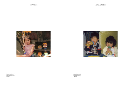
Next to all the sections (PART ONE, PART TWO, PART THREE) I also added the names of the participants of which section they are in. To me by adding this it shows who’s part is which.
I also made changes to all the text in the photographs sections of my publication.
Before:
After:
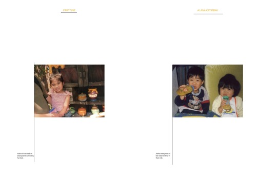
The changes I made was adding colour to the text above the images. I did this for all the pages with images. I also aligned the text to the image for the description.
0 notes
Text
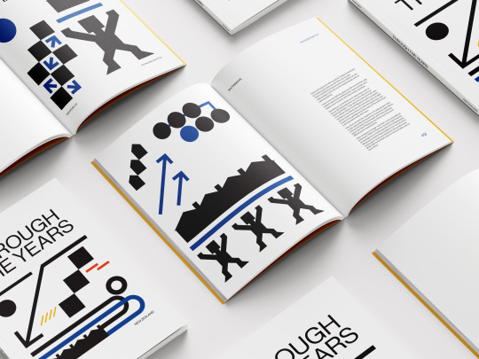
Week 14 - Mockups Final
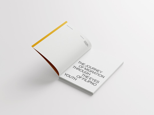
Cover Page:

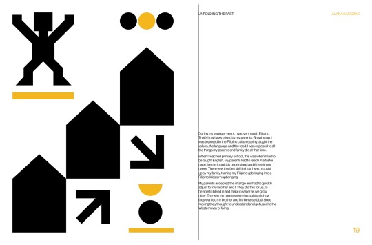
Introduction Page: to introduce the publication and the participants.
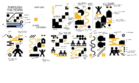
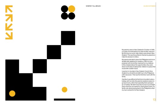
Part One: Alana Katigbak Double Page Spread

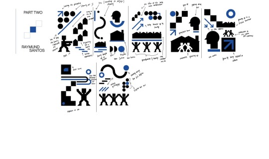
Part Two: Raymund Santos Double Page Spread
Laid out spreads of one of Raymund’s chapter with the cover page.
Part Three: Meg Panlilio Double Page Spread

Poster Series of Alana and Raymund’s story.
Meg’s Poster with tube
What I changed:
I got rid of the laid out spreads of the images for each person. To me I didn’t like how it looked with the other mockups as well as it became repetitive, having the same mockup used over. I instead replaced this with laid out spreads of one of Raymund’s chapters.
Before:

After:
0 notes
Text
Week 14 - Changes to Posters
After looking at my posters I didn’t like the hierarchy of the text, as to me it wasn’t visibly seen. I decided to make the changes to make the title of the poster larger and the numbering system smaller.
Before:

After:

This made the design have hierarchy visibly seen.
0 notes
Text
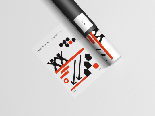
Week 14 - Mockups for Posters
I placed the posters in a mockup to make it more professional and to see what it would look like visually.

0 notes
Text
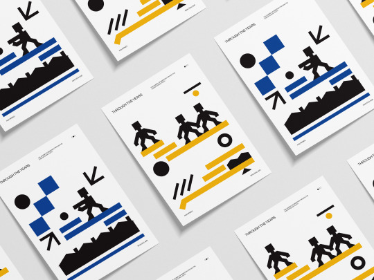
Week 14 - Final Posters
After the creation of my posters I was satisfied with the outcome of all. Each person has their own poster which is represented by their colour.
The next step I have to do is to place them in a mockup.
0 notes
Text
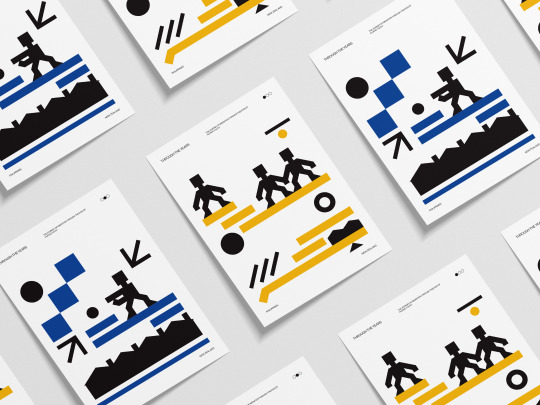
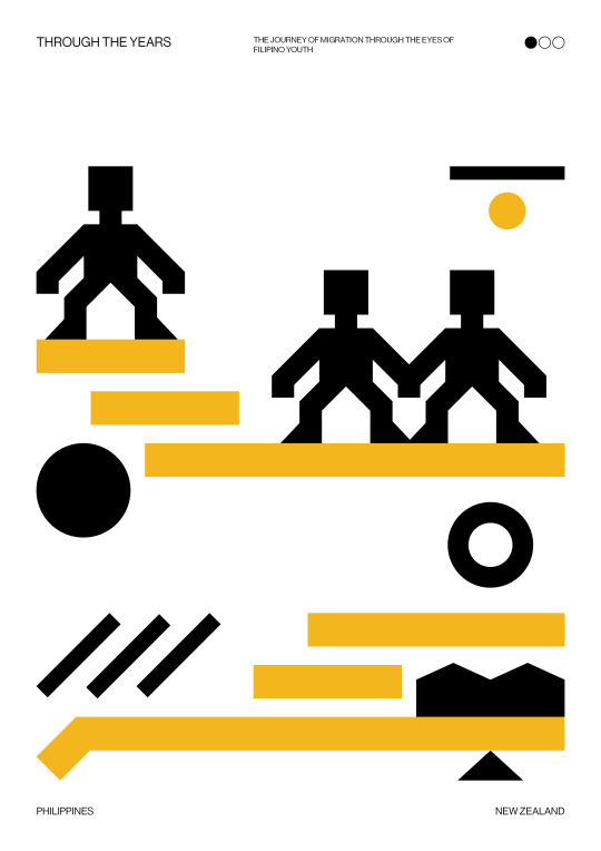
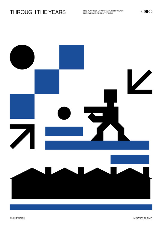
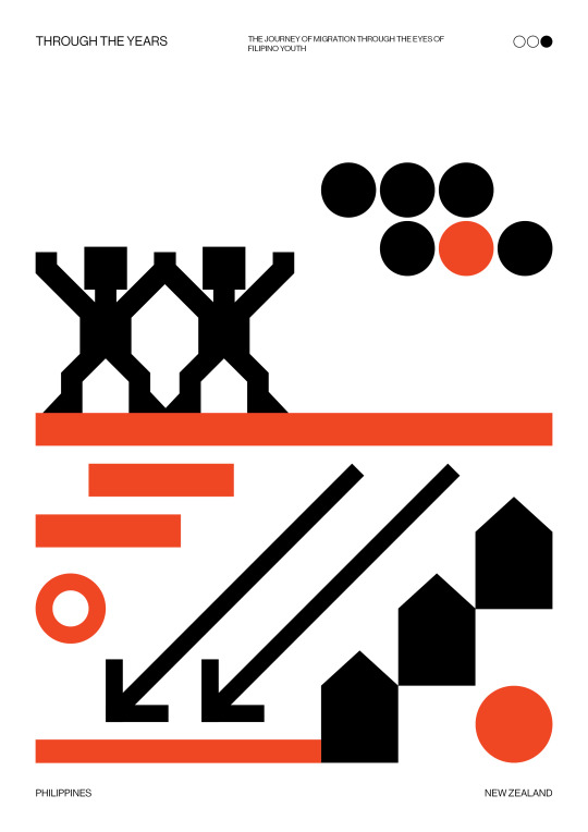
Week 14 - Posters
It was previously mentioned to think about creating posters. Since I already have existing illustrations I decided to create posters last minute to include with the publication as I wanted an extra artefact to be included.
Originally my plan was to use existing illustrations from my publication.
Poster #1

Poster #2

Poster #3

After much thought I got rid of the idea as I didn’t want to reuse the illustrations I made. I wanted to create something new.
I decided that I would use existing elements instead rather than using existing illustrations as a whole.
This process was easy as all I needed to do was to pull elements through from my existing illustrations I made for each person. Since my publication is divided into three I also decided to make 3 posters in total. This is so that each person will have a poster to themselves that showcases their story.
I started placing elements on the page and played around with the placement. The first person I created a poster for was Alana. I didn’t like this creation as the text was too big as well as the middle pictogram took up a lot of space.

After continuing playing around with the placement I was able to come up with a layout design I liked.

I liked the over all design as these are the illustrations that can be seen in Alana’s section. The only problem I had with this was that the text was too small.

I slightly changed the poster, moving elements around.

I made a few changes adding things and getting rid of things as well.
I was satisfied with the layout design and thought to continue the outcome with the other participants.
For Raymund’s poster I started designing, bringing in elements of illustrations evident in his section. I followed the style I used in Alana’s.

I continued developing the poster, moving things around.

Final Design:

After doing Raymund’s design I moved on to Meg’s, creating the same style and layout.

When it came to Meg’s design it became easier for me as I already had experienced with the other two and I knew what I wanted in the end.

0 notes
Text
Week 14 - Mockups
I placed my final publication design in a mockup to make it appear more professional.
Cover:
Introduction Page:

Alana’s Section:
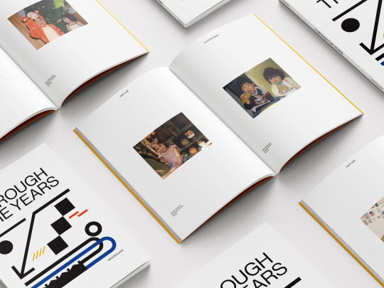
Raymund’s Section:

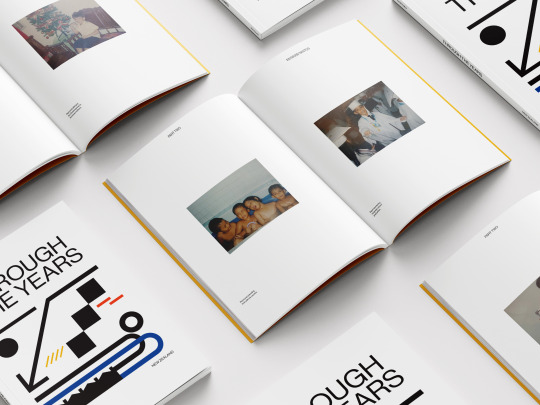
Meg’s Section:
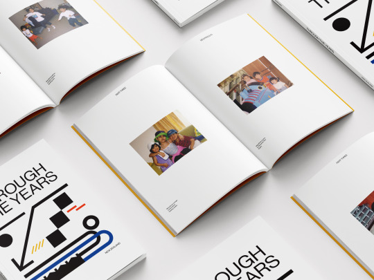
I decided to use two mockups for each person to show variation. I made the decision to showcase one double spread page for each participant as well as display the images I included of them when they were little.
0 notes
Text
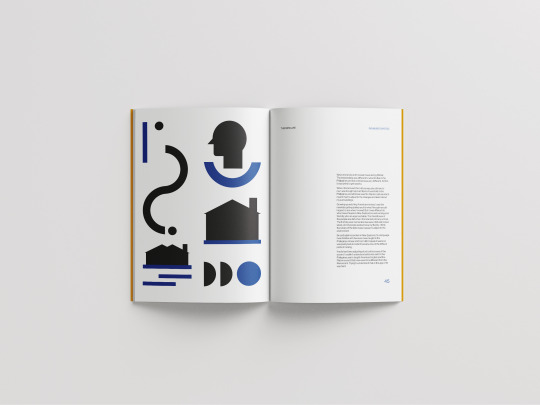
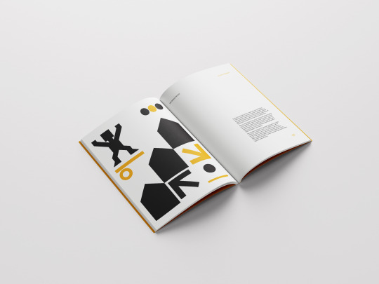
Week 14 - Illustrations & Meaning
The illustrations I created have meaning behind each one that follows the story it is placed with.
Alana’s Illustrations:
Raymund’s Illustrations
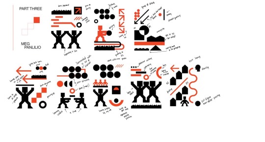
Meg’s Illustrations
0 notes


Text
Week 13 - The Changes
The original plan was to have the introduction of the publication be as simple as this. Having text placed on the middle.

But I thought about the feedback I was given before during one on ones and decided to fill in the space I have. This is also for the text to be more visible.
After:

I made the text bigger for it to be visibly seen as well as I included the participants name to fill in the empty space on the left hand side.
I also moved all the text from one side to the other.
Before:
I didn’t like the placement of the text because as it is, it looks fine digitally. But I thought about what will happen if it was bound. Moving it to the other side would be my best decision.
After:
0 notes


Text
Week 13 - More Changes
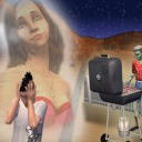
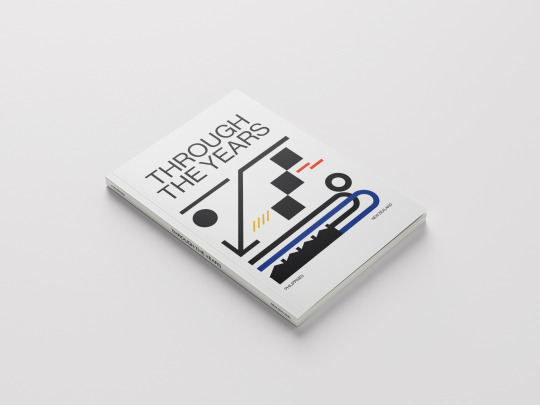
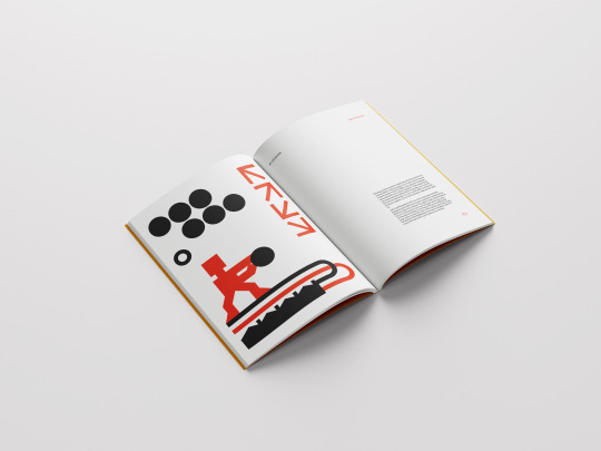
The cover page I created looked too simple. I wanted to incorporate the colours used in my publication, to add a pop of colour rather than keeping it black and white.
Before:

After:

Your eyes are more drawn to the image due to the colours. I also replaced elements in the illustration, moving things around.
After the front cover the original plan was to use black as the background for the next page.
Before:

I liked the idea then but as I continued to look at it, it felt like it didn’t fit in and was too dark. Instead I replaced it with the colour yellow, for it to be an introduction to who’s going to be the first person they see (Part One: Alana Katigbak).

I decided to make changes to my contents page as well as I didn’t like how it looked.
Before:

After:

I added lines to divided each chapter as well as wrote down the parts to separate them.
0 notes
Text
Week 13 - More Refinement
After working on the content of my publication I started working on other pages I hadn’t focused in for a while. I made changes to my front cover, creating a new illustration rather than reusing what I created.
Before:

After:

I also started creating my contents page to make it easier for people to naviagte.

I also coloured in the inner pages after the front cover since I didn’t want it to be white. Instead I replaced it with balck.

Originally I had nothing planed to put anything after Meg’s images, I was gonna leave it blank.

I thought that the space was a waste and made the decision to add text to fill in the space.

0 notes


Text
Week 13 - Continuing
I continued placing colour to my publication I also made a few changes to the illustrations I made before.

0 notes