
Don't wanna be here? Send us removal request.
Statistics
We looked inside some of the posts by andrewcoopersblog and here's what we found interesting.
Average Info
Notes Per Post
0
Likes Per Post
0
Reblog Per Post
0
Reply Per Post
0
Time Between Posts
10 days
Number of Posts By Type
Text
16
Last Seen Tumblr Blogs


Fun Fact
Tumblr’s website traffic is steadily declining.
Text

Parent pages for efficient formatting of interior pages. Margins, Text boxes and page numbers applied to parents to avoid duplication of work.

Paragraph Styles applied to Rhyme titles, Rhyme text, and Content page respectively. Editing the paragraph styles for the different text elements of the document saves time down the road.

A basic Vector image created in Illustrator. Placed into InDesign.

Text wrap applied to fit the image to the text in a more visually stimulating manner.

End Paper created in Illustrator using a basic vector shape transformed into a swatch. Transformed into an artboard and imported into InDesign. After playing around with the page numbering on the end pages and trying several different colours, I decided it looked better without any numbering on the End Pages.
The Finished Product:
Front Cover.


First End Pages.

Contents page and first rhyme.

Second & third rhymes.

Fourth & fifth rhymes.

Second End Pages.

Back Cover.
Reflection:
Creating this mock children's book was a useful refresher for last semester's InDesign intro. Understanding the basics of Parent Pages and Paragraph styles has helped me to streamline my work processes and work more efficiently. The biggest challenge for me was the idiosyncrasies of InDesign's use of images, and whilst I understand the process of resizing the box as opposed to just the image, it still caught me out several times. Overall, a valuable exercise in developing my Adobe skills for use in design work.
0 notes
Text
Final Reflection:
Overall, I have really enjoyed this course. I have never had much experience in using any of the programmes covered, save for a small taste of Illustrator and Photoshop in the Certificate last year. However, I found that the way the material was presented allowed me to learn more, retain the information, and understand how it could be applied to different tasks.
Getting used to all the different shortcuts and functions of the different programmes was the biggest learning curve for me, especially as I have almost never used a mac before. With some practice and repetition though I found that I as able to (sometimes) anticipate what we would do next for a certain exercise.
As someone who has always drawn with pencil and paper, really enjoyed learning to use vectors to create art and would like to delve further into exploring how to merge the two styles (e.g. for inking pencils). The same is true for Photoshop and, while I now have some understanding of Masks and Compositing, it is as a tool for digital colouring that most interests me.
InDesign was an interesting programme too. Initially, it did not seem much different to a word processor, but when we started to combine the text editor with imagery it made me start to see the possibilities. The endpapers was a nice way to end Fundies 1, as it has made me interested in what we will explore next term.
0 notes
Text
InDesign:
Keyboard Shortcuts:
SPACE - pan
z - zoom
v - select
a - direct select
COMMAND + left click (outside of textbox) - exit text edit mode
t - text tool
w - toggle preview mode
Text Mode:
COMMAND + left/right arrows - select text by character
COMMAND + SHIFT + left/right arrows - select text by word
COMMAND + up/down arrows - select text by line
COMMAND + SHIFT + up/down arrows - select text by paragraph
SHIFT + RETURN - soft return
Image/Design mode:
hold COMMAND + SHIFT (before resizing) - constrains when scaling objects
hold OPTION + drag image - duplicate image (when text wrapped)
SHIFT + OPTION + COMMAND + v - paste in place
Paragraph Styles:

Paragraph styles allow us to add preset styles to whole paragraphs. Set these styles through the PARAGRAPH STYLES palette. Create a new paragraph style with the plus icon at the bottom of the palette, the double click its title to enter the Options menu

An example of this is the Bullet points PARAGRAPH STYLE below.

By defining the parameters of the Paragraph style and selecting OK, a new preset is created. It is then a simple matter of selecting the relevant text and double clicking that PARAGRAPH STYLE heading within the PARAGRAPH STYLES palette.
It is important to note, that as the name suggests, a paragraph style will be applied to the whole paragraph even if only a portion of the paragraph's text is selected.
Character Styles:

CHARACTER STYLES are created in the same way as PARAGRAPH STYLES, the difference is they can be applied to parts of paragraphs, sentences, parts of sentences, individual words, or even letters. Here, the text selection has been given a bold, italic CHARACTER STYLE.
Images:

To add an image in InDesign choose the File drop-down menu, then select Place. The image is added in the original size of the image file and InDesign places a box around it. Resizing this box works like cropping it rather than re-scaling the image itself. Holding COMMAND + SHIFT allows for the image itself to be re-scaled, rather than just the frame that InDesign automatically places around it.
Embedded vs Linked Images:
Linking an Image, rather than Embedding it is desirable. When an image is Linked, InDesign references the original image file and will thus automatically update the image whenever changes are made to the original file. The other advantage of this is that Embedded images are saved into the InDesign file, thus increasing the file size with every save iteration.

Text Wrap:
Text can be wrapped around an image with the TEXT WRAP feature. The margins around the image can be changed by increasing/decreasing the offset numbers. These can be done individually or uniformly by with the chain symbol located in the centre of the 4 number values. TEXT WRAP not only looks cleaner when using a combination of text and imagery on a page, it will also reposition the image automatically if text is added or deleted from the document.

Paste Into:
This feature allows an image to be nested within another shape,which acts like a border. The circle was created with the Ellipse tool. Then select the image (the frog), copy it, then re-select the the circle before selecting PASTE INTO.

The circle now sets the boundaries for the edge of the image and the original image can be deleted (if no longer needed for the InDesign document).

Pages:
Pages can be managed through the PAGES palette menu. Use the + icon at the bottom of the menu to add pages. For printing and compiling purposes it is important to remember that the total page numbers should ideally be divisible by 4.
Pages can be added using the + icon at the bottom of the PAGES palette.
Page Numbers:
Page numbers can be applied to pages automatically using he PARENT template at the top of the PAGES palette.

Double click the PARENT heading to edit it. To add the page numbers create a text box and position it in the appropriate place on the page.

Now Insert Special Character as above. Repeat this process for the opposite page. While in the PARENT template, InDesign will use the generic place-holder value 'A'. When you exit the PARENT template though, each page will have the relevant page number inserted.

Margins and Columns:
Margins and columns can be preset for the document through the PARENT. Select Layout drop-down, then Margins and Columns. The margins can be set uniformly, or individually by toggling the chain-link icon in the middle of the 3 values. The number of columns can also be selected here as well as the space (gutter between them).
Parents:
Creating a new PARENT allows another preset template to be created. In this example the text colour of the PAGE NUMBER has been altered to accommodate pages which contain images where the black text will not show through well.
Endpapers:

By creating a simple, vector image in Illustrator, it can be transformed into a SWATCH and used as FILL for other shapes.

Here, the bird has been made with the PEN tool and over top of a simple, geometric shape. By GROUPING this image it can then be dragged and dropped onto the colour palette next to the SWATCHES section, creating a brand new SWATCH.

By double-clicking the thumbnail of the SWATCH, we can access the PATTERN OPTIONS, here we change the appearance of the swatch. The pattern has been tiled by ROW in a Hex pattern.

Now we can make a rectangle using the RECTANGLE tool and from there it can be exported into InDesign through the copy and paste method. It helps to save time by ensuring that the rectangle is the same size as the page setup in InDesign.

Here it has been pasted onto a double-page spread in InDesign. PARENT-B has been used for the Page format, so the page number has been set to white text on white background.
0 notes
Text
Layers, Masks and Selecting:

Selecting:
Using the ELLIPSE MARQUEE SELECTION tool to select an individual piece of fruit from the basket. As the orange is more or less elliptical in shape, the ELLIPSE tool is useful in this instance. By using the ADD TO SELECTION function, ellipses can be added to the area already selected. Rectangular objects can be selected in a similar fashion by using the RECTANGULAR MARQUEE SELECTION tool.
To select the remaining pieces of the orange that were not captured by the above, the MAGNETIC LASSO was used in combination with the ADD TO SELECTION function. This lasso snaps to the edge of objects that are well-defined within the image, however it is not so useful where the edge of an object is blurred, similar in colour to the background, or otherwise ill-defined. The POLYGONAL LASSO is also useful for selecting irregularly shaped objects with straight edges. There is also a free-hand LASSO tool, which can be used as well, however I have found this difficult to use efficiently with a mouse.
Layers:

By isolating an object within the image, it can be placed onto a separate LAYER, and manipulated independently from the rest of the picture. I have done this in the above image and adjusted the HUE, SATURATION, and LIGHTNESS.


In this image, the ferry has been selected using the RECTANGULAR MARQUEE tool, and then duplicated. Duplicating the selection automatically pastes the selection onto a new LAYER.
Masks:
By applying a LAYER MASK to this new layer, we can work on this area in isolation. In this case it has been used to remove some of the water around the duplicated ferry so that it fits more naturally with the image's original layer. Inside a LAYER MASK, the BRUSH tool works to reveal or obscure parts of the image. Black = obscure, White = reveal.
The duplicated ferry has also been resized and its opacity has been decreased to give the impression that it is further away than the original ferry.


Using BROKEN POINT CURVES to trace the outline of an object with the PEN tool, it is possible to convert this pen outline into a selection with the PATHS palette. This is similar to the MAGNETIC and POLYGONAL LASSO tools, but is often more efficient for objects such as the above that have a number of irregularly shaped curves and angles.

The HUE of the PATH SELECTION has been adjusted.


Here the Hummingbird has been selected using the PEN tool to create a PATH SELECTION. By inverting the selection, everything else within the image can be selected, here this has been used to delete the background. A LAYER MASK has then been applied.

Another LAYER is added behind/below the main Hummingbird. By giving it a bright colour that contrasts with the subject, it is easier to see the outline of the hummingbird. Using the BRUSH tool within the LAYER MASK, we can trim away any excess from the edges of he hummingbird so that its outline is crisper.


The newly-isolated 'Interest' (the hummingbird) can now be pasted onto a different background. It has been resized and flipped to fit it's new environment.
0 notes
Text
Layer Mask Mini-Assignment:
1 of 2:

Lux Luthor:

The background

The 'Interest' pt 1

I predominantly used the ELLIPSE tool to cut out the 'interest', using several ELLIPSES and the ADD TO SELECTION function I was able to capture 90% of the face. To capture the remaining areas, I used the MAGNETIC LASSO, adding those to the selection as well. Once I was satisfied that I had all the 'interest' selected I applied a layer mask, and used the BRUSH tool to finesse the areas around the edges of the head. Revealing and hiding the pieces that had escaped.

The 'Interest' pt 2
To reinforce the idea behind the final image, I cut out the logo using a constrained ELLIPSE so it was a circle. Another LAYER MASK was applied.
It was then just a matter of resizing the 'interests' to fit the background.
2 of 2:

Rev Thomas Burns in the First Church Pulpit:

The 'Interest' and the Background

Initially, I tried the OBJECT SELECTION TOOL to cut out the wax figure of Rev. Burns. The quality of the original image proved to be a challenge for this though, as some of the lighter parts of the background were added to the selection, while similar tonal parts of the figure were excluded. In the end, I used the PEN tool to draw around the outline of the figure, mostly using BROKEN POINTS to maneuver around the various angles. Once I had gone all the way around the figure's outline, I turned the shape into a PATH and then applied a LAYER MASK.
I flipped the background, as the figure became too pixelated when I tried to flip it. After resizing the 'interest to fit the background I used worked on the LAYER MASK with the BRUSH tool to obscure the lower parts of the 'interest' so it appeared that the Burns effigy was standing in the pulpit.
0 notes
Text
PHOTOSHOP - IMAGE ADJUSTMENTS:


Curves:
The original of this image appeared far too light/faded. Examining the CURVE GRAPH, I found a large chunk of empty space at the Black end of the x axis. By adjusting the slider at the Black end and moving it close to where the graph started to display the tonal range in the image I was able to darken it. The final result looks much closer to what the photograph should have looked like. Leaving a small amount of empty space at the Black end of the CURVE GRAPH ensures that the darkest areas of the photograph do not become so dark that detail contained within those areas is lost.
If an image is too dark, the solution to may be as simple as the reverse of the above explanation. If there is a lot of empty space at the Light end of the CURVE GRAPH moving the x axis slider to the left and cutting out that empty space will darken the image. Again, a small amount of that empty space is still desirable so as to not blow out the white areas of an image, thus losing the subtleties of colour variation in the lightest areas of the image.

The underexposure of this image means that a lot of detail is lost in the darker areas (though it does fit quite well with the brooding appearance of the photo's subject).

Above is the result of eliminating 95% of the empty space in the tonal range of the CURVE GRAPH.

Hue and Saturation:
Some of the colour variation in the cat's pelt has been lost due to the darkness of the original image. Adjusting the CURVE GRAPH was not enough to correct this. To bring out the yellowish colour in the cat's fur, we can adjust the SATURATION/brightness of the image through the HUE/Saturation palette. Increasing the saturation level of the image a little allowed me artificially reproduce the subtleties of the yellow in the fur. Not only is this closer to what the cat would have looked like to the native eye, but it also brings a level of warmth to the photo, that the simple adjustment of the CURVE GRAPH lacked.


The original image appears very dark. To achieve the result in the final image, I again removed most of the blank space at the Light end of the CURVE GRAPH. Another point was the added to the, approximately midway along the line and then bent slightly upward,this further lightened the image to achieve a more natural appearance.

By increasing the SATURATION of the picture, we can bring out he colours in the image. As the overall scene is rather drab due to the overcast day, this was useful in finessing the brighter colours in the scene. The effect is subtle, but has made the reds of the roofs, and the yellow of the one house, as well as the white house in the foreground stand out.


Colour Balance:
The original of this picture was very good, though there is perhaps a little too much red coming through overall. By altering the COLOUR BALANCE of the image this can be easily corrected. By overcompensating for this (increasing or decreasing different colours beyond what appears natural) different tones or moods can be attached to the image. The COLOUR BALANCE sliders are Cyan & Red, Magenta & Green, Yellow & Blue. There are also options for adjusting different colour ranges - Midtones, Highlights, and shadows.
In the second of the two pictures of this gentleman, I moved the Midtone COLOUR BALANCE sliders slightly towards the Cyan and slightly more toward the Blue. The Highlight colour range was also altered with adjustments in the same directions as explained in the Midtones. The result has given the image a 'cooler' feel, and makes the subject appear in less immediate danger of sunburn.

Photo Filter:
PHOTO FILTERS are colour presets that effect the whole image. These are a quick way to change the mood of an image by applying a HUE adjustment.
To further change the mood of this image, I applied a COOLING FILTER (80) to it, leaving the colour as the default blue, I lowered the filters Density a little so that the image didn't become too 'cold'.


The final version of this image uses a combination of CURVES, HUE/SATURATION, and COLOUR BALANCE applied to it.
THE CURVE GRAPH has had 2 extra points added to it, which have been bent to give the line a slight 's' shape. This has lightened some of the dark areas, while darkening some of the light areas creating a better contrast between the variation in each of those ranges.
I have used 3 separate COLOUR BALANCES.
More Red and Yellow have been added to the Midtones of the COLOUR BALANCE giving more definition to those colours and bringing out some of the definition in the colouring of the various river stones. A smidge more Green has been added as well, to bring out the greens in the bushland.
In the Highlights, a little more Cyan, Green, and Blue have been added, to make those colours more prominent in the Highlights
This one focussed purely on adding more green to the Midtones to make the foliage stand out even more.
Over top of the COLOUR BALANCE and CURVE, I adjusted the SATURATION of the image a little to brighten it.


This image has also had a combination of the four Image Adjustent tools applied to it. The original is overexposed and the overall colour leans toward too much Red. To counter this, a COOLING PHOTO FILTER was added to downplay the Red tinge.
A COLOUR BALANCE was then applied, which leaned heavily into the Cyan and Blue colours to further bring balance to the overall redness of the photo. A small amount of Green was also added to try and define the trees more.
A CURVE GRAPH was then added, with a couple more points being placed of the diagonal line. The line was then bent very slightly into an 's' shape to darken the lights and lighten the darks. The effect was very subtle, but overall helped to repair the photograph.
To further try and balance the Reds, a SELECTIVE COLOUR Filter was added, with Reds being the target colour, by adjusting the Cyan slider to bring more of that Colour into the Reds. The starkness of Red within the overall image was further blunted.


In the original of this image there is too much shadow. The techniques described above to adjust the image would be ineffective, as the sky is already the right colour/hue, whereas the streetscape is far too dark, and it is difficult to make out a lot of the detail.
A LAYER MASK has been applied to the image, so that only the lower portion of the image is target by the image adjustments. This allows us to focus on the problem areas of an image, whilst leaving the sky (which is pretty good as is) untouched by any alterations.
Within the Layer Mask, it was a simple matter of adding an extra point to the CURVE GRAPH and putting a significant bend in it o allow more light into the very dark streetscape.
0 notes
Text
WEEK 2: Compositing
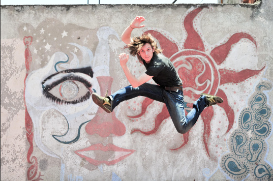
Original Image:
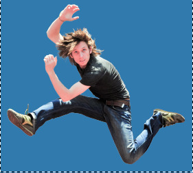
Using the PEN tool to 'trace' the outline of the figure with broken points, it is then transformed into a PATH. The figure is then placed onto a new LAYER and another LAYER is placed below the figure on the LAYERS Palette. This LAYER has been given a solid blue colour to help edges of the 'Interest' stand out.
A LAYER MASK is applied to the 'interest' and then the BRUSH tool is used to finesse the edges, hiding or revealing any visual information that was missed by the PEN tool PATH technique described above.
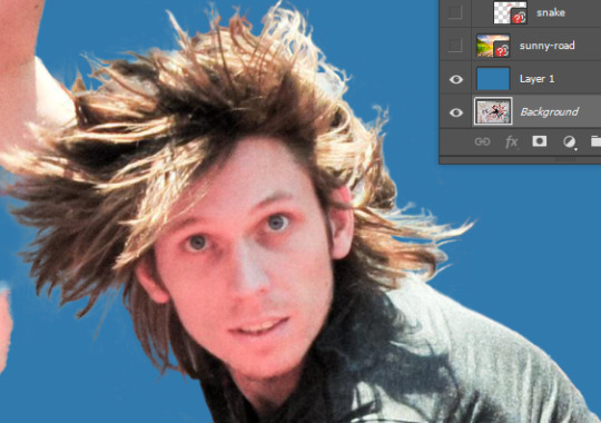
By switching the Blue background LAYER between visible and invisible the more complex areas - like the hair and its highlights - can be finessed more easily. This can be a time-consuming process and using other tools like SELECT COLOUR RANGE can be useful in speeding up the process. Taking time in this step is worthwhile however as it gives a crisper finished result.
Layer management is supremely important here, as I found out when I erased a small piece of background that I had missed but did so on the wrong LAYER. I did not noticed until further through the process and it became somewhat annoying to fix. In the end I opted to trace around that piece, and switch the original background layer back to visible so I could cut out the offending piece and re paste it.
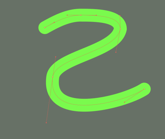
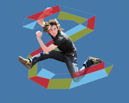
A basic shape is creating in Illustrator with the PEN tool, here an 's' shape.
The original background has first been loaded into Illustrator from Photoshop and the 's' is created on a new layer. The points and handles are finessed to make the shape conform to the figure of the jumping guy.
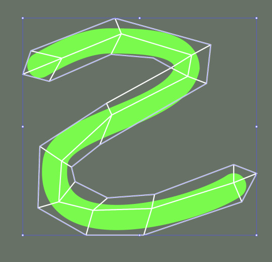
Using the finessed 's' shape as a guide, a more complex version of the shape can be created with the PEN tool. Here, it is a wire-frame type mesh made using a stroke with no fill, again created on a new layer.
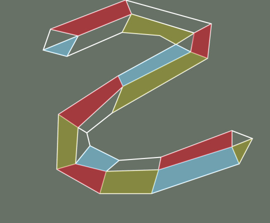
Now, the wire-frame can be filled in with various colours by retracing the lines with the PEN tool, this time with fill and no stroke. The opacity has been lowered in anticipation of the image composited with the Photoshop image.
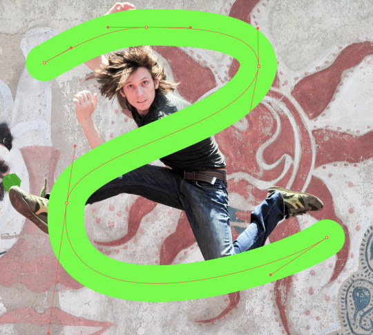
Returning to Photoshop, we can now select PLACE LINKED from the File drop-down menu. This way any changes made to the Illustrator file (the 's' shape) will be updating in Photoshop automatically.
By placing the Illustrator layer above the guy in the LAYERS palette, it will appear over top of him, returning to the MASK we created earlier for the guy, we can reveal aspects of the guy so that it appears the shape is snaking around him.
Below, this concept is developed further with the addition of a new background and some other 'interests'.
Compositing H/W
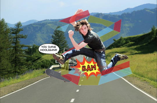
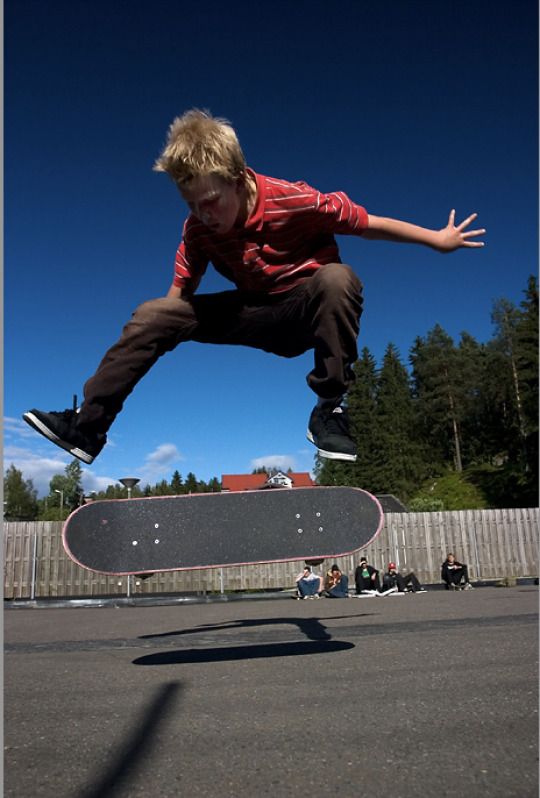
The final image of the compositing exercise.
In addition to the work we did in class, I decided to add a jacknifed semi truck and a skateboard as the raster images. In my mind they seemed to complete the story. of the guy leaping.
The two vector smart objects are a sound effect and a speech bubble. I added a mask to the Bam effect so that I could super-impose it over the top of the guy's leg, as I wanted it to appear 'loud' without detracting from the main character. I lowered the opacity to 25% and painted out the part of the effect that intersected with his leg.
For the speech bubble, I positioned it on a layer behind the guy but in front of the truck to give the impression that it is being spoken by the truck's unseen driver.

The speech bubble was made from an ellipse, then I used the PEN tool to add 3 extra points and dragged out the tail of the speech bubble. The TEXT tool was used for the words (I deliberately chose everyone's favourite comic book font Comic Sans). From there it was a matter of resizing the speech bubble to accommodate the text and then using the GROUP function to combine them.
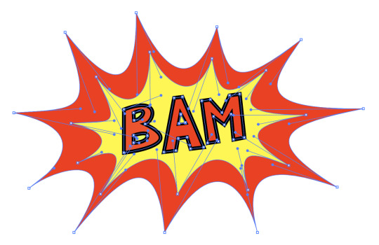
The BAM sound effect was made with the PEN tool and is a bunch of broken point curves. At first I just made one arc and duplicated it, rotating each piece to form the closed shape. I wasn't satisfied with the final shape though because it was too symmetrical and I felt that detracted from the dynamic chaos that it was supposed to represent. So I started over and drew the shape again as a series of freehand angles.
Once the red shape was complete, I duplicated it, changing the fill to yellow and shrinking it in scale. Then I tweaked several of the points so that there was a little more chaos in the effect.
The letters are also made with the PEN tool using a combination of straight lines and curves.
The truck and skateboard were cut out from images on the web:
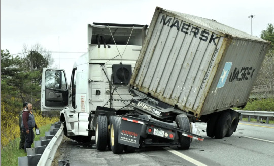
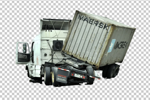
I used a combination of POLYGON and MAGNETIC LASSO for the bulk of it, then used the freehand LASSO for a few of the smaller points. After I was reasonably happy with the cut out, I applied a mask and reveal/hid the little bits I had missed, once complete I lined it up with guardrail and resized it.
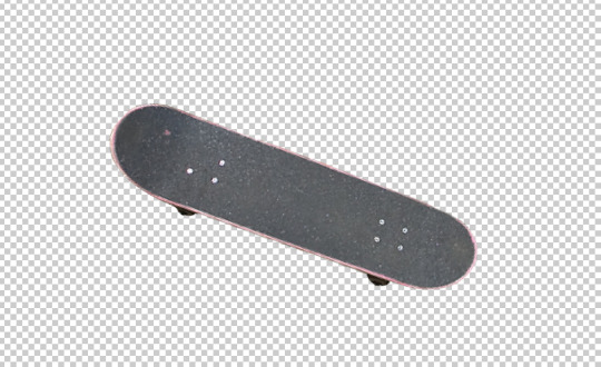
For the skateboard, I use the PEN tool to draw around the image and then converted it into a path. I applied a mask to it and hid/revealed the bits I missed. Next, I positioned and resized it, and rotated it a little make it seem like it was more in motion.
I considered cutting out the boards shadow as well, but the guy doesn't have a shadow, so I decided against it.
0 notes
Text
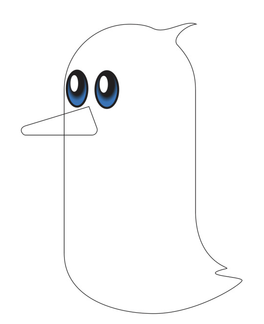
Week 2:
Penguin Activity:
A cartoon penguin created in Adobe Illustrator using vectors.

STEP 1:
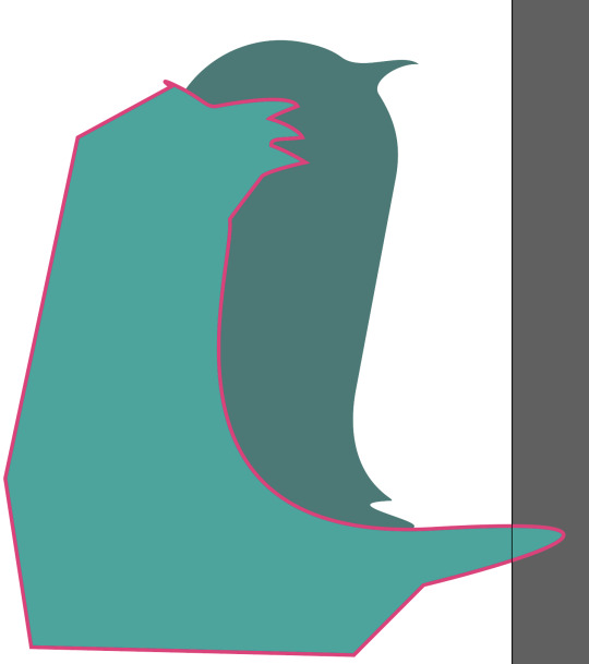
To begin with, a pill shape is created using the ELLIPSE tool to make a circle. Then, using the DIRECT SELECTION tool, the bottom point of the circle is selected and deleted leaving a half circle arc. This is the duplicated and reflect so that there are now two half-circle arcs which are mirror images of each other. The requisite space is then left between them. By drawing a marquee around the bottom left point of the top shape and the top left of the right point, they can be joined with a straight line using the JOIN function. The same is then done for the right-hand side points, and a pill is formed. By drawing a marquee around the new shape and using the GROUP function, the new shape can be turned into one shape.
STEP 2:
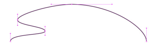
To add the tail and lick of hair, use the PEN tool and the ADD POINT feature, more points can be added to the pill shape. Then using DIRECT SELECTION, these points can be manipulated - in this case, dragging the middle point of 3 points the tail feathers and hair lick can be stretched out of the pill shape. Once the are in approximately the right position, the angles of the curves can be adjusted be using DIRECT SELECTION on the handles of the points.
STEP 3:
The eyes are created by using the ELLIPSE tool. The fill of the eye has a GRADIENT applied to it. The gradient blends 2 (or more) colours to achieve a natural-looking transition between them. The preset RADIAL GRADIENT uses a circular effect and worked well for the eyes. The white reflective glint is just another ellipse filled with white. The two ellipses that form each eye can then be GROUPED together and duplicated to produce the second eye. This method eliminates the need to finesse the shapes and sizes of the ellipse to make sure the match. The beak outline was made with the PEN tool, and is 3 straight lines forming a triangle. Again using the DIRECT SELECTION tool, two of the triangle's points were softened into curves by dragging the little circle that appears inside the point.
STEP 4:
The feet are made using a series of curves to produce the top half of the appendage. This is then duplicated, reflected, and flipped to make the bottom half, ensuring that it is symmetrical. Once the 2 halves are aligned, a marquee is drawn around the foot and GROUPED to create one shape.

By duplicating the foot, and off-setting the two shapes can be super-imposed on each other. By selecting the path along the bottom of each toe of the upper-most shape and deleting it the overlapping parts of the toes can be removed. Then it is a case of selecting the two points at the end of the toe and using the JOIN function to draw a straight line between them, the same is then done for the two points in the webbing of each toe.

Combining the new, 3D foot into one shape with the GROUP function allows us to flatten the shape so it appears that it is standing flat on the ground. The leg is a rectangle drawn using the PEN tool with the bottom two points softened into curves. GROUP the leg and foot into one. Duplicate and then rotate it to the required angle so it looks like he is stepping. I also made this 2nd leg a little smaller than the other as it is furthest away from the viewer. The shape can then be filled with colour, and a decent penguin's foot with the appearance of 3 dimensions is created.

STEP 5:
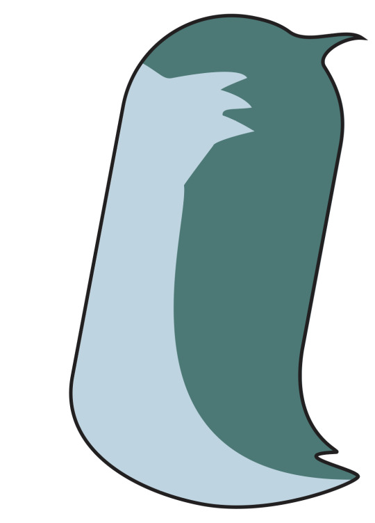
Now that there are multiple components to the picture, it is useful to separate them into LAYERS using the LAYERS palette. This enables us to work on individual parts of the penguin. Each layer can be hidden/revealed with the eye in the left-most column of the palette. The next column with the padlock locks/unlocks layers. When locked, that layer cannot be changed until unlocked again. This is useful for ensuring that changes aren't accidentally made to those parts of the image while working on another layer. It is also useful to give each layer a name that corresponds to what is happening on said layer so that they can be easily accessed and switched between without wasting time trying to figure out which parts of the image are on which layer. Different aspects of the image cange be moved between layers by using the SELECTION tool. A coloured dot will appear in the right-most column (not shown), by dragging this to a different layer in the palette, that part of the image will then be deposited on the new layer - this is also useful for separating a one layered image into multiple layers as more aspects are added to it.
STEP 6:
To give the penguin some belly feathers, the rough shape that will appear on the body is drawn with the PEN tool using a mix of curves. Using a bright colour for the stroke is good so that it is easily distinguishible. Everything that appears outside of the main pill shape of the body can be slapped in without too much thought as to the angles. all that is needed is a closed shape. Now open the PATHFINDER palette and with both shapes selected, chose the INTERSECT Shape Mode.
This cause the overlap between the 2 shapes to create a new shape and everything outside the body is gone. Turn off the outline of the belly feathers shape and adjust colour as required.

Using the same process as for creating the belly feathers, we can add some shadow to the penguin to give the appearance of depth to the body. Lower the OPACITY of the shadow shape so that it is not just a solid colour and allows the 2 colours of the bird's body to show through. The highlight on the head was created by making a circle with the ELLIPSE tool, the ADD point feature of the PEN tool. A bunch of points were added around the circle and then stretched and re-angled (as described in STEP 2) to give the impression of light bouncing off that part of the penguin's head.
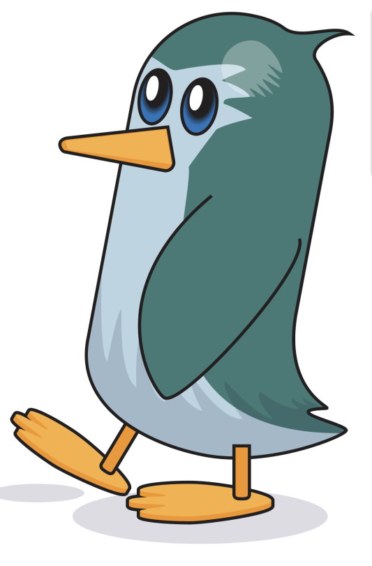
STEP 7:
The wing is added, and moved to the front of the image using the OBJECT menu on the toolbar - ARRANGE - MOVE TO FRONT. The penguin's right foot was moved to the back of the image in the same way, except using he MOVE TO BACK function. Colour is added to the beak, with a second triangle drawn over the top with a different hue of orange to give the impression of 3 dimensions. Finally, add an opaque ellipse, or two beneath the penguin to act as a drop shadow, further breathing life into the little guy.
0 notes
Text
VECTOR OBJECT CREATION:

This is a simple picture created in Adobe Illustrator using vector lines. It is loosely based on Mr. Potatohead.

This is the iniitial sketch I did to plan it. In the final deign I dropped the bowtie and altered the mouth because when I started to colour it, I became concerned that it was looking like blackface/minstrel show.

To begin, I used an ellipse and a circle, then used the direct selection tool to delete the bottom half of the ellipse and the top half of the circle. Using the guidelines I aligned the two, threw a marquee around the two open points on each side of the two open shapes and grouped them together to create the egg shape. I duplicated the new shape and shrank it down to make the nose. The eyes are are series of ellipses and circles. The mouth and ears were made using bezier curves. At first I moved the ears to the back of the image, but then decided that I preferred the tapered lines at the top and bottom of each ear where they overlapped with the outline of the face.

The cigar was created with bezier curves and ellipses, then grouped together.

I positioned the cigar and then moved it to the front of the image. This turned out to be unnecessary, as I later put the cigar onto a separate layer when creating the shadow on the face, and that ended up being the top-most layer in the final picture.

The face shadow was created with the pen tool and several curves, and then using the Pathfinder, intersected with the head shape. I added one to the nose as well to add a little more depth. I lowered the opacity on both shadows.

The highlight on the head is an ellipse with a bunch of extra points added to lower half of the shape and the stretched out with the direct selection tool. Finally, I added another ellipse beneath the image to give the impression that it was floating.
0 notes
Text
Week 2:
PHOTOSHOP SHORTCUTS:
x - switch between foreground and background colour
b - brush
[ ] - decrease/increase tool size
z - zoom
SPACE - pan
e - eraser
OPTION + DELETE - fill selection with foreground colour
COMMAND + DELETE - fill selection with foreground colour
COMMAND + a - select all
DELETE - clear selection
1-9 & 0 - each key corresponds to a 10% increment of the opacity slider. 1 = 10%, 0 = 100%
hold OPTION - quick colour picker/eyedropper
v - move tool (moves what is under the pointer i.e. on another layer that is visible)
hold SHIFT - constrain
COMMAND + d - deselect
COMMAND + z - undo
COMMAND + SHIFT + z - redo
COMMAND + j - copy selection to a new layer
COMMAND + t - transform Gizmo
w - object selection tool
p - pen
COMMAND + u - Hue/Saturation palette
COMMAND + m - Curves palette
COMMAND + w - Close current file
0 notes
Text
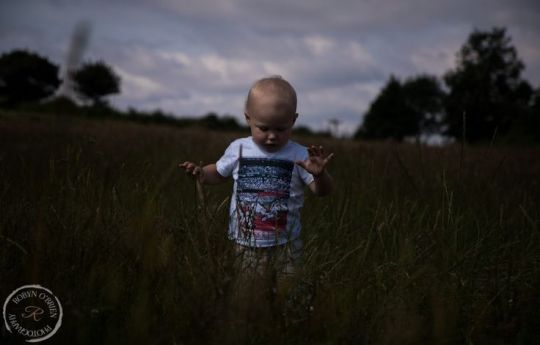

Photoshop Exercise Colour 1 of 4:
A Toddler in a field:
The original was underexposed so I adjusted the Histogram Curve (by cutting the majority of the empty space at the white end) to brighten the image, added a little more Green (as the grass was still very dull) to the Colour Balance, increased the Saturation (to further brighten the image), and finally ramped up the Lightness a smidge (to further lighten the image).
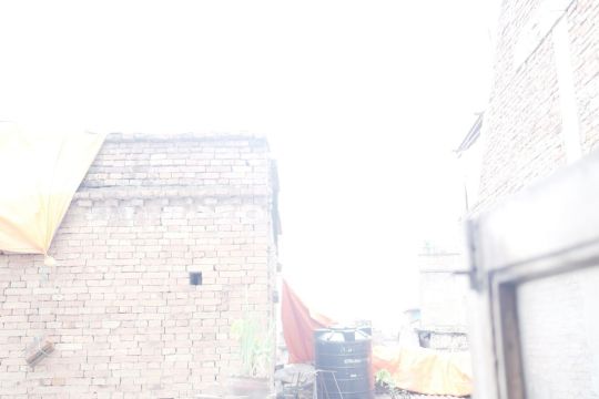

Photoshop Exercise Colour 2 of 4:
Brick Building:
The original was very over-exposed. I cut out most of the empty space on the histogram at the black end of the scale and added a couple of extra points to the line to tweak the darkest and lightest areas. Then I raised the saturation a little to bring out the colour of the bricks. There was still too much white space in the sky though so I decreased the lightness of the image to try and draw out some of the grey in the sky. Finally I played with the Colour Balance to add a tad more red and blue to the image.
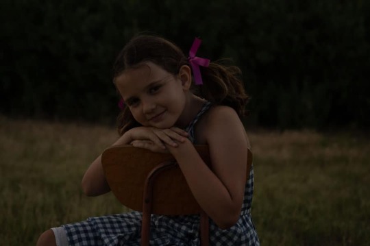

Photoshop Exercise Colour 3 of 4:
Another Kid in a Field:
This one was a fairly simple exercise in removing the blank space on the white end of the Curve Histogram, of which there was a lot. I then decided to adjust the Colour Balance a little, as she looked quite sun-burnt (which is possible). I increased the amount of Cyan to decrease the influence of the Red, and added a little more green to bring out the flora.

Photoshop Exercise Colour 4 of 4:
Terrace in Suburbia:
This one was overexposed. After playing around with a few other overexposed photos (with lots of white) and being unhappy with the results, google told me that where the camera records white pixels (through overexposure), there is no information to recover. I thought this one would be interesting as there is quite a lot of white, but it is somewhat broken up. First I added a curve, but there was no empty space at either end of the Histogram so I put in couple more points and tweaked them into an 'S' shape until I got something that showed some more of the colour and detail of the picture. This left the greenery looking too vibrant though, so I added a Colour Balance and lowered the green quite a lot in the Mid-tones, while increasing the blue and cyan a little. I then lowered the Saturation as the overall image was still quite bright. Finally I added a second Colour Balance and increased the green in the Highlights, as I felt the foliage had been dulled too much overall.


Photoshop Exercise B&W 1 of 2:
Streetscape:
The original was very dark, so I added a point towards the Light end of the curve and another at the dark end, bending them both upwards to bring some more light into the image. It was a fine line between lightening the image to reveal more detail and balancing that against the removing any variation in the small amounts of white already extant in the image.
0 notes
Text

Closed curves:
Closed Curves follow the same principles as multi-arc curves. Click, hold and drag to get the handle. Use SHIFT to constrain the angle of a handle to horizontal/vertical.
I found trying to get the symmetry right to be the most difficult part of this exercise. Using the guidelines to align the points, and SHIFT to constrain the handles helped, but more practice is needed to finesse.
0 notes
Text

Single and multi-arc curves:
Multi-arc curves are created in the same way as single arc curves. Using the PEN tool, left-click and drag in the direction you want to continue drawing. Click and drag again to create a second point. Drag in the direction you wish the curve to bend. Holding the shift key constrains the axis of the handle to horizontal/vertical. Shorter handles are easier to manipulate and generally keep the image cleaner, which is important for ease of use when creating more complex images using multiple curves.
0 notes
Text
Week 1: Thursday

Single arc curves:
Arcs and curves can be made using the PEN tool, however instead of just clicking an anchor point as for straight lines, hold down the left mouse and drag in the direction required. This creates a HANDLE, which acts as a lever to bend the straight line into an arc. Drag the handle in the direction that you wish to keep drawing.
Shorter HANDLES allow for more control when it comes to fine tuning the curve at a later date. Finessing the points using DIRECT SELECT after drawing the curves made achieving some degree of symmetry easier.
0 notes
Text
Week 1: Thursday

Straight line shapes 2:
Straight line shapes using the PEN tool. Adjustments and fine tuning of lines and angles using the DIRECT SELECTION tool, particularly for diagonal lines. Further fine tuning done with the cursor keys once the anchor/path was selected with the DIRECT SELECTION tool.
The star and the segmented square (the 6th image) were the trickiest because the angle of the lines needed to align more exactly so that the sizes of the parts that make up the image were proportionate. I found it helped to add a couple of extra straight lines to use as guides and the delete them when the shape had been created.
0 notes
Text
Week 1: Tuesday
Adobe Illustrator Shortcuts:
Z - Zoom - hold left mouse and move to the right to zoom in, move to the left to zoom out.
SPACE BAR - Pan
X - toggle between stroke and fill. Stroke is the line/ outline of a shape. Fill is everything within the outline. The red forward slash icon below the stroke/fill boxes on the Illustrator toolbar will turn off the fill so that a shape will only be an outline without any solid fill inside the line/s.
P - Pen tool (+: add point, -: subtract point)
V - Selection tool
A - Direct Selection tool
COMMAND + left click - stop using the pen tool (e.g for an open shape)
COMMAND + Z - undo
COMMAND + X - cut
COMMAND + C - copy
COMMAND + V - paste
COMMAND + SHIFT + V - paste in place
COMMAND + J - join open points
COMMAND + Y - wireframe mode
COMMAND + U - toggle smart guides (the pink lines)
COMMAND + G - group
COMMAND + SHIFT + G - ungroup
COMMAND + R - ruler
COMMAND + SHIFT + S - save file
S - scale
R - rotate
O - flip/reflect
Straight Line Shapes in Adobe Illustrator:
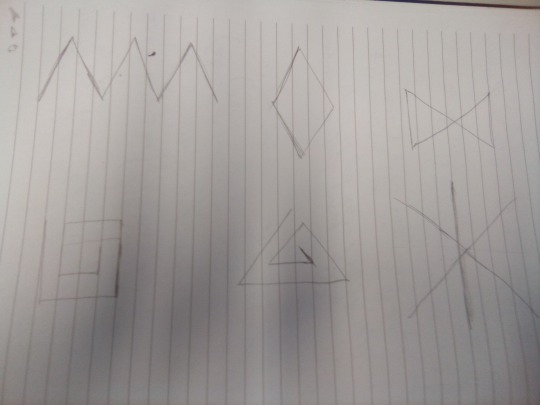
Six basic straight line shapes drawn by hand.

Six basic straight line shapes drawn with vectors in Adobe Illustrator.
The PEN tool (P) is used for drawing from point to point. Left click the first point, move mouse to desired position for the end of the straight line and left click again, repeat until the desired shape has been formed. Closed shapes like the diamond automatically stop continuing the line from the previous point, open shapes (the other 5) will continue the line, so holding the command key and left clicking will drop pen.

Once shapes have been drawn there are two selection tools which can be used to manipulate them.
SELECTION (V) will select the whole shape, it can then be moved around by dragging within the selection box, expanded or contacted by clicking one the smaller squares around the border (the GIZMO), or by hovering the cursor slightly outside one of these small squares an arc icon will appear, which can then be used to rotate the image.
DIRECT SELECTION (A) will select only a part of the shape. At the start or end of a line it will select the anchor point, which can then be elongated/contracted, the angle of the line can be changed. Selecting anywhere beyond the line will bring up the path (the line between the 2 anchor points), this will allow the line to be moved, it will not change the shape of the line, but will manipulate any lines connected to either of the path's anchor points.
0 notes