Don't wanna be here? Send us removal request.
Text

Image 1 - Disinformation Visualization
The infographic on abortion utilizes visual strategies to subtly guide the viewer's perception in a way that supports an anti-abortion agenda. The volume of statistics presented in rapid succession discourages detailed analysis, promoting a more passive consumption of the data. This design tactic weaves the stats into a single, directed narrative that may lower the viewer's guard against potential bias. The generic icons, which blend representations of a woman, fetus, and trash can, serve to negatively frame the issue of abortion. These icons are not neutral; they are loaded with implication, encouraging an interpretation of abortion as disposal. The change in scale between global and U.S. abortion statistics manipulates visual impact; while the actual proportion of U.S. abortions is much smaller, the infographic exaggerates this by showing a substantial number of "baby throwing mommies." This misrepresents the U.S. share of global abortions, falsely insinuating that the U.S. is a major contributor to the worldwide count. This visual representation does not match the actual data; a careful analysis would reveal that the U.S. contributes to a much smaller percentage of abortions worldwide. The infographic relies on viewers not taking the time to scrutinize the numbers, thus advancing an underlying agenda through a subtle visual misrepresentation.

Image 2 - Miss Dior packaging and Dior identity
The Miss Dior packaging is a testament to the brand's cohesive identity system. It achieves consistency through:
Color: The pale pink and white convey the brand's classic femininity, mirroring the colors used across Dior's product ranges.
Typography: Elegant serif for "Miss Dior" and a simpler sans-serif for product details maintain brand consistency. The capitalized "Miss Dior" draws the eye, establishing a visual hierarchy. Consistent text alignment, centralized positioning, and precise kerning are hallmarks of Dior's attention to detail.
Material: The texture and quality of the material suggest luxury, a common thread in Dior's product presentations.
Design Motifs: The silver border lines echo Dior's subtle yet distinct motifs found in other brand elements.
This package is devoid of imagery, relying on the strength of the brand's typographic and color choices to communicate the product's identity, ensuring it is unmistakably Dior.
0 notes
Text

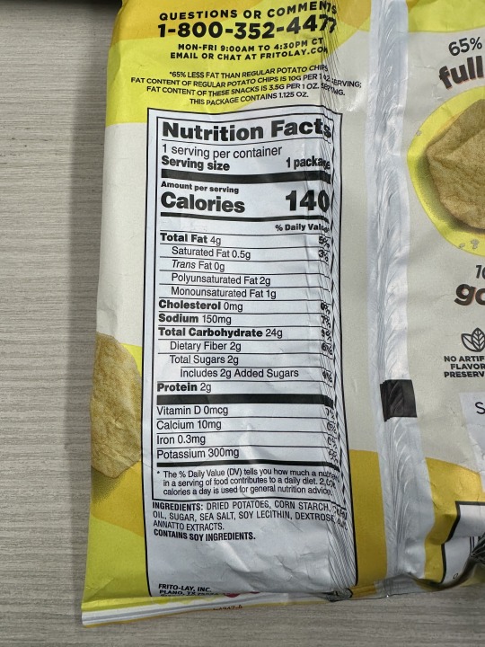

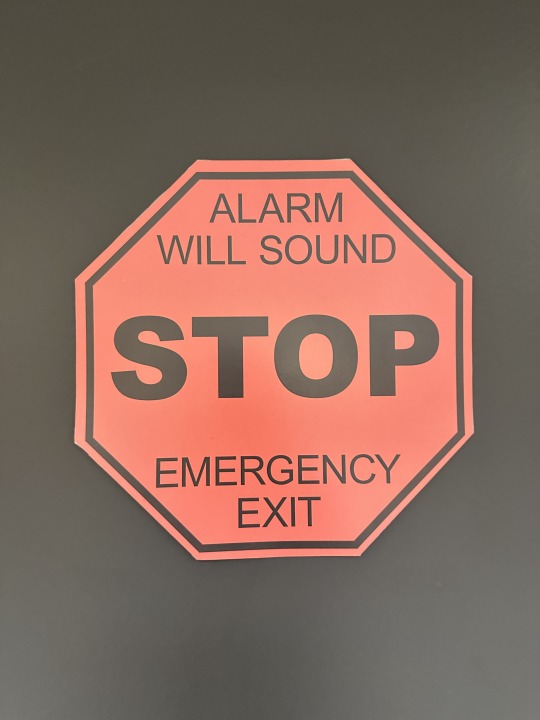
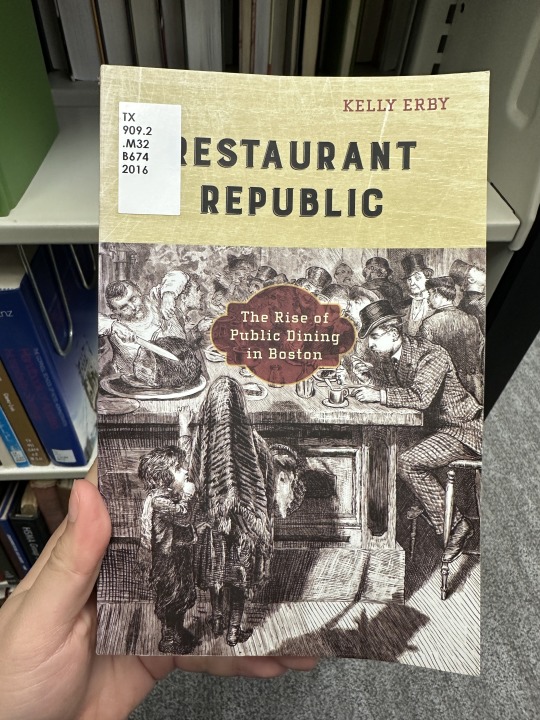
Image 1 - Denotative Meaning of a "Stop" Sign
Captured here is the universally recognized 'Stop' sign: an octagonal shape with a stark red background and bold, white letters that spell out 'STOP'. This sign is designed to capture immediate attention with its bright color and distinct shape, differentiating it from other signs. The use of red, a color that instinctively signals caution and urgency, universally communicates the necessity to stop. Its octagonal shape is unique among signs, ensuring it is quickly identified by people even from a distance.
Image 2 - Connotative Meaning of a "Stop" Sign
(The picture is not a "Stop" sign on the road but the meaning is also included the "Stop" sign on the road.)
This 'Stop' sign, while straightforward in its command, carries deep connotative meanings within our society. The red color not only demands immediate attention but also evokes feelings of danger and the imperative to cease motion, reflecting an unspoken rule of compliance and order in the public domain. It symbolizes the collective agreement and trust in a system that prioritizes safety and order, ensuring the flow of traffic is managed, and accidents are minimized. Its omnipresence at intersections serves as a reminder of our shared responsibility towards each other's safety. In this way, the 'Stop' sign also serves as a physical manifestation of societal norms and legal obedience, enforcing not just traffic rules but a cultural doctrine of caution and vigilance.
Image 3 - Iconic Function: Recycle Icon on Water Bottle
The recycle icon emblazoned on this water bottle embodies an iconic sign of sustainability and environmental responsibility. With its three arrows looping back on themselves, the design visually mimics the continuous process of recycling—collecting materials, processing them into new products, and then starting the cycle anew. This icon transcends linguistic barriers, offering a universal message that encourages consumers to participate in recycling efforts. Placed on a water bottle, it communicates the bottle's potential for reuse or proper disposal, aligning the everyday act of drinking water with broader environmental goals. The simplicity and clarity of the icon make it instantly recognizable, transforming a small symbol into a powerful advocate for reducing waste and conserving resources. By representing the recycling process in such a straightforward and effective manner, this icon not only informs but also inspires action towards a more sustainable world. Recognized worldwide, the symbol not only guides behavior but also fosters a global community committed to sustainability.
Image 4 - Nutrition Facts Box as an Indexical Sign
The Nutrition Facts box found on the side of snack packaging serves as an indexical sign, providing a direct quantifiable insight into the snack's nutritional composition—calories, fats, sugars, proteins, and more. Unlike mere advertising, which might claim that a snack is 'healthy' or 'low in calories,' the Nutrition Facts box offers tangible evidence of these claims, grounding them in data. This direct connection between the information presented and the physical reality of the snack's ingredients and nutritional profile marks a clear indexical relationship. Consumers rely on this information to make informed dietary choices, making the Nutrition Facts box a crucial element of modern food packaging. It not only communicates essential health information but also reflects broader societal concerns with nutrition, health, and informed consumer choices. This transparency empowers consumers, promoting healthier choices and fostering a more informed public.
Image 5 - Symbolic Function of the Apple Logo
Featured here is the iconic Apple logo, a symbol that has transcended its literal meaning to embody innovation, simplicity, and elegance in the realm of technology. Despite the apple shape having no inherent connection to electronic devices, through strategic branding and consistent design philosophy, it has become synonymous with cutting-edge technology and user-friendly design. This logo symbolizes more than a company; it represents a lifestyle choice and a commitment to aesthetics, functionality, and innovation. It also plays a crucial role in cultivating customer loyalty and evoking a sense of belonging among users, further amplifying its symbolic potency.
Image 6 - Book Cover Referencing Woodcut Print Style
This book cover employs a design reminiscent of historical woodcut prints, a technique characterized by its bold, engraved lines and stark contrast, which was widely used for illustrating narratives before the advent of photographic reproduction. By referencing this style, the cover art for 'Restaurant Republic' is not merely a visual choice but a signifier connecting the contemporary content to the historical subject matter within. It invokes a sense of nostalgia and authenticity, suggesting a scholarly approach to the history of public dining in Boston. The use of woodcut print style signifies a connection to the tradition of storytelling and historical documentation, hinting at the detailed research and possibly a narrative richness that awaits the reader. It evokes the era when public dining establishments began to flourish, and the medium's textural quality suggests a tactile engagement with history, drawing a parallel between the tactile nature of eating and the sensory experience of reading. This tactile quality not only visually engages but also invites the reader to feel a part of the historical narrative, enhancing the immersive experience of the book.
0 notes
Text
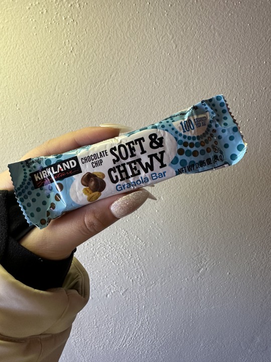
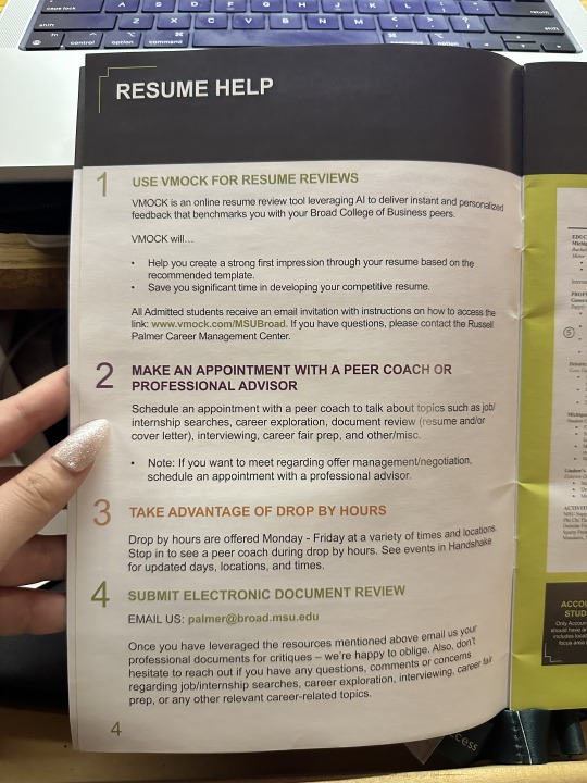
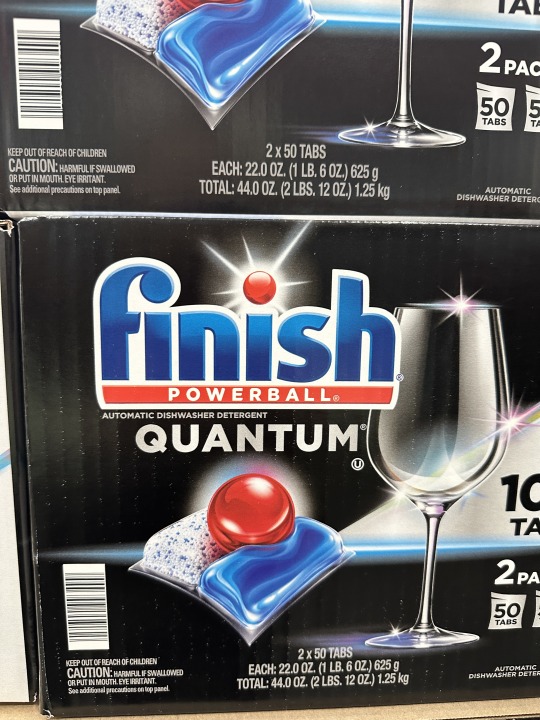

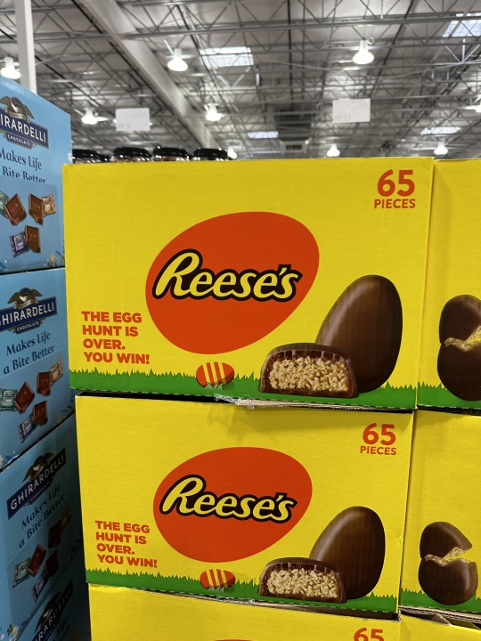
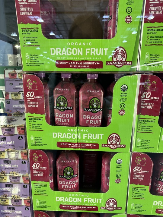
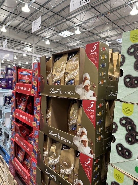
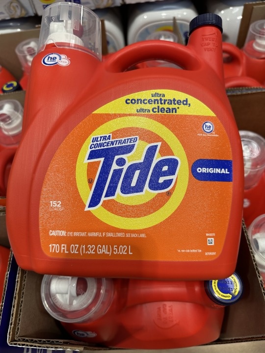
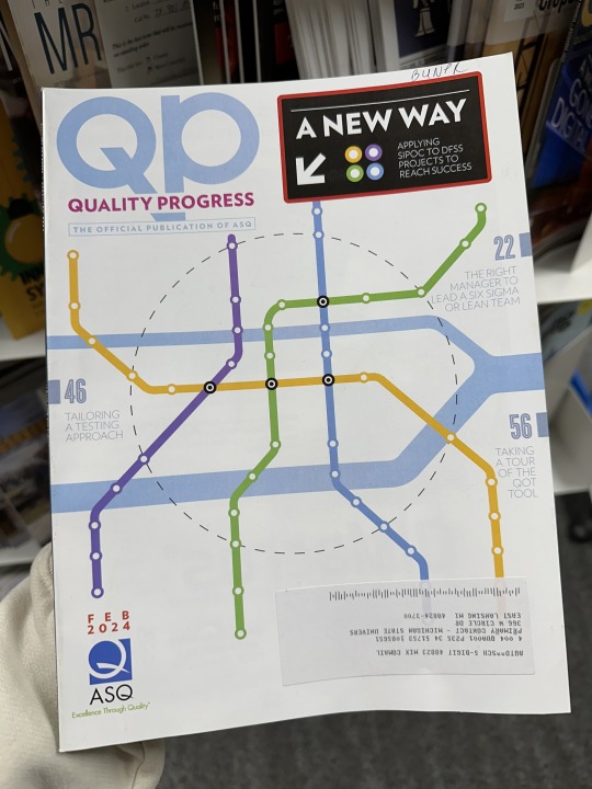

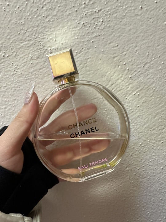
An example of rhythm in a publication design: The packaging design of the granola bar displays rhythm through its repeating patterns and dot sequences, which creates a dynamic flow that guides the eye across the package. Additionally, the arrangement of elements, such as the logo, product name, and key information, guides the eye in a rhythmic movement from one part of the packaging to another.
Typographic Hierarchy Example: The Career Handbook at MSU Russell Palmer Career Management Center serves as an example of typographic hierarchy. The page's design prioritizes the main topic of "Resume Help" by using larger or more prominent text for critical information such as utilizing VMock, making appointments with coaches and advisors, taking advantage of drop-in hours, and submitting documents for review. Details are presented in smaller text, establishing a clear order of importance on the page.
Letter with an Ascender: The packaging of Finish Powerball prominently features letters with ascenders, such as "f" and "h." Ascenders are the parts of letters that extend above the main body of the letter (the x-height), contributing to the readability and stylistic aspects of the typeface.
Letter with a Descender: The "f" in "Swiffer" on the Swiffer Heavy Duty Dry Cloths packaging is an example of a descender. Descenders are the parts of letters that extend below the baseline of the text, playing a crucial role in typeface character and legibility.
Letter with a Counter: The "e" in "Reese’s" on Reese's chocolate packaging illustrates a counter. Counters are the fully or partially enclosed spaces within letters, which are essential for letter recognition and aesthetic appeal.
Letter with a Crossbar: The "A" in "Dragon" on the Sambazon Organic Dragon Fruit packaging showcases a crossbar. A crossbar is the horizontal stroke in letters, connecting one side of a letter to another, or in the case of an "A," adding structural stability and stylistic flair.
Large X-Height Font: The Lindt chocolate packaging uses a font with a large x-height, where the main body of the letters (excluding any ascenders or descenders) is tall relative to the ascenders. This characteristic enhances legibility, especially in small print.
Small X-Height Font: The phrase "ultra concentrated ultra clean" demonstrates a font with a small x-height, where the ascenders are notably taller than the main body of the letters, giving a distinct visual hierarchy and emphasis.
Modernist Design: I found two examples for this: The first cover (9.1), featuring a subway map design, uses a clear and functional visual language with a structured layout, which reflects a modernist aesthetic. The second cover (9.2) uses bold, flat colors and geometric shapes which also align with modernist tendencies. Both covers emphasize simplicity and a structured, functional approach to design, hallmarks of the modernist movement.
Font Connoting More Than Text: The "Chanel" and "Eau Tendre" uses a font that not only says Chanel Perfume but also conveys elegance and luxury. This is an example of how font choice can evoke certain feelings or associations beyond the mere textual content, aligning with the brand's identity and the product's perceived value. Additionally, this font serves as a legacy element, consistently used across Chanel’s branding to maintain a strong and cohesive visual identity.
0 notes
Text


Image 1: Complementary Colors - The Graduate School Poster
The photo depicts a design utilizing BLUE and ORANGE, colors opposite on the color wheel. This intentional choice creates a dynamic contrast, making elements like logos or key messages stand out vividly, drawing the viewer's eye directly to these focal points. The contrast not only adds aesthetic appeal but also serves a practical purpose in enhancing readability and viewer engagement.
Image 2: Analogous Colors - Taste of Spring Break
The image shows a poster with a color scheme of blue, light blue, and greenish-yellow. These analogous colors, sitting next to each other on the color wheel, create a serene and cohesive visual experience. This color choice, often found in nature, evokes a sense of spring and freshness, resonating with the theme of a culinary event. The use of these colors could be a strategic decision to render the design inviting and harmonious, reflecting the event's atmosphere.
Image 3: Predominantly Cool Colors - Vital Proteins
The photograph focuses on a product with predominantly blue packaging, a deliberate use of cool colors. These shades are commonly associated with notions of cleanliness, health, and tranquility. The choice of cool colors in this design likely aims to convey a sense of purity and calmness, aligning with the product's health-oriented branding and appealing to consumers' subconscious associations with these colors.
Image 4: Predominantly Warm Colors - Pringles Packaging
This image captures a product design dominated by warm colors like red and orange. These colors are often linked to feelings of warmth, energy, and excitement. In this context, the use of warm colors might be intended to communicate the spicy and bold flavor of the product, stimulating appetite and conveying the product's intensity.
Image 5: Contrast in Color for Importance - Mixed Paper Instruction
The contrasting color scheme in this design, specifically white text on a orange background, is a strategic choice to make critical information stand out. This stark contrast not only grabs attention but also conveys a sense of urgency or importance, guiding the viewer's focus to key messages.
Image 6: Gestalt Principles of Grouping - Proximity - Sparty's
The Sparty's branding example illustrates the gestalt principle of proximity. The repeated use of the brand name alongside various phrases creates a cohesive grouping. This proximity suggests a range of experiences associated with the brand, fostering a sense of community and belonging. It demonstrates how closely placed elements are perceived as part of a collective, reinforcing the brand's identity.
Image 7: Active Figure-Ground Relationship - The Recycling Sign
The recycling sign's design is a prime example of an active figure-ground relationship. Accepted items are highlighted against a darker background, making them the focal 'figure', while non-accepted items are marked distinctly, positioning them as the 'ground'. This clear distinction aids in quickly communicating essential information and guides the viewer's understanding of the sign's purpose.
Image 8: Historical Allusion in Design - Cafe Du Monde Cup
The Café Du Monde coffee cup design uses historical references to connect with the café's long-standing heritage. The traditional illustration and typography evoke the café's origins in 1862, creating a sense of nostalgia and authenticity. This historical allusion aims to appeal to both locals and tourists, linking the product to the cultural fabric of New Orleans and its rich history.
0 notes
Text


Image 1 - Protein Balls Packaging: "PROTEIN BALLS" is in big letters so you see it quickly. The picture of the balls is right in the middle with a lot of space around it, making it stand out. The big words are up top, so they seem more important than the small stuff at the bottom.
Image 2 - Broad Career Chats Flyer: The big words at the top, "BROAD CAREER CHATS," have lots of space around them so they're easy to read. Underneath, the list of events is written smaller, so you know they're less important than the big title.
Image 3 - Instant Savings Sign: The "$3 OFF" is super big, so it's the first thing you see, emphasizing the money you can save if you purchase this product. The picture of the food is right next to it, showing you what you can save money on. The big green line is like a resting place for your eyes before they look at the details.
Image 4 - Orgain Protein Shake Packaging: The big circle that says "30g protein" tells you the main thing about the drink. The circle keeps showing up, which helps you remember the logo and what you're looking at. There's a lot of other info, but it's smaller and kind of in the background.
Image 5 - Cash Back Rewards Sign: The sign has different size squares with different numbers, showing you how much money you get back for different things. The big numbers are easy to see, emphasizing the percent of money you get back, and the smaller words just give extra details. The way the squares are lined up makes it easy to see what the deal is.
Each of these images uses contrast in graphic design by varying the scale, weight, and spacing of elements. This creates a hierarchy, guiding your attention to the most important parts first. The designs have elements that stand out immediately, while others provide more information without distracting you.
1 note
·
View note
Text


Image 1 - Mystique Belgian Chocolate Packaging: The packaging is designed to convey a sense of luxury and quality. The gold foil accents suggest an exotic and premium chocolate experience. The inclusion of the Belgian flag color indicates the origin, known for high-quality chocolate. The cocoa percentage is prominently displayed, catering to consumers who are specific about the intensity of their chocolate.
Image 2 - Caution Wet Floor Sign: This is a standard safety sign used to warn about slippery surfaces. The bright yellow color is used for high visibility and to draw immediate attention. The bold, capitalized "CAUTION" text and the universally recognized triangular warning symbol with a person slipping denote the purpose of the sign even from a distance. This sign is a good example of functional design that prioritizes clear communication over aesthetic considerations.
Image 3 - Ice Breakers Ice Cubes Gum Container: The container features a vibrant and refreshing design, with cool blues and whites to represent the peppermint flavor. The use of a clear, icy motif, along with the image of ice cubes, reinforces the product's promise of a burst of freshness. The branding is clear and modern, appealing to a young, energetic demographic.
Image 4 - Clorox Disinfecting Wipes Canister Container: This product packaging uses the recognizable Clorox brand colors of blue and white, with a hint of yellow to suggest the lemon scent. The label communicates effectiveness with phrases like "Kills 99.9% of Viruses & Bacteria," which is especially reassuring in a health-conscious market. The packaging is practical, with a focus on the ease of use and the benefits of the product.
Image 5 - Spartans Banner: The banner uses the school colors and the Spartan helmet logo to represent Michigan State University. The message "WE ARE SPARTANS OF A BETTER TOMORROW. SPARTANS WILL." is inspirational, suggesting that the students and community strive for improvement and success. The design is simple yet effective, with a clear message that aligns with the university's branding.
These descriptions highlight the varying objectives of graphic design in different contexts, from selling a product to communicating a hazard to inspiring a community. Each design balances aesthetics with functionality to achieve its specific purpose.
2 notes
·
View notes