
Seeking Expert Digital Product Designers? Let's Connect! | Clutch Award Recipient 2024 🏅 | UpWork Top 3% Talent 🚀 | Clutch 5/5 Ratings ⭐
Don't wanna be here? Send us removal request.
Statistics
We looked inside some of the posts by ankitparmar09 and here's what we found interesting.
Average Info
Notes Per Post
1
Likes Per Post
1
Reblog Per Post
0
Reply Per Post
0
Time Between Posts
2 days
Number of Posts By Type
Text
17
Last Seen Tumblr Blogs


Fun Fact
Tumblr has a 66 index score for customer satisfaction in the US.
Text
Small habits → big results.
Just started Atomic Habits by James Clear, and Chapter 1 already hit hard. Here’s the line that stuck with me: “Habits are the compound interest of self-improvement.” We chase big goals. Big changes. Big wins. But what actually works? → Getting 1% better every day. → Building systems, not just setting goals. → Doing the small things consistently — even when they feel invisible. Bad habits compound too. Progress doesn’t always show up right away. But over time? It’s undeniable. This book is making me rethink how I approach growth: → Less pressure on outcomes → More focus on process → Tiny wins that stack Here’s the question I’m now asking myself every morning: “What’s one small habit I can build today that my future self will thank me for?” If you’ve read Atomic Habits, what was your biggest takeaway? Drop it in the comments — let’s learn from each other.

0 notes
Text
Still designing the old-school way?
These AI tools will change your UX game forever. Real talk—most design workflows are slow, manual, and packed with guesswork. But with AI, you can move faster and make smarter decisions. Here are few insane tools that are transforming how top teams design: → Maze + UXtweak – Run user tests while you sleep. No more guessing. Real data, overnight. → Attention Insight – AI eye-tracking shows you exactly where users focus. No heatmaps needed. Just spooky-accurate insight. → Galileo AI + Uizard – Type a prompt like “SaaS dashboard” and watch full UIs generate in seconds. From sentence to screen. → PlaybookUX – Records real people using your designs. Watch where they struggle—before your clients do. → Stark + EqualWeb – Instantly check for accessibility issues. Color contrast. Screen readers. Compliance—handled. → Locofy + Anima – Turn your Figma into clean React code. Less back-and-forth with devs. More shipping. These tools aren’t just about speed. They completely rewire how you design. This is how future-ready teams work. Smarter testing. Instant feedback. Automated builds. Follow me for more UX + AI tools. Let’s level up your workflow and stop designing like it’s 2015.
0 notes
Text
Still mapping user flows by hand?
You’re wasting time. AI tools now do it faster, smarter, and way more accurately. Welcome to the new era of UX design. Platforms like Hotjar | by Contentsquare, Fullstory, and Mixpanel track exactly how users move through your product—in real time. → They spot hesitation → Pinpoint drop-offs → Highlight confusion No guesswork. No manual flowcharts. You get: → Instant heatmaps → Auto-generated flow reports → Session replays with real behavior But here’s the real shift: AI doesn’t just show you what happened. It predicts where users will get stuck next. That means you fix problems before they hurt retention. Faster iteration. Smarter decisions. Better UX—without the guesswork. Mini challenge for you: Take one of your app ideas and run it through an AI flow mapping tool. Then compare it to your original sketch. Bet you’ll spot at least one thing the AI caught that you missed. The future of UX isn’t coming. It’s already here. And it’s automated.
youtube
0 notes
Text
AI is now our junior designer — and it changed everything.
We don’t start from a blank canvas anymore. We start with intent. And we let AI handle the first draft. Over the last few months, here’s how we’ve redesigned our process: → From brief to prototype in hours, not days → AI helps us sketch flows, outline ideas, and explore edge cases → We move faster without losing depth or quality Faster doesn’t mean sloppy. It means: → More experiments → More feedback → Less friction → Smarter pivots And with the grunt work offloaded, we finally get to focus on what matters: → Strategy → User psychology → Micro-interactions → Journey refinement We’ve shifted from MVP → MLP → MAP: → Minimum AI-powered Prototype → Validate early. → Iterate faster. → Build smarter. Building something bold? Design with intention. Ship at speed. Let AI be your junior designer.


0 notes
Text
People don’t just use your website.
They feel it. And if it feels slow, confusing, or stressful… they’re gone. Frustration kills conversions. Good UX isn’t just about design. It’s about emotion. → A clunky checkout = stress → A cluttered layout = overwhelm → A slow page = instant irritation Negative emotions = lost customers. If you want people to stay, you need to make them feel good while they’re using your product. Here’s how to create a UX that builds trust and drives action: → Use clean, simple layouts – lower cognitive load → Add progress bars – give users a sense of control → Choose warm colors + friendly copy – boost confidence When people feel confident, they explore more. When they feel calm, they convert faster. When the product feels right, they come back. UX is emotional. Get that wrong, and no amount of clever features will save you. Want to build a site that feels amazing to use? DM me. Let’s make it happen.
0 notes
Text
Smart People Use Simple Words
Complex language doesn’t make your product look smarter. It just makes it harder to use. Here’s what I mean: Before UX: "Enable MFA for all authenticated endpoints" Half your users just checked out. After UX: "Turn on extra login security" Clear. Simple. Actionable. This isn’t just copywriting. It’s usability. Good UX means your users immediately get what to do — without needing a dictionary. Because if they don’t understand it, they won’t click it. Clarity builds trust. Simplicity drives action. Confusion kills adoption. So next time you write microcopy, remember: → You're not writing for engineers. → You're writing for real people, under real pressure, trying to get stuff done. Good UX starts with clear words. Don’t overthink it. Just say what you mean.

0 notes
Text
Most Product-Led Growth playbooks get UX dead wrong.
PLG sells the dream of virality, frictionless onboarding, and self-serve everything. But in the rush to scale, teams forget the most important piece: → The user’s actual experience. Not just UI. Not just onboarding. The full journey — including the parts that suck. Here’s what most PLG strategies miss: → What does the user really want? → Where do they get emotionally stuck, not just technically? → Why do they drop off after they finish onboarding? Too many teams optimize for signups and fake engagement. They track clicks and flows, but ignore confusion and friction. UX is not decoration. It’s not a growth hack. It’s the trust layer. And without trust, your funnel is a leaky bucket. If you want PLG that actually works long-term: → Prioritize clarity over cleverness → Focus on outcomes, not walkthroughs → Design with human context, not just dashboards Growth isn’t a replacement for value. It’s just the echo of a great experience. Stop treating users like funnels. Start treating them like people. Curious — where have you seen PLG UX go sideways? DM me now.

0 notes
Text
Speed matters. But speed without focus leads to garbage launches.
We needed a new way to move fast and build things that actually work. So we built a 5-step system that fuses AI into every part of the UX process. Here’s exactly how we do it: Step 1: Discover We use AI to summarize interviews, tag pain points, and find hidden patterns in user data. → Tools: ChatGPT, Dovetail AI, Fireflies → Time saved: 40–50% on research synthesis Step 2: Define AI helps us turn chaos into clarity. → Auto-generate journey maps → Draft personas → Detect ethical risks before they bite → Tools: Claude, Miro AI, custom GPT workflows → Time saved: 30% on definition Step 3: Design We co-design with AI — from wireframes to onboarding flows. → UX copy, prompt flows, UI drafts → Tools: Figma plugins, Uizard → Time saved: 40–60% in early-stage design Step 4: Test & Train Simulated feedback loops = faster learning. → Analyze user sessions → Test AI responses → A/B test prompt + UI combos → Tools: Maze, OpenAI Playground → Time saved: 50% in test cycles Step 5: Launch & Learn AI tracks user behavior and model performance in real time. → Sentiment monitoring → Predictive UX tweaks → Prompt dashboards → Tools: Mixpanel, PostHog → Time saved: No lag between releases The result? → Faster decisions → Leaner teams → Lower design & dev costs → 30–60% faster time-to-market (depending on product complexity) This isn’t just a workflow — it’s a design acceleration system built for the age of intelligent products. Curious how we can help you build and launch faster, with purpose? Let’s talk → 💬

0 notes
Text
Too many choices = no action.
And that might be why your conversions are tanking. This isn’t theory. It’s Hick’s Law—backed by decades of behavioral science. → The more options you show, the slower people decide. → The slower they decide, the more likely they bounce. → No decision = no sale. They don’t explore. They don’t scroll. They don’t buy. They freeze. I just dropped a quick video showing how this plays out in real life—and what to do instead. Here’s the short version: → One page = one action. → Kill the noise. Prioritize what matters. → Step-by-step checkouts = less overwhelm. → Make the CTA scream “click me.” You’re not designing for curiosity. You’re designing for clarity. Because when people have to think too hard, they leave. Simplify the decision. Speed up the sale. Watch your conversion rate jump. If your site feels like a buffet, don’t be shocked when no one fills their plate. Make the choice easy. Make the path obvious. Make the “yes” simple. High traffic but low sales? This might be why. Watch the video. DM me if you want help cleaning up your UX and turning browsers into buyers.
youtube
0 notes
Text
Happy Guru Purnima🙏🏻🙏🏻
Happy Guru Purnima! May the light of your guru always guide you towards wisdom and peace.

0 notes
Text
Ever felt your work was judged wrong?
(Does it feel like comparing apples to oranges?) I recently shared samples of our work with a potential client. Their immediate reaction was to compare them to their own needs. Each client has unique goals, audiences, and challenges. What should a sample really show? → The quality of the work. → The thought process behind the solution. → The team's capability and creativity. We don't offer ready-made solutions. Our job is to understand your unique needs. We build solutions tailored just for you. We don’t copy what worked for others. Let’s focus on capability, not comparison. Let’s move from replication to collaboration. That’s where real value is created. Consider this: A local bakery wanted to increase its online orders. Our solution involved a targeted social media campaign. It highlighted their unique artisanal bread. A tech startup, however, needed a different approach. We designed a comprehensive digital strategy. It focused on user engagement and data analytics. Both clients had different goals. Our solutions were tailored to meet those specific needs. → Understand unique client needs. → Build tailored solutions. → Focus on collaboration. → Create real value. Ready to create something unique? Let’s connect and explore your brand’s potential. What if we shifted our focus from comparison to capability? It’s time to value unique solutions. It's time to value tailored strategies. Ready to create something unique? Let’s connect and explore your brand’s potential. hashtag#CustomSolutions hashtag#CreativeCollaboration ♻️ Repost to help your colleagues!

0 notes
Text
Struggling to get meaningful feedback from your users?
Here’s what you’ve been missing ↓ Traditional surveys often fall flat. They're generic, poorly timed, and fail to capture the nuances of user experience. This guide will show you how contextual micro-surveys can transform your approach to user feedback. Step 1: Identify Key Interaction Points ↳ Pinpoint moments in the user journey where feedback is most valuable. Step 2: Design Context-Aware Questions ↳ Craft micro-surveys that directly relate to the user’s recent actions. Step 3: Implement Triggered Delivery ↳ Deploy surveys immediately after the interaction for real-time insights. Want to go the extra mile? • Tip 1: Use branching logic to tailor follow-up questions based on initial responses. • Tip 2: A/B test different question formats to optimize for higher response rates. By implementing contextual micro-surveys, you’ll be able to gather deeper, more actionable insights that drive product improvements. Remember, the key is to ask the right question at the right moment. How do you currently gather user feedback? Let’s discuss below. Found this helpful? Repost to help your connections. Follow me for more insights on UX design.

0 notes
Text
Happy Birthday 🎂🎉
Happy Birthday, Aman Pate Wishing you a birthday filled with joy and accomplishments. 🎂 🍰 🎉

0 notes
Text
Ever wondered how food delivery firms manage chaos?
I have a story about bringing order to digital meals. We helped a FoodTech platform redesign its UX/UI. It was like cooking in a fast-paced kitchen. The goal? ↳ Clarity for a system handling many things. ↳ Thousands of orders daily. ↳ Real-time delivery. ↳ Restaurant performance. ↳ Customer happiness. The challenge was big. How to simplify a complex operation? We focused on key areas. ↳ Dashboard intelligence. ↳ Restaurant management. ↳ Analytics. ↳ Order tracking. ↳ Admin settings. We delivered a sleek system. It balanced data with user-friendly design. It helps managers, teams, and restaurants. The results? Faster choices and fewer mistakes. Happier users all around. Looking to improve your SaaS product? Especially in FoodTech or logistics? Let’s talk! How can we build operations together? Drop a comment or send a DM.


1 note
·
View note
Text
Before vs After UX – eCommerce Product Listing Page (PLP) Makeover!
If your eCommerce store isn’t converting as expected, chances are your Product Listing Page (PLP) needs a UX rethink. We recently redesigned a PLP for a fashion brand, and the results speak volumes. The transformation wasn’t just visual—it was strategic, using psychology-driven UX principles to improve navigation, engagement, and conversion potential. Here’s a look at the breakdown and why every change matters 👇 BEFORE: ❌ A cluttered product grid ❌ Inefficient filters ❌ No visual hierarchy ❌ Low engagement and unclear navigation paths AFTER (UX Revamp): Each enhancement is rooted in proven UX principles that lead to real-world business results: ➔ 1. Free Shipping Banner on Top Uses the Von Restorff Effect to highlight key offers and boost visibility. ➔ 2. Aligned Logo, Search & Icons Follows Fitts’s Law for faster, more intuitive navigation. ➔ 3. Breadcrumb Navigation Applies Hick’s Law to reduce cognitive load and show user location. ➔ 4. Clean, Logical Side Filters Based on Miller’s Law—filters are grouped for easier scanning. ➔ 5. Category Banner at the Top Leverages the Aesthetic-Usability Effect to build trust and engagement. ➔ 6. Multi-Select + Searchable Filters Uses Jakob’s Law to match familiar user behavior. ➔ 7. Clear Heading with Product Count Applies the Clarity Principle to set user expectations. ➔ 8. Keyword Tags + Separate Sort Option Follows the Law of Proximity to improve scanability and reduce confusion. ➔ 9. Visible Brand, Price & Discounts Supports Visibility of System Status for quick decision-making. ➔ 10. Clean Grid & Neutral Background Follows the Law of Prägnanz to enhance visual clarity. ➔ 11. Pagination at the Bottom Creates a Feedback Loop, guiding users through exploration. 👀 The result? A smoother, faster, and conversion-friendly shopping experience – exactly what every online store needs in today’s competitive market. UX isn’t just about how things look—it’s about how they work, how they feel, and how they guide users toward your goals. If you’re: ✅ Seeing high traffic but low conversion ✅ Losing users due to poor navigation or clutter ✅ Planning a website revamp or new eCommerce launch 💬 Let’s talk. We specialize in data-backed UX transformations that turn browsers into buyers. This isn’t about trends—it’s about performance. 👉 DM me or reach out at [email protected] Let’s make your eCommerce experience one worth shopping again.
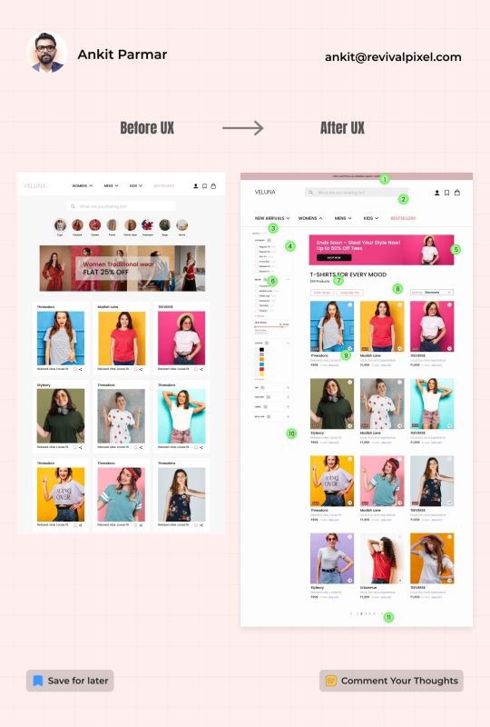
#UXDesign#eCommerceUX#BeforeAfterUX#ProductListingPage#WebRedesign#UserExperience#ConversionOptimization#UIUX#AnkitParmar#RevivalPixel#LeadGen
0 notes
Text
Jagannath Ratha Yatra 2025🎉🙏🏻
With Lord Jagannath's blessings, may you find the strength to overcome every obstacle. Wishing you a peaceful and powerful Rath Yatra!

0 notes
Text
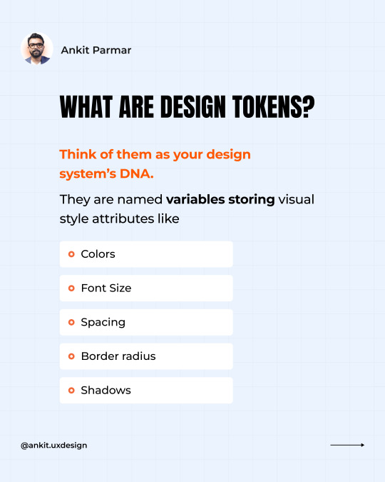
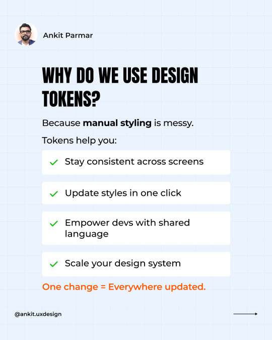
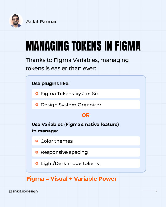
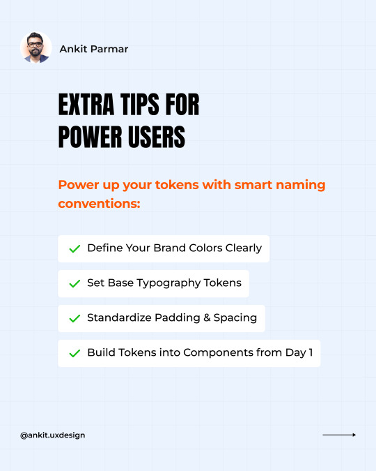
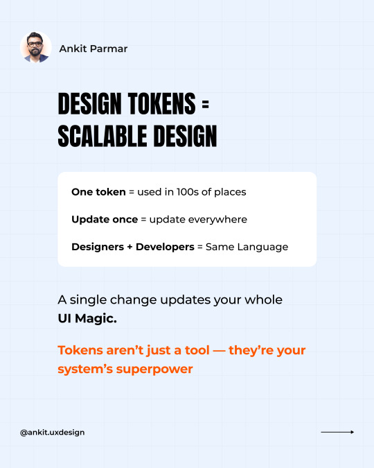
Designers & Devs — ever felt your UI is one update away from chaos?
Here’s how to get it right ↓ It’s time to talk about your design system’s secret weapon: Design Tokens. Many designers and developers struggle with maintaining consistency across their UIs, leading to chaotic updates and increased development time. This guide will help you streamline your design process and ensure scalability. Step 1: Understand Design Tokens (UI DNA) ↳ Design tokens are the fundamental values that define your UI, such as colors, typography, and spacing. Step 2: Ditch Manual Styling ↳ Say goodbye to manual styling and embrace tokens for automated, consistent updates. Step 3: Master Figma Management ↳ Learn how to efficiently manage design tokens in Figma to keep your design system organized. Step 4: Naming Conventions ↳ Use clear and consistent naming conventions for your tokens to enhance collaboration and maintainability. Step 5: Token-Driven Updates ↳ See how a single token change can update hundreds of UI elements, saving you time and reducing errors. Want to go the extra mile? • Tip 1: Implement a token management plugin in Figma for easier handling. • Tip 2: Regularly audit your design system to ensure tokens are up-to-date and relevant. By following these steps, you’ll be able to bring clarity, consistency, and collaboration to your UI. Remember, a well-managed design system is the backbone of scalable UI. I just dropped a new Figma carousel: "Design Tokens in Figma – The Secret to Scalable UI" 👉 Swipe through to learn how to future-proof your design system. What’s your biggest challenge with design systems? Let’s discuss below. Help your network by sharing this post today. Follow me for more insights on design systems.

0 notes