
Hello there! 👋 I'm a 29-year-old female hailing from the scenic state of Virginia. My roots are a blend of English and Costa Rican heritage, contributing to the rich tapestry of my identity. Currently, I'm deeply immersed in the world of RV renovation, embracing a lifestyle centered around living off the land, hunting, and farming.By day, I channel my creativity into the realm of sound as an audio engineer and voice-over artist, bringing stories to life through the magic of soundwaves. When not in the studio, you might catch me on the road as a delivery driver, navigating the diverse landscapes of both work and play.What makes me uniquely me is my journey through trauma, a challenging path that has cultivated in me a profound sense of empathy. Rather than letting adversity embitter my worldview, I've chosen to approach life with a belief in fairness, justice, peace, and forgiveness. My uphill battles have not only shaped my resilience but also fueled a deep commitment to understanding and compassion.So, whether I'm behind the wheel, transforming RV spaces, or lending my voice to narratives, I bring a unique blend of passion, resilience, and empathy to every endeavor. Let's navigate the journey of life together! 🌟
Don't wanna be here? Send us removal request.
Statistics
We looked inside some of the posts by art-appresh and here's what we found interesting.
Average Info
Notes Per Post
3
Likes Per Post
2
Reblog Per Post
1
Reply Per Post
0
Time Between Posts
14 days
Number of Posts By Type
Text
5
Last Seen Tumblr Blogs


Fun Fact
70% of Tumblr users say the Dashboard is their favorite place to spend time online.
Text
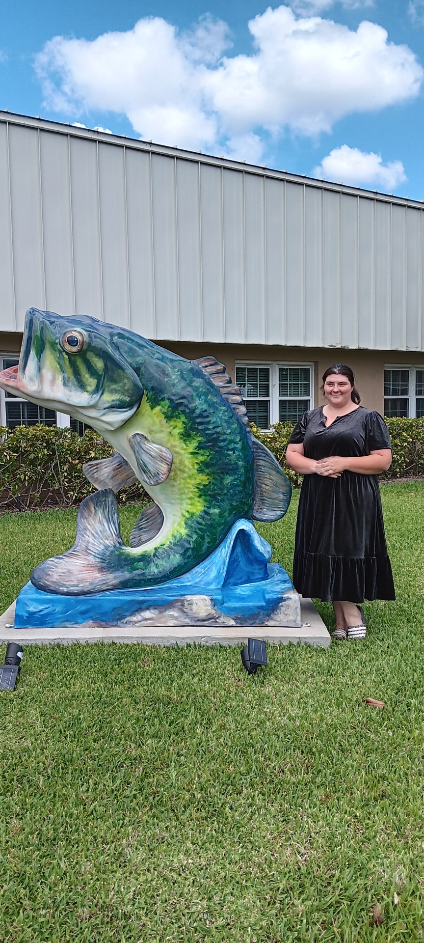
I live a small town of Auburndale, that is only twenty square miles so there is no museums here but recently there has been an interesting installment at the city hall. A fiberglass status of a large mouth bass about 6 feet tall. Unveiled July 31, 2020 by the City of Lake Alfred, FL the city commission, city staff and community members. The first of several bass statues the City unveiled at different locations. Artist Greg Holdren of Beloit, Kansas, this artwork speaks volumes about the artist's understanding of the community and its essence. Reflecting a deep awareness of the local culture and environment. Situated in a town known for its numerous lakes and thriving fishing culture, the artwork serves as a symbolic representation of the town's identity. Moreover, the fact that the bass is featured on the city seal further emphasizes its importance and relevance to the community. Holdren communicates a message of pride in the town's natural resources and recreational activities. The artwork celebrates the beauty of nature thru it's accurate coloring of deep blues and greens as a fisherman myself I can say looks as if your standing next to a huge fish! Holdren's intention seems clear: to create a piece that resonates with the local population, evoking a sense of nostalgia and appreciation for their surroundings. In terms of artistic elements, the sculpture appears balanced, with its sturdy base supporting the weight of the fish. The proportions of the bass are well-maintained, capturing the essence of the species accurately. The rhythm of the sculpture is evident in the smooth lines and curves that mimic the fluid movement of a swimming bass. Furthermore, the unity and variety within the sculpture create a harmonious composition that captures the viewer's attention while allowing for individual elements to stand out. Overall, Holdren's artwork not only pays homage to the town's heritage but also serves as a testament to his skill as an artist. By effectively conveying the essence of the community and nature through his sculpture, Holdren has succeeded in creating a piece that is not only visually striking but also deeply meaningful to those like me who call Lake Alfred home. I'll attach a photo next to the statue now!
0 notes
Text
Logos Gatorade, Domino's, Xbox, Hurley, Torrid, All these logos are in eye view of me at the time of writing this. I know about the Domino's logo because I work there and they put the logo on all the work clothes so employees are easily identifiable when out in public. It definitely makes it easy for customers to find me in a crowd or when walking into a building. Most of time I don't have to go searching for the customers because of it. I think for a brand to be successful they have to be recognizably different from other products or services of its kind. Image if all soda had close to the same logo; the confusion would probably lead to less sales because people might think they are all the same. I think the value in a logo is its ability of differentiation.
0 notes
Text

A self-portrait painting captivating a vision of my family in the future, crafted with an artistic blend of traditional aesthetics and futuristic elements through the lens of AI paint. The portrayal captures the essence of a nostalgic 60s style, evoking a sense of warmth and simplicity reminiscent of a bygone era. If you're familiar with me, you'll find this image remarkably accurate—it even includes details like the pink hair and smoking, and I didn't provide explicit instructions for those specific elements. This unexpected and accurate representation further underscores the dynamic and insightful nature of AI in the realm of artistic creation. It seems like the painting not only embodies my vision for the future but also resonates with my individuality and style. The appeal is further heightened by the thoughtfully coordinated color scheme, where the outfits seamlessly blend with the sky and buildings, creating a harmonious and comprehensive aesthetic.
0 notes
Text

My bunny painting, prominently displayed in the hallway right outside my bedroom door, is a piece that seamlessly blends form and texture. The artist skillfully employed mixed media to bring the artwork to life, incorporating various materials to create a textured background that adds depth and dimension. The inclusion of flowers enhances the overall aesthetic, providing a harmonious balance to the playful presence of the bunny. Beyond its decorative function, this artwork serves as a delightful focal point, infusing the space with a sense of warmth and charm. The textured background not only aligns with my personal style but also invites tactile exploration, creating a visually and sensory engaging experience. The intricate details and thoughtful composition make it undeniably beautiful, evoking a sense of joy and appreciation for the artistic craftsmanship at play.
0 notes
Text
Hello, I'm Shy Alley, a dedicated voice-over artist, and interestingly, I share my home with six bunnies and two dogs.
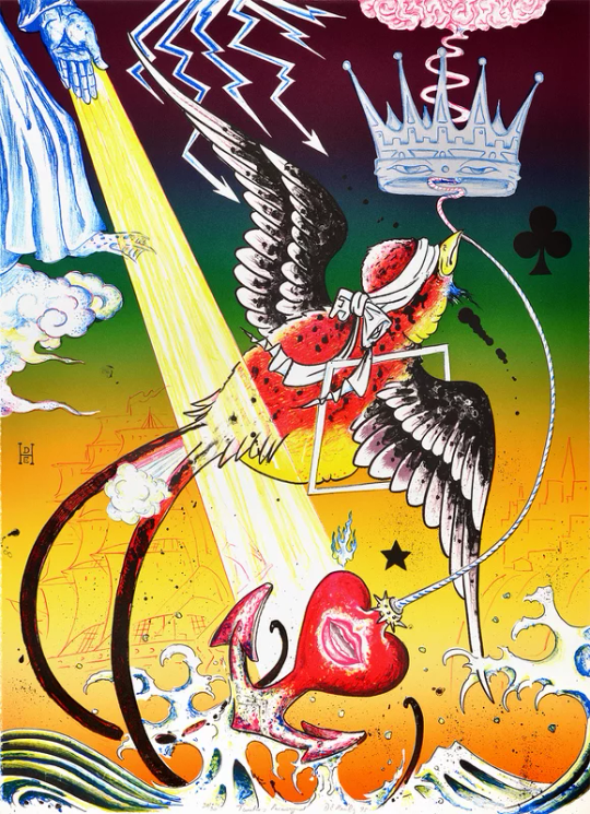
Facts about Don Ed Hardy and Tweeter’s Recovery.
Tweeters Recovery is a follow-up painting done in 1995 to a 1992 painting after the L.A. riots which was titled “Bad News (Tweeter is Sick)”.
The painting contains significant religious symbolism, including Tibetan Buddha eyes on the crown, and depicts a god figure walking through the sky with his hand emitting benevolent rays.
Don Ed Hardy integrates traditional Japanese tattoo techniques with American styles in his designs, creating a blend of Eastern and Western artistic influences.
In addition to his tattooing expertise, Hardy rose to prominence by launching the Ed Hardy brand in the early 2000s, which gained acclaim for its unique clothing line featuring designs inspired by Hardy's distinctive tattoos. (My dad use to wear them when they were popular.)
Don Ed Hardy holds a master's degree in Fine Arts from the San Francisco Art Institute. This academic background demonstrates his formal training and dedication to honing his artistic skills, setting a solid foundation for his influential career in tattoo art and design.
When I first encountered this artwork, its style immediately evoked memories of the 2000s for me. However, my initial impressions were somewhat negative, likely influenced by the association of the brand with bikers and the prevailing stigma surrounding tattoos during that era, before they gained widespread acceptance through pop culture icons. At that time, I was unfamiliar with the specific details or had seen any of his actual paintings. Now, upon closer examination, my initial reaction is that the composition feels a bit cluttered. Questions arise about the significance of elements like the club, the random ink blots, and the 'D' over the 'E.' While the symbolism within the piece is intriguing, I find the background particularly compelling. The outline featuring the clipper and Telegraph Hill harmonizes well with the background's color transitions. However, elements like the blue ink used for the god, the crown, and the lightning seem to clash with the overall color scheme, becoming somewhat distracting.
3 notes
·
View notes