
Don't wanna be here? Send us removal request.
Statistics
We looked inside some of the posts by artinthesolace and here's what we found interesting.
Average Info
Notes Per Post
1
Likes Per Post
1
Reblog Per Post
0
Reply Per Post
0
Time Between Posts
3 days
Number of Posts By Type
Text
13
Last Seen Tumblr Blogs


Fun Fact
Tumblr.com rank in the US is 25.
Text
Heat Waves
Artist: Dawn Howard
Media: Acrylic Paint on Canvas
Date: 2023
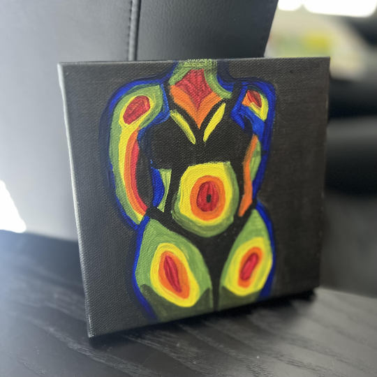
When I discovered that our Final Exam was going to be creating art, I honestly was incredibly nervous about it. At the beginning of this course, I thought it was going to be more about art history than the actual process of creating art. I am one who thoroughly enjoys learning about art and its different time periods. Yet I have always struggled when it comes to creating artwork of my own and being satisfied with it. I am more creative musically than I am with a paint brush in hand. Nonetheless, I decided that if I have learned anything from this course it is that we form art and art forms us. Creativity, as the text taught us, “is the ability to bring forth something new that has value.” I do not need to be the next Picasso to create a piece that provides feeling and emotion. The possibilities for creativity are endless when an open mind is kept throughout the process. For my medium of art, I decided to use acrylic paint on a white canvas. When beginning my creating journey I decided I was going to paint a woman's body outline and provide a way of emotion. But before I could begin with the paint right away, I chose to use pencil and sketch out her body and its features. Once I felt like my drawing was complete, I began adding acrylic paint to the canvas. I chose this form of media due to its popularity with many artists today and its history of being an invention of the mid-twentieth century. My choice of “lamp black” acrylic allowed for the use of chiaroscuro in the background of the artwork. It created a shadow effect that gave the body emphasis which allows for the center of the piece to stand out. The slight use of black acrylic on the undergarments allowed definition on the body. My next acrylic color choice was “ultramarine blue” for the outermost of the body. I then decided to mix the colors “viridian” and “yellow ochre” to create the perfect color of green for the next layer of the body. Afterwards, I mixed the “lemon yellow” with a tiny bit of white acrylic to create the right color of yellow to add brightness to that next layer of the body. Then the next layer was painted with “metallic orange,” and I finished the final layer of the white canvas with “crimson red.” As each layer would dry, I was going back to each color and adding another layer of paint till I felt like it was complete. Subsequently, I had created a piece that resembled thermal imaging which is something that makes pictures from heat instead of light. My heart in this piece was to allow the art to form me as I was creating, and I honestly believe it did just that. Through the colors I had chosen I wanted the viewer to feel the radiance coming off from the body. My wish was for it to appear as an aurora for the viewer to read and discover for themselves. How this painting makes the viewer feel is completely up to them. And I believe that to be my favorite thing about art.
0 notes

Text
Writing, Thinking, and Looking Critically
Jackson Pollock was under the mentorship and guidance of Thomas Hart Benton. Who also played the role as a father figure to Pollock at the time. It is said that Pollock struggled with alcoholism and became very violent when he drank. And through my research it is also said that Benton rose to (short lived) fame. Thus, leaving Pollock to fend for himself as an artist. I believe that in that time of self-reflection as an artist, Pollock found his own voice and was done creating in the ways he had once been corrected from doing. Which may have resulted in the reason of why Pollock removed all of the imagery from his famous "drip technique" paintings. Many people have mocked the artist for using such a technique, but maybe that is the exact reason he continued to paint in that chosen style. Although it is a style that is not understood or accepted by many, he continued to create it as such. He may have wanted to stand out from the rest of the world and believed it would capture more eyes if he did so. And maybe through these paintings he was able to see himself in his trust form and it helped him understand himself better piece by piece. Beauty truly is in the eye of the beholder.
0 notes
Text


For this assignment I chose to analyze the Mater Dolorosa, previously known as The Blue Madonna, 1670s painted by Onorio Marinari (Italian, 1627-1715). My boyfriend, John, has always told me how this work of art captures him every time he visits it. And through the process I took of deeply studying this piece I can see why that is. This painting can be found in the Italian Baroque Art section of The John and Mable Ringling Museum located in Sarasota. This painting is an oil on canvas and measures the image: 21 × 15 1/2 × 3/4 in. (53.3 × 39.4 × 1.9 cm) and frame: 30 1/8 × 24 1/8 × 2 1/4 in. (76.5 × 61.3 × 5.7 cm). Bequest of John Ringling, 1936. The reason I mentioned this to be previously known as The Blue Madonna is because this piece was once attributed to the great Carlo Dolci. Upon further research by the Ringling Museum, it was learned that this was painted by one of Dolci’s greatest followers and cousin, Onorio Marinari. Dolci and Marinari had a remarkably comparable way of producing art that portrayed a great balance between melancholy and sweetness to their pieces. In the Mater Dolorosa, we see a beautiful portrait of Mary wrapped in a royal blue robe. An emphasized color that would capture the eye of anyone strolling through this exhibit. Which would easily allow for this painting to be one of the most visited works of art in the museum. Blue became associated with the Virgin Mary in the early 5th century and the color signifies her role as the new ark while representing peace, tranquility, and the divine. In this painting we can appreciate how Mary is illuminating from the inside out. Her face was captured in such a soft way that she almost resembles a porcelain doll. I could physically feel the spiritual glow of her aurora just by looking at her. Marinari did a stunning job of using the effect of chiaroscuro in this piece through dark shadows of the background and luminescent light shining down on Mary’s face. The slight touch of highlight added on top of her head makes it look like a halo is being cast over her. How incredible that there is only one subject matter to this piece, yet there is such a wide range of emotions to feel in the simplicity. This artwork tells me that the artist, Marinari, is a religious man who wanted us to view Mary in a soft and innocent lighting. He might have even wanted us to feel sympathy for Mary and the melancholy she felt. I say that because the Mater Dolorosa means “the Virgin Mary sorrowing for the death of Jesus Christ.” Based on everything that I have learned from the artwork and the artist, this is an important piece to society and to the world. This is because the world needs spiritual enlightenment and awakening. We need pieces like this to help us feel emotions that are greater beyond our own understanding. That is where the truest form of peace and purpose can be found. And I believe it to be a hope from Marinari, that we would not only view his artworks as a skill but that we may look through it to understand the emotions he was trying to convey to us.
0 notes
Text
Photo/ Design
Group 4: Interactive Design
Interactive Design is a user-oriented field of study that focuses on meaningful communication using media on a website/app.
Top 5 Interactive Designs according to Dawn Marie:
1. Spotify - Web Player: Music for everyoneLinks to an external site.
2. Home - Taylor SwiftLinks to an external site.
3. PinterestLinks to an external site.
4. AppleLinks to an external site.
5. BLACK RIFLE COFFEE COMPANY – Black Rifle Coffee CompanyLinks to an external site.
When it comes to Interactive Design, it is incredibly important for it to be engaging and fun for the user. I have been using Spotify for over 10 years now and I can honestly say that it is my favorite interactive design. It truly fulfills its purpose of being a music outlet but also goes above and beyond throughout the app as well. It has allowed me to be on top of new releases from my favorite artists, has a screen that displays the lyrics on time with the music, and even has added a wide variety of podcasts for listening as well. Making it even more diverse than just your average music app. It has interactive components to where you can follow your friends and see what music they are currently listening to. I've most enjoyed how every year the app compiles an album of your most listened to songs of that year. Which makes it fun to look back on and see how the genres have changed or if they've remained the same throughout the year. Being a lover of music, this is something that I have always appreciated greatly.
0 notes
Text
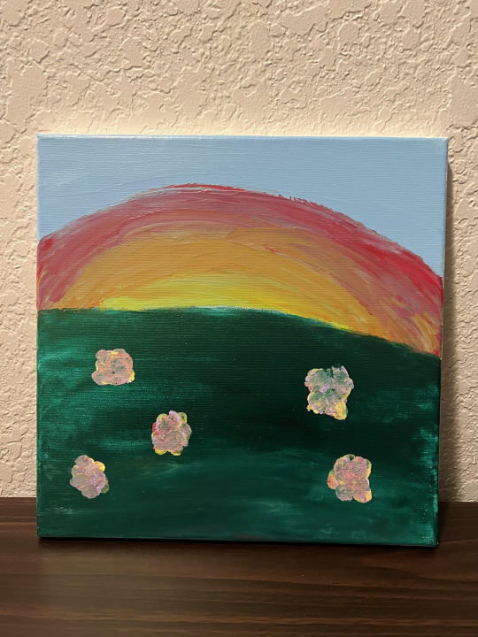
Art Project - Artist's Choice
I am not an artist by any means, but this is my best attempt at creating a painting that represents something meaningful to me. My name is Dawn, and this piece was made to represent my love for the sunrise and sunsets. I used acrylic paints and my fingers to create this, lack of a better word, masterpiece.
0 notes
Text
Connecting Art to your World
Color has affected my world since I can first remember. There are certain sunsets that I have seen in my life that's hues of pink and orange I swear healed me from the inside out. The aurora of color has more of an effect on us psychologically than we may sometimes even realize. Similar to the sound of a song or the taste of a sweet treat, different colors can associate to different memories of our past. I remember being on top of a mountain at sunrise and viewing the intensity of the dawn through the mist of the early morning sky. How at peace my soul was to be able to witness such a heavenly sight. That being said, if I were to live in a certain color scheme for the rest of my life, I would have to choose one of a rose-colored glass. One that is of a warm sunrise that wraps you in its vibrant hues. "La vie en rose" as they say it.
0 notes
Text
Writing & Looking
One piece of art that the textbook first mentions in chapter 7.3 and has forever been a favorite of mine would easily have to be the fresco paintings by Michelangelo on the Sistine Chapel ceiling in the Vatican. (see FIG. 17.9)
The ceiling of The Sistine Chapel is broken into 33 separate works of art and each individual piece has been painted with a different religious scene. Michelangelo worked between the years of 1508 and 1512 on the ceiling. And although the artist was more accomplished as a sculptor, he was requested by Pope Julius II to paint the Sistine Chapel as part of the renovations to the Vatican. Within each panel was the use of incredibly beautiful frescos telling different stories from the bible. Which he also had lacked the familiarity with the fresco techniques and made the attempt at it anyways. The fresco technique requires: two layers of plaster (a thicker one named arriccio and the thinner one that is lied down daily to be painted until the surface of the wall is wet). The hired team had built a scaffold following Michelangelo's instructions. In less than three months the old fresco would be removed, and the plastering of the vault would be completed. Which indicated that the arriccio was done and the ceiling was ready for painting. Once the rest hired for the job had arrived, they took on the project. And I'll never stop being amazed at the fact that this piece was completed so beautifully in just 4 years.
0 notes
Text
Principles of Design
Here is a look into each of the Principles of Design and how they look in our everyday lives.
Unity (the appearance of similarities, consistency, or oneness) and Variety (the opposite of unity; diverse elements in the composition of a work of art). We can see Unity in the world of art by the modern use of geometric shapes that include bright colors next to dull colors.
Balance (an arrangement of part achieving a state of equilibrium between opposing forces or influences). Leonardo Da Vinci's "The Last Supper" is a great example of Balance, and in this case symmetrical balance. An equal number of figures can be seen on either side of Christ in this painting. Showing us six on each side.
Emphasis (a method an artist uses to draw attention to an area; may be done with central placement, large size, bright color, or high contrast) and Subordination (technique by which an artist ranks certain areas of a work as of lesser importance; areas are generally subordinated through placement, color, or size). When we examine a painting such as "Girl with Pearl Earring" by Johannes Vermeer, we can take note of the use of Emphasis in art. With this painting particularly, the use of highlights that are contrasted against the dark background help to create the emphasized effect.
Directional Forces (pathways that the artist embeds in a work for the viewer's eye to follow). "Storm of the Sea of Galilee" by Rembrandt van Rijn (1633) is the perfect example for Directional Force. The shape of the sails on the ship with the movement that the artist portrays gives us direction as the viewer to follow. One that is a triangular type of shape for your eyes to go towards.
Repetition (the recurrence of visual elements) and Rythm (the regular or ordered repetition of dominant and subordinate elements or units within a design with related variations). One example that quickly comes to mind of Repetition and Rythm in art would be Vincent Van Gough's "Starry Night". The repetitive swirls that create movement throughout the artwork draws the viewers eye into the painting.
Scale (the size relation of one thing to another) and Proportion (the size relationship of parts to a whole and to one another). The famous marble sculpture done by Michelangelo titled "David" gives us a great example Proportion. There have been multiple replicas of the same sculpture that all have different sizing of his proportions. Some exaggerating him to be bigger and stronger while others showing him in kid-like proportions.
0 notes
Text
Art Project (Self-Portrait)
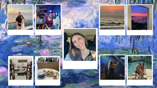
For this assignment I decided to create a virtual collage that depicted the things in my life that define who I am as a person. I chose the background to be Claude Monet's "Water Lilies". This oil painting and its beautiful color scheme I felt gave expression into how I view the world. "La vie en rose." Which translates into "life in pink" or how I would also describe it as seeing the world in rose-colored glasses. In this collage I created polaroids to depict my love for capturing the moment through film. I share photos of my family and sweet boyfriend, my love for the sunrise and sunset. Visiting my favorite coffee shops and bookstores. And I also share a photo of me singing, which is easily one of my favorite things to do. Music truly gives my life purpose and meaning. And hopefully this photomontage can give you a lens into what makes me: Dawn.
0 notes
Text
"Writing a Self Portrait"
When we are looking at art, we are perceiving the works through the lens of our soul. Some people may choose to view things in black or white, but I chose to view it in technicolor. And that would be due to my open mind and wandering spirit. I am a 24-year-old woman, born in Tampa Florida. I am half Scottish half English, so I often joke that I am a descendant from William Wallace. My life consists of working at a local Piano Bar, that I love so much. I've been there for 2 years now. I do school online so that it mixes well with my schedule. And on the off chance I have open time, you will find me wrapped up in music, finding unique food spots to try, and going to farmers markets/thrift stores. The thing that makes me uniquely myself is that I am adopted. I was adopted around the age of 4 and have been blessed with the most beautiful family and life ever since. I even got to meet my biological sister for the first-time last year. I didn't know I had siblings, but she lived her life knowing about me and hoping to meet once again. It was true fate that our lives were aligned with one another because now I feel a sense of closure from that part of my life.
0 notes
Text
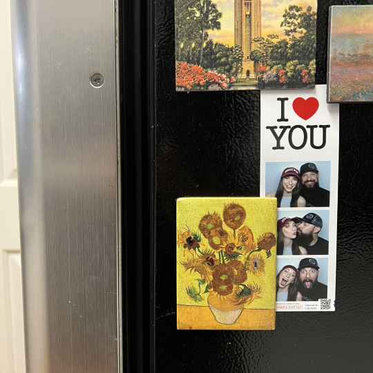
When choosing a work of art to showcase from my life, I knew just the place to head towards. The refrigerator of course, due to the array of magnets from different museums my boyfriend and I have visited together. Sadly, we have never had the chance to visit Vincent van Gogh's work in person. But this magnet keeps the hope alive for that one-day opportunity. This oil on canvas was titled "Sunflowers", located for viewing at the Van Gogh Museum in Amsterdam. He was known for his heavy use of paint in his brush strokes to create flow, rhythm, and breaks in the movement. Sunflowers are my favorite flower, and this work of art beautifully depicts the flowers vibrance. He really knew how to make a piece of art come alive into full movement.
0 notes
Text
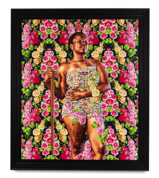
Hi class, my name is Dawn! And one fact about myself is that I love to travel. Seeing the world and experiencing different cultures is one of my favorite things to do. And that especially includes trying different types of foods from all over.
My artist for this assignment is Kehinde Wiley and his 2018 oil on canvas painting "Tyesha Flemons".
5 facts
1. Kehinde Wiley is an American portrait painter based in New York City, who is known for his highly naturalistic paintings of Black people, frequently referencing the work of Old Master paintings.
2. He was commissioned in 2017 to paint a portrait of former President Barack Obama for the Smithsonian National Portrait Gallery, which has portraits of all previous American presidents.
3. He was included in Time magazine's 100 Most Influential People of 2018.
4. At the age of 11, Wiley and his brother were selected with 48 other kids to spend a short time at a conservatory of art in Russia, just outside St. Petersburg. It was here that Wiley developed his passion for portraiture.
5. Wiley traveled to Nigeria at the age of 20 to meet his father and explore his family roots there. He was strongly influenced by seeing the works of Gainsborough and Constable.
When I first looked at this piece of art, I could tell that it was modern work. With that being said I thought it was a beautiful piece, but it didn't capture me completely at first. And now I can say that I am more intrigued after learning about the back story on the artist and how old school classics influenced his style in oil painting. To also read about the struggle of this artists upbringing and how his family continued to pursue a creative lifestyle for him is inspiring. His work with oil painting on canvas is stunning, and his achievements are admirable.
References:
1 note
·
View note