
This is a blog specifically for my University course (Visual Communication Photography). If you're interested in my work, you can see more of it on my instagram: @valdezthephotographer
Don't wanna be here? Send us removal request.
Statistics
We looked inside some of the posts by bcuvaldez-blog and here's what we found interesting.
Average Info
Notes Per Post
0
Likes Per Post
0
Reblog Per Post
0
Reply Per Post
0
Time Between Posts
13 hours
Number of Posts By Type
Text
17
Last Seen Tumblr Blogs


Fun Fact
US Tumblr user growth rate is estimated to slow down to 4.1%.
Text
The Final
This is the overall work that the group did, I’m proud of it !!


0 notes
Text
Advertising the Tote Bags
Now that our tote bags have been made, I took photos of the product in a university setting to signify who our target audience are, and to advertise our brand.


0 notes
Text
Tote Bag Competition
Initially,, we were going to use the power of social media, through the use of the hashtag that we made ‘#Bhamoutdoormarkets’ where people could win the a tote bag through uploading photos of their food using ingredients from the market, but we though of how people could simply purchase products from supermarkets. To combat this flaw, Kate came up with the idea of using a treasure hunt-like ‘game’, where stickers are placed in an array of different places within the outdoor market, and people had to find and take photos of them to upload to social media using the hashtag to win the tote bag. Compared to our initial method, this is a enhance of it. The level of interaction towards the audience have increased greatly, due to the fact that our audience will physically have to take part in the competition rather than uploading photos in their homes. This way they’ll actually be in the market, to feel atmosphere of it and maybe socialize with the market stall holders.
We decided to not use our initial stickers for the ‘hunt’. In the stickers in the competition, we decided to use one of our initial sticker designs and added a strike across it stating the prices of food in the market, to enable another form of advertising within the market.


To inform people about the competition, Kate made a poster containing information about the competition. What stickers to look for, what hash tag to use and which social media outlet to post to.

0 notes
Text
Making the Tote Bags
Jen bought a pack of plain tote bags from amazon for us to make our brand merchandise. Considering that I didn’t know how to print screen, Jen and Kate made our idea of making tote bags a reality.


Looking at the outcome of the product, I was quite impressed with it. It was simple and sophisticated as visioned in our concept.

0 notes
Text
Billboard/Poster Ads (Final)
This is the three designs that my group chose to be presented, I changed the font of the statement ‘More For Less’, as the font that I initially used was restricted by its owner. We chose these three ads, as it showed the market in a good light. For instance, the first photo shows a person that works from the market interacting towards the audience in a positive manner. In this perspective, the market people are not being viewed as being abrasive individuals, as stereotyped by people. The second photo shows a candid photo of an elderly lady selling her products, showing that the people who work in the market have a history working there, and that there’s a variety of ages that’s in the market. The last photo, shows students walking out of the market with smiles on their faces connoting the friendly environment of the market, and the cheap prices for fresh fruits and meats.


0 notes
Text
Billboard/Poster Ads (Development)
Showing Jen and Kate these mock-ups, they liked it, however, Jen pointed out that the statement wasn’t directed towards our audience, which is true. So, I changed the statement to ‘More for Less’ to create an emphasis of quality and quantity of food in the market, is priced better than supermarkets. This statement is relevant to our audience, as students tend to be financially deprived, therefore by underlining the statement it will be effective. Another change that I made was adding two more photos within the set, one documenting solely the market, and the other showing happy Uni students going out of the market with shopping bags, to evoke that the market is not only a place to get cheap and good quality food, but a place for people to socialise.


0 notes
Text
Billboard/Poster Ads
Now that I have accumulated photos, it is now time to make advertisement. To make these designs, I replicated the methods from Benetton and Dove (from the ‘Inspiration For Advertisement’), which is text stating a short, but strong statement that’s related to the photo.
In the ads that I have made, I chose the photos that have the most blank photos that will contrast the white text, so the statements that I will place on the photo will stand out. I decided for the text to say ‘Save Your Market’, as the market seems to be ‘dying’, therefore it needs to be saved by our audiences. Beside the text, I placed our brand logo to signify that it’s not only from our brand, but also from the Birmingham Outdoor Market.


0 notes
Text
Lecture Series 1: Protest
Initially, I thought protests we’re a collective of people who gather together to express a view that they agree on, and fight for it to be taken into account by by who objects them through an act of a ‘march-like’ actions. Although this is true, it is one way that protests can be expressed. Protests also contain a more oblique approach towards it.
This work by Jackson Pollock, is a great example of the oblique approach of protesting, as he dismissed the generic conventions of painting by not putting stretcher frames around the perimeter of the canvas, he didn’t use any brushes to create it, nor did he use an easel stand to to apply the painting on the canvas. Instead he laid it flat on the ground and applied the paint that way. I see this painting as an act of Rebellion towards the culture of painting, at the time it must’ve been a radical action for an artist to do such things. When I first saw it, I thought of how messy and chaotic it looked, it’s an abstraction with a strong statement. By Pollock going against the generic conventions, this way of painting became his unique stamp, evoking intense energy and motion within the painting through potent gestures.

A more commercial approach into the oblique ways of Protesting is through advertisement to raise awareness towards social and political issues. anti-fur organisation Lynx launched ‘The Dumb Animals’ campaign to inform consumers about where fur actually comes from, it’s to make them aware that fur comes from animals, and to obtain fur you must kill them. The idea of using shock factor within an advertisement creates a resilient statement to give to its audience. Calling it ‘Dumb Animals’, is the purpose of the organisation tempting consumers that they don’t care about nature, and they get caught up in fashion trend that they forget how the products are made.
The photo being created, and the video being directed by David Bailey, added shock factor within the advertisement as he’s a fashion photographer. As fur coats are generally associated with a fashion lifestyle, and the adverts are about anti-fur, being produced by a fashion photographer creates irony within it. I’d usually think that a fashion photographer would stay out of subjects like this, as they have strong affiliations towards it.

youtube
0 notes
Text
Documenting the Market (Empty) 2
Although I liked the idea of documenting the market completely empty, and documenting it through an architecture style photography, It was missing a sense of human subject. In my opinion human subject makes the photo more interesting as it adds a narrative within the photo and I will be taking photos of the same thing. To combat this I included human subjects within my photos, but only including one subject. To capture these subjects, I simply waited for subjects to walk past, and when they were in the position that I wanted them to be in, I took the photo.


0 notes
Text
Documenting the Market 3
In this documentation of the market, the purpose was create an ad using billboards, therefore how I created the photos contained lots of spaces for the text to be placed on. What inspired was in the past blog that I did ‘ Inspiration For Advertisement’, I was intrigued on the effectiveness of simplicity that the ads incorporated. The ad that I tried to articulate the most was the ‘Dove Ad Campaign’ although Rankin created the photos in studio setting, I replicated the same approach of using huge spaces within the photo for text to be placed. Also, the fact that the type of photography that will be demonstrated will be a Street/Documentary style Photographs, as it’s the best way to show the market.


This photo was the idea of Jen’s. As our target audience were University students it’s only appropriate to take photos of students looking happy in the market.

0 notes
Text
Documenting the Market (Empty)
Other than documenting the market with people in it (like a market should), I thought it would be interesting if I also document it if it’s empty to go against the generic conventions.
The way I approached the style of photography is in an architecture manner, due to the fact that there are no people to show as subjects. In the photos, I used the market’s infrastructure, using lines through symmetry, repetitions and patterns. As shown through the photos, the day I documented the market was in a rainy day. The rain managed to make its way in some of the tables in the market because of the old roofs that may have had holes in them, creating puddles on the table. I used this to my advantage, by using them as ‘mirrors’ through framing and composition to reflect the market’s architectural design onto the puddle.


Other than using the puddles on the table, I also used these puddles as reflection the market floors.
0 notes
Text
Documenting the Market 2
I live in Birmingham, but I wasn’t entirely familiarised with the market until now, as It hasn’t stimulated my interests. Doing the project, my interest towards the market has grown, and it has enabled me to document the market more, which enabled my to not only create more photos, but understand the environment and people of the market.
I documented the market in a street photographic style, inspired by photographer: Daido Moriyama and Bruce Gilden ( Inspiration for Documentary Photography Blog), as they’re stye of street photography intrigues me, through their methods and ideals.
Although, I didn’t go as far as Bruce Gilden would to take a subject’s photo close up, I dedicated myself to to photograph as close as I can, and at times subjects would communicate to me in a positive manner. They would ask for photographs, or wouldn’t mind if i take a photo of them in their stall. A reoccurring aspect of majority of the photos is using the roofs with beautiful lines, which is an attribute that I took from my first documentation of the market, as it adds aesthetics within the photo. I see it as a mixture of street and architecture photography.


0 notes
Text
Merchandise
Now that we’ve finalized our logo, it is now time to create merchandise to market the brand. We decided to make canvas tote bags, to combat the latest incident of England; having to pay 5p for plastic bags in Supermarkets and Retail Store. This we’ll be helping our audience save money for the long term, and not just the short term.
What we wanted on the tote bag was something simple and sophisticated, that it will be recognized that it’s from our brand. So we placed our logo on the front of the bag.

Another merchandise that we’re making are stickers, this is to appeal to the generation of “sticker bombing”. This is a fad that’s come up in the past year, where people place a little to large amount of stickers in their items, such; laptops, phone cases and etc.
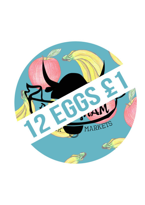
Within the sticker, Jenn used her Illustrations in the background showing bananas and apples, and our logo in the middle bottom of the “background. To diversify our sticker, we assured that it was in a bull face outline, as many stickers are either square, rectangle or circle.

This is the second sticker that Jenn made, incontrast with the first sticker where we wanted to make ours unique, we also made a sticker with a generic design to have a broader range of stickers. This sticker is the same with the first, however the only difference is the shape of it, as it’s circle.

This is the last sticker design, Jen took the shape from the first design (bull face shape sticker ) The difference between the first and this sticker is that it doesn’t have the logo anywhere, instead, it has a hashtag saying “#Bhamoutdoormarkets”.

0 notes
Text
Recipe Designs
As art students, the way we’re going to make these recipes is going to be visually aesthetic towards our audience. The sizes we’re thinking of doing are flyer-like sizes as they’re not too big, and they’re not too small. They’re the right size for our audience, to look at and take.
Here are some inspirations:


What we like about these examples, is the variation of designs that others made. They have a unique and creative vision towards making a simple recipe design and going against the conventions of a generic recipe design, which what we adore about them.
In the first design they portray a traditional art style, due to the collage style images together with paper, which seemed to be stained by coffee as the background. It’s messy and unorganized in a way that it makes sense. What i adore the most about this design is the unconventional use of background to make the illustrations of food pop.
The second design is sophisticated and simple. It uses a simple black and white colour way with fancy fonts with simple illustrations of ingredients and the final product of the recipe. I am greatly interested in the cartoon-like illustrations of the ingredients, as it suits the atmosphere of the design.
The last design has a hectic radiation towards it. The colours that’s been used are bright, and what adds to it’s attention grabbing aspect, is the green patterned background, which provides aesthetic attributes towards the overall design.
What all these designs have in common is the fact that it suits our vintage style logo, which means that it easily integrates with out work already. Additionally, the group’s illustrator Jen has a similar style to this.
0 notes
Text
Making Recipes
To compensate to our audience more, we decided to create a recipe that would appeal to them, with using majority of the ingredients from the Outdoor Market. This will encourage the students to buy their ingredients in the Outdoor Market, as it’s cheap and the quantity of products that they’ll receive will be in high amounts.


To make recipes we need to look at other people’s contribution towards it that targets a similar audience to ours. This website “Studentrecipes.com” provided exactly what we are looking for, they provided quick and easy to follow recipes. Not only that but it also includes forums between students to discuss what shops have the cheapest ingredients. However, in this case we’ll be encouraging students to go to the market, to increase the business of the outdoor market and provide students with excellent deals.
0 notes
Text
Logo Final
Here are logos draft from Jen. I was quite impressed with each and everyone of these logos,as I liked all of them. However, we only needed one logo to represent our brand to save the market.
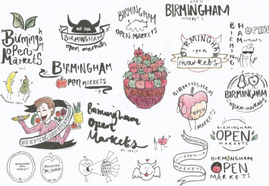
This is the logo we picked out of them; It was simple and sophisticated, it also has a modern/vintage feel to it similar to how Dyeline design their products. We now need to make it digital through Illustration.

This is the final design of the logo, everything is the same except for a few aspects of the original logo; we decided to remove the establishment date on the bull’s head, due to the fact that we’ve struggled to find out what the original date the Outdoor Market was Establish. We added the bottom half of the bull, as people may not realize straight away that’s a bull representing Birmingham. Lastly, we changed the font of the bottom text saying “Outdoor Markets”, as the original font was too fancy and not clear enough to read.

0 notes
Text
Lecture Series 1: Production
In this lecture, I learnt about the influence technological advancement through the history towards the innovations of products. For instance, in 19th century, they were great limitations towards the typesetting technology. The type had a small amount of variations that resulted to newspapers looking identical with one another.
To combat this problem, the type technology was enhanced to types being “Metal Movable Type”, the advantage of this technology is it easily made large amounts of copies of print to be the same type, and it was cheap. However its visual aesthetics were its downfall and the fact that it was difficult to read.

Due to its flaws, there were still improvements to be made within the Metal Movable Type, which lead to another advancement of it “Wooden Letterpress Type”. This was the “perfected” form of type. It provided unique style of types, which made visually aesthetic texts, and the short duration it took to print. This was beneficial at its time, as it was when the entertainment business was on the rise theaters and circuses often used posters to advertise their shows.


Not only did the advancement of Type advanced, but everything else at the time. During the early 19th century personal and household objects were made by hand, therefore it took longer for the customers to receive the products, however this all changed in Mid-19th Century, factories developed new techniques and machines now made majority of the items. This made the production process in objects change completely as it was a combined effort that required low level skill set.
In the advancement of “things” it is easy to see the positive perspective within it, as advancements are deemed to be positive by the masses. However, in terms of craftsmanship it’s a huge downfall. Although, it may be easier for individuals to make the product, it loses its touch of how it’s traditionally made. For instance, in my given example of objects being made with factory techniques and equipment, the individual now loses the full skill set it takes to make that product. They become “lazy” and are entitled as a job that “anybody can do”. This is what happened to photography; it was derived from the use of “special paper” to film to digital. In the early days of photography, it was mandatory for photographers to perfect lighting, know how to develop photos, have extensive knowledge on compositions and framing, but now with the Digital age photography all has been lost, due to Photo editing software, such as; Photoshop and Lightroom. Not needing to develop photos, as the internet is the most common place to look at people photographs; Instagram, Flickr and etc. which also ties in to not knowing how to develop photos. Camera needing SD and CF cards as storage for photos not film. Although, I put these in a negative light, there are also positives into each of them. Photography has become more attainable, the process of sharing photos through social media for everyone to see made people famous towards the good work that they do, and the fact that photographers don’t need an agency and “real” high – up connections, makes them more respected for their work and not who they know. The processes in which photos are edited have been improve to be faster and much more sophisticated. Additionally, we can now do manipulations that can never been as good as they are today.
0 notes