
Click the dates for content. Yours truly, Bianca Cross. 2017.
Don't wanna be here? Send us removal request.
Statistics
We looked inside some of the posts by biancacrossresearch and here's what we found interesting.
Average Info
Notes Per Post
2
Likes Per Post
0
Reblog Per Post
2
Reply Per Post
0
Time Between Posts
6 days
Number of Posts By Type
Photo
13
Last Seen Tumblr Blogs


Fun Fact
Users from the US are the majority of Tumblr visitors.
Photo

(please listen to this while you read for context)

I ain’t the sharpest tool in the shed but even I read the signs. Shrek is a postmodernist piece of cinematic genius. And if you don’t know what I’m talking about well you’re looking kinda dumb, with a finger and a thumb in the shape of an L on your forehead.
Well, Shrek is a hermit who lives alone in his swamp and rejects all authority and culture that the world around him is conforming to. So you’ve got that to hit the ground running. Then there’s the whole hybrid fairytale characters thing with mr gingerbread man and the big bad wolf whose their nanny and puss in boots in the sequel, which is like they’ve gotten the old fairytale aesthetic with new materials. So much to do, so much to see also apparently the hybrid of a romance film as well as an action/adventure/comedy was very non-conformist of the time which Shrek was made. The whole parody aspect to the film was postmodernist as it took classical disney films and even the classic fairytale narrative and twisted it.
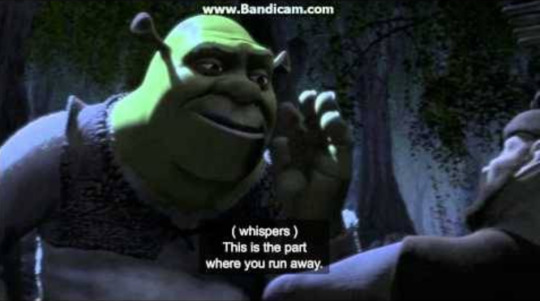
It’s a cool film, but they say it gets filmier. The ultimate postmodern feature in a film is breaking the fourth wall. This is when a character in the film is all of a sudden self aware that they are a character in a film. Shrek does this a couple of times by saying ‘this is the part where you run away’ during a fight scene, as if it’s the part in the movie - which it is.
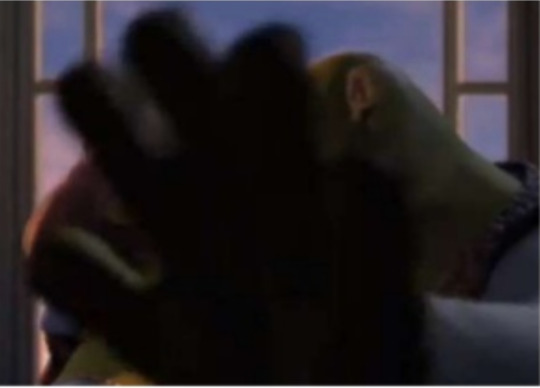
At the end of the film he covers the camera with his hand, giving away that he knew the camera was there and he would like it to go away now.
Shrek, just like Robert Ventura, makes many pop culture references that help define the parody aspect of it but also cement it as a postmodern film.
When Shrek says “That’ll do, Donkey, that’ll do“ it is a reference to the popular film Babe, which is also about a man and his animal best friend.
Fiona’s fight scene directly references the Matrix fight scene - which is also about badass females which is super cool.

0 notes
Photo
The lecture this week reminded me that I used to want to be an architect, which is sorta laughable really, but in my nostalgic excitement, I remembered someone I hold dear to my inner architect’s heart.
Frank Gehry was a really cool architect during modernism but he didn’t confine to any labels he wasn’t a modernist architecture he was too /cool/. AnYway, I learnt once that his architectural process was that he just scribbled on a piece of paper something that slightly resembled a building maybe?????? and he gave that scribble to his architects and engineers and was like ‘build this.’.

HOW STRESSFUL would that be to be on his team. But also it inspired me to one day be that person who made a heck-load of moolah just drawing scribbles and seeing them come to life. That’s probably how people who work for him feel; like they’re an important part of seeing greatness come to be. Anyway, I’m kinda mad at postmodernism because they had to revert to KINDA HIDEOUS architecture just to reject this era because they thought there wasn’t enough creativity in it but like I bet they never even gave Frank Gehry a chance? Lots of postmodernists could have learnt a lot from him.
But is deconstructivism anyway just another form of postmodernism? If you read Frank Gehry’s writings he always says he rejected modernism as a style and his whole thing was tearing things apart and being different so in a way it is. Google definitely defines it as postmodernism but what does Google know. Gehry himself never classified his work as anything and his style isn’t 100% typical of any era sO WHO KNOWS MAN.
I think postmodernism is a style that can be done well by true geniuses and can generate some really creative pieces. Except during the period where everyone wanted to have their piece of ‘YEAH REJECTING MODERNISM YEAH’, it was all just too much and the pieces of the postmodernist architecture shown in the lecture were just generally uncomfortable. I think people need to be more creative than high modernism sometimes (i guess) but also know when to reel it back in and refine their creativity. No wonder Frank Gehry didn’t want to be put in the ‘Postmodernism’ category.
0 notes
Photo
Is there anything truly and inherently beautiful? Or Universally ugly? How can a human being make rules about what is beautiful and expect each and every individual and unique person to just accept that as gospel?
I am finding difficulty writing this post because I am realising as I am typing that I have so many biases about what beauty is because I have my own tastes, just like anyone else, about what I consider beautiful. So instead of trying to answer these existential questions, I’m just going to talk about beauty from my own perspective.
This is one of my favourite illustrators, he draws the human form in a way that it is simplified so that the missing lines do not need to be present to complete the form. I think there’s beauty in all the negative space in his illustrations as well as the faintness of the lines creating very little positive space.
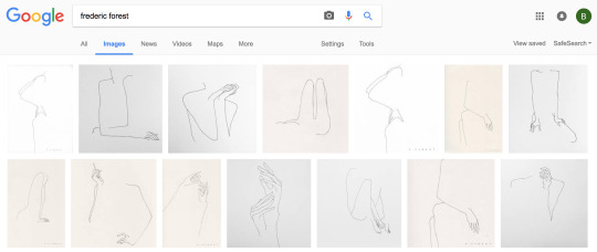
Modernism puts a lot of emphasis on the positive and negative space of a piece, from this perspective I think there is a lot of beauty in it when done well. These pieces aren’t exactly the most simple forms though and I think if they were simplified more than they are, they would lose their harmony.
So where is the line? When do we stop simplifying?
On the other end of the spectrum, I like to draw flowers. Florals are beautiful to me because each separate petal or leaf or vain or thorn has its own character and they all fit together to become a group of shapes which work in harmony. Florals are an intricate song of detail and personality, each petal is needed to create the balance.

The Ancient Romans shared my opinion here when they designed the Corinthian Column. They engraved acanthus leaves into the capitals of the column. The designs were extremely ornate and when placed on architecture were said to be a symbol of wealth and beauty.
I think in my opinion, there is definitely beauty in simplicity. But there is also beauty in every small detail of the world and I don’t think you could ever define beauty by simplicity on its own. I think you need a balance of both because if everything was simplified into it’s purest form, everything would be super boring to look at. Or would anything exist at all?
0 notes
Photo

Philip Larkin’s ‘This Be The Verse’ was an interesting take on behaviourism that I stumbled across recently. He talks about the progression of society as though generations cause each future generation to degenerate because of all the mistakes gen A has made and miseries they carry with them. But what about successes and celebrations? Don’t they get passed down too?
0 notes
Photo

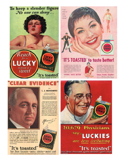
How Lucky Strike cigarettes became ‘good for you’
youtube
I’ve been watching (okay, re-watching, for the third time) Mad Men and I just watched this episode which talks about how Lucky Strike - the cigarette brand - got around the fact that people were discovering their cigarettes were unhealthy - deadly even.
I looked it up and this was a real ad campaign. Lucky Strike used behaviourism to disassociate their cigarettes with all of the health risks that were being publicised by associating it with something completely different: ’toasted’ tobacco. Don Draper pitched it really well in the show by saying ‘everybody else's tobacco is poisonous, Lucky Strike’s is toasted’.
1 note
·
View note
Photo
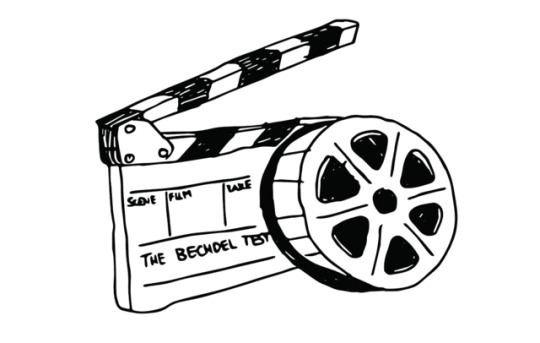
The Bechdel test is a way of highlighting gender portrayal of females in film. It asks a simple question, consisting of three parts:
Does the film have:
- at least two named women characters
- who have a conversation
- about something other than a man.
Apparently only around half of all films meet these requirements, which is shocking gender portrayal of females. It does not mean the film is misogynist in nature or on purpose but it is just a way of looking at the equality of portrayal (or lack thereof) that the film industry has.
Here are a few films I have seen lately that I was shocked to discover failed this test.

Apparently, this one didn’t make the cut because although there are named female characters and they do say brief lines to each other, the only conversation held by two female characters was when Neytiri and her mother have a lengthy conversation about Jake. A man. SO CLOSE!
Sidenote: I found this INCREDIBLE video by SNL about the graphic design of Avatar which I am equally as appalled about, as one of the largest film franchises to date I really expected more from them, both as a feminist and a designer. I’ll probably talk about this clip again lots.

This movie I was shocked about because I really expected it to pass! I love this movie especially because of Black Widow and how badass she is. Apparently, The Avengers franchise recognised that their films were gender biased so attempted to fix this by putting Black Widow in the mix. Which works except that she is an extremely masculine character for a woman and does not actually portray a ‘female’ role at all, so it is not surprising that the film failed this test.
SNL also did a clip about why Black Widow does not have her own film or play a feminine role while still being a superhero here. The satire in this really points out a lot of gender bias in films in general. Lots of SNL appreciation here.

Actually not very surprising that this failed, there’s probably only one female character in this whole film. Would be pretty difficult for her to have a conversation with another female character, much less about something other than how attractive that soldier played by Harry Styles was.

Honestly, I am APPALLED at this. I expected cinematic GENIUS in this film. This had every opportunity to be the gender awakening plotline of the century. It could have been everything I had ever hoped for in a film and more.
Okay note sarcasm, I haven’t actually seen this film yet, no one can force me to sit through it. But one could assume that since emojis are gender neutral that even if they were to put genders on them they could have done it evenly and had an equal amount of female/male characters. It could have been so easy for them to pass this test. But no? Too risky in a male-dominated industry for that to even be on the table? Yeah…
0 notes
Photo
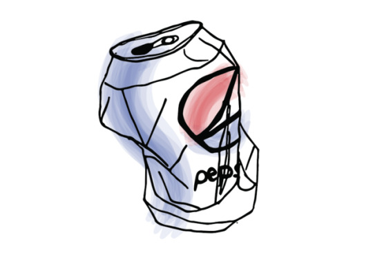
The Pepsi can. A modern-day symbol of world peace. The end of racism defined in a small 330ml object. At least according to their latest ad campaign.
The Kendall Jenner Pepsi ad caused a good amount of controversy around the subject of cultural appropriation. The ad sees Kendall Jenner flee from a photoshoot to join a group of protesters. When the protesters approach police, the ad sees her step forward from the crowd to hand a can of Pepsi to the police officer. This causes everyone to begin cheering as the police officer accepts the can and takes a sip.

Pepsi’s aim here was to associate Pepsi with unity and peace, but the public had a different reaction to this ad. People thought it was promoting white privilege by the fact that Kendall Jenner - an upper-class white female - had to step in and take the lead of the protest. The fact that she was the one to give the police officer the Pepsi looked as though the protesters needed a white person to speak for them. The action of handing the police officer a Pepsi also mimics a similar photograph of Iesha Evans standing up to police at a protest - except that she was later arrested.

The ad has tried to promote unity by the use of actors in the protest that are obviously of a large range of ethnicities, I think this is something that at least has been done well in this ad as there is often in media, not enough diversity in what is supposed to be diverse storylines. I think the main problem people have with this ad was that it was so detached from reality - the protester's signs were vague: ‘join the conversation’ etc. The people were far too happy and the scene was way too colourful to be an actual protest and it seems like Pepsi was trying to paint a picture of unity and harmony that just isn’t realistic in the society we live in.
0 notes
Photo
After the reading we had about Ornamental Cookery, I was in a trendy cafe waiting for my takeaway flat white and noticed a magazine sitting on the counter called ‘Stone Soup’. The magazine is a creative take on food publishing and their mission is to create an exciting discussion about food towards a youthful audience.
Anyway, I stumbled across this piece in the magazine called ‘Cocktail Party’. It had lots of full bleed photography of tables set with various dishes, the colours were all super colourful pastels that were aesthetically intriguing. What I found most interesting about this article is that I looked at it a solid three times just appreciating the photography before I realised that the recipes and the food that was in the photos were kinda weird and gross.

This is a dish they called ‘Leek Terrine with bacon vinaigrette’. Yup, okay, seems legit. It’s a square of leeks stuck together in a loaf with a bacon sauce, a small chunk of spam(?) with an egg yolk on top, a pile of white bread with the crusts cut off, and some unripe tomatoes. The photography and the presentation of these dishes make all the difference, so much so that it makes it look actually appealing when really this is a very questionable recipe.
I found it so intriguing that design and photography could be used not only to target a certain market as was discussed in the reading, but to change the perspective of something so drastically as this has done. I’m still not 100% sure if this is a serious article or not but I think that’s the beauty of it.
0 notes
Photo

Actually, they’re not funny at all. They’re a little bit classless.
0 notes
Photo
Someone said something to me today that I thought was super interesting. They were showing me a friend of theirs who was doing a bunch of paintings, they were really dark and had layers of depth and meaning while using a lot of colour. The artist was from South Africa and my friend was saying that there is so much unique and original art that comes out of Africa because of all the adversity and oppression that so many people have faced there.
this got me thinking about Art and Design as a Discipline from a Marxist Perspective and if privilege affects a persons ability to be creative.
Marx’s opinion on aesthetic was that genuine and entirely original art could not be created by the bourgeoisie because they had no criticism of their reality to express and did not face any adversity. If society was limited to development through dialectical materialism there is no room for any genuinely original creation because everyone is progressing at the same pace and value is entirely equal.
I would consider myself a privileged person in that I have had a fortunate upbringing. I think from my point of view, if someone is creatively inclined and that creativity is nurtured, the person's skill and natural talent will develop and creativity will flow. Maybe the ideas they come up with will be slightly different because of the difference in backgrounds from someone who is less privileged, but is that necessarily a bad thing? Marx definitely thought so but I disagree. I think there is a place for all kinds of art in the world, and each person’s perspective will tell a different but equally as intriguing story.
0 notes
Photo
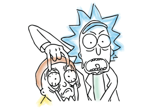
A Freudian Analysis of PICKLE RICK
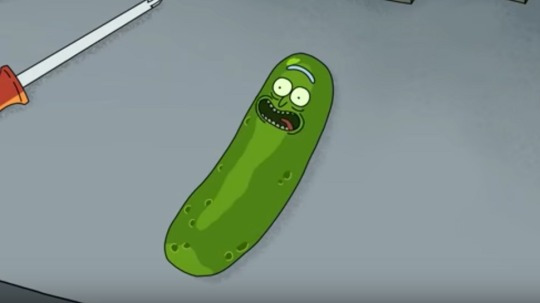
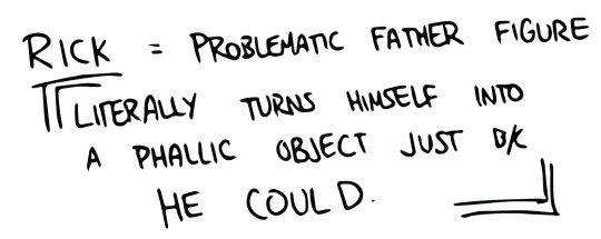
Is it symbollic of beth (Rick’s daughter) to take the antidote off him, because it is the cause of the freudian plotline and she is the instigator of it.
Rick’s journey to de-pickle-isation is the most obviously masculine and bravado-filled, gory, action plotline I’ve seen in the whole three seasons of the show. It’s literally Rick marking his masculine territory all over the episode.
This plotline juxtaposes with Beth and the kids at a family therapy session. Here, the therapist spins the session to discuss Beth’s absent father. She takes the fact that he is a pickle to mean more of a metaphor - as any regular human would.
“Does Grandpa turn himself into a pickle a lot?”
Beth refuses to believe that he has lied or done anything wrong when it’s really obvious that he definitely turned himself into a pickle to get out of family therapy because he’d literally rather not be human than do anything he thinks of as sub-par to his brilliance, such as talk about his feelings.
What I get from this episode is that Beth clearly has some unresolved issues with her Electra Complex causing her to not see any wrong from her problematic father, and Rick himself has heavy set phallic compensative issues forcing him to need to be the dominant male in the household.
Did I mention he practically convinced Beth to divorce her husband, Jerry, in the previous season?
I rest my case.
0 notes
Photo
So basically Freud thinks I’m a psycho. Cool.

0 notes
Photo
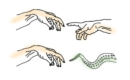
So this week it got mentioned that there’s a strain of thought that suggests the shape which encompasses God in Michaelangelo’s famous painting is actually a human brain. I went to research further into this and found that there is another strain of thought (which the author described as a far more convincing analogy) that the shape is actually a human placenta. This theory suggests that the outstretched arms in the painting are symbolic of an umbilical cord and that the shape encompassing god is anatomically the same form as a human placenta.

The painting was painted in 1508 - 1512 AD. This article seems convincing but was written by a Gynecologist in 2006, almost 500 years later. Since this is her specialised field her interpretation could be distorted, and she states this in the article.
Michaelangelo was a male in the 16th century, and although the article states he was a man of science and involved in the medical field, further research has told me that the medical side of pregnancy and childbirth was only ever performed by women - midwives usually, and physicians who wrote about it used guesswork and were not exceptionally knowledgeable on the topic. Based on this I would question how Michelangelo could know enough about childbirth at the time of painting the Creation of Adam to create an anatomically correct representation of such a key.
People tend to read a lot into historic pieces of art, but context is so important to any piece of design. It is highly likely that the Creation of Adam is symbolic of something much deeper that modern humans cannot even fathom. It is also highly likely that Michaelangelo was just a man who wanted to paint a religious piece with God in an abstract shape. Who knows.
1 note
·
View note