This is a blog where i post about my graphic design course work
Don't wanna be here? Send us removal request.
Statistics
We looked inside some of the posts by bradleyfishergraphics-blog and here's what we found interesting.
Average Info
Notes Per Post
0
Likes Per Post
0
Reblog Per Post
0
Reply Per Post
0
Time Between Posts
4 days
Number of Posts By Type
Photo
14
Text
3
Last Seen Tumblr Blogs


Fun Fact
The total number of visits Tumblr.com received during January 2021 is 327 million.


Text
evaluation
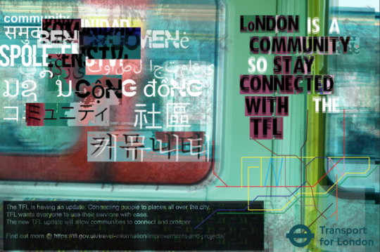
i think that my topic was well presented and i chose a great product to advertise. the colour changing coat aka triple c is a imaginary product that chages colour depeding on your outfit. i wanted to present it in a way where i knew people my age would see it and post pictures of it. by picnicking a tube i knew a lot of commuters would see it it and take pictures. i wanted the advertising to seem glossy and cool, something that would attract all to the product
0 notes
Text
Evaluation
1. I do think about my choice of artist waS effective and well selected. Because they all help me visualise and think of a concept for my work. All my artists contributed different themes , That I wanted to integrate into my work. Jin Dallae and Park Woohyuk aka (진달래&박우혁은), made me think aesthetically about the colour palette of my work. What colours go complimentary towards each other. The work of minimalistic and eye-catching, I think I wanted to present in my work. David Carson help me realise the way in which I wanted to present the text. His work is reminiscent of early 2000’s aesthetic which I think a lot of millennial can relate to. 2. Yes I am happy with the way my final outcome turned out. I think the use of layering work, aesthetically work really well and overall contributed to the theme of confusion, of which I wanted to present. I also think that the colour pallet and composition of the work, cohesively worked really well together and left a uniform appearance on the advertisement. Even adding minute details such as dirt, to create a more rugged, used aura to the work , made the piece as a whole work well. However I can say the affects of my work that didn't necessarily work well together with the rest of the project. Such as the use of me cutting out words from the background of the image, as this sometimes left the text unreadable from afar distance . 3. From the poster you can clearly see who my client is. The TfL logo he is clearly presented on the poster, and the background of the image directly relates to TfL. I wanted to rebrand the TfL for a more connected generation, so I wanted to present a modern look with a twist. I want the viewer to be intrigued and happy that there is a community of people connected by one thing, public transport. I even added the real website to the TfL in my final piece to show my research. 4. I have and this piece at everyone. I want an older and younger generation to experience renovation and innovation in the heart of London. I picked complimentary colours that are aggressive but also placid to relate to both genders. The font is easy to read so both young and old can read it. 5. If I would've had more time I would of made my work a gif as I feel this would be much more eye catching for the viewer
0 notes