
A fan of the ever-changing and insane marketing world.
Don't wanna be here? Send us removal request.
Statistics
We looked inside some of the posts by brendast820-blog and here's what we found interesting.
Average Info
Notes Per Post
0
Likes Per Post
0
Reblog Per Post
0
Reply Per Post
0
Time Between Posts
9 days
Number of Posts By Type
Text
10
Last Seen Tumblr Blogs


Fun Fact
Post activity is at the highest at 4:00 pm EDT; notes peak at 10:00 pm EDT.
Text
Is Last-Click Attribution Model Effective At Measuring Marketing Nowadays?
Last-Click attribution model was used by many marketers to measure the effectiveness or ROI of marketing strategies. But in a world where marketing takes place across multiple channels, does this model still work?
Probably not.
According to Clickz, customers in fact interact with a brand 4.3 times over a two-day period before they finally make a purchase. In addition, the average U.S. shopper will be in contact with a total of 10.4 new and traditional media sources prior to purchasing. Therefore, if we were only to look at the last-click and credit the last source, then what about all other engagement customers had taken with brands? If we only count the last-click as valuable, then it is probably over valued.
Imagine a female customer who purchased a facial cream from Origins. She did not know which brand to purchase at first, but she did know that she wants to find a hydrating cream that is specially friendly fir sensitive skin. Therefore, she searched on Google, “best hydrating cream for sensitive skin”. The first result she saw was a beauty blog writing about the “Top 10 Best Cream for Sensitive Skin.�� In this blog, the customer saw that Origins cream ranked first. Therefore, she decided to directly search for the brand on Google and visited the official website to view product details. However, she did not make a purchase at this stage.
A few days later, she saw a poster about the brand Origins on subway, on her way to work. When she got off the subway, she saw another poster positioned in front of an Origins physical store. But she still did not take any actions. Later, on her way back to home, she was using Instagram and saw an Origins ad. So she clicked on the link and viewed the product detail again. After she arrived home, she was doing some research for work, and saw an banner ad, and she clicked on the ad which redirects to Origins website. She found that the cream was on sale, so she decided to make a purchase.
As we can see from this example, it is unreasonable to only count the banner ad that showed up at the end of a consumer journey. In fact, every touch point contributed to the final purchase. Maybe the discount incentivized the customer making a purchase more than the banner itself. Or maybe the blog that customer viewed helped generate great first impression of Origins cream.
Therefore, if we only consider the final interaction that happens before a purchase, we might miss some of the most important engagement events with the brand that led to a purchase. Last-click attribution model ignores the supporting elements, which undervalues the overall integrated marketing effort, and therefore considered the least effective at measuring multichannel influence.
0 notes
Text
Revolutionary Video Plug-In, Finding All You Want Without Searching or Leaving The Video
Instagram recently added a new feature where brands or users are able to tag the specific product in the picture, and the tag directly links to the shopping site with product details. In the past, it only shows users which brand the product is, and in order to find or shop for that particular product, users would have to go to the brand account or website.
By offering a convenient path for consumers who have potential interests for a specific product, brands will be able to promote and sale its product in a more efficient manner. Based on this idea, I developed a service called “Find Me”. It is essentially a video-stream plug-in for products/scene appeared in video, movie, and TV show.
Video makes up a large percentage of our daily content consumption, and there are hundreds and thousands of time where we watch a movie or video, we raise some questions similar to the following:
“What is the brand of the sweater the main character in the movie is wearing?”
“The restaurant the characters are dining in looks really great, where is that place?”
“What is the mom making in the video? I want to get the recipe and the sauce.”
“The cup that the girl is holding in the video is cute, where can I find a similar one?”
“Wow, the scene is beautiful, I want to visit there. Where is that place?”
We can get the answers through “search”, and this is usually where the two-screen experience comes into play. But it takes time to search, and a lot of time after a few searches we find it too time-consuming, and decided to quit. What if all these can be accomplished through one action? “Find Me” will allow viewers to know all the above answers while they are watching the video or movie with the “tag” sign similar to Instagram.
In addition, users are given the option of turning on or off this function at anytime, and can choose which category of tags they want to see (product, food, tourist attraction, restaurant, or female vs. male, kids vs. elderly products). They can also alter the intensity or frequency of the tags. If users do not want the tags show up during the video, they have the option of search and review the product/information that they are interested in at the end of the video/movie. Even after a few months, they can go back to the video and the tags for information. When the “Find Me” function is turned off, users can view the video as usual.
As time and technology evolve, “Find Me” can ultimately become an information hub and search site with eCommerce element for users. This feature/service will not be implemented in the movie theatre necessarily, but can be a feature added to all video-streaming platforms, e.g. YouTube, Hulu, Netflix, Amazon Video, etc.
“Find Me” offers brands a great opportunity to sell and advertise their products when consumers show the highest level of intent. It also enhances exposure of sponsor of the video/movie. For consumers, they no longer need to spend time and search the entire Internet to find the product or information they want. Therefore, it is a win-win from both brand’s and consumer’s perspective.
0 notes
Text
How Google's Updated SERP Snippet Length Affects Your Site?
Search Engine Watch recently posted an article regarding Google’s updated SERP Snippet Length. In the past, Google would display a snippet around 150-165 characters, but now they are much longer according to the new policy (300-350 characters). The main purpose of showing longer snippets is to provide more descriptive and valuable information so people can have a better understanding about how the page might relevant to their searches and make effective click.
Meanwhile, Google now often does not display the page’s actual meta description as the SERP snippet even it is specified in the HTML. What Google does instead is to directly extract texts mostly from the first paragraph of the content, make a combination of actual meta description and texts from the first two or three sentences on the page, or sometimes via image ALT attribute for longer SERP snippet.
Although for some sites the SERP snippet is still from the meta description, Google has been trying to use different texts that its algorithms decide make sense for user’s query. Not using the actual meta description indicated in HTML resolves the issue of having poorly written ones which could affect the site’s click through rate, organic traffic, and therefore conversions, even though it does not affect ranking according to the article.
As a result of displaying longer SERP snippet, Google is able to further optimize the searcher’s experience in finding the most relevant and useful content, which saves searcher’s time and make the entire process more efficient. Because of this change, companies and search marketers might need to take responsive actions to improve or maintain site’s organic traffic.
For example, as the length of SERP snippet is increased, then they should probably consider increasing the length of meta description for pages they wish to receive higher traffic and clicks. Meanwhile, if not all the meta description of a site are going to be rewritten, then they could consider polishing the content, using keywords or making the first paragraph more appealing and compelling for searchers, since Google is very likely to pull the first several sentences for SERP snippet.
As Google updates and revises its policy and algorithm, site and page traffic will continue being affected. However, no matter how these changes take place, one thing search marketers should always keep in mind is to create valuable and relevant content for searchers and fulfill their query so the site can stay relevant and acquire traffic growth.
Reference: Google’s updated SERP snippet length: What should be your SEO strategy now?
0 notes
Text
Transactional Email - More Important Than You Think
Email marketing has been widely applied by brands to engage with consumers. Email campaigns vary based on the groups of customers brands want to reach at different stage. While you think this approach should be effortless because of the low cost and easy execution, and be perfectly implemented by most of the brands since it has been around for more than a decade, it is not the case. In particular, transactional email as part of the email marketing and customer engagement ecosystem is often easily neglected by brands.
Zara, one of the largest fashion retailers, apparently has not been performing well in optimizing its transactional email over the years. Usually, after customers shop at the store’s website, an email confirmation letter will be sent. Zara sure includes this step. However, when compare to other retailers’ confirmation letter (transitional email), Zara’s email does not seem so user-friendly.
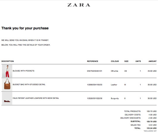
The above is a screenshot of the order confirmation letter sent by Zara immediately after a transaction was made online. When first looking at this email, one might say it looks concise and clean, some people may think this is a good transactional email. Indeed, at least this email aligns with Zara’s overall style - modern and simple. However, from the brand’s and customer’s perspective it is actually not well-designed.
First of all, it takes up too much space on desktop and mobile. The screenshot did not show the actual spacing. When it was opened on computer, one had to scroll down many times to actually view the order number and confirm the billing/mailing address. This could be inconvenient for customers who look for order number when they have a conversation with the customer service team.
Secondly, even though the email shows the pictures of what a customer ordered, it is not clickable. In fact, there is not a single link within this email for customers to revisit Zara website. This suggests that if a customer realized that he/she had chosen the wrong size or color, and wanted to reorder or make modification, he/she has to open a new page and type Zara.com and log in to their account or search on the website to order. Even for those who only wanted to review what exactly they ordered by going back to the pictures, they have to open a new webpage to do so.
From a brand perspective, by not providing any live links of the store website in the email, Zara lost the great opportunity for up-selling. Maybe the person who shopped at the site did not see the email until a few days later, and therefore this email could be a second chance for the brand to pitch its customers and spark their interests in other products. The transactional email of Saks Fifth Avenue is a great example of including multiple links and sections in the email to increase the chance for customers to visit the website again.
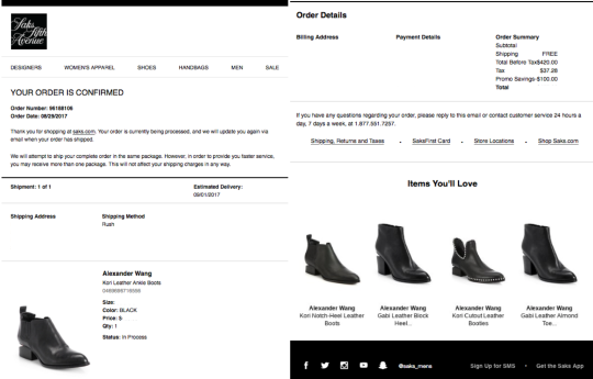
As the above screenshot shows, Saks’ order confirmation letter provided a picture of what the customer ordered with clickable link to the product site. The order number and date is on the top of the email. In addition, the email has a section of “Items You’ll Love” and a header for exploring other categories of products (e.g. bags, shoes, apparels, etc.), all of which increase the likelihood of revisiting the Saks website. And at the bottom, social media accounts of the brand are attached. While this email includes lots of information and sections, the length of this email is appropriate and shorter than Zara’s.
It is not easy to have an email going to the inbox of the right consumer, so when the opportunity arrives, it is the job of brands to optimize the “touch points” and maximize the outcome.
0 notes
Text
Is Email Marketing Dead?
Since the prevalence of mobile marketing and digital marketing, there has been a cliché saying, “Email marketing is dead.” It is true that larger percentage of brand’s marketing budget is focused on search marketing, display advertising and social media, email marketing has never been erased entirely from the picture and probably will never be. No matter which brand we have engaged or are interacting with, email marketing campaigns can often be found in attracting, converting, closing and delighting customers. While some people still believe in the cliché statement, it is a rumor after all given the fact that a lot of brands are planning to increase spending on email marketing in 2018.
But why is that the case? Here are the three reasons:
1. Effective In Reaching Mobile-Savvy Consumers
One main reason that email marketing is valuable for brands and companies is that it is an effective way of reaching consumers on mobile and keeping them informed without too much input. In a world where everyone is staring at his/her phone wherever and whenever, mobile device is used for all kinds of requests. According to a report from Pew Research Center, more than 50% of cell phone users check their emails from their phones. Email marketing is therefore not only an easy tactic but also an effective way to help brands and customers stay connected. Customers, especially loyal customers, are still signing up for emails/newsletters from brands of stores if discount activities or equivalent reward program were offered, according to a study by Loyalty 360.
2. Strong Impact, Easy To Execute
Among all other advertising approaches, such as mobile app, display/banner ads, print advertisement, radio or TV commercial, that require certain technology or software input, email marketing/advertising is one of the easiest ones to implement, yet can still bring a strong impact on direct response and conversion. For example, when companies or brands send out email coupons, an increase of online and in-store sales can be expected. In fact, Shop.org suggests that 64% of Internet users in the US have accessed a coupon from an email to save money. Ostensibly, it may seem that brands are losing the game since consumer are actively seeking to save money. But the truth is consumers visit and shop more often because of the email coupon offer, which can ultimately turn into opportunities for revenue generation.
3. Low Cost, High ROI
ROI always stays on top whenever an investment occurs. According to Campaign Monitor’s report in 2016, for every dollar spent on email marketing, there is a $44 ROI. While some global brands are willing to spend a significant amount of money on expansive channels such as TV or print, email marketing is a more friendly solution for all-sized business from a ROI perspective. It can achieve massive reach while keeping the cost low, which is why even though rumors say, “Email marketing is dead”, brands and companies are not giving up on it, and many of them are actually increasing budget of email marketing.
Indeed, when a marketing channel is highly cost-effective, do you think it will be even close to an END?
0 notes
Text
Mobile + AR + eCommerce, See How Patrón Tequila Is Conquering Consumers
With people consuming more than 60% of the digital content on mobile, mobile marketing is taking the lead for most of brands’ marketing initiatives. Mobile application, mobile display ad, mobile message push-out, mobile responsive/adaptive webpage, etc., all have been taken into consideration during the marketing planning process.
The tequila brand Patrón recently developed a Mobile application, "The Patrón Experience", that leverages augmented reality (AR) technology to take its users on an interactive journey to its home in Jalisco, Mexico. As one of the first brands to create a hand-held AR innovation, this mobile app shows consumers how Patrón tequilas are distilled and aged while also providing an in-depth introduction of Patrón’s wide variety of handcrafted tequilas.

(Photo credit: DIGIDAY)
Open the app, users can participate in the virtual tequila-producing process and are asked to first plant an agave in a field which is generated by placing the iPhone against any flat surface seen through the camera. Then, users are taken to another scene where four types of Patrón tequilas are displayed, and no matter which one users click on, the virtual bartender will provide a detailed description of the taste characteristics as well as the spirits. In the end of the interactive AR journey, users can order bottle of Patrón online and visit Patrón website through the menu bar on the app.
youtube
(Source: YouTube - Patrón Tequila)
With this mobile platform, Patrón is providing a new way for consumers to engage with the brand and learn the brand history. It becomes an educational tool for existing customers to understand the ingredients of what they are drinking by breaking down the barriers of physical space between them and the secret Patrón Hacienda where all tequilas are made. Moreover, this improves the transparency of the Patrón brand and its products, from harvesting agave to crafting the liquid into each bottle.
While marketing of this mobile app is mainly through email marketing to its current email list and primarily targets existing customers, the app itself also attracts many potential consumers through WOM (word of mouth marketing), and therefore bringing more people to the interest of Patrón Tequila.

(Photo credit: DIGIDAY)
In fact, instead of making a sales channel out of this mobile platform, the mobile app initially only aimed to help the consumers learn the brand history, tequila production process, diverse portfolio of products, and therefore had no eCommerce element attached. However, after receiving 50,000 views and downloads within three months of its launch, Patrón realized the app could be an effective way to sell tequila, which is why the current version has the option to make a purchase at the end of the AR experience.
Although the sales revenue from this mobile platform has not been disclosed by Patrón Tequila official, what we can be certain is that Patrón is catching the eyeballs of the consumers, making a favorable impact on Patrón Tequila and its initial goal has been achieved without doubt.
0 notes
Text
Will KFC’s Out-of-Chicken PR Campaign Be Better Off Using Video?
What happens when a chicken restaurant ran out of chicken?
KFC in UK & Ireland is apparently undergoing a chicken shortage crisis, which has led to massive anger among consumers as well as the close of many of its U.K. restaurants. In response to this ongoing crisis, KFC and Mother London created a “FCK” apology ad running full page in two U.K. papers over the weekend.

(Credit: Mother London)
The ad immediately caught attention of the general public and generated significant amount of social buzz. With sincere apology and clear verification and explanation of the current situation, KFC not only won the heart of its customer back, but also turned the PR crisis into a perfect pitch.
As part of the crisis management campaign, KFC UK & Ireland also updated on its twitter account with 4 impactful posters addressing consumers’ concerns, receiving hundreds of likes and reposts. Ostensibly, the posters are answering the questions of the consumers, but what they are truly accomplishing is great brand building by underlining the corporate’s persistent pursuit of high quality as well as the proactive attitude in responding customers’ inquiries.

(Credit: KFC U.K & Ireland)
While traditional and digital media have been included in this campaign, the format of their content has focused on posters or photos. Although the campaign itself has already achieved some level of success, what if videos were involved? Will the scope of social buzz or attention be extended?
Video has been widely used in different campaigns by brands. The term “viral video” is even invented to describe the massive reach that certain video content is able to achieve within short period of time. Video, as a very interactive format compare to others, generally expresses ideas in a more straightforward and comprehensive way, it minimizes level of misunderstandings or misinterpretation that text or image involves. Unlike other formats where viewers have to actively read or digest, video pushes the content to viewers and requires little effort to consume.
Regarding the KFC PR campaign, even though the poster ads are successful and impactful, they are all text-intensive. With a normal reading speed, it takes more 10 seconds to finish reading just one poster. But the truth is we usually lose people’s attention in 3 to 7 seconds. Given the static format, the attention span might be even shorter. With video, however, it is relatively easier to keep viewer’s attention especially if it captures audience’s interest at the beginning.
In fact, a video recorded by a random user was picked and reposted by KFC UK & Ireland twitter account. It shows a customer complaining about the chicken shortage issue of KFC. She was extremely upset because she had to go to Burger King instead. This is a 12-second video, but it was presented in such a humorous, interactive yet authentic way that has led to over 4,200 likes and 1,100 reposts. This retweet is actually one of the most engaging posts the account ever had (in terms of number of likes, comments, etc.). Imagine if KFC had taken advantage of this PR crisis, and actually collected similar funny videos around all areas in U.K and created a video. The circulation and attention would be dramatically upscaled. After all, who doesn’t enjoy funny video at the end of a day?
Brands do not receive massive attention and social buzz on a daily bases, when the chance comes, how to catch the opportunity and maximize brand exposure is not an easy task. In KFC’s situation, creating a video might be challenging since this event happened almost overnight, posters/images seemed to be an easier solution from a timing perspective. But as a recap, such video content maybe an ideal option for continued buzz generator.
0 notes
Text
How Important Is A Brand’s Website To Marketing?
I cannot think of anything else if we were not to say ‘brand’s website is the “face” of a brand’. A user-friendly and effective website not only creates positive impressions for the brand, it also has direct impact on lead generation, e-Commerce, brand stickiness, etc. No matter which medium or channel brands is using to initiate the marketing effort, the ultimate destination has always been the website or the physical store for either learning more information or making transactions (and for the majority of the time, going to the website comes before visiting the stores). Website is really the core for most digital marketing.
As of how to define a “good” website or a landing page (if people visit from referral), we must consider the “meat” – content, but more importantly the “seasoning”, user experience (UX) and user interface (UI), is playing an increasingly significant role in building a site’s value for consumers as well as improving site traffic and stickiness. Only when these three elements are optimized, an amazing “dish” can be created for the brand and the consumers. This cooking process may sound straightforward, but while different sites and webpages are created for diverse purposes, not all of them are successful in achieving their goals.
The Italian mid-to-high end handbag brand, Coccinelle, recently launched a email marketing campaign to promote its 2018 Spring/Summer new collection. As a previous (lapsed) customer of this brand, I received their promotional email with subject line - “Ready for a new adventure?” However, once I opened the link embedded in the image, I was immediately disappointed. The landing page fails to serve the purpose of this campaign. It generates a rather unsatisfactory user experience and shows how little effort the brand has spent on creating a valuable and user-friendly site for its customers, which significantly impacts my impression about the brand.

This email campaign is to promote the 2018 S/S new collection. However, when the link is opened, there is only one single static image above the scroll, and the bags that are being promoted only take a small portion of the photo. Normally, if a brand is about to promote an entire new collection, the landing page should at least include three to five rotating slides (images) showing multiple products from the collection. Imaging if a person is not attracted by the product appears in the image and there are no other alternative products they can view at first glance, the brand immediately lose his/her attention; an “exit” of the webpage is likely to takes place.
Meanwhile, the copies on the above-the-scroll image are displayed in white color, and the model in the background is wearing a light blue dress, which makes it extremely difficult to see the small words on the photo. More importantly, if it is an entire collection the brand is trying to promote, multiple images of the products should be included on the landing page. However, there are only six photos on the entire page, leaving visitors the impression that there are only a few products in this new collection. Also, for all the photos on this landing page, there is no direct link to view product information, such as price, size, color, purchase, etc. In order to purchase or view, site visitors must make extra effort to search under the “Bags” tab.


Additionally, the landing page has a tab called “Coccinelle Club” along with the links to its social media platforms. The “Coccinelle Club” is a site that shows fashion bloggers wearing different Coccinelle bags. The visuals are actually very impactful. The photos shown on this site is even better than the ones they had on the landing page or on any of the product detail page. However, the link to this site and to the brand’s social media platforms are hidden. In order to view, one has to scroll the page to the left, and the links/icons are extremely small.
Moreover, a website usually has log-in/account, shopping bag or related tab on upper right corner, and when site visitors put the mouse on the little icon, a text that indicates the meaning of this icon will appear. However, this landing page and the entire website does not include this function, meaning visitors have to click on each icon to test which site it will lead to, which is very inconvenient for people who are unfamiliar with the website. Maybe for the web designers, recognizing these icons is effortless, but not everyone can guess the icons’ indication right and neither would they spend extra second to test different tab, especially for prospects and lapsed customers.
“Website is the “face” of a brand and the core for most digital marketing”. We cannot emphasize this any further. When the brand fails to develop a valuable, effective and user-friendly site for consumers, why would they be willing to make a contribution to your revenue?
0 notes
Text
T-Mobile Super Bowl Ad, A Great Success Or Failure?
Last Sunday’s Super Bowl has apparently surprised many football fans with unexpected result. Aside from the buzz around the win of underdog Eagles, the BEST vs. WORST Super Bowl commercial contest received no less attention. With brands spending $5 million on a 30-second commercial during Super Bowl, this annual football event has turned to a commercial festival for worldwide marketers and advertisers.
In comparison to last year’s Super Bowl ads that almost entirely happened to apply a political theme, this year’s commercials seem more neutral in general. However, one brand obviously decided to go with a different path and continued the political conversation in year 2018.
T-Mobile’s Super Bowl ad “Little Ones” shows babies with different ethnicities and races to promote diversity, equality and inclusion. The one-minute commercial is narrated by Kerry Washington who is one of the most recognized voices in broadcast and also an advocate of diversity and equality for years. These are also the mains reasons that T-Mobile chose Kerry Washington in the first place, according to the company’s EVP of marketing and experience, Nick Drake.
Differ from the T-Mobile Super Bowl ads in 2016 and 2017 which mainly aimed for driving direct response and business revenues, T-Mobile’s goal of this year’s piece focuses on branding and public relations building. As implicitly communicated, this commercial tries to show how T-Mobile values and promotes equality and diversity both inside and outside of the company. Although Drake implies that what they are sending is not a political message but a national message, he does expect critiques to call the commercial political.
But when we take one step back from the company’s marketing objectives and their perspectives, is this year’s Super Bowl ad successful for T-Mobile?
The answer is, probably not.
For first-time viewer of this commercial, it is extremely difficult to connect the message with T-Mobile’s brand personality and character, and it is actually challenging for audiences to relate to T-Mobile at all if they do not watch the ad until the end where a logo of T-Mobile is shown. In many cases, brands prefer to maintain a low profile in ads and only show a logo or slogan at the end. But this requires highly relevant content/messages that match or represent the brand so audience can seamlessly connect and recognize it even without brand name being mentioned explicitly. The message, format, and the creative design of the T-Mobile ad, however, fail to assist audience to successfully make the connection. Even if a logo is presented at the end, there is still gap between the brand and the content itself.
If we were not to change the message itself, at least adjustment could be made in terms of format, visual and creative design to make the ad more impactful, more brand-related or more “T-Mobile”. For example, we can apply T-Mobile pink for the scene setting. Visuals and colors are the easiest and most straightforward method for improving brand recognition and helping consumers to differentiate diverse brands. Meanwhile, T-Mobile could star babies of their customers, and indicate that at the start of the vides so viewers will immediately understand that this is a campaign for T-Mobile, and T-Mobile has diverse customer portfolio and values diversity and inclusion.
These are only two ideas for how to make the content more relevant to brand, there are more apparently. The point is, when we create a campaign, a TVC, a poster, etc., we always have to start from the audience’s perspective. What would they see? What would they perceive differently than what we are trying to communicate? Is the message or content easy for them to understand, connect or resonate with the brand?
If we fail to consider these problems and if our intent is different than what is perceived, then the value of any types of marketing efforts will be spoiled.
0 notes
Text
Digital Marketing, For Branding Or For Direct Response?
When we speak of marketing nowadays, digital marketing seems to be the prevailing words that jump out of our mind. But first of all, what is Digital Marketing?
“Digital marketing, the promotion of products or brands via one or more forms of electronic media, differs from traditional marketing in that it uses channels and methods that enable an organization to analyze marketing campaigns and understand what is working and what isn’t – typically in real time.” --- SAS
Indeed, living in a digital era, with the extensive use of traceable electronic media, allows brands and consumers to be more connected, engaging, and most importantly more transparent and understandable than ever.
But how should brands play with digital marketing? Is digital marketing better for branding or drive direct response?
The answer is, there is no better or worse scenario. The reality is that branding and direct response cannot live without the other in the digital marketing world. More importantly, digital channels should be integrated in any marketing plan as it is so powerful that branding and direct response can both be achieved more effectively and directly than majority of marketing approaches (*Note: Social marketing is part of digital marketing).
Branding and direct response are inseparable. If the brand image is unsatisfactory, no matter how good the product or service is, or how appealing the discount is, most of the consumers will give a second thought before any action takes place. Meanwhile, if a customer buys the product, and receives positive experience with the product, he/she tends to create good impression about the brand, which may lead to further purchase. Therefore, it is better off for digital marketers to keep both objectives in mind while launching a marketing campaign.
With the massive reach and interaction that digital channels offer, digital marketing is probably the most efficient in terms of connecting with target audience for branding as well as direct sales/response. When we go through the customer journey, from awareness to interest, consideration, purchase, retention, and advocacy, digital channels play a key role in any stage of this journey. Brands and businesses create social media account and official website, place display ads, apply SEO/SEM, email marketing, etc., all of which help to build brand image and drive direct responses/sales at different levels.
Today, marketing is all integrated, new media and traditional media have come to an alliance to maximize the outcomes for brands. Digital marketing, as a current trend and efficient approach, has been catching substantial attention from marketers and brands. How to optimize digital marketing strategies for different businesses and generate positive branding as well as driving direct responses are really where the challenges come.
0 notes