I'm Bryan. I'm 28 years old and am originally from Connecticut, but live in Florida now. I have a Bachelors in Graphic Design and Theater from Southern Connecticut State University. This blog will be used as a way to document my journey during my personal growth and development as I progress through Full Sail University's Media Design MFA program.
Don't wanna be here? Send us removal request.
Text
12.4.2. Mastery Reflection - Professional Practice
Month 12: Professional Practice Mastery Reflection
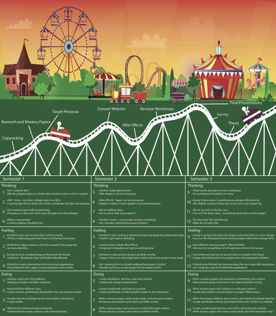
The last 12 months have been a rollercoaster of emotions, ups, downs, highs, and lows. There has been a plethora of useful material covered in every class that will be beneficial to my success in the field. It’s crazy to think that just a year ago, I was applying to the Full Sail University Master of Fine Arts program in Media Design and here I am a week away from walking across that stage to receive a diploma. Looking at the Experience Map located below, this year has not been shy of some obstacles, but in the end, these obstacles have made me a better designer. As the final week on the program comes to a close, let’s go ahead and take a look back on each month and reminisce about each course and how it helped me achieve mastery in the field.
1 – Mastery: Personal Development and Leadership
This first course was all about getting back into the swing of being a student again. It had been 5 years since my undergraduate program, so finding a routine was necessary. This month helped me learn how I was going to organize myself and my work and how I would manage my time and schedule for the remainder of the program. It was all about finding a balance and doing a little work each day, rather than save it all until the last minute. I also had to learn APA style formatting when it came to writing a research paper. My undergraduate career, I only used MLA, so this took some getting used to, but I was able to write my first research paper in 5 years and I was pretty proud of the end result. These skills are not only necessary for almost every job, but they were also very helpful in finishing my thesis. By managing my time and keeping all of my projects and papers organized throughout the program, it was easier to find and look back on these assignments for the thesis project.
2 – Defining Client Needs
Defining Client Needs was the first class that taught the skills and tools required in the initial stages of the design process. The first assignment asked to create mind maps for three different categories for three different cities. These mind maps were so helpful because it creates a visual of so many different ideas on one page with the hopes that one of these ideas will spark a creative idea that will lead to the next step in the process, sketching. Sketching is something I never did, so this took some getting used to. I usually would just go straight to the computer, but I found that it was so useful to sketch not only for the client but also for myself. As a designer, sketching actually saves a lot of valuable time. Creating designs and initial compositions on the computer takes time and if the client does not like the idea, then all that work was wasted. Sketches take very little time to do, so more ideas can be created in less time. The sketches can then be shown to the client and the most effective ones for them can then be produced into compositions on the computer. These mind maps and the idea of sketches was very helpful in the final thesis presentation because it allows me to show the process of reaching the final design and explain how the final presentation came about. Design is not just about creating something, but it is also about the process and how we arrived at that final design. This idea was brought to life because of the tools taught during this second month.
3 – Brand Development
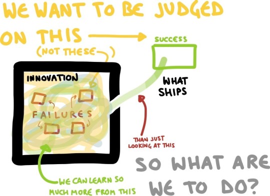
“Design iteration means learning from failure before putting a product in front of users – so that you are judged on success” (Interaction Design Foundation, 2018). This quote from the Interaction Design Foundation really sums up what this month was about. Iterative design is key to a successful final product. As this quote explains, iteration helps a designer learn from their failed attempts. After selecting the city of Kyoto, Japan as the city I would move forward with for the logo design, I created hundreds of sketches for a logo design, but only the best and most effective designs for the client and target audience were turned into vector compositions. These logos were then added to toolkits or moodboards that included images, typography, color palettes, and other useful information for the brand. This assignment pushed me to be creative and come up with many different ideas based on geography, culture, and traditions of Kyoto. The tools learned from this course helped my thesis project because moodboards are very important to designers in showcasing a lot of information about a brand on one page. For my thesis, I had to explain my design process for many different learning outcomes and the addition of moodboards allowed this information to be communicated clearly and effectively to the audience.
4 – Effective Copywriting
The Effective Copywriting class really had me look at a different element of design that I never thought of before. I always thought of design as something to look at and never really thought of the words in an advertisement. This course had us think about taglines, headlines, and the body text of advertisements. In an article by Sue Unerman titled, Eight out of ten people only read the headline. She then writes, “hello there if you’ve got past the headline. You’re in the minority” (Unerman, 2015). This article explains just how important a good headline is to the effectiveness of a magazine cover or advertisement. This idea is something I never thought about before this course and really pushed me to write the best headlines and copy to grab the audience’s attention. We also had to create target personas, which was one of my favorite assignments of the entire program. Creating the ideal person for the target audience of a brand was exciting and allowed me to be very creative and detail oriented. My thesis presentation benefited from this course because it taught me to research and truly understand the target audience and as a result, the best and most effective final presentation could be delivered.
5 – Design Research
This course required us to create a website for a benefit concert to help the conservation of sea turtles. This one only my second time creating a website from scratch, so I knew this course would be a challenge. I feel like this course required a lot of work and many revisions were made based on peer and instructor feedback. This course introduced me to the importance of user experience. It is one thing to create something beautiful, but when it comes to websites, the user experience and whether or not they were able to maneuver through the website easily is very important. Design is all about reputation and if the target audience is frustrated or cannot effectively scroll through the website, this negatively affects the designer’s reputation as well as the brand. The final thesis project was to be presented in a website format. Therefore, the skills and idea of understanding the user experience were very beneficial in creating the final thesis presentation. If the information on the final website was unclear then this would negatively affect my argument on why I achieved mastery.
6 – Organizational Structures
Organizational Structures was one of my lowest points in the program. I am not very experienced in Adobe After Effects and motion graphics in general, so I knew a lot of outside research and training would need to take place. This course asked for an animated logo of one of the designs created in month 3. After watching some videos on Lynda.com, I was able to comfortably create some storyboards and a final animated logo for Kyoto. After peer review, I found that the animated logo looked great, but it did not effectively communicate all that Kyoto has to offer its tourists, which was the design problem I was trying to solve in the first place. I then added more images and words to describe Kyoto and added the animated logo at the end, which worked a lot better. When it came to my thesis project, what I took from this class was that as a designer, I need to fully understand the design problem because if I do not, then the target audience will be lost, and I did not solve the client problem either. By fully understanding the questions the thesis project was asking allowed me to clearly communicate the solution and arguments to the target audience.
7 – Design Strategies and Motivation
This course taught me that there is always room for improvement. There are always ways to make a design better and more effective for the client. During this course, I revisited the logo project from month 3. The final project during month 3 resulted in three different logo designs based on three different categories of geography, culture, and traditions. After learning more about design in the next three months, it became clear that branding is a huge deal when it comes to design and if a brand does not clearly communicate their ideas and mission to the target audience, then it will most likely fail. This idea was brought to the Kyoto logo project. I decided to create a template logo that is easily recognized as a brand, but the secondary images of the logo could be changed to showcase all that Kyoto has to offer. As a result, a series of logos was produced, but each one contained elements that were similar and can easily be recognized as the same brand, this allows for versatility in design while maintaining the look, feel, and mission of the brand. Later on, these logos were added to stock images with the header, “A city of possibilities. Kyoto.” This was created into a campaign as the final presentation. This course helped me complete my thesis project because I learned that often the first approach is not the best approach. It is better to take a step back from a project and revisit it later on. This allows the designer to see the project differently the second time and fix what may not be effective for the final product. This is what happened with my thesis website. What I sketched on paper and what actually was created looked completely different.
8 – Design Integration
This month was very similar to month 7, except the project that was revisited was the benefit concert website. The original website seemed flat, so wavy lines were added to the background to give a sense of flowing water. The user experience was also revisited and modifications to the design were made in order to make navigation through the website more positive for the audience. I also wanted to create a more complete and effective final presentation. Yes, the design process and how a designer arrived at the final product is important, but the way the final product is presented is even more important. If the final presentation is not clear and effective in communicating the design solution and vision of the brand or company, then the designer failed. I really wanted to make sure the final presentation included the process of arriving at the final product, but also look beautiful and have all the information pertinent to the client and design. By really focusing on the final presentation, I was able to take this skill into account when presenting the final version of the thesis project.
9 – Multi-Platform Delivery
This was the third month of revisiting projects from previous courses. This month I revised the three testimonial advertisements for the non-profit organization. The organization chosen was the Adoption Exchange, this name was changed to a fictional organization for portfolio purposes. The purpose of this project and design problem was to create advertisements that increase donations and awareness for the non-profit organization. Miranda Paquet states, “A well-planned campaign can spark new interest in your business and increase your sales, donations, and impact” (Paquet, 2018, para. 4). This idea sparked the “Love Knows No Bounds” campaign. The campaign allowed for the brand and look of each of the three advertisements to look similar and consistent. Consistency is key when it comes to design. To take this idea a step further, for the final presentation for this project I wanted it to include a brand style guide. Karla Cook states, “Developing a consistent brand starts with creating a brand style guide. These branding rule books help graphic designers, marketers, web developers, community managers, and even product packaging departments all stay on the same page and present a unified vision of the brand to the public” (Cook, 2018, para.4). The style guide will allow everyone involved in the project to stay on the same page. My thesis was benefited from this course again because of focusing on the final presentation and clarity of the information to the audience. Communication is very important in design and when it came to the thesis presentation, so this course definitely helped me with this effectively communicating my arguments.
10 – Measuring Design Effectiveness
Month 10 was very helpful to my career as a designer. It is one thing to create a design, but to actually measure its effectiveness and see how well it does with its consumers is another. This course required us to create a survey and actually test and analyze the results. These are skills that are very beneficial in the design industry. Conducting a survey is very important to a designer because it allows them to learn from their mistakes and see what does and does not work for the future. I tested the benefit concert website and found that the results were quite positive. Having been worried about web design prior to this program, I never thought that a website I created would receive such positive feedback. I found that viewers liked simple design and an easy to navigate website with a menu bar. The survey also brought up ideas and elements that were missing for the website. This was very helpful when creating the website for my thesis because I knew what design elements worked and what did not. I knew what consumers wanted in a website and what information fell flat and was unclear to them. When developing my final thesis website, all of these ideas were taken into effect to create the most positive user experience that effectively communicated all of the information presented.
11 – Thesis: Presentation of Design Solution
This course was when we had to create our thesis presentations and I knew that the pressure, time management, and organization skills would have to be increased. Throughout the program, I kept all of my projects and assignments in folders on my computer which helped me find all of the information and images needed for the thesis project. Organization is crucial in any job, but it paid off and made things more efficient and run smoother in this particular case. I had used wix.com before so this aspect of the assignment was easy for me. I took everything I learned from the previous courses into account and really wanted to showcase my best work and communicate my ideas clearly to the target audience. From month 10, I found that simplistic web design and navigation is key, so I really wanted a simple design, but in order to effectively communicate my ideas, I needed to include a lot of images and information. Users can become very overwhelmed with information, so finding the balance between including a lot of information but keeping the website simple was necessary. This was probably the most important project of the entire program and by understanding and using all of the tools and skills taught from the previous courses, the most effective thesis presentation was created.
12 – Professional Practice
This final month really put everything together and allowed us to wrap all that we learned into a final course. We learned how to present ourselves professionally in our resumes and cover letters, but also how to sum our personal brand up into a single statement. We created an experience map that looked back on how we were feeling, what we were thinking, and what we were doing during each course, good and bad. This allowed us to see our journey throughout the program in a single image. Over the past year, I have learned so much about design, the process, research, the ethics and morals surrounding design, and so much more. However, most importantly, I learned a lot about myself and with the help of the program, my peers, and instructors, I feel that I have achieved mastery and that I am ready for a career in media design. Thank you to everyone who helped and supported me along this rollercoaster, it’s been a ride I will never forget.
References
Cook, K. (2018). 21 Brand Style Guide Examples for Visual Inspiration. Retrieved December 5, 2018, from https://blog.hubspot.com/marketing/examples-brand-style-guides
Interaction Design Foundation. "Design Iteration Brings Powerful Results. So, Do It Again Designer!" The Interaction Design Foundation. 2018. Accessed March 28, 2019. https://www.interaction-design.org/literature/article/design-iteration-brings-powerful-results-so-do-it-again-designer.
Paquet, M. (2018, January 16). How to Create a Successful Marketing Campaign. Retrieved November 29, 2018, from https://blogs.constantcontact.com/create-a-campaign/#
Unerman, Sue. "Eight out of Ten People Only Read the Headline." Campaign. 2015. Accessed March 28, 2019. https://www.campaignlive.co.uk/article/eight-ten-people-read-headline/1374722.
2 notes
·
View notes
Text
11.2.3 - Mastery Reflection
Month 11 has been truly challenging. Basically, all of our work over the past 10 months came down to this course. This course required us to look back on all of our projects and choose which ones best help prove our mastery in each degree learning outcome. Having to look at all the sketches, compositions, revisions, and final designs have been a lovely reminder of all the hard work that was put into this program over the last year. This course pushed me to think about each project and what I gained from each.
The four DLO’s are Connecting, Synthesizing, and Transforming, Solving Problems, Innovative Thinking, and Acquiring Competencies. We were given a template and images to use for the home page. I did not want to add any colors or animations to each page because I wanted the project and design images to be the main focus. The main introduction paragraph was in a larger font and placed at the top of the page. This paragraph explains the design problem for each project and how this project was best suited for the particular DLO. The layout of each page includes images and paragraphs explaining the design process for each project. The final presentation is presented at the bottom of each page. This idea is to have the viewer follow the design process as they scroll to the final design.

Connecting, Synthesizing, Transforming page

Solving Problems page

Innovative Thinking page

Acquiring Competencies page
The three major takeaways I got from this course are organization, communication, and time management. The first is organization. This course required me to go back and look at all the sketches, iterations, and final presentations of each project over the year. If these files were not organized then it would be very difficult to find everything needed for the thesis presentation. All of my projects, sketches, and papers throughout the year were all organized in folders on my computer, which made this process much simpler. Another aspect of organization comes to how each page was organized and laid out. I wanted to organize the images and information in a way that was easy to follow and explain my design process but also use a sense of hierarchy. Brandon Jones states, “perhaps a more practical explanation is that it’s simply the way that our brains categorize information: grouping similar visual elements and organizing it into meaningful patterns is as inherent to our human nature as eating or drinking. Either way, the fact is that even in it’s most basic form, information that is organized with a hierarchy in mind will always be more effective at communicating than unorganized information” (Jones, 2011, para. 9).
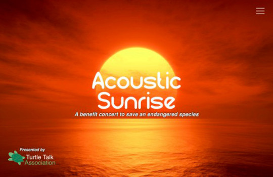
The next major takeaway is communication. “At it’s core, design is all about visual communication: To be an effective designer, you have to be able to clearly communicate your ideas to viewers or else lose their attention” (Jones, 2011, para. 2). Writing my thesis presentation required me to communicate my design process and explain why the way I did things would prove my mastery in each DLO. I found that communication and rationale behind a design are not simply stating I picked these colors or font because it looked pretty, but rather why they are better than other options. For example, the colors for the concert website were changed from fiery orange to a peach color because the orange seemed too bold and harsh. The website was meant to be completely immersive and since the music is acoustic, the fiery sunset was not peaceful and serene enough for the type of music. With these gentler colors, the entire theme and all elements work as a more cohesive unit. It is very important to be able to communicate the reasoning behind every design decision to the client and throughout this year, each project and assignment has helped become more comfortable.
The final major takeaway from this course is time management. This was something that I had to learn all throughout the program, but it was extremely relevant this month. Managing time and knowing how long it will take to finish each task and assignment was very necessary. This skill will be helpful in the professional world as well when it comes to reaching a deadline. Time management is not only reaching the deadline, it also “includes: Effective Planning, setting goals and objectives, setting deadlines, delegation of responsibilities, prioritizing activities as per their importance, spending the right time on the right activity”, according to Prachi Juneja.
References
Jones, B. (2011, September 28). Understanding Visual Hierarchy in Web Design. Retrieved March 3, 2019, from https://webdesign.tutsplus.com/articles/understanding-visual-hierarchy-in-web-design--webdesign-84
Juneja, P. (2019). MSG Management Study Guide. Retrieved March 3, 2019, from https://www.managementstudyguide.com/time-management.htm
0 notes
Text
Mastery Reflection - Measuring Design Effectiveness 10.4.3
During this course, we conducted a questionnaire and crafted questions that led to meaningful results about a previous project. This course provided valuable information on how to survey for effective feedback from users. We have to consider what we wanted to know and learn from the target group that would ensure the results of the design will be what is expected and better to solve the client’s design problem.
Website
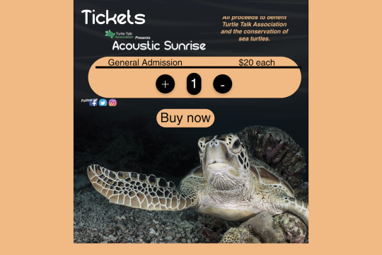
Purpose
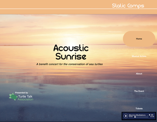
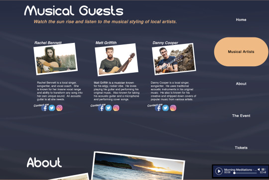
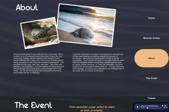
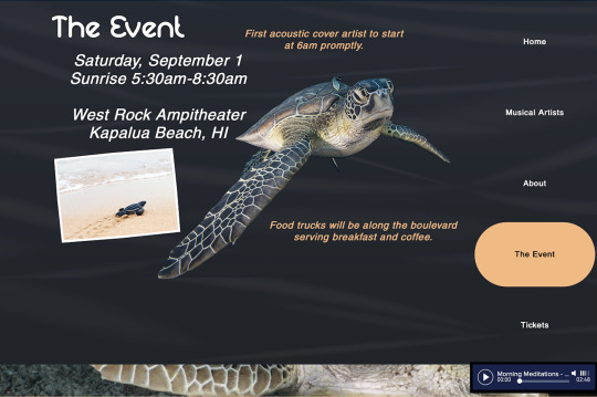
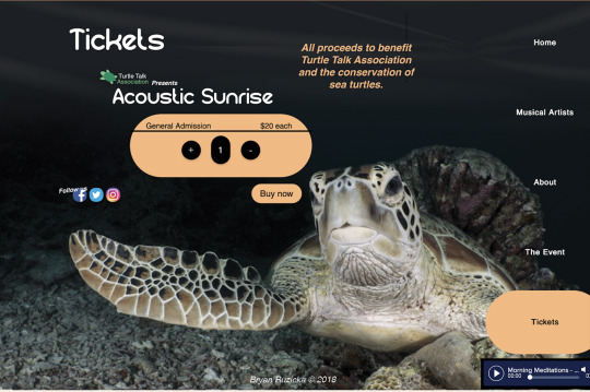
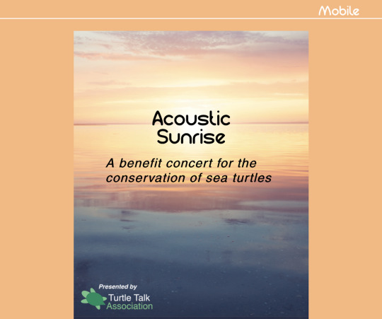
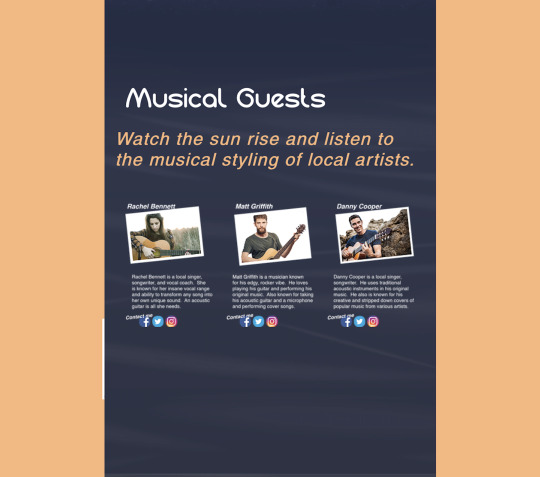
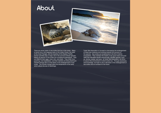
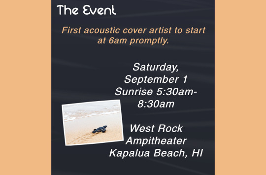
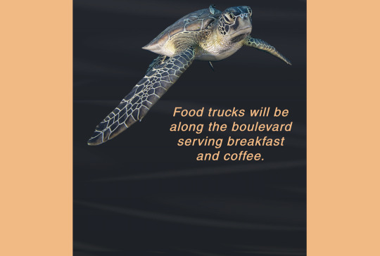
The purpose of the project being tested is to create a website for a benefit concert. The design problem is to create an innovative website for the conservation of sea turtles that is user-friendly and persuades the target audience to buy tickets or donate to the cause. The target audience, in this case, is any person of any age that wants to help conserve sea turtles or a person who enjoys live acoustic music. According to Terry Lee Stone,
a particular group declares something as good or bad. And if a person is part of that group, they tend to agree with the group opinion. Why this all matters is that, at its heart, the design is about encoding and decoding messages to move a particular group or target audience to do, think, or feel something (Stone, 2013, Section: 7, Para. 1).
By understanding the target audience and their needs and opinions, a designer will have a better understanding of how to cater to their needs and persuade them to respond to the call to action. By conducting this survey, the designer will better understand these needs.
Initial Questions
What is your gender?
o Male
o Female
o Prefer not to answer
Please specify your ethnicity
o White
o Hispanic or Latino
o Black or African American
o Native American or American Indian
o Asian/Pacific Islander
o Other
What is the highest degree or level of school you have completed? If currently enrolled, the highest degree received.
o High school graduate, GED
o Some college
o Trade/Technical/Vocational Training
o Associate degree
o Bachelor’s degree
o Master’s degree
o Professional degree
o Doctorate degree
What is your marital status?
o Single, never married
o Married, or domestic partnership
o Widowed
o Divorced
o Separated
Are you currently…?
o Employed
o Self-employed
o Homemaker
o Student
o Military
o Retired
o Unable to work
What genre of music do you prefer?
This question will help the designer better understand the type of music the target audience listens to and if the genre of the benefit concert suits their musical taste.
How did you first learn about our website?
The purpose of this question is to help the designer understand where the target audience learned about the event and the website. The target audience will be taking this survey after the launch of the website. Since the website will be launched, the survey is a way to see what the brand can improve on for future events. By understanding this information, the designer will have an idea of where the website and event are promoted and where they should focus and promote more. For example, if the target audience first learns about the event and website through print advertisements, the designer and marketing team should focus more on website banner advertisements or tv commercials. These different media platforms will provide a different demographic of the target audience. In a study by Marketing Artfully, they found that “if you want to target 12 to 24-year olds, you should be using Snapchat and Instagram for your marketing efforts” (Marketing Artfully, 2018, para. 3). As it could be seen, these different platforms are more popular for different demographics and should be used as such.
How likely is it that you could recommend our website to a friend or colleague?
Ed Keller states, “personal recommendations are the number one driver of consumer purchase decisions at every stage in the purchase cycle across 10 product categories studied” (Keller, 2012, para. 3). By asking about recommendations, the marketing team will understand how the target audience responded to the website and whether or not their business will improve based upon word of mouth. Keller also states that “over 8-in-10 purchases influenced by a recommendation are influenced by people talking face-to-face” (Keller, 2012, para. 5). By asking for a face-to-face personal recommendation, the target audience will feel a more personal and human connection to the product or organization.
What comes to your mind when thinking about our website?
What was your first impression when you entered the website?
This is a way to understand the user’s perception of the website. By having them clearly write out their views, then the designer will understand what they think of the website. In an article by James Leist, he discusses how
Your website’s appearance is one of the most important factors in determining how successful it is at converting visitors into customers. When a potential customer visits your website, they make a judgment on whether or not they like the look and feel of it within 0.2 seconds. Typically, the first thing they will look at sits in the top part of the homepage. This will normally include your logo, an image, some headline text, background colors and a navigational bar (Leist, 2017, para.1).
If the designer cannot keep the attention of the visitor with the homepage, they will most likely not move on to visit other pages, therefore the sale is lost. Although this question may come across as vague and may come back with a variety of different responses, the questions offer the audience to respond how they feel fit.
On a scale of 1 to 10 (10 being the highest), What score would you rate us based on user experience?
By getting a score of 1 to 10, the designer will have a better understanding of how successful the website is for the user. Sometimes a numerical number is a faster and better way to understand the success rate rather than a written explanation.
How does our website compare to other event websites?
This question helps the designer investigate the strengths and weaknesses of the website design and usability. It also addresses the competition, which is a good way to see what others are using for their designs as a way to gain more ideas for the future. It is very important to stay up to date with the latest trends and keep up with the competition.
What do you like least about our website?
What do you like most about our website?
Which feature(s) of our website are most important to you?
Which feature(s) of our website are least important to you?
These sets of questions help to understand what elements of the website makes the user happy or sad, as well as what features the user likes or dislikes. It is unfair to add new features to the website without improving the ones already in existence. These questions pinpoint what works and what does not. Kathryn Best states, “different ways that design success can be measured include… improved product and service quality” (Best, 2006, pg. 173). By improving the quality of the product, the user is more likely to respond to the call of action, resulting in a larger design success rate.
How easy is our website to use?
The user is the most important person the designer must keep in mind. If the website is not easy to use, the website will most likely fail, and the event will not sell tickets. “Responses can be used to determine whether users are satisfied with or confused by the new tools” (Visocky O’Grady, 2009, pg. 28). The usability of the website determines whether or not the visitor continues to scroll through the website and ultimately whether or not they buy tickets or donate.
What is the most important feature(s) you think we should add to our website?
This question helps to inform the designer of the weaknesses and shortcomings of the website design. By asking the user what they want to see on the website, it gives them a deeper connection to the website and makes them feel important and like their ideas matter. Hilary Collins believes, “questionnaires allow plenty of time for the respondent to formulate their responses and also avoid any interviewer bias” (Collins, 2010, pg. 128). These questions allow the user to give their true opinion without being persuaded by an interviewer.
Would the website move you buy tickets or donate to the organization?
This question helps the designer know whether or not the usability and design of the website actually worked and persuaded the user to respond to the call to action. This is a way to optimize sales and increase revenue. Again, the survey will be taken after launch and after the user has visited the website. If the user was not moved buy tickets, what stopped them and how can the website be improved to change their response to the websites call to action.
If so, what is your preferred payment/delivery method?
Did we offer this type of method?
By asking this question the designer can understand what payment method is the most popular and easiest for their visitors. Everything could be perfect about the website, but if they do not offer the payment method easiest for the user, then the sale may have just been lost. If we do not offer the most up to date payment method, then this is something the designer should look into and maybe add for the future.
Was pricing reasonable and clear to you?
Again, this goes back to usability. If navigation and how to purchase tickets is unclear to the user, then the tickets may not have been sold and a customer has been lost.
Is there anything missing from this website?
If you were unhappy with us, what can we do to improve your experience in the future?
These last two questions are here to improve the website design in the future. It gives the visitor the opportunity to give us constructive feedback on how to improve the website. If information or features are missing from the design, this allows them to tell us what these are and why they would like these added. It is impossible to make every customer fully satisfied, so by giving them the opportunity to give feedback, it helps the designer know what information, design elements, or features should not be missed.
Peer Review and Revisions
After receiving peer review and feedback from the instructor, it was determined that some questions should be reworded and that they should not all be open-ended. By adding multiple choices, the survey will be more likely to be completed in full with no questions skipped. Survey Monkey only allows for 10 questions, so I had to narrow down to the best questions that I felt would provide the best results and the most constructive feedback. Although I would have loved to include questions about the demographics of the target audience, I had to eliminate these questions in order to have the most questions about the work itself. The final survey questions were as follows:
1. How likely is it that you would recommend our website to a friend or colleague?
2. What was your first impression when you entered the website? How did you hear about us?
3. On a scale of 1 to 10 (10 being the highest), what score would you rate us based on user experience?
4. What do you like least/most about our website?
5. How easy is our website to use?
6. Would the website move you to buy tickets or donate to the organization?
7. What is your preferred payment/delivery method?
8. Was pricing reasonable and clear to you?
9. Is there anything missing from the website?
10. If you were unhappy with us, what can we do to improve your experience in the future?
Results
After viewing the responses on the last day of the survey is open, I found that there were only about 13 responses. This was not as many as I had anticipated, so on break at work, I asked everyone I could in the break room to come take the survey on my laptop, which added another 15 responses for a total of 28 responses, which is a better total to get a clear analysis of the results.
On average, a respondent took about 2 minutes and 19 seconds to complete the survey. The following will be a question by question breakdown of the responses.
1. How likely is it that you would recommend our website to a friend or colleague?
53.57% said very likely
35.71% said likely
10.71% said neither likely or unlikely
Recommendations and word of mouth are very important when it comes to websites because it allows for more traffic through the site and the potential for more donations or sales. Hitesh Bhasin states,
Quite simply said, if the right positive review hits the right chord with the prospect, then he can be converted to a customer just because of the correct customer review that he read. You see a lot of people buying products online just because they saw five stars and read some great comments in the reviews section (Bhasin, 2018, para. 5).
2. What was your first impression when you entered the website? How did you hear about us?
While writing these open-ended questions, I knew they would produce a wide variety of answers. However, this was not the case after looking back at the responses. One of the main responses was that their first impression of the website was that it was very clean cut and simple. Many people loved the colors and pictures. One person loved the cause, so the sea turtles were the first thing they saw. Another person loved the vertical navigation bar on the right-hand side. They said that this type of navigation bar is not seen very much, so it was one of the first things that they saw. All of the responses were very positive, which is helpful because it shows that the design was simplistic to not overwhelm, but was visually appealing enough to keep them drawn in.
3. On a scale of 1 to 10 (10 being the highest), what score would you rate us based on user experience?
The average of all responses was an 8.6. Anything about an 8 to me is very good. This means that the user has a positive experience and found the website to be easy to use and were able to find what they were looking for.
4. What do you like least/most about our website?
Again, with an open-ended response, I assumed that there would be a bunch of different responses. What people liked the most about the website is the simplicity, theming and how easy it was to navigate (especially with the sidebar). They also loved the pictures and the font styles. The one-page scrolling made all of the information accessible without having to flip through different pages. Although they loved the simplicity, they also found that there could be more information on the artists. I definitely could agree with them. The musical guests’ descriptions are very vague, but since all of that information is made up, it was difficult to come up with information. However, this is good to know that users want to know more about the artists and do not mind more words on the page. The most consistent dislike was the music bar at the bottom of the page. Some people found the color or the fact that it was stationary distracting. I could agree with this and is something that I struggled with while creating the website. I was going to get rid of the music bar altogether but kept it because I wanted a fully immersive website. Moving forward maybe having the sidebar be a cheeseburger menu and having the music bar be part of that would be more beneficial.
5. How easy is our website to use?
71.43% said very easy
28.57% said easy
This is probably the most important question in the entire survey. Angela De Schrijver writes, “according to statistics gathered by the Website Standards Association, visitors will remain on a Web page for about 10 seconds before deciding to leave or stay” (De Schrijver, 2017). Since a user knows almost immediately whether or not they want to continue scrolling through a website, how easy it is to navigate through is very important in maintaining their interest and not overwhelming them or making them frustrated.
6. Would the website move you to buy tickets or donate to the organization?
82.14% said yes
7.14% said no
10.71% said neither yes or no
The majority of people said yes, which is helpful in knowing that the website is persuasive enough to engage the audience as well as move them to respond to the call to action in a positive way.
7. What is your preferred payment/delivery method?
The answers to this question did not come as a surprise. I had a feeling almost everyone would say by card and would like their tickets e-mailed or electronically sent to them. Some people responded with Venmo, PayPal, or Apple Pay, which are all ways that I did not think of. These options are very helpful in the future.
8. Was pricing reasonable and clear to you?
96.43% said yes
3.57% said no
Almost every response said yes. For marketing purposes, ticket prices should be clear and reasonable for the consumer, but also take in a profit for the organization. The price should not come as a shock to the guest, so the fact that the price was fair and clear to the guest is very helpful for future events.
9. Is there anything missing from the website?
The following two questions, I anticipated no answers, however, the responses were very helpful. The majority of responses said that there should be a direct link to donate, which is something that I did not even think of. Other responses were more information on sea turtles, the cause, and the artists, which is good to know for the future. One person said that there were no popups. I always assumed that users disliked popups, so maybe this is something to look into.
10. If you were unhappy with us, what can we do to improve your experience in the future?
As stated above, I did not expect many answers to this question. Most people said that they were happy and satisfied with their experience. The responses that went further in detail stated that there could maybe be another page for future events or that the social media icons were a little distracting. Moving forward maybe the social media icons could all be changed to one color that is within the color scheme, that way they will not distract from the other information on the page.
Conclusion
Altogether, I found that the results of the survey were very helpful. Web design was always something I struggled with during my undergrad, so by conducting this survey and receiving positive reviews was a great learning experience. I found that people do not mind reading more information and that simplicity is the way to go. The bold colors were something that stood out to people, but when introducing a secondary color such as with the music bar or the social media icons, they were not received as positively. Respondents came up with aspects of the website that I did not think about, such as a donations box or a tab that led to more future events. Overall, I am very satisfied with my results and know what to improve on for future projects.
This course was very helpful in evaluating and analyzing the results from a survey or questionnaire about user experience. When it came to the mastery paper, it was helpful to write out the design process and see how research, prototyping, iterating designs, and coming up with solutions to the design problem works to help the client. Moving forward, I feel a lot better about creating websites and knowing what the user likes and dislikes.
References
Best, K. (2006, October 31). Design Management. Retrieved January 13, 2019, from https://ce.safaribooksonline.com/book/design/9782940439782
Bhasin, H. (2018, February 12). Importance of Customer reviews and recommendations to businesses. Retrieved January 27, 2019, from https://www.marketing91.com/customer-reviews-and-recommendations/
Collins, H. (2010, September 01). Creative Research. Retrieved January 13, 2019, from https://ce.safaribooksonline.com/book/design/9782940439676
Jacobsen, T. (2018, December 29). Customer Demographics - Age Demographics for Advertising (Updated 2018). Retrieved January 13, 2019, from https://marketingartfully.com/2012/12/13/customer-demographics-age-demographics-for-advertising/
Keller, E. (2012, July 27). Recommendations are What Drives Your Business. Remember to Ask for them. Retrieved January 13, 2019, from https://www.forbes.com/sites/kellerfaygroup/2012/07/25/recommendations-are-what-drives-your-business-remember-to-ask-for-them/#4ff4372439c6
Leist, J. (2017, February 4). The Importance of Website First Impressions. Retrieved January 13, 2019, from http://jamesleist.com/above-the-fold-the-importance-of-website-first-impressions/
Schrijver, A. D. (2017, November 21). Importance of Web Usability. Retrieved January 27, 2019, from https://smallbusiness.chron.com/importance-usability-44946.html
Stone, T. (2013, September 12). Evaluating design based on a creative brief. Retrieved January 13, 2019, from https://www.lynda.com/Design-Business-tutorials/Evaluating-design-based-creative-brief/114320/148463-4.html?org=fullsail.edu
Trista. (2018, April 04). 20 User Experience Survey Questions and Templates for Inspiration. Retrieved January 13, 2019, from https://www.mockplus.com/blog/post/user-experience-survey-questions
0 notes
Text
9.4.1 Mastery Reflection
Over the past 4 weeks, the assignment was to work on a project in 2 week intervals to reach a final presentation that is portfolio worthy. The project that was chosen to spend the entire month on was the non-profit organization testimonial advertisement project. The original design problem was to create 3 different testimonial advertisements that persuade the target audience to respond to the call to action. The organization that was chosen was the Adoption Exchange. The mission of the Adoption Exchange is as follows:
We are the connection between the children who wait in foster care and the families who adopt. We provide expertise and support before, during, and after the adoption process (Adoption Exchange, 2018, Sec. Our Mission).
The testimonial advertisements created for this project were designed with this mission in mind, how adoption connects families. The final presentation was a campaign called, the Love Knows No Bounds campaign. The idea was to showcase the different families positively effected by the gift of adoption. The testimonial advertisements use pictures and testimonials from the not so typical family, for example, a single mother, and a same-sex couple. The idea of love knows no bounds is created to represent how these families love each other no matter their pasts, their race, their sexual preference, or disability. The love, bond, and connection that adoption creates is above any other and this campaign is intended to represent that idea.
Going into this first two week process, for a final portfolio piece, this campaign needed to be further explored and more detailed. As is, it was a strong campaign, but there are missing ideas and details that needed to be hashed out. For one, in order to present this in a portfolio, the name Adoption Exchange and logo needed to be changed to one that does not exist. Therefore, the Adoption Organization was created. The logo idea is similar with the idea of a heart, but the overall design is very different. Adoption is very personal to my heart and moving ahead, these designs needed to have a more emotional effect on people and get them to participate in the call to action of donations or fostering a child. There are adopted children in my immediate family and is a key factor in how I would be able to create a family myself. By having such an emotional attachment to the campaign, these same emotions need to resonate with the target audience. These ideas are what the next revisions need to portray.


Based on the feedback received through peer review, one idea was to change the logo font to a handwritten font. By incorporating a handwritten font in the logo, the organization may appear to be more personable and relatable. For these iterations, the font was changed to a handwritten font that appears to be written by a child. Adoption is all about giving children a home, so by using a child's handwriting mimic the idea of children being at the core of the organizations mission. Another idea was to use the same layout throughout each advertisement. Instead of using the same layout and just changing the words and images, the same general design was used throughout. Instead of using navy for one advertisement and red and grays for the other two, the main colors of the brand were changed to just gray and maroon, whereas the navy was deleted. The same angles and lines were used throughout each design as well. This creates a more unified campaign and showcases a better understanding of the brand. A drop shadow was added to every image, rather than the previous iterations where the drop shadow was only present in two of the designs. Miranda Paquet states, "A well-planned campaign can spark new interest in your business and increase your sales, donations, and impact" (Paquet, 2018, para. 4). The idea of the "Love Knows No Bounds" campaign is to increase donations and spark interest in families wanting to adopt and respond to the call to action. With these new revisions, the campaign will be more effective in achieving these goals.


The changes made were to create a logo for a faux organization so the project can be used as a portfolio piece. The new non-profit is similar to the Adoption Exchange and their logo. The logo is still a heart, but is more rounded and less scribbled as the original. The Adoption Exchange was also changed to The Adoption Organization. The font previously was a serif font, but is now a handwritten font in a child's writing. The child idea mimics the mission of the organization, to help children. In the last revision, the words were more in the entire heart image, but now the text is more to the right side of the heart showing more of the image itself. All of the layouts have been changed to the same red and grey color to make a more unified design campaign. Also in the previous revision, only one image had the white Polaroid background, but to keep consistency all of the images have them now.
The following article was used to learn more about design consistency when it came to creating the "Love Knows No Bounds" campaign.
https://designshack.net/articles/graphics/7-tips-for-designing-consistency/
Carrie Cousins discusses how "Consistency will make your design better, easier to use, and practically invisible. It gives the user plenty of room to experience the design in the way you intend" (Cousins, 2016).


For the second two weeks, the goal was to create a brand guide for the Love Knows No Bounds campaign for the non-profit organization that was finalized the past two weeks. The original design problem for the project was to create three different testimonial advertisements for a non-profit organization. The organization chosen was The Adoption Exchange. The past two weeks, the project was revised into a more cohesive campaign with a similar theme and faux name. Therefore, a new logo had to be created as well. The design problem for these two weeks is to create a brand guideline that represents the design, mission, and goals of the organization and campaign that sparks interest in the target audience to respond to the call to action.
The designs posted below are the beginning stages of a brand guideline for the campaign. Karla Cook states, "Developing a consistent brand starts with creating a brand style guide. These branding rule books help graphic designers, marketers, web developers, community managers, and even product packaging departments all stay on the same page, and present a unified vision of the brand to the public" (Cook, 2018, para.4). She discusses the different pages and categories that should go in a style guide, such as typography, target personas, and color palette. The idea behind the brand guideline is to be a reference for other designers to go to in order to keep a consistent design and maintain the vision of the campaign and organization in other designs and areas. These designs use the same colors and typography, as well as overall style in all of the pages. Another logo variation was also created.


After receiving feedback from the instructor and one of my peers, they discussed how the slanted lines seemed a bit too harsh for the campaign. The solution was to use ovals and rounded shapes instead. These curves create a more playful and softer look to the campaign. Another idea that was presented during review was to personalize each of the polaroids of the advertisements. Each polaroid now has a handwritten note on the bottom of each image. This idea showcases how every family has a different story and by adding a handwritten touch represents this and makes each story more personal. By doing so, the target audience will have a more emotional attachment to the advertisement and will be more likely to respond to the call to action.
Another idea was to add more than just the mission statement in order to better identify the values of the organization. A page with keywords and core values was now added to the brand guide. After reviewing the Twitter brand guide, another page with how to use the logo and how much space there should be around the logo. This helps another designer or collaborator to understand the space needed around the logo to not crowd the design. The article by Midori Nediger is very helpful in understanding how to create an effective style guide and what to put into it.


After reviewing the feedback from the instructor and my peers, they suggested to use softer lines rather than harsh slanted lines. In the current iterations, the harsh lines were changed to curves in order to mimic the ideas of the organization. The slanted lines seemed to business like and impersonal. Going off of a more personal campaign, the polaroid pictures received a handwritten note on each of the white frames in a different style. They are all different because every adoptive family's story is different and this idea should be recognized in the design as well. Another piece of feedback that was received about the advertisements was that the paragraph justification was inconsistent throughout all three designs. These current iterations all use the same justification creating a more unified campaign. Moving on to the brand guide, the instructor suggested to create a template page. This page could be used as a reference for other designers and collaborators to use in order to create a consistent campaign even though it is designed by different people. Secondary colors were also added to the color palette page. Another suggestion was to add bullet points to the target personas pages. By adding the bullet points, the viewer will be able to read the main points of the personas without reading the entirety of the persona. Finally, the clear space page instead of using points and measurements to help understand how much space should be between the logo and the other elements of the design, it now uses a part of the logo itself as the measurement. By doing so, if the logo is sized up or down, the designer does not need to do math in order to convert the measurement to coincide with the new logo size. Now by using part of the logo, the designer knows that that amount of space should be between the logo and other elements.
Raudi Marie Perilli writes about how brand consistency is important to a campaign and how to achieve it. She states, "Multiple people creating many branded elements can make it difficult to keep things aligned. For both big corporations and small business, it can be easy to veer off course, sometimes without even realizing it" (Perilli, 2016, para. 2). This idea is one of the major components of why in my project I decided to create a brand guide. This article was very helpful in my designs.
These changes will be seen in the final presentation post that will be below.
As of right now, I did not receive any peer review on my third revision for the second two weeks, so I took it upon myself to further revise my project to a final presentation. The revision presented today is a final presentation that would go to the client. The first page is a title page that defined the design problem and has the created logo in the bottom right hand corner. The post then goes into the 3 advertisements that were created with a description on what the campaign intends to achieve. Next, as the viewer scrolls, they can see the brand guide. The revisions made to the brand guide was that if they are on separate pages, the design works, but if the style guide was one long page as seen below, the grey creates their own shapes. The magazine preview was also added to give the client an idea of what the advertisement would look like printed in a magazine. Finally a template is shown in case any new pages need to be added to the style guide by another designer.
Peter Vukovic writes an article on how to prepare a final design for presentation. Many of his tips were applied to my own work. The article is listed in the references.


This month pushed me to further explore a project and helped me realize that designs can always be iterated further. Even though the original campaign advertisements were effective, they did not create a brand. A brand is consistent and I feel that with the help of instructor and peer feedback, I have iterated this campaign advertisements and brand guide to a level of mastery. I would be excited to include this project in a portfolio because I know that it took a lot of research and revisions to present the final presentation that can be seen above. I gained many skills throughout this month, such as critical thinking, innovation, and knowledge of how to maintain brand consistency. Overall, this month was a success and I am proud of the final work presented.
References
Cook, K. (2018). 21 Brand Style Guide Examples for Visual Inspiration. Retrieved December 5, 2018, from https://blog.hubspot.com/marketing/examples-brand-style-guides
Cousins, C. (2016, July 13). 7 Tips for Designing Consistency. Retrieved December 3, 2018, from https://designshack.net/articles/graphics/7-tips-for-designing-consistency/
Nediger, M. (2018, October 31). How to Create a Brand Style Guide Like These Top Tech Companies. Retrieved December 9, 2018, from https://venngage.com/blog/brand-style-guide/
Paquet, M. (2018, January 16). How to Create a Successful Marketing Campaign. Retrieved November 29, 2018, from https://blogs.constantcontact.com/create-a-campaign/#
Perilli, R. M. (2016, September 14). 5 Steps for Making Your Brand Identity More Consistent. Retrieved December 12, 2018, from https://www.entrepreneur.com/article/281523
The Adoption Exchange. (2018). Connecting Waiting Children & Loving Families. Retrieved November 21, 2018, from https://www.adoptex.org/
Twitter Brand Guidelines[PDF]. (2018). Twitter. Retrieved from https://cdn.cms-twdigitalassets.com/content/dam/brand-twitter/asset-download-zip-files/Twitter_Brand_Guidelines.pdf
Vukovic, P. (2014, October 24). 5 tips on how to prepare a design presentation. Retrieved December 16, 2018, from https://99designs.com/blog/tips/5-tips-on-how-to-prepare-a-design-presentation/
0 notes
Text
8.4.1 Design Integration Mastery Reflection
This month we spent 4 week improving a project completed for a previous class. I decided to expand upon the benefit concert website project.
At first I defined the design problem as to create a more developed website and final presentation for the sea turtle benefit concert. The goal for this first week is to make the design composition more finalized. One area that needed to be resolved was the color of the table and text. Previously the subheadings were an orange color that went with the color scheme of the sunrise, however that specific color was not seen in the main image of the design. For these revisions, a color from the actual image was sampled and used for these elements. The color is now more of an orange/peach color and is definitely found in the rest of the design, since it was actually sampled from the image. Another area that needs to be resolved is the background image and color of the water. Currently, the middle of the page is a gradient that blends from the sunrise, into the ocean, all the way down to the bottom of the ocean. This idea works, however, the design problem is to make this element look more realistic. The water needs to look more real. In order to achieve this the solution was to use the pen tool and make different lines and fill it in with the same gradient, this way the water looks more realistic, has more dimension, and creates a sense of movement. Although this iteration works, there can still be improvement. In an article by Charlie Davis he discusses how “to use texture from Adobe Stock to add depth and warmth” (Davis, 2018). This may be worth exploring with the next round of iterations.
Next, the original creative problem for this project was to create an innovative website design for a benefit concert for the conservation of sea turtles. The original website design was strong and effective in showcasing the importance of sea turtle conservation, as well as provided all the appropriate information about the concert in general. However, there were a few design problems that needed to be addressed again in order to make the website design even stronger. On Wednesday, the problems identified were that the table and subheadings color was too orange and could not be found throughout the rest of the palette. This color was changed to a peach color that was sampled from the image of the sunset. Another problem was that the background water seemed too flat. Even though a gradient effect was present to show that the water got darker as the reader got deeper into the ocean and further away from the sun, there was something missing. To create movement in the ocean, the pen tool was used to create lines. This created more movement and dimension to the water, however the lines seemed too bold and harsh. The movement and lines needed to be softer, so peer feedback on how to approach this was necessary.Amy agreed that the peach color of the subheadings and text was better than the original orange color. She also agreed that the water needs to look more realistic and thought that the gradient effect helps. However, she found that the pen tool lines made the water too chaotic and inconsistent. She suggested to use the rubber stamp tool. Different effects, brushes, and fill patterns were used, however none of them provided the most effective approach. Ultimately, a transparent ripple effect was found on Adobe stock and was used multiple times throughout the background. The ripple creates just enough interest and movement to make the water more realistic. Where the images start and end seemed too harsh though, therefore a directional gradient at the top and bottom were added to create a more smooth line from image to where the ripples begin. Amy also suggested to add the white border around the images of the musical guests that all of the other images in the layout have as well as make the social media icons smaller since they seemed to distract from other elements on the page. These revisions were included in this iteration and prove to be effective in making a stronger and more consistent design. In an article by Creative Bloq called, Why visual consistency can make or break your web design, they discuss how "because so much of visual design affects the user on a subconscious level, your site must first feel familiar. When users encounter a new design, they are armed only with their prior experiences as they make a snap judgment" (Creative Bloq, 2015). After reading this article, it is apparent that consistency is key for users and the revisions made for this layout were needed.
Original


New Version


The design problem for this project is to create a website that persuades the target audience to buy tickets and attend the benefit concert for sea turtle conservation. The target audience are the people who enjoy acoustic cover artists and singer/songwriter type music. The revisions made based off of instructor feedback was to eliminate the references at the end of the website and photo credit information. All of the images were licensed from stock.adobe.com, therefore the need for the photo credit information was unnecessary. Based off of the feedback from the peer review, it was discussed that all of the photos should be consistent with the white border around them. For these revisions, this idea was taken further. All of the subheadings in the peach color were changed to straight horizontal text. Before some of these subheadings were angled and some were straight across, therefore there were inconsistencies. Lewis Wake states,
The visual design of your website should be consistent. Users become familiar with the small details of your site. They’ll associate a specific colour as your “link colour”, they’ll come to recognise the typeface of your body copy, etc.
Therefore, being consistent with the small details will not only contribute to a great-looking design, but it’ll also provide a more familiar experience for users (Wake, 2016, Section: Design, Para. 1-2).
Wake and the instructor feedback suggests that the more consistency in the website layout and design, the more familiar and user friendly the website will be. Next, the social media icons were again scaled down in order to not draw focus away from the information. Another suggestion was to add more room in-between pages. The previous iteration seemed crammed and too crowded. In this current revision, there is more space in-between pages, this creates a clear definition of when one page ends and the next begins. The final revision that was made was to create a margin along the right side of the website in order to keep enough room for the "cheeseburger" menu to drop down and not interfere with any of the information as the target viewer scrolls down the page.
The design problem for this project is to create a website that persuades the target audience to buy tickets and attend the benefit concert for sea turtle conservation. The target audience are the people who enjoy acoustic cover artists and singer/songwriter type music. The peer feedback found that the inconsistencies before were fixed in the third round of revisions. However, the revisions made for round 4 based off peer feedback were to not keep the side column for the menu. They found it to be unbalanced. In this revision the column was eliminated and the use of a slide over menu was applied. When the viewer clicks on the cheeseburger menu, the menu will slide from the right side and show the navigation bar vertically on the screen. The website that inspired this slide over menu is below.
Slide over function: http://thisistheplace.tv/genre-epic/
Making this changes creates a more balanced and unified page. In an article found by Amy, Chambers states that one reason hamburger menus were created was to save on space and that its function can be used in different ways (n.d. para 6). When the column was present this idea was backwards. Space was not being saved, rather the column was creating more unnecessary space that made the layout unbalanced and less user friendly. In order to make the website more interesting, the slide navigation bar was applied.
Rocheleau states, "Sliding drawer nav menus are great for responsive design but they can also be tricky to implement" (Rocheleau, 2016, para. 1). Is the sliding navigation bar a better solution than the static column? Is the bar too big? Should it not take up the whole length of the page? Is this distracting?
Moving forward, I would like to focus on creating a parallax video preview. A parallax website has always been the plan for this website as Roderick suggests in the peer review. "With parallax scrolling, you put your visitors in charge. By doing so, they take in an active role in their interaction with your site. This active role gives people the impression that they choose to engage with your site, making them more positive and more open for your message" (Idler, 2016, Section: Engagement, para. 1). By doing so, this will help the idea of a more user friendly and active role of the user while scrolling through this website.


The design problem for this project is to create an innovative and user friendly website for a benefit concert for the conservation of sea turtles by engaging the target audience to buy tickets. For this two week project development, the goal is to create a preview video that will show the parallax scrolling that will be part of the overall website design. Jalou Batilong states, "You can create a parallax web site to provide your visitors an interactive story. You can build a parallax site to showcase what you are offering to the viewers in an engaging way. This is a good start to let your visitors know immediately what you can give to them. You can make page visits last longer by encouraging your visitors to scroll through your entire website" (Batilong, 2018, Section: The Origin of the Parallax Website, para. 3). By using the parallax effect, the target audience will be more engaged and persuaded to read more information on the site and buy tickets for the benefit concert. By incorporating a parallax effect for a benefit concert website is more innovative and engaging than just a multiple page website with the same layout design on each page. Jonson Lee writes, "As a viewer you won’t have to flip the pages or go to a next one. You can scroll down for the whole story which is accompanied by music and sound" (Lee, 2013, Section: b. Pictorial Narrative in Action, para. 2). A parallax adds more visual interest, but keeps the layout on one page making it more user friendly.
The revisions to the static website design based of instructor feedback was to keep all of the margins clean and free from other words and design elements. The musical guests tab on the menu was too close to the edge of the page, therefore the musical guests was changed to two lines. The work presented this week is definitely a work in progress. I would like the background and different elements to scroll at different speeds, rather than just the background and everything else. I have never been good at motion graphic or web design, so by incorporating movement into a website design forces me to work harder and takes me out of my comfort zone. Incorporating a video into my final presentation of the website design makes the overall presentation stand out from others. The difficulties I faced creating this video was getting every element to scroll at different speeds while still being legible.
https://fso-lms4-mortal-assets.s3.amazonaws.com/public/150983/201811/d5c55fe7-7cc5-4372-b826-3705bf1cf94e-8b4951d8-4b05-4a1f-b767-f04db7bade83/WebsiteParallax.mp4
The design problem is to create an innovative website for a benefit concert for the conservation of sea turtles that engages the target audience to purchase tickets to the event. For this two week revision process, I am creating a parallax website preview video for the final client presentation. Based on professor feedback I had to work on the timing of the parallax so when the composition is fully on screen, no elements overlap. I am not the best in Adobe After Effects or creating motion graphics or videos in general, so this task was very difficult for me. The work presented in this third revision is in no way complete. I definitely need to continue to work on the timing and create pauses in between in slide to show that the composition is fully on screen. Other feedback received was to start the music a second or two after the parallax begins, or show the viewer how to start or pause the music. Having the music play from the very beginning could annoy or aggravate the viewer if they do not have the option to pause or stop the music from playing. This play, pause button will be part of the menu when the hamburger icon is pressed.
I found it interesting in an article by Emily Grace Adiseshiah, she states, “parallax is erived from the Greek word ‘parallaxis’ meaning ‘alteration’” (Adiseshiah, 2017, para. 4). Parallax mean alteration and through the process of this case and these workshops, we are making alterations to our projects. I found it interesting that these two ideas correlate.

For the final revision of this 4 week workshop, I applied the professor and peer feedback to the best of my ability. I went ahead and started creating a mockup of how the website would interact with the viewer. Rather than creating a video that plays, the client is now able to go to a mockup website and interact with how the site will actually be for the final product. Daryna Puhka states that this is a high-fidelity presentation. She explains,
A high-fidelity prototype is a computer-based interactive representation made as close to the final design as possible (in terms of details and functionality) to allow your client to examine the product’s usability and make conclusions about user behavior.
High-fidelity prototypes let you feel transitions and functions of the website more realistically than low-fidelity ones and reveal potential bugs or difficulties at this stage before creating the UI (Puhka, 2018, Section: Final Stage, para, 2-3).
The mockup website allows the client to play and pause the music at their own will, which was one of the major elements discussed in the feedback received. The parallax is now more subtle and allows every element to be seen at all times with no overlap. One idea that changed a lot from the previous iterations is that the menu bar is now constant and pinned to the page, whereas before the cheeseburger dropped a menu down and the client could navigate that way. The design is also different for mobile and desktop allowing the site to be assessable to everyone.
Some struggles that were faced was that when clicked to another page, all of the information above it disappeared. Is this a huge annoyance for the viewer? Another thing was that the music will not continue to play when the viewer clicks to another page; they will have to replay the music at the bottom of the page. Is this a huge problem, or since the website is designed to be a one page design does this matter? Since the website is one page, does there even need to be a menu bar at all or is this redundant? Is the parallax effective in allowing the viewer to dive deeper into the ocean or does it miss the mark and needs further exploration?


Overall, this month has brought my project to another level. I am very happy with the results and feel like the final presentation of the website stands out from others. The idea is innovative and the client is able to actually interact with the website. The link can be found at the following
https://whpoptart08.wixsite.com/acousticsunrise
References
Adiseshiah, E. 10 must see examples of parallax effect websites. November 17, 2017. Retrieved from https://www.justinmind.com/blog/10-must-see-examples-of-parallax-effect-websites/
Batilong, J. (2018). The Pros and Cons of Using Parallax Website for Your Business. Retrieved November 7, 2018, from https://syntacticsinc.com/news-articles-cat/pros-cons-using-parallax-website/
Chambers, R. (n.d.). 10 Steps to better website navigation. Retrieved from https://www.butterfly.com.au/blog/design/10-steps-for-better-website-navigation
Chapman, C. (2014, December 22). How to design the perfect single page website. Retrieved October 31, 2018, from https://www.webdesignerdepot.com/2014/12/how-to-design-the-perfect-single-page-website/
Davis, C. (2018). Creative Bloq. Retrieved from http://www.creativebloq.com.
Idler, S. (2016, December 16). 15 Reasons Why Parallax Scrolling In Web Design Is Awesome. Retrieved November 03, 2018, from https://usabilla.com/blog/15-reasons-why-parallax-scrolling-in-web-design-is-awesome/
Lee, J. (2013, September 18). All You Need to Know about Parallax Scrolling. Retrieved November 7, 2018, from http://www.instantshift.com/2013/09/18/parallax-scrolling-designs/
Puhka, D. (2 February 2018). How to Present a Web Design to the Client. Retrieved from http://www.instantshift.com/2018/02/02/present-web-design-to-client/
Rocheleau, J. (2016, September 19). Best Practices for Sliding Hamburger Menus. Retrieved November 4, 2018, from https://webdesignledger.com/best-practices-for-hamburger-menus/
Staff, C. B. (2015, May 22). Why visual consistency can make or break your web design. Retrieved October 28, 2018, from https://www.creativebloq.com/web-design/why-visual-consistency-can-make-or-break-your-web-design-51514942
Wake, L. (2016, April 07). Why is consistency important in web design? Retrieved October 31, 2018, from https://digitalcommunications.wp.st-andrews.ac.uk/2016/04/07/why-is-consistency-important-in-web-design/
0 notes
Text
7.4.1 - Design Strategies and Motivation Mastery Reflection
This month was all about iteration and reevaluating the design problem to come up with multiple solutions to find the most innovative and effective one. According to the Interaction Design Foundation,
Iterative design allows designers to create and test ideas quickly. Those that show promise can be iterated rapidly until they take sufficient shape to be developed; those that fail to show promise can quickly be abandoned. It’s a cost-effective approach which puts user experience at the heart of the design process (Interaction Design Foundation, 2018).
The first iteration is not often the best. Through iterative design and the layout of the next 10 weeks of this program, there will be much iteration of current designs that will further execute these ideas into the best and most innovative designs that effectively solve the design problem for the client’s needs. Below are are some images from the Interaction Design Foundation website that are very helpful when it comes to iterative design.


The following sketches represent the idea of furthering the current three logo designs from a previous course into a more related design. The strongest sketches seem to be the ones where the image is in the center of a circle and the same general text is applied to the design. These sketches also incorporate the idea of including the work “Kyoto” spelled out in Japanese lettering. This idea could be interesting when it comes to creating images in Adobe.


The original problem was to manipulate the three previous logo designs into a series of logos that work well together and are similar and represent the same brand. The norm is that a logo never changes,
The tricky thing is that while your logo is unfailingly unchangeable, your brand identity must have both consistency and flexibility. Creating a brand identity that is distinct yet varies based on it’s form, is a challenge but can bring big dividends in your brand’s value. The elements that can be part of a full brand identity could be fonts, colors, imagery, and even the voice of the writing (Visible Logic, 2018).
In order to stay innovative, by changing the image inside of the logo, but keeping the general design similar may create some interest. Going into the revisions for the sketches, I wanted to play around with more iterations of connecting all of the logo designs into a series. The first sketches I found that the way I could connect the images together the most effectively was when they were put in a circle. This brought up the idea of creating logos that look like a stamp. By making all of the elements look like brush strokes or somewhat faded, they may look like they are printed by using ink.
The peer feedback received was to create more sketches that may spark more ideas. I created a few more sketches, but ultimately decided to start making compositions in Illustrator and InDesign. If these comps do not work, maybe going back to pencil and paper would be best. I found that keeping the general ideas from my original logos but tweaking them to have a template or master logo and just change the main image to represent something different in Kyoto. In the article Can a company use two logos? Karen Tiber Leland states, "One option is to combine both a typographical and an image element to make a master logo" (Leland, 2013). By making a stamp with the name of Kyoto and a circle in the center, the images can be changed, but the main design of the logo will look the same and can easily be associated with the brand.


Based on the feedback from Professor Baldowski, he stated that my original iterations did not necessarily not work together, however he stated that more information as to why a series of "logos" was going to be developed. The reason for a series of logos is that Kyoto is such a huge, modernized city, that limiting the design to one element is nearly impossible. Therefore, the design problem is to create a group of images that work well together and represent the same brand, but also are different enough to showcase different areas of the geography, architecture, culture, and traditions of Kyoto. Karen Tiber Leland from Entrepreneurs.com states, "One option is to combine both a typographical and an image element to make a master logo" (Leland, 2013). By creating a master template for each image, the brand is easily recognizable and does not confuse the target audience. The will see the Kyoto "stamp" and recognize the brand, even though the inside image has changed. In Forbes' article, Secrets of 7 of the Most Effective Ad Campaigns by Michelle Greenwald she states,
The message for all brands is to try and find values to become uniquely associated with that transcend mere product attributes and features. Ideally the values should be broadly and relate to users' personal and/or professional goals. The brands should, by association, help users achieve them. It’s not easy to find these resonant messages and keep them fresh and alive over time, but it’s a brand’s best hope of creating loyalty, relevance, and profitable sales (Greenwald, 2017).
By changing the images inside the circle of the master template, the brand remains the same, but enough changes that the target audience will see the innovation and changes keeping the series relevant for a longer period of time. The changes gives the brand versatility and will allow the images to be used in a wider range of materials. The series of images can be combined with a clever tagline and can be used as a strong and effective campaign for that promotes the city of Kyoto bringing in more tourism.
The revisions that have been made are small, but make a big difference in the effectiveness of the designs. Before every design contained the image of a cherry blossom. They also were all red and black. These elements made the series of images seem redundant. The feedback received was that there did not seem to be a need for more than one design. With the changes, I have added two new designs to show that the series can constantly add a new design keeping the brand and campaign relevant for a longer period of time. I have added a design with a traditional Japanese tea pot and tea cup used in a tea ceremony. There is also an image of an origami swan and Japanese lanterns in the background. The image of the Geisha contained a cherry blossom, however this was removed and was changed to a Japanese fan that a Geisha is often found holding. The image of the Torii gate was changed to blue and red keeping the colors different and non-redundant.


Based on peer feedback, it was discussed how all of the images work well to create a campaign and that the different colors do not distract the audience. She described how three of the five designs include a cherry blossom and that the design with the cherry blossom only seems to be the main logo design. I could agree with this argument. She talked about how it could be effective if every design incorporated the cherry blossom in some way. These revisions all include a cherry blossom in some way, which creates more of a similarity and connection between designs but also adds a little more visual interest, especially to the tea pot.
For the fourth version of revisions, I went ahead and started creating a campaign to go with the series of logos that were created on Wednesday. By creating a main template for the Kyoto logo and just changing the main image, a different image is able to be formed without changing the message and overall brand of the city. The campaign is intended to showcase the different aspects of Kyoto and all that the city has to offer to its tourists. The campaign is called, "Anything's Possible" because in Kyoto that phrase is true. According to Lonelyplanet.com,
This is a city of some 2000 temples and shrines: a city of true masterpieces of religious architecture, such as the retina-burning splendour of Kinkaku-ji (the famed Golden Pavilion) and the cavernous expanse of Higashi Hongan-ji. It's where robed monks shuffle between temple buildings, prayer chants resonate through stunning Zen gardens, and the faithful meditate on tatami-mat floors. Even as the modern city buzzes and shifts all around, a waft of burning incense, or the sight of a bright vermillion torii gate marking a shrine entrance, are regular reminders that Kyoto remains the spiritual heart of Japan (Lonely Planet, 2018).
As it can be seen, Kyoto is a city thriving with culture and history, but over the years Kyoto has expanded to be one of the leading cities in modernization. The "Anything's Possible" campaign mixed with the series of logos, or "stamps" created will enhance this idea.
The images use a main background image from Adobe Stock that mirrors an idea in the main image of the "stamp." The colors are also similar in order to make sure that every aspect on the design is cohesive and works well together. The text in the "Anything's Possible" is the same as the "Kyoto" text in the logo.


The “Anything’s Possible” campaign suggests how anything can happen in Kyoto and that there are limitless activities, destinations, and aspects of culture that tourists can immerse themselves in. Combining this idea with the different background images and the different “stamp” designs, a strong and effective ad campaign is produced. According to David Airey, a design more be simple and memorable. These five designs are very simple, but visually appealing that they will all create attention and be easily recognized by the target audience. Even though there are only five advertisements, there is a possibility for more to be created. This is another element of the campaign that is very strong. The design allows variation and for the idea to be expanded upon; making the campaign relevant for a long time.
This month I learned how to further expand upon a simple design and create it into a full advertisement campaign. I was able to create a visual identity for a city that could be used in multiple ways. This month pushed me to further my creative process and to keep creating and keep iterating my designs to become the best and most innovative ones.
References
Greenwald, M. (2017, March 20). Secrets Of 7 Of The Most Effective Ad Campaigns. Retrieved October 17, 2018, from https://www.forbes.com/sites/michellegreenwald/2014/07/10/secrets-of-7-of-the-most-effective-ad-campaigns/#367da43d320c
Interaction Design Foundation. (2018). Design iteration brings powerful results. So, do it again designer! Retrieved October 10, 2018, from https://www.interaction-design.org/literature/article/design-iteration-brings-powerful-results-so-do-it-again-designer
Leland, K. T. (2013, January 02). Can a Company Use Two Logos? Retrieved October 14, 2018, from https://www.entrepreneur.com/answer/225317
Lonely Planet. (2018). Kyoto travel. Retrieved October 21, 2018, from https://www.lonelyplanet.com/japan/kansai/kyoto
Neumeier, M. (2005). The Brand Gap. Retrieved from http://ce.safaribooksonline.com/book/branding/0321348109
Visible Logic. (2018, May 23). What is branding? Defining Logo, Brand Identity, And Brand. Retrieved October 14, 2018, from https://www.visiblelogic.com/blog/logo-brand-identity-brand-what-is-branding/
0 notes
Text
Mastery Reflection - Organizational Structures
This month I knew was going to be a difficult month for me. The main focus of this course was to create an animated logo from one of our designs for the city logo branding assignment. The design problem is to create an animated logo for the city of Kyoto that sparks interest in the target audience and brings more tourism into the city. By creating a design that is visually appealing and has a clear design, the design problem is effectively solved, and the message conveyed. During my undergrad program, motion graphic was never in my wheelhouse. I knew that this month I was going to have to do a lot of research and watch videos and tutorials on animation.
First, we began with storyboards for our animation design. Webster dictionary defines a storyboard as “a panel or series of panels on which a set of sketches is arranged depicting consecutively the important changes of scene and action in a series of shots” (Merriam-Webster, 2018). I created a storyboard design with six panels that told a story of three cherry blossoms blooming. Then a gust of wind blows black petals onto the screen that a similar to the petals that make up the typography of the word Kyoto in the logo design. As the petals blow off screen, the word Kyoto swipes across the frame. Going into the revisions, instead of the cherry blossoms coming together and blooming, they now dissolve into the frame and blow around with the gust of wind.


The next step was to visit the idea of music and audio that will play during the animation. The idea of flutes and chimes playing a traditional Japanese tune came to mind for the audio. Throughout the animation, the sound of a Japanese flute plays music. The article, “Shakuhachi: The Japanese Traditional Bamboo Flute” by Brian Franklin provides information that is pertinent to her argument, he states, The venue most associated with the shakuhachi is the honkyoku. Honkyoku is a style of music made specifically for the shakuhachi and is often used for meditation. The shakuhachi is the only melodic instrument Zen Buddhism uses for meditation (Franklin, 2000).This information is important because it shows that the Japanese flute is often used for meditation and effectively communicate the idea of Zen and tranquility that the animation expresses.
This month I really needed to focus on including research and explaining why certain choices were made. The article by Franklin perfectly explains why Japanese flutes came to mind when I thought of audio for the animation. I wanted to create a tranquil mood during the animation and Franklin explains how the Japanese flute was often used in meditation.
The second half of the course we explored creating the actual motion graphic. At first, the animation was very difficult to create. I had to make a path for each petal to follow when the gust of wind blew. I also had to find the perfect amount of petals for the design. Too little made the design look empty, but too many made the design too long. The process was tedious, but the overall design was very effective. The design had to follow a specific technique. The technique that was chosen for the Kyoto design was kinetic typography. According to Carrie Cousins, The technique used for a number of reasons but can add emphasis to certain content. It can help convey tone and emotion. It can help create a unique visual where none exists. It can be an affordable option for those with limited budgets. It can add interest when your design is in need of a boost (Cousins, 2015). This research helped decide that kinetic typography would be best suited for this design. By reading articles and seeing examples of the other design techniques, it was clear that animating text would be the best design solution in order to solve the design problem and create the best design to convey the message to its viewers. Other design techniques such as cinemagraphs or motion posters use static images, but only animate one element of the overall picture, such as rain or a spinning globe. Since this is a logo design and the message and main design problem is that Kyoto is a beautiful tourist destination, creating an animation with words would be best. This eliminates the other design techniques.
After receiving feedback from Professor Baldowski, he helped me realize that my design was not necessarily kinetic typography. Therefore, going into the final design I added more scenes to the animation and included more text to emphasize the story.
The story of the animation starts with the image of a Japanese temple and then the words “a place full of history” slide into the frame. The next image is of a traditional geisha girl and the words “and enriched with culture” appear. The third image is of a Zen garden with the words, “where we embrace tranquility.” The fourth image is of a beautiful scene in Kyoto full of gorgeous flowers. The words “and bask in nature’s beauty” animate onto the image. Finally, an image of famous architecture, mountains, and cherry blossom trees slide onto the screen. A cherry blossom dissolves into the frame and a gust of wind blows black petals that are similar to the black petals that the letters of Kyoto in the logo are made of. The petals swirl around the frame and reveal the word Kyoto as they continue to blow off the screen. Then “The true heart of Japan” slides underneath the word Kyoto. Kyoto was the capital of Japan for over a thousand years, but when the Emperor was moved to Tokyo, the capital changed. Kyoto is very special to Japanese history, so by saying it is the true heart of Japan, showcases that this city holds a special place in Japan.

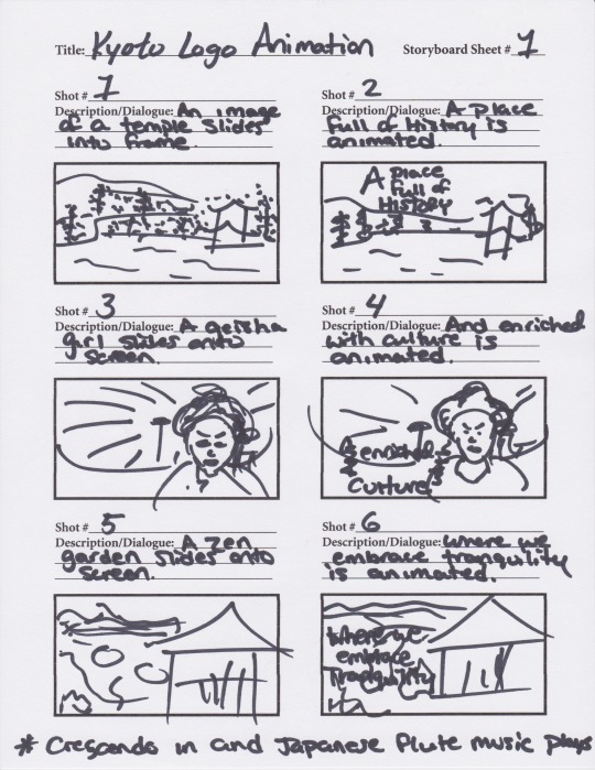

https://www.behance.net/gallery/70528045/Kyoto-Animated-Logo
Above is a link to the final presentation and video of the Kyoto logo animation on Behance.
Another aspect of the course was to keep a story journal every day throughout the course. I found this assignment very helpful and want to continue writing down little things that happened throughout the day or take pictures of places and things that I find interesting. I found that this assignment helped spark ideas and inspiration for different ideas that could later be used for design concepts. I wrote about travel, work, things I watched on television, and conversations I’ve had with friends and coworkers. The most inspiring ideas come to people when they least expect it. I went to Shanghai and was immersed in a different culture and was so amazed by the different sights, sounds, and everything around me. This assignment made me look at the world around me and embrace the different places and people around me. It made me think of the idea of self-reflection and acceptance. I found that writing down my thoughts every day for a month was very therapeutic and made me think about little things that I normally do not.


Above are some images I took during my trip to Shanghai.
The final aspect of this month’s course was the peer critique. A critique is different from a peer review. A critique is like a sandwich according to Fast Company. A good critique must include positive remarks, give criticism, and then remind them of their strong points.

When giving critique, I need to make sure to not base my thoughts on what I like, but rather what is effective and what answers the design problem. I also need to make sure that I offer solutions that could possibly fix the areas that do not quite work. My second critique was definitely a lot stronger than the first one.
Overall, this month has been tough, but I am definitely happy with the results. I found that the challenges I faced during the design process of creating a motion graphic was helpful and made me better understand the process. By conducting research and explaining my design choices more clearly, my rationale was more effective and communicating to the target audience was stronger. The story journal was also helpful in providing a documented presentation of each day and could be looked at for inspiration. Moving forward, I want to continue to take pictures and write about my day to see what inspires me next. I’m excited to see what the next month has in store and how it will help me in the future.
References
Beauchamp, M. (2016, September 29). How to Target Your Communication. Retrieved September 15, 2018, from https://yourbusiness.azcentral.com/target-communication-4099.html
Cousins, C. (2015, August 05). Kinetic Typography: An Introductory Guide. Retrieved September 13, 2018, from https://designshack.net/articles/typography/kinetic-typography-an-introductory-guide/
Franklin, B. (2000). Shakuhachi: The Japanese Traditional Bamboo Flute. Retrieved September 17, 2018, from https://www.thejapanesepage.com/culture/shakuhachi/
Seiter, C. (2014, December 31). The Art And Science Of Giving And Receiving Criticism At Work. Retrieved September 23, 2018, from https://www.fastcompany.com/3039412/the-art-science-to-giving-and-receiving-criticism-at-work
Storyboard. 2018. In Merriam-Webster.com. Retrieved September 23, 2018, from https://www.merriam-webster.com/dictionary/hacker
0 notes
Photo

8bit NASA meatball!
follow for more 8bit space art, or check out my patreon!
13K notes
·
View notes
Text
5.4.2 Mastery Journal Reflection - Design Research
In this course we created three different mood boards for a fictitious benefit concert to be held for the conservation of sea turtles. The first mood board created was a rock concert called, “Sea Turtles ROCK!” The idea was to combine delicate sea turtles and the beauty of the ocean with the hardcore, grunge style of rockers.

The next mood board was a reggae style concert called, “Turtle Jamathon.” Although this mood board originally needed the less revisions, it was not used in the final project because it seemed too overdone and cliche.

The final mood board that was created was an acoustic cover artist concert that would be held during sunrise on a beach. This concert would be called, “Acoustic Sunrise.” Although all three mood boards offer a unique experience to the target audience, ultimately the style that was the most unique and translated the best was the acoustic version. The final moldboard can be seen below.

The revisions that led to this finalized mood board included changing the size of images and text to create a more cohesive hierarchy. The original mood board lacked a description, the final mood board includes this information and has the text follow the shape of the sand. The color palette changed from navy, orange, black, and white to showcase navy, orange/peach, purple, and gray, but will also include black and white. All colors and ideas go with the idea of the sunrise and can be seen throughout the board.
We then worked on wireframes and sketches for the preliminary stages of the website design. The idea of the website is to have a parallax website with the background, text, and images all moving at different speeds while the viewer scrolls. By having a “cheeseburger” on the top right of the screen, the menu bar will be hidden, but when clicked the menu screen will pop down with a list of each topic. By incorporating this idea with a back to top bottom on the bottom right, navigation between topics will be easier and more user friendly. Below are the preliminary wireframes and sketches.
The use of the wireframes and sketches was very helpful because the overall look of the website was already laid out in these sketches. All that was left to do was plug in the correct information. In “Mapping the Modern Web Design Process,” Morten Rand-Hendriksen states, “by building a wireframe for a page, you can visualize how the different components will interact and where they will live relative to one another” (Rand-Hendriksen, 2014). This idea is exactly what happened when referring to the wireframes designed. All of the components were already in place, the only thing left to do was using the actual images and copy for the website.
Home
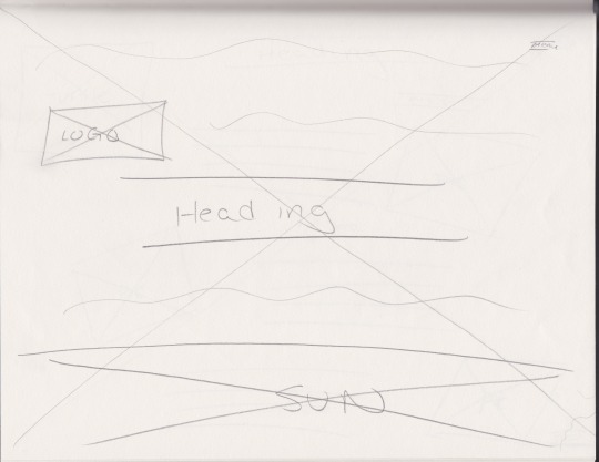
About

Artists
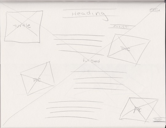
About the Event

Tickets


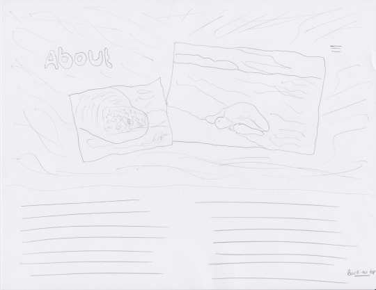

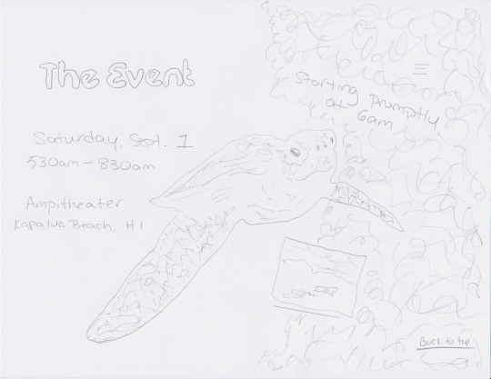

Next, the first version of website static comps were created.
The design comps communicate brand values, engage the audience, and motivate the audience to respond to the call to action because the use of a long scroll puts all the information on one page. The breathtaking views mixed with the stripped-down style of the music will offer guests a unique experience where they can relax, drink, eat, and enjoy the music and atmosphere, but also raise money and awareness for a great cause. By making the website one page, the viewer can continue to scroll through the information and they will not have to navigate from page to page. According to Jerry Cad in the article “Why long scrolling sites have become awesome,”
when advances in Javascript and CSS opened up more options and sites like Facebook and Twitter broke the ice with single-page sites, designers found that users actually do scroll. In fact, studies have been conducted to back this up: they found 66 percent of user’s attention on a normal media page was spent “below the fold.” (Cad, 2015).
As research suggests, more than half of website users like to scroll through one page. The website will end with ticket information and a form where the viewer can purchase tickets makes the call to action for the event even easier.
The background image for all five pages are designed to work together and seem as if you are getting deeper into the ocean. The homepage starts with a sunrise and the title of the concert in the middle of the sun. This idea plays with the name, “Acoustic Sunrise” and makes the audience want to continue scrolling to find out more information. Next, the about page makes the audience dive into the water, but they are still close to the surface and can see the orange and yellows from the sunrise under the water. The colors include orange and navy, which according to Beaird and George in The Principles of Beautiful Web Design, “Orange is thought to promote happiness, and represents sunshine, enthusiasm, and creativity… blue symbolizes openness, intelligence, and faith, and has been found to have calming effects” (Beaird, 2014.). These ideas translate into the brand and vision of the concert and mock association. The concert is meant to invoke happiness and a sense of peace, which goes hand in hand with the acoustic nature of the music. The next two pages bring the audience deeper in the ocean. They are able to see a sea turtle swimming by and coral and rock on the side. Finally, the last page, the ticket page, brings the reader all the way to the ocean floor, where they are greeted by a sea turtle. By including this image, the audience should want to save the sea turtles and want to buy tickets or “call to action.”
Design Comp Version 1
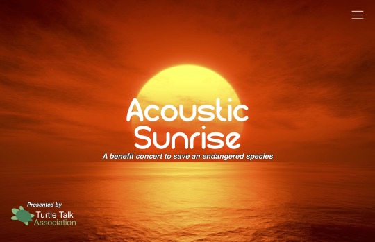
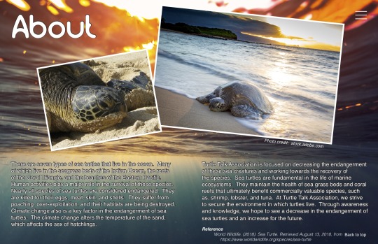

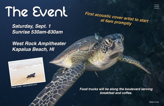
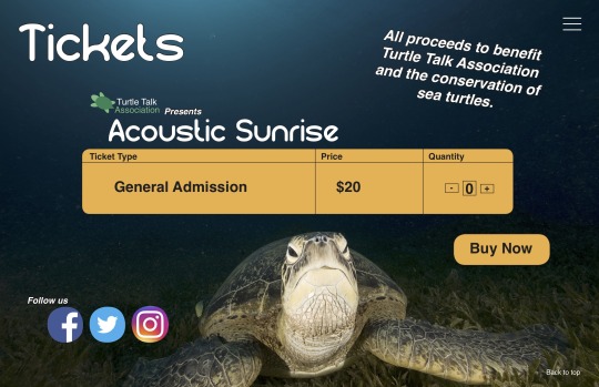
Website Final Comps


Final Presentation can be found on https://www.behance.net/gallery/69450447/Acoustic-Sunrise-Concert-Moodboard-and-Website
Moving forward, I would like to continue to experiment with web design. Many designers are proficient in coding, which I briefly touched upon during my undergrad. Coding was always a struggle for me so I would love to read books and watch some tutorials on Lynda.com about the topic. In my final presentation, I tried to include a video of how the parallax concept of the concert website would work, but since the idea and coding is very minimal for me, I created the video in powerpoint.
When looking at web developer jobs on google, many have posted requirements such as these listed below.
• Experience developing wireframes and visual concepts
• Experience working with creative teams to implement desired look and feel
• Experience with responsive web design
• Experience with optimizing website performance
• Well versed in working WordPress tools and plugins
• Thorough knowledge of WordPress, PHP, MySQL, Bootstrap, jQuery/JavaScript, HTML5, Sass, and CSS3
• Understanding of ajax and JSON technologies such as JSON, SOAP, and HTTP
• Page Speed Insights, Google Search Console, Google Analytics, Google Tag Manager, event tracking and SEO/SEM knowledge huge plus.
• Experience with API integrations and ajax functionality
Although, I’ve heard of many of the programs listed, my experience in them a very limited to none. Moving forward, I would like to learn more about these programs and become a more well versed designer.
References
Beaird, J., & George, J. (2014). The principles of beautiful web design. Collingwood: SitePoint Pty.
Cad, J. August 19, 2015. Why long scrolling sites have become awesome. Retrieved from https://thenextweb.com/dd/2015/08/19/why-long-scrolling-sites-have-become-awesome/
Rand-Hendriksen, M. (December 19, 2014) Mapping the Modern Web Page Design Process. Retrieved from https://www.lynda.com/Web-User-Experience-tutorials/Wireframing/174989/367167-4.html?org=fullsailold.edu
Quality One Wireless. (2018) [Job listing]. Retrieved from https://www.linkedin.com/jobs/view/web-developer-at-quality-one-wireless-826087089/?utm_campaign=google_jobs_apply&utm_source=google_jobs_apply&utm_medium=organic
0 notes
Photo

“Focus” hand drawn typography by Jenna Bresnahan
748 notes
·
View notes
Photo

Pearl Jam, Beyoncé, Coldplay, Ed Sheeran To Play Global Citizen Fest in New York’s Central Park September 26
86 notes
·
View notes


