
Don't wanna be here? Send us removal request.
Statistics
We looked inside some of the posts by bryrebranding and here's what we found interesting.
Average Info
Notes Per Post
0
Likes Per Post
0
Reblog Per Post
0
Reply Per Post
0
Time Between Posts
10 hours
Number of Posts By Type
Photo
12
Text
5
Last Seen Tumblr Blogs


Fun Fact
In Q3 of 2020, 31% of US users access the Tumblr app daily.
Photo

Changed Issue name to ‘Creatives, the Issue with’ as this means I can use ‘the issue with’ more cleanly in advertising
0 notes
Text
Feedback to advertising
Copywriting could do with a little work - the issue with/the issue on - could change series name possibly to just make it a little smoother? while keeping in balance to kind of being too offensive to creatives
0 notes


Text
Tutor Feedback
More Orange? Try end papers?
Entry point - reading is a slow moving experience so it’s okay to be repetitive in order to make the brand recognised e.g, logo again, issue title again
Consistency in type - headings size, numbers, headings/contents titles.
Contents - title too large? Repeat issue name. Creatives or processes more important? Repeat names larger on intro pages so they can be found
Check contents same titles! Page numbers w contents!
Cover - grey signatures rather than white? a bit overpowering
blending layers issues w printing
Orange for rhythm/constrast, music in flow
Orange details each page?
Why is lewis so small?
Could use all 7 spreads?
0 notes


Photo


More advertising ideas
- collage the work of the creatives together
- print and crumple whole BLAD as a poster
- pages of BLAD pinned up, like they are WIP of a creative (meta)
Thinking about context when photographing the book - not just a book on its own, but maybe a creative sitting surrounded by crumples paper holding the book...
Thinking of use of rhetoric:
Got an issue with Creatives? We have.
The Key to creative success is//
A curated collection of processes for success
0 notes
Text
Tutor Feedback
Rich black - printed a bit strange so adjust
Maybe try a spread with the whole page text. Could switch out the C. S . Lewis page
could use the crumpled text as a end paper/front matter page - link to some of the brand words/ethod
Tidy type - m dash and long lines
bring the chaotic personality in to the blurb, but maybe change the list name to something more legible
bar code, spine
add extra pages where adjustments have been made to guidelines
check blackboard things
0 notes


Photo


E. özsaray. (2020). MALAZGIRT 1071 BOOK LAYOUT. https://www.behance.net/gallery/94267669/MALAZGIRT-1071-BOOK-LAYOUT?tracking_source=search_projects_recommended%7Ceditorial%20layout
A. Koin. (2021). The book about Livadia shipyard. https://www.behance.net/gallery/124677865/The-book-about-Livadia-shipyard?tracking_source=search_projects_recommended%7Ceditorial%20layout
What is it that makes a layout look finished? Looking at examples to try and finish off my spreads professionally. I think that kickers - small details are important: Page numbers, headers and footers. Type variations of weights and scale balanced well in small chunks and with nice spacing.
0 notes


Photo
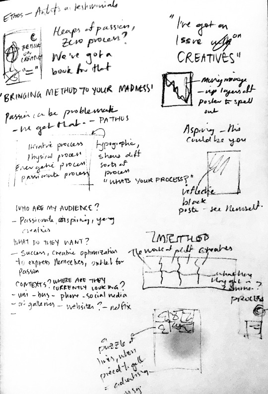
Some thinking about advertising
The other day at the bus stop my attention was caught by some of the bus shelter posters having been ripped up - and it made me pay attention because I started thinking ‘oh, was someone mad at this advertisement or something and decided to deface it?’
So I thought - playing off this chaos - what if my one image was layers of ripped posters that spell out my tagline all together? This could work as a still, or as a mini video. What if they spelt out something that caught the attention of the viewer by shocking them a little - our series title is ‘The Issue on Creatives” -links to saying you have an issue with something - what if our ad said ‘I have an issue with Creatives” - would we offend them enough that they’d take a closer look and see that the issue is a literal book?
0 notes


Photo


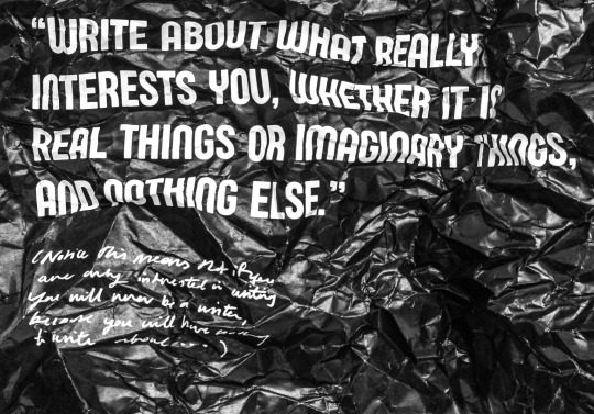
distressing images, and physically laying out - Alexander McQueen style
0 notes
