An insight into the development and my learning of how to create a website
Don't wanna be here? Send us removal request.
Text
Bibliography
References Burgett, S., 2015. Spring Colors: The Psychology Of Pastels | X-Rite Blog. [online] X-Rite. Available at: <https://www.xrite.com/blog/spring-color-update-psychology-of-pastels> [Accessed 17 March 2020].
Kay, M., 2017. One Page Vs Multi-Page Website Design: The Pros And Cons. [online] Klood.com. Available at: <https://www.klood.com/blog/gdd/one-page-vs-multi-page-website-design-pros-cons> [Accessed 13 March 2020].
Mulder, P., n.d. What Is The Johari Window Model? Definition, Example, Template | Toolshero. [online] toolshero. Available at: <https://www.toolshero.com/communication-skills/johari-window-model/> [Accessed 17 March 2020].
Figure List
Figure 1: Patel, N, 2020. The Psychology Of Color: How To Use Colors To Increase Conversion Rate. [image] Available at: <https://neilpatel.com/blog/the-psychology-of-color-how-to-use-colors-to-increase-conversion-rate/> [Accessed 15 March 2020]
Figure 2: Donnelly, K 2020. Killian Donnelly Home Page [screenshot] Available at: https://killiandonnelly.net/ [Accessed 17 March 2020]
Figure 3: Smith, S 2020. Sheridan Smith Home Page [Screenshot] Available at: https://www.sheridansmith.org/ [Accessed 17 March 2020]
Figure 4: Mulder, P undated. Johari Window Model [image] Available at: https://www.toolshero.com/communication-skills/johari-window-model/ [Accessed 20 March 2020]
0 notes
Text
Overall and Issues
Overall, I have quite a lot of experience with website building because of my job outside of my studies so I found it really easy to use the Wix.com website builder. I think what really helped in creating my was sitting down and start meticulously plan the site. I had 4 key areas that I had to think about:
- Colour
- Layout
- Images
- Design
I planned them all out and after I had decided that I was going to only use one page, I planned carefully my site and stuck to my simplistic design as much. as i could. It has been really difficult to not stray away from the design because in Wix it has all different tools, gadgets and gizmo’s to enhance things and change things but, I did not want that i just wanted one thing- Simplicity. My site is very easy to use, its simple pages with simple, easy to read and well laid out writing.
Issues
To be honest, I did not really face any issues with my site because I planned it out well and stuck to my design. The only issues i faced were that I had slight sizing issues with writing and that was easily resolved when i went through every single page and set it to a specific font type, colour and size. So it looked very professional and sleek. I wanted the whole site to look essentially the same. Not to be boring or mundane but so the reader simply takes away what they need to see and what information they need to retain.
My images were also an issue, I had hundreds of pictures in my possession and all of them were good enough to put on my website but to decide on what ones I was to put on my website, I chose the most recent and the most diverse, for example; I used ones from Rocky Horror because I played the lead role but i also used ones from Cinderella as I played a woman, I wanted to show my diversity as a performer.
Overall, I think i have fulfilled what I intended to do, my website is designed as a simple but, effective site with all the relevant information. My Biography/CV is my favourite part of the website because it has personal meaning and also my CV looks really professional and its laid out into different sections for the reader to see what I am capable of and where i work best.
0 notes
Text
Final Page...
For my final page it was the contact page. I do not have any representation as of yet but, I want to set up my own company doing that too, its something I and my business parter of the ‘Upstaged’ group have been speaking about so maybe in the future this page will have Upstaged’s Agency on and my representation. I have designed it the same as all the other pages, grey background, white writing and subtle hints of blue throughout.

I decided to have three ways of contact on my page. One is my info (personal) such as phone number and email the other one is Upstaged email and phone number. I wanted to have two ways of contact for different types of people, one will be for people to contact me about work and the other will be for people to also contact me but to enquire about Upstaged. I have also used a tool to just send a message. It’s a simple and hassle free way to send me a message. It gives people the option there and then to send me a message without the faff of going into the emails etc...
I really like this part of my website as it is really simply laid out, you also have my social medias there in big bold logo’s if thats another way you want to contact me. After all in these modern times the most fast and easiest way to contact somebody is through their social medias because its all linked to most peoples smart phones and they usually pick up straight away.

0 notes
Text
I am proud of, Upstaged
I started up my own theatre group back in 2019 with my friend because we were both sick of the camaraderie at our other one and nobody taking it seriously as it was only a hobby for them. They were also intertwined in their old non-conformative views and it was something that did not sit right with us. We started up, Upstaged Theatre Group which I believe it to be a group that accepts everyone, anyone can play anyone and we are a totally diverse group of people with all different talents for all different walks of life.

I decided one of my pages was to be about my theatre group, I wanted to showcase it on its own page, the title in the menu bar is also a bit cryptic, it simply reads ‘Upstaged’ if you don’t know me or what i am about you’d have no idea what it is so I think that you’d be instantly drawn to it to see what it was. I think for 20 years of age it is impressive that I am creating theatre and showcasing it. I have decided that I am going to include my logo for the group and when you click the logo it opens a new tab and takes you straight to our facebook page. I have also included the story of Upstaged for the viewer to read as I want them to know the story and what I am about and what I believe in as an actor. It creates a good way for casting directors or future/potential members of my group to see what the groups values are as a collective.
Also to the left I am going to continually update and change the groups flyer photo, it creates free advertising for us and also it showcases our shows and that I am continually working and showcasing my work.

0 notes
Text
Reel
Whilst i think the CV is the most important part, after speaking with my tutors and their experiences within the industry they said to us a class that casting directors like to see show-reels more than anything. It shows you in action, performing as the best version of yourself. I put a lot of effort into my reel and I wanted to show it off as much as possible.
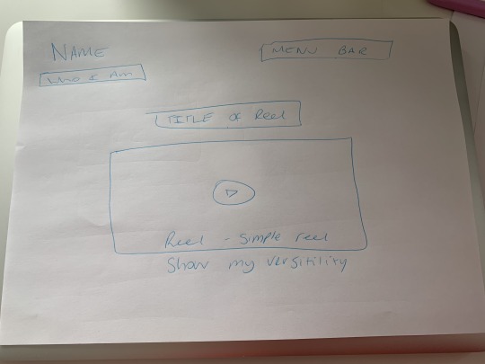
I planned out I would just have my reel and only my reel on a page to not distract the viewer from exactly what I want them to view; The Reel. In my reel I have showed my versatility as a performer and also at the start and the end of my reel put my voice over work in that I did for an advert for a show I was in. I ended my reel with my bow in my most favourite show that I have done:Rocky Horror to signify the end of the reel, I opened the reel with the opening of the show too. I have did this to show the viewer the start and end and I want them to remember most me performing as Frank N’ Furter.
The reel does not play as soon as you go onto the page, I tried that out but for me; it didn’t work. I did not like the fact it played straight away and the viewer may miss something, its about choice if they want to play it they have to click the play button to watch. My website is all about choices and you choose where to go on it so I wanted to emulate that on the reel too.

0 notes
Text
Gallery
I had so many weird and wonderful ideas for my gallery but, once i had spoken with my tutors about what would work and what wouldn’t I decided to take the more simplistic route because after all, I said from the start I want it to be sleek and easy to use.
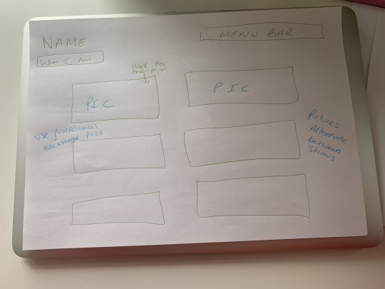
I had decided from the get-go really that I would showcase my gallery with both professional and backstage photo’s. I am not just a robot-performer I am human and i wanted to show the fun side of me too, smiling backstage having fun showing i am easy to get along with. You might be able to perform well but do you work well with other actors? I used that analogy for this part of my site.

When you hover over a picture it shows you the show name, theatre it was performed at and the date of the show. If the reader has been to the previous page before they’ll be able to easily distinct who I am playing from the title. If they have not they will have to go back and read my CV (I did that on purpose to make people go back over and read my CV). The pictures of laid out very simply, in squares all down the page. I have used my images that I think best show me off as a performer, there are 12 Images all either from different shows or if they are from the same show they are spaced out a bit to show the viewer how diverse I am. When you click on the images they go into slideshow mode which I did not first intended to do but once I placed it in just to see, it worked really well with my sleek and modern design that I have gone for. I went for a big images rather than little ones and went for only a small amount. I went with the ‘quality, not quantity’ look

0 notes
Text
Creating the site pt2
The second page, I decided to put two aspects of my website in one as they tie in so well my ‘About me’ and my CV. This page is just all about me and nobody else. It is essentially me showing off in the best light I can.
Bio

I planned this one out to showcase my headshot, I have created a slide of all my headshots to showcase myself, some B+W and some colour. I have also made a personal about me and in that I have used the phrase ‘mad house’ in the first sentence. As I said in a previous post. It is something that I had to have in my website. Above my headshots I have also put my fully downloadable PDF of my CV. Really easy to see and in a different colour to draw the eye to it. In my ‘About me’ section I have mentioned me working with Love Island/BooHoo, I have used a separate paragraph to showcase that to the reader. I wanted to have a fully downloadable CV/Resume too for the viewer. I know if casting directors come to the website they will want somewhere where they can go and read into me a little bit more and a CV will be something they are used to reading so they will be easily be able to navigate through it.


My CV, in my opinion is the most important part of my website and me as a performer, I need to show the reader that I am fully versatile and I am always working and I have a plethora of different jobs and roles that i have played. I have put them all into different subcategories to show all the different types of entertainment I have done, the pastel blue also is sued in my CV; I have used it to write the role I played in that specific show. If a casting director were to look at it they know straight away what kind of roles I am cast-able for/roles I do well in. I have also shown my award nominations whilst they might not be as Impressive as winning an award it shows that I am consistently being put up for awards for my work. I would thin the awarding body of NODA is very well known as it showcases all amateur dramatics across the UK so I would be hopeful that casting directors would be inclined to hire me from seeing that I am not only good at what I do, critics also love what I do.


0 notes
Text
Creating the site pt1
The first page I created was-
Home
I sketched out what I wanted to create

I had a clear image of what i wanted the home page to look like; A slideshow of a few images showing off who I was as a performer and showing my versatility. Keeping the home page very simple so you did not spend too much time on there. It was to see who I was read the header and decide where to go next. I made my name the biggest set of writing and blue to draw you right to my name when you first enter the site.

The issues I faced on this part of my website was deciding what Images I was to use, it is so hard to choose what you think would showcase the best version of yourself
0 notes
Text
To create the site
From when I planned out my website it was relatively straightforward. I chose simple template and went from there. I roughly sketched each page and area of my website. I had 6 pages I wanted to include which were
Home
Biography
Gallery
Reel
Upstaged
Contact
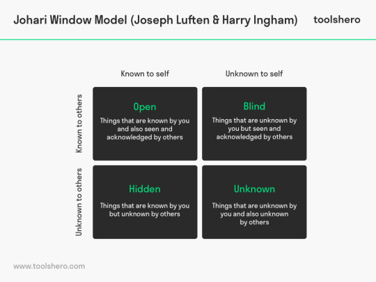
Figure 4
Johari Window was an extremely important part of starting to create the website, whilst I have a good opinion of myself, others do not know me and need to know whilst I may hold myself well I do not want to come across as cocky or brash at all. I need to show myself in the best possible light and enable myself to be ‘cast-able’. ToolsHero writes “The Johari Window Model was created in 1955 by Joseph Luften and Harry Ingham. The name is derived from the first names of the creators. The Johari Window Model can help people to better understand their communication with others” (P, Mulder undated) From another module using that module and this module has helped me figure out who and what I am, what I bring to the table, what makes me different and most importantly what showcases me and makes me shine.
I wont include much of my amateur dramatics but, I will include my best work in those, that I have been nominated awards for or won awards for, I want to also showcase my gender fluidity within the entertainment I do.
Now that I had the skeleton of my website, the colour scheme and the images I wanted to use on my site. I got to work
0 notes
Text
Images
Images are really important in creating and showcasing yourself on a website. i have hundreds of backstage photos of me and photos that the audience have took of me but, I need to include the best ones to show me in the best possible light.
The image below, whilst it may be a good image of me it is of smartphone camera quality and doesn't showcase me in my best light.
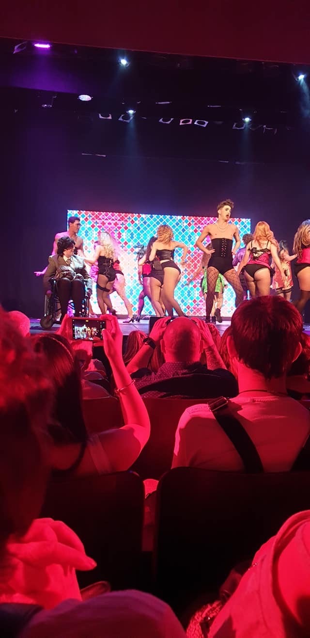
The image below is showing me in my best light but, it is with my Fiancé and not on stage or a backstage photo of me and cast members. It is too personal of a photo

This image below is perfect, it is of professional quality and this is what all my Images are going to be like on my website. if they aren’t a professional image they will be a backstage photo of the best camera quality showing me in my best light. This image shows me off as a performer well.
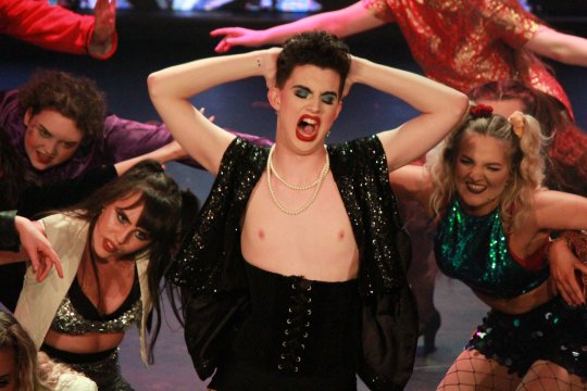
0 notes
Text
The ‘feel’
I felt my website was going to lack ‘personality’ making it grey. A lot of musical theatre stars have gone for the simple white/grey look with big images and pop’s of colour. That made me feel so much better but I wanted to stand out more than the rest so, I put exactly what I am about on my header of the website “Actor, Musical Theatre Practitioner, Female Impersonator” My first 4 images I show are a versatile set, me playing different roles.

Figure 3

Figure 2

I had key things i wanted to include-
Love Island Scare Challenge- I had worked with the popular show Love Island and Clothing Brand Boohoo and they are huge at the moment so I wanted to showcase them
The Phrase ‘Mad house’- It is a little personal nod to my cousin who lived with me and called our house a ‘mad house’ he passed away recently and he always supported my endeavours so I wanted to include him in some way.
Award winner- I won an award and in some way I wanted to either show a picture of me with the award or say I am an ‘;Award winner’ for my acting. I think that also shows that I am good at what i do and more hireable as I am being nominated and winning awards for my work.

0 notes
Text
Colours and Simplicity
Colour was also another really big one for me, I wanted it slick and modern for the get-go but, I wanted one pop of colour. I set out with grey backgrounds and white writing but pop’s of certain colours. I toyed with a few colours

Figure 1
Red- To highlight my favourite role of Frank n’ Furter but, my images rely heavy on that role so I didn't want to overload. Also, I wanted to use red for my love of Liverpool FC and being from Liverpool but my website is for my career not my hobby.
Pink- I own a theatre company and the groups main colour is Hot pink so I was going to use that for my pop of colour but, upon using that for the website i was dead set on using it buy once I had done the website it looked way too feminine for my liking. It also didn’t go with the overall theme of modern.
Blue- Pastel Blue is my favourite colour and without it being too much in your face like normal blue it embodies a calming sense and I am not necessarily ‘Masculine’ but embodies the feel of slight masculinity. Xrite writes “Pastels are less saturated than primary colors, making them feel light, soft, and calming” (S, Burgett 2015)


I had so many ideas and “Must Do’s” but my personal must would have it to be ‘easy to use’ I never wanted it to be complicated, I wanted it clear at the top where the pages can take you. I did not want everything all on one page as it doesn't give the ‘journey’ feel to your website. I wanted people to have the freedom to go where they wanted on the website. I read about which one was better Klood writes “Trying to cram too much content into a single page website is terrible for a user’s overall experience as they might find it difficult to locate and then interact with what they came to the site for” (M, Kay 2017) It decided it for me because I want my viewers to come to my website and remember things instead of having them have an over-load of information.

0 notes
Text
Who am I?
The first thing I needed to do to create my website was to mind map who I am as a person to create my ‘personality’ to my website. Johari’s window is another way to find who you are but, I have a clearer image on what I want because I had planned it out.

I think I am quite a modern person in my views, the way I see theatre and the way I present myself on the whole. I like new innovative things and I am looking to the future always too. I dress up as a woman a lot and I think that sets me aside form anyone else, I am not a drag queen etc.. I perform as a woman so I wanted to include the words ‘Female Impersonator’ prominently.
I am not a dancer either. I did not want to showcase something that I am not the greatest at because i want my website to showcase the best version of me i can possibly be. I wanted to angle it towards my versatility mostly
0 notes
Text
First Post
Over the past few months I have been researching and looking at various types of websites, I have looked at performers and also other different types of websites. I will document on my tumblr blog the journey I take to create my website to showcase myself as a performer
I had a clear image for what I wanted for my website, clean and crisp, and easy to use for everyone. I found looking at any sort of modern brands/businesses were a good starting point to look for what I envisaged.
As I said I had a very clear image from the start for the website, I made plans of each page of my website. At first I though it would be a good idea to have it all on one page but, people like journeys and discovery and being able to pick and choose where they go so I gave people the freedom to do that.
1 note
·
View note