
This is where I will keep you updated for my DART classes.
Don't wanna be here? Send us removal request.
Statistics
We looked inside some of the posts by carlbgdart and here's what we found interesting.
Average Info
Notes Per Post
1
Likes Per Post
0
Reblog Per Post
1
Reply Per Post
0
Time Between Posts
24 days
Number of Posts By Type
Text
12
Photo
4
Video
1
Last Seen Tumblr Blogs


Fun Fact
The KCSC sent more than 20K requests to delete posts related to prostitution and porn to Tumblr from January to June 2017.
Text
Grad student programs
This first program is based in Toronto at the OCAD University.
OCAD
The second is a program created as a collaboration between two schools, the University of Illinois, Chicago (UIC) and the Institute of Visual Communication / The Basel School of Design of the FHNW in Switzerland. In this way, you get a double degree. Also, the school is really focused on International studies and offers multiple opportunities to do internship and obtain other experiences abroad.
FHNW
This last program is actually more of a selfish fanboy choice. I am picking the MFA in Design at New York’s School of Visual Arts because that is where John Gall, one of my favourite Graphic Designer, specialized in book design, is currently teaching.
SVA NY
0 notes
Text
Response 4 [441]
Au cours de la session, les multiples lectures et cours magistraux m’ont permis de voir la diversité et les possibilité qu’offrent le design graphique. On voit l’importance du visuel, le l’esthétique, mais aussi l’évidence de la recherche et d’avoir une forme qui suit réellement la fonction, qui est représentative et permet la communication du sujet.
En plus de la recherche à propos du sujet, nous avons vu l’importance, si le sujet est humain où en relation avec une communauté, de considérer le facteur humain et culturel de l’enjeu. En fait, nous avons aussi exploré cette thématique dans le cours de Rhona, DART491, et nous y avons lu un texte intéressant sur l’importance de designer avec l’aide des communautés recherchés, et non pour les dites communautés, spécialement si celles-ci sont marginalisées ou stigmatisées.
Je crois qu’il est important de spécifier que dans un contexte scolaire, il est plus difficile d’inclure les sujets dans la recherche par manque de temps et de ressources. Par contre, il est important pour moi, dans un cas où la participation directe de la communauté est impossible, de m’informer le plus possible afin d’éviter de parler pour eux, mais de vraiment exposer une réalité qui leur est propre et leur conviendrait. Ainsi, pour mon premier projet, j’avais une certaine vision en tant qu’homme gai sur l’enjeu de la représentation Queer dans les cartoons, mais je ne suis pas une figure d’autorité suprême sur le sujet, l’expérience peut être différente pour d’autre, surtout pour d’autres parties de la communauté LGBT. Je souhaitais représenter et bien choisir mes icônes de façon à être inclusif et ouvert, mais surtout respectueux envers les autres lettres mis de l’avant dans le terme LGBT+.
En plus d’approfondir l’idée que nous nous faisons du design, je crois que ce cours en nous permettant d’explorer un sujet qui nous est propre et qui nous intéresse, nous donne une liberté en tant que designer qui ne nous sera probablement pas attribué sur le marché du travail et nous permet de monter un portfolio représentatif de nos intérêts et talents.
Pour être honnête, ce cours a probablement été un de mes favoris dans le programme de design et celui qui m’a permis de vraiment explorer des sujets qui me tenaient à cœur.
0 notes


Text
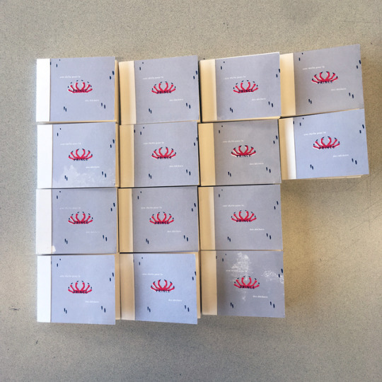
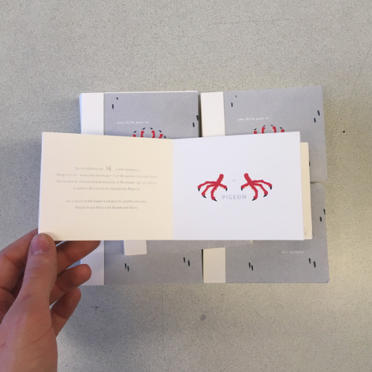
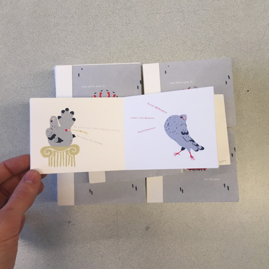
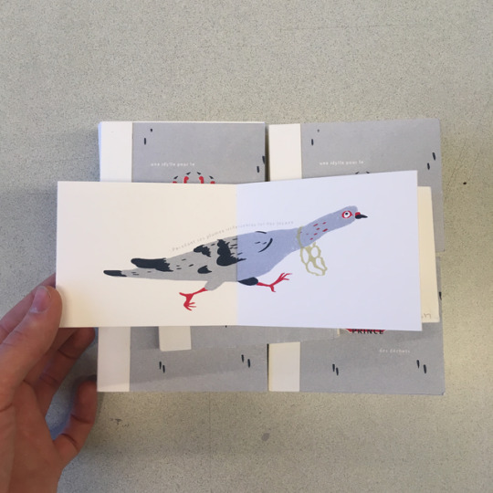
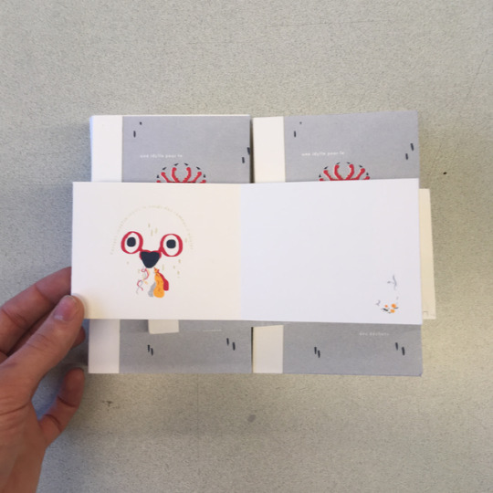
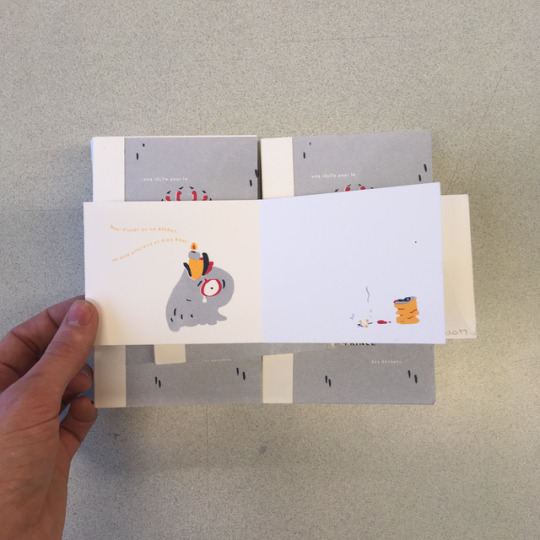
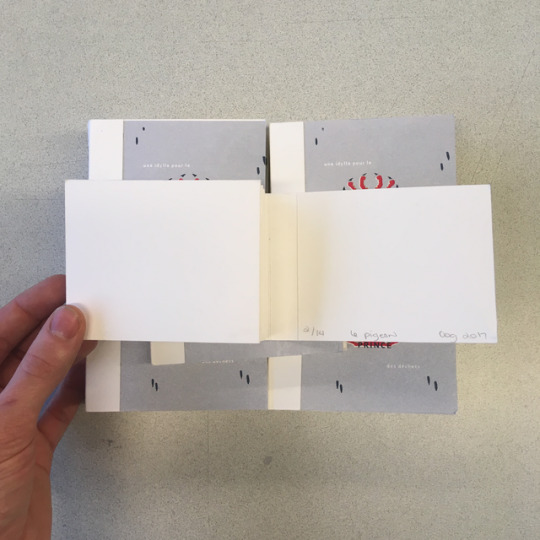
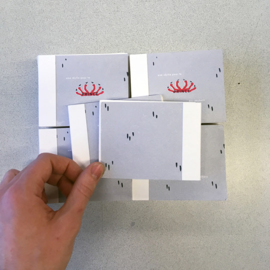
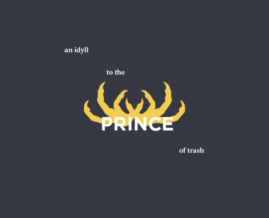
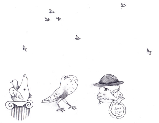
[Project 2] Final Design

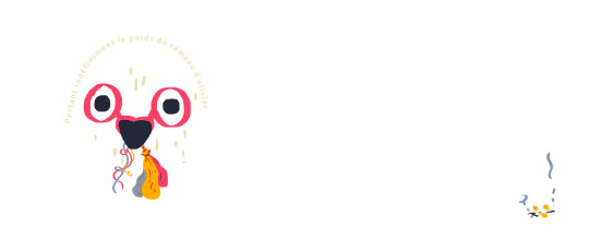
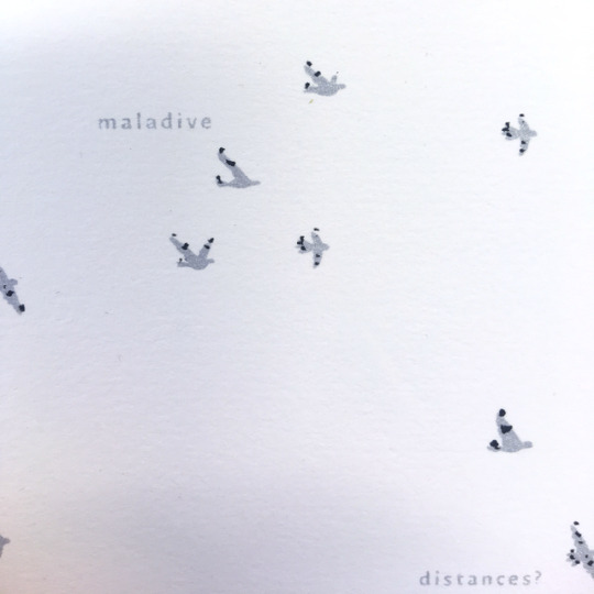
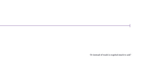
Une idylle pour le prince des déchets
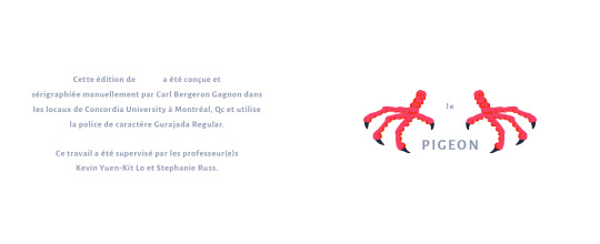
Cette édition de 14 a été conçue et sérigraphiée manuellement par Carl Bergeron Gagnon dans les locaux de Concordia University à Montréal, Qc et utilise la police de caractère Gurajada Regular.
Ce travail a été supervisé par les professeur(e)s Kevin Yuen-Kit Lo et Stephanie Russ.
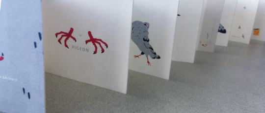
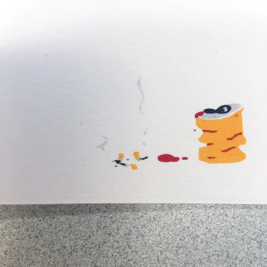
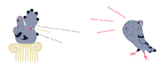
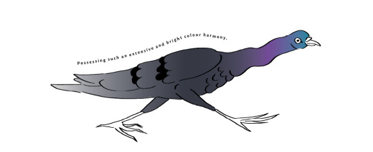
Le Pigeon
En symbiose avec l’homme depuis le temps de Persée
Ayant déférence envers ses devoirs matrimoniaux
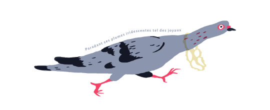
Paradant ses plumes iridescentes tels des joyaux
Portant indéfiniment le poids du rameau d’olivier
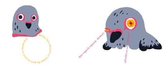
Milles fois décoré en temps de guerre pour sa bonhomie
Son regard aiguisé, démuni, affaibli et sans défense
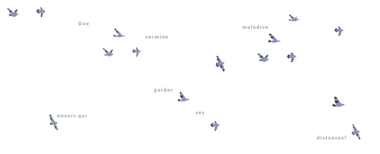
Une vermine maladive envers qui garder ses distances?
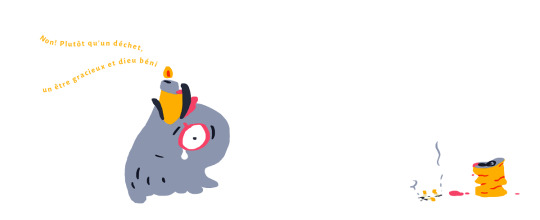
Non! Plutôt qu’un déchet un être gracieux et dieu béni
0 notes
Text
[Project 2] Design tests
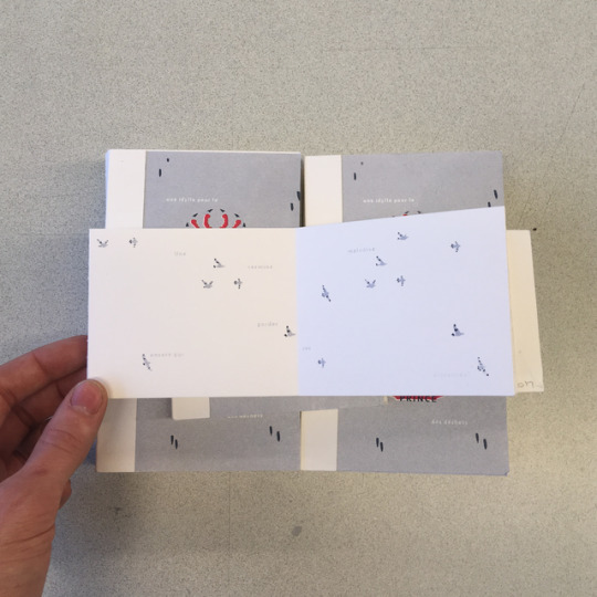
Here are some example of tests I did regarding the content and format of the book.
The original idea was a small book which would use different playful techniques to give out a message about pigeons.
^ Symmetry
^ Rainbow roll
^ Embossing
^ Repetition
^ Die cut
^ Folded page
I then moved on to a more illustrative approach and decided to join text to images as a way to complete the images.
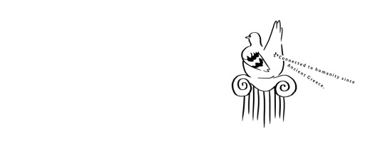
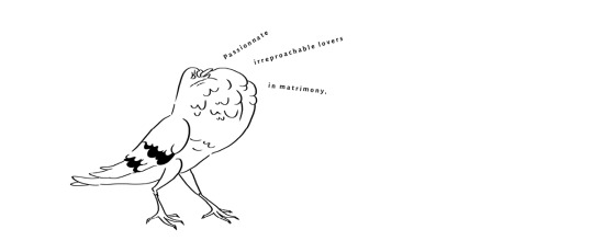

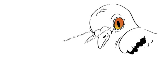
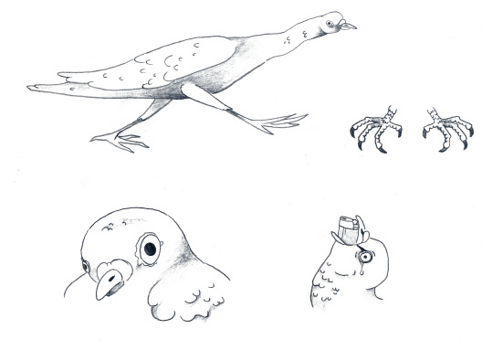
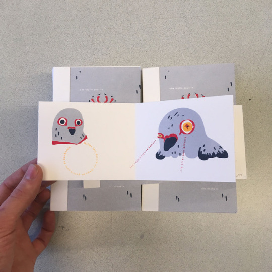
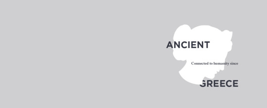
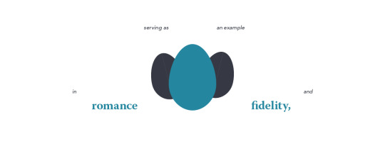
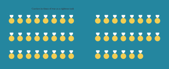
The Prince of Urban Spaces (1)
Connected to humanity since Ancient Greece
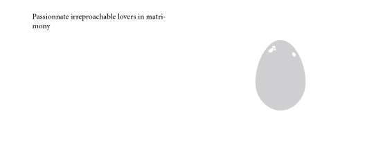
An example in romance and fidelity
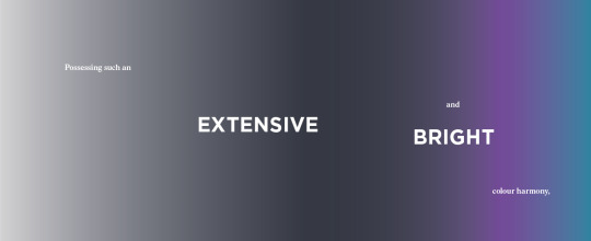
A fine colour diversity
A strong and precise eyesight
Highly decorated for WWI and WWII
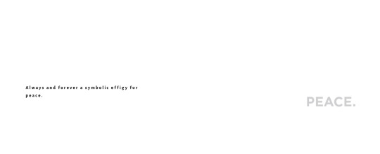
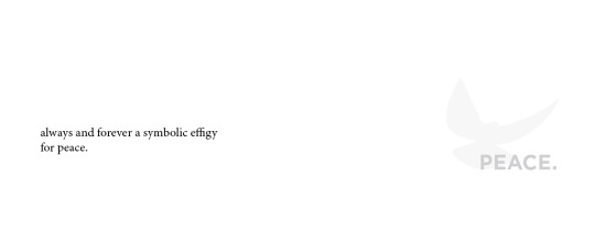
A symbol for peace all over the world
An outstanding air traveller
0 notes
Text
[Project 2] Textual Research
Here are some articles and documentaries on pigeons :D
The Pigeon Control Company
Une brève histoire de la Colombophilie
Brilliant Beasts Pigeon Genius
The Secret Life of Pigeons
0 notes
Text
Response 3 [441]
I guess as a gay person, I would be part of the Queer community. This category could be seen as something pretty large though and is often separated in sub-categories, and I’m not talking about sexual categories such as twinks, otters, butch-lesbians and leather-daddies. What I mean is that people tend to agglomerate based on their beliefs and hobbies. Therefore, I would put myself in the art Queer category, which could englobe some Punk Queers as well.
As a marginalized community, art Queer people tend to create material about issues in their lives which is often representative of the Queer “lifestyle”. I guess we tend to illustrate the struggles of being gay in a world made for straight people. This might come out as printed materials, music or even tattoos. Obviously, I did not choose these mediums randomly. I have examples for each ;)
Revel and Riot is a non-profit organization created by a Montreal-based graphic designer, Emily Storey (EE Storey, from Storey Elementary) and Sarah Fobes. The company creates shirts, bags and accessories to spread awareness on Queer issues and also is a platform to help other people in need of help by providing them with links to information centres and online resources in accordance with their needs. They are the people behind the God Hates Bags tote bags, meant to mock the Westboro Baptist Church’s infamous slogan. Some Queer people create imagery to help others in need.
A lot of artists choose to communicate through Queer music. Such artist could be Limp Wrist or Transgression, which are both bands part of the Queercore movement. This movement usually relies on self-produced materials to promote the music. The last album by Limp Wrist, Facade, came with a virtual zine as an album booklet. This zine featured the songs lyrics as well as written pieces by writers from the Queer community and art pieces from collaborators to the band. The visuals from the Queer Core movement is often very grunge, mixing found imagery, raw materials and usually a lot of explicit content. Zines will link gay pop culture to sex, porn and raw emotions in a mixture that is often very expressive and hard to ignore. Some Queer people create material to challenge norms and stereotypes.
Lastly, some people rely on other types of visual representations to express their inner Queerness. Artists such as Charline Bataille, working at Minuit Dix tattoo, a queer run tattoo shop and safe space established by Muriel de Mai, in Montreal, fight the patriarchy and promote lesbian art through their own platform by marking humans forever with their amazing coloured pieces. Through this, some people can get tattoos that will brand them as part of this community forever. This could be seen as a very big commitment, but to us these tattoos often resonate with values such as inclusivity, originality and empowerment, which are, in my opinion, all values everyone should aspire to develop. Some Queer people empower themselves through the empowering of others.
http://www.revelandriot.com/
https://limpwrist.bandcamp.com/album/facades
http://nancyzine.storenvy.com/what-is-nancy
https://www.instagram.com/charlinebataille/
http://minuitdixtattoo.com/
0 notes
Text
Design Response 2 [441]
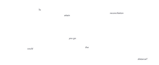
Secret Path - Gord Downie
Illustrated by Jeff Lemire
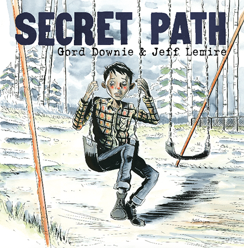
Secret Path is a concept album written by now late Gord Downie, which is accompanied by a graphic novel illustrated by Jeff Lemire, an novelist used to tackle very Canadian issues and to deal with the Canadian identity in many of his other publications. The album and novel were later adapted into a CBC television special broadcasted on the 23rd of October 2016, in accordance with the 50th anniversary of Chanie Wenjack’s tragic death.
The album follows the story of the young Chanie “Charlie” Wenjack, a young first nation child who was taken from his family to attend one of the many Residential School in Canada. In an attempt to get back to his family, the young Chanie fled the school and the traumatic experience it represented and attempted to follow the train track to get back home, which he was not aware was more than 400 thousands miles away. As you can imagine, he never made it home and died of exposure a few days later. (Downie)
Through this album, Downie wanted to try to force Canada to reconcile its history with the first-nations, to try to heal and become one nation. Though, since most of the people who seemed to be explicitly involved in the project are white-Canadians, the issue of cultural appropriation and of speaking for another nation could be raised. Maybe this story was not ours to tell, especially since the residential school system was something mostly silenced in the school system and even hidden from non-first-nation individuals.
To Downie, this was an important aspect and he went through a lengthy process to make sure that first-nation population and the Wenjack family, notably Chanie’s sister Pearl, would benefit from his musical and social project. He wanted the nation directly affected by the issue to also be included in the process. After taking the issue to the directly involved individuals, the solution found to address this issue was the “Chanie Wenjack Fund, dedicated to ‘cross-cultural education to support healing and recovery’.” (Brown)
To me, this project is a great exemple of using culture from another nation to create discussion around an issue that might not be ours to tackle alone, but that still concern us as a nation and that needs to be addressed in a way that will generate change. The issue was discussed with people that had the expertise to comment on the issue and to take a decision. A monetary compensation was also given in the form of a fund in order to thank the first-nation contributor. One of the main composante of that project that, to me, made a difference, is the fact that a Canadian celebrity raising the issue might have contributed to giving it a larger social impact. As of 2016, the subject of the residential-school system is taught in school Canada-wide and this might help people realize that Chanie Wenjack was far from being an exception in his story.
Brown, Ian. “Archive: If Secret Path 'Is the Last Thing I Do, I'm Happy': Gord Downie.” The Globe and Mail, 21 Oct. 2017, beta.theglobeandmail.com/arts/music/if-secret-path-is-the-last-thing-i-do-im-happy-what-happens-to-gord-downienext/article32483883/?ref=http%3A%2F%2Fwww.theglobeandmail.com&.
Downie, Gord, and Lemire, Jeff. Secret Path. Simon and Schuster, 2016
0 notes
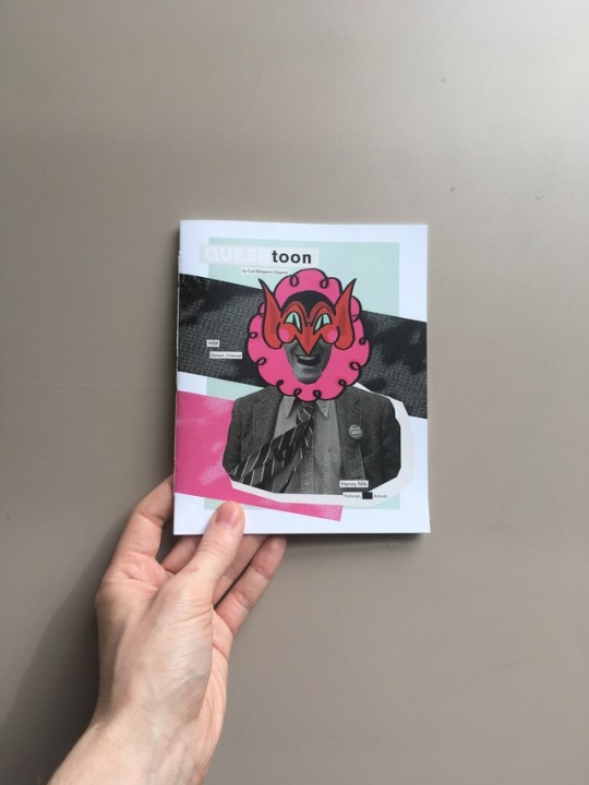
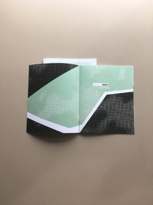
Photo
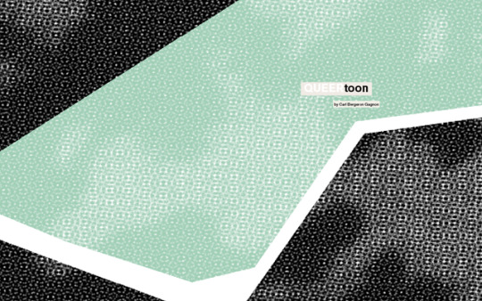

This is the Final design for the first project.
The first image is the front and back cover, the rest are the spreads in order.
0 notes

Text
[Project 1] Design tests
Here are some early design tests and images. I’ve also included explanations for most of my aesthetic choices.
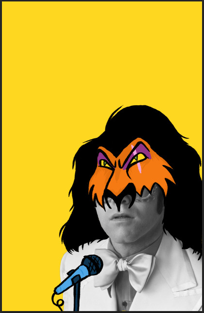
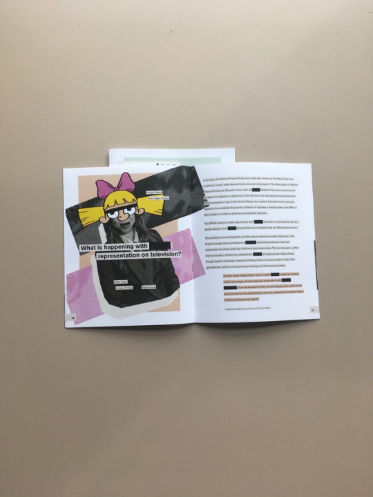
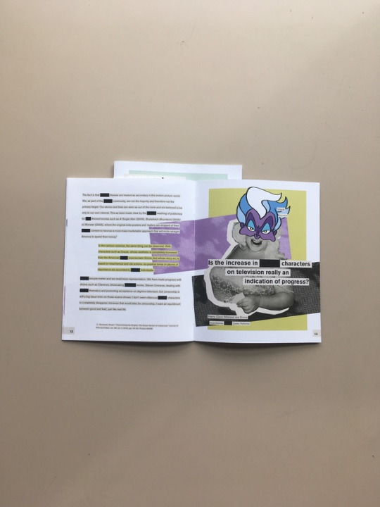
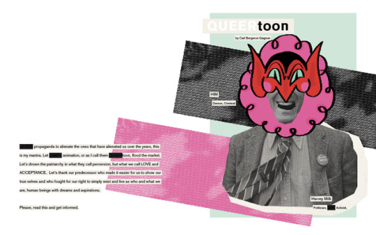
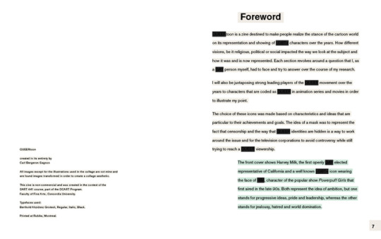
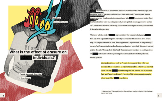
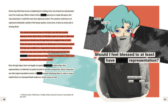
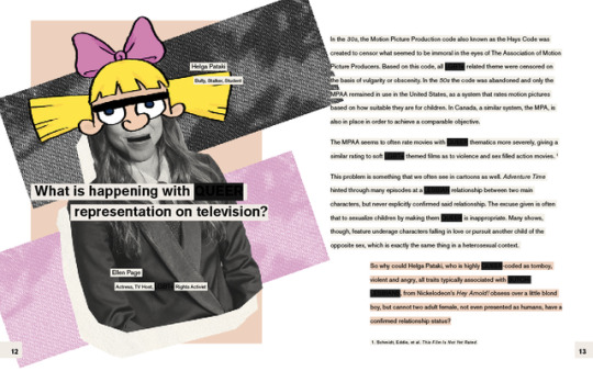
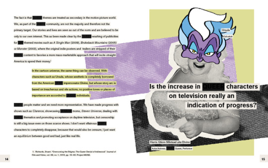
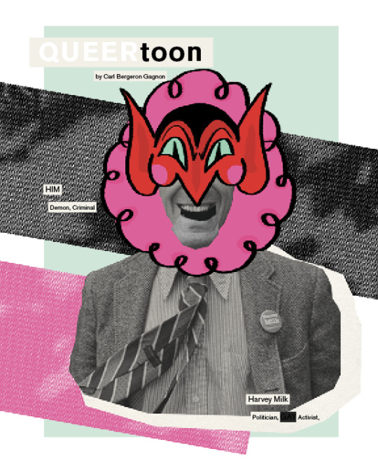
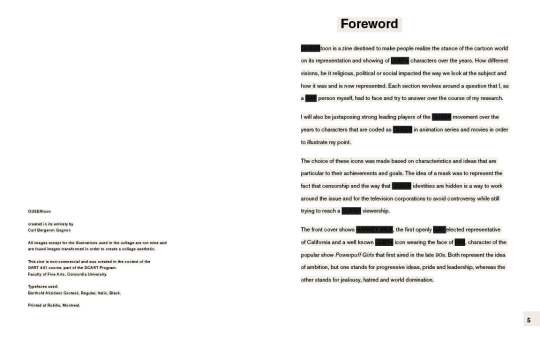
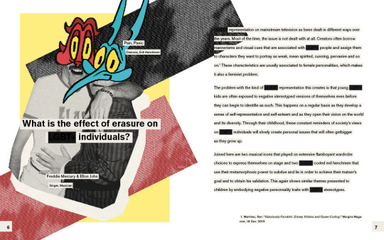
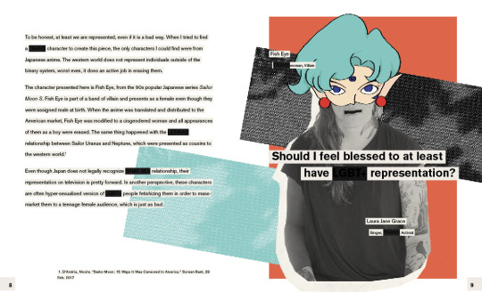
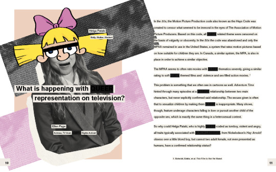
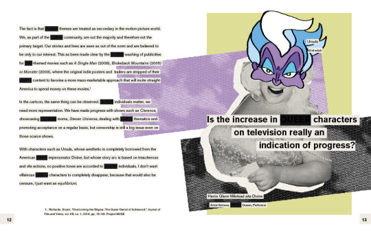
This represents the first idea that I had to create a series of posters. I was going to simply juxtapose both a Queer-coded cartoon character to a Queer Icon and add some catch phrase that would indicate that LGBT+ youth also needed representation in medias. The use of the character as a mask was to refer to the way Queer themes are often modified and transformed to fit a more straight narrative and to appeal to a wider audience without offending religious and less mind-opened communities.
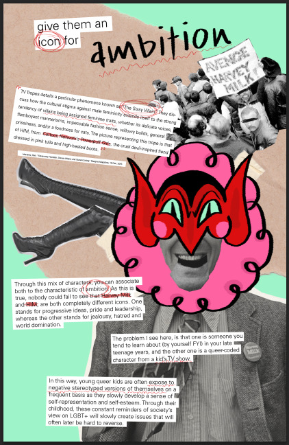
As the project moved forward, I felt that this idea was too simple and that more information would be relevant and beneficial to the project. I added inserts from my informations sources like magazines and scholarly articles. I also added texts that I had wrote explaining the process of choosing which character would go with which real life Icon.
It rapidly became evident that the poster was no longer the most efficient form that this project could take. I then moved to the magazine or independent zine format.
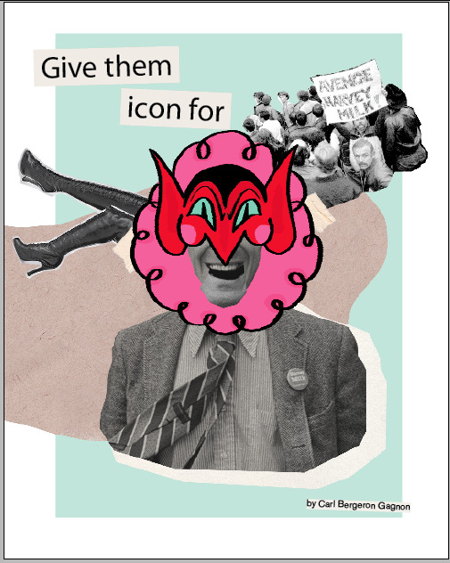
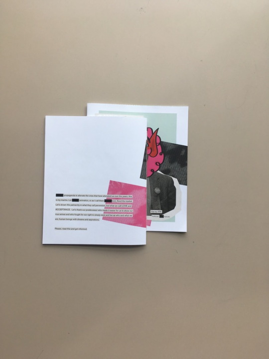
I rapidly decided to adapt what I had created earlier to this new format and to add a dimension by blacking out the words referring to Queer thematics in order to mimic the censorship applied to those same thematics in the Motion Picture industry. I used cardstock, crooked text and more found imagery to continue with the collage aesthetic.
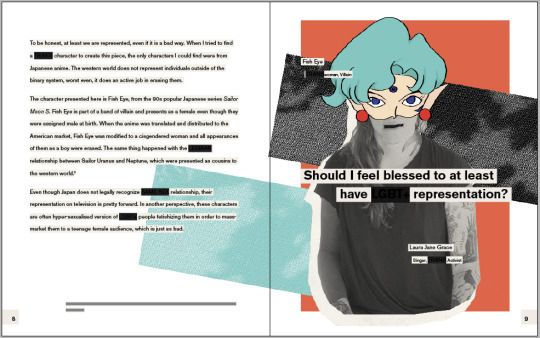
As my project went on, I started to dislike the collage aesthetic I was creating and realized that I felt more attracted to work dealing with collage in a more constrict way. I like square shapes, Straight text opposing the crooked imagery used behind it. I wanted something that would feel more constructed than crafted. I found more inspiration in the work of John Gall and his work on book designs and covers and started to look at constructivist propaganda.
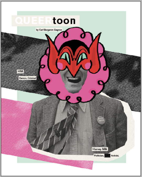
I kept the original ideas, with the mask, the censorship and the collage, but changed it to make it much less organic. I decided to use two parallel rectangles to reference the Human Rights Campaign logo and to play with it as a background. I chose a minimal colour palette for each image in a way to keep the visuals appealing and simple despite the usually very dense medium that is collage. I added small detailed information on the images to point out the opposite nature of both the human Icons and cartoon characters and decided to have the title of the small article as part of the image itself. I also changed the censor rectangles to a very dark grey in an attempt to make the word underneath them at least barely visible to facilitate the comprehension of the texts.
0 notes
Text
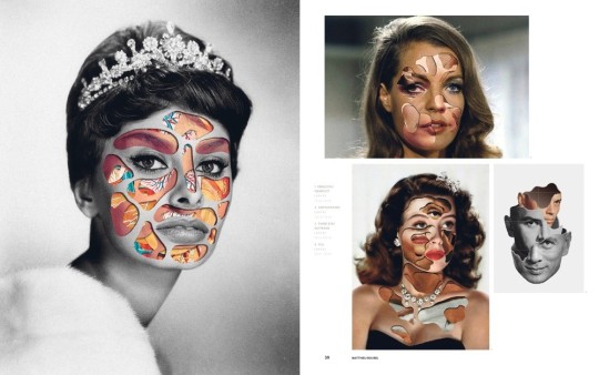
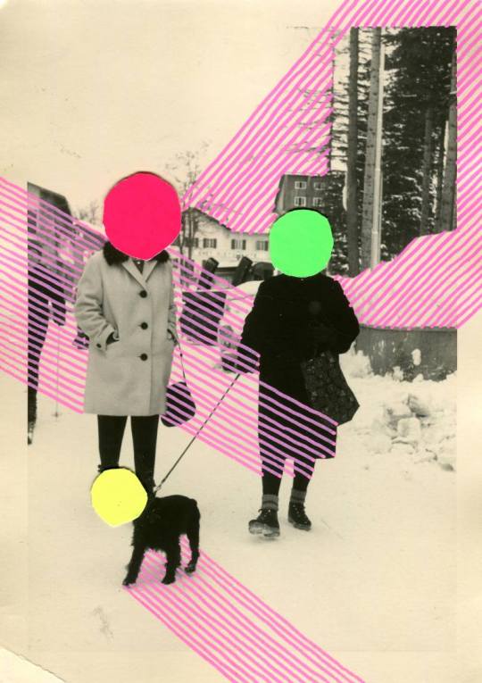
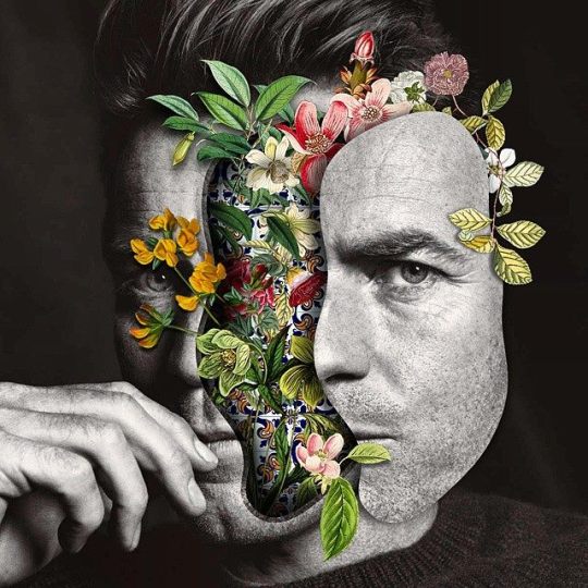
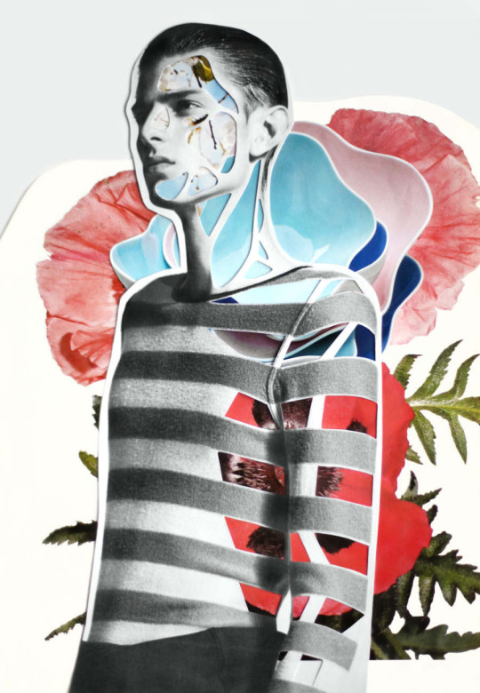
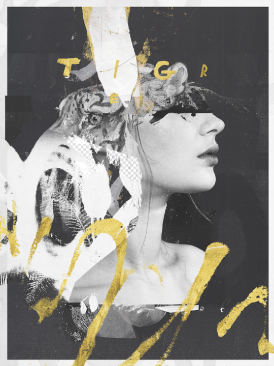
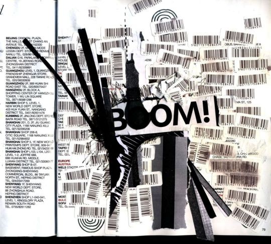
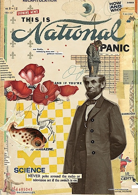
[Project 1] Collage Inspiration
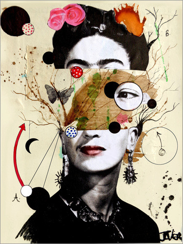
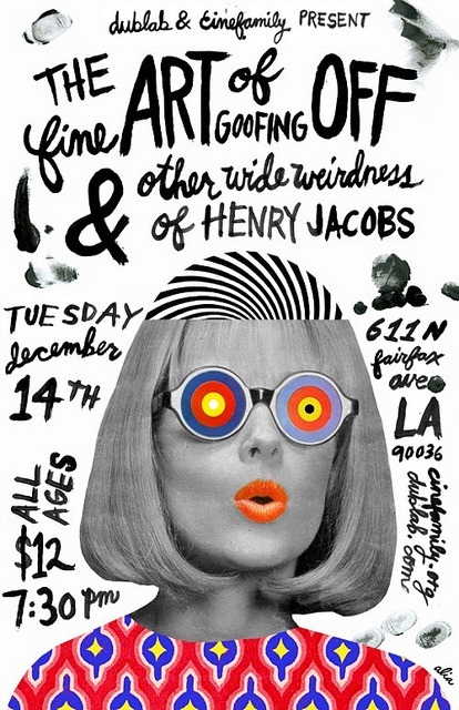
These images are not mine and were taken on multiple sites detined to distributes images such as Pinterest, Designspiration, Tumblr and Google Images.
My Design direction was also greatly inspired by John Gall’s aesthetic when dealing with photo and text collages.


0 notes
Text
[Project 1] Textual Research
Pop Articles
Fabulously Fiendish: Disney Villains and Queer-Coding
Sailor Moon: 15 Ways It Was Censored In America
Here's a Brief History of Queer Children's Cartoon Characters
The Complete History of Queer Characters in Cartoon Shows
Sissy Villain
How America Got Past the Anti-Gay Politics of the '90s
DISNEY'S LONG, COMPLICATED HISTORY WITH QUEER CHARACTERS
Why So Many Disney Villains Sound 'Gay'
The Motion Picture Production Code of 1930 (Hays Code)
Disney Making LeFou Gay Isn’t the Representation I Need
Love Is Strange, but the Movie’s R Rating Is Stranger
Why the MPAA thinks all gay people should be rated 'R'
'G.B.F.' director blames 'R' rating on MPAA's gay double-standard
Scholarly Articles
Gay, Lesbian, and Bisexual Content on Television: A Quantitative Analysis Across Two Seasons
Overcoming the Stigma: The Queer Denial of Indiewood
Queer Resistances in the Adult Animated Sitcom
Closet Cases: Costuming, Lesbian Identities and Desire, Hollywood Cinema and the Motion Picture Production Code.
Movie
This film is not yet rated
0 notes
Text
Design Response 1 [441]
Haruki Murakami - Colorless Tsukuru Tazaki and His Years of Pilgrimage
Graphic design by Chip Kidd
I’ve read most of Haruki Murakami’s book over the past few years and I can definitely say that they are, as an ensemble, pretty well designed. The American versions of the books have been designed and redesigned by both John Gall and Chip Kidd, depending on the occasion and edition. I am usually a sucker for John Gall’s old school collage aesthetic, but for this response, I’m actually going to review Chip Kidd’s work on Colorless Tsukuru Tazaki and His Years of Pilgrimage.
I fell in love with the book’s design as soon as I saw it at my local bookstore. The use of a die-cut in the dust jacket to reveal colours and a pattern from the hardcover was very attractive to me and reflected a sense of cleverness that was rarely present in the other books I had ever owned or encountered. You see, I’ve come to understand that English editors tend to spend more budget on the design of their books than French editors. The English book section of the bookstore is usually filled with novels in various sizes and designs, with flaps, textured paper, die-cuts, and overall really nice «books-as-objects» appearances, whereas the French section is dull and striking with the use of the same template for each book published under the same label (Libre Expression, Alire) with a simple illustrated «first degree» image as a visual aid printed on a boring glossy card stock.

After reading the book though, my mind was blown by the overall thought put into the concept of the book cover. The story is about a man who tries to reconnect with his 4 high-school friends who he lost contact with. It happened suddenly, when he moved away from his hometown to go to college, where he studied railway systems to become an architect specialized in transport stations, his obsession. Years later, when he gets in contact with them, they refuse to acknowledge him and he discovers that something happened to make them all turn their backs on him. He will then engage into a long pilgrimage to try and figure out what happened.
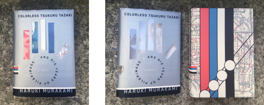
The four friends each have a surname which reference different colours in Japanese (Blue, Red, White and Black), but Tsukuru’s name doesn’t. In this way, he was known through his circle of friends as Colorless Tsukuru. The cover makes a great use of that. Each colour is used to showcase train lines that flow in the same direction (the four friends) and a fifth train line, which as no colour, that goes in a different direction and only briefly crosses them (Tsukuru). All of these are placed on top of a subway map pattern, which references Tsukuru’s long time obsession with transport systems.
The dust-jacket makes a great use of the undercover by having a die cut of 5 rectangles placed in the shape of a hand, with Tsukuru as the thumb, the odd-placed finger trying to get in touch with the others. The sub-title, and His Years of Pilgrimage, is then used as the palm and placed in the shape of a circle underneath the rectangles, probably referring to what appears to be a hard and endless journey.
Multiple of these details are used throughout the book as well. Chip Kidd pays attention to the smallest details and even goes to the extent of playing with the page numbers, changing the colour of each 4 to white in an effort to reinforce the idea of the 4 lost acquaintances.
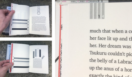
To me, this book is a perfect exemple of pushing book design over the limit and of Kidd’s design abilities. The designer does not only provide something that reference the content of the book, which is often the case with other covers in a very obvious way, but he also plays with it, inside and out. Chip Kidd gives the reader something to look out for, an additional intrigue outside of the main text, in the margins, on the title page and on the cover.
1 note
·
View note
Video
youtube
No battery
End of term project
Images and animation and some sounds created by Carl Bergeron Gagnon
Other sounds from freesounds.org and are creative commons and royalty free
Ending theme:
Fleetwood Mac. Rumours. Warner Bros. Records, 2013. CD.
0 notes