
Don't wanna be here? Send us removal request.
Statistics
We looked inside some of the posts by cccellen-blog and here's what we found interesting.
Average Info
Notes Per Post
9
Likes Per Post
7
Reblog Per Post
1
Reply Per Post
1
Time Between Posts
6 days
Number of Posts By Type
Text
13
Last Seen Tumblr Blogs


Fun Fact
Tumblr Inc. is using 66 technologies for its website.
Text
Reflection

Through the communication design course, I learned a lot about the history of design and the artistic style of different periods. Especially the Bauhaus made me interested and impressed. It showcased the aesthetics and design methods of different periods, and made me marvel at the development of design. In addition, many classroom activities are also very helpful to me. Expanding thinking uses a variety of different methods to form letters, such as using items around me, triangles and squares, and cutting graphics from magazines to form letters. Shape and so on. Every class is very interesting. We use our imagination to make a single letter diverse and interesting. This is the most enlightening and most enjoyable part of this course. This course gave me a strong interest in letters and learned to be good at discovering and using graphics. Design comes from life, so we can also use the graphics and elements in life to create designs.
Finally, thanks to all the lovely classmates and teachers❤️, you have enriched my imagination and vision, so that I have a fruitful semester.😄😄
1 note
·
View note
Text
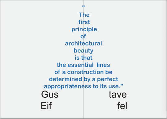
In the last feedback, I gained some new understanding for assignment 3. After some consideration I changed my layout for the booklet. I used the simplified shape of the Eiffel Tower on the cover page, and used the Eiffel's quote on the middle page, and make the letters form the shape of the Eiffel Tower. I like this page very much. In other pages I added some paper-cut about Eiffel's works. I like this one more than the last one because it breaks some seriousness and adds a bright blue color.
0 notes
Text
Assignments 3 process
Last week,I changed my last question because I think it is more suitable as an interview question.
How to get inspiration for the Eiffel Tower? Is there any special story behind it?
This tower was inspired by the New York City Observatory, and this tower symbolizes not only the art of the modern engineer but also the century of industry and science in which we are living.
Eiffel Tower is of special significance to me because it entrusts my deep miss and love for my deceased wife. My relationship with Margaret is very deep. In the difficult times of my early career, it was her encouragement and support that made me persevere, so I designed the Eiffel Tower for her. When I stood at the top of this tower, I felt that this was the closest place to heaven and told my lover that I love you.
And made the first layout for my booklet, although it was not very good. At the beginning, I chose the black and white style, because I think Gustav Eiffel is a great architect, and the building itself is a rigorous thing. But after talking with Karen in class last week, I realized that this typesetting is too commercial and serious. It can not reflect the design style of Gustav Eiffel, and it does not seem so attractive. I think I need to reconsider layout and improve it, and I hope I can make it better : )
0 notes
Text
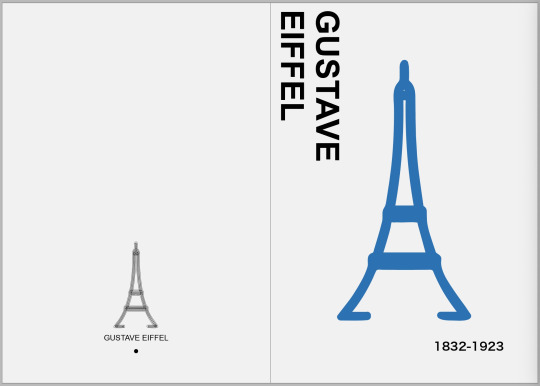
Assessment 3
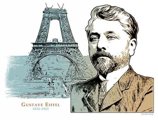
I did a lot of research about Gustave Eiffel, he is a very amazing architect who made miracles with steel. Many people know the achievements of the Eiffel Tower, but what people do n’t know is that this is the tower closest to heaven that Eiffel built for his dead wife, to extend the deepest love to his wife. This immortal building has become an eternal witness to remember their love.
There are some questions about Gustave Eiffel here, and I tried to answer them.
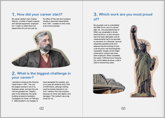
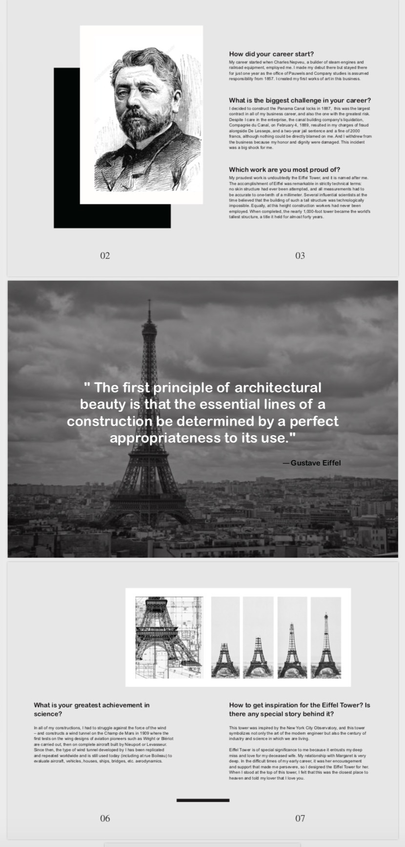
How did your career start?
His career started when Charles Nepveu, a builder of steam engines and railroad equipment, employed him. He will make his debut there but stayed there for just one year as the office of Pauwels and Company studies is assumed responsibility from 1857. He will be creating his first works of art in this business. He worked on the Bridge in Bordeaux between 1858 and 1860. He left the Pauwels and Company in 1866 and set up his consulting engineer, then formed his own company the following year with which he built a railway line viaduct between Commentry and Gannat.
What is the biggest challenge in your career?
In 1887 Eiffel decided to construct the Panama Canal locks, an unprecedented project poorly run by Ferdinand De Lesseps that ended in the century's biggest financial scandal. This was the largest contract in all of his business career, and also the one with the greatest risk. Despite Eiffel's care in the enterprise, the canal building company's liquidation, Compagnie du Canal, on February 4, 1889, resulted in his charges of fraud alongside De Lesseps and his friend, and a two-year jail sentence and a fine of 2000 francs, although nothing could be directly blamed on him. He retired from the company with his honor and dignity seriously compromised.
Which work are you most proud of?
The answer is undoubtedly the Eiffel Tower. The accomplishment of Eiffel was remarkable in strictly technical terms: no skin structure had ever been attempted, and all measurements had to be accurate to one-tenth of a millimeter. Several influential scientists at the time believed that the building of such a tall structure was technologically impossible. Equally, at this height construction workers had never been employed. When completed, the nearly 1,000-foot tower became the world's tallest structure, a title it held for almost forty years.
What is your greatest achievement in science?
In all of his constructions, he had to struggle against the force of the wind – and constructs a wind tunnel on the Champ de Mars in 1909 where the first tests on the wing designs of aviation pioneers such as Wright or Blériot are carried out, then on complete aircraft built by Nieuport or Levasseur. Since then, the type of wind tunnel developed by Eiffel has been replicated and repeated worldwide and is still used today (including at rue Boileau) to evaluate aircraft, vehicles, houses, ships, bridges, etc. aerodynamics.
How to get inspiration for the Eiffel Tower?
Eiffel openly acknowledged the inspiration for a tower inspired by the Latting Observatory in New York City, Eiffel said the tower would symbolize “not only the art of the modern engineer but also the century of industry and science in which we are living.”
Koechlin made a sketch of their design, described by him as "a great pylon, composed of four lattice girders standing apart at the base and coming together at the top, linked together at regular intervals by metal trusses.' Initially, Eiffel showed little interest, but he allowed further research, and then the two engineers asked Stephen Sauvestre, the architectural department head of the group, to contribute to the design. Sauvestre described three levels, the first two of which had glass rooms to welcome the public, built wide decorative arches between the tower's feet, decorating the base with pedestals of stonework and the top with a bell tower.
4 notes
·
View notes
Text
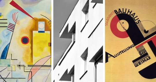
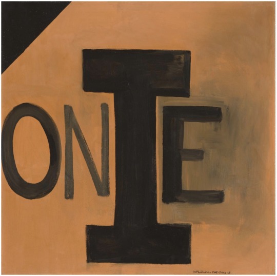
Bauhaus
Bauhaus is often mentioned in lectures in recent weeks, and many design styles are related to it, which makes me interested in the Bauhaus. I did some research about the Bauhaus because I think it will be more conducive to learning design.
German Architect Walter Gropius founded the Bauhaus School in 1919 for art, architecture, and design. Bauhaus means 'house of construction' or 'building school' and its legacy has influenced modernist art, architecture, graphic design, interior design, industrial design, and typography. Instead of promoting a particular artistic style, the Bauhaus school was about a way of working – of communicating between disciplines, and the importance of craftsmanship combined with a recognition of the power of mass production to share beautiful functional architecture. The objective was to create an accessible, beautiful living design - a Gesamtkunstwerk: 'total art of work.'
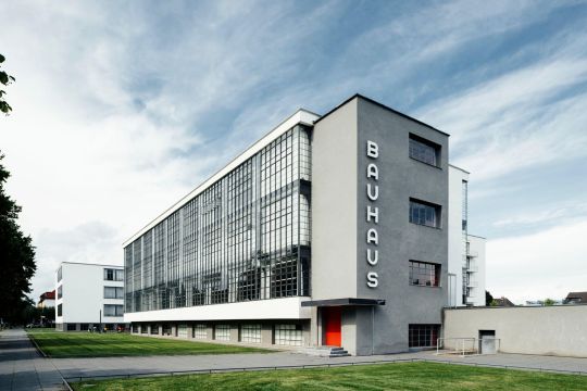
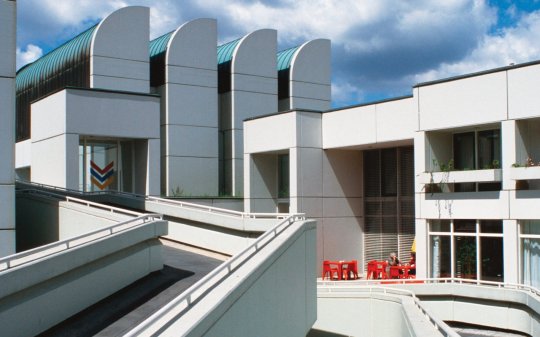
The Bauhaus was probably the single most influential school of 20th-century modernist architecture. Long after its closure under Nazi pressure in 1933, its approach to teaching and to the relationship between art, culture, and technology had a significant influence in Europe as well as in the United States. The Bauhaus was inspired by artistic movements such as the Arts and Crafts movement of the 19th and early 20th centuries, as well as the Art Nouveau movement and its various foreign incarnations, including the Jugendstil and the Vienna Secession. Both of these movements tried to level the gap between the fine and applied arts, and to put together innovation and manufacturing; their influence was expressed in the Bauhaus ideals' romantic medievalism during its early years when it formed itself as a type of artisan guild. By the mid-1920s, however, this dream had given way to an emphasis on uniting art and industrial design, and it was this that underpinned the most original and significant accomplishments of the Bauhaus. The school is also known for its outstanding students, which later contributed to the growth of modern art-and modern thought-throughout Europe and the United States.
Combined with the Bauhaus's precarious financial position, the increasingly chaotic political situation in Germany forced Mies to move the school to Berlin in 1930, where it operated on a reduced scale. In 1933 he eventually shut the Bauhaus. Many of the Bauhaus' main figures emigrated to the United States during the tumultuous and sometimes dangerous years of World War II, where their research and teaching philosophies inspired generations of young architects and designers.
0 notes
Text
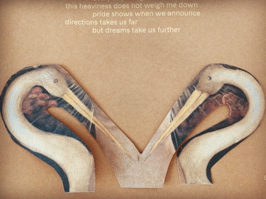
HAHA, I cut these two birds from the booklet to make M,I like it!
0 notes
Text
In the class of week6, we had an interesting activity, which is to use squares and triangles to form all the letters. The members of our group were very enthusiastic and they helped me when I was troubled with the use of squares to form the letters S and R. Finally we completed all the letters together. The letters S and R impressed me, and I can share them.

The last one is the Q that I tried to form. Although it may be a little difficult to recognize, I think it looks quite interesting.
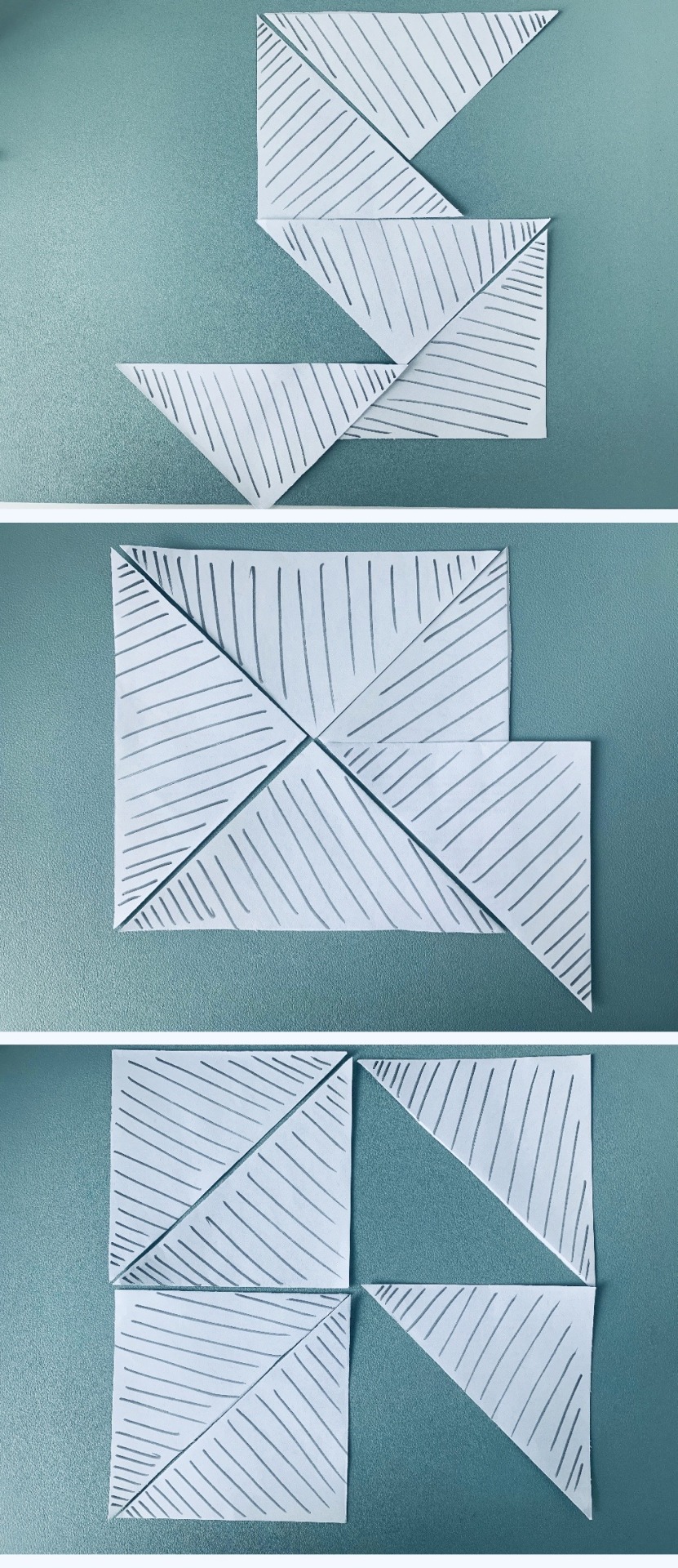
It's hard to believe that I was interested in letters. I think this is the magic of this course. I started to change my attitude towards alphabets, and I also talked about letters with my classmates. I really like this kind of change, and it also gives me a better understanding of the alphabet. I think this is beneficial to me :)
0 notes
Text
Helvetica
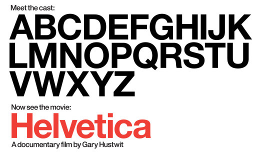
In fact, I rarely watch documentaries because they are always a bit boring, but Helvetica is an excellent movie for me. It describes the origin and development of Helvetica, which can make me know more about fonts.
Helvetica originated in Switzerland,and itwas designed by designers Max Miedinger and Eduard Hoffmann in 1957. Compared with handwriting or serifs, Helvetica is simple and clear, and pays more attention to the structure and readability of fonts, so it was widely used in the 1960s and 1970s.
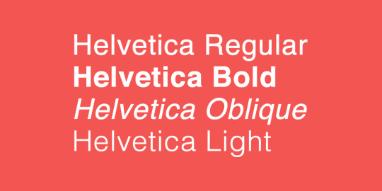
The clear and easy-to-read of Helvetica's features make it ideal for standard fonts in communal facilities. Helvetica almost monopolized the standard fonts for public design, especially after designer Massimo Vigneli used it to design a logo system and map for the New York subway. Therefore, the widespread use of metropolitan and brands makes Helvetica more popular all over the world.
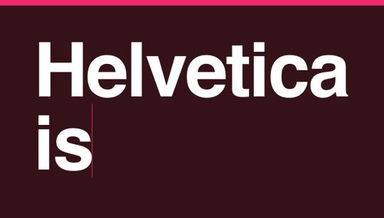
Helvetica has been loved by many people so far, and its simplicity and readability are important factors for its popularity. However, there are many people who do not like Helvetica. They think that Helvetica has no personality, no emotion and vitality, and it ignores the interactive and emotional experience that fonts may bring to the audience. But I think one of Helvetica’s main goals was ‘‘ deindividualization ’’ when it was designed originally, and It is the advantage of Helvetica that it could be recognized by most people. ( images from google )
0 notes
Text
Recently, I like to read some works related to letters, because the lecture talked a lot about that. At the same time, I discovered the charm of letters gradually,and I found a variety of letters, which brought a different visual feelings for me, such as hand-lettered, and I can share some pictures here.
They are from a young designer, JENNET LIAW. Her handwriting is beautiful,and the letters look very vivid and vibrant,so I like her works because she always has a lot of bold new ideas, which impressed me.
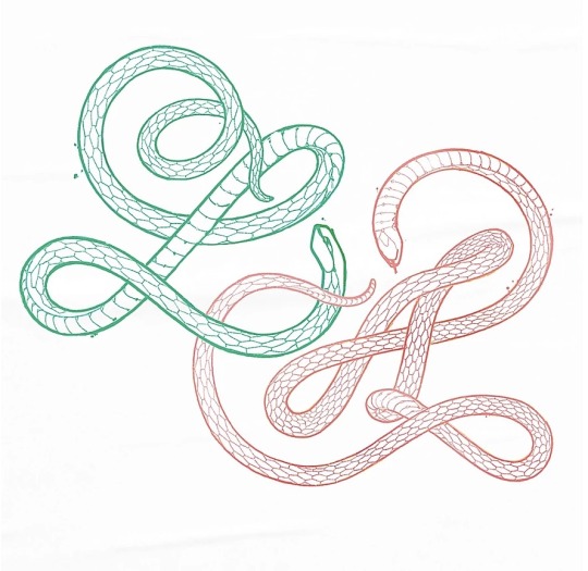
She used the shape of snakes to create letters.

In fact, I didn't think much about letters or fonts before studying this course, but I have changed my view of letters. Maybe it is not boring and rigid, and we can show letters in many ways. I think it could be fun,and we can get more ideas in the process.
0 notes
Text
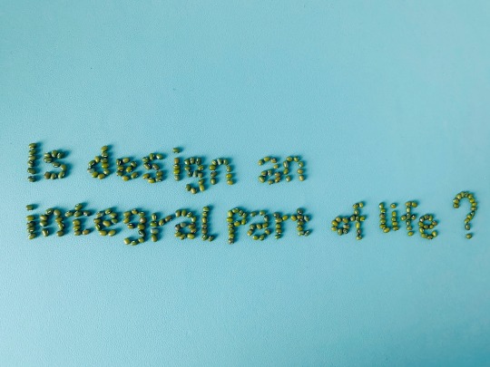
I just share today's work. I actually thought about using other items to do it, but I think it is better to express the question through grains. In my mind grains are very important and indispensable for people, and the design is same. Because design enriches our lives like a magic, it is ubiquitous and changes our lives in many ways. And I believe it is just like these ordinary grains become fun because of the design. So design is also like a language.
I really like this photo, it looks so cute :D
1 note
·
View note
Text
Pangram Noodles
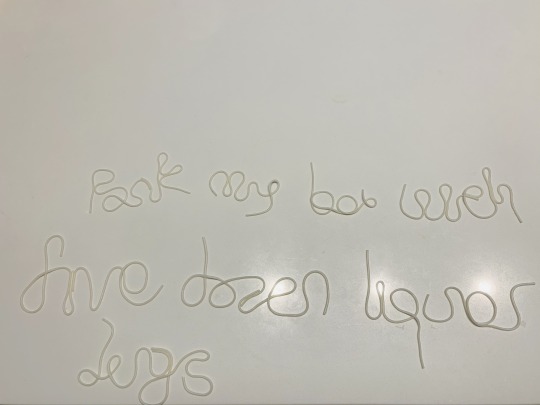
After watching the video, I tried to do pangram noodles. But the noodles were not long enough, so I have to link them. Anyway, I did it. Could you guess this sentence, guys?
HAHA, the answer is ‘Pack my box with five dozen liquor jugs’ : )
1 note
·
View note
Text
NGV COLLECTION
Recently, I cannot visit the NGV art exhibition because of coronavirus. However, I found some information from NGV's official website. LETTERS AND NUMBERS is a work of art by artist Colin McCahon, and it will be on display at NGV on November 14, 2020.
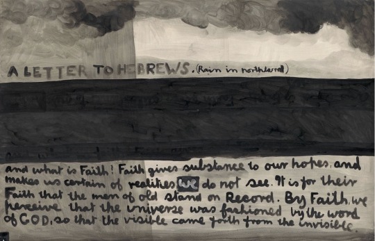
Colin McCahon (1919-1987), in 2019, the NGV is marking the centenary of the artist’s birth with Colin McCahon: Letters and Numbers. Numerals, texts and biblical themes are recurring features in McCahon’s paintings; attributes shared by all of the works in the exhibition. Influenced by the use of text by Italian Quattrocento painters such as Fra Angelico, words first appeared in McCahon’s paintings in the 1940s in the form of cartoon-like speech bubbles in biblical scenes set in recognisably New Zealand landscapes. However, words in his immediate environment were also a source of inspiration, such as in advertising graphics and hand-painted signs at roadside stalls.
McCahon’s use of texts drawn from biblical sources corresponded to his affinity for Christian symbolism, yet he did not consider himself Christian. He often demonstrated an equivocation towards his cited texts.
In my opinion, McCahon uses text and numbers as elements, which is a very unique form in his creation. However, most of his works are difficult to read and understand, which has caused McCahon's works to be controversial. This means that this art is not acceptable to everyone. McCahon uses the unique art form to convey the various emotions he wants to express, brings us different visual arts, and has his unique artistic charm. I want to visit this art show in November if everything is fine : )
1 note
·
View note
Text
Week 1
In the first week of class, the teacher asked us to use the items in the backpack, including pens, erasers, glasses, books, etc., to put the letters of our names. And each of us began to look for the items in the backpack,and make them for the letters. I started to realize that this should be an interesting class. The tension in the first class relaxed, which made me gradually enjoy the class. Next, we used all the available items to piece together 26 letters and 10 numbers to work together in our respective groups, and after that, students visited the works of other groups to communicate with each other. Interestingly, most of our group used stationery to make the letters, while other groups used scarves, hats and coats, which are different whit our works.
There are some photos from our fun class.
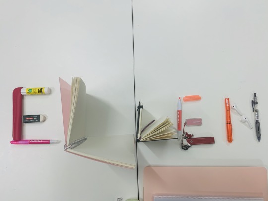
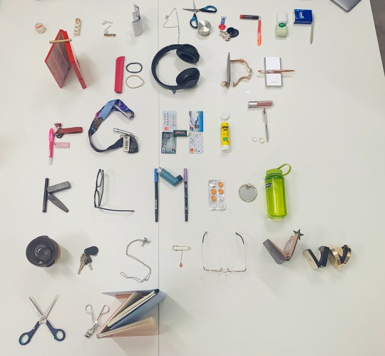
At the beginning, I was a little confused about this course, and then, I gradually became full of expectation and interest in this course. Moreover, in the weekly lectures, the professor also shared many interesting designs and pictures with us, which made me feel that the design was not boring. This is a good start. I hope that I can improve myself by studying design course this semester.
1 note
·
View note