
Statistics
We looked inside some of the posts by cfloki and here's what we found interesting.
Average Info
Notes Per Post
0
Likes Per Post
0
Reblog Per Post
0
Reply Per Post
0
Time Between Posts
2 days
Number of Posts By Type
Text
17
Last Seen Tumblr Blogs


Fun Fact
The total number of visits Tumblr.com received during January 2021 is 327 million.
Text
Adobe indesign pt2 ( sorry in advance if this doesnt make alot of sense ive got pink eye and 4 hours of sleep )
Parent pages and column grids. We begun with creating an A5 document in Indesign, changing the units to millimeters. The next thing we did was create 12 diffrent pages ( 1 cover, 1 backcover and 10 pages in the middle of the two ) We labled these two pages as so, Cover and Backcover, centering the titles.


Above are the layers showing the order. Next we looked at how to number the pages without having to manually go and label each one. Luckily, Indesign has our back! Using the Parent feature!

First we wrote 'Page 1' and 'Page 2' and then selected the numbers. we used this to make it so the page number would properly corolate.

After doing this we were like 'Oh!' because now the cover and backcover had page numbers, which we didnt want. We fixed this by dragging and dropping the 'None' Page onto the cover and backcover, leaving them effectivly orphaned.

The next thing we did was mess around with changing columns. Layout > Margins and columns, is where the margins and columns dialogue can be found


The next thing we quickly did was how to change the color of the page numbers, Shift + X to fill a few pages and half pages.


To change the color of the page number to white we made a duplicate of Parent A, called parent B. Parent B was applied to these pages with its color of the Page numbers set to white. End papers
Illustrator isnt working very well for me right now as i cant see that well so ill just be using the images from Moodle. End papers are mst commonly seen in older books, and are made up of a patterned page spread on pages 1 and 2 - These should match and be the same design. They are used for both the front and end of the book. Examples below

I wasnt able to do this part as ive been unwell. so here is how Toby has expained it on moodle. To make an endpaper tileable design, we'll use Adobe Illustrator, which has a neat way of doing this, but the tool is a bit hidden..


You can also use a hexagon tile system...


Using either the regular tile, bricks method or hexagon you can make most types of seamless tile patterns
0 notes
Text
Adobe indesign Pt1
I cant go in and grab my version of this project so i'll just be using the images and some of the info from moodle :) sorry! What is indesign used for? Using photoshop and illustrator you can create images, but in indesign you can combine and assemble them. Though they have similar tools for creating shapes its far more common to make vector graphics in Illustrator. Raster images of photos and backgrounds are generally created in Photoshop. Because of how the design process is and how a client uses it Indesign gives creators several methods of making changes easily to projects. Two of these methods are styles, and Linked items.
"Styles allow designers to apply settings to objects and text and save those settings as a style. The style can then be applied to multiple things of the same kind, such as text. If the client or designer decides they want to change that style, then all instances where it was applied will change if the designer makes a change to the style." Paragraph styles In Indesign, a paragraph is the text that is enclosed by two carriage returns. A carriage return, which got its name from the typewriter's carriage moving from the end to the beginning, is just pressing the return or enter key after writing a title, bullet point, list item, or a piece of text.
As soon as your work gets more than a few paragraphs, it makes sense to use paragraph styles. For smaller documents it isnt as needed.
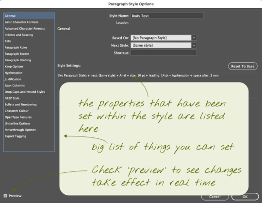
Paragraph styles can be accessed from the windows menu as seen below
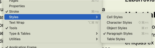
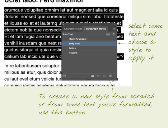
Above is an example of the 'Paragraph styles' box.
Inside of the 'Paragraph styles' Bullet points
A bullet point is a symbol that is used in writing to introduce an item in a list. A commonly used symbol to represent a bullet point is a centered dot (•), but many different symbols and characters can be used in bullet point lists. Sometimes, bulleted lists even use numbers and/or letters. Below is how to correctly use a bullet point in indesign.

Loading images into InDesign and moving them around. Indesign images are stored as links, this means instead of it embedding a file into your work it inserts a link, which is somewhat similar to a smart object in photoshop; meaning that when something is changed about the image it can be updated using the link
Without linked files, any image files are duplicated within each document, creating larger files:
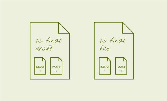
With linked files, there's only one copy of each image file, and edits to it will show up in the file:
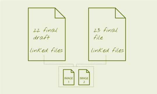
The benefits of this is that the images are not included in the file, and remain 'live'. If you're supplying an InDesign as an archival package, you must supply the images with it. To insert an image into your InDesign document, go to File > Place and navigate to the desired image(s) you wish to include. Moving images around. The important thing to understand in InDesign from the get go, is that anything added via 'place' is put into a frame, which is the same size as the image. Understanding this will avoid a lot of confusion.
To an image around in the document, press V to activate the selection tool. Then click the image and drag the image around.To move an image within its frame, use the selection tool and after clicking the image drag the circle that appears in the middle.
To scale / adjust the frame that contains the image, click the image, then manipulate the corner or edge points of the gizmo. Hold shift whilst doing this to constrain proportions. Hold Option/ALT (PC) whilst doing this to scale from centre.
To scale / adjust the image AND the frame together, hold down Command/CTRL (PC). A common move is to hold down both Shift and Command/CITRL (PC) to reliably scale objects and their frame together.

To wrap image around text you need to put the image into the text area and then open the properties menu. Use the text wrap options in the properties panel (WIndow > Properties) to set the text wrap around the image object.

0 notes
Text
Adobe indesign shortcuts
space = pan z = zoom v = select a = direct select CMD + click outside of the textbox = exit textbox edit mode t = text tool type -> fill with filler / placeholder text w = toggle preview mode click, hold shift and use arrow keys to select letters cick, CMD + shift use arrow keys to selects words. shift + command = to rezise image + to constrain when selecting images designate number = ctrl+alt+shift+N shift + x to fill
0 notes
Text
Fundamentals 1: Software Pūmanawa A bit more compositing
The first vector image i made was a fly, just a wee simple one. i used the elipitcal tool primarily for this and manipulated the shapes.

The second vector image i did was a little duckling, I again primarily used the elliptical tool, changing the shapes as needed and sending things forth and backwards

These are the two raster images ill be using


The first image i did was the 4 ducks, it was the more complex one as getting around the grass and thin lines around the ducks were difficult. this is the image before it was put on the compositions

the next image was the cat ( goose the cat ) which was a little bit less tricky, i only ran into issues with some false selections but that was easily fixed by using the quick - selection tool

the last thing to do was to put the two vector images and two raster images within the actual image. I did this by putting the vector images in as smart objects. then i just copy and pasted the raster images into the original image from a different file. This is the finished product.

Overall this project was pretty fun but I still dont like illustrator. It was pretty simple since we did it in class but I struggled a bit trying to describe it so apologies if its a bit short this time around!
0 notes
Text


This is the first wee dabble we had in photoshop using the marquee slelection tool. we bun this prossess by cutting our subject out from the photo, i used smart select and went and refined it. ( subject is the 3rd image ) We then divided him onto a diffrent layer, seperating him from the background. The next thing we did was grab a new background and stick it behind the lad, now hes jumping in the middle of the road! hope he looks both ways. Using illustrator I made this god awful sin of nature 'snake' if you can call it that. We transferrred this into photoshop by making it a smart object which updates whenever the file changes. Using the brush and erasure tool I changed what parts were visable to create the overlapping effect. Thats how we created this... Special image! Layers and finished product shown above.
0 notes
Text
Photoshop Hotkeys X = Swap foreground and background colour Shift + Command + Delete = Fill with foreground colour Command + D = Deselect B = Brush E = Eraser Option + Delete = Fill selection Command + Option + Delete = Fill selection with Background Colour Window -> Brushes -> General brushes[ = Shrink ] = Enlarge Command + A = Select all Number keys 1-0 Opacity ( 1 is 10% 0 is 100% ) Option = Colour pallete Command + U = Hue And Saturation Command + Z = Undo Shift + Command + Z = Redo V = Move tool *In the move tool photoshop will move whats under your cursor. Add when selecting = Shift Delete when selecting = Option Move when selecting = Space Paths Window -> Paths -> Click path thematic to create selection
0 notes
Text
Photoshop terms Hue What is the colours colour Saturation ( Tone ) More = Vibrant, vivid, pure, saturated Less = Muted, dull, gray Brightness ( Value ) Add = Tint Subtract = Shade Layer mask Black = No image ( 0%) White = All image (100%) Filters Curves = Used for altering brightness and darkness Brightness and Contrast = Changes the brightness ( or darkness) of the whole image, Contrast adds or removes contrast of an image. Colour balance = Changes the colours of the image (RGB) Hue + Saturation = changes the actual overall hue ( colour ) of the image, also used to saturate or desaturate the colours of an image.
0 notes
Text


This is some of the work we did in class with Adobe photoshop. We experimented with selecting and changing single objects in a photo rather then the whole image. For the boat image ( original at the top. ) we selected and duplicated the boat and used tools within photoshop to blend the second ship into the image. ( result 2nd image ) With the image of the plant I used the quick selection tool to select the bulk of the 5 leafs and used the polygonal lasso tool to get the thinner areas and clean up the selection. We used hue and saturation to change the colour of the leafs. With the fruits we used the elliptical selection tool, using shift click to add to the selection and option click to remove from the selection. Using the selected area we used hue and saturation to change the colours of the fruit. With the humming bird I selected the bulk of the bird using the object selection tool and using the pen tool for the more blurred area to refine the wings. We did this by placing points and changing them after to further reflect the shape. We removed the hummingbird from the original image ( Greyish background ) And put it on a new background, flipping it and blurring around the bird to create movement. We also shrunk the image and rotated it to our liking
0 notes
Text
Adobe illustrator Penguin
This here is my final product for my adobe illustrator penguin. Below this i'll explain the process, though I have lost a few stages.

I'll admit its a little bit janky, but its the best I could do at this time. Below are the stages and a brief explanation of my work.

We started with using the rectangle tool and rounding the corners with a little circle on the corners, creating a pill shape. We also learnt how to duplicate and flip an object.

There is unfortunately a jump in the progress here since some of my saved files were lost. But i'll try and explain to the best of my abilities. First we added additional points to the penguin using the + tool, adding 4 or 5 different additional points. We dragged these points out to create hair and tail feathers. Next we used the elliptical tool, creating one black oval for the first eye, and then using the gradient tool to add a blue colour to the eye. After that we once again used the elliptical tool, creating a filled white oval as an eye shine, placing it on the eye. After creating the full eye we duplicated the object while it was grouped, adjusting it to create a second eye. Our next step was to create the beak, we did this by using the rectangle tool. Creating a rectangle sideways we then adjusted the points, sliding them to create a diagonal. We used the same circle rounding tool to round the beak at both ends. After this we selected the beak and added an orange fill. Last thing in this catchup was the first foot. We used the rectangle tool again and rounded the bottom for the leg. For the foot we made the top half first before duplicating and flipping the object and combining them. We filled it in and then created a shadow.

Theres another jump here but its less jarring then it looks. We duplicated the foot and then tilted it upwards and leant the penguin back, creating some motion to the image. We also added a flipper Then we separated everything onto different layers ( as seen below )

First we filled the penguin with a solid colour, I chose a dark blue for my main fill. Our next step was to create a marking, I used a more vibrant blue and we used the pen tool to create this. Its a little bit janky but it does the job well enough. Our final step was to add shadows and highlights, we did this using the pen toll on a separate layer with a dark and light colour and adjusting the opacity. Overall this was a pretty challenging task for me, I kind of struggle creating sharp and even shapes but Im just glad I got it done!
0 notes
Text

This last black and white image I went for something a lot more simple. I adjusted the intensity of the image with curves, making the blacks and whites a bit more solid and intense. I added some contrast using the brightness and contrast tool. The last thing I did was add a sepia photo filter to age the photo a bit. Below are my layers and the finished photo


0 notes
Text

For my first black and white image I really just wanted to have fun and see how far I could change it while still looking cool, the main thing I used for this one was the curves tool, pulling the tail end of the curve way down creating a wicked blue almost retro like effect. I changed small things using hue and saturation and brightness and contrast. Below are my layers and the finished product


0 notes
Text

This above is my second image, as you can see it's pretty rough looking. I decided that first I wanted to see what I could do and tried out the spot healing brush tool along with the blur tool, getting rid of some shadows to keep the focus on the two subjects. I also did some individual color correction using the hue and saturation tool. The final thing i did was alter the brightness and contrast to make the image a bit less jarring to look at. Below are my layers and the final product


0 notes
Text
Fundamentals 1: Software Pūmanawa Simple Image Adjustments

For this original first image ( as seen above ) I thought it needed a little more colour and some light adjustment. I did this by using the curves and hue and saturation alterations. ( as seen below ) creating a warmer and almost dream-like feel to the photo.

After I made my main changes I created a vignette filter. Using the ellipse tool and inverting the selection. Then I filled the selected area with a warm brown before de-selecting and gaussian blurring the layer. This is the final product

0 notes
Text
Software Pūmanawa Object Creation
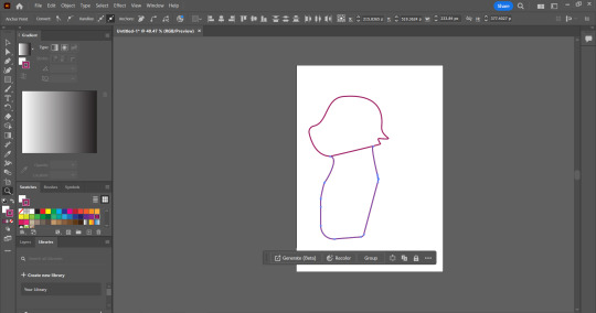
In this post I will illustrate my process of creating an object in Adobe illustrator 2024 using the skills I have learnt over the past week. I've got to admit this was not a simple process, and I probably did not choose the best object- or animal. In whch i chose to create a cat.
First things first I set up my workspace, bringing out the swatches, gradient and layers tool. I also toggled the control bar at the top of the screen. For my file settings I had it set to pixels and RGB.
Then I begun laying down simple shapes, trying to get a rough understanding of where I wanted to place parts of the cat. I started by using the ellipse tool, creating a circular shape for the head. Next I used the rectangle tool and adjusted the shapes to my liking.
The next thing I did was place additional points on the circle using the + key. I used these points to drag out fur and a muzzle for the cat. I used rougly 3-4 different points around the head for this process.
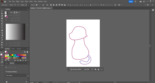
My next stage was to begin shaping the body and tail of the cat, I rounded it out and created a tail that curves around the body. I did this by using the pen tool and creating some anchor points.
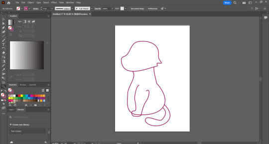
The next step was to try and make some sort of front legs, this, as you can see, did not go very well. it was incredibly difficult and it was very very fustrating. However, I still had to persavere. I created this first front leg using the pen tool.

The next thing I had to do, was create a second front leg. I did this by duplicating the first let and deleting the segments that werent visible from the perspective.
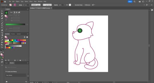
My next two steps were the creation of the Eyes and nose, and the hind leg. The hind leg was the difficult part, trying to get it to sit correctly. The easy part was the eye, I used the ellipse tool once more and then used the gradient tool selecting the second gradient option and then dragging the green up from the swatches. The nose I later changed but it was also fairly simple, just using the pen tool.
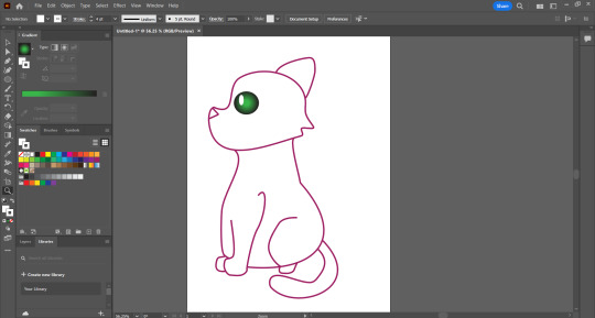
A quick short step was just adding the white shine to the eye, all that was nessacary was using the Ellipse tool again but having the stroke and fill set to white. This however is where it went down hill.
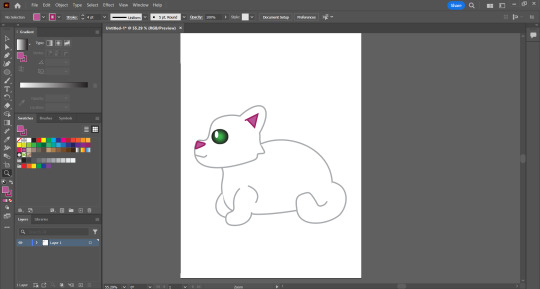
You might look at this and go 'hey! thats not the same cat!' its because it isnt, excluding the head. I ran into an issue where when i went to fill the body there was a giant invisible white square, I tried for ages to fix this but only ran into more issues. One of the ways I tried to fix the problem was entirely redoing the body, which is why the shape changed so drastically. After googling and searching for solutions and finding naught I decided on just making the cat white, which wasnt my plan but it was the only thing I could think of. As for the coloring I added an inner ear and redid the nose, setting the stroke and line to two diffrent pinks, one dark and one slightly lighter.
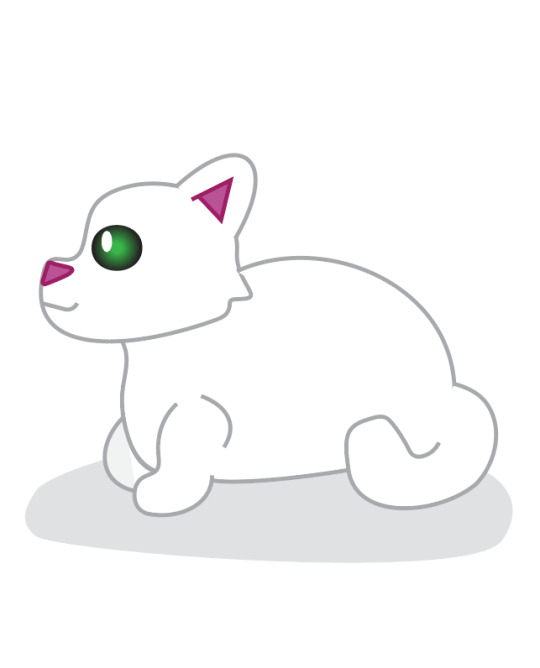
My last and final step was adding some sort of shadow, as the body is nearly fully incolorable I went for adding a shadow to the bottom of the cat and the front leg. You can actually see a bit of the problem square on the front leg shadow. It is incredibly fustrating. This above is the final version of my design. Though not entirely happy with the outcome ( because of the coloring issues ) Its cute enough and i think it demonstrates my learning. I also seperated what I could into layers.

Overall, the most difficult and slowest part was definitly the coloring process I chose the cat because I like cats and know their general anatomy, but I think id choose maybe a building or something next time. I definitly need more practice with the pen tool as its still a bit difficult to wrap my head around.
0 notes
Text
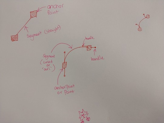
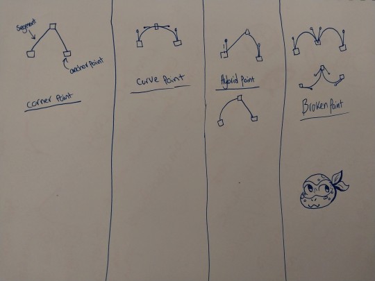
Fundies 2 part 3 Above are my diagrams of different point types and anchor points. The top image shows a straight points ( also known as corner points ) and its segment and anchor. The other diagram is a curved point also known as an arc. The second diagram is a more cohesive look at the 4 points we've looked at. This includes a corner point and curve point like the first image. The two new ones are the hybrid point and broken point. A hybrid point is done using this process 1. click hold 2. hold option 3. drag out handles. 4. let go of the mouse, then option. A broken point is done by holding option, allowing you to edit handles while they're being made.
0 notes
Text


Fundies 2 Part 2 This is where we learnt how to do single arc curves in Adobe illustrator, The first image was the result of me messing around trying to get the hang of it. We used the pen tool by placing two anchor points to create a curved shape. The second image is my copy of the shapes given to us.
0 notes
Text
Hotkeys and Commands MAC COMMANDS Command + N = New Finder tab Shift + Command + S = Display the Save As dialog, or duplicate the current document Shift + Command + 4 = Screenshot Shift + Command + 5 = Screen record ADOBE ILLUSTRATOR COMMANDS Stroke is outline fill fills the line Zoom is Z and Space is Pan RMB Zoom in LMB Zoom out / Clear fill or stroke X Toggle fill or stroke P = Pen V = Select tool ( all ) A = Direct Selection ( part(s) ) Command and click to click off an object and or click no where Selection box around something is called a Gizmo Move + Rotate + Scale these are known as Transform Drag to select Command + U = Toggle smart guides on ( pink lines ) Command + X = Cut Command + C = Copy Command + V = Paste Shift + Command + V = Paste in place Command + J = Close open points + Add point - Remove point Shift + X = Fill / Stroke Command + G = Group Shift + Command + G = Ungroup
0 notes