
Don't wanna be here? Send us removal request.
Statistics
We looked inside some of the posts by charliewuca2018-blog and here's what we found interesting.
Average Info
Notes Per Post
0
Likes Per Post
0
Reblog Per Post
0
Reply Per Post
0
Time Between Posts
9 hours
Number of Posts By Type
Text
7
Photo
8
Video
2
Last Seen Tumblr Blogs


Fun Fact
25% of US internet users with an annual income of $80-100K use Tumblr.
Text
Final Evaluation
This project went pretty well as I ended up making a substantial animation form it and learned some new skills along the way. The final piece ended up looking very different from what I planned to do at the beginning of the project as I started by working in a pair and ended up splitting. Yet despite that I was able to come up with a new concept of deforestation and through research able to come up with tits own art style and general structure. The research provided me with contextual awareness in to pop art and surrealism that I would now otherwise as well as how much of a problem deforestation is which I showed through the animation. This also helped improve my own skills at making digital art in photoshop through experience and research. As well as new ways to animate that I will likely be able to use in the future. Th workshops also taught me the proper way to prepare images for printing and how to have books made as well. I managed to stay in task to my timetables to stay organized. throughout the project which lead to a successful final piece that will be presented at the end on a monitor with a book.
0 notes
Text
Week 8 Evaluation
This week was just about finishing the actual project it self which I did. The animation is finished. Edited together in After effects instead of premier that I started using as the time line and layers where easier to see and follow. I added in text after establishing that this will provide some much needed context to the animation so people know what is happening and it is about. The music was probably the hardest part of this process as I ended up doing it myself which I have nether done before but it came out good so I am glad I did it. Even the book is finished by this point but will not came on time so I will replace it with a pdf for the actual assessment. I did this weeks research last week so there is none and by this point I doubt it would be useful anyway. Next week is just doing the paper work the critical review and citing my sources along with any other miscellaneous tasks so there likely wont be any posts for that week.
0 notes
Photo


These images show the last parts of the second section along with the third one, The third section shows concepts and otherwise unused images for the animals and backgrounds.
0 notes
Photo


Thees are he first few pages of the book which where designed in In design as that program allowed for more freedom and ease for designing a book. I was given the template in the workshop some time ago and needed to set up the boxes to put the text and images in. If the images where to bid then the corners would be cut of which is why the template helped as it showed the maximum size for these. Not all of the pages are on this post as only ten pictures can be added to one post. This however shows the front cover and the first two sections. I put the title for each section on one page and the images after as there are twenty pages by default and it would look weird if there where to many blank spaces. The background pictures where originally landscape but because the book will be a square I had to adjust them slightly without disrupting the quality and generally making the image look stretched. The same was true for the animals as if the images where made to big one way then the animal would be stretched and hence look weird.
0 notes
Text
Friday 2nd of May 2019
With the animation finished I know needed to focus on designing the book and then ordering it. Unfortunately the book will not come in time for hand in so I will represent it with the pdf printed out instead. In terms of the book it self I had the idea of making a children's book out of it as the way I have drawn the animals looks like it could be from one as I am told. Instead however, I decided to keep it simple and use it to show the backgrounds and animals on there own. For this I separated the book into three sections. The first just showing the background on there own, the second with just the animals and the last one showing a mixture that was used for concepts or otherwise not used at all.
I also ordered it as well using blurb. As I planned I chose to go for the 18x18 with image wrap and premium Lustre. This is because from the examples provided before this was a good size for showing pictures and the hard covers generally looked better then the other o[options. Premium Lustre was picked for the paper as it wasn't to shiny and not flat either which gave a good balance. This combination also did not cost to much either.
0 notes
Text
Wednesday 1st of May 2019
Know that the footage is al in place I just need to add the sound to the animation instead. The original plan was t use royalty free music from a sight but I decided to use a software that comes with my mac called garage band instead. The site comes with some sample tracks that are royalty free and allows me to edit them together. I have nether done this before and the first attempts where not that good. I got advice from my friend that is more familiar with this which helped. He explained that there needs to be a build up in the music and that there isn’t a real way to fade into a different track. As their is no way to fade in I instead used the different layers to transition by having one layer end while the others are still going. The inly problem I couldn’t figure out was there was no real way to end the songs in a satisfying way so a lot of them just end abruptly.
I needed three tracks for three parts of the animation, a more serious one for the start where the trees are being cut down. The second part with a more cheerful one to show the forest being re built and finally a sad one where it shows the problems that cant be fixed. I managed to make one for each. For some reason the video with the music was exported in a strange file format that I will likely export it again later to a more normal one. Like before the footage isn’t on here as it is to big to fit on Tumblr.
0 notes
Photo

Here is the background I made for the text in photoshop. These where added to provide context for each scene and the animation overall as when I showed it to people they didn't know either of these. The words are on different layers as this allow me to just add keynotes to the words to make them fade in and out while leaving the background in tact. This also means that I will have to import and resize the text separately which will take longer. The background was made with black and white shades that I sampled form the background that was black and white. The words will be in white to make them stand out. I thought about making the backgrounds here the same colors for each different scene but thought that would detract from the meaning of the words.
0 notes
Photo


These show the spider diagram I made for how the final piece will be presented as well as some sketches of the ideas I liked. The real important part of this is how the final piece which is a animation will be shown as that is the important part of this project. I thought about whether it should be shown on a normal monitor or projected. If it is projected on to what a wall or another material like wood as this project concept is about deforestation. I also looked at what work should be presented with it if its prints or a book as O have been shown how to do both by this point. Finally I sketched out some of the ideas I liked into a rough shape of our main studio that I assume we will be presenting are work in.
The first square shows the work potentially being used as part of the show reel from the main projector however there will likely be no sound with it. The second is of the animation on a monitor that will come with a table I could put the book on, this will provide sound via head phones. The third is the same idea except with a projector instead and no book. Th final one is also similar except with print outs. I will likely use idea 2 because it provides sound and a place for the book which are both important.
0 notes
Text
Tuesday 30th of May 2019
Following up from yesterday I put together all the words for the animation along with a rough background. I chose to use Photoshop for this as I used for the rest of the assets and this lets me have more control over them, I will actually animate them in After effects with opacity Keynotes to make them blend in. The background I made is just in black and white as it would be the text that is more important here which will be in white. In terms of the actual animation I decided to edit it in After effects as its time line and layers are easy to see in it, plus I know need to animate the text so this will allow me to do both. The keying function also doesn't leave the strange tint I was experiencing yesterday so this seems like a all around great idea to use After effects instead. Again the footage is not on here as it is too big a file to fit o Tumblr.
Other than that I also spent some time coming up with ideas for how the final piece will be presented in the exhibition. I thought about how the animation will be presented wether it will be on a monitor or projector as well as any other work being shown. I then sketched out some of the potential ideas as well. I will likely use a monitor to display the animation which should come with a table to put the book on. I had a work shop showing me how to prepare pictures for printing by showing how to scale to different sizes. This could be another alternative to making a book but I will likely stick with the book as I have already thought about how to lay it out.
0 notes
Photo


These are the notes from the lecture that basically just told us what will be happening for hand in and after for the exhibition. Here I just noted when hand in is as well as that it needs to be packaged and labeled individually. I will likely put everything in a A1 folder but will still label everything that is being assessed. Other than that we where show a list of what needs to be handed in as well as optional work as it varies between person to person. Finally we where given key dates for when the exhibition is and when work needs to be collected.
0 notes
Photo


The first two screen shots show the words I am putting in to the animation and where. This became necessary as when I showed the parts I have edited together, people didn't understand what was happening and why. As of such I am going to put in these to add context like in a silent film. The ones I picked just explain what is happening before the scene plays and I will likely put them in between transitions instead of just transitioning to the next scene. The screen shot at the bottom shows the changed timetable for the next couple of weeks. The only real changes is that editing will take longer then expected so it has been extended for most of the week which was reserved for excess stuff that wasn’t finished anyway. The other change is that I will finish the book and order it for print on Friday.
0 notes
Text
Monday 29th of April 2019
Now that easter is over and all of the actual animation is done, all that is left to do in terms of the animation is edit it together. I started doing this with premier pro after I rendered all the separate parts and arranged the main chunk of the animation together. The actual footage isn't on here because it was to large a file for Tumblr. The only real problem I experienced is that premier doesn't key out the green screens properly and leaves a strange tint that I don’t know how to get rid of. In the process I showed it to people to get there opinions and discovered a common problem where they don’t really know what is happening. There is no context, I understand it but I also made it and I wont be there when it is being marked or in the exhibition to explain it. As of such as I predicted I would need to earlier, add in some text to explain what is happening in each scene like from a silent film. As of such I planed out what text goes where in preparation for tomorrow when I make them. I also made a new time table based of the old one so I know what needs to be done through out the next couple of weeks. This is so I get everything done on time.
We also had a sort of lecture giving us the details about hand in and after hand in. A list of what will be needed and may be needed for hand in was shown as well as when the exhibition is along with the dates to collect are work.
0 notes
Text
Week 7 and ester Evaluation
I am doing these in the same post as I more or less did the same thing for these weeks and I technically don’t need to do one for Ester. These weeks where all about one thing, editing the actual scenes in preparation for editing next week. All of these where done but had mixed results as I think some came out much better then others. The scene with the fire is probably the worst out of the bunch as the fire effects could have been done much better by adding more layers as it goes by so fast or changing there shapes to look more like fire. The first scene with the Elephant I only don’t like because I feel the background colors don’t stand out as much as the other scenes. Besides that the other scenes look great to me in terms of there colors and animations. Each one challenged my problem solving skills in different ways to find the best way to animate certain parts of them which I appreciated and found that each one took less time then the other.
Research for these weeks where very similar as three of them where surrealist artists that I looked at as the animations and visuals looked very surreal not to mention that I looked at surrealist animators in the past. The other one was Chuck Jones that I found while looking through a book called the world history of animation a long time back in this project. I looked at him because he is known for adding a lot of personality to his animations.
These weeks whole long as animating usually is was also very enjoyable as I just had the opportunity to animate. There where some difficulties but I was able to over come them. Next week is just about editing all this together into a presentable video.
0 notes
Video
tumblr
Here is the last scene finished using After effects for the animation and photoshop to make the assets. The scene is meant to show the many goods that trees are used to make which was represented here with paper, palm oil and furniture. These are represented here by having trees literally turn into the objects such as the trees turning into paper, the oil represented by a bottle with a oil label on them and the furniture shown as a cupboard which was based of my cupboard. The art style is based of pop art however here that is shown in black and white rather then the bright colors used for the other scenes, for the same reason the color wheel wasn't used here either. I chose to make it black and white as I felt it helped showed the grim reality for why deforestation is happening. the smoke effect was done as a frame animation in Photoshop and in my opinion could have been done better by changing the general shape to be more rounded then oval as well as doing separate animations for when it disperses as I only reversed the footage.
Like in the other scenes the transitions are also present when the image separates and opens like a door. Besides the smoke everything was animated in after effects using position keynotes, they where animated with the attention of leading the eyes to where the next part is happening so nothing is missed. This was to make a smoother transition to the next part that looks like it was intentional, the background for that is green so it can be used a s a green screen to show the next scene behind it. This ends with the part showing that reforestation is helping bring back the forests which is shown when the trees return.
0 notes
Photo


As for the other scenes this one will have transitions at two points, the first part after it shows the initial destruction of the forest and the second part where the forest is fixed. For the transition I took a screen shot of the part before they needed to happen and cut into two pieces in Photoshop. I then exported them back into After effects where I used position keynotes to have them open up like a door. There while be a green screen behind these so that the next scene can be seen behind it while its opening. The only down side to this method other then having to line up the separate parts with the background is that in the process the images lost some of the original color and became more dole. From where I used in the other scenes this transition happens to fast to be noticed which is fortunate.
0 notes
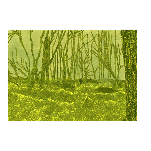
Photo


The idea for this scene was to show what trees are often used for so I had to make the objects separately in Photoshop. I started by using shapes in Photoshop to create the outline before coloring them in. The cupboard was made up of squares before I colored it and is based of my cupboard the only difference being that I replaced the handles from knobs to bars so they could be seen better. The bottle was made up of three squares and a circle because I wanted it to be different to the oil l used in the last scene as they come from different sources. The paper was just one square that I put the actual tree that it would turn into on it. Due to how the art style works I had to make these black and white like the background so I used much darker shades so they wouldn't blend in.
0 notes
Video
tumblr
The original idea was to have the trees literally be shown turning into the objects using Adobe animate. However I deemed this to be to difficult as that would mean I would have to animate it individually for every tree which would take to long and I didn't think it would fit in with the art style. So Instead I had the idea of animating smoke to obscure the tree and then replace it with the object. For this I used Photoshop to create a frame animation that is like a cell but uses layers instead. When I first tried this there where not many frames which made the effect to quick. To fix this I added more in betweens which increased its duration. The background is green so it can be used as a green screen in After effects.
0 notes