
Christopher Bravata - Design Survey Journal - Fall 2020
Don't wanna be here? Send us removal request.
Statistics
We looked inside some of the posts by chrisb-design and here's what we found interesting.
Average Info
Notes Per Post
1
Likes Per Post
1
Reblog Per Post
0
Reply Per Post
0
Time Between Posts
7 days
Number of Posts By Type
Text
15
Last Seen Tumblr Blogs


Fun Fact
12.7% of mobile users access Tumblr.
Text
Week 15 - Final Thoughts
I am no fortune teller, not by design or by nature - however I am an INFJ; for whatever that is worth. A common trope of INFJ-minded folk is are keen ability to notice details and minute patterns; and use these to create a very accurate prediction of the future. So, I hope that the patterns and small details that I have picked up on will lead me to make some hopefully accurate conjectures about the future, as it pertains to the design world. The first prediction I have for the design world is a partial return to a more ornate aesthetic, synergized with key blocking found in modernism. The reason for this particular conjecture is based off of the pattern of ‘teter toter’ within the realm. The concept of deep ornate detail has its origins in parity with the beginning of ‘structured’ design. Then came along the modern movement with the Bauhaus and such - introducing color blocking to the likes of De Stijl with typographical rules only Behrens could conspire. While an obvious transitional period occurred, these two were shining examples of a stark departure from the ornate past; and there was minimal time spent in between exploring the between of the two aesthetics. Only now do I see the third phase, often the final phase, where these two stark systems collide in synergy on scales that we have not seen before. I cannot pinpoint how it will appear, though I know its presence is imminent. Another prediction I suppose carries on the principle I stated before, however it extends further into the realm of digital interfaces. User interfaces have evolved quite a lot in the short span of time that they have existed; and they will continue to do so in reflection of the rapid changing ecosystem that our technology revolves within. This prediction is the introduction of ‘neumorphism’; a synergy between the life-like interfaces (best seen with iPhone OS 1 - iOS 6) and the more recent flat approach (best seen with iOS 7 - present). I’ll use Apple as a key example of this, as often their design choices do set the benchmark for the entire market at hand for user interface. Note the threedimensionality of iOS 6, with its shadows, fractals, reflections, and so on; with textures and detail to mimic the real world - even going as far as to make the calculator app a near digital replica of Dieter Rams’ ET 66 calculator. When the stark change in iOS 7 appeared, many were dismayed - myself included. I eventually grew back, grew to appreciate some aspects of it - however I will reserve my iOS 7 critique for another day. At the crux however, these two styles came to be because one was ‘too much’ and the other wanted to be the antithesis of it. Now that we have been saturated with it for quite some time, they are slowly evolving together. This is best signified with certain three dimensionality of iOS 14 (very few elements, though present - including the tab picker element), but rather the strong three dimensionality of macOS 11’s new iconography. While the three dimensionality only extends to the icons (for the most part, and some aspects of the menu bar & new control center) it is a definite three dimensional departure from the flat iOS 7 style. It is a clear return to what was before, but still diverging from history and charting its own path a new. It is obvious to me, at this point, that iOS 15 will follow this style and expand upon it further; the drawn of a neumorphic style is soon to be on the horizon. In building off of the neumorphic approach, I believe it itself will lend to the proliferation of AR design within the world. I still hold doubts for AR googles, glasses, or such - though I do see certain holographic like experiences and more trans dimensional experiences within design taking a new approach. And this will be signified with the neumorphic aesthetic; mimicking the affects of the environment on elements and interfaces, however clean and sanitary from baggage of old styles, more resembling modern principles. I am unsure how this AR trend will evolve in the current era, though I can tell it will be significantly aided with the implementation of precision location technologies - including LIDAR and Ultra Wideband communication standards. I feel that we will likely move closer to 2.5 dimensional interfaces (interacting on a three dimensional plane - ie glass pane + gestures in the space above/in front of it) with representation on the glass pane two dimensionally. I cannot pinpoint how this execution will work, though that is rather light prediction on its execution, though I firmly believe that AR will definitely become more prominent in the future of personal tech; and in such, AR related design - including the neumorphic aesthetic will need to be present to convey appropriate behaviors and interactions.
0 notes
Text
Week 14 - Personal Choice
Oh, the freedom to discuss design openly. This I could take and run with - I duly miss the opportunity to simply discuss it with others *sad pandemic tears*. So let’s get started, shall we? One aspect of design in which I am constantly fascinated with is the idea of immersive design. No not virtual reality, no not augmented reality either. It is the principle that design, so well refined on multiple facets within a single interaction - is so immersive it feels almost magical. It is hard to chronicle who has achieved it, for it is such a rare concept within the design universe. This ideology of design is something that I chase with every fleeting effort as I study here at the University of Milwaukee. And from what this class taught me, I am not independent in this pursuit of an all encompassing design philosophy. It spawned from Peter Behren’s “total design control” when he worked as the artistic advisor for AEG. This influenced Walter Gropius, a major figurehead in the history of the Bauhaus. A titular concept from the Bauhaus was ‘gesamtkunstwerk’ - the ideology of a total work of art; encompassing all mediums. In Gropius’ mind, architecture was at the core and all other arts would spur from it. I can understand where Gropius derived this ideology, however I to feel it is fundamentally flawed to perceive architecture at the ultimate core. I will refer to the total work of art as an ‘Entity’ - for the whole German word is too much to retype without typos. I believe that this total work of art does not have one particular central core, as each ‘project’ in which design is contracted to be done can have multiple ‘jettisons’. An Entity for a coffee brand may not stem from the architectural identity of a coffeehouse, but rather the curated vibe and aesthetic that many come to imagine when visiting one. An Entity for a travel brand must rely upon its medium of travel and the experience it creates rather than on one particular region you can travel to with it; as that would be bias within a travel brand (not desired, however some cases do occur). It must be understood that these Entities must be living design structures, an interconnected web of design that touches each facet of the artistic medium in varying quantities. Some Entities do not architectural elements, others rely greatly upon it. And when all of the elements within a design Entity culminate ever so carefully into a way that strikes such a chord - it simply feels magical, as the pure rarity of its existence channels the aura of fantastical realities. Consider this: an entity for a coffee shop, lets say Stone Creek Coffee (particularly the great Downer Avenue location only four blocks from Mitchell Hall), has a well curated aesthetic within their shops, which coupled with the often found jovial staff actually makes each visit a delight. They place so much detail into every little notion, the “recombobulation area” to the very nice and open outdoor seating space - every visit is purely bliss. Certain constraints cannot be avoided however, including the point of sale area/time. I would certainly like to see some (or conduct some myself) interaction design research on how to better improve that experience. Too often is the whole point of sale/transaction slow, putsy, and boring to be around - so it would be fun to imagine what it could be, and potentially explore a real world experience. Simply put, I want to immerse myself within the discussions of design - to which this one way outlet will not permit, sadly. I hope that when this pandemic concludes that I can reengage with fellow design students who think similarly - and maybe even think design wise for the university in which we all attend. I certainly can imagine many improvements that are largely design-based, that contribute to the aesthetic, the vibe, and the culture here; as they are purely put - the most neglected, yet talked about aspects of design.
0 notes
Text
Week 13 - Digital Aesthetic
In opposition to the Machine Aesthetic, a feeling/style that derives from the “primitive” style from the days prior, the Digital Aesthetic was born. Here now exists a style that is comically considered ‘pure’, without perfection; when in fact some may even say it’s virginity be the actual imperfection. While I believe that the smooth and pure style of the digital aesthetic is quintessentially the very texture that it beholds, I am not here to debate that. I am here today to depict living proof of such; and in doing so I will focus on the critically acclaimed video game (that has taken many hours of my life) Minecraft. While the video game inherits textures and depicts ‘imperfections’ of the natural world, everything within it conforms to a STRICT 3 dimensional grid structure. Every block cannot be offset, not even by the slightest. Every object conforms to this perfect grid; aligning with the digital aesthetic. Furthermore, while this video game aims to mimic the dangers of an unexplored world (while providing a canvas to create whatever crosses the imagination), it does so only in a simulation. There are options to enable or disable these simulations - thus creating a pristine, perfect, world that conforms to the digital aesthetic even further. Another example of the digital aesthetic in the modern world would be the brand style for design products such as Sketch. Sketch, a Mac application that specializes in vector user interface screen mockups, leverages the digital aesthetic to further convey the purpose of their product. When developing applications, designers must create multiple variations of an interface - often with minor adjustments across the table. These are created with mathematically generated graphics (vectors) and often are duplicated in large quantities. For the most efficient work environment, no unneeded details or textures are needed - thus pristine and smooth like the digital aesthetic. This is translated into the brand identity of Sketch with their pristine and smooth gold diamond logo, which recently was updated to include a background for the macOS Big Sur update. The background only further hits the nail on this digital aesthetic, as it includes an extremely abstract representation of the user interface for the app. It also integrates a blur that is mathematically generated depending on the various backgrounds it goes on. Leveraging the computational ‘perfection’ of computer graphics is at the core of why the digital aesthetic is ‘clean’, ‘pristine’ and/or smooth’.
0 notes
Text
Week 12 - New/Interactive Media
In the past 20 or so years, interactive design - especially digital-based interactive design - has evolved in rapid ways. While the desktop computer interaction evolved in its own right, progressing with milestone after milestone; the mobile computing interaction evolved with a giant leap. That giant leap was the introduction of mainstream touchscreens, brought to the public by means of the iPhone. From utilizing styli, d-pads, and more to interact with the screen, the introduction of touch screens eliminates any of these mediums for interaction. To touch the display - the virtual elements - without any buffer was singlehandedly the most vital aspect in this ever continuing evolution. Another monumental impact on interactive design, more recently, would be the widening market of wireless products. Avoiding the clunk and clutter of cables wiring around the house like TRON gives a truly liberating experience. However, a large caveat with this wireless experience is conveying the “connected” state between two or more devices. No longer is there a long cable to undoubtedly identify two connected devices; this creates a need for clear design that conveys connection without the physicality. Many have tried to accomplish this, few have succeeded. One to watch out for more recently is Apple’s Automatic Audio Switching, where users with W1 chip equipped headsets (AirPods, Beats, etc) can switch seamlessly by not worrying about connecting devices. Their system rather lies on active states of devices (ie AirPods are ‘active’ when in the ear), paired with a uniform media player across macOS and iOS. When a user plays media on one of their devices within this uniform media player, the system then connects to whichever active headset is being used; if none are being used, then sound is played over the speakers. For the end user, they never have to consider connecting their devices again; they can just focus on what content they want to watch and simply press play. This kind of ‘just works’ interactive design is a definitive Apple characteristic, from the iPod, iPhone, and now to the AirPods and the interaction between each.
0 notes
Text
Week 11 - Graphic Design
The expansion of the role in which we deem ‘designer’; that is what I perceive the “Citizen Designer” to be. No longer does the limitations bound a designer to that of the graphical, industrial, or architectural mediums. The more broad scope places an emphasis on the systems that communicate the interplay through our society. The layout of roads within a city is not technically industrial or architectural; however it does require a concerted design effort to maximize the overall experience. While the burgeoning age for this ‘citizen designer’ has passed, we are living in the realm in which it has proliferated our daily interactions; not quite the full realization - though very much along the trip to such. My perception of it considers this a graduation and a recognition. To much of the corporate world, ‘good design’ in their eyes is whatever generates the largest revenue. We designers know this can be true, it is by means not the whole construct. I will not digress into a definition of good design, however the precedent should be set - interest and revenue are byproducts of good design. As for if this practice of being a ‘citizen designer’ where more nuanced aspects of society, including the actions and behaviors, are designed to play in concert with each other is a good practice - I believe so. To design a good ecosystem for citizens to interact within is crucial; in fact it can serve as the launchpad for more designers of other facets to ‘blast off’. At the crux of design, is the critical eye for how things work; a strong analysis of interplay and affect. If anything, applying this mentality or practice - design - onward to ourselves and our societies, is moreover merely the next evolutionary step in the growth of this practice and ourselves (as humans, creators, designers, and more) as a whole.
0 notes
Text
Week 10 - Graphic Design/Typography
Typography has always been a deep interest of mine; from the days of scrolling through the font list in Publisher on my mother’s Windows XP desktop, to the time I made a custom font for my rec-league basketball team - granting custom styled names and numbers. Many of my notes for this reading are scattered about - ranging in various subjects and anecdotes; I will try to provide some coherence, however there may not be the strongest connection (outside of the general typographical subject heading). After first reading about the Bauhaus earlier in class - one aspect that I took to heart was Bayer’s case for single-case typography. He claims that uppercase letters are ‘superfluous in the age of scientific management’, single-case letters are both easier to learn and read, saves on costs, and an apparent increase of clarity and legibility. Much opposed to the note in lecture of how people on the internet often enjoy utilizing all capital letters - which appears as shouting (however some say its more authoritative and commanding). In either capacity, I have relegated to single-case typing/writing my own personal notation and general communication. In instances where I want to place emphasis, I’ll underline (in writing) or bold (when typing). The natural curvature of lowercase letters, over the angular stature of capital letters, allows a more humane and friendly perception. I almost never shout in person, therefore it makes sense that I want to reflect that element of my character within my nonverbal communication. Obvious exclusions to this practice exist however, primarily within the realm of professional and academic writing - as is this journal post. To compound on this, I learned of the concept of rubrication; the act of showing emphasis by the use of coloration (when underlining/boldening was not available given the limitations of typography in the very early ages). While I often dispose the concept of color fonts, I do think there can be a place for rubrication in the modern age - with dynamic two-tone glyphs. Enabling an uppercase letter would subjugate a rubrication of the same glyph - drawing emphasis without distorting the actual figure; a color that would be variable and definable based on the context of the medium. Some more anecdotal thought are included below: - New York City is the ‘ultimate modern city’, the pinnacle of urban modernism. - Sans Serif is indispensable, for it is the only type capable of expressing the spirit of the machine age - The principle of Learning from Las Vegas, that is “the case that architects should pay attention to the ordinary buildings - the vernacular architecture - that surround everyday life” should in truth be extrapolated into all design practices.
0 notes
Text
Week 9 - Industrial Design
While the efforts of industrial design within Milwaukee were not ancillary to the grand progression and influence of industrial design, many aspects can be said to operate in parallel, or within its own bubble. The efforts directly of Brooks Stevens, are more ‘bubble’ like than anything else. To plainly put, he saw Milwaukee as the location to be; over New York City (or any other burgeoning design hub at the time). There were businesses, industries, and more that needed quality industrial design; to which Stevens provided. Frankly put, Stevens chose the local route because design is not exclusive to the market of New York City. Smaller businesses (that can equally benefit from quality design) will not have the resources or opportunities to contract, communicate, or interact with pioneering industrial designers - especially in the earlier 1900s. I’d rather not consider Stevens efforts sacrificial; that in the light of his career when he could’ve gone to New York City, and likely make a name for himself. He chose his home town because the business was there, and likely he saw something in Milwaukee too. It is important to note however, he did not bring industrial design to Milwaukee, or the midwest for that matter. He was not the harbinger of industrial design in this neck of the woods, however he was a strong signal and proponent of quality design (be that industrial) to the Milwaukee region. Despite all of this, his impact on the regional, national, and global scale should not be miscredited. While there is no byline for designed products often on the market, more often than not - you, your friend, or some stranger has seen his work, or a direct derivative of such. He introduced the idea of a wide-mouth peanut butter jar, born out of his desire to not waste one of his favorite foods. He also designed the iconic weinermobile, seen across the nation. Stevens also worked with many globally known Milwaukee brands, including Miller, Harley Davidson, now defunct Milwaukee Road, and more; bringing quality industrial design to the masses, right from The Good Land.
0 notes


Text
Week 7 - Architecture (Universal Design)
The seven principles of Universal Design are a foundation in which quality design can spawn. They are a guideline that defines a certain experience so that it remains uniform for everyone, regardless of language, intellect, mobility, or other defining factors. In all instances, I firmly believe that many of the products released by Apple provide an exemplary model for these principles of Universal Design. A great example of this is the iPhone - particularly the first ever. From packaging, to general usage, the iPhone was - and continues to be - a gold standard for how mobile devices must be simple and intuitive to use. The most iconic element, which was at the core of this simplicity, was the Home Button. It was the only front facing button - contrary to many other handheld phones at the time. It also bore the name “Home Button” - a simple name that paralleled the comfort and clarity that comes with one’s own home. Further demonstrations included a skeuomorphic user interface, an aesthetic that digitally replicates real world objects, so that users would not be alienated by the touch screen. Apps like Notes had a notepad texture, Voice Memos had a classic decibel dial, and each button was shaded like a real one. Another example of how Apple demonstrates these principles of Universal Design is within their retail stores. Like before, technically the Apple Stores can satisfy each of these criteria - however I will focus on the Size and Space for Approach and Use factor specifically. For anyone who has had the opportunity to visit an Apple Store, these venues are far different from a Barnes & Noble, H&M, or Auto Dealership. Gone are the large specification sheets, racks of products, and aisles of goods. Ultimately, they clutter and confuse the guest - this Apple knows. They instead fill their stores with open tables, with wide spaces in between. Some newer locations even feature outdoor parks out front (Apple Hilldale in Madison, WI for example) or seating in the back (Apple Mayfair in Wauwatosa, WI for example). These open spaces, with room to mingle and pass through create an ambiance that is both welcoming and inviting; but also accessible. To argue from memory, I would believe there is more room between the tables, than there are the width of table. In fact, there is ample room for people who crutches, wheelchairs, and more to fit in-between these tables. One could argue that this is a defining symbol of how much of an emphasis Apple places on their guests - which is certainly a plausible conclusion. Lastly, as indicated earlier, these stores do not have specification sheets for the guests to read; as most guests don’t know how to interpret or understand what all of it means. Apple has more employees throughout their store that serve as these specification sheets - translating technical specifications into terms that each individual guest can understand. In fact, this specification translation could also sate Perceptible Information, Toleratance for Error, and Low Physical Effort qualities of Universal Design as well. I’ve said it before, and I will say it again - Apple continues to be one of the few gold standards when it comes to fulfilling the Universal Design guidelines, in a meaningful and intuitive manner.
0 notes
Text
Week 6 - Architecture
Notes on the Fiserv Forum
Opened in 2018, the Fiserv Forum has become the penultimate gathering space for all of Milwaukee. It possesses a very iconic figure, the swooping roof/side, that some have even compared to that of our president. Regardless - this unique figure, complimented with the vast, geometrically arranged, windows makes this building a clear work of modern architecture. Emphasis is placed on the materials, letting their textures - like the brown zinc panels - really become the defining and recognizing elements for this building. Inside, the building is almost museum like - with white walls nearly everywhere. It feels very sanitary - however certain inclusions of wood, more zinc paneling, and artwork give the interior space a more cozy, homey vibe. In all, the building was designed to handle a lot of people - coming in, enjoying the event, and going away. While it has a grand entrance - that is the east-facing Atrium; I do feel that it struggles with providing enough ingress/egress points. There are two dominant entrances for the whole building; with a third more reserved (specific club access + ADA entrance). There is no entrance to the building on the southwest corner - by one of the two primary parking structures. Maybe there will be an opportunity for expansion in the future, however it seems unlikely. Regardless, it is a high quality venue that balances the simplicity of modernist architecture with a cozy feel - and to that, I am grateful.

Germania Building - Westown, Milwaukee

Third Ward Canopy Buildings - Third Ward, Milwaukee

The Wells Building - East Town, Milwaukee

Colectivo on the Lake - Lakefront, Milwaukee

University of Milwaukee Mitchell Hall - Downer Woods, Milwaukee
University of Milwaukee KIRC Hall - Downer Woods, Milwaukee
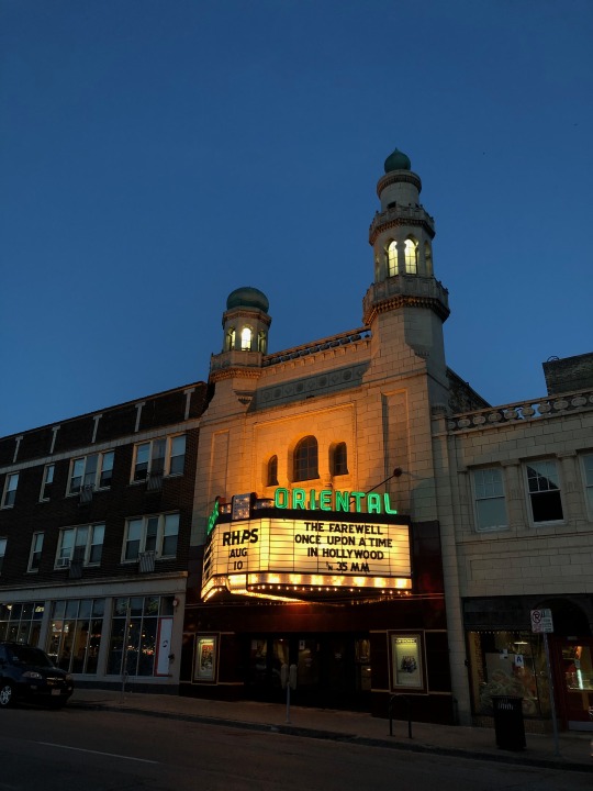
Oriental Theatre - North Point, Milwaukee

City Hall - East Town, Milwaukee
The Commons at Marquette University - Marquette, Milwaukee
0 notes
Text
Week 5 - History of Design

Image from Tread of Pioneers

Screenshot taken of Tommy Bartlett Show Facebook Page
To recreate the essence of the carnival atmosphere - that was the goal of the vibrant and cluttered poster for “The Barnum & Bailey Greatest Show on Earth” - which translates into the modern age with Wisconsin Dells’ “Tommy Bartlett Show” (p42). Key design elements like large skiing men and bold red lettering remain a constant across the ages. In contrast, the Tommy Bartlett Show has a more standardized and imagery based advertising medium - given the modern advances in technology. No longer needed are the posters of the ‘Barnum & Bailey’ past, for it has now translated to Facebook, Twitter, and other internet pages.
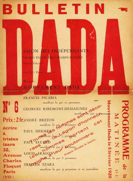
Image from Pinterest, Bulletin Dada no. 6

Image from @Brewers Instagram
In visual terms, the translation of Tristan Tzara’s *Bulletin Data no. 6* to the Milwaukee Brewers’ social media style is undeniable (p133). The bold typography, contrasting colors, repetitive format, and geometric arrangement are all present. The ‘in your face’ aesthetic - that is of Dadaism - works really well in this case, conveying the key information in an organized, geometric arraignment. Furthermore, contrasting bold type draws the viewers attention to where it matters most - and effectively drawing out the key aspects of their messaging. On the contrary, the Brewers’ social media does not share the same level of mockery, irrationalism, or humor that was often integrated with Dada.

Image from Mutual Art

Image from Pinterest, Cafe Bustle Classic Packaging
This instance may be more of a hybrid; Cubist/Abstract illustrations guided by the colors of De Stijl is the coffee packaging for Cafe Bustelo - seen on shelves of supermarkets worldwide (including the Metro Market on Oakland Ave). While their new packaging has drifted from some of their more abstract roots - their earlier designs featured many lines, triangles, and a very abstract representation of a woman sipping a cup of coffee. This geometric approach, stark shadowing, and limited color palette is also shown in *Pressa Köln* by H. Nöckur (p 263). Additionally, all of these designs feature the very identifiable primary color color-scheme of De Stijl - however it can be argued that it is more correlation, rather than delineation in this instance.
0 notes
Text
Week 4 - Found Object
Taking many forms, squiggles, and hoops - the simple bike rack has an ominous presence in our society; especially upon any college campus. Its figure can be a loop, a hoop, and even a swoop - or something completely different. However, the figure must maintain a hole - for a lock to loop through and serve its purpose.
There are countless bike racks throughout campus, Milwaukee, and beyond - so I will narrow down my selection to the newly installed bike racks outside KIRC. An individual bike rack seen there is of the upmost simplicity; an inverted U fastened to the ground with four bolts. The rack’s pole seems to be about an inch and a half thick; maintaining consistency throughout the entire hump - akin to a macaroni noodle. It features a unibody design constructed out of steel - with no paint or finish to detail. This simple construct is peak utilitarian design - it serves its purpose very well, with no garnish to convolute it. Sometimes witnessing these bike racks within a series can create unique and appealing patterns that enhance the environment around them. Since the racks outside KIRC are placed with precision and bolted to the ground, this is a great example of this visual pattern; however there exists another bike rack not to far that expands upon this premise far greater. Look no further than a handful of blocks to the south and the west to the intersection of North and Cramer - outside the Milwaukee Public Library East Branch. At the northeastern corner of the intersection lies a unique bike rack - designed by UWM professor Ray Chi. While both bike racks serve the same purpose, the series in which Chi’s is presented adds an artistic element but remains simple in form and function. The flair that he adds does not convolute, add complexion, or further hinder the end user’s interaction with locking their bike to the installed rack.
In all, the design of a bike rack is quite simple; however it should not be underestimated. For many commuters, the study simplicity that it provides - both in mind and in physicality - are what give it an edge over other forms of biking.
0 notes
Text
Week 3 - History of Design
* I hope I did this right - please let me know if I missed something *
Design Observation #1: Fiserv Forum

Design Observation #2: Orbit Key

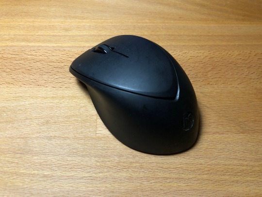
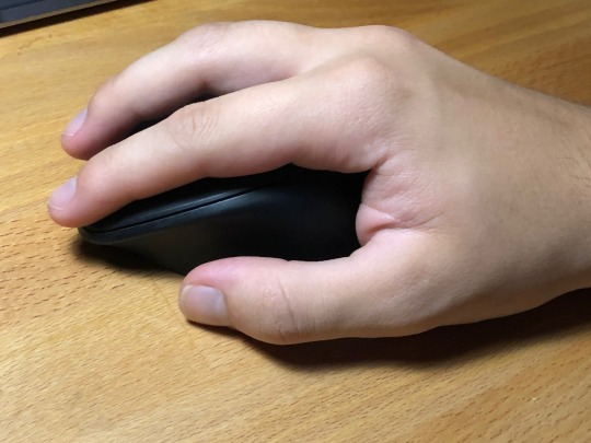
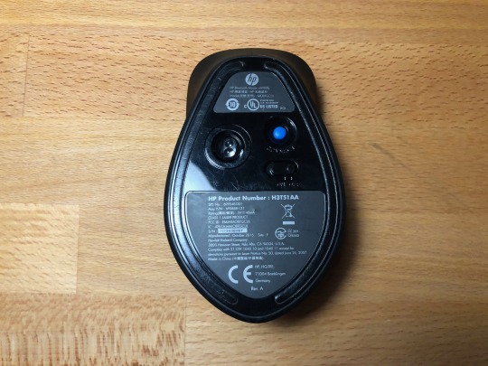
Design Observation #3: Wireless Mouse

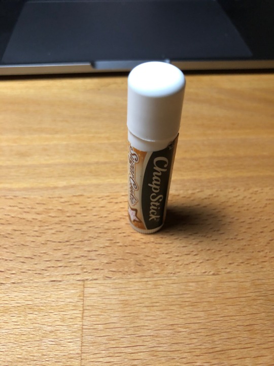
Design Observation #4: Chapstick Container


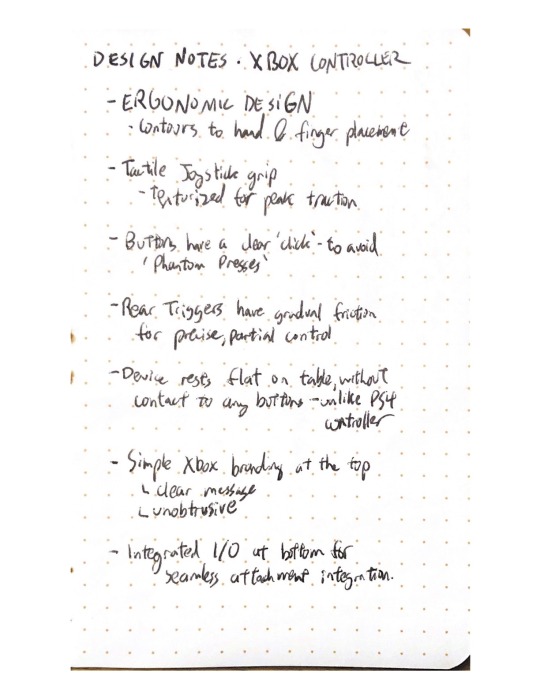
Design Observation #5: Xbox Controller
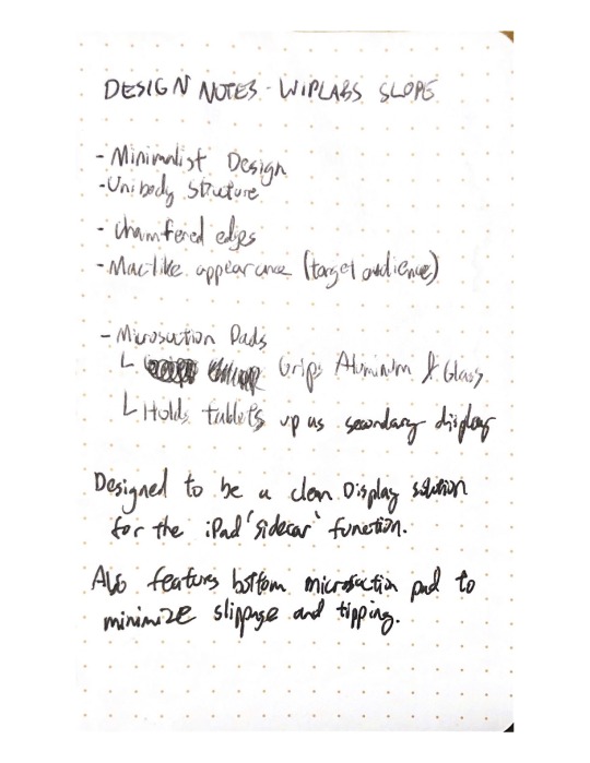
Design Observation #6: WipLabs Slope
Design Observation #7: Vitamin Container


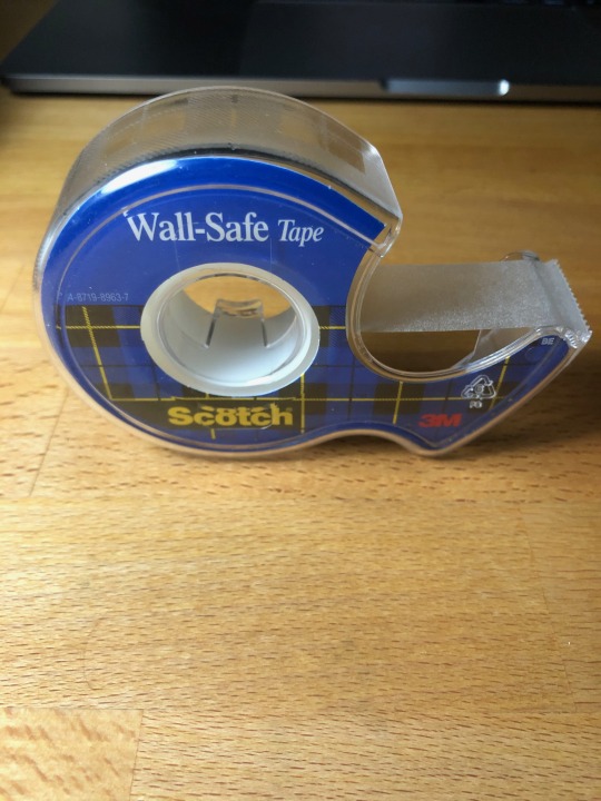
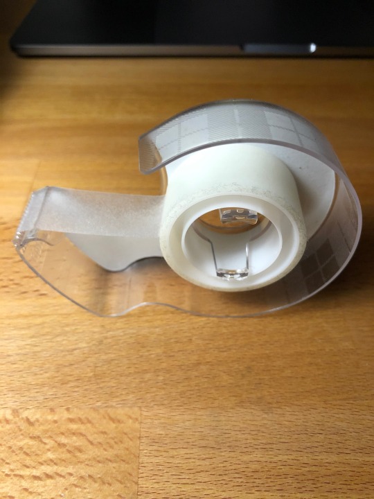
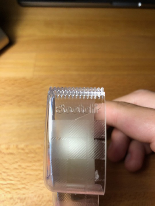
Design Observation #8: Tape Dispenser
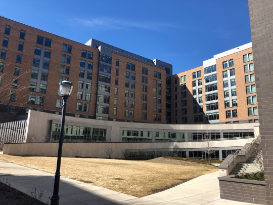
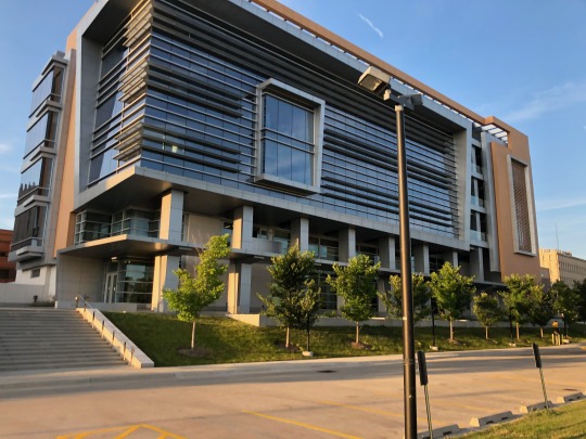
Design Observation #9: Kenwood Interdisciplinary Research Center

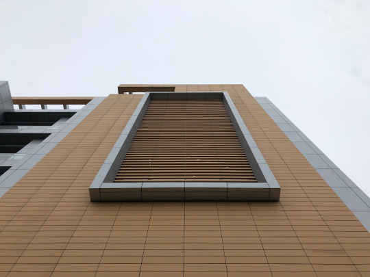
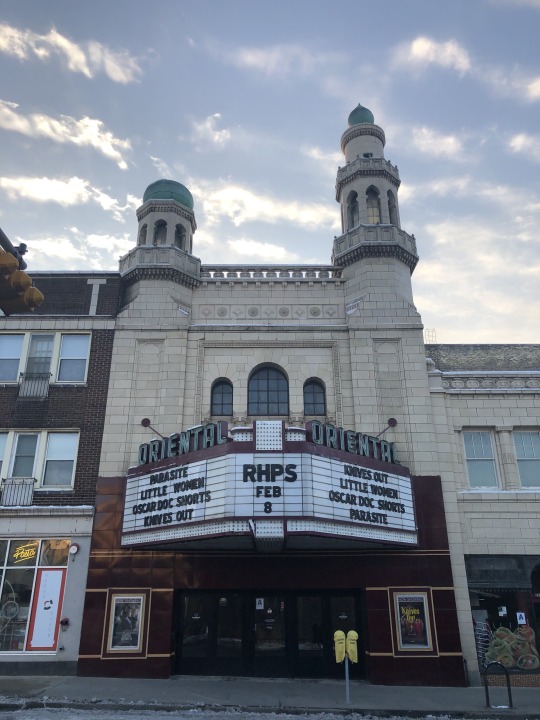
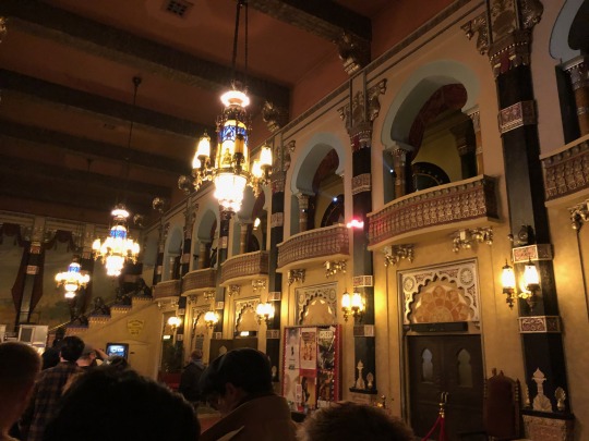
Design Observation #10: Oriental Theatre
0 notes
Text
Week 2 - Design Thinking
Design is a well thought construction of a product. It requires the constructor to consider many aspects of the product - its environment, its user, its context, its materials, etc - in order to develop the optimum creation that fits within its applicable constraints. One could mirror design to a driving race; anyone can drive along the race track from start to finish (hopefully). However, any average person would likely only earn an average time - not keen on noticing details or indicators, understanding the vehicle they are driving, and much more. In order to achieve the fastest time possible - the driver must understand the limitations of their ride (mileage), signals of the course (ie apex markers), and knowing when to slow down and accelerate before you arrive at a curve. In parallel, anyone can design - however it may not understand key traditions and practices, support all standards, or completely miss out and gravely cost the consumer or producer. A designer weaves through all the thick and thin, considers every angle, and skillfully elects the right course of action that will best serve the most consumers.
A great example of design thinking in a product that I use would be the recent trackpad implantation for the new iPad Pros. When iOS 13.4 debut earlier this year, along came official trackpad implementation for the iPad. One could’ve implemented a cursor - commonly how Android has taken this approach - but Apple delved deeper into the user experience. Apple skillfully designed a quality user experience that solves the grain of control issue that spans between desktops and tablets. This issue, is that mice and trackpads - primary input devices for desktops - have very fine and precise control; whereas touchscreens - primary input devices for mobile devices and tablets - have a much simpler element of control. Apple developed a pointer that shifts size, scale, and appearance to match the context of where it is being utilized. There is a whole 42 minute long video that delves into this design thought process on Apple’s developer website - linked here. I highly recommend watching it if you have the time.
In regards to the most significant concept presented in this weeks readings, it would have to be the many new job titles and opportunities for designers - and hybrid designers - in the modern economy. More now than ever, especially amidst this pandemic, is quality design and user experience/interaction design needed. Being able to create a product that is easy to understand for both a K5 student and a grandparent is a tough feat - but achievable nonetheless. Furthermore, designers now are being spread thinner than ever - often having to prototype code (ie Web Industry) or operate as independent (and sometimes individual) design firms for bigger companies. I’m extremely excited for the future where the CDO is a standard, and respected position, in a major company. Being able to live in a society that values quality and beautiful design much more than our present one does is major, and having the title of Chief Design Officer has quite a nice ring to it.
0 notes
Text
Week 1 - About Me
var myName = “Chris Bravata”; Console.log(“Hello World! I’m ” + myName + “!”);
Hello World! I’m Chris Bravata!
I’m a second year Design & Visual Communications Major here at UWM, where I am following my passion of design. I am deeply fascinated with design - and frankly, I can talk about it without end. However, that is not all of who I am; I share interests in photography, technology, and exploration - of cities and nature.
I taught myself how to code back in 7th grade - namely HTML, CSS, and JS. Endowed with that knowledge, I simply assumed that my career would be in computer science; for code - and its method of thinking, came natural to me. I didn’t listen to my innate actions, and it took the death of my very creative uncle for me to center myself and listen. Since his passing, I’ve centered my compass, and realized how similar code is to design - yet different. Both are languages with limitations and unique quirks; however both have bountiful opportunities that have no end in sight.
Inspiration for me is a direct synergy between the organic construction of nature and the almost ‘sanitary’ yet quirky process of code development. In both facets - simplicity is key, anything ancillary is eliminated, and the ever refinement creates the most efficient byproduct. These are integrated into my practice innately - however more overt inspiration will come from the project itself. I believe design is sequential; a process built atop what was created before hand. In a more general quote for life and others; “don’t fret from your past - unless dire - for it is you yourself, and you cannot outrun yourself”.
A cohesive design experience is the pinnacle for how I purchase many of my goods. While many can talk about how well designed an Apple product is, which it is, it seems cliché for me to talk about something so commonplace. Rather put, I’ll mention my new Orbitkey - a key chain replacement that radially arranges keys, obscured by a sleeve. A rather simple product, but it solves two main problems: noisy keychains and ugly keychains. No-one enjoys a noisy keychain - clinking around on the table, in the pocket, or within the cupholder. Furthermore, it is hard to make a sporadic assortment of keys, often different in size and scale, look presentable and/or stylish. The Orbitkey solves this blissfully - looking good and serving good simultaneously.

Photo from Orbitkey.com
1 note
·
View note