Statistics
We looked inside some of the posts by circle-art-process and here's what we found interesting.
Average Info
Notes Per Post
15
Likes Per Post
11
Reblog Per Post
4
Reply Per Post
0
Time Between Posts
2 months
Number of Posts By Type
Text
9
Last Seen Tumblr Blogs


Fun Fact
Tumblr was created by web developers David Karp and Marco Arment.
Text
ZINE MAKING
A zine is a self-published work for non-commercial use. They can include any topic or theme.
I started by deciding on a theme. I decided on "Dark Academia." It is a social media aesthetic that focuses on literary classics, Gothic architecture, library settings, and the like. It mostly utilizes dark or muted brown palettes.
I planned out the content and layout in Photoshop.

I then made some illustrations using Clip Studio Paint.


I looked up some interesting photos and made a collage with Photoshop.

I finalized the layout and design and then proceeded to print it.

The images came out a bit dull. We didn't have the best printer nor the best paper.

I then trimmed out the white edges using a cutter.
Afterwards, I scanned the pages.

I bound them together with a stapler and done!
Wasn't quite proud of this one. I feel like I could have done better. I guess I am just lacking motivation and inspiration at the moment.
But it was quite fun to do too!
Approximate time: 7 hours. I suppose I am also practicing how to use Photoshop.
1 note
·
View note
Text
RECREATE YOUR MASTERPIECE
Fernando Amorsolo was a nationally renowned Filipino painter known for having rural life as his subjects.
I find Amorsolo's works really inspiring. He believes in painting the world in a warm and happy light, which is a fresh perspective from my pessimism. His attention to details, mood, and lighting was also super awesome.
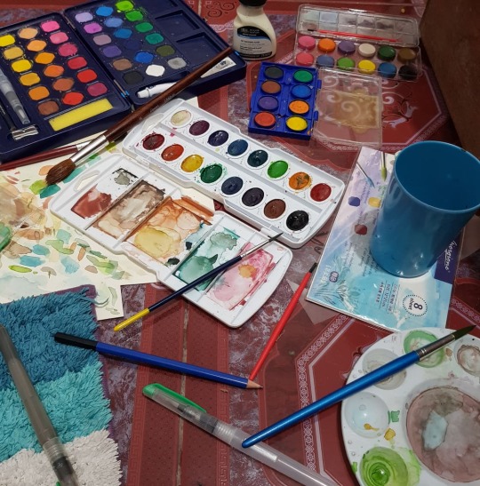
I was planning on using acrylic at first, but my range of colors were very limited, so I opted for watercolor, which I just realized have an ungodly amount of for some reason. I don't even paint that much.
I was thinking about doing something about the rural scene. Fortunately, I grew up in a rural area, which is currently in the process of urbanization. Luckily, I still have my childhood memories to hold on to.
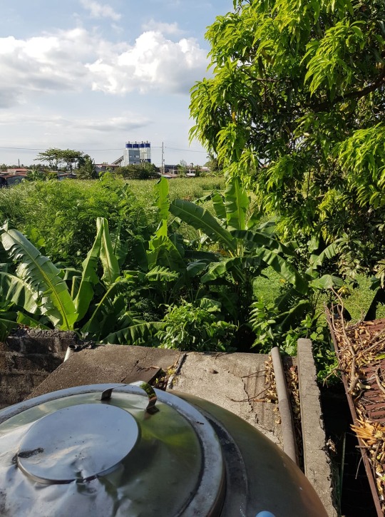
I took a photo from my backyard as inspiration. Some people used to tend to the area there, but they stopped for some reason. Now, it's overgrown with wild greenery.
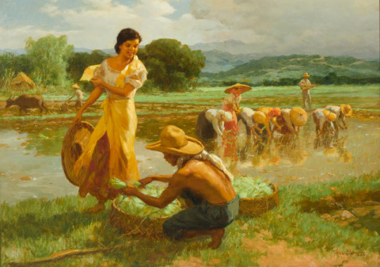
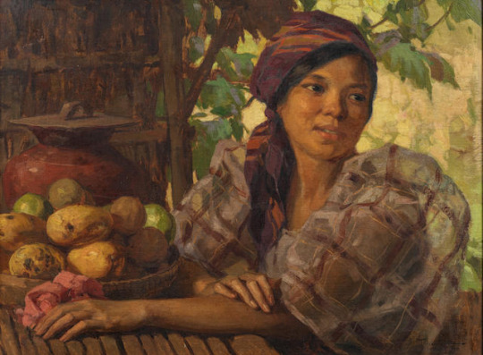
I then looked at some of his works for reference. The compositions look so warm and detailed. As expected from the national artist.
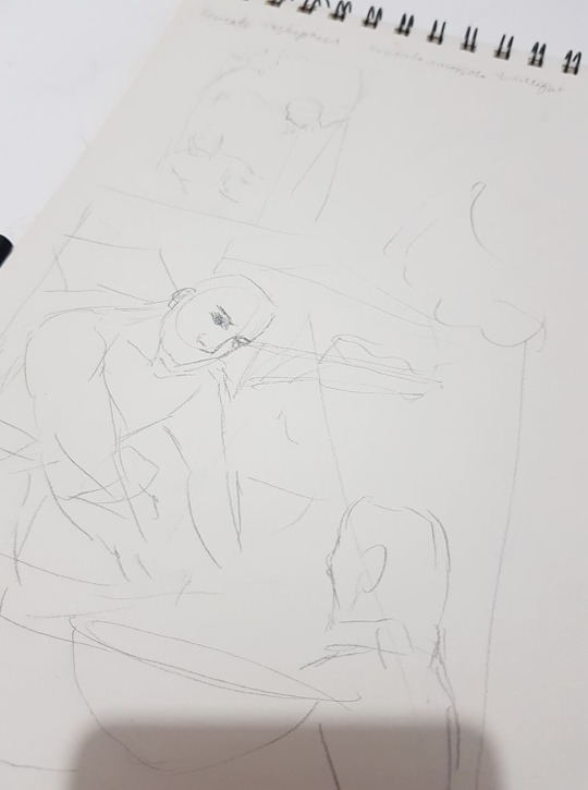
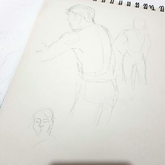
Next, I sketched out my ideas on my trusty sketchpad. At this point, it seems like only I could understand them.
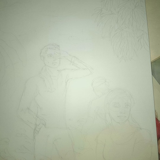
I then made a final sketch on my 12x18in canvas. I used a 5h pencil.
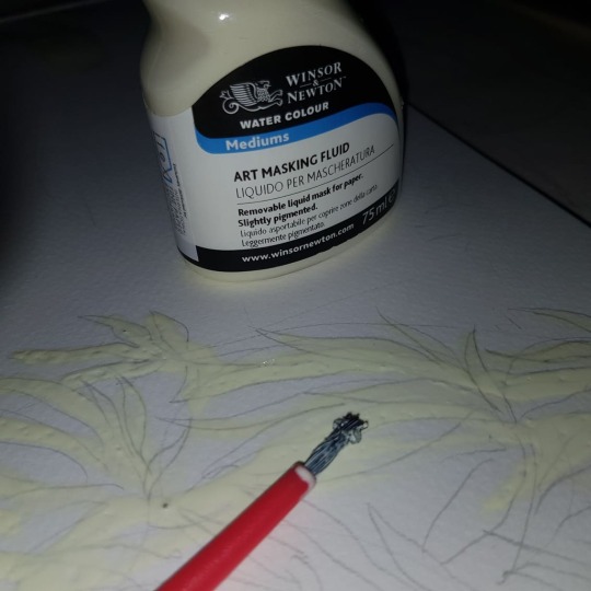
When I went to the Mall of Asia recently, I learned about the art store next to National Bookstore. I was thrilled when I saw the masking fluid. I saw it once being used by a fancy watercolor art account online, but I could not find it in any stores until then. It was exciting finally getting to try it.
I then watched some watercolor tutorials on YouTube and tried my best in painting.
And then I finished, but realized I took to long as it was already past the deadline.
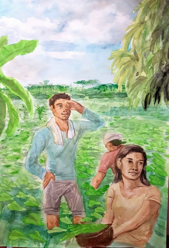
The painting is a family of three harvesting water spinaches (kangkong). The father is wiping away a sweaty brow, while the mother is holding a basket containing their produce. The son is working diligently at the back. Their clothes are a reference to the colors of the Philippine flag.
Of course, I could never amount to one of the greats. As of now, that is. I guess I failed at capturing the warm effect using color theory. I am pretty colorblind after all. This looks more cool than warm with all the blues and greens. The colors look a bit dull. I suppose I have my low quality watercolors to blame for that, or maybe it's just me. Despite all that, I'm still pretty proud of this work. I never knew I was capable of producing something like that traditionally.
Approximate time: Around twelve hours. Watercolor takes time to dry, but is very rewarding! I mean, look at those soft and blending effects. So pretty!
8 notes
·
View notes
Text
LETRAS Y FIGURAS
Part 2 because apparently tumblr only allows 10 photos per post.

Some boatmen at the beach fixing boats and fishing nets.

A taho vendor that I look forward to during my childhood mornings. He sometimes sells strawberry flavored ones in the afternoon. Yum!

A kid on a tree. I remember climbing trees as a kid. My mother didn't want me to but I did anyways. The view was nice.

A man lifting a coffin. I've been to many funerals. I don't know or are not close to most of them. But I have seen people grieve. I can't imagine losing a loved one.

A carabao carrying a variety of items on its back. I remember being so fascinated by them when our car passes by them on the street. I wonder where they went.

A girl singing karaoke. People in our neighborhood enjoy singing karaoke during parties and events. I must admit they are pretty good.

A girl and a cat. This was my high school classmate. She liked petting cats. I drew her for no particular reason whatsoever.

An old lady carrying groceries in the rain. She is signaling a tricycle driver for a ride home.
1 note
·
View note
Text
LETRAS Y FIGURAS
Letras y figuras (letters and figures) is a type of art or painting that emerged during nineteenth century Philippines. It involves figures that form up the letters of an upper class Filipino name back in the day.
I started by researching inspirations and references from the internet. There are so many detailed ones. So pretty!

Following that, I grabbed my sketched and drew my initial ideas and designs. It is very much inspired by my experiences growing up in the Philippines.

After visualizing my design, I then sketched it out on my computer.

Following that, I finalized the linework for my letter figures.

I also added some color and details.

I then painted the background, which took up a lot of time. I also took note of how the light colors of the background should contrast the darker colors of the letter to make them more visible.

The top background is the street I grew up in. The lower one is the beach near our place. They both hold many memories.

And here's the final product. I forgot that it needs to be in an A3 dimension so I resized it.
This activity really made me reminisce about my past and experiences. I am quite fond of them and sometimes wish I could go back to simpler times.
Approximate time: about eight hours or so
Scroll below for an explanation for each characters.

My cousin playing with our cocker spaniel dog who got lost and never came back. His favorite toy was a red chew toy in the shape of a bone.

A couple of kids playing street games. I remember playing them and having so much fun.

I was a ring bearer at my godmother's marriage.
2 notes
·
View notes
Text
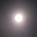
IMPRESSIONIST ART
Impressionism is an art movement in the 19th century that emphasizes on visible brush strokes. In its time, it rejected the traditional art forms people have considered true art.
It has been a while since I laid my hands on a brush. I’m really nervous, but also really excited.
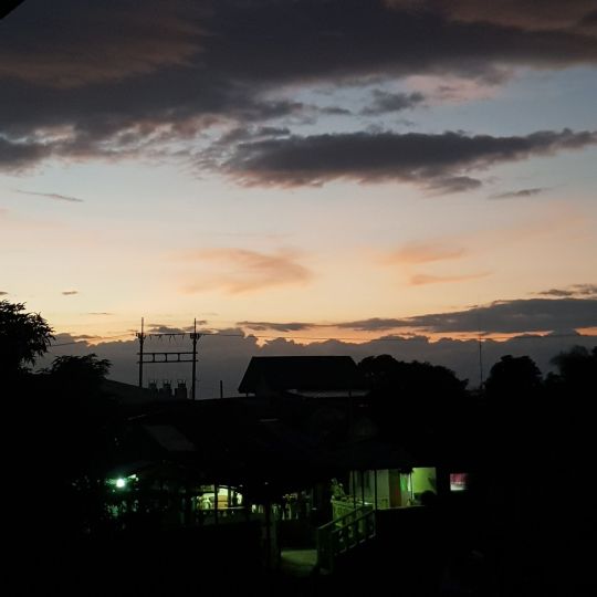
I started by picking out a photo. It was a photo I took with my phone on a sunset.
I then placed tape on the edges because I’ve seen other artists online do it.
I then laid out a base color using acrylic. It was my first time using acrylic so I just had fun with it.

I then added some details.

The image did not translate well but it had a charm of its own.
I also decided to create more.
I wanted to paint the moon.
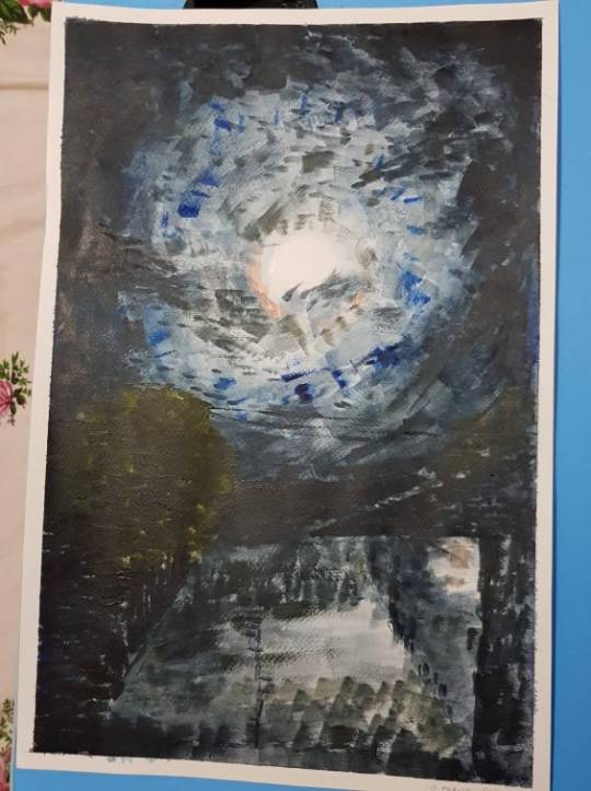
As a final attempt, I referenced a photo with proper lighting from the internet.

This was really fun and relaxing to do. Less stressful than realism. Although, it is a skill I would like to master someday.
Approximate time: An hour per piece. Not too shabby for a first time.
0 notes
Text
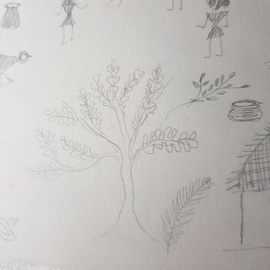
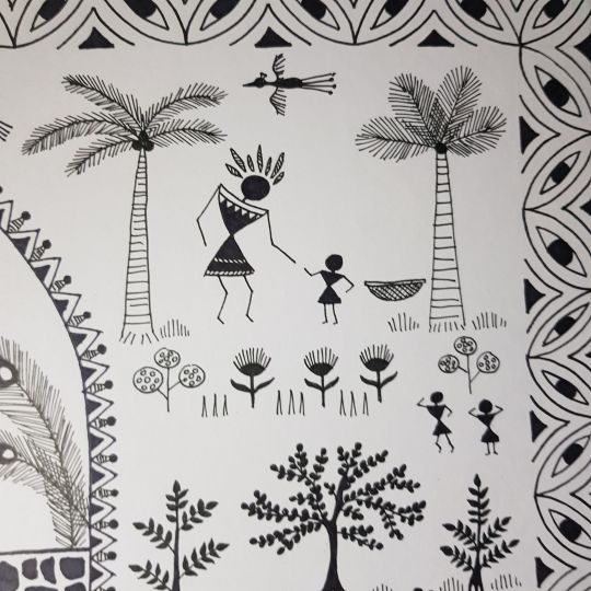
WARLI ART
Warli painting is a form of tribal art that originated from India. It is mainly characterized by geometric shapes and patterns, usually with themes of fertility and the village life.
I started by looking up warli paintings online and took some designs and styles that I liked.
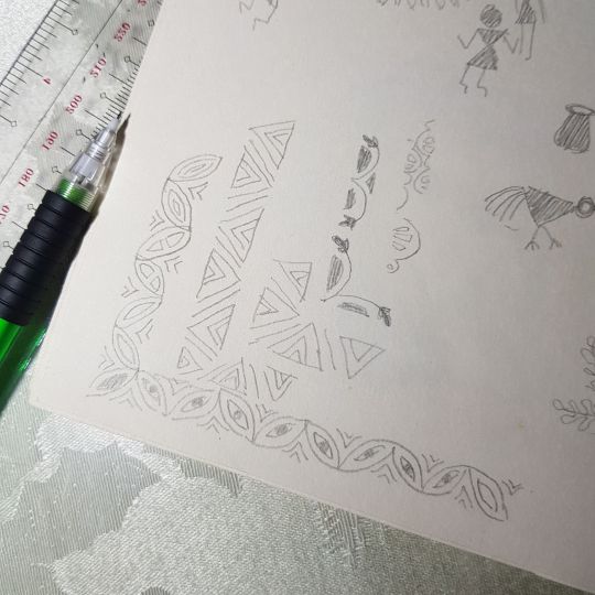
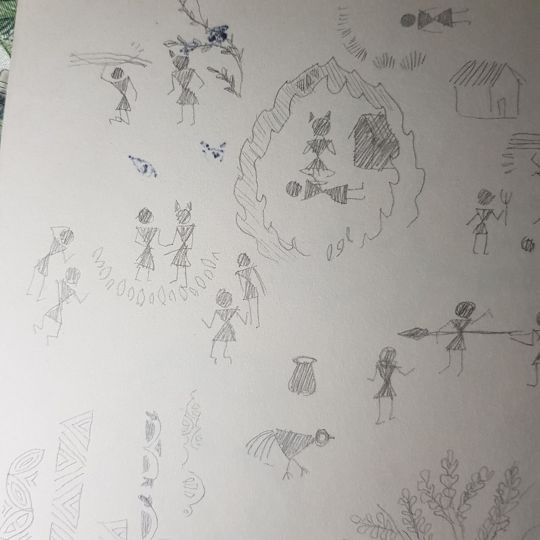


I then sketched out the design and the story I have settled on.

I trimmed my illustration board into an A3 sized one.

I then sketched out the border design. Flowers and scopophobia were my inspirations.

I inked the border with a 0.5 pen.

I erased all the pencil marks and then proceeded to sketch the composition.

I started inking with a 0.3 pen to accommodate the finer details.

After inking, I erased all the pencil marks.

It was really challenging to create a piece that was so simple yet so detailed and complex. I really enjoyed drawing the chickens the most.
Approximate time: Seven hours. I’m a pretty slow worker.
You can read the story below.
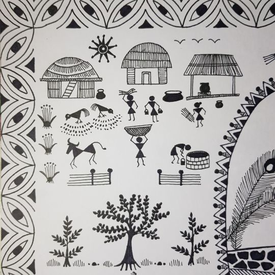
In a small village, a small hardworking community thrived. There was a person whose job is to collect fruits and vegetables in the forest. One day, the person fell too deep in the forest.
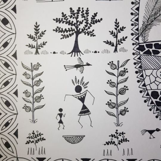
Deep in the woods, the person met a mystical giant. The person and the giant frightened each other. The person pleaded for their life. The giant apologized and told the person that they were lonely and were looking for a companion the the deep forest. The giant only had birds and beasts to play with for decades.
The fruit gatherer promised to meet up with the giant every week as long as the giant doesn’t come to destroy the person’s village. After some time, they grew on each other and enjoyed each other’s company. The giant asked the person to stay in the forest forever with them. The person hesitated and then agreed. The person told the giant that the person must return to the village one last time to let the villagers know of their departure. The person kissed the giant’s cheek and said that they would be back.
That same day, townsfolk were sent to look for the fruit gatherer since they have been gone for too long. Two of them witnessed the fruit gatherer communicating with an evil giant. Out of fear, they ran back and reported that the fruit gatherer was conspiring evil with a giant monster.

The townspeople were horrified and enraged with the fruit gatherer’s traitorous act. Upon the fruit gatherer’s return, the person was confused as to why spears were pointed. The angry folks dragged the person across the village and lynched the person on the spot.
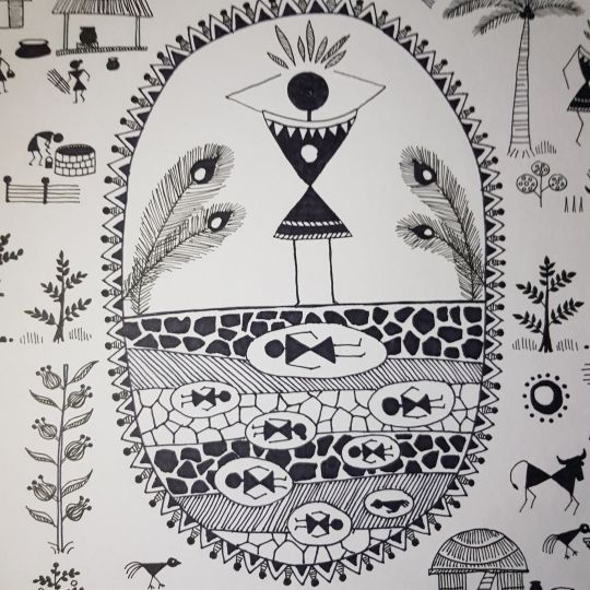
Growing impatient, the giant in the forest followed the direction the fruit gatherer went. Just in time, the giant saw the corpse of the person they cared for. In a fit of overwhelming rage, the giant murdered all the people and destroyed the village until there was nothing left. After cooling down, the giant realized the severity of the actions and gave them a proper burial.
The giant mourned for weeks and felt a hole in their heart. The giant became the monster the townspeople said to be. The giant returned to their previous life of isolation and loneliness.
The end.
1 note
·
View note
Text
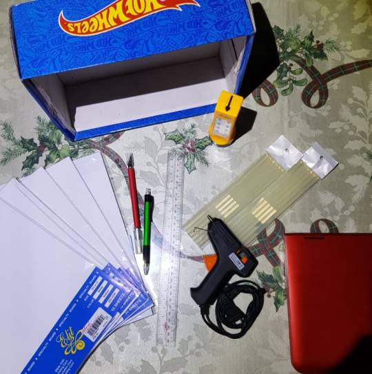
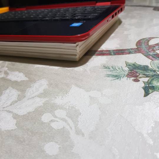
PAPER CUTOUT LIGHTBOX
Popularized by Indian couple artists, Hari and Deepti, paper cutout lightbox is an art form wherein paper cutouts are layered to form a three dimensional image and are illuminated at the back.
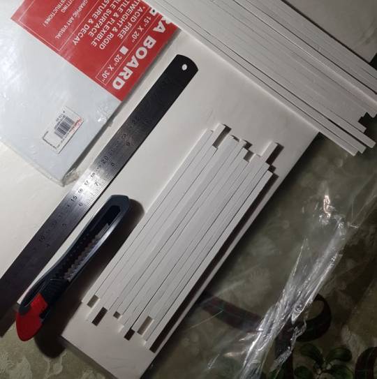
First step to do is to gather all the materials.
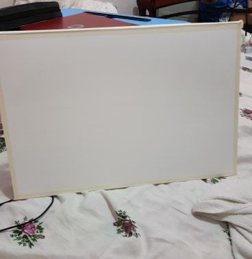
Next, remove the bottom of the shoe box.
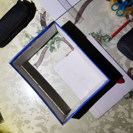
Almost stabbed my abdomen with a box cutter.
I added some glue gun for stability.
At this point, I realized that this was going to be a disaster. The box was too uneven. I also thought that the harder the paper, the better. I got a 220 gsm board paper. I never thought how difficult it was to cut them. I decided to do what the lady did. However, I wasn’t able to get all the materials, so I improvised.
Video link below.
https://www.youtube.com/watch?v=7ZOXIcCxtCs&feature=emb_title
I watched a lot of tutorials on YouTube because I had no idea how to do anything. I got used to working digitally.
I learned that plastic or wooden rulers shouldn’t be used when cutting with a blade. I bought a metal one. RIP to my shredded plastic ruler.
I also learned how to make clean cuts. Start with a light initial cut,and then do heavier ones; sliding down repeatedly. It should be done on sturdy, smooth surfaces. I cut on a glass covered table.
The materials I used were:
PVC board - 3mm thick (Couldn’t find a foamcore board)
Ivory colored board paper - 170 gsm
Regular white glue (Didn’t have any wood glue)
Precision knife no. 2
Mechanical pencil
Metal ruler
Box cutter
Flashlight (LED strips were too expensive; I’m also not very good with wires)
From the board, I cut out some supports just like the video said.
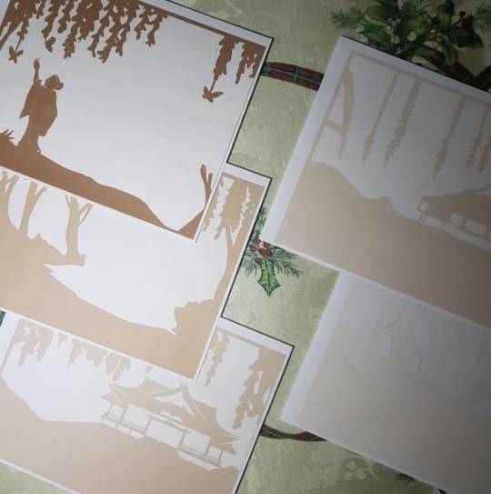
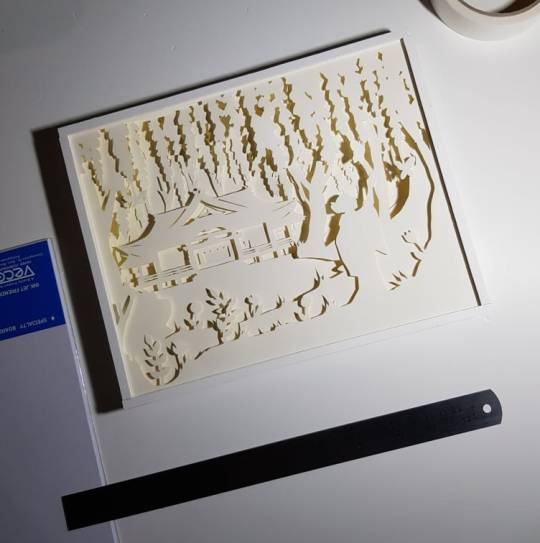
I planned out the design on my laptop. I was inspired by the wisteria forest from Demon Slayer. I used 6 layers in total. Hopefully, I’m doing things right.

I printed out each layer for a uniform and proper scaling.
I trimmed the board paper I have to fit the size of the designs.
Then, I traced each layer onto the board papers. I used the television stand as a makeshift lightbox because it is made of of glass.
For the paper, I picked an off-white one to give off creamy colors when lit.

The precision knife I bought from Ace Hardware worked better and is cheaper than the one I bought at National Bookstore.

I then cut out the outline that I just traced. I learned that the knife must point the direction you want it to go, so it involves a whole lot of rotating the paper and your wrist. My thumb got sore from the constant pressure. I’m used to the pain life always brings.

Finally finished them! I had this genius idea of using the backside of the paper to hide the pencil marks.
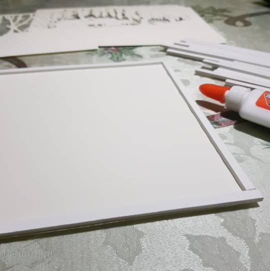
I then placed the PVC board I cut earlier on the edges of the layers. I used regular glue for the adhesive.
Unfortunately, the paper was curling up from the glue. Maybe I put too much? As a solution, I placed my laptop on top so I can wait for it dry while answering assessments.

I then cut out the materials for the frame. Unlike foamcore, PVC boards do not have paper layers. I used double-sided tape to put together the paper and the board. I forgot this was completely optional.
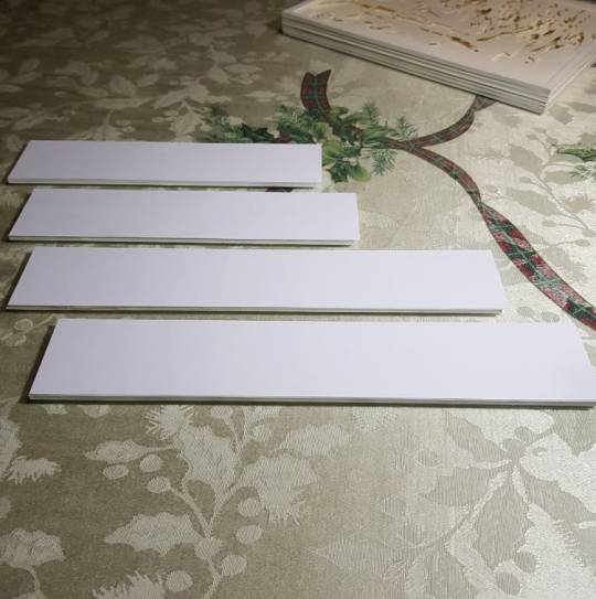
The paper is meant to be longer that the board to cover up glued corners.
I then connected it all together to make a frame for the main body.
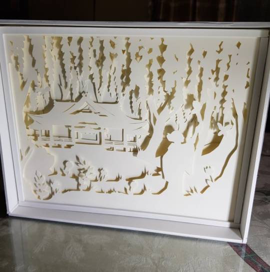
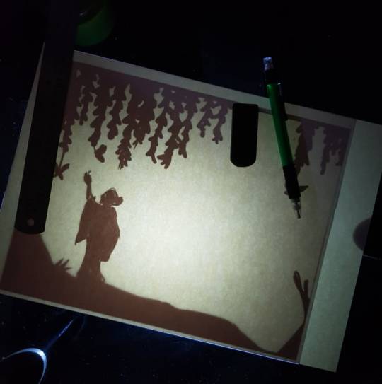
I used a flashlight to illuminate the backside of the box.
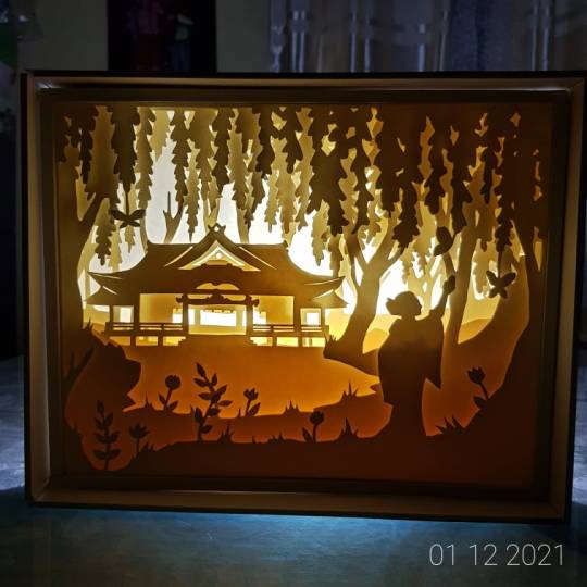
I really enjoyed doing this piece the most compared to previous ones.
Approximate time: Seventeen hours. It feels nice to work on projects without accompanying workloads.
Below are some close-ups.

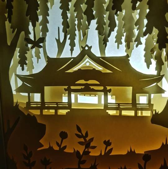
きれい です ね ! 素晴らしい一日を
2 notes
·
View notes
Text
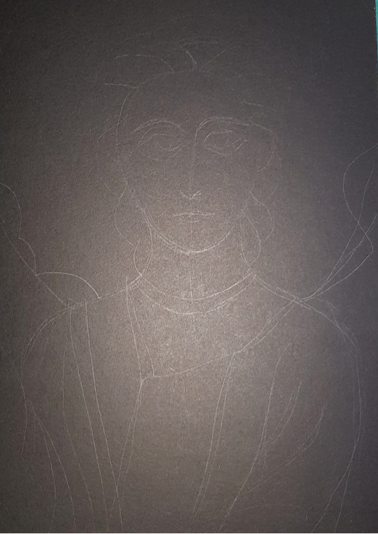
MOSAIC
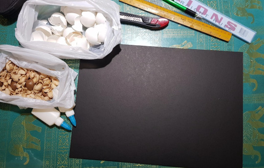
A mosaic is an art form wherein small pieces are used to make a picture.
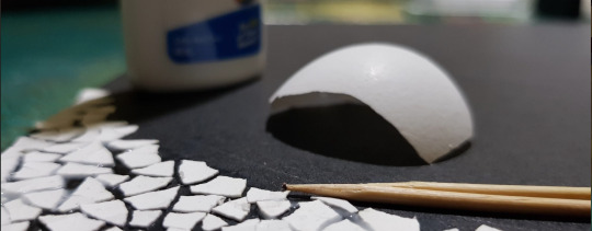
I started with collecting eggshells and pistachio shells. The eggshells stank a lot because apparently you have to remove the membrane first. Afterwards, I bought a 15" x 20" illustration board and trimmed it into an A3.
I also decided to not use the nut shells because I figured they would be too difficult to deal with.
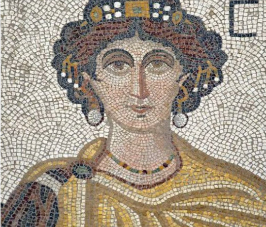
I searched up some reference photos and then I sketched the initial layout on the board.

I proceeded to do a few tests using the leftover cutouts. Since eggshells are only white, I had to put some pigment on them.
I tried using watercolors and saw that it wasn’t very pigmented. I also had to use the inner side of the shells because the paint didn’t really stick much. Maybe I'll use them for lighter shades.
I also bought poster colors and they worked better than watercolors.

Now it's time to glue the shells on the board.
Mmmmmm. ... Honestly it feels incredibly overwhelming. But'cha know, I have to start somewhere.
I don't know anymore. What is time? I can't feel my hands. Yet onward I go! Sir Bilog’s smile and cheery attitude gets me going.
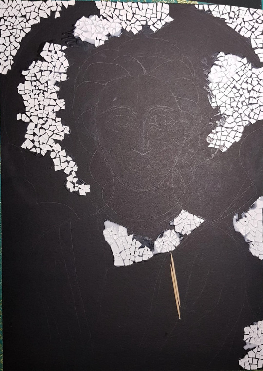
I really don’t know what I’m doing. I just decided to fill in some spaces.
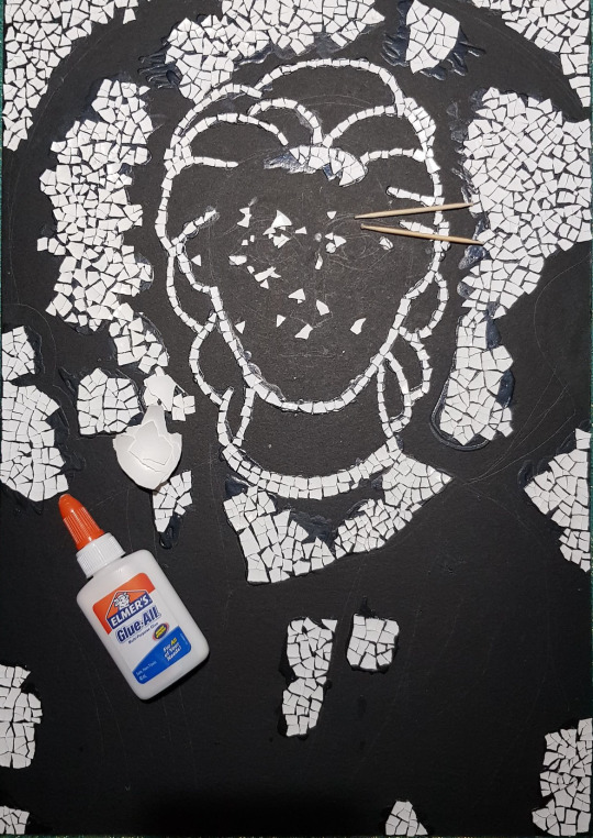
I finally figured out what I’m doing. The spirits of byzantine mosaic artists guided me. It seems like I needed to start with the outlines.
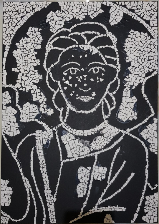
Anyways, I finished the outline and I intended to paint them first because they might get lost.
It looks like a third grader's macaroni art project.
Woaahh it looks like the eggshells are dancing. I think someone's watching me. The eggshells are trying to tell me something...
I decided to cut the huge parts into sections so I don’t get as much of a mental breakdown.
It's dark... It's cold... There’s a storm outside... yet here I am cracking eggshells into small rectangles.
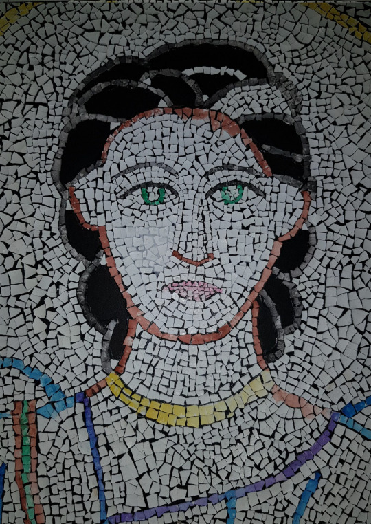
The face is more detailed so I had to make smaller pieces. They're excruciatingly microscopic. They're still bigger than my self esteem.
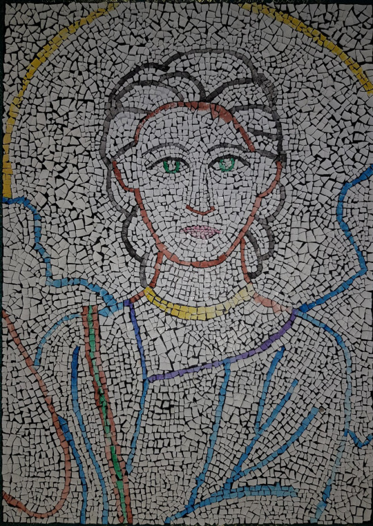
My back hurts.
FINALLY DONE WITH THE SHELL GLUING. It is life-changing. I now understand the working conditions of enslaved children in China. I now know the suffering of Filipino workers who died building the Manila Film Center.
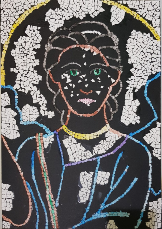
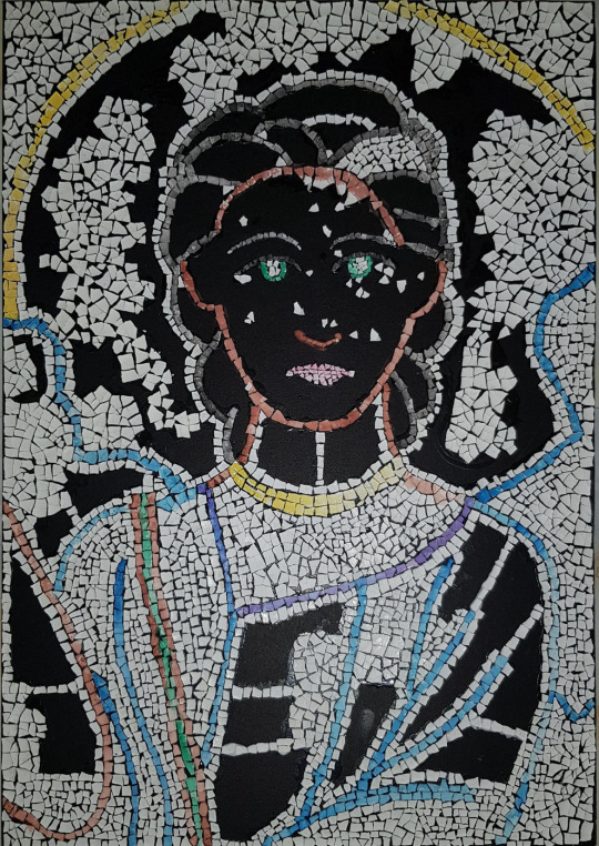
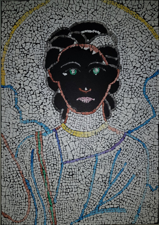
Time to color! Ooh the fun part!
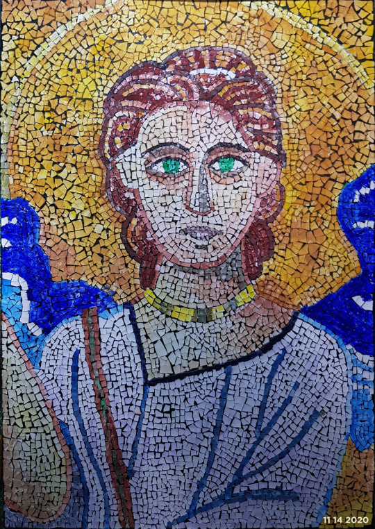
I mixed yellow and brown watercolors to make a golden-ish background (I tried).
I used a golden metallic pen for the nimbus. I actually kinda regretted doing that because it made it less visible.
I used the leftover dirty water from painting the background to paint the skin.
I used copic markers to add details to the face, add shadow to the neck, emphasize the colors on the robe, and add details to the neck accessory.
I used brown poster paint and yellow watercolor for the hair.
I used blue watercolor and blue poster paint for the wings.
Aaaaanndd that’s about it.
Approximate time: Thirty-two hours and twenty minutes. If I ever see another egg shell, I am going to explode.
Below are some close-ups.
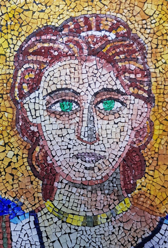
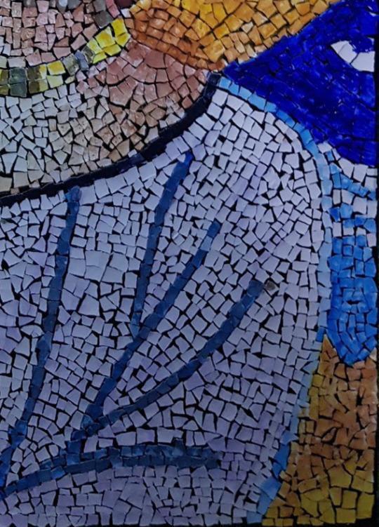
The longer you stare, the uglier it gets.
0 notes
Text
TESSELLATION
A tessellation is an art form created by repeating shapes to cover a plane without any gaps or overlaps.
At first, I panicked because they looked really difficult and I'm not very good at math. Thanks to some tutorials provided, I realized them for who they really are --- deformed squares.
For my digital works, I use Paint Tool Sai 2. I began by making an A3 canvas. I then created a 2" x 2" canvas for the square. I copypasted it on the original A3 canvas.
It's difficult to design a tessellation that I get satisfied with, so it took quite a while.

I repeated the new shape I made to form a pattern.

I then googled reference photos for a palette.


Hmmm. This was not how I envisioned it. Maybe it'll look good in the end.


Oh well. Good enough.
I figured the organic look wasn’t for me, so I made the colors flat and added a multiply layer to add some details.

And here is the finished product.
Approximate time: Three and a half hours. Took me longer than expected.
Below are some tessellation practices I made.


0 notes