
Don't wanna be here? Send us removal request.
Statistics
We looked inside some of the posts by cobrienba1a and here's what we found interesting.
Average Info
Notes Per Post
2
Likes Per Post
2
Reblog Per Post
0
Reply Per Post
0
Time Between Posts
1 day
Number of Posts By Type
Text
17
Last Seen Tumblr Blogs


Fun Fact
Tumblr is used by 21% of adults online aged 18-29 years.
Text
DisneyWorld's Magic Kingdom, Florida - Research and inspiration
Today I went to Disney world in Orlando, Florida. As this was Disney's own theme park, the quality of art and decoration was astonishing.

One thing that caught my eye in the attractions were the animatronics. They were not like any ordinary animatronics that you'd see in any ride. They were programmed in a way to make them seem very life-like and believable. It used features that correlate with the animation principles (proposed by the Disney animators Ollie Johnston and Frank Thomas); such as: slow in and out, secondary and overlapping actions etc. I went on two animatronic based attractions, one was The Little Mermaid's Ariel's Undersea Adventure, and the other, Pirates of the Caribbean.
We were unable to get good videos of the attractions but there is one on YouTube that showcases the entire ride. Some of the models were so realistic that we couldn't tell if it was an animatronic or an actor dressed as the character. The first Captain Jack sighting was the most realistic out of the rest, the video didn't get a good look of him however.
youtube
The following ride was the little mermaid ride, in the waiting queue we were greeted by scuttle the seagull, as you can see in the gif I created, there was easing in the movements and lots of secondary actions, this took away any robot feel that the animatronic could have had and gave a much more realistic feel to the motion.


The video of Ariel dancing had a lot less motion than scuttle but it was clear to see that a lot of effort was put into making the motion much more believable with easing. It made the motion smoother and easier to loop.
Later on in the ride we got to Ursula, this was the best animatronic in the entire ride (in my opinion) in terms of motion. There was a choreographed dance to go with her song "Poor Unfortunate Souls", the mouth moves to sing it and the eyebrows often raise to give more variations to her facial expressions. This is a video online showcasing a minutes worth of her song (we only got to see 10 seconds of it before we moved on).
youtube
Overall, the rides were brilliant and it was really fascinating to see how humanlike they could make a robot just through movement. I need to make sure to pay attention to easing and secondary action in my future animations (especially 3D animations) to give a better quality animation with believable motion.
0 notes
Text
Sea World - Movement Analysis
Today I've taken a trip to SeaWorld in Orlando. I've witnessed many aquatic wildlife and noticed that their movements correlate heavily to the principles of animation. The way that they move in regards to these principles gives us as the audience a good idea as to what is going on/ is intended by the animals.
Take this group of seals for example, the one that goes to steal the fish creates a short anticipation before the seal leaps to grab the fish before the other seal gets it. With the neck, you can see an element of squashing in the anticipation and stretching in the main action to go and get the fish. Indicating that the seal went into great effort to quickly snatch the fish and this effort is complimented by the follow through, which is falling back into the water which gives the hint of the seal falling back into relaxation.
The way that the seals look at the first seal (that the fish is being thrown to) gives a good sense of staging which (without context) will give the audience a good indication that the seals know who we are aiming for which then inspires the big leap.
In regards to my chosen character, Clyde, these sea creatures can aid in research. The manatee and the Turtle.


The aesthetic of the Turtle is what my character, Clyde, is based off of. He has a pink turtle suit which closely resembles this turtles shell. This turtle is nicknamed "Grandma" because of her old age and lack of lower lip which gives her an stereotypical, anthropomorphic look of an elderly woman without her dentures. As the main danger of a turtle is their powerful bite, Grandma has now lost every physical threatening feature she has, this is what I wished for Clyde, as he is not meant to have any features that looked threatening. However, there are lots of triangular features on the Turtle that could still create a dangerous connotation, whereas Clyde is much more round, much like this manatee. It's stationary and completely round and fat, just like Clyde, if I were to explore more on Clyde, I'd focus more on making him look like a manatee as it is much less threatening if size is taken out of the equation.
The next show was the Orca's, lots of their tricks involved jumping out of the water, which was amazing considering their immense mass. I noticed arcs in a lot of their jumps.

Of course, any natural jump will have some arc to it, however, this arc was quite narrow, I noticed that the dorsal fin acted as the central turning point and if you look at it enough, it like like the rest of the body is pivoting around it before dropping back in the water. This is most likely due to its weight and not being able to give itself enough of a momentum to propel itself further. The weight was also highlighted in the timing, where in the air, the orca slows down very quickly as it gets to the peak of its arc before accelerating downwards again.
Another principle that these animals fall under is appeal, where they are showcased to perform anthropomorphic stunts such as waving or nodding their head. It adds a loveable personality that you wouldn't see in their wild kin. It would engage the audience and relate to them more.
Overall, watching all of these animals in the eyes of an animator, I've come to view their actions differently to how I normally would, noticing key principles that would go into a normal animation being acted out without them even knowing. All of this would also help me with animating the motion of an aquatic creature as they move far different to any human.
0 notes
Text
Dynamic Animation Exercise
This is the finished result of my dynamic exercise. I would have liked to give it a more refined touch with a cleaner art style but overall I'm happy with this animation. If you look back on my work in progress images, you would see that I had a different ending planned for the blacksmith, being that he would hold the sword up in the air when he was done and it would show more that the sword had been lifted up. However, when experimenting, I did not like this idea much and decided to instead go for a more slapstick approach and have the blacksmith fall over in a follow-through motion. This would also show impact as the blacksmith would hit the ground and make it shake.
youtube
I added lots of speed lines to the piece to give it a sense of acceleration. Since I did not want a constant movement the whole way through but I did not have enough time to create differentiation in movement with such a complex animation. However, the speed lines work well and is one of my favourite features of this animation.
If I had more time, I would have spent longer planning timing instead of improvising it like I did here. And if I were allowed a few extra seconds; I would have used that time to create more of a follow through to help the audience understand what's going on as it is quite quick. I would also make it more evident as to what the blacksmith is actually doing and what he's pulling out of the forge.
Next time I would also work on keeping the proportions of the animation constant throughout. As you can see, when the blacksmith reaches in, the body gets a lot smaller, with better planning I should aim to achieve in the next iteration.


0 notes
Text
Character Cast Model Sheet
I created my character sheets for the design project, I based the designs off of the characters that I developed in my sketchbook. I have given the height and rough shape sketches for each of my characters.
Captain Dingus is very square to symbolize strength and stubbornness. Clyde is very circular and non-threatening, Lord Pleeb is very triangle oriented to symbolize danger, as he is the shadow. Mr. Krank has a combination of squares, circles and some triangles. As he is a non-threatening person due to his old age, he is also strong and stubborn, however, he can be dangerous at times and quite snappy when hungry. The last one, Mr.Chief, has a circle for the mask-snout, as that is the non-threatening look that he wants you to see, but the rest is quite triangular and dangerous, not one to trust.
I also included the silhouettes to help define the shapes with the added clothes.

I then inked the characters and gave them some colour. I used connotations of colours in correlation to the archetype of that character. For example, the villain has a black and red scheme, which would symbolize evil in this context, I also added the colour purple to connotate royalty. The yellow on the hero would connotate excitement and joy etc.

This is my finished Cast sheet, complete with shading and highlights.

I chose Clyde to continue with the character sheets. His non-threatening design coupled with his colour scheme made him outstanding from the cast so I decided to try something different.

I gave Clyde lots of different poses to express his personality. I chose to try to create really dynamic poses so it looks appealing and juxtaposes his constant emotionless face. I took many factors into consideration, including negative space, to create a dynamic pose that even in a silhouette, it would be easy to figure out what was happening. I used contrapposto to create an asymmetrical pose, showing weight distribution and to make the character seem less robotic and more human. Which helps because he is meant to be a very relatable character.

At this point I got to the turnaround, I used my character model sheet to act as guidelines for some of the frames. I believe that with more time, I could definitely refine this piece and make the animation both smoother and cleaner. I used TV Paint for this animation.
youtube
I then went on to do the walk cycle. For this process, I first researched some character walk cycles and wanted to find a suitable one for the character and is weight. I came across the Po walk cycle from Kung Fu Panda. I chose to use the jiggle physics and slight head bounce, and exaggerate it for my character. I also used TV Paint for this animation.
vimeo
youtube
Overall the character sheets have been a success, however, I would have liked more time on this subject as I could have made it much neater and more presentable, however, I feel like I have managed to get my point across.
1 note
·
View note
Text
Weekly Summary - 2/11/18
Character Design
In this week I had finished all of my character sheets, using photoshop, as well as this, I have also completely finished my sketchbook by filling up the first half of the pages with random drawings of everyday objects using different mediums and the second half with character silhouettes, ideas, and other concept art.
I felt like this week went quite fast, I got a lot of work done since I had to have everything finished by today as I will be missing the next 2 weeks of University due to Holiday. I thought that the quality of my work wasn’t that great but I did try and get everything done as quickly as possible. I did make some extra work for myself by adding shading and highlights in my character design sheets that didn’t even need color. Although it does make the piece look much more polished and didn’t take too much time.
Pros: I managed to get all of my work done for this project and on time, I also managed to get some research for my character choices, as well as having a full cast of characters, each with names as well as a demographic and name for the show. I made lots of poses for my character Clyde, as well as thinking of a personality and 8 unique poses for him. I feel like this went really well and definitely good for someone that hasn’t had much time on the project.
Cons: Given more time, I would have really liked to do multiple drafts and much more research on my chosen character. My final animations weren’t what I wanted them to be, this is because I felt rushed for time. I had to quickly implement this into TV Paint and make both animations. This comes down to my poor time management, however, I managed to create the animations in the end.
Overall I feel like I did well for the time that I had, although I feel like with more time, I could refine my work much more as well as partake in a lot more research. This would help me with my character designs, perhaps allowing me to create better, more thought out designs.
If I had more time, I would definitely work more on making the animations look smoother as well as researching a lot more into different genres and demographics to see what works in a character design.
Life Drawing
This week I didn’t have any life drawing classes but I have been preparing my images for submission, I have counted a number of pictures that show my progression. Other than that, I didn’t manage to find the time to join any extra classes this week.
I don’t have any other classes on this matter, however, I can continue independent study to get a more information on how to draw the form effectively. I will also get information on the lecture that I’m going to be missing so that I know what to study while I’m away.
I’m using photoshop to make my artwork presentable, this is because the bulb went out in my room so I’ve struggled to get a good picture with a good amount of lighting on it. Luckily, I can make the image look like it has been scanned in by adjusting the levels and curves in the picture
Character Research
I had finalized the essay for my character research today, this was my second draft, for this topic. I changed it up a bit and made a research blog for it to show what I’m using to research. I managed to learn how to Harvard reference this week as well. This is good because I’m going to be needing this later on in the year.
I felt like I could have tried to get multiple, drafts done on this essay before my final submission. However, this is fine because I already had one draft and one set of comments so I know I’m roughly on the right tracks. I think that my essay went well in the end although I still had lots to say at the end of my 1000 words.
Pros: The positives of this week has been that I’ve managed to finally learn how to Harvard reference in my work which has made the process a lot easier for me and I am able to Harvard reference efficiently. I also finished my whole essay whilst staying in the 1000 word limit.
Cons: I did learn to Harvard reference quite late which was a major drawback since it meant I couldn’t properly research until then. I should have looked into it harder a lot sooner but it’s fine because I managed to achieve this now. I also feel like I could have written a lot more in my essay, 1000 words is a small number of words for the topic I had in mind.
In the future when doing essays, I have to start to manage all of my work effectively with allotted word counts to aim for each paragraph so I know that I don’t waffle.
Dynamic Animation
This week in dynamic animation has mainly consisted of the final task that we were given for this project. The task was to create an animation based on one of the principles of animation. My animation was going to be a blacksmith pulling a really heavy sword out of his forge, showing weight and effort.
I felt like I didn’t leave myself enough time to make lots of rough drafts before moving into the final iteration. I thought what I had for myself was also quite complicated despite its numerous simplifications.
Pros: I managed to finish the animation, everything went quite well and the movement and acceleration in parts were good as well as the timing. I feel like the speed lines helped to imply a fast movement as well which is good.
Cons: If I had more time, I would want to work more on refining my piece, this is because the animation was a bit choppy, the form is quite inconsistent and the lines wobble quite a lot. It would be good if I instead started making the TV paint version a lot sooner because then I would have more time to be careful with the lines.
In future, I need to be careful with my time management, this is so I can get lots of work done early and spend more time after on refining my work and making it look presentable and neat. To do this I would make a timetable of each day and stick to it in order to keep my work rate at a decent pace.
0 notes
Text
Character Idea Sketchbook
In my sketchbook, I have been running through ideas using shapes, silhouettes and fully developed sketches to reach my cast of characters.


These are my silhouettes, it was hard trying to think of shapes and sizes for these pieces but I referred back to the method of creating lots of exclamation mark variations and turning those into characters. There were some designs that stood out to me which is good because I would later be making iterations of these concepts.
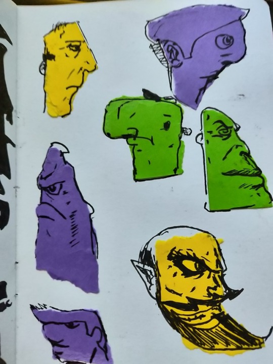

I then moved onto the heads, to do this, I ripped apart coloured paper and stuck them into my sketchbook using a glue stick. Then I tried to find the face shapes on these bits of paper and see what comes to mind. I made quite a few designs for the faces and tried to be different each time so I could really explore the range of characters.


These are the bodies that I created by getting the ripped pieces of paper and combining the ones that differed the most to make interesting body shapes. It was a lot harder to figure out how to do since instead of a face, I was thinking of an entire fleshed out character, so I had to think long and hard before I stuck anything down.
Archetypes
After this, I was ready to start combing all of these ideas into character designs and iterations
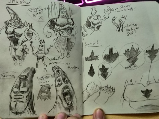
This is the shadow of the story, my first design, I named him Lord Pleeb, I wanted this villain to have a comical charm to him, whilst still retaining an intimidating and evil vibe. His weakness is his true nature, a wiggly alien underneath his giant intimidating armor and if he were to lose his armor, he would most certainly perish. I gave him a very triangular shape language, with the symbols basically being his silhouette, you can see that he is just made up of triangles.
I was going to have his arms exposed, but I decided to give him spikey feet and gloves just to give a sense that he’s really trying to hide his weakness and gives him a vulnerability that the hero is oblivious to. I then went to give him spikes on his gloves, but I thought that was a little bit ‘overkill’ so I just kept the original design for the gloves.

I wanted the hero to rival the villain in strength, so I made him extremely muscly also. Although his mesomorphic stature resembles a triangle, I wanted to give him lots of square-like features, to give him a strong- heroic portrayal. He has broad shoulders and a big, defined chest, but I made sure to make his legs smaller so the audience pays more attention to his upper body strength to view him more as a superhero type, rather than a body-builder.
I went through many clothing designs since I wasn’t satisfied with the complete superhero cape and suit, however I wanted to retain some of its qualities, I wanted a Sci-Fi look to him, so I still kept the superhero vibe with the posture and mask but added things like shoulder pads and a space gun to give it more of a space adventure vibe.
His personality is very cocky, naive and very excitable. He has a Johnny Bravo crossed with Buzz Lightyear personality which will make our hero into a hulking but loveable idiot. Which is why I named him Captain Dingus. Not one to take seriously but when push comes to shove, his facial expression can change to this really intimidating anti-hero look which was inspired by Batman. This gives a dynamic shift to the character that I could keep traversing.
The next archetypes I visited were the ally and the mentor.
The ally is meant to be an extremely emotionless, average-Joe, that was designed to ground the hero’s over-excitable nature with an extremely monotone personality which is entirely for comedic purpose. complimented with the unorthodox outfit that suggests that he is either comfortable in the suit or he drew the short straw in the costume selection process. I also wanted to make him the hero’s roommate, to give a pre-established friendship, suggesting that they care for each other, but are still very different people. He’s the introvert to the hero’s extrovert personality, always getting dragged into Captain Dingus’s shenanigans and not finding it very fun.
He has a very non-threatening character design with his circular shape language and his lack of any anger or sharp edges which make him pose a threat. But the twist is that he is stronger than most opponents in the galaxy and given the chance, will most likely wipe the floor with Lord Pleeb, he’s just never in the same room or is leaving the fighting to the hero as he doesn’t enjoy conflict.
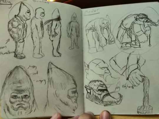
The mentor is there to give guidance to the hero, he aids the hero with moral choices and also in training the hero to become fit and strong. He is not a relative to the hero, but an experienced Landlord that is connected with the heroes past. Though the mentor has a very miserable and grouchy chip on his shoulder, he has a care for the hero deep down which is what motivates him to watch over him.
His name is Mr. Krank, which fits well with his personality. He’s got a triangle face to show his constant miserable ways, as well as a really bad posture caused by his oversized hands in proportion to his body, but still is very strong which helps when training an intergalactic superhero.

This is my shapeshifter/trickster character, I liked my earlier design that included a friendly fave on the end of the real characters face, sporting a hat and full suit to hide his nature. I named this character “Mr.Chief" to play on the words “mischief”. No one really knows if he has good or bad tendencies, when it seems most that he’ll pick sides based on whatever/, however, he feels on that day, he just wants to see how the scenario plays out so he could either help the heroes or betray them to serve as a catalyst.
The suit and Fedora both have a mysterious vibe to him, no one can really track him down, he just shows up. His clothing has later been developed to look like a 1920s mob boss suit, this gives intimidation and powerful vibes. He got this suit idea from observing planet earth (despite being an alien) and come to like this kind of attire.
Overall, I feel like I have successfully created my cast of characters and believe that I would be able to create a cast model diagram to show the sizes, proportions and shape designs of all these characters.
0 notes
Text
Essay Research
Question: Does Frank Miller’s “The Dark Knight Returns” bold step in substituting the status quo for a darker, more brutal Batman, work for the character?
Essay Revamp Notes
The essay needs to be roughly 6-8 paragraphs
Need to have a strategy for every paragraph
Get Bolder as I go
Write as if the reader doesn't know
Back up all facts with evidence and Harvard referencing
No opinions, only facts
Things I know
The silver age was heavily censored- because of this, everything that came after it for a while was toned down
Batman’s origin story and motives- After his parents’ death he swears to bring justice upon Gotham through being a vigilante
How brutal batman can be- He does not stop at one punch on a criminal, he would go as far as to instill fear into them whilst breaking bones and leaving them traumatized, but he would never willingly kill.
Although, Batman has had times where he did kill, either he had no other choice or unwillingly killed people.
Batman had trained with the league of assassins which explains his movements and attack strategies
Things I know now after research
The censorship died out gradually after the realization that this method was failing
The enforcers of this act were the CCA, Comics Code Authority
The method was to try and put a stop to juvenile behavior among the child population as they thought that the amount of crime committed by children was caused by the violence in comic books.
The animated intro for Adam Wests Batman first appeared in 1966, an animated series did not come out until 1968
The CCA would only approve of the comic if it had: no horror, no sympathizing with criminals, good must triumph over evil etc.
Batman and his archetype, he is more of a hero type in the 1966 but F.Ms one is more of a combination of most archetypes
Things I need to find out
Frank Millers Motivations for the piece- Why he chose to break the norm
Why the darker Batman was preferred?
The design choice for Batman – Why was he aged and why was he made the size he was
How his movement and combat changed as well as why.
Structure
200 words for intro and conclusion
Leaving 700 words MAX for the rest
Batman’s origins and who he’s meant to be character-wise
Status Quo of the 1960s
Frank Miller's interpretation and Why Frank Miller changed the character
The archetypes both the old and new batman represent
Why the newer animation was more preferred?
Why the old Batman may have been more preferred?

References
“I fell in love with Batman and with Daredevil. In both cases, I simply fell in love with the characters, and have revisited them from time to time when I miss them and when I get a new idea of some new torment to put them through.” - Frank Miller
What I can gather from this is that Frank has decided that he adored the characters so much, that he wanted to create tougher situations to help reveal the character more, give everyone an insight into his mind and how he thinks. By putting the character through “torment” it will truly express his true nature and how he deals with the harder decisions, ultimately painting a more developed character.
“Circumstances don't make the man, they only reveal him to himself.” ― Epictetus
“Study the classics. Beyond that, my best advice would be to mix it up”- Frank Miller
This was also taken from the interview and The evidence suggests from this that Frank’s change on Batman was still inspired by the original classes. It is implied that he has done his research and to create his take on that character, he felt to “mix it up” and thus the dark knight returns was born.
(Miller, Spring 2012, pp. 42-57)
Fingeroth, D. (2012 Available at: https://search.ebscohost.com/login.aspx?direct=true&AuthType=ip,sso&db=asu&AN=73881644&site=eds-live&custid=ns195502 (Accessed: 19 October 2018)
Appearance:
“Criminals are a superstitious cowardly lot. So my disguise must be able to strike terror into their hearts. I must be a creature of the night, black, terrible... a . a... a bat!”
Finger, Bill and Fox, Gardner. (1939)The Batman Wars Against the Dirigible of Doom, Detective Comics, Vol 1 #33

Looking at this iteration of Batman (1973) we can see Batman’s character pose, we can see he has that superhero physique (evident muscular features as well as strong, square, shape language) although as Batman’s goals was to put fear into his enemies, this design is very distant from his comic counterpart in the bronze age.
It is clear here that this costume and this quote does not go hand in hand, Batmans circular features give a non-threatening look to the character, definitely not one to visually instill fear into criminals. As well as this, he is described to want to be a creature of the night, although possesses a mid-tone blue attire which does not fit the “black” aesthetic he originally wanted in the comics.

Frank Miller’s iteration of Batman (in the animated film) is a lot different from the 1960/1970s Batman, but if you look closely, there are still a lot of similarities, for example, the color scheme is the same, only with a darker tone, the build is still muscular, the layout of the suit is the same. However, the only difference is, everything is exaggerated. He has muscles but they are MUCH bigger, he has the same layout but it’s been given more detail and definition, he has a blue attire but it’s a much darker blue (almost black). There are no circular shapes in this body, it is all very angular and blocky, which gives it a more sharp, intimidating and dangerous vibe, which hits a lot further to home than his predecessor.
Audio:
Peter Weller:
youtube
This Batman represents a dated one, one that has been in business for many years and has gained a lot of experience with it. He is quite harsh in his tone, definitely not one you’d find in your typical hero, Batman in this film is quite dark and his brutal nature really shows through his voice. He had just had a fight with one of his best friends (Superman) as he had become corrupt and a dog for the military, which goes against Batman’s beliefs. This also shows in his voice, you can sense his anger with his lecture to Superman about staying out of his way.
youtube
Olan Soule:
youtube
Soule is a definitely what you would recognize in a heroic voice as it sounds strong and light-hearted, it lacks the dark nature that later iterations have but it makes more sense in the mind that he is a superhero. This is just an advert to road safety but the voice doesn’t really change depending on his scenario, he always keeps up with the heroic voice.
0 notes
Text
Weekly Summary - 28/10/18
CHARACTER RESEARCH
This week on character research, we delved into the uncanny valley, talking about what the meaning of uncanny is and how close to a human a humanoid entity can get before it starts to get unsettling to the average person. We also looked at how the uncanny may affect animation. I had also been working on learning how to Harvard reference, in doing so, I’ve coded an application that has all the information I need in one place on how to Harvard reference.
I felt like this lecture was quite good, we got to watch lots of unhomely movies that really explored into the ideas of the imperfect and how much it can psychologically put us off. It was a very interesting topic to explore, however it isn’t something that I would consider putting into my essay so I didn’t think it as important as I would have liked.
Pros: The lecture was enjoyable and I learned a lot about what it means to be uncanny. It shed a light on everything I have been watching over the years such as iRobot etc. I had also got a good deal on my research essay done, so I should be able to finish this project in the next few days.
Cons: Time is running out to complete my essay and I haven’t pieced everything together as of yet, I also feel like I could do more contextual research since most of my essay consists of blunt facts on the subject.
Overall, I need to finish my research blog so I can submit that as part of my project, then I need to finish my essay and ensure I have all of this time to use sending the essay to my lecturer to see if I can get more feedback and to see if this version of the essay is better than my previous iteration.
To do this, I need to time manage all of my projects and ensure that I have enough time put aside for my character research project.
CHARACTER DESIGN
This week was the start of our character design project. This project includes creating a character with lots of background research and then implementing that into a 2d animation of a 360-degree turnaround and then a walk cycle. This week we started with creating quick rough designs for characters, this included using inkblots and shapes to find a silhouette or a simple design for a character that we could later expand upon. We also completed an entire sketchbook, filling half of it with drawings of anything other than characters and then the other half focussing solely on character design.
I feel like the sketchbook was quite rushed since we only had a week to get the entire 32 pages of the sketchbook done, as well as making sure we had 50-100 character designs done in the second half of it. I feel this way because we also had other projects due as well and this was a very short time-frame to get this all done. Nonetheless, I managed it. On the other hand, I thought that the lessons were a lot of fun, being able to release all of my ideas onto paper, as well as improvising and creating new ones based on archetypes working with shape theory and poses.
Pros: This week has been good for getting into character design, I’m fine with the pacing to a certain extent and the work output has been good as of now. I have done lots of characters and plan on developing quite a few of them ready to make my cast model sheet. Character design is a strong point of mine since I practice drawing characters a lot at home, therefore I haven’t been taken out of my comfort zone as of yet.
Cons: The deadlines have been the biggest downfall as of this week as we have started quite late in this project as opposed to all of the other projects which we had a lot more time to refine and do. My work output has not been the best quality wise because I need to rush everything due to the holiday I will be having at the end of next week. Therefore I won’t be able to do all of this at a steady pace.
Overall. this week has been an ok start into character design, it's quick and gets to the point, however, I would appreciate it more if instead, we were able to start this project earlier since I have only got 2 weeks to finish this entire project.
What I need to do next week is to get everything done as quickly as possible and once it’s all done I will move onto refining my work. As of now, I will be researching characters to help me form my cast model sheet.
DYNAMIC ANIMATION
I did not get much done at all in dynamic animation as I have spent the whole week focussing on character design. Although I did have an induction in TV paint which I have now got the trial version, so I plan to do the animation in that software.
I feel like the software is fairly easy to use, although it is unlike software that I have used before so it will be tricky to get used to. However, it is the most efficient way to animate at the moment and will include me using a lot less paper.
Pros: The software looks easy enough to use and has a simple UI. It also has a bitmap-based interface which will give me a lot of freedom when animating unlike a software such as adobe flash which is entirely vector-based.
Cons: The software might be tricky to use, however, as well as this I don’t have a lot of time to refine my animation for many reasons. One is that I only have one week to finish this and the other being that in the trial version I can’t save my work, meaning I have to do it all in one sitting which will be extremely troublesome. It also means I will have to use a video capturing software as I also won’t be able to export the video.
Overall, this exercise will be tricky but I should be able to pull it off given the time, I can also come into the university to stay late and get it done, that way I will be able to save my work.
LIFE DRAWING
This week on life drawing we looked at tones and highlights, we had a different person in today which is good because it allowed us to draw a different person with different muscle mass, hair, and features.
I feel like this lesson went well, I have improved a lot since the first time, as well as this, I’m getting more confident line strokes instead of the rough and scruffy linework that I am used to doing.
Pros: Already having a weeks experience with life drawing and after reading the book it has come to a lot easier to get into. I was successful in my tonal work in the end as pointed out by the lecturer, I also found it a lot easier than I thought it would be to shade but that may be because I am used to drawing characters and giving them lots of shading.
Cons: I didn’t have such a good start anatomy-wise and I still need to work on effective highlights, however, there weren’t many other cons to it, this week has been good. Maybe I could do with more research on anatomy so I can get more information on how to go about drawing them.
Next week I don’t have a life drawing session but I might see if I can join an extra one since I will be missing the last one the following week, therefore I won’t be missing out on something potentially really important.
0 notes
Text
TV Paint Induction
This induction was about TV paint, we learned how to use this software which will aid us in 2D digital animation. This will be useful because I plan to do my dynamic animation exercise animation. In the start, we looked at video examples of animation on the TV paint website, with this software, it is clear that it is bitmap-based, which is very different from adobe animate, which is completely vector-based. This means that every line I wanted to do would be calculated, smoothed and heavily restricted, whereas, in TV paint, the bitmap artwork gives me a lot more freedom.
We started off with a simple ball bounce, we followed a guide that was handed to us to save time, making use of the opacity tool and lightbox (or onion skin on other any other animation software). Once we had successfully made the ball bounce we moved onto a character walk cycle. Again we all traced a guide and animated it using tools such as pan, which helped us place each frame where we wanted it. In the end, I added my own spin to the animation and came up with the Flash walking really fast, I did this by duplicating the initial animations and lowering the opacity consecutively by 10-20 each layer to get a speedy after-image effect.
This is what I managed to accomplish by the end of the induction:
youtube
Overall, this is a software that I feel like I can use again for more animations and I am looking forward to completing my dynamic exercise and character design walk cycle using this software.
0 notes
Text
Life Drawing - Tones and Highlights
This is the second lecture I’ve had on life drawing, today we started off with the 16 multiple small drawings, each set of 4 has to be done in a shorter amount of time than the previous set. However this time, we had a set time on the line art and then a set time on the shadows as we are focusing on tone this week. I managed to maintain quality this time, but I think that the earlier drawings weren’t very good because I hadn’t gotten used to it, the 1: 30-minute sets were better than the 2-minute sets, but I think that's because I started to get used to it and thus started to improve.

After we had a look at doing the exact opposite with our artwork, where instead of tone we looked at doing highlights instead. We did this artwork on black paper and used chalks. We did this with no line-art, it was just to explore the parts of the body that received light. I felt like this went quite well.

Next we were given toned paper and instructed to draw once more for 35 minutes and mix everything we’ve learned from both shadows and highlights to create a fully toned piece. The lecturer came round and gave some feedback, most of which I was able to fix, but I made the model too buff, where he was quite skinny, so next time I’ll need to watch out for muscle mass when drawing.

0 notes
Text
Character Cast Analysis
TASK
“Analyze 3 character casts (film, tv, game) using the following principles
Audience
Shape language
Silhouette
Asymmetry
Suggest 4-6 characters per cast.”
Cast Model 1:

Audience: The demographic for this show would consist of younger children, this insists for non-threatening/comedic designs.
Shape language: Spongebob is clearly a square. Although Spongebob is the exact opposite of strong and sturdy, it could instead reflect on his personality, his ability to make and keep friends with a strong bond. Patrick and Mr. Krabs are triangles, but I’ve noticed how the points are rounded, giving a less threatening design and a softer look which reflects on their personalities, they are both good characters. Squidward is more round which should have a soft and innocent connotation but he has a lot more of a harsh personality, constantly complaining filled with resentment. The anchovy is string-like but has been known in its debut episode to be rather destructive in groups being feared by the likes of stronger characters such as Mr. Krabs.
Silhouette:

The Silhouettes all have a different form which helps in distinguishing themselves from each other. Their stances alone help paint a picture of who they are, Spongebob is upright, with arms out and hands spread as if he’s ready, Patrick looks laid back and lazy which fits his character. Squidward is standing without any personality, which could show that he doesn’t care. Mr. Krabs actually has a threatening pose which gives us the interpretation that he’s angry, this could suggest his aggressive nature and his intimidating strength. The anchovy doesn’t have much of a distinguishable shape to him, which fits as anchovies come in large herds so it makes sense that they all look bland.
Asymmetry:
Each character is posed to look asymmetrical, they would be completely symmetrical if they were facing front on, but if everything were perfectly symmetrical then it would look out of place. So the slight angle allows to keep that simple symmetry and at the same time, keep the characters looking interesting.
Cast Model 2:

Audience: While the Simpsons is a still a cartoon that is heavily censored and contains child-like humor at times, it is clear that the aimed demographic is teenagers to adults. We can also gather this by looking at their slightly more “real” designs as opposed to any cartoon character in a kids show.
Shape language: It is very clear there are lots of different shapes making up these characters that tell us something about their personality. For example, Bart has a square head, which should indicate strength, but it could instead show his stubbornness, this is all complimented by the dozens of triangles on his head and all over his body, which indicates that he's very daring and dangerous. Lisa may have lots of triangles but it is said that upside triangles can represent “female energy” which tends to include the earth and its elements, which makes a lot of sense since Lisa is vegetarian, a Buddhist and cares for the environment, vastly different from any of the other members of the family.
(source) https://www.thoughtco.com/geometric-shapes-4086370
Silhouette:

In this image where each character has their own traits, the similarities really show as they are a family and each child carries one of the parents’ traits. Bart has homers physique. Lisa and Maggie share a hairstyle and Lisa dresses just like her mother. On the other hand, there are lots of differences which do a good job defining them, Homer with his large physique and bald head, Marge is quite slender and has really tall hair, Maggie is never shown with her legs out so she has this sluggish look to her.
Cast Model 3

Audience: Adventure Time is a kids show on a children's channel aimed at kids. However, there are lots of things in Adventure Time that is better directed to teenagers and that can be seen in some respect, however, the designs remain quite simplistic and unthreatening.
Shape Language: The characters are expressed using shapes a lot clearer than the characters in a show such as the Simpsons, as it is a lot more surreal in terms of context, the shape is played with a lot here but it is very clear to see the personalities just by looking at the shapes alone. The Ice King is clearly made up of a lot of triangles which indicates his evil nature and dangerous powers. Lumpy space princess and Princess Bubblegum are both quite rounded which indicates that they are calm and unthreatening. Marceline is also rounded but has triangle flicks at the ends of her hair and has triangular boots which are very visible which could then indicate that she likes the thrill of danger or just a calm character with dangerous potential.
Silhouette:

The silhouettes also tell a lot about the character, mainly from the poses and stature of the characters. BMO and Bubblegum have their hands raised which indicates that they are both quite friendly and inviting. Ice King has his arms out and shoulders raised which indicates that he’s is aggressive and ready to attack etc.
Asymmetry: I’ve discovered that the only character that is completely symmetrical in this cast model sheet is the ice king, this could be because he is viewed as quite boring or it may be to contrast his chaotic nature ironically. Other than that, the only character CLOSE to symmetry are the princesses so it could be something to do with royalty that permits this kind of symmetrical, important and maybe organized look.
OVERALL It is clear that the use of the cast model sheet is really good at telling people what a character acts like just by showing their designs. It is also a good way to twist the character ironically, by making the audience think one thing due to their shape language or silhouette and have them act completely different, for a comedic or surprising effect.
0 notes
Text
Character Design - Silhouettes
Today in character design we looked at silhouettes and how to make them from combining basic shapes. We started this in our first character design session, today we focussed all of our attention on it. We have also been given a task to do up until now which has been to draw absolutely anything we see (as long as it isn’t any characters) and fill half of the sketchbook. We were given 2 days to complete this task and we weren’t allowed to use the same medium consecutively so we needed to range our mediums as much as possible.


After this was handed in, we all looked at each other's work to see what everyone else did and managed to accomplish. Then we were given ripped up pieces of paper that we needed to use to form shapes using 3 or 4 of them. Once we had formed a shape then we needed to draw that onto paper and fill it with black to make a silhouette, once we had done this, we then needed to add features to it and make it look like an actual character.

After this, we were tasked to draw the ‘exclamation mark’ in as many different ways as we could. This included variations on the entire shape, the angle, the width, height etc. until we had a decent amount.

Then we were tasked to add features to that, as the line and dot served as the torso and pelvis, meaning that we needed to place the head somewhere, we needed to think of poses, arms, legs etc. This is the design set I had come up with.

After this, we looked into archetypes and what silhouettes could fit into these. On the big bit of paper my group was drawing on, we all looked through all of the characters we drew and decided which archetypes would fit well with which character.

This was the cast model sheet that we made from our chosen characters, we had four characters, a shadow, an ally, the hero and the mentor. We made a name for it called the quest of Gulell and it was aimed at a teenage demographic.

This is the full view of the paper with everybody’s designs on.

This is what I need to do in my independent study. Overall, today was a good lesson, I learned a lot about drawing in silhouettes and will most likely use this process in the future.
0 notes
Text
The Uncanny Valley Character Research
Today we delved into the word uncanny, what it means and how it affects the animations we see.
But before this, we looked at Gender, sex, and sexuality in animation in relation to what we studied in week 4. We looked at examples of the iconic male Disney cast and their girlfriends and compared the clothing, pose and characteristics. For example, Mickey Mouse is seen as the default prototype (as he came first) Minnie was given many features to distinguish herself both visually and in terms of gender. For example, she has long eyelashes, high heels, feminine posture.
The Uncanny
Friedrich Schelling, German Philosopher discussed this matter in 1835 describing it as “unsettling” or built on uncertainty, making us uncomfortable but not a lot of knowledge as to why that was.
Uncanny is not to be confused with horror, as it isn’t terror that uncanny focuses on, but rather dread, the anticipation of apprehension rather than experience.


The German word for uncanny is “Unheimlich”. Freud (1919) realized that this word had a peculiar clue to its nature. As Unheimlich literally translates to “Unhomely” but Heimlich can also mean ‘conceded’ or ‘secretive’ which gives a new perspective on the word but somehow ties it together at the same time. It means we don’t feel at home with anything uncanny, but could also mean that it is something that should stay hidden or a secret.
Many would look at humanoid creatures to be quite uncanny because it feels so close to what we think we know but the slight imperfections we think we’d never see in a human being we would pick up on and become uncomfortable. The comfortability is much more extreme when the subject is moving. There is a point where the familiarity drops with the human and the comfortability with it, this drop is called the uncanny valley.

Animation can’t capture photorealism, not without the aid of live action and CGI. An animation isn’t one to record reality but invents it.
There are 5 types of realism when it comes to animation
Visual Realism
Aural Realism
Motion Realism
Narrative and Character Realism
Social Realism
Most animators refer to number 3 when wanting to create a decent animation.
Disney wanted to escape the plasmatic flexibility of the “rubber hose” style and strive for a realistic approach to animation. This was because Walt Disney wanted the fantasy to come ‘fully alive’ and the way to do that was to make it seem real. Rotoscoping was used a lot for this because it was the most efficient way to animate realistically because the only thing that can capture realism, as stated earlier, is live action.
0 notes
Text
Acting Class
In this lesson, we had a visiting lecturer come in and talk to us about acting and its importance in animation. There was a theory side to the class and there was a practical task. We were taught that we couldn’t animate a movement we couldn’t hope to possibly achieve ourselves since we needed a full understanding of what we were trying to animate.
We learned about Constantin Stanislavski, a Russian actor turned director. His legacy included conforming The Moscow Arts Theatre and introducing realism in terms of production and “psychological truths”. ‘The System’ was developed by Stanislavski and was used as a method to focus on the internal life of a character and how that was physically manifested.
Action: This is what the character is currently doing or trying to do. e.g. picking up a water bottle and drinking the water.
Given Circumstances: This is everything about the character we need to know that might prove as a certain stimulus in effecting the action. e.g. How old is the character? Where is the actor? etc.
Research: Know about the character you’re portraying. e.g. If you were playing someone of a different culture, age or anything, you’d need to find out how they drink water as opposed to yourself
Objective/Super Objective: The objective is the motive of the character, what he/she is trying to achieve. The super-objective is the OVERALL objective or the end goal that the character is working towards. e.g. the objective is drink water, the super-objective may be to finish the marathon and the objective is just part of the journey to the super-objective.
Obstacle: This is anything that could pose as a potential barrier or hurdle that stops the character from performing the action, or at least presents as a temporary problem. e.g. the character struggles to open the lid to the water bottle or misses the bottle when going to pick it up.
Beats: This is something that changes the flow in a scene e.g. the character has finished the water and must proceed to do another action such as placing the water bottle down.
Text/Subtext: The text is the overall narrative or what the character is doing, a script if you will. The subtext is what the character is actually thinking which compliments the actual text as it helps refine the way in which the character would perform an action. e.g. the character is really excited so he would drink the water but because of the subtext, he would drink it really fast. Nothing else is making the character do that except the subtext.
After this, we were tasked to stand in the room and think of a movement and we were then asked to perform that action. This took us all out of our comfort zones but turned out to be quite fun as we explored the same movements in a variety of ways which portrayed different attitudes and potential circumstances. The different ways that we performed the movements were based on LMA (Laban Movement Analysis) which is a “theoretical framework for observing qualitative and quantitative changes in movement”. These were the types of movements:
Direct
Pressing (strong, sustained)
Punching (strong, quick)
Gliding (light, sustained)
Dabbing (light, quick)
Indirect
Wringing (strong, sustained)
Slashing (strong, quick)
Flicking (light, quick)
Floating (light, sustained)
Overall, this lecture was useful and I can definitely use this in my animations to help give a personality and purpose to my character, giving believable actions with a thought process behind each one.
0 notes
Text
Introduction to Character Design
Today was our first day in the character design session. We were introduced to a new lecturer that would walk us through this project. Our first task was to draw well-known characters on the piece of A4 paper, this was a warm-up task. After this, we got the brief for the project, by the end of it, we need to present a:
Cast model sheet - This is a sheet that showcases a range of characters (in my case, 4 characters) detailing unique and thought out character designs with a consistent style.
Character model sheet - This is a more refined version of your cast model sheet, only it only focuses on one character and it shows different views of that character. The front view, side view, back view, and three-quarter views of the character.
Character design sheet - This is an upgraded version of the character model sheet, where your character is displayed in multiple poses and expressions, which helps show the characters personality or purpose.
An animated turnaround
An animated walk cycle

After this, we looked into the character design principles,
research
shape language
silhouette
asymmetry
abstraction
appeal
movement
We also looked at the shapes and how they can represent the most characters and their construction. The three core shapes we looked at consisted of circles, squares and triangles, with these we can formulate the basis for most characters.

After this, we used the paper with paint splatters all over it to find shapes and try to see any familiar patterns in there that we can use to make characters, I made a lot of characters from these shapes, none too interesting but I drew what I could picture in my head.

After this we then moved on to the shapes to create silhouettes of different characters, similar to the previous exercise. Then after we needed to decide on one we like, whether if it was the paint one or the silhouette one. I made a man with extremely heavy arms that caused him to arch his back.

This is the full page with my full and final creation being the one in the middle. I really like the way my design had come out. It has a square like structure, indicating strength and stability, with triangle features to suggest an angry or sharp tone.

Once we had finished the final designs, everyone in the class had a go at drawing everybodies character and handed them out to the people who created that character. It’s great to see that everybody captured my character perfectly and even some iterations I prefer to my own piece which is really good as in industry everybody will have an idea so it is important to hear them out.


Below is the task we need to complete for 25/10/18
“SKETCHBOOK
Fill half of A6 the sketchbook with primary observation.
***We don't want you to draw characters, anything but. Just random primary research***
Each page using a new medium (pen, paint, ink, collage, etc)
Draw anything. Draw everything.
People, animals, plants, buildings, clouds, lamps, hands, feet penguins, anything and everything (just not characters, yet).
Find patterns, shapes, textures,
Leave no white space.”
I will try using different mediums as much as I can, I will practice with painting as that is my main weakness so it would be good to strengthen those areas.
1 note
·
View note
Text
Weekly Summary 21/10/18
CHARACTER RESEARCH
This week in character research, we were taught about anthropomorphism, we looked into why animators chose to give anything that wasn’t humans, a sense of humanity. We looked at how animals could be used in animation as well as what distinguishes an animal and why it would be used.
Overall I quite enjoyed this lecture, since this was a question I too had in my head for a while and wanted to truly dive deep on what made anthropomorphism so popular and well used. I thought the lecturer was very informative, however, I did not so much need it as I wouldn’t have had anything to talk about in the essay in regards to anthropomorphism unless I could somehow link batman in an animal-natural sense as opposed to a human-cultural sense.
Pros: I understood a lot about anthropomorphism after this lecture, It was very informative and I may not be able to use these notes in my essay but I could very well incorporate this into any animation in the future. I am also making a steady but good start on the second iteration of my essay, I’m putting a lot more effort into my research this time.
Cons: The only thing that did not go well this week is that I still need to wrap my head around Harvard referencing since its the one thing I desperately need to learn but haven’t quite figured out yet.
I’ve already started to improve on this downfall however as I’ve made a quick computer application that will make it easy to figure out how to structure a good Harvard reference. As well as this, I need to carry on redoing my essay and making sure I submit it at a professional standard and give a good start to my theory work-set. However, I understand that it is still early in year one so I won’t stress too much on quality as I always have room to learn.
Next week I plan to finish the essay and try and properly learn Harvard referencing.
DYNAMIC ANIMATION
This week we looked into one last dynamic animation exercise on traditional media and submission info so we know in detail how to submit all of our data. As I will be having my holiday 2 weeks before everything is due in, I need to submit earlier, so I need to make sure I have everything done by the 5th of November. We’ve been given a new assignment as well, it is to create a 50-75 animation detailing either: weight and effort, speed and acceleration, stretch and squash or impact and reaction.
I feel quite excited for this task as this exercise seems to have no limits to what we can animate as long as it showcases at least one of those sets of principles. I do think this will be fairly difficult, however, but that is something to test once I start making good progress. I have the basic designs that have been through a few iterations and are looking good. My only concern is that I might have an idea that could be too ambitious, but its something to test and see.
Pros: I have a really good idea to start with, it is something that I feel like will turn out really nicely if all goes according to plan. I am also liking the final basic design I have given my character, I have removed the details but I have kept it looking professional and enough like the character to have a good guess of what it is.
Cons: I do feel like the concept might be fairly ambitions which could propose a problem as I do not have a lot of time to animate this as I will be on holiday two weeks before the assignment is due. So testing too much isn’t an option. As well as this, there is a slight chance that I could have simplified it too much to be interpreted as something else, however, I can test this theory by asking my classmates and lecturers to give their guesses and see for myself.
Next time, I plan to finish any designs I need for the animation, then I will move onto the animating phase, starting with initial plans and then onto the first draft and so on. I plan on doing a good portion of this over this week and will finalize it on the following week by the latest as well as getting all of my other work ready to submit. If I finish early enough, I plan to make one last iteration of all of the animations that need it.
LIFE DRAWING
This week I didn’t do any classes on life drawing, but since I am to be missing the last two weeks of my project due to my holiday, I took it upon myself to do some private research, by looking through some books that talk about the anatomy.
I feel like I am not getting enough experience in life drawing and I will need to take advantage of any open classrooms and try and join in extra life drawing sessions to better help my learning. Although I thought it was a good idea to read a book on anatomy since I need to work on my anatomy in terms of proportions.
Pros: I have done well in researching anatomy considering I haven’t done any lessons on it. Independent research is essential in learning so it was a good idea to get some out the way.
Cons: I need to attend extra curricular life drawing classes (such as the life drawing society) for a better chance at learning life drawing. I also need to read other books on anatomy instead of just the one, this will help me practice anatomy and be able to draw body parts efficiently.
Overall, even though I didn’t have any life drawing classes, it is essential I still try and push myself to learn. This way, I can improve in a shorter amount of time and will have the right amount of skills necessary for when I leave for 2 weeks.
0 notes
Text
Dynamic Animation Exercise
This lecture was the last lecture that we were learning and practicing dynamic animation through traditional media. We looked at sets of principles and were tasked to create storyboards and then animations based on one of these principles:
Weight and effort
Speed and acceleration
Stretch and squash
Impact and reaction
The animation can be digital or hand-drawn, but it must be kept simple, absent of color and short.
So far I haven’t decided whether I want to do a paper animation or do it digitally, I might plan until it gets to the lesson next week where we are introduced to TV paint. Although paper animation seems to be what I would most likely go for.
These are my ideas presented in the forms of 3 storyboards.

The first one is a very fast man running with increasing acceleration until he comes to a sudden stop as he hits a brick wall. This animation would be exercising speed, squash and stretch and impact, the most prominent however would be speed and acceleration.
The second would have a blacksmith standing over a forge, with his tools, he would then reach into the forge (with an anticipated and exaggerated action) then he would struggle to pull something out of the forge and suddenly as if all the downward force disappeared, he would pull the sword out. This would exercise every principle: Speed for the thrust into the forge and the quick pull out of the forge, impact for when the blacksmith dives his hands into the forge, it will create a small splash of molten metal, he will stretch when he is struggling to pull the sword out and squash when he finally does, and the weight is represented when trying to lift the sword.
This is the simplest idea, where a man jumps on a bouncy ball, he slips and the ball pings out from under him and hits the wall and then his face. This shows squash and stretches as well as impact and weight.
In the end, I decided to go with the blacksmith idea as this was the one that I favored the most. So as of now, I have managed to get the basic design down and that is it. I wanted to get a feel of what my character should look like so I sketched the blacksmith. I wanted to give him a moody persona and let him be happy once he gets the sword out.

This was the first design I have had, I feel like this has gone well, only the biggest problem is that it is far too complex for a simple animation. So I decided to make it a lot more simple by giving it a more confident and clean linework and minimal shading.

This one was a better design but I felt like it was still too complex, as I would be animating the blacksmith move a lot, I would have to remember each part of the beard for a smooth animation, so I decided to make it even more simple and reduce his beard to a more cartoonish look.

This is the design I plan to go within the end. It is a lot more simple and will be easier to animate.
Overall I have made a fairly decent start and hope to get a lot done this week.
0 notes