
Communication design studies - reflective journal s3850340
Don't wanna be here? Send us removal request.
Statistics
We looked inside some of the posts by cococolab and here's what we found interesting.
Average Info
Notes Per Post
2K
Likes Per Post
1K
Reblog Per Post
833
Reply Per Post
1
Time Between Posts
1 day
Number of Posts By Type
Text
15
Photo
2
Last Seen Tumblr Blogs


Fun Fact
Tumblr Inc. is funded by 13 investors.
Text
The END.
This semester was definitely not what I had in mind when I first started. Despite all the obvious challenges, I feel as though I have had a pretty successful semester. I’ve learnt a great deal about design history through the weekly lectures and tutorials and have improved my skills in adobe software.
When first transitioning to online learning it was a pretty steep learning curve. I found myself not very motivated and was getting agitated from staying inside most of the time. However, after two weeks or so, I began to get motivated again and from then on it wasn’t so bad. I stuck to a routine and found I was doing more work than what I had been doing at uni.
I think the most valuable lesson I’ll take away from this semester is to never start a project in adobe software. More often than not I would get an assignment and open up either illustrator or indesign straight away and try and create something. This caused me to have creative blocks. Moving forward, I want to be able to think outside the programs, the way I did prior to university.
I was very lucky with the tutorial group I was placed in. It was an engaging class with an engaging teacher and I think this helped me greatly in terms of motivation and confidence. Overall I have gained a lot of knowledge in the world of communication design and am grateful for this experience.
3 notes
·
View notes
Text
Prior to this course I hadn’t known what The Bauhaus was. I feel as though The Bauhaus has played an integral role in my learning this semester. After being introduced to the bauhaus in class, I was fascinated by it and wanted to keep learning more. It was interesting to learn about the artists and designers from that era and the work that was produced. I felt as though there was always more to learn and it kept me engaged throughout the semester.

Bauhaus Monochrome
1K notes
·
View notes
Text
Whenever I see a piece by Anni Albers I often look at it for quite a while. Her work is so detailed and has so much going on, it’s hard to take it all in at once. This is the reason why I chose her. I find it really impressive the way she incorporates a lot of elements but they all seem to work with each other. As busy as her work is it is never overbearing.

Anni Albers, “Design for a rug,” 1927. Harvard Art Museum
688 notes
·
View notes
Photo
This is the kind of style I was trying to replicate throughout my magazine. Not this particular image but images like this is where I sourced a lot of my inspiration from.

Willi Baumeister ‘Composition’ 1922.
(via eBay)
90 notes
·
View notes
Text
I really love this style. Even though a lot of the objects on the page a different, they all fit together really well to create a coherent piece.
Planning and strategies
After doing researches on the Object itself and answer all 5 questions, I started to explore different ways that I can design my website. I chose to work on website instead of zine because I wanted to add motions/ movements to my creative piece and I thought it would be easier to do this on a website.
1. Firstly, I would collect inspirations on Pinterest for my potential poster layout. I searched up different typography styles, images and collages that go well together. For instance, the collage below belongs to Jurgen Maelfeyt and it intrigues me because I could sense some kind of movement through the circle elements on the pages, as if the planet in the middle of the page is spinning. The typography component is great as well since they have that ‘chaotically organized’ looks. The black background really helps to bring out other elements on the page.
—>with this image and with my tutor’s help, I come up with the ideas that I should include 5 moving objects on my website - in which these objects represent the 5 questions.

2. Research on the 5 objects that I want to include on my website.
For Question 1, the general context is about the inspiration to create the cup, so I include the fur-covered cup itself.
For Question 2, the context is about World War 1 and Dada art movement, so I include a moth to symbolize the horrors of war and death.
For Question 3, the context is about Feminism and women empowerment, I include a flower object.
For Question 4, the context focuses on Sigmund Freud’s automatism and dreams, so I include a floating head, to represent the human’s unconscious mind.
For Question 5, I include the hand raising up, to represent freedom since I was talking about Karl Marx’s ideology on social freedom and the erasure of classes.

This is the home page of my website. To see the objects moving click on this link: https://object1936surrealism.weebly.com
2 notes
·
View notes
Text
ASK ME ANYTHING - ANOTHER TAKE ON FACEBOOK
For B4 I've chosen to interview Stefan Sagmeister. He has a way of involving himself with his projects. Below are a few of his projects, where he has handwritten words over a portrait.
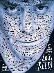

Source: https://www.aiga.org/medalist-stefan-sagmeister
Source: https://www.behance.net/gallery/79031311/Designer-Quote-Stefan-Sagmeister
I really like the concept, and wanted to find a way to of incoporate it into my work. My original thought was to introduce him in this format, with a portrait of himself. And then writing over it digitally, in my own style. I'm lucky that my computer is a touchscreen - and for this work I used my finger to write, rather than a digital pen. And so my first work was created:

In this, I decided to let Sagmeister stand out from the type, and have it work as almost a background element. In reflection, my stroke size could be larger, so that the letter are more obvious in their form. But this was only my first version. I created a few more with this image and varied the size, style and placement of the type around the space. I had created a square shape in the first work, which I didn't notice until stepping back from it. I did like the greyscale colour palette, as it created a nice contrast. I found another portrait of Sagmeister, taken by Juan Brenner and fell in love with it. The details in the face, and the silhouette draw the viewers focus to his piercing eyes.

I followed a similar process with this work, but instead of having type filling the space, I used more negative space in the background to frame the face and text. I simplified my use of type, only involving the designers name, and the I project name. In this, I drew over his face, but not over key facial features. This portrait worked much better, and didn't become pixelated as it was a larger file size. Overall, I'm really happy with how this turned out.
7 notes
·
View notes
Text
!!! this was one of my personal favourites from class. Really creative and unique. The choice of music and visual representation is really effective.
Week 10 - Saul Bass Interview
tumblr
Here is a short snippet of what I created for my Ask Me Anything project. I worked with experimenting with what I could do and create. I did this before creating my interview to understand the limitations I was working with. I had planned for longer answers but with the nature of this kinetic typography style, I couldn’t be too wordy. Here is my interview:
How has film changed design? How has design changed film?
Film inside a film. Set the story’s tone.
How do you maintain your design identity in the corporate space?
“It’s the way I want to live my life; I want to make beautiful things. Even if nobody cares.”
How has your legacy impacted modern design and cinema?
Showcase of logo and movie poster work.
How do you remain consistent in your work?
To create a brand, you must repeat the message. Keep a restrictive design palette. Style is substance.
What do the opening and closing title sequences of your life look like?
Create movement. Bold imagery. Infectious energy. Make an impact. BASS.
11 notes
·
View notes
Photo
I was refreshing to see a different take on project 3. I hadn’t seen many students doing comic books and I was really drawn to this one. You can definitely see the effort that has gone into it. Seeing this work has inspired me to experiment with adobe illustrator over the semester break.

ask me anything - wip
i found it really interesting last week to be able to go through everyone’s works in progress! there’s such a huge range of diversity in terms of medium and method for this project in our class alone, and i loved being able to see everyone’s different styles and approaches to the task. it’s one of those things about art + design which can be so so intimidating (seeing other’s work and how they tackle a design) and can sometimes be a trigger for us to compare ourselves with others and to put ourselves down about our own work. i felt this to an extent, but at the same time, the pieces everyone shared have been so different that they’re not really comparable at all!
also, i really appreciated andy challenging us to make productive comments on other’s work - until then, i’d just been posting WOW I LOVE THIS SO MUCH, and making an effort to go back to those comments and try to articulate what about the design i liked and found effective was a really good thing for me to have practised, and i’m keen to continue posting constructive comments again in the future!
6 notes
·
View notes
Text
I found this work really incredible. I loved the detailing and how intricate it was. I really enjoyed looking at other students work and seeing what their forte’s were.
Week 6, Wednesday
Still thinking about and inspired by Klaus Voormann as explored within my previous post, I decided to physically familiarise myself with his artistic/design practice. It could be a very large possibility that I incorporate some of his techniques and his overall aesthetic or style within the design of my zine dedicated to his interview. However, I am keeping in mind I do not want to plagiarise his intellectual property, so I suppose this is only for experimentation purposes. However, I would like my zine to be largely illustration based; perhaps drawing the interview in each frame or page, with the words surrounding his face, or illustrating his answers. I could possibly use my own style of illustration, in ink to give the hint of Voormann’s style? That’s simply just my initial vision, however I like the idea of it. It will require me creating thumbnail sketch layouts of how I visualise each page looking. However, there are steps to take before that as described in the brief: first I must figure out what the five proposed questions will be!
So just for fun and practice, and invest in Voormann’s materials and techniques of ink and collage, I decided to recreate the Revolver album cover using myself and some close friends as subjects in the essence of his portrayal of John, Paul, George and Ringo.

Myself as inspired by Voorman’s depiction of John.

Seb as inspired by Voorman’s depiction of George.

Bon as inspired by Voorman’s depiction of Paul.

Marlon as inspired by Voorman’s depiction of Ringo.

Scanned each illustration, edited on Photoshop (edited out paper backgrounds to turn into PNG format, turned to mode to greyscale, heightened contrast to achieve crisp, solid black fine lines within the hair), and composed all together on Illustrator in the same composition as Revolver. Similarly, added cutouts of images and other illustrations by me to create the collage component of Voormann’s style.
8 notes
·
View notes
Text
Re-blog series
I’m going to do a series of re-blogs of posts I have found interesting and helpful throughout the semester from students in my class and also artists and designers.
Enjoy.
0 notes
Text
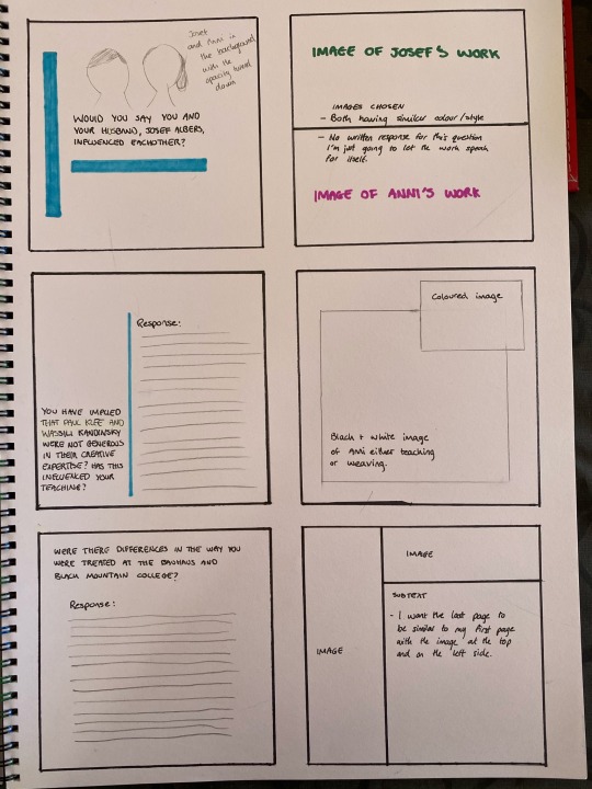
Zine layout explanation
When designing my layout I wanted to somehow replicate the Bauhaus style. The reasoning for this is the Bauhaus played a big role in Anni Albers career and if it weren’t for the Bauhaus she may have never taken up weaving. A lot of my questions are centred around the Bauhaus so I thought that that was also a valid reason to replicate the style. In terms of my colour scheme, I have used colours that Alber’s has used in her work. I used the eyedropper tool to try and get as close to the colours she used.


3 notes
·
View notes
Text
Ask me anything: reasoning behind my responses
Seeing as for project 3 the task was to ask 5 questions to our choice of subject and provide 5 answers and nothing else, I thought it would be a good idea to post on here how I came up with my answers for Anni Albers.
I did a fair bit of research on Albers and learnt about her whole life. After researching and looking at her artwork, I tried to find interviews and documentaries to see if I could get a deeper understanding on who she was. I found a couple of interviews and some of the questions asked were similar to mine. I gathered all the responses that seemed useful and put them into one document. I then selected extracts from Albers responses and incorporated them into my answers. Some of my answers have extracts from different interviews combine, but I felt this worked well as they were responding to a similar subject. When it came to myself writing part of the responses I used the knowledge and research I had already and attempted to mimic her style of speech. I tried to represent Albers as best and as truthfully as I could.
1 note
·
View note
Text
Zine rework

Over the past week I’ve been a little stuck with how I’m going to present my magazine and the layout of the pages. I initially started by creating an indesign document and I followed the layout we learnt in our tutorial. As I’m fairly new to indesign I didn’t attempt to change the layout. However, this proved to be not very effective. Every time I opened the indesign document I felt a bit lost and didn’t have any clear direction to go in. After yesterday’s tutorial I decided to start fresh and sketch out every page in my magazine to try and get a clearer picture and stylistic direction I wanted to go in. In hind sight I should’ve done this from the beginning rather than going straight to indesign. I felt by drawing out each page and choosing what to include, led to more care and thought being put into each page which hadn’t been done prior. This design is not final and might change slightly when I get to putting it into indesign, but I feel I now have a stronger sense of direction and a clearer idea of what the final product will be.
3 notes
·
View notes
Text
Zine progression
For my cover page of my magazine I wanted it to be full of colour similar to some of Anni Albers work. Following on from my experimentation with paint and trying the replicate Albers style, I progressed by trying this in illustrator. I figured this would be a much more affective method as there would be no paint smudges or paper rips. Below was my first attempt. After creating this, I discussed with my teacher wether this would be a good idea for my title page. Both of our concerns were that it wasn’t Albers work and it may not sit right if the magazine is about Anni Albers with a piece by me at the front. I agree with this, it wouldn’t feel right going about it this way. Instead I chose one of my favourite pieces by Albers and have made that my title page. I think this piece works well as a cover as there is kind of a grid like system to it where the title can fit well. The colours also get the readers attention straight away.
edit*** I have later come to the realisation that the piece below is actually not Albers work, it is the designs of Gunta Stolzl. The piece was in an article about Anni Albers so I just assumed it was hers. My bad. This obviously means I will not be using this as my cover page.


1 note
·
View note
Text
Lecture 11: What’s next for communication design?
Throughout this lecture we looked at how we have now moved into a hybrid state between a material world and a digitalised world. Towards the end of the lecture the question was asked when using adobe software how much of the design is authored by you the designer? and how much is authored by something else? e.i. the program. I don’t think I could answer this question properly as I haven’t spent enough time on the adobe programs. However, it is an interesting idea when you think programs such as adobe supply you with all the tools and equipment you need and most of the time can do all the hard work. I feel the idea comes from the person and then is executed by the program.
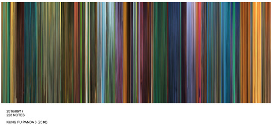
Early on we looked at this movie barcode from Kung Fu Panda 3. Before seeing this I didn’t know movie barcodes existed. I found this segment really interesting, especially how you can predict the storyline just from the barcode and how you can often tell what the character is going through by the use of colours, e.g. purple means turbulent. After the lecture I looked up other movie barcodes and found them all rather beautiful and kind of mesmerising to look at.
Reference: Moviebarcode.tumblr.com. 2020. Moviebarcode. [online] Available at: <https://moviebarcode.tumblr.com> [Accessed 20 May 2020].

We also looked at Parametric and Generative design and how they have been used. We looked at how you can generate different patterns by using the same grid, similar to the way Pepsi has. There is an overlap with grid work from the early 20th century that parallels to what is happening in the 21st century. Can also relate to the Bauhaus and how some artists were heavily influenced by using a grid system in their work.
Reference: Davis, D., 2020. Parametric Typography. [online] Daniel Davis. Available at: <https://www.danieldavis.com/parametric-typography/> [Accessed 20 May 2020].
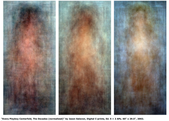
Work by Jason Salavon. He has manipulated preexisting media to create works of art ‘by overlaying images (such as multiple photographs) and averaging the result to create visual amalgamations and, second, by distributing processed media (such as individual frames of a movie) side by side or in other configurations.’ - https://en.wikipedia.org/wiki/Jason_Salavon
I wasn’t fully sure on what Parametric and Generative design meant, so I looked into them a bit more and used these definitions as a reference.
Parametric design is a process based on algorithmic thinking that enables the expression of parameters and rules that, together, define, encode and clarify the relationship between design intent and design response.
Generative design is a design exploration process. Designers or engineers input design goals into the generative design software, along with parameters such as performance or spatial requirements, materials, manufacturing methods, and cost constraints. The software explores all the possible permutations of a solution, quickly generating design alternatives. It tests and learns from each iteration what works and what doesn’t.
Reference: Theophanidis, P., 2020. On Uniqueness And Averageness: Jason Salavon’S “Every Playboy Centerfold, The Decades” (2002). [online] APHELIS. Available at: <https://aphelis.net/uniqueness-averageness-jason-salavons-every-playboy-centerfold-decades-2002/> [Accessed 20 May 2020].
3 notes
·
View notes
Text
Creating fonts
After watching the week 11 lecture, I decided to have a play around with making different fonts on Metaflop. I was fairly pleased with this first one, I still think it might need some more work as I probably wouldn't use that exact font in my work. I find it a little bit to vertical and thin, I’d probably try make the stroke a little bit shorter.

For the second attempt I deliberately tried to make it not that aesthetically pleasing and a bit of a headache to read. For me, having the letters slanted to the left instead of the right really annoys me, which is why I chose to do it that way. I wanted this font to not feel very good. This was just a bit of fun inspired by lecture 11. I’ll continue to play around making fonts and hopefully come up with something that I will potentially use.

Fonts created on: https://www.metaflop.com
2 notes
·
View notes
Text
Aspiring designer in the age of Instagram
During my tutorial on Monday we briefly discussed the effects that social media platforms such as instagram have on us creatively. I wanted to look into it a bit more and discuss the effects it has had on me. In the last couple of days the images below have popped up on my instagram feed by various artists. I think all these works are great and really beautiful but I can’t help but think how will I ever get to this standard. I find it quite daunting when I scroll through feeds of artists and designers work on instagram and I make sure I’m not doing it all the time otherwise it may become a bit too overwhelming. Even though I am appreciating and admiring their work, I can’t help but compare it to my abilities. I’ve only just gotten into design, I’ve been out of high school for over two years now and have spent the last couple of years working. I wasn't familiar with the adobe programs before starting this course and would say I still struggle using them properly. So especially seeing these types of works, which some have been done on programs such as illustrator can be disheartening and make me feel not that competent. I often do look at design pages for inspiration and they have been very helpful in that sense.
I think it’s particularly hard for young designers now, as I feel everything is at such a high standard and easily accessible that it makes it hard to find your identity - or create something that hasn’t already been made. However, in saying that the world is forever changing and new ideas are always being thought of - for me I’m only at the beginning and it’s important that I don’t worry too much about what I can and can’t do, I’m still very much in the learning phase.

Instagram: @pavlovvisuals

Instagram: @nicholasmoegly
Instagram: @mikeperrystudio

Instagram: @s_harrington
1 note
·
View note