
変わらない物を求めて、変わり続ける - I will change to request that it doesn't change. ここでは、お気に入りの風景や作品を取り上げています。掲載のものには私以外の著作物も含まれますので製作者の欄をご確認ください。
Don't wanna be here? Send us removal request.
Statistics
We looked inside some of the posts by cota and here's what we found interesting.
Average Info
Notes Per Post
37K
Likes Per Post
20K
Reblog Per Post
16K
Reply Per Post
17
Time Between Posts
5 months
Number of Posts By Type
Text
1
Video
6
Photo
10
Last Seen Tumblr Blogs


Fun Fact
Tumblr is used by 21% of adults online aged 18-29 years.
Text
コミックマーケット103 12月30日土曜日に頒布されるサークルMed bob様の表紙デザインを担当させていただきました COTA.jp 「コミックマーケット103 声優イラスト本表紙」より
0 notes
Video
vimeo
#45 東京へ飲まれた小さな村と別れる from こた - COTA on Vimeo.
おばあちゃんが育った集落は11世帯で裸足で歩くこともあったという。やがてその村は拡大を続けて世界一大きな都市「東京」として飲まれていった。その村を去るときが来た。
おじいちゃんが書き留めた日記を手にして。自分も節目を迎える。
・おじいちゃんの一行日記(17年分) cota.jp/sincere/nikon/simplediary/
0 notes
Video
vimeo
#32 静かな宵に光を灯し、 from こた - COTA on Vimeo.
遠くに届くのは強い光とは限らない。この先の見えない宵、光とされるのは一体なんなのだろうか。
どんなに深く長く続く夜はあってもいつかは明けるなんてみんな歌うけど、一方で抱く希望や夢というのはどんな闇夜も流すことを許さない。
崩壊の足音。光の兆し。 誰かの責任なんかじゃない。笑えなくてもいい。ただどこを向いたって自分の胸に描くものは変わらないのだから、せっかくなら光を灯してみて良いと思う。その光を誰かがみて心を灯し、繰り返すうち闇は消えるだろう。
久々にペンライトを握った。スイッチを入れて心を横浜アリーナに向ける。誰もいないステージに立った彼女は人の心を蝕む三文字の病気の名前に触れぬよう、画面という存在を感じさせぬよう歌い倒す。
我らの目にも見せず勢いを強める相手も、所詮はその場がなければ広まることすらできない。 世界に散った観客は状況、視線、それらから意図を読みとりつつ変わらずにペンライトを振る。どこにいようとも仲間とあの頃を思い出して光を天へ。その瞬間、勝利を宣言した。
0 notes
Video
vimeo
#35 The rely will save the World. 甘える勇気が世界を救う from こた - COTA on Vimeo.
When in doubt, ask each other.
At the end of World War II, my grandpa went to the war zone. In reality, he was not fighting, but was wearing tattered clothes, and even securing food was beyond his limits.
Poverty then is different from the harshness now. But the fear of poverty is more than being poor, it is the atmosphere of not being able to ask for help.
The feeling of not being able to forgive yourself may eventually lead to not being able to forgive those around you, which may lead to the theory of hard work and the forcing of fruitless hardships. Before that happens, I want you to rely on what you need to rely on. Then you can do your best. History has taught us that.
My grandpa didn't talk about the war when I was a kid. He didn't want to preach about something so harsh. It was only a few years before he passed away that he finally started talking about it.
With a record of that time. It is wonderful to do your best, but I hope that you will understand that I don't want you to overdo it.
困ったときはお互いさま、です。
第二次世界大戦も終わり、おじいちゃんは戦地へ赴きました。現実は戦うどころかボロボロの服に食料の確保すら限界を超えていたと言います。
当時の貧困といまの厳しさは違います。ただ貧しさの怖さは貧しいと言うこと以上に、助けを求められない空気です。
自分を許せない感覚はやがてまわりも許さず、努力論や実のない苦労の強要を生むことになるかもしれません。そうなる前に、頼るべきものを頼ってほしい。それから頑張ればいいと。歴史が教えてくれています。
おじいちゃんは戦争の話は俺が子供の頃してくれませんでした。過酷すぎることを説教にしたくなかったようです。亡くなる数年前からようやく語りはじめてくれました。
その時の記録とともに。がんばることは素敵ですが無理をしてほしくないということが伝わって欲しいなと考えています。
0 notes
Video
vimeo
#34 不安の敵には負けて良い from こた - COTA on Vimeo.
つまり不安と戦うのは熊と戦うくらいに無意味なことだ。
常に何らかの不安を抱えて人は生きている。その不安を共有することは安心を得ることにもつながる。
しかし自らの体裁を一番に考えて不安と無理に戦おうとしてしまうとどうなるか。不安がエスカレートして何か別の人を崇拝し、そこから安心を得ようとすれば、他人へ感染するかのように得体も知れないモンスターが出来上がる。
大丈夫。冷静でいること、そのまま受け止めたり周囲とお話をすることが一番負けないことに繋がるから。
0 notes
Video
vimeo
#33 破綻寸前 銚子電鉄 初詣 ラーメン ル・コルビュジェ from こた - COTA on Vimeo.
ナウなヤングにバカウケ必須なトレンディ初詣をちょちょいのちょいでご提案。神社の境内でだべっていたら出会ったのはラーメン!?待っててくださいチャーミングな竹本社長!ドンピシャで滑り込んだあなたの車は今、ちんたらと犬吠に向かっていますヨ☆
0 notes
Video
vimeo
#31 聖夜を照らせ星空 グランピング from こた - COTA on Vimeo.
クリスマスを目前に湖の畔でグランピング。後輩さんがどう感じたかは分からないけれど、自分だけではできなかったきっかけのプレゼントをくれた事をありがたく感じました。
距離を置くということを何よりも大切にしなければいけなかった今年一年。寒い屋外でも楽しめたのは、楽しもうという��係があってこそでした。冷たくなったスープを冷製スープとして笑えたのも、室内の大切さが分かったと笑ったのも。
真面目な後輩さんは、春先から外出自粛制限が解かれた後も県をまたがず徹していたそうです。そして今回のグランピングには予定を合わせるため夜勤明けに。翌日も仕事です。そんな中でも行きたいと申し出てくれたこと、その関係に感謝しています。
その感謝の言葉を直接伝えてしまうと、後輩をつけあがらせてしまい(動画内参照)教育上よくないですからね。いつもぐちゃぐちゃな先輩達に付き合っていただきありがとうございます。
そしていつも一緒の時間にお付き合いいただいているあなたへ。 良いお年を。
0 notes
Photo
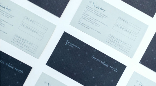


Branding by Balsamstudio for Scandinavian Clinic
See more on WE AND THE COLOR.
Follow WE AND THE COLOR on: Facebook I Twitter I Pinterest I YouTube I Instagram
37 notes
·
View notes
Photo


“ Hedeker Wealth & Law ” visual ID by SocioDesign
Follow “a day in the land of nobody” on tumblr
Pinterest | Society6 | Redbubble | Teepublic | Twitter | Designspiration | MAB
182 notes
·
View notes
Photo


Brand Identity for Hey Baby by Funkhaus
“With a familial approach to doing business, our work had to create a system that would be recognizable and trustworthy. It was also important to strike a balance of playfulness to match the name itself, yet not push so far that it became unserious. Inspired by their team’s connection to Scandinavian design, we took a geo-sans approach that stacked the two words, making it more of a logo than a traditionally-read phrase.Then to further lend warmth, we matched this with a rich, contemporary orange, inspired by the Cut-Outs of Henri Matisse.”
Funkhaus is the creative’s creative agency. They create highly tailored platforms online and in print, working side-by-side with premier brands to design websites and visual identities, build new technologies, and develop strategic content and branding.
T D B: instagram • twitter • facebook • newsletter
269 notes
·
View notes
Photo

Saad Branding+Design – Rebranding
See more here: http://bit.ly/2eNESgP
Follow WE AND THE COLOR on: Facebook I Twitter I Pinterest I YouTube I Instagram
14 notes
·
View notes
Photo


Packaging for Craig Alibone Chocolate by north
“The logo is based on a hand-drawn typeface to give a unique expression and to emphasize the craft that goes in to every single product. The visual identity is restrained with a strong focus on photography presenting Craigs creations. We also designed a system for the packaging which is easy to expand with new products since the labels are printed in-house. The full scope of delivery includes a complete visual identity, a wide range of packaging, website, printed material and photography.”
by north™ is a design studio located in Bodø, Norway focusing on strategic branding and design. They are brand specialists who develop effective and unique solutions for companies of all sizes. With extensive experience in branding and digital communications, they know how to get the brands to communicate with the customers.
T D B: instagram • twitter • facebook • newsletter
295 notes
·
View notes
Photo


Brand Identity for Run Mfg by Perky Bros
“Run Mfg is an independent race design and production studio based in Chicago, IL. Led by Nathan Barnhart and Elaine Lau. Their brand identity is made for motion. The logo, inspired by a looped shoelace, expands and contracts building endless run routes. The simplified electric blue and black color palette creates a bold, energetic mindset, separating them from the competition, from print to digital to race day.”
Perky Bros exists to help brands gain clarity, value and distinction through design. They create visual identities, websites, packaging, print materials and any odd or end necessary to create an authentic experience. Working with startups to more established brands, they like to keep their approach flexible. Regardless of what they’re tackling, they strive to offer solutions built on plain-spoken, ambitious ideas - always grounded in research and meticulously crafted in their execution.
T D B: instagram • twitter • facebook • newsletter
175 notes
·
View notes


Photo


Em Cartaz – Branding by Kempeli Design e Comunicação
You can find more of the brand identity here: http://bit.ly/29ANrIG
Follow WE AND THE COLOR on: Facebook I Twitter I Pinterest I YouTube I Instagram
35 notes
·
View notes
Photo


Thorncrown Chapel is a chapel located in Eureka Springs, Arkansas, designed by E. Fay Jones and constructed in 1980. The design recalls the Prairie School of architecture popularized by Frank Lloyd Wright, with whom Jones had apprenticed. The chapel was commissioned by Jim Reed, a retired schoolteacher.
1K notes
·
View notes
Photo


Branding for BDG Architecture by Manual
“BDG architecture + design is an international consultancy focusing on strategy, architecture and design for corporate, public sector and education clients. Our solution was to turn their three-letter acronym into an iconic logotype with a unique personality. We abstracted the letterforms into reductive geometric shapes. This consolidation of forms subtly references the nature of architecture and the constructed environment—and aims to suggest ways in which parts work together to form a whole.”
Manual is a design and branding studio based in San Francisco. They help clients express themselves and their products through iconic brand identities and beautiful experiences. Their work strives to clarify purpose, build meaning, and stir up curiosity and emotion.
#thedsgnblog#design#graphic design#identity#visual identity#typography#type#print design#branding#brand identity#visual communications#print#logo design#logo#stationery#stationery design#architecture#bdg architecture#manual#design studio#san francisco
351 notes
·
View notes