
Don't wanna be here? Send us removal request.
Statistics
We looked inside some of the posts by cpmddn413graphicblog-blog and here's what we found interesting.
Average Info
Notes Per Post
0
Likes Per Post
0
Reblog Per Post
0
Reply Per Post
0
Time Between Posts
2 days
Number of Posts By Type
Text
2
Photo
15
Last Seen Tumblr Blogs


Fun Fact
Tumblr has 4 main sources of revenue.
Text
Final Thoughts
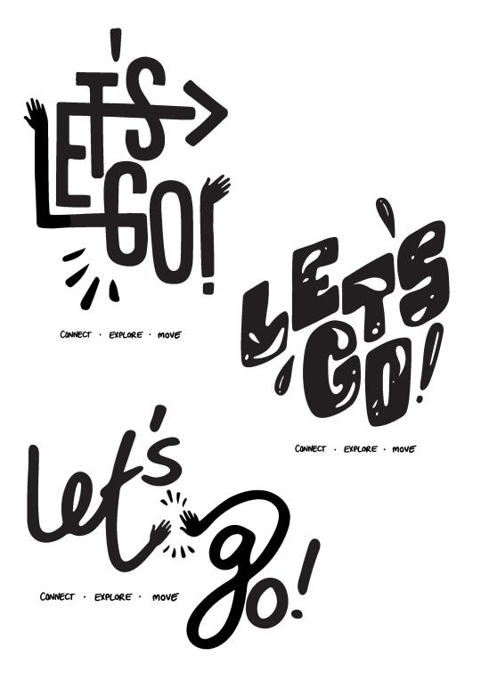
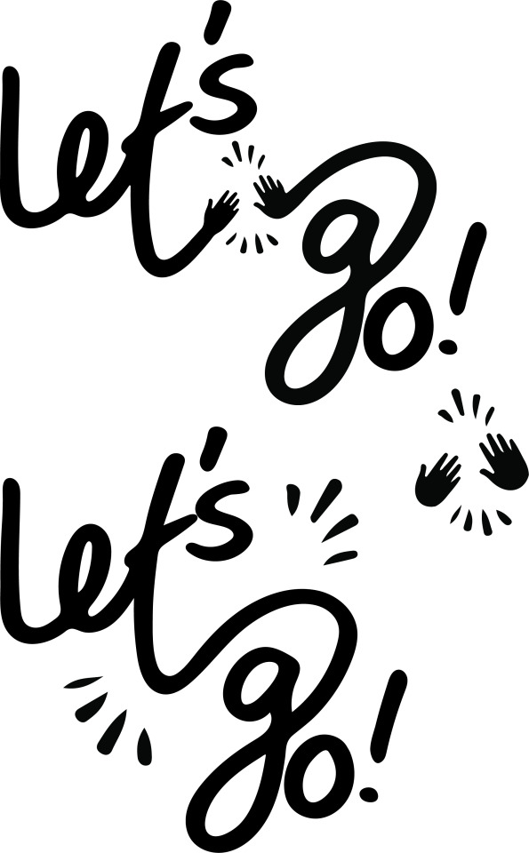
My final 3 compositions each have a different application of the key ideas outlined in the brief to be portrayed through type in Let’s Go’s branding. I chose the simple message of “Connect, Explore, Move” as the subordinate text because i think these 3 ideas capture the essence of what the brand is trying to achieve. The use of hands and joining letters represents the way the app is intended to bring people together and movement in the type symbolises the exercise and activity people are looking for in their social interactions through engaging with others. I chose a vibrant, fun but professional looking colour palette to suit all range of ages and genders that the app is intended to be used by.
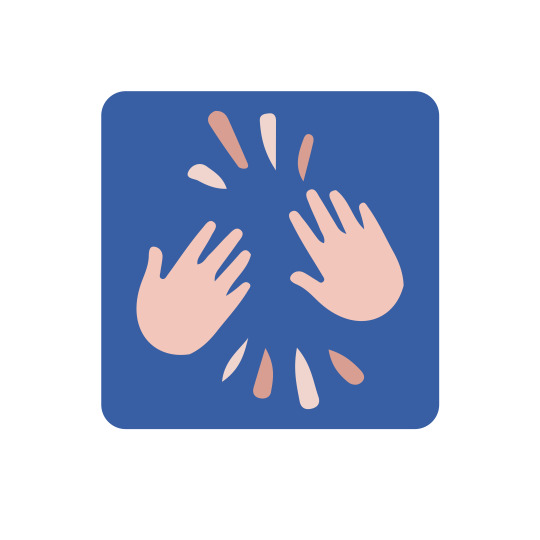
I think concept one was the most succesful as a homepage logo because of the blocky composition and strong contrast, also making it easily recognisable as identified by the client.
The use of drops and dots in the second composition suggest fun and movement with quirky block lettering, but I think ultimately the other two concepts were more succesful and succinct at communicating this message with the use of hands ‘waving or high fiving’ bringing a strong sense of positive social interaction.
I also created a small icon that could be used on the homescreen which is a simplified version of the logo featuring just the two hands but with the distinctive lets go look and colours.
0 notes

Photo
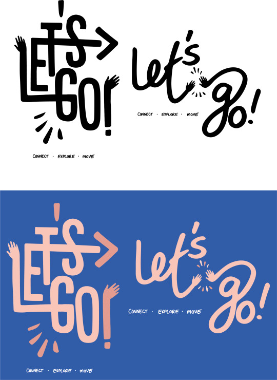
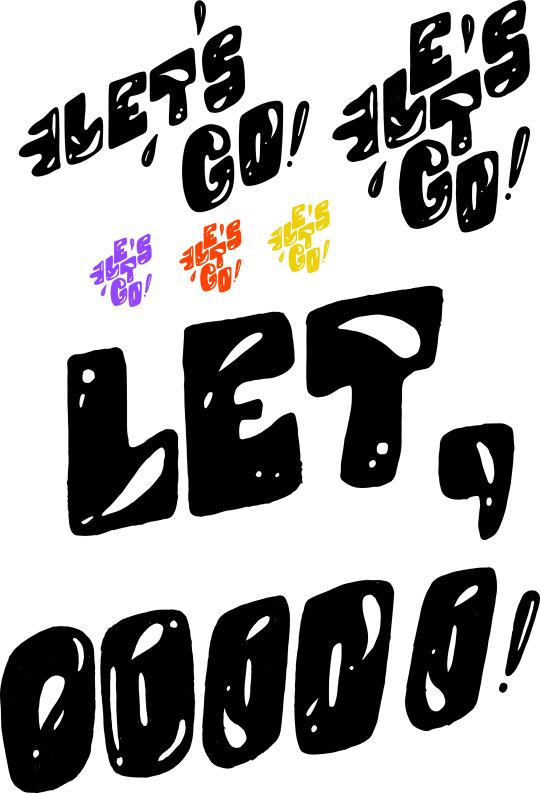
EXPLORATIONS OF FINALS , APPLICATION OF COLOUR, HOME SCREEN APP ICON
0 notes
Photo
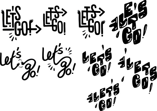
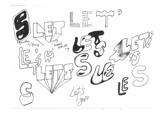
Concept explorations
these are my three chosen variations , to be further refined and select a final composition for each.
0 notes
Photo

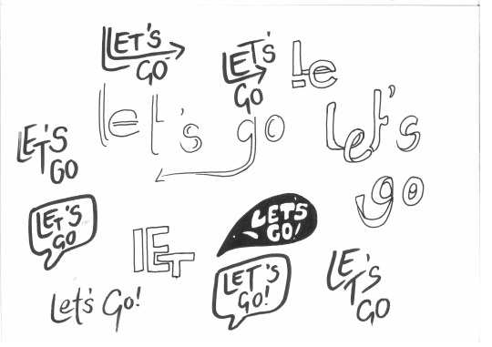
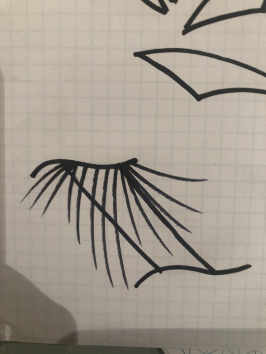
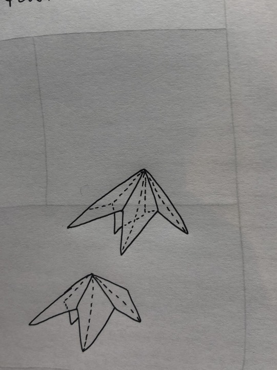
I Imported a combination of hand drawn and existing typography into illustrator and converted them through image trace to create forms I could begin to manipulate. I played around with composition, sizing and adding details as well as tidying up imported images by using the smooth tool and creating additional movement in the styles. I created lines arrows and created a 3d feel through new details in the type to bring my own style and incorporate elements needed in the brief that weren’t present in the existing typography.
0 notes


Photo
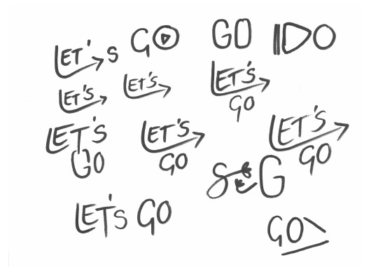

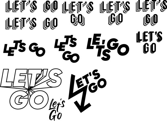
I have experimented with the use of marker for that thick, handdrawn look and using different compositions and looping to be bought into illustrator to edit together
0 notes
Photo


Mood Board + Initial sketches
I like the idea of using hands meeting, high fiving or waving to communicate the social, human aspect of what the brand is hoping to achieve with this new platform. The us of arrows, looping, and splashes suggest movement suggest activity and movement. Block and hand lettering are commonly seen in exercise focused and social type apps so I want to use these in a hand lettered way
0 notes
Text
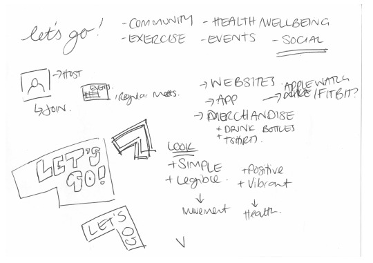
Brie (Key points) + Initial Thoughts - Let’s Go Social Exercise Platform
Name of Client: Lets Go!
Type of Organization: Lets Go is a service that brings the community together for activities that involve exercise to promote health and well-being. The service helps people come together to participate in active events such as group trips out for a bushwalk or getting a group together for a run or exercise. The service promotes the idea of anyone, and everyone can come together for a fun time, making new friends and memories on the journeys.
Big Picture: This service provides opportunities for people to host and join events that are convenient for them to participate in physical exercise. It joins a market of busy individuals that are seeking to get motivated to become more active in their lives. There is an increase to more people not getting enough daily exercise and wants to get more people active to help the health of the community.
Unique Proposition: The biggest strength of the brand is the strong social aspect, allowing members to host and join events at any time. The brand sets itself apart by its social features and developing strong feedback and ratings towards each event and host.
Audience: The service promotes to be targeted at an audience of all ages and physical capabilities, motivated by the ideas of being more active and learning and making new connections. They strive for a healthier lifestyle and want others with them on their journey.
Objective: The goal of the logo to visually communicate the face and values of the service.The logotype will be used across website and application platforms.
Tone: The logo must be simple and easily legible while also stylised to fit a positive and vibrant design. It must incorporate some way to show movement and health
Takeaways:
I want to communicate movement activity, fun, social and a feeling off connecting with my typography. I want it to feel fresh, inviting, fun and bold.
I will look at other social networking apps and fitness apps to look at how I can incorporate visual language from these two elements that makes sense together and has a cohesive overall composition
0 notes
Photo

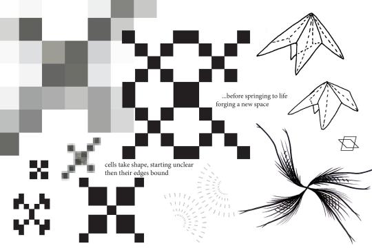
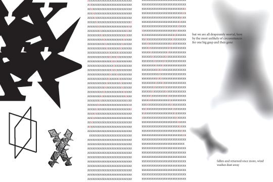
For my Zine , I kept it really simple and moved through each page as small steps in the exploration we did over the course of our exercises. For the tex, I spoke about the concept of ‘making a mark’ as a reference to the letter x itself often marking a spot of some kind, and alluding to different strokes (people) and different phases they go through in life.
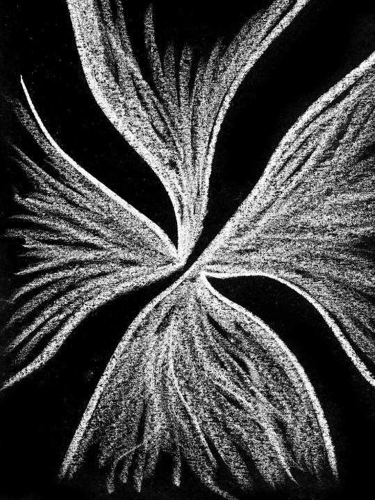
I punctuated the zine either side with 2 of my favourites from the chalk exercise, the one at the start reminded me of a strand of DNA ‘converging’ or ravelling together then the final one more of a disbanding or ‘diverging’.
My spot colour was the red and I just used it as a way of creating contrast against the black X columns to form an x within the text. It’s a subtle use but I wasn’t seeing any value added in turning one of the x’s red so kept it greyscale for the most part.
0 notes
Photo

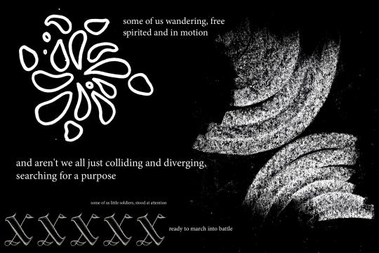
I really like the abstraction of the x into more of a 3d expression in this poster. The white on black was more striking so I chose to invert it from the original sketch and I think this is the furthest I was able to push my letter without it feeling lost or that it didn’t inform the overall design. It is reminiscent of the radial waves in one of the zine pages I used from the chalk on black exercise and I think the movement is captured in a way that was unexpected and playful
0 notes
Photo


Here’s a few in progress shots of some of the forms I played around with on Photoshop, Illustrator and In Design.
0 notes
Photo

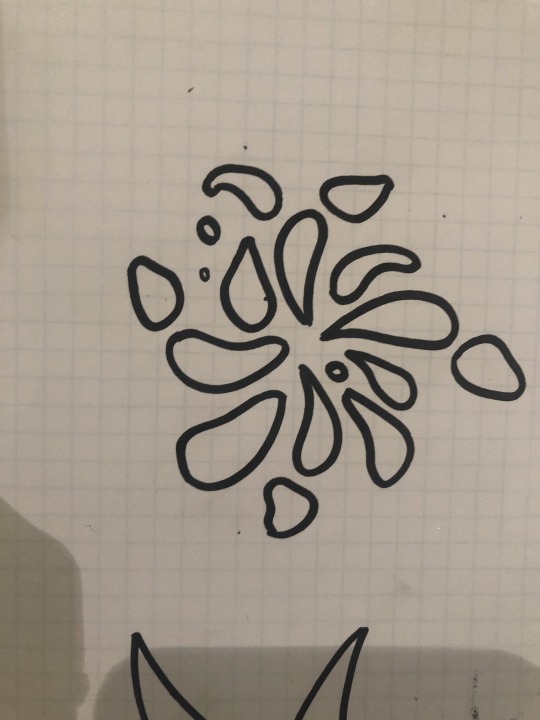


These are some free form sketch explorations of the letter, I think the use of thick black lines gives a new confidence and deliberateness to the lines and gives a nice textural quality that can come across quite delicate in some of the pieces
0 notes
Photo
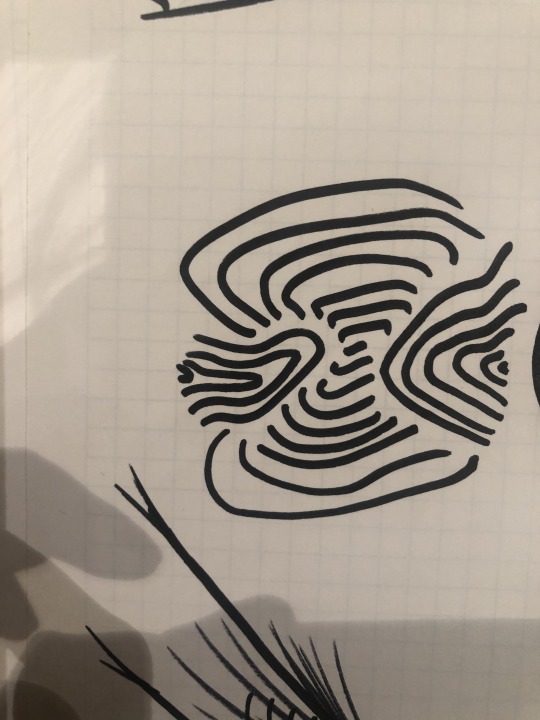
I chose to take some of my earlier, 3d explorations and turn them into outlines to form a 2d expression of the black square exercise, I think they communicate a unique aspect of the form of the letter x and will be a great addition to the final zine.
0 notes


Photo


For some reason, tumblr is only letting me upload two of these at a time, will do caption at the top post
0 notes