Statistics
We looked inside some of the posts by cremadesignpractice and here's what we found interesting.
Average Info
Notes Per Post
0
Likes Per Post
0
Reblog Per Post
0
Reply Per Post
0
Time Between Posts
24 days
Number of Posts By Type
Text
14
Photo
3
Last Seen Tumblr Blogs


Fun Fact
In 2020, Tumblr had 29.4 million users in the US.
Text
Blog Post #9 Rationales Refined
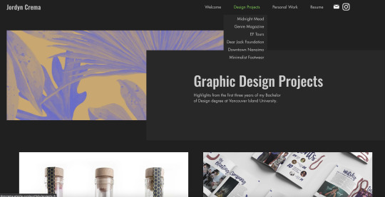
Personally, in GD portfolios, I find titles that aren’t straightforward and descriptive of the project to be very off-putting. That being said, if a portfolio is showcasing ONLY packaging design for example, less descriptive is okay, but personally I would like to see the projects named with the brand or product names for clarity. While I still want the rest of my rationales to be fairly direct and to the point, I do find it important to add a little more personality and information than simple point form. My rough rationales come across as a little dry as they are, so my goal with today’s assignment was to make them more engaging. Title: Midnight Mead Packaging
Challenge: To design a brand and cohesive labels for the debut line of products from a local meadery. These products are small batch, made with local ingredients whenever possible (which is most of the time!), and aged for a minimum of ten months for a smooth and flavorful product.
Approach: I researched existing meaderies in Canada to get a feel for the industry, and what is already out there. I also researched the rich history of the beverage. I chose the name Midnight Mead from a list of potential brand names, I wanted something that set the brand apart from the others which often focus on the honey/bees. Mead is an old beverage, and is often mentioned in stories of fantasy and whimsy. Historically, it is referred to as “the nectar of the gods”. I felt Midnight Mead captured part of the mystery and allure that makes these stories so popular.
What I Did:
Working in Adobe illustrator, I created a wordmark for the brand, and visuals for the three flavours in this line. I wanted the labels to reflect the small-town, hand-made values of the company through the use of textured labels, and hand-drawn inspired type. After many test prints to get the colours right on my chosen watercolour texture paper, I added heat activated embossing powder to add texture as well as a little celestial shine. I also printed a pattern on the back of the labels that can be seen through the lighter flavours/empty bottles, as a nod to the honeycomb that makes mead possible. Using sticker paper, I created a custom “tape” seal to further tie this to the brand.
Tools: Illustrator, textured paper, double-sided printing, embossing powder.
Title: Downtown Nanaimo Wayfinding
Challenge: To make downtown Nanaimo more inviting, and easier to navigate, while highlighting features and businesses of downtown.
Approach: Creating a cohesive brand identity highlighting the main districts, including a sign system. To start with I made a list of my favourite reasons to spend time downtown Nanaimo. I then explored downtown, making it a point to ignore what I would habitually do, and discover more of what the downtown core has to offer. I also took photos of existing signage and confusing areas. I took note of any and all frustrations I had while trying to navigate to new places in the area.
What I Did: I used Adobe Illustrator to create a logo/wordmark for downtown Nanaimo. I chose to include an icon of one of Nanaimo’s most notable landmarks, the bastion. This icon is found throughout the brand, unifying all of the separate elements. I branded each district with a distinct brand accent colour, and identifying wordmark.
Tools: Illustrator, Photoshop.
Title: EF Tours Magazine Ad Series
Challenge: To create a series of magazine ads for the same company that work as standalone ads, but can be easily recognized as a series.
Approach: My client for this project was EF Tours, advertising their tours that focus on Canadian History. Largely focused on the World Wars, these tours are primarily throughout various European locations. These trips are a great way to see parts of the world while still prioritizing your education.
What I Did: I wanted these ads to feel as exciting and engaging as the tours are. To create a sense of being transported into these images, I created masks in indesign and gave the photographs the illusion of breaking out of the articles. One challenge here was to make sure the text remained readable with the engagement from the ads. Each image features a location from a different EF Tours D-Day trip.
Tools: Photoshop, InDesign.
Title: Dear Jack Foundation Poster Series
Challenge: The Dear Jack Foundation is a non-profit providing impactful programs benefiting adolescents and young adults (AYA) diagnosed with cancer and their families to improve their quality of life from treatment to survivorship. The foundation was founded by Andrew McMahon, musician and YA Leukemia survivor. Every year on November 11, he hosts a benefit concert in support of the foundation. The challenge was to create a series of outdoor posters of varying sizes for the event.
Approach: I looked at past years poster, as well as Andrew’s ever-evolving album art. I chose to come up with one main visual that could be consistent and uniting across a smaller poster, a bus stop shelter poster, and a billboard on the side of the highway.
What I Did: I used illustrator to create a shape meant as an abstract representation of sound, using the Dear Jack Foundation brand colours. I placed these on a dark background, and started with the small poster. The small size was relatively easily scaled up to a bus stop poster, as all of the information still had enough attention in this setting to include. With such limited time to read a sign on the side of the highway, even more attention to hierarchy was required for the billboard version.
Tools: Illustrator, Procreate, Photoshop.
0 notes
Text
Blog Post #8 Case Study Rough
(I changed my mind and would like to use a project I listed last week as my case study) Project title: Function First Footwear app Client Name: Function First Footwear Date completed: Spring 2023
Your Role: Designer
Project description:
To create a not-for-profit educational app about barefoot/minimalist footwear, and lifestyle.
Research and Analysis:
Researched minimalist shoe brands, exercises for healthy feet, and reasons to switch to minimalist footwear. Installed many apps for shopping, news, and exercise to research UI/UX design patterns that worked well for these tasks.
Design Process:
Started with sketches, mood board, and personas. Developed wireframes and used these to create a working prototype in Adobe XD.
Design Solution and Deliverables:
I designed a working prototype in Adobe XD, users are able to click through as though it were a real app. Not only does this allow users to see the design with more context, it gives an idea of how it would feel to use the app.
Special Circumstances:
I wanted the prototype to feel as close to a real app as possible and spent many hours linking all of the products to unique product info pages, and linked externally to the real shops.
I also struggled with balancing the branded design with functionality, a few stages of iteration were a little over-designed. I was able to prioritize pages and elements that made sense to show off the brand style, while keeping the app functional and easy to use.
0 notes
Text
Blog Post 7: Rationales Rough
Title: Midnight Mead Packaging
Challenge: Fictional, small, local business required branding and labels for a new product.
Approach: Created name for company and product, printed labels on textured paper with pattern printed on the back, chose unique bottle shapes.
What I Did: Invented company/product, typography, layout, illustration, printing, photography.
Tools: Illustrator, texture paper, double-sided printing, embossing powder.
Title: Function First Footwear app
Challenge: To design an informational/educational resource app for minimalist footwear awareness campaign.
Approach: An app with an education section, blogs, exercise videos, and a curated shopping resource featuring approved brands.
What I Did: Created name/logo for company, layout, typography, copy-writing, animation.
Tools: Illustrator, Photoshop, Procreate, Adobe XD.
Title: Barefoot Infographic
Challenge: topic: minimalist vs conventional footwear. Bring awareness to the benefits of more foot-shaped shoes.
Approach: Research and compile data to distill into an engaging and educational info graphic poster.
What I Did: Typography, layout, illustration, graphs.
Tools: Illustrator, Procreate, Photoshop, InDesign.
0 notes
Text
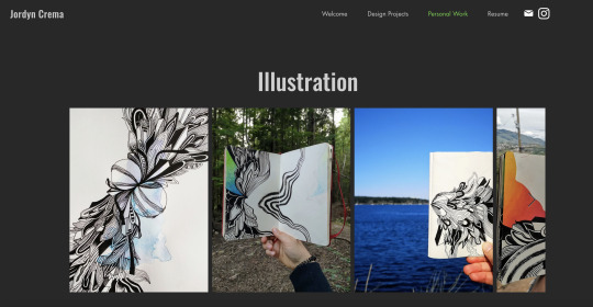
Post 6 Identity and Mood Board

I aim to use very clean photography when relevant, and simple mock ups that let the design come forward.
0 notes
Text
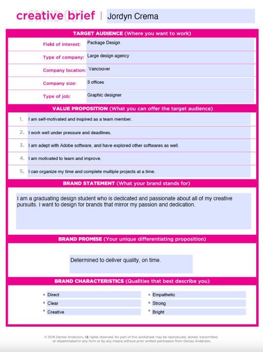
Blog Post #5 Ideal Workplace
A. Who are they? (use somewhere you dream about working) Crew Marketing is a strategic marketing and creative agency specializing in consumer goods. https://www.crewmarketingpartners.com/
B. How are they a good fit for you? How do they align with your own personal and professional goals? What might you learn? How will you develop further as a designer?
I have always had an interest in package design, particularly for food. Not only does Crew Marketing focus on these products, they also tend to work with BC/Canadian brands.
C. How are you a good fit for them? What skills and unique qualities do you bring to the table? – as a human being – as a new designer
As a person I am punctual, honest, and creative in many aspects of my life. I work well independently and as part of a team, and I love collaborating. As a new designer I bring fresh ideas and an open mind.
D. What are you offering to them, specifically? (think about your value statement, your skills, your strengths, your characteristics).
I offer a desire to learn, and the drive to constantly improve myself. I try to see the creative side in everything I do. I thrive in a leadership roles as well as supporting roles. I am open to criticism and am confident giving feedback when needed.
0 notes
Text
Blog post 4 - Self Audit
List the links you’ll use in your Portfolio:
- About
- Design Work
- Personal Projects (To showcase more hobby-oriented projects)
- Resume (?)
3-4 Projects:
- Midnight Mead packaging
- Downtown Nanaimo case study
- EF Tours ad Series
-Minimalist Footwear infographic
Holes to fill:
- I have written rationales for all of my projects in my portfolio currently, I would like to comb over these and make sure they are clear and concise, and have all information my viewers will need.
- My portfolio projects most likely need more written rationales along with them. I will need to create more of a story along with my portfolio pieces, discussing the concept, my process, the goal, and the result.
Platform
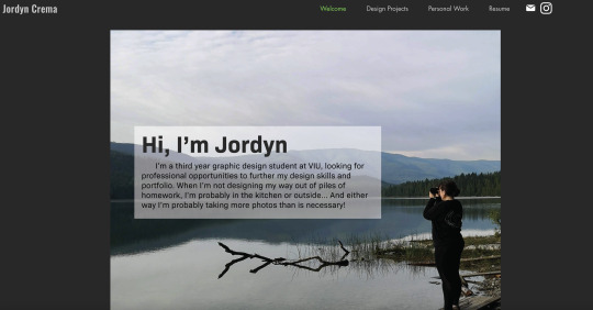
I’m using Wix as a platform for my portfolio, I think I’m happy with it.
Domain
I haven’t put too much thought into my domain as I haven’t been ready to commit to anything monetarily yet. I’m thinking “jmcrema” to match my instagram handle, or maybe just jordyncrema.
Visuals
I’m pretty happy with the current layout of my portfolio site, and think I will make some minimal tweaks after ironing out the other details.
0 notes
Text
Blog Post 3
This worksheet took me much longer to fill out than expected. This has definitely been a challenge to begin with, but with each activity it gets a little clearer. I am hoping that I will be able to push harder and continue to evolve throughout the semester.
0 notes
Text
Blog 2: Inspiration
One thing that really stuck with me from the portfolio review videos was the concept of having empathy for the viewer. For one, it makes it a lot easier for the viewer (likely a prospective employer or client) to navigate and understand your work. It also shows that you have the skills to understand and cater to your audience, which is such an important part of graphic design.
I strive to have a portfolio that:
-is well laid out and easy to navigate
-is professionally written, no spelling or grammar errors, straight to the point and easy to understand
-gives context not only to each project, but each component of each project. While I may know the exact purpose and size of each component of my own projects, it is not going to be immediately obvious to every outsider.
I really like Heather Shaw’s homepage. It is still designed and shows her personality, but clearly identifies what each project is about. If I’m not interested in seeing her web design projects, it’s easy to know which ones not to open.
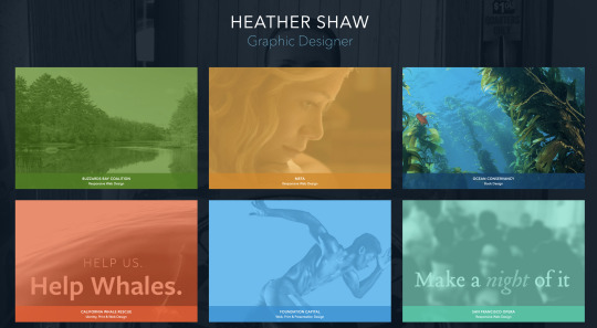
The website is also very simple and easy to navigate. It is simply the homepage and the project pages. She has a footer on each page with a quick description of who she is, in lieu of an actual “about me” page. Personally I think this is a great way to still include that important aspect without cluttering up your site.
I also find her project pages hit a lot of the points I plan to. She gives context to the companies she designs for, as well as size context for the project deliverables.
0 notes
Photo

I will admit I haven’t necessarily been expecting to enjoy this class—the concept of branding oneself sounds impossible and exhausting to me. But despite my trepidation it’s certainly an important project, and I am ready to tackle the challenges presented by the self-reflection and self-discovery required.
For the “pixie dust” exercise I actually struggled at first to think of enough hobbies/activities etc to sketch, but in the end realized I had actually thought of more than I needed to.
0 notes
Text
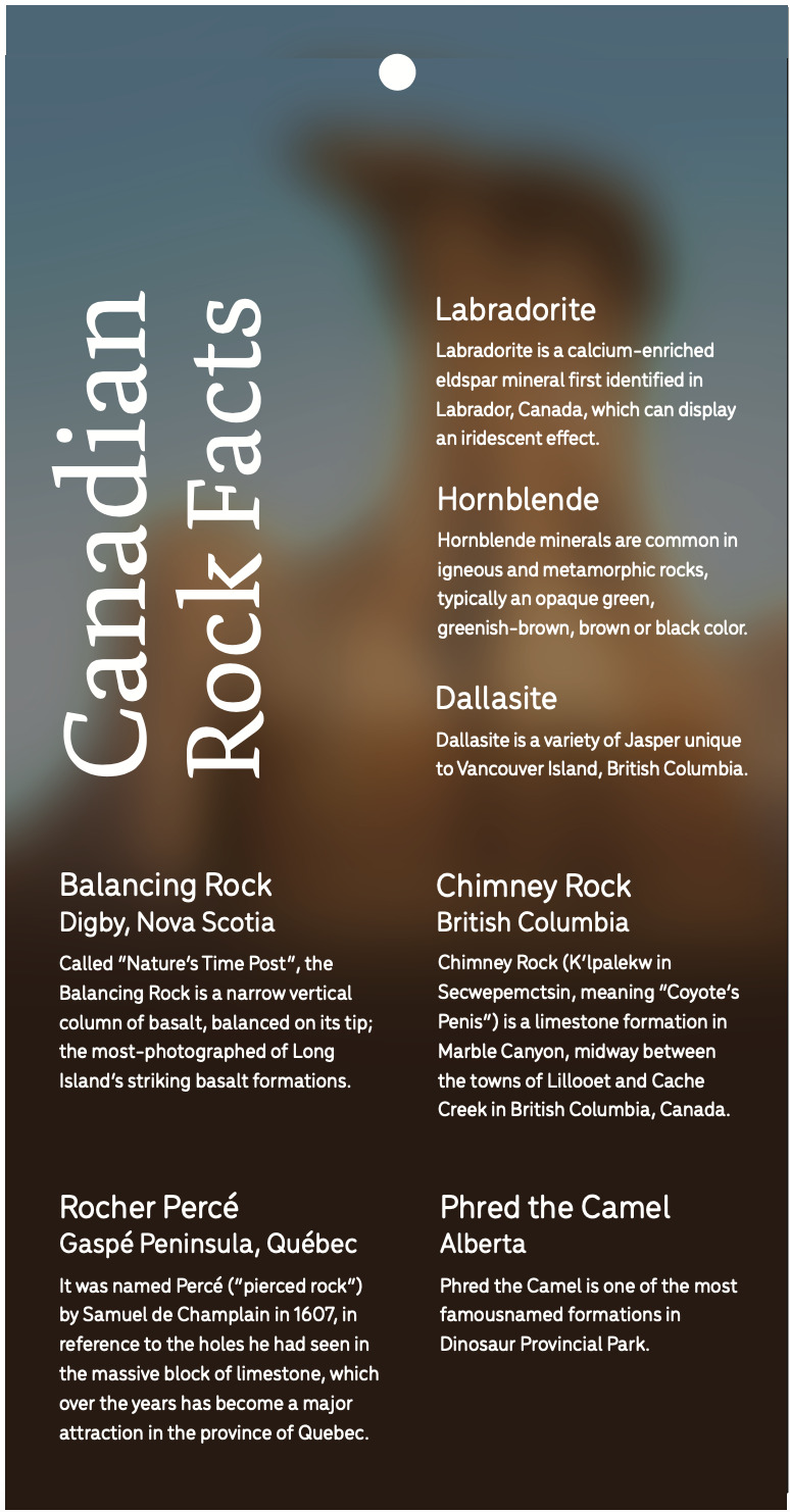
Proof 3
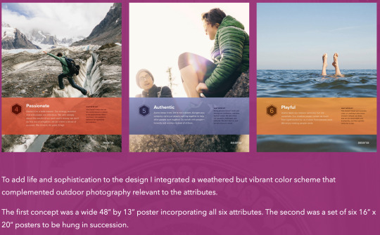
Natasha has done such a fantastic job of refining her illustrations and applying previous critiques. Just a few small changes this week mostly around text readability. The seals print dark so she is going to lighten those up so the details shine.
0 notes
Text
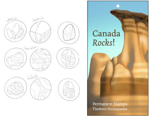
Proof 2
Natasha is powering right along! Changes from last week are definitely moving us in the right direction. A few smaller tweaks this week including:
making the seals’ background less awkward when on their own, while remaining cohesive with the booklet.
Less contrast on the word “alberta” to match the rest. Changing the background rocks to help Phred stand out more.
Using the serif on the left for the title.
Continuing the back design with the sketch drawn up today.
0 notes
Photo
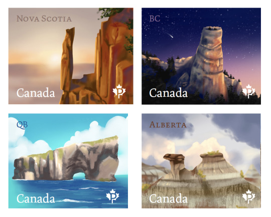
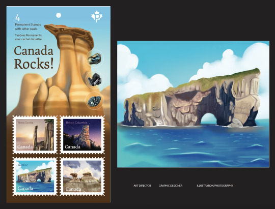
Natasha was more than prepared for today’s meeting with very well rendered and thought out sketches.
She already had layouts thought out and ideated.
Summary of our changes going forward:
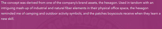
Working on typeface exploration (”Canada” on the stamps works, sans serif everywhere else) Shrinking the permanent stamps type on the background, moving it to the top. Shrinking background illustration, moving up, maybe gradient to dark on bottom to make room to display stamps and seals.
“Alberta” type stands out much more than others, bringing that colour closer to the sky.
Nova Scotia balancing rock has great vibrant colours but doesn’t include the natural rock colour as much as the other stamps do. Letting the grey rock show through with bright, warm highlights where the light hits.
0 notes
Text
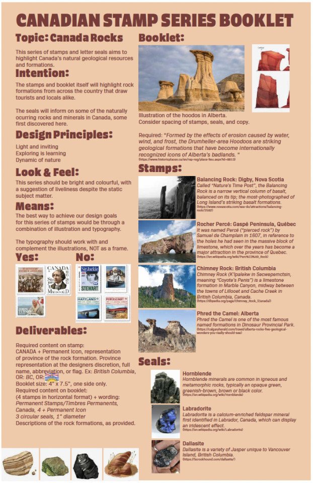
Project two brief
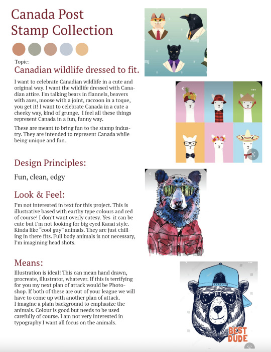
Talia had a very fun idea for the stamps: Canadian animals dressed in cliche Canadian attire. She doesn’t want it to be too cutesy, she wants it edgy but fun. The project is illustrated, it’s not my top strength but I recently got an iPad so it will be a good way to learn more about Procreate!
0 notes
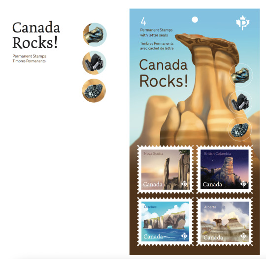
Photo
The imagery is looking great, and there is a good amount of white space. Our focus for the next week is tweaking the copy. Fixing orphans and widows, minimizing hyphenation, making sure paragraphs align.
0 notes
Text
Blog post 5 - Designer check in
Hannah came to our meeting today very well prepared. She had 5 different ideas for her first spread of the article. We were able to narrow it down to one general direction, and agreed on which imagery was working the best.
The body typeface is functioning really well, and we discussed a few tweaks to make to the title.
This is the layout we decided to move forward with: a nice balance of text, imagery, and whitespace.
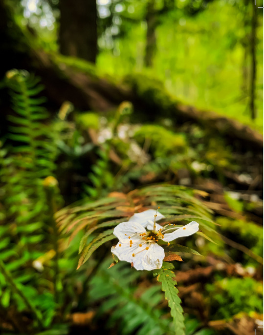
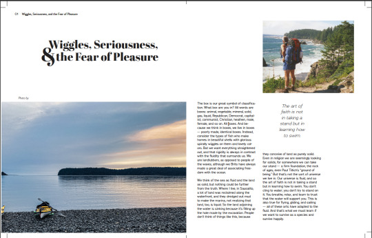
One thing that functioned really well from the other iterations was this close up image of a flower. It’s a great representation of BC nature, and serves as a visual reminder to slow down and enjoy the details/small moments, and to connect with and appreciate nature. I think this is headed in the right direction to represent both the magazine and the article.
0 notes
Text
Blog post 4
For this article I need to make sure to use a strategic amount of whitespace combined with imagery in the form of photography and or illustration to accompany the writing. The article must be formatted in no more than two columns per page. The layout can include one pop of colour and must be in the magazine’s typeface (Acumin). Luckily my art director was able to include some example spreads from Offscreen magazine in her brief so I have a pretty good idea of how they usually display their content, and what kind of imagery is appropriate for their theme.
0 notes