
New to the bookbinding/ficbinding hobby and learning the ropes. Loving the digital but still uneasy at the physical. Posting here to keep track and share the good, the meh and the awesome.
Don't wanna be here? Send us removal request.
Statistics
We looked inside some of the posts by cuteknightbindery and here's what we found interesting.
Average Info
Notes Per Post
1K
Likes Per Post
898
Reblog Per Post
185
Reply Per Post
25
Time Between Posts
5 days
Number of Posts By Type
Text
17
Last Seen Tumblr Blogs


Fun Fact
If you dial 1-866-584-6757, you can leave an audio post for your followers.
Text

This is a mock up cover for the hilarious fanfic little menace by the talented @inkpotsprite avaliable on A03. It is a quarto design though the mock is a folio sizing which is why it has the white border on the top and bottom.
I really enjoyed the hilarity of this fic and it has made me snort and laugh in public on the bus before so I knew I wod want to design a cover for it even though it is not finished yet.
I searched for quite a while looking for a pic of a little Timmy and that is how I found the absolutely stunning art by @ky-landfill and knew her work would be pereect for this and other binds as the talent is amazing. I was overjoyed they gave me permission to use their work and hope I've done it justice.
I used a lot of colours and shapes in this bond with little stars to bring out the fun and cuteness of the fic. I used Canva Pro to make the cover and it took a little over an hour to design.
Keep fanfic free.

35 notes
·
View notes
Text

This is a mock cover deisn for the super unique Bagginshield fanfic 'Oak and Mistletoe' on A03 by @hildyj.
The amazing @rutobuka2 did the cover artwork for the fic depicting one of the scenes from the fic. With their permission I have used this piece as the cover for the mock design and another of their work on the back.
I kept the cover simple to truly highlight the beauty of the artwork and just added the cover and author name.
The back I originally wanted to find a silhouette of thro in and highlight the five senses and couldn't find one that was exactly what I wanted. I did find among hildyj's art this lovely sketch which I seperated into two pieces with the same background colour as the artwork.
This was designed using Canva and took a little under an hour.
Keep fanfic free.

42 notes
·
View notes
Text

This is a mock cover for the stunning Kayasurin whose works I always love so much. This is for a complete fic called listen to your heart that follows the concept of soul mates and the difference in species regarding that. It is a great Jackrabbit/Frostbunny fic.
Music is such a large part of the fic with Bunnys people (Pooka) finding their soul mate as they hear the song of their soul. As a result he has been hearing Jack's song since he was born.
I originally wanted to give the fic a cover with the OST from karate kid that Kayasurin noted having listened to while writing but was unable to find the sheet music. I still wanted to utilise music in the cover and looked through some of the original art with Jack from the 5th guardians of childhood book and the art book for the movie and found one of William Joyce's (author and illustrator) pieces of artwork of Jack and though it was perfect.
It's a full wrap round with musical notes wrapping around wherever Jack has flown. It took a long time to get the notes correct as I was unable to simply remove the background so had to zoom in super close and crop and copy and paste lots and lots.
I love how this turned out. It took about an hour and half to create on Canva.
Keep fanfic free.

15 notes
·
View notes
Text

This is a mock cover for the emotive fanfic Borderline by TheResurretionist avaliable on A03 following th batfamily after their minds are connected irreversibly.
It is a super simple cover as I am trying to explore different styles and I loved the idea of using mazes in this fic to represent the different minds. I had originally wanted to have a maze with multiple safe spaces for each mind but couldnt figure out how to make one and decided I liked this style too.
The idea would be to continue the maze element through the entire bind whether that's border edging and chapter headings.
I deisnged it using multiple maze generators online and Canva. It took about 15 minutes as I wanted to keep the style simple.
Keep fanfic free.


31 notes
·
View notes
Text

This is a mock cover for the Sing Sweet Sparks series from @rayshippouuchiha. There are currently 5 parts to this incomplete series and it is one of my absolute favourite character studies of Derek mostly and how the past traumas in his life messed him up. It is very much a 18+ NSFW piece of work that is absolutely unhinged in the best of ways.
I love the relationships between them all and always love when authors explore darker elements of characters which has been done here fantastically.
This is a cover I had absolutely no idea where to tart with cause I just wasn't sure what I wanted to do. I liked the idea of an image of stiles with his hands around Derek's neck. However I've seen lots of ficbinds and re-binds involving Renaissance art and really liked the idea of that. I did search for quite a while to try and find wolves or burning houses but didn't find anything that really fit until I found this one and it was just what I wanted.
I like the religious elements because the way Dereks thinks about Stiles to me was very devoted and 'Worshipy' at times.
This was a fast mock up because I wanted to keep it super simple and took me about 15 to 20 minutes but I still really like that simplistic element to it.
Keep fanfic free!

64 notes
·
View notes
Text


This is a 3 part mock cover set for the fabulous @kayasurin who has written many a rotg fic. This mock set is for the fanfic series the white wolf which follows the story with Jack having been changed into a werewolf prior to his death and the way it effected his story going forward. It is a Frostbunny/Jackrabbit fic.
I used the outline from the 5th volume of the guardians of children book that was released after the film following Jack. It has the same overall design of the other four with a grey colour pallete. I quite quickly decided to use the border and design elements with this mock.
I used art from the original art book and avaliable from the Rotg books by William Joyce who is both the Author and Illustrate of the guardians of childhood books. I modified each image or added to them to match the fic. Things like fangs & scratches, tiny bunny & wolf shadow and adding bunny into the image matched more with the fic itself. I stuck very heavily to the design format of the original cover though not so much with the back where I kept only small elements.


I also looked at the spines of the original books and added that into my design for the mock covers for the fic. The spines need a little extra work to ensure they all align properly and my snowflake on the last one has disappeared but other than that they are pretty uniform.
This took about 3 hours on Canva to create.
Keep fanfic free.

62 notes
·
View notes
Text
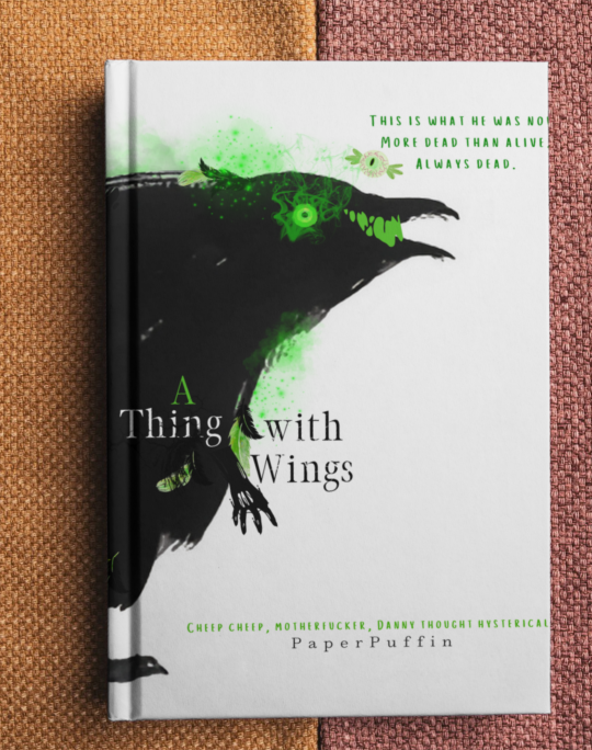
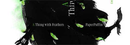
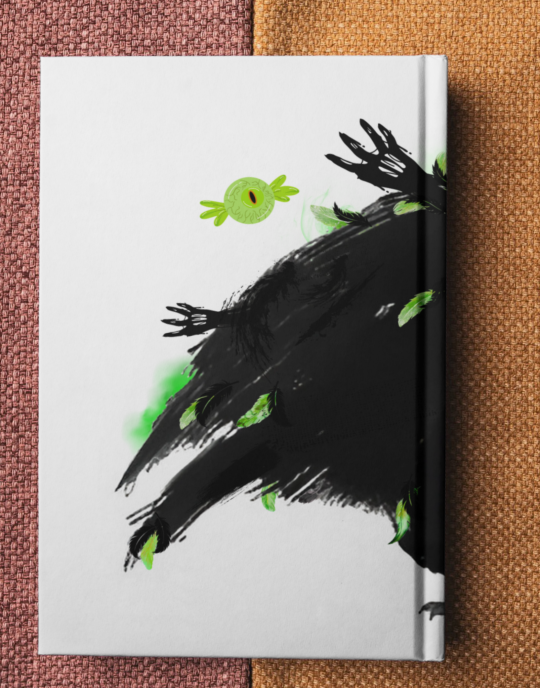
This is a mock cover of the absolutely amazing PaperPuffin (A03) or @clockwayswrites (tumble here) of her recently started Danny Bruce fanfic A Thing with Wings. Thank you so much PaperPuffin!
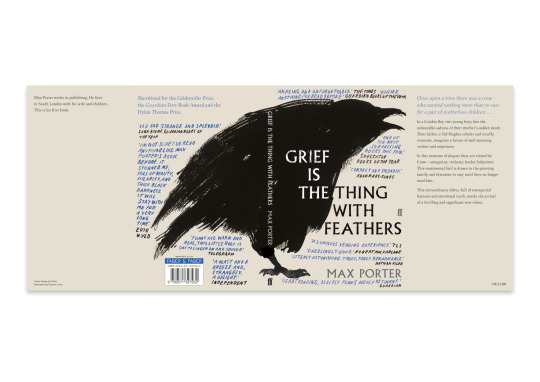
This is heavily inspired by the cover of a very specific cover of grief is the thing with feathers (see below) that, as soon as I read the 2nd chapter of the fic, I suddenly had a feeling of deja vu and went searching for... and found!
At the monet the cover only has two quotes on the front but the plan is too add more as the chapters update because there will be no shortage with such a fantastic author!
This was designed using the original art of the ink drawn bird which has been very slowly added too with various elements from Canva. It took about 1 hour and 15 minutes with changing all the colours around as I wanted them and trying and cutting things (I originally had more floating eyes but did not like them).
I have designed it with the same format so it is a wrap around. I really like this fic so far and tbh I'd never even considered Danny Bruce but now I see it. Love the whole idea of it all and can't wait to read more.
Keep fanfic free!
290 notes
·
View notes
Text

This is a mock cover for Loading and Aspect Ration by the amazing JUBE514 on A03. It's a long 1 chapter finished fic that is absolutely amazing. It's a really fun concept that I love; fake cryptid batfamily and the way that effects their relationships and canon events.
This was a real simple design and I originally wasn't quite sure what kind of style I wanted to do. I was leaning towards a more all encompassing black with hints of feathers and mechanical cogs and such around. Maybe some batman eyes. However I found tho image of a gargoyle and it was perfect for Gothlam.
I messed around with the original photo, changed up the colouring and softening parts a little more. I added curved title and author name and decided I liked the simple look.
I designed it as a full spread so the photo goes over the spine and to the back cover. The part I prolly spent the most time hyming and hahing over was the colour for the back. I found an image of a mechanicalised wing on Canva and used that at the top. I chose to not include the whole summary here and instead the 'small summary' and then a funny mini thread from the comments that amused me. After that it was just the qr code to the fic, the price, wordcount and my binder name.
All in all this took me about 30 minutes to do using Canva and I really like the more simplistic design and the cover wrapping around to the back.
Keep fanfic free.

106 notes
·
View notes
Text
Typeset for aldera files 1 by mentallypapaya on A03 or @mentallyunawareofpapaya on here.
Super funny short about deku and bakugo relationship. Super funny.
19 notes
·
View notes
Text
My typeset for Beethoven but it's just bakugo telling eri to kill herself by mentallypapaya.
The most detailed typeset yet. Created using Canva Pro and Affinity Publisher. I created alot of the images using a mixture of images and stills from the original manga and anime and different elements from Canva modified and edited how I wanted them to look.
@mentallyunawareofpapaya
10 notes
·
View notes
Text
Complete my chapter pages for the amazing like betta fish do by Paper Puffin or @clockwayswrites using their stunningly adorable chibis with various elements from the chapters themselves. Created using Canva. Some food illustrations and photos were found using Google.
I am considering adding in a little takeout menu design to mention all the food from the fic! Or reciepts from takeout places. Not sure, my mind just started to run with it.
Posted on tiktok aswell and have included the link (the original screen record had my voice and the true crime I was listening too in the background so added music there to remove that background noise 💚)
7 notes
·
View notes
Text

This is a mock cover for the amazing fanfic Like Betta Fish Do by Paper Puffin on A03 or here on tumblr as @clockwayswrites and is the amazing writer of this fic and artist of the adorable chibis on the back of this mock that they have drawn for each chapter. I am so glad she gave me permission to bind her fic!
I am trying different styles of covers at the moment and I wanted to try and do one where the title is the focus. I chose the colour of green ectoplasm/Lazarus water as the focus colour for the whole hypothetical bind. In the background I used the skill design from the artwork to tie it together.
In title I've got mini ghosts for the eye dots and over the author name I've got a little fish for the dot. I made the card by copying over what was said in the fic in a chosen handwriting choice. I added a ghost corner border and made a bat corner border. I've also got a phantom coloured betta fish in the corner and the main focus is a gift basket.
I made this using Canva and I am really happy with the look of it.
I've continued the background skill motif copied over from the artist/authors chapter chibi backgrounds and chosen the 1st 2 chibis to go on the back of the book. I have included the summary, a quote and a bit of fic info alongside a qr code to the fic itself. I also included another fish in phantom colours as it is such a consistant part of the fic. If there had been a different fish name each chapter I would have made that more of a focal point in the design elements.
Keep fanfic free.

279 notes
·
View notes
Text


This is a trilogy mock cover for the fic A New Place to Stay by Debsthesnapeslytherinfan on Fanfiction.net and A03 that I have done in 3 shades. I seperated it into 3 different volumes.
I kept the cover simple with small elements added like sparkles and such but not much done to it.
The back however I added quite a bit. There is a background image on the side of each (1st snaps house, 2nd hovwarts and 3rd hovwarts with a bit of damage) and I used Canva illustrations for these moving them about how I liked. I also included small pieces of the fic. Each back has 2 quotes, one from Harry's POV and one from snaps POV. One has an additional quote. Fonts were consistant with same character povs having the same font. I wrote the summaries for the 2nd and third volume of the fic and included elements relevant to the seperated parts. Qr code to the fic was included along with the A03 symbols. I screenshot, chopped and enhanced the symbols. Next to it I have included the fic info and separation info for the fic.
This was made on Canva and took about 1 to 1.5 hours. More time spent rereading for the quotes than the cover making!
Keep fanfic free.


30 notes
·
View notes
Text


This is a series of Mock covers made for the mammoth of a fic by debsthesnapeslytherinfan avaliable on fanfiction.Net and A03. They are a true pillar of the hp fandom to me and we're my introduction to snarry (as seen here) and to severitus. The aithor remains one of the best I have seen that explores the problematic nature of the age gap. I still remember reading their work on fanfiction.Net when I was younger and they only had a few still updating fics versus the whole bookcase worth of words they have been kind enough to gift to the fandom.
This fic is called willing and I have done 4 volume covers using the stunning @severus-simp who has blanket permission on their blog for their art to be utilised in such work as long as official citation is provided. They do some absolutely amazing artwork for the snarry fandom and I knew as soon as I saw it that I wanted to use it for some of the authors work. Due to how gorgeous the work is I wanted to keep the rest of it super basic and simple to not take away from the art so I only added ink splatters and fic info. The only real change I made was to Snapes wand to his hand and a dagger to Harrys in one of the mock covers.
The time itself taken on these cover was aproximatly 45 minutes to an hour and more time was spent rereading the fic to have a quote for each volume to go on the back cover of the mock ups than designing. A nice use of time for sure that I sent my work commute reading!
The back has a self made summary for each seperate volume (other than the first summary), a quote and fic information at the bottom. I screenshot the A03 symbols and cropped and enhanced them. The qr code links to the fic and at the bottom is a bunch of the fic info including where I would seperate in into different volumes. Ink splatters were also used here. I chose a more refined font in reference to Severus and then a less refined one in reference to Harry.
Keep fanfic free.


21 notes
·
View notes
Text


This is a duology mock cover in a folio size for the fanfiction Fate Be Changed by the talented araceil that once lived on fanfiction.net. The author has since moved to A03 and this is one of the ones not reposted but it was such a favourite I wanted to make a mock up. It was an unfinished hobbit/hp fic that was one of my comfort fics.
This is a mock cover design using shadowed flat elements in different tomes. The first cover is entirely in shades of green to show the journey aspect starting at the shire with the official hobbit walking line up and an added female shadow at the end to show Femharry. The second has more elements to it with lots of little details such as pillar patterns added and repeated, different cave parts, gold piles, a dragon and finally femhp.
I really like the distinct colour choices I've made with one green and vibrant and the other browns to symbolise the mining and mountain aspect. The back also follows this more simple style that I tried out for the first time.
They were created in Canva and took aproximatly 45 minutes to an hour to do both as many elements followed over in both volume mocks. It was fun to try a new style.
@araceil
Keep fanfic free.


37 notes
·
View notes
Text

This is a mock up cover to be used for a spiderman fanfiction anthology bind. This was one of the 1st ones I did however I decided to go back to it as I wanted it to look like the comic book however my previous one did not fit that (see below).
To make it more of a comic book style cover I added on top certain elements from the original spiderman comic with some modifications to fit the fanfiction aspect.
The image was expanded and the Web was removed from and duplicated to be able to use further.
Keep fanfic free.


29 notes
·
View notes
Text

This is a mock cover for the 3 part series The end is the beginning of the end written by Kayasurin on A03.
I struggled with cover as I wanted to keep it somewhat simple but them kept adding things and still feel like something is missing. I plan to when binding use aither glitter laminant or even a snowflake holigramatic laminant if possible.
I used art from the rotg original art book cover edited with various elements from Canva. I used a variety of snowflakes and aster flowers to decorate the cover and back.
This mock up took aproximatly an hour and a half to 2 hours.
Keep fanfic free.
@kayasurin

31 notes
·
View notes