
Statistics
We looked inside some of the posts by darkangelfreesoul and here's what we found interesting.
Average Info
Notes Per Post
2
Likes Per Post
2
Reblog Per Post
0
Reply Per Post
0
Time Between Posts
13 days
Number of Posts By Type
Text
6
Last Seen Tumblr Blogs


Fun Fact
Kazakhstan’s Minister of Communications and Informatics has blocked the Tumblr site because it contained 60 sites of terrorism, extremism, and pornography in 2015.
Text

This is a piece of infographic about "MCDONALDS BURGER MENU AROUND THE WORLD" made by Expedia. I think the underlying agenda that this wants to show the audience that the Mc Donald's respect each country's culture by offering various hamburger tastes. The style is cartoon and I think it will attracts younger ones.

2. Here is a photo of the packaging for the Sprite. The overall design follows consistency by using same colors (green and white) and same typographic. The logo of the Sprite using white background and green text so does the cans.
0 notes
Text

Denotative meaning- This graphic design shows a white truck carrying another red truck carrying a lifter, a motorcycle with an elephant on it. On the top left corner of the post has some logos and a phone number. On the top right corner of the poster, it has the name of the automotive company and a slogan saying: "Carrying what you need and what you can even imagine".
Connotative meaning- IVECO is an automotive company that emphasizes strength and the hardiness of their vehicles. So, it is not hard to tell from the ads poster that why this truck is carrying so many things. Elephant is an animal that will make people immediately relates to "heavy weight", that's one reason adding an elephant on the poster. While this elephant is also riding a motorcycle and seems like doing some sort of acrobatic performance. It may also reflect the stability while being carried on truck made by IVECO company. Under the motorcycle there is a lifter, I think it wants to show the world how balance it is while driving. All in all, I think this is a very creative and thoughtful design.

3. This is a Graphic design about "I love NY" by created by Milton Glaser in 1977. The iconic part of this design piece is the "I" and "NY" lettering in BOLD BLACK font and the red heart represents the word "Love". This design had becoming world famous by its simplicity.

4. This is a THAI FOOD EXPRESS poster. To emphasize the hotness of the restaurant, it uses index such as the smoke coming from the burnt leg. When it's smoking, it will make people thinking about fire, and when it is on fire, everything is hot and hot has another meaning of popular, so this design uses its creativity to show hoe popular the THAI FOOD EXPRESS is.

5. This is a advertisement about cigarettes. The coffin on the cigarette is a symbol of death. This ad wants to warn the world that once you start smoking, you will be more likely going to die.

6. This is the title sequence we often seen in the beginning of the Star Wars movie. The style of the fonts is created by Dan Perri for the original Star Wars film in 1977. The style of the "opening crawl, is still remain using in the latest Star Wars Movies. The style of the font not only describe important information about the story, but also references to its past.
1 note
·
View note
Text
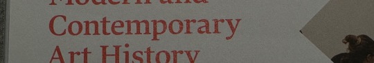
This is a publication from SAIC (School of the art institute of Chicago). The main rhythm of this book is using big image as background and adding white square for texts. The space between the text square and the edge of the book follows a rhythm which has the same space.

2. This is a great example of using typographic hierarchy to establish the order of importance on a page. It is the same content from the same book above, by using larger and different color texts to emphasize the most important information.
3. The letter "t" and "d" are two examples of letter with an ascender. An ascender is the part of a lowercase letter that extends above the mean line of a font.
4. The letter "y" from the word "contemporary" is an example of letter with a descender. A descender means a letter goes below the baseline.
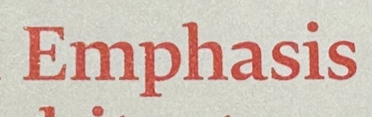
5. The letter "p" from the word "Emphasis" is an example of letter with a counter. A counter means the area of a letter that is entirely or partially enclosed by a letter form.
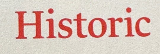
6. The letter "H" from the word "Historic" is an example of letter with a crossbar. A letter with a crossbar means a letter that has a horizontal stroke across the middle of it.

7. This is a font named Glegoo which the font with a large x-height has a relatively large lowercase letter height compared to its uppercase letter height

8. This is a font named EB Garamond which the x-height of a font is the height of the lowercase letters without ascenders compared to the cap height of uppercase letters.

9. This piece seems reflects the word "Modernist" which is simple and clear. The font of the word is as minimalist as the font Helvetica. The overall layout of this page is just clean as a crystal glass.

10. This is an interesting font named "Pasta". As it can be seen that when people seeing this font can refer to the food pasta.
0 notes
Text


The first is a graphic design for a facial mask. The Complementary Color in yellow and purple communicates each very well to represent the Slogan and important information to customers.
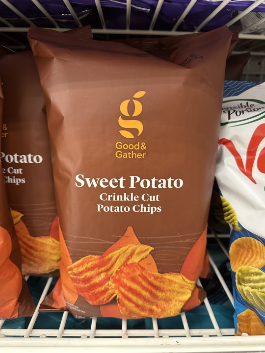
The second design is for a potato chips. The Analogous Colors in red represent the color of a sweet potato. The darker brown in the background helps emphasize the light red for the Logo and shapes of actual potato chips.
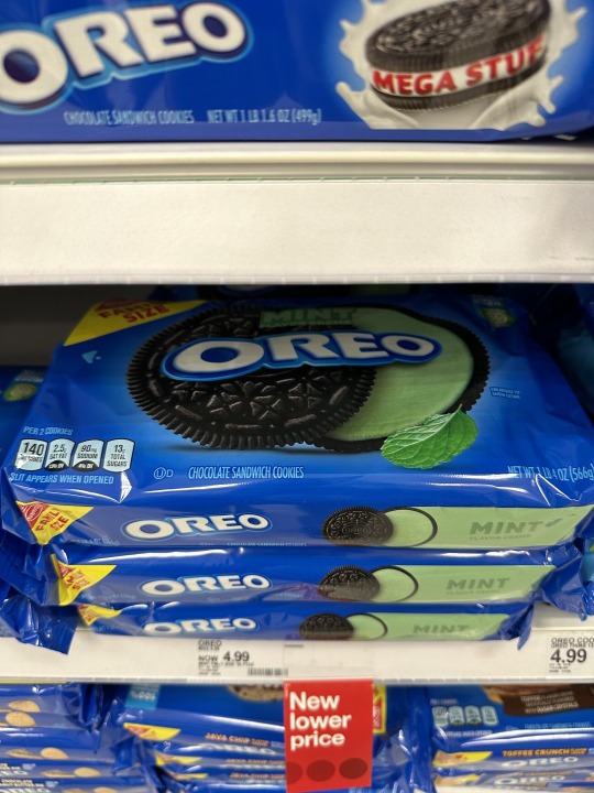
The third design is for the mint OREO package. The blue color is a classic OREO color and the green color emphasize the mint flavor for customers. It also gives customers a cool feeling when seeing the mint green.
The fourth design is a menu for Raising Cane's Chicken Finger Restaurant. The red gives a strong feeling of passion and love when seeing the menu. I really like this menu poster; it emphasizes the enthusiasm of the employees and the positive for the brand.
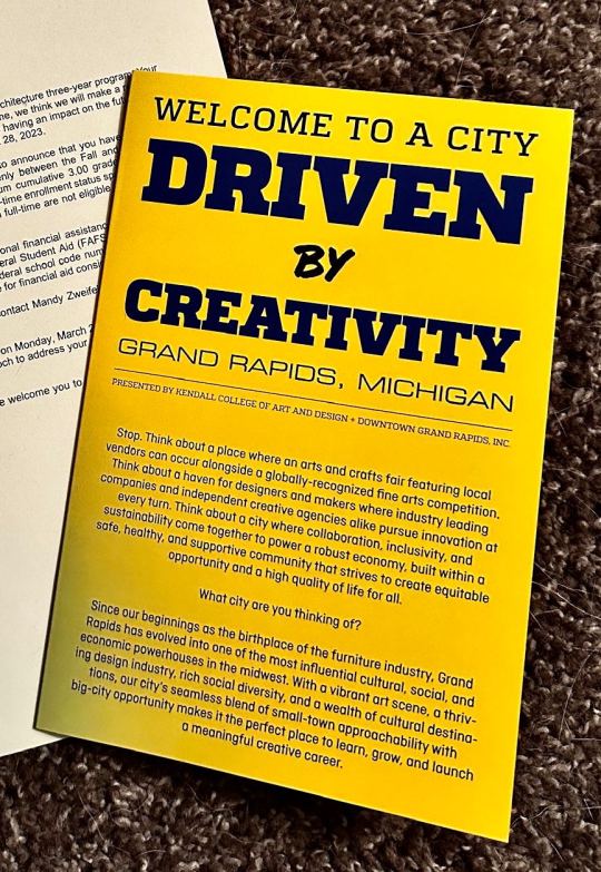
The fifth design is for a guide to Grand Rapids. The combination of yellow and black is my favorite color combination. It is not only the color for batman (my favorite superhero) but also helps emphasize the text no matter which one is in the background. It makes so easy for readers to read without making it dazzle.
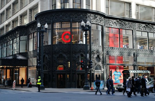
The sixth design is for the Logo of Target. The closed circle is an element of closure. The bullseye icon communicates with the name of Target.
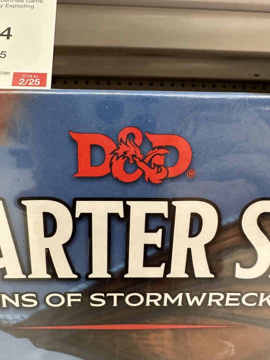
The seventh design is for the board game Dungeons & Dragons. The logo has an active figure-ground relationship. It depends on how you see the symbol "&". It can be either a "&" or a dragon which represents the name of Dragons.
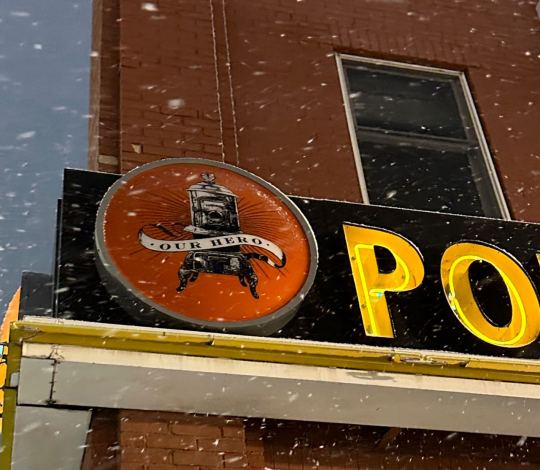
The eighth design is for the restaurant "Potbelly Sandwiches Works". The logo is a potbelly stove with a text says our hero which represents the potbelly stoves invention in the 19th century. This graphic design tries to look like something historical in order to communicate the invention in the 19th century.
0 notes
Text


The first photo is a air freshener that contrasts in typography, as it can be seen that the name of the product "Air Freshener" has different size and font than the "by made au gold" texts. Larger and bold text can be used to emphasize the most important content.
The second one is a Lego piece which contrasts in shape. From the example the layout is made of rectangles, the thing that will stand out the most will be the round shape in the bottom right, because it uses a different shape which creates contrast and draws attention.
The third photo is an ink packaging that contrasts in spacing. It uses negative spacing to create the letter "hp" on the top.
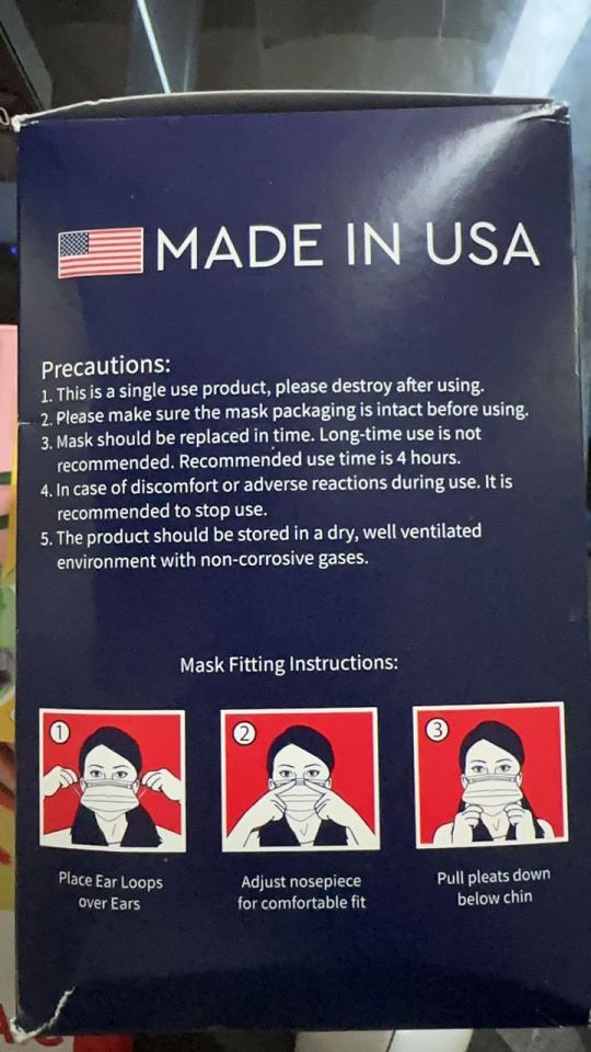
The fourth photo is mask packaging that contrasts in color. From the example, it uses red and blue color contrast to make the content in re stands out.
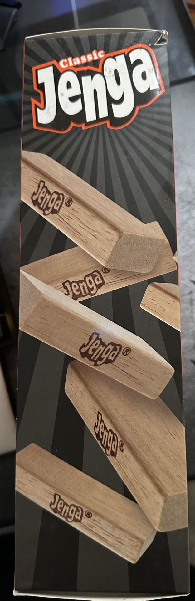
The last photo is contrast in repetition. It is a packaging for board game Jenga. Repetition refers to the use of repeated elements, such as patterns, shapes, or colors, to create unity and consistency throughout a design. From this example, it uses repetition of wood pieces to emphasize what the game will look like.
0 notes
Text


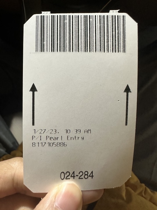
Image 1: This is a screenshot from a yearly game replay. The image is combined with types and images. The information shows how many games being played in a year with different sizes of fonts and colors. The layout is clear and understandable.
Image 2: This is a water bottle from Kendall college of art and design. The image on the water bottle communicates the information of the school logo and how many oz this water bottle has. The layout uses minimum information to advertise the brand.
Image 3: This is the book cover of "Money" by Jacob Goldstein. The book cover has types and images and communicates the information that this book talks about the history of money and different forms of money.
Image 4: This is the book cover of "Design Basics" by David A. Lauer. The image took the most space of the book which communicates the information that it's a book of design; the shape and color that being used in the book cover represents the basic of design elements.
Image 5: This is the parking ticket with minimal information to communicate the information such as where is the direction to insert the ticket and when is the time you enter the parking lot and the location of the parking lot.
Graphic design is a tool for communication. It uses visual design to communicate with the audiences.
1 note
·
View note