
Statistics
We looked inside some of the posts by deadtiredmax and here's what we found interesting.
Average Info
Notes Per Post
8
Likes Per Post
8
Reblog Per Post
0
Reply Per Post
0
Time Between Posts
8 days
Number of Posts By Type
Text
16
Photo
1
Last Seen Tumblr Blogs


Fun Fact
Tumblr has 4 main sources of revenue.
Text


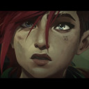
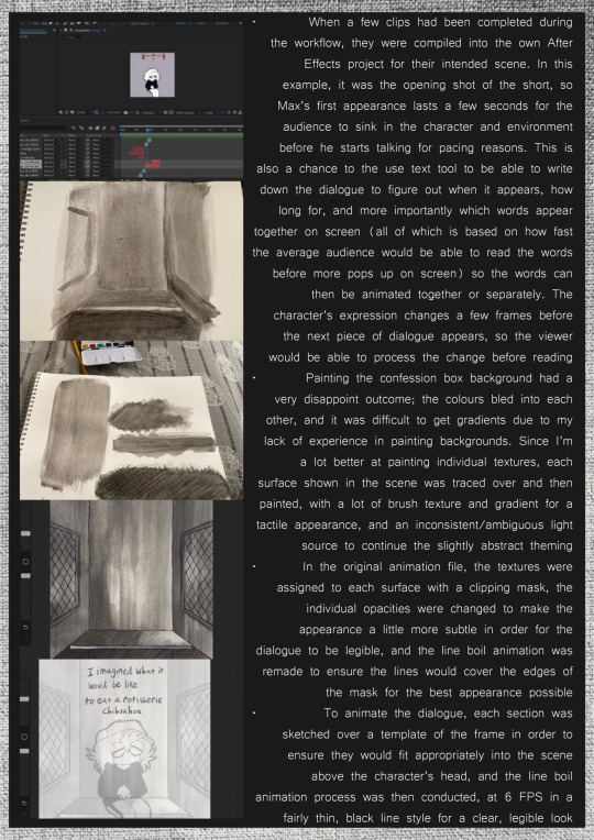
Max’s Grand Days Out: The Baltic
A personal trip to see the new exhibits at the Baltic before my third and final year on the course. Aside from being very interested in publicly installed art as of late (mostly statues and interesting architecture), I was drawn to a lot of the environmental activism themes in exhibits. Even if how a lot of contemporary art is portrayed (in their styles and forms) isn’t something that’s right up my ally, environmental themes is something I’ve enjoyed portraying in my illustrative work in the past, and could be a big thing to consider expanding on in my final year through animation.
7 notes
·
View notes
Text


EVALUATION
Overall, I’m satisfied with the final product and the preproduction workflow I was able to accomplish over the course of the module, from initial concept to final short film.
PREPRODUCTION
Both the script and storyboard had multiple drafts before being refined into final versions, which explored different ideas and took professional layout and what would be more appealing in mind. Storyboarding is the area of the industry I’m most interested in pursuing, and I felt the final version was generally very clear in communicating the contents of the scene, and the workflow resulted in a clean, mostly professional appearance. Despite the content itself not being very action-packed or expressive, I do think if I were to push myself, I’d be able to make more visually interesting storyboards in the form of animatics in time to music or dialogue, and this is what I’ll be focussing on over the summer to develop my skills. The character design process, mostly the first, did a fairly good job of exploring and outlining the basic design details but could’ve included more thorough exploration of the character design fundamentals, such as shape, form etc. and generally a lot more idea generation before settling on a final design so soon. The stylisation phase of the preproduction workflow was similar to the initial script and storyboard workflow, testing out several different ideas and variants to find the best possible outcome. Experimenting has been something I’ve always needed to do more of in my course work, and I felt I was able to successfully do that, and it benefitted the final outcome in the long run. I think next time, I could experiment on an even broader range by testing the possibility of using different software and separate workflows to see if this would further improve the final film.
FINAL FILM
Overall, I feel the final film was able to reflect the influences and achieve the refined vision well, developing my personal visual style of 2D and mixed media into a well-rounded and mostly realised distinct visual. There were several elements I thought let the film down however; to start, the line boil outline on the main character would often stop on one frame for two frames, which wasn’t awfully noticeable but did make the animation inconsistent; this wasn’t a problem while animating or while compiling the clips into After Effects, so it seemed to be an issue with the rendering. This will be kept an eye on while rendering from now on as to not effect the quality of future work. Another issue, while possibly adding to the sketchy, handmade look of the short but which still stuck out as a slight eye sore, was the inconsistent line weight in the lettering. This would be sorted by simply using a consistent pen size throughout the workflow. A final problem was the choppy frame rate of the camera pan shot. The After Effects composition was set to 12 FPS in accordance with the 2D animation, although with double that frame rate it would make for a much smoother shot while not affecting any of the animation. The two other narrative segments that had been scripted and storyboarded will be worked on over the summer, both for experience, material for my PPD blog and to build my portfolio.
0 notes
Text

Stylisation and animation tests
https://m.youtube.com/watch?v=hJQbfaFgFq0&list=PLwvGwubmUxodTsyc1E4e2zzm1s1YdUt-1&index=1
youtube
0 notes


Text


Digital storytelling introduction and draft scripts/storyboards
0 notes


Text

More frame by frame, my first go at an action scene with a little guy being flung around by his ankle. Very proud of this for what it is
0 notes
Text


MISTER BONES EVALUATION
Overall, I’m happy with this short; the efficient workflow turned out a refined piece of multimedia and visual effects and I was able to come up with creative solutions to problems along the way. The appealing cartoonish movement was achieved by testing out various keyframe options, and each element of the film was planned in a way that would communicate the intended theme and style, which benefited the final outcome. On top of this, problem solving has always been the most daunting task for me, and I felt I was able to work past these efficiently and creatively (for example, the problem with the artefacts in the footage, or having to come up with a background that would stylistically suit the short).
Although the issues I have with the short aren’t as prevalent as the last, there are a few. The intention for the colour palette was to appear as a washed up, old piece of footage that consequentially had a brown tint. However, because each asset was worked on individually, the colours weren’t consistent with this idea. Another problem was the zoom effect; it cramped the footage toward the end, which ties into the last problem of framing. Although I understood the reference to George Melies’ style of framing, from most other peoples’ view this might’ve just appeared as an awkward shot which contributed to the zoom in looking cramped.
Solutions to issues like these next time would be to have a firm colour palette drawn out first, or to colour the assets how they’d appear if there wasn’t an old film filter, and then add the vintage look by testing out colour grading/correcting effects in Photoshop or After Effects to have a consistent look across all elements. For the second two, some solutions could have been to look into alternate zooming effects on After Effects, and/or to research into shot types and plan the frame layouts more concisely in the storyboarding stage.
‘Mister Bones in The Ragtime Boogey’: https://youtu.be/5f7fPv8DVn4
youtube
0 notes
Text
MANI KAMBO TALK WRITEUP
· Artist statement/character blurb; a summary/introduction of who you are as an artist, your background, your strengths etc. These are usually found on an artist’s website and are written in third person to sound more professional
· Competitions, festivals, collaborations, and exhibitions are very useful and important for sharing work, may have to be scaled down depending on access to studio/space
· Never hurts to ask for exhibition/studio space!
· Arts Council England and Film Above North fund creative projects, including animations
· Art Council are focused on the core information for what the project will need; what it is, what it is about etc.
· None of the funders cost anything to apply for!
· Middlesborough Art weekender showcases art, illustrations, animations etc.
· Don’t feel you have to be pigeonholed to one style or set of themes in your work; do whatever works best for you
· Look at RIFT exhibition (about huma psyche, dreams etc.)
· Have a network around you, stay in contact with creative peers
· She has a Baltic exhibition at the end of the year!
0 notes
Text

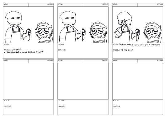
Another rough storyboard example done as a favour to a friend on their own VFX task. While my storyboards are largely done digitally now, next year I’m hoping to expand past Procreate onto other industry standard tools such as ToonBoom/Storyboard Pro
0 notes
Text
‘DIPPY’S DEMISE’: MULTIMEDIA VFX EVALUATION
Overall, while I think the final outcome is far from perfectly refined, the workflow and digital techniques used show a lot of progress and improvement in my time as an animation student, and the film displays some of my strengths as a creative.
To start, the 2D character was one of the first frame by frame characters I had attempted that lasted several seconds, that had to interact with another media appropriately by moving its arms and changing facial expressions. I’m generally happy with how the character turned out; it’s bold facial expressions and scratchy line boil conveyed the gritty but cartoonish style of the short very well, and its motion overall was very fluid. A negative however was that somewhere along the workflow, too many frames were added and so it later had to be sped up in post to keep up with the footage and react appropriately to what was happening. The workflow of the character itself, while repetitive as frame by frame tends to be, was efficient and resulted in the general outcome I wanted, and I was able to work on the elements of the animation I found difficult (such as the raising hands) with pre-planning and trial and error. This could have been avoided by more concise planning of how many frames would be needed in the animatic stage, and/or keeping track of how the timing is coming along by comparing each shot after competition with the footage. Another element I didn’t like much was the timing of the animation itself which, for the most part, made each shot move at the same pace and didn’t add as much visual excitement or emotion I was hoping for.
The background and Claymation assets matched the themes of the short well, having a handmade, tactile look to them that displayed the multimedia element and inspirations from The Amazing World Of Gumball, Tim Burton and Ghostbusters. While they both had jerky, choppy movements, I think this enhanced the handmade themes and benefitted the outcome, and these assets were able to fit neatly into the composition. As for the sound effects, while I think they were charming and exactly what I had in mind, next time I intend to use Premiere Pro as the sounds can be mixed and altered in ways After Effects doesn’t allow.
As I now know, in a visual effects workflow, poor quality live action/green screen footage can cause a domino effect in terms of problems in post. While I was able to direct my friend in giving a ‘performance’ that matched the cartoon energy of the character and film in general, there was a host of issues that had to be worked on in post; the way the hand was consistently off centre, the footage was incredibly blurry, and the lighting was not even or consistent. While these were problems, this made an opportunity for me to independently problem solve, probably the biggest task yet in my time studying and creating animations as I had done it before but never to this level, since I was trying several different methods I had barely done previously. I tried two new different methods to sharpen the footage, which worked somewhat well but had a harsh outline around it. The second, biggest issue I had was the masking, which is my least favourite part of the short. It clips constantly and isn’t convincing at all, and very little could be done to help this other than constantly trying over and over to get the best possible outcome; these issues all come back to the poor-quality footage. I want to make more multimedia animations incorporating live action in the footage, so I know understand the importance of good quality, well lit green screen footage, as many elements of the compositing rely on it. Despite being disappointed in the live action footage, I’m very proud of myself for working so independently with tools and techniques I hadn’t tried previously. I felt genuinely confident going into processes I was very unfamiliar with and was ultimately able to display knowledge and problem-solving skills in my workflow, even if the results weren’t overly effective.
Final film: https://youtu.be/WhwxewRvD_w
youtube


1 note
·
View note
Text


Some beautiful artwork done by our college’s illustration students. Very interesting to see everyone’s different take on the layout and general concept of a playing card :)
0 notes