
Statistics
We looked inside some of the posts by deanstwrtartcontext and here's what we found interesting.
Average Info
Notes Per Post
2
Likes Per Post
2
Reblog Per Post
0
Reply Per Post
0
Time Between Posts
10 days
Number of Posts By Type
Text
4
Last Seen Tumblr Blogs


Fun Fact
In 2020, 44% of users from Denmark used Tumblr daily.
Text
Who am I as an Artist? Moving Forward
There are so many different methods of printmaking, each with their own character and charms. Linocut prints producing patchy and carefree prints, etching specialising in tone and monoprints creating one-of-a-kind pieces each time. I am personally most inspired by screen printing, also known as silkscreen printing. Screen printing is a form of printing using a screen made of stretched fabric and a frame1. The artist creates a stencil by applying glue, film/paper or photoresist to the areas of the screen that they don’t want printed, then smears ink through the untouched parts of the screen to create a print. This method is primarily used on paper and fabric; however, it is possible to print on other materials such as wood and metal if using specific inks. Screen printing is wildly popular due to its ability to print bright and even colours regardless of the surface2. Screen printing works similarly to a reduction print, creating multidimensional art using layers rather than tone and shading. It is also praised for its ability to produce identical prints in little to no time, making it a key method in the mass production for the likes of posters. Screen printing started being used in the 1920’s for advertisements, even though the method dates all the way back to 221 AD China3, and was being used by artists only 10 years later. By the 1950’s, screen printing had become a widely appreciated media amongst artists. During the 1960’s, screen printing boomed in popularity after pop artists such as Andy Warhol and Keith Harring used it for their designs4. Screen printing was the prime medium for the pop art movement because of the ease at which you could create colourful block shapes and patterns, as well its ability to mass produce designs. Screen printing has a long and diverse history, but not one that is going to end anytime soon. The method is still wildly popular today amongst printmakers, with its charming characteristic and accessibility maintaining its popularity as strong as ever.
Ben Rider
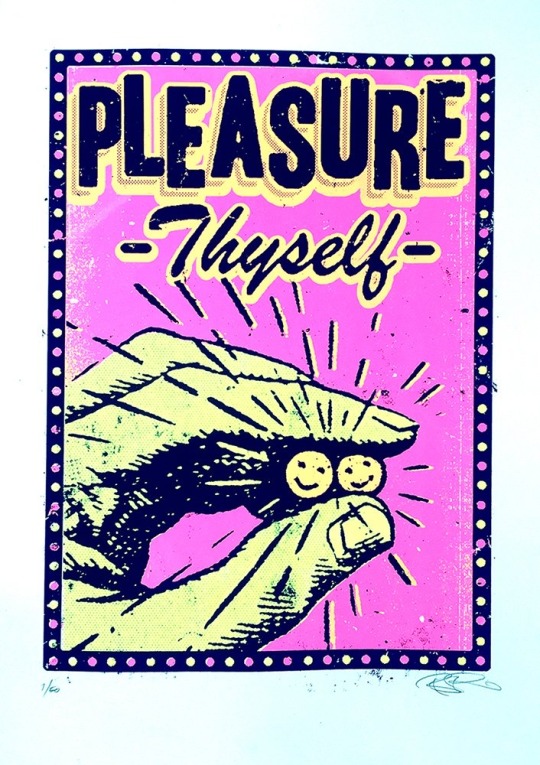
Ben Rider is an illustrator and prink maker based in London. Rider is known for his messy neon prints with punk undertones. His work is created using a screen print to bring his illustrations alive, usually in a psychedelic pop art style. One of my favourite pieces of his would be ‘Pleasure Thyself.
5Print Club London. (n.d.). Pleasure Thyself by Ben Rider. [online] Available at: https://printclublondon.com/shop/pleasure-thyself/ [Accessed 13 Mar. 2021].
This print includes a hand holding to smiley faces, as well as the name of the piece, ‘Pleasure Thyself’. This print is fairly simple; however, I feel as though there's a lot of depth to it. At first glance, it simply seems to be a print about looking after yourself and your mental health. The description of the piece states, ‘In these strange days it's good to be reminded to just be kind to ourselves too!’. I feel as though there could also be a comparison drawn between this piece and drug culture. The hand seems to be holding two smiley faces, which at first reminded me of pills. The slogan of, ‘Pleasure Thyself’ could also relate to the act of getting high or taking an upper. I feel as though the colour pallet helps strengthen this analysis. The piece includes bright pink and yellow, creating a psychedelic feeling. There are also a bunch of lines coming out of the faces, making them the main focus point of the piece. I feel that this also adds emphasis to the pill like shapes. However, some may say that these lines were included to replicate a sun. It could also be argued that this print was inspired by addiction. Many people fall into a dark hole and use drugs as a form of escapism, using the euphoric feeling of being under the influence as a stimulant during hard times. Over all, I feel that this piece was created with this double entendre in mind. It could simply be enjoyed as a print about looking after yourself and staying positive, but on the other hand, could also be viewed as a piece inspired by drug culture. With many of Rider’s pieces having a sense of social commentary to them, I don’t doubt that this was his intentions.
Steven Wilson
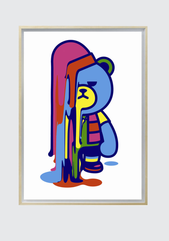
Steven Wilson is an artist, designer and animator based in Brighton. Born in London, Wilson currently works for his own self-titled business alongside Pedro Cardoso. The company works in both analogue and digital methods to create unique and colourful pieces of art. Steven Wilson has found a great deal of success since launching his company in 2001, creating work for big names such as: Nike, The Oscars, Virgin and the New York Times, amongst many others.6
7 STEVENWILSONSTUDIO. (n.d.). Krunk Melt. [online] Available at: https://www.stevenwilsonstudio.com/prints/krunk-melt [Accessed 13 Mar. 2021].
‘Krunk Melts’ is a screen print, made using 3 layers, by Steven Wilson. It includes a bear, with a rather unpleased look on its face, melting away. I really liked this print because of the bright colours and unusual subject matter. Many of Steven Wilson’s work has a huge pop art style to it, and you can definitely see the correlation in this piece. The print uses a lot of bright colours, creating a cartoon style. The bear is outlined with a dark blue rather than a black, softening the piece all together. I feel that this makes the print feel a lot more comforting, compared to creating a stark contrast between the bright colours and a solid black outline. However, this carefree style is contradicted with the expression on the bear’s face. It has a very disapproving look on its face, as opposed to the stereotypical cheery smile cartoons are often given. This changed the feeling of the piece completely. The look on the bear’s face, along with the fact that it is melting, created a more sombre feeling to the print. This is strengthened with the fact that the bear itself is blue, a colour often used to convey sadness. I really liked the contrast this created. The use of bright colours in a piece that feels rather negative confuses the viewer. The art that, at first, seemed so cherry and carefree now has a sense of melancholy that was not initially obvious. I feel that this depth, mixed with the simplicity of the design, created a really interesting and effective print. After closely inspecting the piece, you are almost left not knowing how to feel about it, highlighting how powerful an image it is.
Andy Warhol
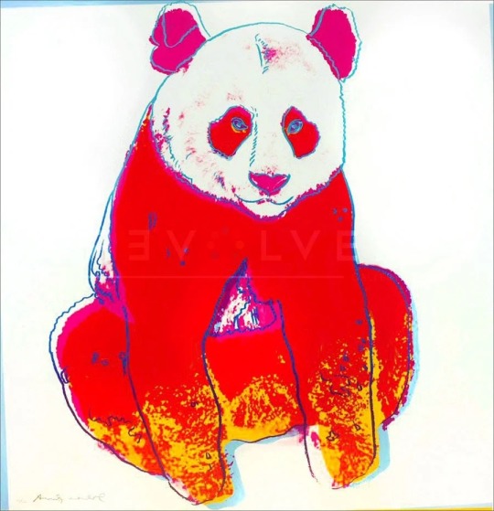
Andy Warhol was an American artist who explored a huge selection of media such as: painting, printing and sculpture as well as photography and film. Warhol was best known for his screen prints that explored the relationship between advertisement and celebrity culture. His art boosted him to fame during the 60’s, leading to him being considered a leading artist of the pop art movement with pieces such as, ‘Campbell’s Soup Cans’ and ‘Shot Mrilyns’. 8
9Revolver Gallery. (n.d.). Giant Panda 295 by Andy Warhol. [online] Available at: https://revolverwarholgallery.com/portfolio/warhol-giant-panda/ [Accessed 13 Mar. 2021].
Giant Panda 295 is a screen print done by Andy Warhol in 1983. The piece was done as a commission by Ron and Freyda Feldman, and was one of ten pieces created inspired by endangered animals. The print included a red panda with a thin blue outline and pink and yellow details. I really liked this piece as I felt it was instantly obvious why it was created. The red and yellow together somewhat mimics a fire, creating a sense of danger and anxiety. The use of a blue outline really helps the piece stand out more, especially against the red. This choice was especially effective in the eyes of the panda. There isn't really much detail, however I feel that this colour choice makes them look a lot more unnatural. The blue against the red really helps the eyes stand out. I feel that this was done to make the view feel like the panda is looking right at them, almost as if the panda is shaming you for not helping. This small detail, along with the intense colour pallet creates a sense of urgency, almost pushing you to help the cause. I think that this was a highly successful piece, managing to capture so much emotion in such a simple print. Even without looking into the background of the piece, you can hazard a good guess as to why it was created. Proving just how powerful a print this is, highlighting Warhol’s talent as a whole.
Screen printing inspires me for many reasons, and I feel that the more artists I research that explore the medium, the more passionate I feel about it. I really love that every artist that uses screen printing does it in their own way, with every artist’s work looking wildly different from each other's. Yet, the use of bright colours and layers ties them all together. I think throughout my journey as a printmaker, I want to experiment with screen printing more, taking into consideration how I can use both colour and layering to enhance my work.
Word count- 1.487
1 Tate (2017). Screenprint – Art Term | Tate. [online] Tate. Available at: https://www.tate.org.uk/art/art-terms/s/screenprint [Accessed 13 Mar. 2021].
2Customplanet.co.uk. (2020). What is Screen Printing? A Step-by-Step Guide to Silk Screen Printing. [online] Available at: https://www.customplanet.co.uk/what-is-screen-printing-step-by-step-i50 [Accessed 13 Mar. 2021].
3www.leicesterprintworkshop.com. (n.d.). A brief history of screenprinting - Leicester Print Workshop. [online] Available at: http://www.leicesterprintworkshop.com/printmaking/screenprinting/a_brief_history_of_screenprinting/#:~:text=A%20brief%20history%20of%20screenprinting.%20Screenprinting%20originated%20in [Accessed 13 Mar. 2021].
4My Modern Met. (2018). 8 Print Artists That Will Inspire You to Try Silk Screen Printing at Home. [online] Available at: https://mymodernmet.com/silk-screen-printing-artists/ [Accessed 13 Mar. 2021].
6STEVENWILSONSTUDIO. (n.d.). About. [online] Available at: https://www.stevenwilsonstudio.com/about [Accessed 13 Mar. 2021].
8Tate (2019). Andy Warhol 1928-1987 | Tate. [online] Tate. Available at: https://www.tate.org.uk/art/artists/andy-warhol-2121 [Accessed 13 Mar. 2021].
2 notes
·
View notes
Text
Saint Jerome 2017
Alastair Gray

Sait Jerome (2017) is a relief print by Alasdair Gray. It features an older looking man, a lion and a semi-constructed building, as well as some birds and trees. The piece has a semi abstract style, with most of it being stylised, giving the piece an almost cartoon style. It has been printed in black and white, creating a somber feeling. The lack of colour suggests a time of darkness and despair. The man featured is also very thin, with the shapes of his bones being defind, implying that the man could be starving. This further adds to the somber and depressing feeling of the work. The man, whilst appearing to be withering away, still has a sense of wisdom. I feel this is because of the two quills he is holding, implying he is a writer. He also has a very long moustache, which is often used in media to depict a man of great significance and power, particularly is asian media. This chinese inspiration is reinforced by the oriental design at the top of the picture, which is used to signify clouds. The print also a featured a thick piece of fabric draped over a branch, flowing down to the lions paw. This helps to guide the viewers eyed from from the top of the piece to the lion, giving a sense of direction. The lion is drawn using flowing lines creating a more tame feeling to the animal, as apposed to the threading aura that lions are usually perceived to have. The lion is also lying down next to the man, suggesting a sense of companionship between the two. While it’s not obvious what the piece means, it reminds me heavily of the story of the buddha. This is because the man appears to be hungry and have very little, yet still seems to have a sense of sophistication. The quills he is holding implies that he is recording his expiernce, almost as if he is on a journey of some sort. While i don’t create work with religious connotations, I can definitely see similarities in his and my art styles. I enjoy more abstract art, often experimenting with perspective and proportions, which is hugely evident in Alasdairs piece. This leads me to feel an added sense of familiarity and appreciation for this print.
0 notes
Text
History of Printmaking
Lino Prints
Linoleum, or lino, was first invented in the mid 1800’s by Fredrick Walton . It was originally used for flooring and wallpaper as wood and metal, which had been previously used, was too expensive and took a lot of time . It wasn’t until the 1920’s that lino was used for art, with Austria and America being speculated as the first places to use the medium. At first, lino printing was seen as an “amateur” medium, mainly being used by Woodblock Printers and Painters. However, it rose in popularity by the 1920’s because of artists like: Pablo Picasso, Edward Bawden, Henri Mtisse and Sydill Flight. After The Grosvenor School of Modern Art opened in 1925, Sydill Flight began teaching classes using lino prints. This then led to The Grosvenor School of Modern Art playing a massive part towards the growing interest of lino in Britain . Flight even orchestrated the first British Linocuts exhibition in 1929. Linocuts were originally used to for the likes of books and magazine covers, but as publishers started wanting more intricate designs, linocuts diminished in popularity. Nowadays, lino isn’t used as often as other forms of printing, however it is still one of the most recognisable forms of printmaking.
1 Fowler, R., n.d. Linocut Artists and History — Linocut Artist | Boarding All Rows. [online] Linocut Artist | Boarding All Rows. Available at: <https://www.boardingallrows.com/history-of-lino-printing-and-famous-linocut-artists#:~:text=History%20of%20Lino%20Printing%20Linoleum%20was%20invented%20by,started%20to%20use%20it%20as%20an%20artistic%20medium.> [Accessed 18 January 2021].
2 Greatnorthartshow.co.uk. 2014. The history and process of linocut print: from paupers to Picasso – Great North Art Show. [online] Available at: <https://greatnorthartshow.co.uk/the-history-and-process-of-linocut-print-from-paupers-to-picasso/#:~:text=The%20history%20and%20process%20of%20linocut%20print%3A%20from,includes%20work%20by%20Northern%20etchers%2C%20engravers%20and%20printmakers.> [Accessed 18 January 2021].
3 McLaughlin, A., 2019. Celebrating Britain’s vibrant history of linocut printing. [online] Creative Review. Available at: <https://www.creativereview.co.uk/celebrating-britains-vibrant-history-of-linocut-printing/> [Accessed 18 January 2021].

0 notes
Text
History of Printmaking
Etching
Etching is a form of printing in which you cut a design into a metal plate and submerged into acid. The acid then works into the smooth metal so the design appears with ink. This technique stemmed from the old practice of engraving designs onto armour, and was adopted as a print form during the early 1500’s . Rembrandt Harmenszoom van Rijin was named the “First Greatest Master of Etching”, creating over 300 etchings. Many of the earliest etchings involved religious scenes and depictions, and became popular when paper became more readily available . During the late 18th to early 19th century, soft- ground etching became increasingly popular. This is when an artist covers a sheet of metal with a soft, sticky wax (ground) and covers the metal with a sheet of paper, then draws over it with a pencil . Etching was mainly used to produce numerous copies of a piece of art, as opposed to creating something one of a kind. It was used hugely by 18th century artists such as: Thomas Gainsborough, John Sell Cotman and Thomas Girtin, to create their own original artworks, primarily focusing on landscapes. By the late 19th century, artists like: Edgar Degas, Camille Pissarro and Mary Cassatt brought about another resurgence of the method, bringing about a revival in the 20th century. Etching also resulted in the popularity of crosshatching and stipple as they were easy ways to convey shading and depth to a piece when scratching into metal.
1 Parrot-Sheffer, C., Rodriguez, E. and Tikkanen, A., 2018. Etching | printing. [online] Encyclopedia Britannica. Available at: <https://www.britannica.com/topic/etching-printing> [Accessed 18 January 2021].
2 Science.jrank.org. n.d. Engraving and Etching - Origins And History Of Intaglio Printing. [online] Available at: <https://science.jrank.org/pages/2515/Engraving-Etching-Origins-history-intaglio-printing.html> [Accessed 18 January 2021].
3 Lambert, C., 2013. Soft Ground Etching Explained - Carol Lambert Artist. [online] Carol Lambert Artist. Available at: <https://carollambertarts.com/soft-ground-etching-explained/> [Accessed 18 January 2021].

0 notes