
Featuring a stylistic analysis of an artist's work each week. We take a look at 6 different works before wrapping with a conclusion to our weekly artist. Come join us and learn why these famous creators were famous and what made their work exciting. This week's featured artist is Frank Frazetta.
Don't wanna be here? Send us removal request.
Statistics
We looked inside some of the posts by deconstructing-masterpieces and here's what we found interesting.
Average Info
Notes Per Post
4
Likes Per Post
3
Reblog Per Post
1
Reply Per Post
0
Time Between Posts
1 day
Number of Posts By Type
Photo
17
Last Seen Tumblr Blogs


Fun Fact
The total number of visits Tumblr.com received during January 2021 is 327 million.
Photo
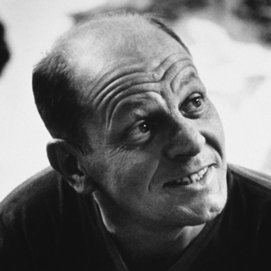
Jackson Pollock
“I want to express my feelings rather than illustrate them.”
There have been few to match the sheer ferocity and caliber of Jackson Pollock. When it came to the art world, he made quite the splash, both literally and metaphorically. One could say Jackson didn’t possess the talent often associated with fine art, but instead possessed raw aggression, the compulsion to paint what he felt and succeed with it. And succeed he did.
Jackson's paintings are these orderly works filled with a structured framework on which the colorful palette sits. At the same time, they are colorful works of chaos and disorder, departing from the form and structure of normal work. Yet, Pollock was creating feeling and emotion not likenesses. His goal was to explain how he felt, not what he saw.
Rhythm and fluidity in the midst of balanced structure leaves the viewer of a Pollock feeling starstruck though he might not be able to identify why. They are masterpieces simply in the way they defy logic. That is why the art world has lifted this man’s legacy on their shoulders, supporting what may be the greatest works in the history of abstract. May Pollock inspire many up and coming abstract artists.
2 notes
·
View notes
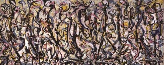
Photo
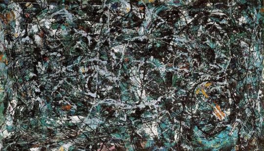
Full Fathom Five by Jackson Pollock
Our final piece from Jackson Pollock fully displays the wonder of his drip technique. Full Fathom Five is a tumultuous piece that exhibits Pollock’s perfectly balanced style and chaos. Let’s take a look.
The basis of every Pollock painting is the underlying/ overarching structure. So that again is where we must start. There is perfect order to this painting even if it seems impossible. Take a look at the lights and darks, the line quality and the rhythm, even the colors. Everything is spread evenly. The viewer is not bombarded with a central scene or side scenes rendered in thick globs of paint, but instead a beautiful mixture and rhythm that spreads evenly across all four corners of the canvas.
Rhythm is Pollock’s key to success. Paintings are nothing without emotion being invoked and Pollock’s works clearly invoke that emotion. Lines are smooth and flow evenly, varying their quality from thick to thin, sharp at some angles but smooth in others. Again, balance is key.
A very specific color palette is being used by Pollock, gray, green, blue- aqua? Something in that range. It makes for a rather relaxing work with dark and light mixed intermittently. However, what is interesting is the yellow/ brown/ red implemented- ochre maybe? It really draws the eye since it stands put. I feel as if it was Pollock’s way of staying interesting and defying standard artistic conventions. What most artists would abhor, Pollock embraces.
Pollock uses an interesting and intermittent amount of thick and thin lines. As mentioned earlier, his transfer between the two seems natural and unforced, giving the painting its rhythmic vibrant feel. He is a master at the balance of line weight and quality.
Another great Pollock embraces the viewer’s eyes. One can’t help but fall in love with his charming and unconventional methods.
0 notes
Photo
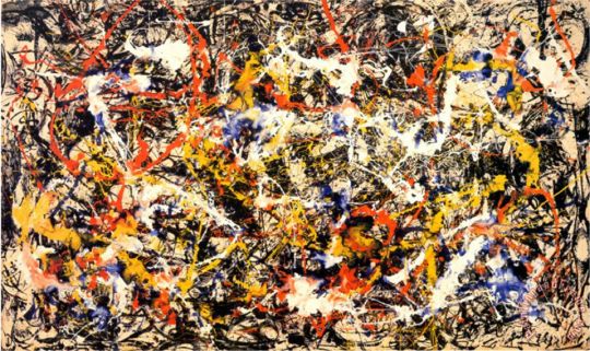
Convergence by Jackson Pollock
This is actually for real considered Pollock’s most famous work. And why not? Let’s see.
Convergence is unlike anything we have seen yet. It is a Jackson drip painting but it is executed in such an artistically unique and disturbingly wonderful way. Its composition is shockingly balanced. Black and white form the background against which the primary colors strand out. Shapes are brilliantly distributed. Blotches are mixed in beautiful clumps. It is simply balanced.
Structure, structure, structure. Look at the way the whites delicately bounce around the canvas along with red and yellow and blue. Jackson was at the height of his drip technique. Convergence uses this drip style to form highly intricate patterns that are deliberate and almost seem to form actual patterns. It is highly organized amidst the chaos presented.
The color choice is wonderful. A dull background against which the flashy primaries splash against. It really is a wonderful look. It breathes life in the midst of age, a vibrancy that is particular and nuanced. It is the random (or not) mixing of these colors in certain places into bubbles of color that makes this painting unique and all the more spectacular.
Rhythm and motion are present but more stiff than other works we have seen. This painting was meant to be a statement about the Cold War, so I can see why the tighter lines and shapes are used. The viewer feels compressed, even agitated by the sharp angles present.
Balance, balance, and balance. Pollock is a master of balancing an abstract work to the point where it doesn’t feel overwhelming and conveys a clear message. Another job well done, Mr. Pollock.
0 notes
Photo
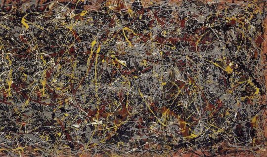
No. 5 by Jackson Pollock
And now Pollock has finally embraced his drip style. Messy? Disoriented? Or is it a masterpiece? Let’s see.
With every Pollock, I can’t help but be hit with a deep sense of order. Here especially, where the canvas peaks through from behind the paint, it seems so regular, so purposeful and so driven. The yellow highlights are the focal point, and they seem to spell out words in their methodical yet fluid pattern. In fact, the whole painting is a structural balance, with colors and shapes spread evenly and systematically.
Color here is somewhat drab, but it has lost the muddiness of earlier Pollocks. Now the colors exist in separate spaces, blending slightly but rarely. They stream across the canvas brightly, in yellows and reds and oranges and whites and blacks, breathing life through vibrancy against the dark.
The fluidity is present yet again in this piece. Movement within structure is the key to convincing art. Think the human figure and its fluidity and rigidity. The yellows and whites dance so effortlessly while the reds and blacks appear more blotched and tight. It is a dance across the canvas that invokes emotion and beauty within the viewer. The eye cannot stay fixed on any point, and it is perhaps this exotic and constant shift of gaze that makes Pollock’s works feel alive.
Again, the viewer is delighted by the enchantment and wonder of Pollock. As an abstract piece, No. 5 offers the viewer an escape from a detailed and organized picture into a realm of creative flow and energy.
0 notes
Photo

Lavender Mist by Jackson Pollock
Perhaps the most famous painting by Pollock? As always, most famous paintings are up for debate, but what isn’t is that this painting marks an extraordinary shift in Pollock’s work. Let’s see why.
Structure is present in this piece in a phenomenally unique way. Structure? You might be surprised. Don’t be surprised. The structure is in the organization, in the way things look purposeful because they are purposeful but then also look random because they are somewhat random. That is the genius of Pollock. This [painting incites feeling and emotion because it is built and purposeful. Strokes look coherent and thought out. Line quality is weighted and consistent. Even the spread of color is somewhat regular. In short, the piece is beautiful because within it exists an inner harmony.
Color is a big aspect of Pollock’s pieces. Here Pollock sticks to a drab style, yet it is interestingly different. It is certainly not the muddiness seen previously. Instead, Pollock applies only blues, greens and blacks to make the picture feel more coherent. The choice in color gives it both its name and soft feel. It looks and feels like a snowy day. The colors are balanced perfectly to where one doesn't overcome the other to a great extent.
Rhythm is within structure here. Yes, there is design, but that design flows and moves and has its being on the surface of a canvas that peaks through to reveal empty space and keep the painting light and airy. But back to rhythm: There are straight lines and curved, jagged edges and smooth, but they all dance across the canvas magnificently. The piece has a seemingly pencil-styled technique applied with broad strokes turning into thin and a sense of shading occurring. It is the ultimate sketch in that there is that complete structure and yet the fluidity and dynamism of movement encased within it. In short, it is genius.
Lastly, this painting marks a shift in Pollock’s work. Drip style is starting to take over completely. yes, it still maintains structure, but not in the same way as She Wolf. The artist is leaving more up to the imagination of the viewer and the flick of the brush.
Again, we see why a Pollock, easy to pass over without thought, contains so much thought withing it. The painting is a living breathing, moving, energetic beast that translated Pollock’s energy to the viewer. It is the ultimate form of expression from an artist to the public.
0 notes
Photo
Mural by Jackson Pollock
This 1943 custom piece by Pollock demonstrates another step in the evolution of his painting style. It was the first time Pollock tried out commercial paint as well as a drip technique. When looked upon by Clement Greenberg, he declared Pollock to be “the greatest painter this country had produced.”
There is one word that describes the composition of this piece: ordered. this, however, is unusual for a Pollock as his works are usually wild and random, lacking structure in exchange for rhythm. At least, that’s how it appears to the casual viewer. This piece is wildly regular in a unregulated way.The same line strokes and shapes are used, albeit differently in different places. Also, the colors seem highly regulated with equal amounts of black and blue and yellow and pink. There is almost a symmetry to the piece, yet this symmetry is an illusion. The viewer’s eyes are dazzled by the apparent order, but a closer inspection reveals chaos.
Colors are notably dull, following in Pollock’s style. Still, they are purposefully dull. Black takes up much of the palette, yet it is gently compensated for by pinks and blues and yellows. In fact, while the color seems to dominate, the canvas peaks through quite a bit, making the painting feel more like a light airy wood than a dense canopy.
The shapes themselves feel rhythmic. There is curve and form to them even though they are random. The viewer cannot help but feel that this is a musical composition and that the notes are drifting across a colorful bar of Mozart’s famous work. It is exciting to see how the blues outline the blacks in their shape, creating contrast and further rhythm. Structure is present almost simulating the decor of an iron gate, yet the randomness and fluidity of the structure breaks away from traditional painting. It is, in short, masterful.
Jackson’s Mural is nothing short of messy, yet the viewer does not feel a sense of mess or disorder. The smears are so wonderfully thought out that one looks upon the painting not as a Big Bang creation but as the work of a thoughtful and caring creator. Jackson poured himself into every drip, line, and cranny, leaving the viewer convinced that every inch of the painting is important. This is the kind of attention that makes Pollock’s work spectacular, as we will further see.
0 notes
Photo
When analyzing works of art, it can sometimes be harrowing to dive into the abstract. Still, this style is a necessary part of the art world, a beautiful and rhythmic part. Thus, we take a look at Jackson Pollock to see what life is breathed into his work.
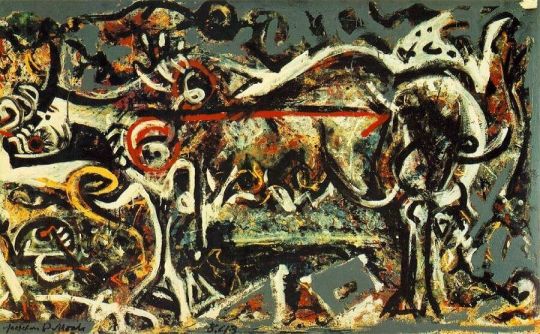
She Wolf by Jackson Pollock
A look at the painting She Wolf by Jackson Pollock seems to reveal some semblance of a four-legged creature. Perhaps the longer you look you will see it or perhaps the quicker you glance it will appear. The head is on the left of the canvas with the body moving toward the right. The figure is highly abstracted, yet retains some form, an important choice by Pollock. There is roundness to the body, yet sharpness to the head and legs, a contrast that perhaps expresses the artist’s feelings.
Shapes are the living being of this work, with triangles, circles, and rectangles forming what appears to be the subject and background. A trapezoid and triangle specifically devoid of paint are located at the bottom. Further shapes take up the top of the piece, perhaps branches or the like. This painting is clearly not the drip style that Pollock would later develop. Shapes are chosen and purposeful, carrying meaning behind them.
Energy is what makes this painting great. There is structure but it is alive and moving before the viewer’s eyes. A lack of symmetry or proportion allows for a wild feel, a sense of expectation debunked. Why is the bottom left so busy? What are the shapes represented? Is there a meaning to the colors used? The viewer is left moved by questions that he must answer himself.
The colors are very dull in nature. It is a specific palette of oranges and yellows and creams and some red put together with blue and greens to mix together a muddy, dull color. There seems to be no thought given to color and how it interacts as it simply appears hastily clumped together into unpleasing tones. Then some red and orange is sprinkled on top. Still, it is the dull backdrop upon which the bright colors pop, drawing the viewer to where Pollock wants them to be. This is definitely a specific choice by the artist.
All in all, the painting breathes energy within odd structure. It is loud but not random. It is exciting but not crazy. It is an early piece in Pollock’s career and it only gets weirder from here.
0 notes
Photo

As someone who was always skeptical of Leonardo da Vinci’s fame, this study of six of his most famous works has revealed to me just how exceptional the artist really was. Following in the footsteps of the Renaissance and incorporating classical elements with a new twist, Leonardo proved his prowess in his often Biblical scenes. It is a pleasure to be able to look upon the work of man who loved beauty, science, and progress.
The forms, the symmetry, the expression- emotion is conveyed in every sense of the paintings. My favorite has to be the Last Supper with its perfect composition and absolute dynamism. The Lady with Ermine captures raw form and a thorough understanding, not just of human anatomy, but animal as well. Scenes are structured to have distant backgrounds, while overlapping further conveys distance. What’s even more spectacular is that we actually have pencil drawing from da Vinci! As one who often sketches, this is perhaps the most relatable part of studying the master. And the Mona Lisa, the créme de la créme, perfectly immortalizes all of the above and more. There is no doubt that da Vinci is and should be a master. His paintings are immortal works that testify to a height of the artistic world.
0 notes
Photo
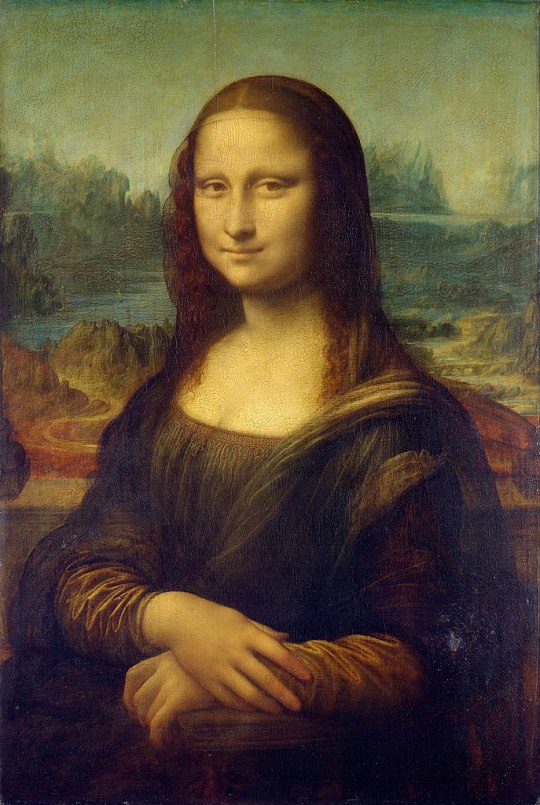
Mona Lisa by Leonardo da Vinci
This is perhaps the most famous painting, or work of art, on the planet. It has sparked rumors, legends, debate, and much exchange of cash. So what’s the big deal? Why is this painting so lauded? Why is it so protected? Why is it the focal point of the Louvre? Let’s look and see.
The painting itself is a standard portrait with a seemingly standard background. In regard to the background, it resembles the virgin and child with St. Anne painting in its layered composition. The mountains, lakes, and winding road build on each other to create the depth of the scene. Still, the colors are a bit dull, in order to emphasize the lady herself.
Interestingly enough, da Vinci’s subject is turning toward the viewer in three quarters, initially facing sideways. This seems like an odd choice for a portrait, yet perhaps it was da Vinci’s way of showing off by capturing the difficult view. Yet for all this desire for Mona to be facing the viewer, her gaze seems to shift to her left, away from us. Perhaps this is why the Mona Lisa feels so mysterious.
Light is the key player in this piece as well as most of da Vinci’s pieces. The light creates the full rounded forms we see as well as adding the pale hue to Mona’s soft skin. Shadow is used to convey mass and define features, but it is used sparingly to avoid the illusion of age or fatigue.
The figure of Mona is very much like the trend of the Renaissance. Her figure is full, rounded, and fleshy with an emphasis on smooth, silky skin over structural, wrinkled skin. The facial features are mostly illuminated without any dark shadows or wrinkles. Even the usual smile wrinkles are missing here. The hands retain their form while losing the indication of veins, knuckles, or bones. Clearly it is more of an idealistic representation than what the subject actually looked like.
Interestingly enough, the hair of Mona takes a turn away from the realistic qualities of the painting. It appears too flat on top as opposed to the curly locks on the side. This is most likely due to da Vinci’s desire to emphasize the face rather than his lack of skill.
Clothing is rendered in a highly detailed style. The sleeves are especially wonderful, utilizing the light to define the wrinkles, yet almost appearing reflective in its shimmering. The rest of the lady's gown is detailed yet dark to prevent focus from leaving the lady.
Stripped of all the lore and speculation as to the subject and purpose of the painting, the Mona Lisa is simply another great da Vinci work. There is nothing about it that is particularly unique or masterful, but rather, like all da Vinci’s works, it is an astonishing piece crafted expertly.
0 notes
Photo
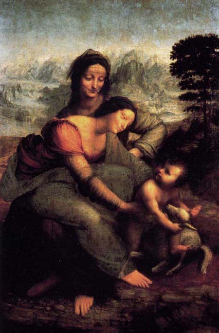
Virgin and Child with Saint Anne by Leonardo da Vinci
Another amazing work by da Vinci, this piece once again delves into the fluid yet structural representation of figures. It takes its Biblical themes and translates them into the studious approach of the Renaissance.
The composition of this piece immediately struck me in that it is layered. Often figures who are occupying the main space of the painting aren’t covering one another, yet Leonardo employs this technique to emphasize space and distance as well as add a realistic touch. Furthering this approach is the layering of the landscape to create distance. This is highly reminiscent of a Bob Ross painting which creates different levels with different depths to push the background further back.
Lights and darks are played with all throughout the scene in a masterfully balanced way. The dark composure of Anne contrasts against the light mountainscape while the softer complexions of the Virgin Mary and Jesus contrast with the dark landscape. In this way the picture feels balanced and draws the viewer’s eyes to what is most important.
Light is further used to create the form and mass of the flesh and drapery to create realism. Leonardo crafted round full forms with a definite structure. Light is emphasized on the Virgin and Child as these are the crux of the piece; however, da Vinci emphasizes the older Anne in a different way, defining her bones to giver her structure and a commanding presence..
Drapery is dealt with much like a classicized Greek sculpture, very airy and alive yet conforming to the figure. In fact, the skirt of the Virgin is transparent and reveals the form underneath. This aligns with the Renaissance emphasis on resurrecting the Classical and focusing on the figure. Also, the rendering of the forms in action poses creates dynamism and allows the viewer’s eye to complete the action. Notably, figures in extreme motion are difficult to craft, but not for Leonardo.
With a mix of full, rounded forms and bony, structural forms, Leonardo has combined two different techniques to maintain an interesting and dynamic scene. Combine this with the levels of contrast and the distance of the piece and the viewer’s eye does not easily grow tired of the luscious snapshot.
2 notes
·
View notes
Photo
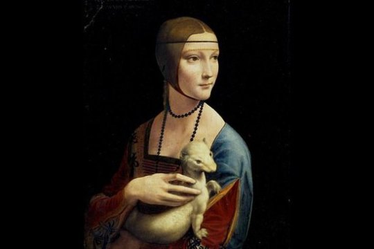
Lady with Ermine by Leonardo da Vinci
Though definitely not one of the more famous paintings by the talented artist, “Lady with Ermine” once again shows the prowess of the master behind its creation.
Some call this work over-painted, especially in the background. While this is in fact true, the separation between light and dark are what give this painting its brilliance. The lady and ermine are accentuated in the soft white light shimmering on them and the viewer is bedazzled by it.
Form is dealt with in a highly realistic fashion, using the light to develop mass. The cheeks are full, the fingers are lively and slender, and the ermine is sleek yet rounded. The realism supplied creates the viewing experience. The artist further adds to the realism with the rendering of clothing as the folds dance down the subject. The light again is used to define what is near and what is far.
Anatomy is what breathes life into this piece. Da Vinci clearly had a mastery of the facial features and anatomy as the lady’s head is beautifully rendered with the pronounced cheekbones, forehead, and chin. Da vinci’s knowledge allows him to change the head from the average proportions to add character. The hand is masterfully crafted, with the underlying structure clearly showing through to reveal a realistic slenderness. The arched fingers add to the dynamism as the viewer’s eyes completes the action. Look at the ermine’s head and how wonderfully its crafted with attention to structure and form. Its body is so wonderfully agile and yet the form remains realistic and perceivable. Again, the motion conveyed here adds dynamism to the piece.
The most impressive aspect of this picture is the artist’s understanding and use of form and anatomy. It is a clear picture of the artist not simply as a creator, but as a scientist and observer. The realism of the piece is carried forth boldly and beautifully.
0 notes
Photo
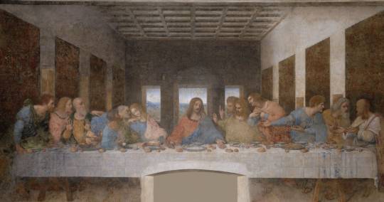
The Last Supper by Leonardo da Vinci
One of Leonardo’s most famous pieces, The Last Supper is a depiction of Christ’s final meal with the disciples and the precedent for Communion. In the work, Leonardo does not simply craft the figures who were present, but excellently captures the emotions conveyed to produce an astonishingly dynamic piece.
The symmetry of the piece immediately captures the eye of the viewer. Cut a dissecting vertical line straight through the painting, and it will pass through Jesus, leaving six disciples, one and a half windows, and 4 tapestries perfectly divided. This is what captures the viewer’s eye and is meant to show the perfection of the holy scene.
Apart from symmetry, another amazing technique speaks to the viewer: perspective. This is complete and total command of one point perspective. The vanishing point falls in our central window which is right behind Christ and the walls expand outward, providing an astonishing sense of depth and placing the viewer right in the midst of the scene.
Realistic use of lights and darks to display how dark the room is as compared to how light the sky is further add to the illusion of depth and realism present. The panels on the ceiling are perfectly lighted to command the viewer to believe in the depth of the piece. Light is further manipulated to shine on Jesus to indicate His divinity.
The use of lush drapery and colors adds to the regality of the scene. This looks more like a royal feast than a supper in an upper room before a crucifixion. It is meant to convey the beauty and majesty of Christ and the Christians.
The crux of this scene is da Vinci’s command of the human figure. Foreshortening is played with lively to maintain realism. Mass and form are enhanced by lighting and even overlapping of figures. The understanding of anatomy and the way the body moves relative to the different muscles is magnificent. It is this sense of vibrant and instant motion that is completed by the viewer’s eye and breathes life into the painting.
Finally, the use of expression is conveyed wonderfully,. Realistic faces each carry their own features in different expressions. Some are sad, some are angry, some are puzzled. Jesus himself looks remorseful. Da Vinci’s command of head movement and how it relates to expression as well as placing features make this painting the masterpiece that it is. We the viewers can feel what each apostle is going through right now.
Da Vinci’s The Last Supper has been parodied and shown all across the world all throughout time and not without reason. Its use of the fundamentals of art in extraordinarily aggressive and confident ways make this piece remarkable and quite simply beautiful. It is perfection, and, if I may say, it is da Vinci’s greatest work.
0 notes
Photo
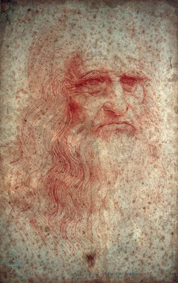
Self-portrait by Leonardo da Vinci
Though it is hotly debated whether this piece is truly a depiction of da Vinci or someone else, what makes it remarkable is the fact that a pen and ink drawing from this period exists today. In a time when illustration is the crux of the artistic world, finding such a predecessor is an exciting experience. Let’s dig in!
The layout of the piece is a normal portrait. Part of the drawing is missing, possibly due to age, but seemingly due to artistic choice. After all, this was technically taken from da Vinci’s sketchbook. That makes it all the more exciting.
Perspective and proportion are dealt with masterfully. Leonardo has chosen the three-quarter view to depict himself, a difficult technique to do well. Still, the placement of the features is handled carefully and skillfully to render a very realistic likeness.
Da Vinci’s mastery of form is really quite astounding. The picture is not filled with intricate lines, but rather skillfully carved out features with as little detail as is needed. Still, da Vinci places dark shadows around the eyes, nose, and mouth. He balances these with the lighter areas of skin to make the piece feel three dimensional.
There is so little detail applied to the hair, and yet it feels so real. The skill in crafting the curves and flows of the locks, especially where they meet the face adds to the illusion of realism.
Line quality and rendering are what sell this piece. The long lines of the hair are continuous and smooth without breaks. The darkness around the eye loses all hint at its origin and smoothly melts into the shadow it is meant to imply. The pencil strokes cannot even be seen in the shading of the nose. It is quite the masterful piece!
Leonardo’s sketch contains everything which makes sketches today so amazing! Line quality, shading, rendering, mass, structure, proportion- all done exquisitely. It is such a treat to be able to see a study from an old master!
0 notes
Photo

Salvator Mundi by Leonardo da Vinci
The man, the myth, the legend. Our next artist spotlight falls on the famous Leonardo da Vinci. As we explore his paintings, let’s try to figure out why the man became so famous. Was it simply chance or was there some real magic behind his work?
Salvator Mundi is, in essence, a painting of Christ. The title is translated to mean “Savior of the World”. Christ, dressed in Renaissance garb, makes the sign of the cross with His right hand and holds an orb in his left to signify the world. What is the significance of this iconography? Simply put, I believe Leonardo was relating Christ to the present day while also establishing his position as ruler and deity.
The layout of the piece is fairly straightforward. It is a portrait piece with Christ in the center. The background is dark to provide contrast against Christ’s figure. Symmetry is in play here, perhaps as a statement on the perfection of Christ.
The play on light and shadow is what makes the Renaissance painters magnificent. Leonardo contrasted the dark background with the pale of Jesus’ skin glowing in the soft light. The shadows provide the mass of Jesus’ body and create a realistic perception of depth.
Form is dealt with in a realistic way as well. The folds of Jesus’ hair cascade softly and are almost overly curled, a technique employed to draw attention to the hair, a status symbol in some ancient cultures. The garment is delicately rendered to show depth and mass in the folds of the cloth. The pattern of the garment is most excellently detailed. Da Vinci has spent much time in making this piece appear intricate and three dimensional.
Jesus’s hands and face are rendered softly and realistically. His eyes and visage seem unfeeling, cold, or even sad. Perhaps this is to evoke the emotions associated with the cross. However, the soft feel of the skin leaves an impression of kind innocence on the viewer. He is a ruler, but one who is approachable.
The color of Jesus’ garment both represents royalty and adds a striking contrast to the pales and darks of the rest of the scene. I also offer a special note on the realism of the orb. It is astoundingly well composed to blur what is seen through it as well as retain its sheen.
All in all, the Salvator Mundi helps prove the thesis that da Vinci was famous because he was a really good painter and not just because of the Mona Lisa. HIs figure of Christ here is excellently composed to convey emotion and realism to the viewer.
0 notes
Photo

“I’d rather that it is less than perfect. I think that is the essence of art. It can be less than perfect yet it’s honest. If you have a statement to make, you’ll make it. If you don’t make it right away, you’ll make it eventually. If you have nothing to say, get the hell out! Don’t pretend to be a creative artist. If you want to fake your way through it and pretend that you’re better than you really are by simply ripping people off, copying this, copping that and take all the credit for it....you really don’t belong in this field. Find something else!”
~Frank Frazetta~
An astonishing artist, a dominating personality, a man unafraid to go his own way and never look back. Frank Frazetta was a man who couldn’t stop hustling. He describes himself as someone who said no to the mainstream art culture and blazed his own path. He said what he meant; he created what he wanted; he earned his fame. When his right side shut down at a ripe old age, he learned to create with his left hand. Enough said?
The series of pieces by Frazetta that we have looked at in the past week are full of artistic knowledge employed to draw the viewer’s eye to the exact scene it needs to see to understand the exact story Frazetta wanted to tell. His use of bland color palettes in the foreground with a striking color in the background is marvelous. His manipulation of light across human flesh is brilliant. Even his accentuation of human forms into overemphasized bodies marks his knowledge of anatomy. It’s just plain hard to do what he did without a high level of skill. The man knew exactly how to draw the viewer’s eye, using positioning, light, and movement to point to the central figure. His rendering was delicate yet fierce; his perspective made the viewer feel that they were part of the piece.
In short, Frazetta’s works do exactly what they need to do. They transport the viewer into a fictional world that will prepare their mind for the story ahead. He was a master of manipulation, and the art world is better for it. The biggest takeaway for me is: don’t be afraid to emphasize, to use striking colors and lighting or accentuate forms. Risk often pays off.
Here's to you Frank Frazetta!
0 notes
Photo

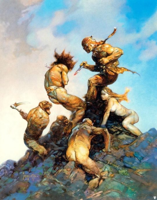
“Conan” by Frank Frazetta
The artwork for Conan the Barbarian is perhaps the greatest achievement by artist Frank Frazetta. Of his pieces, this is probably his most famous and recognizable. As we conclude our study of Frazetta, let’s dive into his most significant cultural achievement.
Conan is a classic Frazetta piece bursting with life and energy even in the midst of its still composition. The piece is defined to a very specific color palette, using mostly earth tones against a bright yellow and orange background. This technique highlights our central, imposing figure.
The picture has a fairly decent symmetry to it, appealing to the eye. The figure of Conan is arranged on top of the hill, lifting him into the spotlight of this piece as he dominates the viewer’s eye.
Everything that isn’t Conan melts into the background, yet subtle detail is still imbued to retain the lively quality. Did you notice the skull in the background? What about the woman at Conan's feet? It takes the viewer a minute to break away from Conan’s dominating features, but when he does, he is met with other surprising details.
Lighting is the principal element of draw in this photo, especially with that vivid background. The light reflecting off Conan is what gives him his definition and further leads the eye across his rippling muscles.
Once again, the figures are not realistic in nature. Conan is nothing but overly-defined muscles, a dumpy-looking head, and some very straight hair. He looks like a person, but no one the viewer has ever seen before. (He should be thankful for that.) His position allows for the full view of his muscles. The woman is also overly emphasized in form. Again, Frazetta’s point is to convey fiction and separate the viewer from the piece by removing familiarity from it.
All in all, Conan offers a combination of everything employed in our earlier Frazetta pieces. From the lighting and color choices to the symmetry and forms, the picture is meant to draw the curious eye to look closer and believe the scene is occurring right before it.
0 notes
Photo
Jaguar God #2 by Frank Frazetta
As we wind down our Frazetta analyses, I couldn’t help but pluck this beauty out from among the bunch. It is a bit different from the characteristic Frazetta style, more in line with the Headless Horseman piece. But without further ado...
I want to start off by talking about the placement of figures. Frazetta has abandoned his traditional way of highlighting the important parts of the piece through light or color and instead uses placement. Every figure except the jaguar man and woman are facing away from the viewer. In this way, Frazetta highlights his main characters, while also adding new figures that help convey the story and make the scene dynamic.
Keeping in line with this strategy, Frazetta places the jaguar man and female atop of the pyramid of figures, thus creating an arrow like composition that again draws the viewer toward the main event. Every additional figure’s gaze, movement, and position lead to the two figures atop.
Light, though not as extreme as in previous works, is definitely an element in this piece. It is used to convey depth and form and is quite visible on the body of our foreground creature. The depth created is realistic aided by an understanding of perspective and an excellent rendering.
Frazetta sticks to his use of a tight color palette, maintaining earth tones throughout.
The dynamism of the piece is astonishing. Frazetta’s understanding of the human figure only aids this deception with tense muscles that are ready to spring. The viewer’s eye is meant to complete the action of the characters, thus furthering the story.
As is usual for a Frazetta piece, the figures are not realistic. They are heroic, over-chiseled representations of muscle and flesh; however, in a sci-fi piece, realism isn’t really the goal. That is why Frazetta’s style works very well.
All in all, this piece tells us that Frazetta wasn’t the slave of a specific formula, but rather utilized different ways to draw the viewer’s eye to what he wanted to be seen.
0 notes