
Don't wanna be here? Send us removal request.
Statistics
We looked inside some of the posts by design-notesruthd and here's what we found interesting.
Average Info
Notes Per Post
0
Likes Per Post
0
Reblog Per Post
0
Reply Per Post
0
Time Between Posts
2 days
Number of Posts By Type
Text
12
Photo
5
Last Seen Tumblr Blogs

Fun Fact
When “GIF” was named word of the year in 2012, Oxford Dictionaries U.S.A. credited Tumblr for pushing the word.
Text
Getting there ...
The latest version of my design - I’m still undecided about the colours.
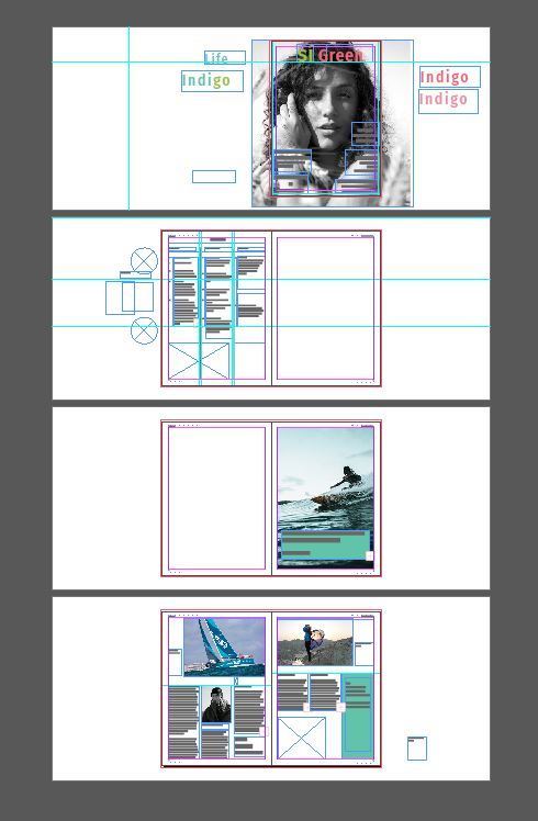
I’ve added a Contents page to add more detail and relevance to my design.
0 notes
Text
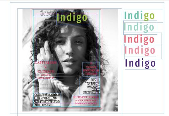
Cover design:
A working design for my cover. I’m going with the black and white version of the image as I think it will serve as a contrast with the typography colours - pink/red or greens/green/blues.
I’m working on my coverlines. While I like the white block text it needs to be more legible.
0 notes
Text
Magazine spread layout
I’ve decided to go with a 3-page spread on a feature of two Irish sportswomen. The first page will be a photo with a headline, subheading and byline in a box at the bottom of the photo. I’ve laid out the 2-pages with two photos and text boxes (see below).

0 notes
Text
What’s in a name?
Deciding on a title for the magazine involved some brainstorming sessions and searches on focloir.ie for a word or phrase that reflected the tone and style.
My initial choice was Green Queen - I thought I could do something with the “een” but having tried out a number of combinations in Illustrator (see screenshots in previous post) I abandoned the idea.
I also considered ‘Indigo’ - though the colour is not what I’m aiming for - a violet-blue - the word itself has associations with wisdom and justice.
I’ve attached a screenshot below of my word search.
Eventually with some help from my family I settled on something that’s simple and also points to the magazine’s Irishness and female readership as well as environmental ethos: Sí Green.

0 notes
Text
Magazine: More Covers
I’m figuring out a masthead while still undecided about the photo - whether to go with the green hue or black and white. At the moment my chosen colour scheme is a chartreuse green with pink/red - (from one of the palettes in my proposal) so the full colour image won’t work with that.
I’ll explain my colour choices in my next post,
Font choice:
In my proposal I looked at two types of covers and their masthead font styles. As this magazine is more down to earth and features real women more like Cosmo or Marie Claire than Elle or Vogue I wanted a font to reflect that.
I discovered a font called Fira Sans that’s similar to the Marie Claire logo - a rounded sans-serif typeface. It’s free on Google fonts so I downloaded it in regular and condensed versions - and I’m happy with how it looks. Below I’ve used the condensed font but I might opt for the regular one depending on the masthead. This was probably the easiest choice I’ve made so far during this project.
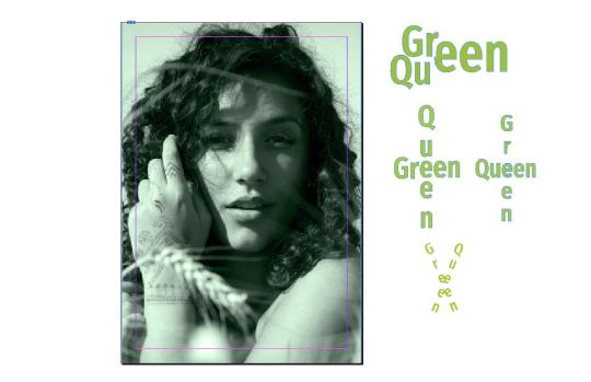
My working title is Green Queen - I’m trying different ways of combining the two words.

Trying out title/masthead in different colours.
0 notes

Text
Magazine Design: Cover
I’m researching an image for the magazine’s cover. While I would have liked to use an image of an Irish woman from politics, entertainment or another sphere it has proven difficult to get a high res image. So within the timeframe I’ve decided to source a free image from Pixabay or Unsplash.
Photo specs:
It needs to be portrait -or if landscape can be cropped to suit A4 cover. I don’t want something too posed like a studio shot. The woman should be facing the camera and in a natural surrounding.
Challenges:
It was difficult to find a portrait image of a woman in a natural scene that didn’t look like something from a travel magazine or health/wellness.
Eventually, I narrowed my search to four images:

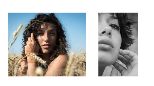
The four images are very different. I really liked the top left but it was too posed I think to fit with the magazine’s style. The woman with the pink hair image is great but perhaps better for a hairstyle or beauty magazine.
While I also liked the bottom right image I thought it didn’t leave much space around it for the masthead and cover lines. So I went with the woman in the field. She looks natural, a bit boho with her henna tattoo.
Cover photo selected. Next step Photoshop.
0 notes
Text
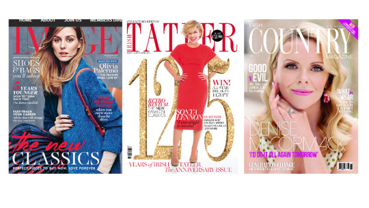
Irish Magazine Covers
The covers of the most popular Irish women’s lifestyle magazines.
Image and Tatler have a similar title font to Vogue, Elle and Bazaar. While Irish Country Magazine also has a thin serif title font it has different sizes for the Irish and Magazine. Also Tatler has Irish printed vertically alongside Tatler.
0 notes
Text
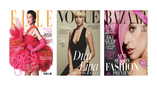
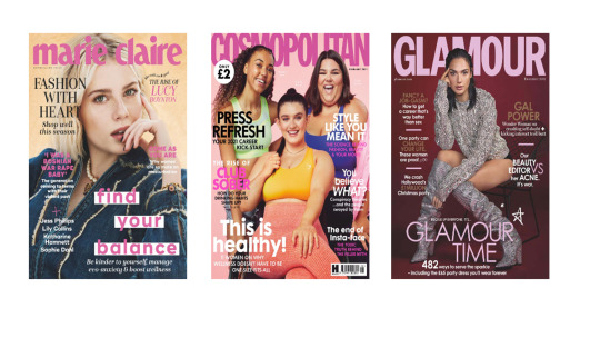
Magazine Covers and Title Fonts
A look at the covers of some of the English-speaking world’s biggest women’s magazine brands.
It’s interesting to note the difference with the title font used. In the first set, Elle, Vogue and (Harper’s) Bazaar, a serif font is used and its colour changes from issue to issue.
In the second set the font is a bolded sans-serif - in these three examples it’s pink but it changes too. Also interesting is marie claire is in lowercase.
The title font in the first set of magazines along with other elements such as the pose of the cover star give an impression of aloofness - the magazine is aspirational.
The title font for the next set is rounded and matches the overall impression of the cover stars - the magazine is more welcoming and real.
0 notes
Text
Magazine Proposal: Colours
Colour is a vital part of design and the colour scheme of a magazine informs its style and tone.
In my previous post I mentioned The Pool which used muted shades of pinks, greens and blues to separate sections. Though it worked for that platform I don’t think it will help a print magazine to stand out on the shelves.
This magazine will be bold and bright in its ideas and opinions and for that I think vibrant and contrasting colours are needed. I’m reluctant to go with the stereotypical hot pinks and reds that dominant many of the mainstream magazines.
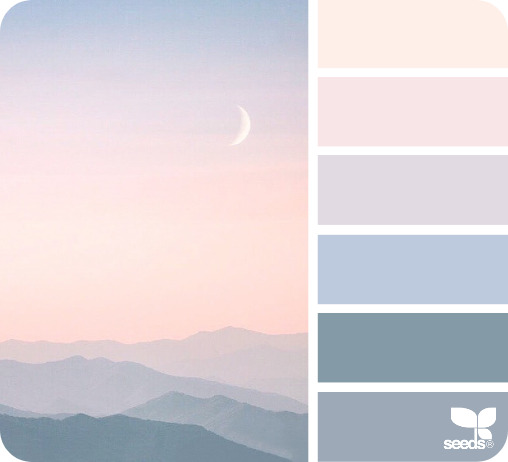
I looked at some colour palettes online to get some ideas and narrowed my selection down to:
Colour Palette no. 1
Colour Palette no. 2
Colour Palette no. 3

Colour Palette no. 4
I loved these colour combinations but I realised that the first one would be beautiful if I was decorating my house. The second one is not quite right either.
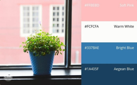
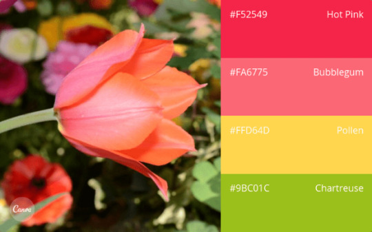
I think the third and fourth palettes are closer to what the magazine represents. I especially like the chartreuse and will experiment to see how it looks with the hot pink (which looks closer to a red).
0 notes
Text
Magazine Proposal: Inspiration
When thinking about my ideal magazine I looked for inspiration to the magazines and other publications I read or consume online.
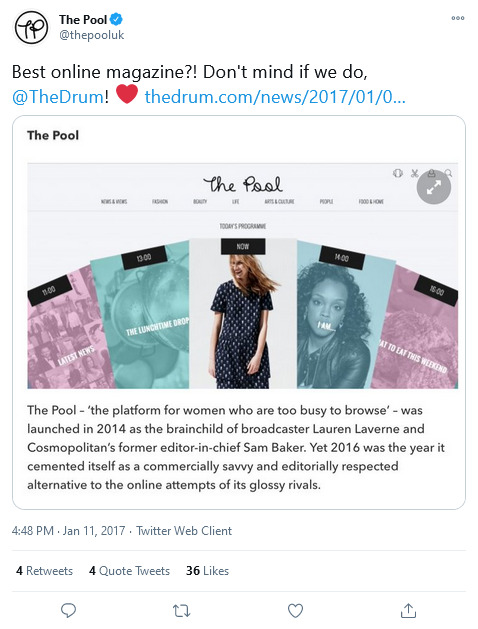
First up is The Pool.
This was a UK-based website for “women who are too busy to browse”. What I really liked about this publication was how it combined light and serious content - indepth features and opinion pieces on politics and current affairs relevant to women and feminist issues, it also had arts and culture, fashion and beauty. It didn’t dumb down the content and assume that all women were exclusively interested in celebrities, reality TV and makeup.
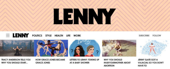
Lenny Letter
Another digital offering that sadly is no more was Lenny Letter - a weekly online newsletter by Girls actress Lena Dunham offering “feminism, style, health, politics, friendship, and everything else”. It had some hardhitting pieces on racial identity and the female experience. It had cool illustrations. It was also rude, graphic and funny.
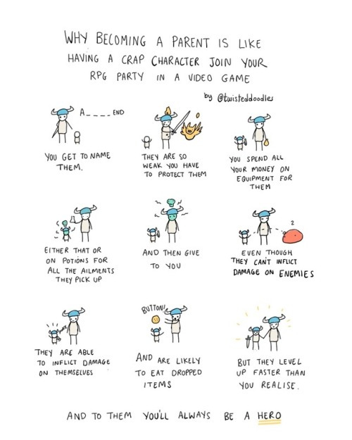
Twisted Doodles
I follow this Irish cartoonist on Twitter. Her illustrations often make me laugh out loud and her humour is uniquely Irish. I would like to include illustrations and cartoons like hers in the magazine.
Refinery29
This is a women-focused website with versions in the UK, US, Canada, France and Germany. It features the usual fashion, beauty, relationships and Netflix recommendations but also Money Diaries and Unbothered - “a community celebrating Black voices ... “ and news articles with titles like “Poverty Is Not New, You’re Just Seeing More of It.”
Le Cool Dublin
Another online publication that I liked was Le Cool Dublin. It was a weekly e-zine that focused on culture and events around Dublin and had a cool creative vibe.

0 notes
Text
Next Project: Magazine Design
The final project for Desktop Publishing module is to design a magazine.
I’m working on my proposal and so far I’ve come up with clear ideas for the type of magazine I want to design.
The magazine will be targeted to women and will be a little different from the mainstream offerings on the shelves of newsagents. I want to create something I would like to read myself - less celebrities and fashion - and more content catering for the diversity of interests, beliefs and lifestyles out there.
Content will include features around the political and social issues that shape our lives. Articles on fashion and beauty will have a strong focus on sustainable products. It will also include content on arts, culture, tech, science and health.
Having conducted a lot of research, I feel confident that I know my target readers and the content and tone very well but I’m still figuring out the style aesthetics: colour, fonts and layout.
0 notes
Photo
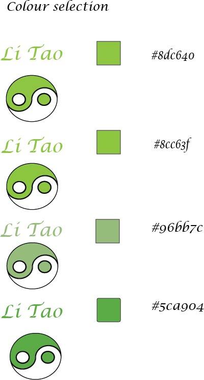
Choosing colours: The brief is for a natural green; like the colours of leaves or grass. I’ve narrowed it down to these four shades. I’ve tested them with the font as well as the symbol to get a better idea of what the colour will look like in the finished design.
0 notes
Photo

This is a rough design that I sent my client. It’s from one of my earlier sketches.
0 notes
Photo
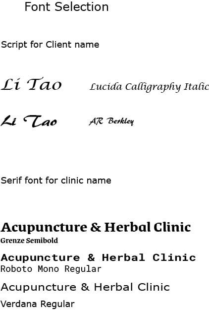
Some font selections: script type font for client’s name
Serif font that’s easy to read for the clinic name.
0 notes

Photo

Early drafts in Illustrator. This is a jpeg of my artboard.
I’ve used a green and white combination for the yin/yang symbol instead of the usual black and white. I’ve chosen a serif script font of Li’s name and block sans serif for clinic name. Looking at it in a smaller version, I realise that the font underneath with green stroke and transparent fill won’t work as it is.
Back to the drawing board.
0 notes