
Don't wanna be here? Send us removal request.
Statistics
We looked inside some of the posts by designdee and here's what we found interesting.
Average Info
Notes Per Post
1
Likes Per Post
1
Reblog Per Post
0
Reply Per Post
0
Time Between Posts
6 days
Number of Posts By Type
Text
7
Photo
4
Link
1
Last Seen Tumblr Blogs


Fun Fact
Tumblr was the first site to host the blog for President Barack Obama in 2011.
Text
Bauhaus Typography
Bauhaus typographers designed type with the idea of creating functional fonts which could be used universally across print media and signage. Many of the typefaces designed by Bauhaus teachers and students were experimental, with some never completed or published. Now, modern-day designers are reviving or reinterpreting Bauhaus typefaces for the digital era.
To honour the Bauhaus centenary, type designer Erik Spiekermann has collaborated with a group of international students to complete and digitize five rediscovered Bauhaus typefaces.

‘Research in Development of Universal Type’ by Herbert Bayer, 1927
Look out for fonts or vector type designs which have a minimal, geometric style to channel a Bauhaus look. This abstract alphabet design by contributor Viktoryia Makouskaya is spot-on.

0 notes
Text
Against the arts' class snobbery
Revolutions in the design world are most often driven by advancements in material and technology. The famous Wassily Chair by Marcel Breuer is precisely one of these, the first-ever chair to feature a bent-steel frame. While it was first created in 1926, it marked the beginning of a new era in modern furniture with a design that maintains a progressive look even today.

Inspired by the frame of a bicycle and influenced by the constructivist theories of the De Stjil movement, Marcel Breuer was still an apprentice at the Bauhaus when he reduced the classic club chair to its elemental lines and planes, forever changing the course of furniture design.
0 notes
Text
10 Basic Principles of Graphic Design
“There are three responses to a piece of design — yes, no, and WOW! Wow is the one to aim for.” — Milton Glaser

Balance Balance lends stability to designs, thinking of the weight behind each of your designs and how it forms part of each design. Symmetrical balance is when the weight of the elements are evenly divided on either side of the design and asymmetrical balance uses scale, contrast and colour.
Proximity Proximity helps in creating the relationship between similar or related elements. These elements don’t need to be grouped but should instead be visually connected in terms of font, colour or size.
Alignment Alignment plays a pivotal role in creating a seamless visual connection with the design elements. It creates a visual ordered appearance with images, shapes and blocks of texts by eliminating elements placed in a dishevelled manner.
Visual Hierarchy Hierarchy is formed when visual weight is given to the most important elements or message in your design. It can be achieved in various ways by using an arrangement of larger or bolder fonts to highlight the title or to place the key message higher to add a focus to more relevant items.
Repetition Repetition creates a visual rhythm and strengthens overall design by tying together consistent elements such as logo and colour palette, this is especially efficient in advertising and branding specifically.
Contrast Contrast happens when there is a difference between the two opposing design elements. Most common types of contrast are dark vs light, contemporary vs old-fashioned, large vs small.
Colour Colour can help dictate the entire mood for the design. The colours picked to represent your brand and it’s tonality. It is important to have a general understanding of colour theory for example blue creates a feeling of calmness.
Negative Space The area around elements can help create a shape and highlight the important components of a design.
Typography Typography is one of the key pillars of design and it speaks volumes about a brand or an artwork when executed stylistically or even customised.
Rules Once you understand all of these rules, it is important to be able to break them without compromising what is trying to be communicated.
0 notes
Text
Everything is design.
Minimalist design, simplicity and efficiency – how the Bauhaus aimed to change the way we live. 2019 marks the centenary of Bauhaus – the school, and the design style. An exhibition in Bonn explores what makes the legendary Bauhaus school of design so timeless. These architects and artists came up with a revolutionary idea that is now taken for granted: Everything is design.

Group photo of Bauhaus masters in Dessau (1926): f. l. t. r: Josef Albers, Hinnerk Scheper, Georg Muche, László Moholy-Nagy, Herbert Bayer, Joost Schmidt, Walter Gropius, Marcel Breuer, Wassily Kandinsky, Paul Klee, Lyonel Feininger, Gunta Stölzl und Oskar Schlemmer. | Photo (detail): © picture alliance akg images
1 note
·
View note
Photo


Bauhaus inspiration with a strong correlation in the rounded style typography which is also present in soul music cover art and posters.
0 notes
Photo

Bauhaus: 3 Primary Colours & Basic Shapes
The Bauhaus's characteristic assignment of the three primary colours red, yellow and blue to the square, triangle and circle was based on a survey that Kandinsky carried out at the Bauhaus Weimar.
0 notes
Photo


The Use of Contrast: Value, Shape, Colour and Orientation
Using contrast I tried to convey different levels of balance between contrasting objects. The first image shows the layering and effects that gradients layered with varied value and shape can create almost a 3D illusion with the solid strong typeface.
Image 2 uses texture to almost represent a planet or ball rolling and bouncing off, the soft shadow between the solid black is also a contrast in textures, colour, value and shape.
Image 3 utilizes colour, value and orientation as a visual representation of the growth of numbers. It is meant to illustrate the counting process knowing zero is there but we generally count from the number 1 up and 3 is the final number and also conclusion.
Image 4 shows the temptation as you fight the yawn and your urge to resist grows smaller so does the font contrasting downwards. The contrast between big and small is prevalent in the use of typography, as well as bold to the thinner font.
0 notes
Link
Bauhaus Inspiration post for Shapes
My inspiration for the post about shapes in basic design elements came from the Bauhaus classes by Wassily Kandinsky. The use of colour and form with basic geometrical forms was simple yet illustrated multiple elements of design.
0 notes
Photo
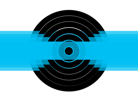
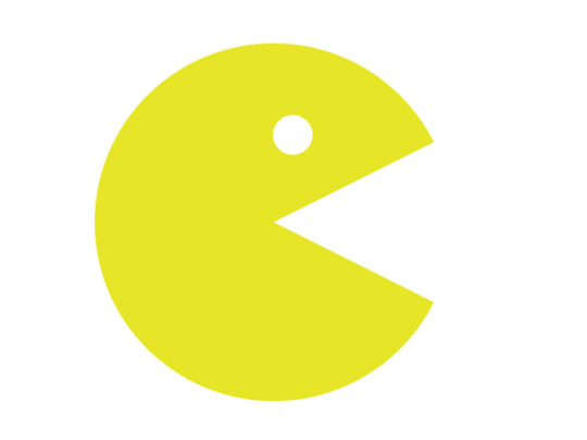
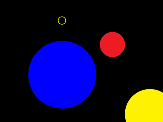
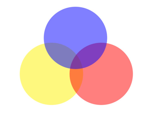
Image Creation using Basic Elements in Photoshop
Getting used to using Adobe Photoshop for image creation and thinking creatively about design while using basic elements. This exercise was fun as it took me back to the basics working with photoshop layers and tools and just experimenting with what I would be able to do.
Image 1 is a varied value of rectangles layered with a dartboard like a pattern expanding from a small solid point growing to a large circle. The value also creates a strong visual indication of the levels of growth.
Image 2 is based off a circle with a triangle layered over and a circle cut out to depict the classic PacMan.
Image 3 uses varied saturation to depict contrasting sized shapes. The contrast again in colours are inspired by Bauhaus. Contrast infill and solid shapes are also present.
Image 4 uses a varied tonal value to overlay 3 colours onto a white background. These colours were chosen based on the complementary contrast, simultaneous contrast, the contrast of hue, and contrast between warm and cool colours could be found about Bauhaus Color Theory.
0 notes
Text
Minimalism & Bauhaus

The minimalist style of Bauhaus art, architecture and design reflected the ideas of functionality and true materials. Influenced by movements such as Modernism and De Stijl, Bauhaus artists favoured linear and geometrical forms, while floral or curvilinear shapes were avoided.
0 notes
Text
Defining Bauhaus style
What exactly is Bauhaus style? Like all design classics, you know it when you see it, but Mies van der Rohe’s motto, ‘Less is More,’ is a good place to start. Form follows function. Each element is stripped down to its bare essentials. Everything is fit for purpose. The result is austere but strangely pleasing on the eye.

The influence of the Bauhaus is ubiquitous even today, as is evident in a modern-day apartment in London's Barbican Estate (Credit: Robert Oliver/ArcaidImages)
The true measure of its immense influence is how familiar it has become. In the Bauhaus Archiv (a futuristic building designed by Gropius, and eventually built after his death) pieces on display seem so contemporary. It’s only when you read the labels that you realise they are nearly a hundred years old. Once a radical revolt against the status quo, Bauhaus style has become the new normal. And by becoming ubiquitous, it has disappeared - into the décor of our daily lives.
0 notes
Text
Early Mass Production
Mass Production was a part of the Bauhaus movement. Bauhaus created a system that fulfilled the needs for societies moving into industrialization and mass production of goods.

An early example of mass production was the Model T, an automobile built by the Ford Motor Company from 1908 until 1927. Conceived by Henry Ford as practical, affordable transportation for the common man, it quickly became prized for its low cost, durability, versatility, and ease of maintenance.
Mass production—manufacturing many identical goods at once—was a product of the Industrial Revolution. Henry Ford’s Model-T automobile is a good example of early mass production. Each car turned out by Ford’s factory was identical, right down to its colour. If you wanted a car in any colour except black, you were out of luck.
“Bauhaus workshops are laboratories in which prototypes of products suitable for mass production are carefully developed and continually improved,” declared Gropius. “In these laboratories, the Bauhaus will train and educate a new type of worker for craft and industry, who has an equal command of both technology and form.”
0 notes