
Don't wanna be here? Send us removal request.
Statistics
We looked inside some of the posts by designsurvey2021journal and here's what we found interesting.
Average Info
Notes Per Post
1
Likes Per Post
1
Reblog Per Post
0
Reply Per Post
0
Time Between Posts
7 days
Number of Posts By Type
Text
15
Last Seen Tumblr Blogs


Fun Fact
Celebrities use Tumblr as well.
Text
Week 15 – Final Thoughts
-After 15 weeks of talking about design, where do you see the future of design? Please give at least three examples of projects or disciplines that you see as the potential future.
Lately there has been more and more environmentally friendly things coming out. Just the other day I saw a razor that used cardboard instead of plastic for the handle. The most appealing thing of it is that you had to build it in an origami type style. There is also more people using strapless lids and metal straws. There is cars that are that are more environmentally friendly as well. As more years go by people might be more conscious of the damage done by the objects we purchase and might make more ethical choices. This will lead to more and more companies looking designs that will be more environmentally friendly. Another thing that I see becoming a bigger thing is assistance type of objects. Things like Alexa , echo and google home were relatively successful and can be connected to other things around ones home. I can see there being bigger and better things when it comes to assistance type of objects. This can also lead to more objects being helpful for people with disability. Another thing that might be a bigger thing in the world of design is Virtual Reality or VR. It’s also already crazy how realistic some things are with it. For example there was this women who got to “see” a dead relative with the help of VR to get that closure. Although I’m curious to see how it will affect different forms of entertainment in the future. I mean there is already a lot of things that can be done such as playing games, watching stuff, exploring and so on. The question is how far can it be taken will it ever be able to feel like real life completely and that’s probably something designers are already working towards.
0 notes
Text
Week 14 – Your choice
-What design related ideas/thoughts would you like to rant about? What type of discussion would you like to start? What questions do you still have regarding design vs. art ... if any? What cool item or product has captured your attention as a result of your new higher awareness of design in the world around you?
I feel like this course really made a lot more aware of thought that is put into everything around us no matter how simple it may seem. Not to mention that there is such a long history of items full of trial and error. While looking at different ideas to what to write about in my paper I was surprise by how dangerous some objects used to be to peoples health. That got me thinking about how in the future ordinary people and designers are going to look at things we are currently using and think how did they even use that. I feel like I overall have a good understanding of art vs. design, like if I needed to pinpoint what a certain object is. The one thing that I really struggled with was different fonts in the typography part of this course. I had to do a lot of back and forth while doing my project and I was very hesitant most of the time. There is very subtle differences that for a beginner like me is hard to understand. Learning the terms was also pretty hard but the chart with the different parts of a letter labeled was pretty helpful for memorizing. Overall I really enjoyed this class and its really helpful to understand how designers view the world in comparison to the average consumer.
0 notes
Text
Week 13 – New Media
-Please expand on the “digital aesthetic” as defined by your textbook and provide contemporary examples.
The idea of digital aesthetics is something that started to get big in the 90s. This created a whole new aesthetic in different things around us. There began to be more textureless features in things due to the inspiration of futuristics things that appear in things like video games. This led to graphic designers using more colorful, smooth and futuristic texture in everything. This style can be seen in the introductions to movies, tv programs. One example of this SportsCenter and ESPN networks logo and intro that has that smooth and futuristic styles. Another thing that also played a big part in using this type of aesthetic was music videos, especially in the 90s and early 2000s.
0 notes
Text
Week 12 – New Media
Please expand on the fields that have the greatest impact on interactive design.
The concept of interactive design is about an interaction between users and products. The internet has made interactive design a lot easier. Especially with social media and brand ambassadors interacting with the customers. The fact that most people have access to things like smart phones that can connect you to virtually anything is what makes things easier as well. You can order food, make appointments, use social media, shop and play games with it. Not to mention that leads to quick and easy feedback from customer, that can lead to more improvements with the products. They are also able to interact with customers in other ways other than social media such as notifications and ads within apps. Companies also often have commercials that include things of space and aliens to perhaps unconsciously tell the consumer that this is what is in today.
0 notes
Text
Week 11 – Graphic Design
-Your reading this week references the Citizen Designer? What does that mean? How is it relevant?
A citizen designer is a designer that also puts some thought into societal issues and it incorporates it to their work. Not every designer does this some just work on aesthetic projects with not much thought to it. Although it’s not wrong to just work on aesthetic pieces designers, have the potential to target a very large audience so in a way some people see it as the right thing to do. As stated in Graphic Design a New History its relevant because they can touch on current issues with consumerism, global climate change and prevention of sexually transmitted diseases. The concept of Citizen Designer can be traced back to William Morris. He believed “ high quality design could serve as a beneficial social force to reform the ills of the industrial age” ( Eskilson 425). Design definitely has the potential to very influential. Designs are more than something being aesthetic it can be something eye-catching used to inform anybody of enriching or lifesaving information.
0 notes
Text
Week 10 – Graphic Design
-Please expand upon some of the most interesting ideas from your typographic readings.
It was interesting to learn that a large part of German printing in the 1890s used blackletter, but they would call it Fraktur. I’ve always found blackletter to be interesting because how bold and eye catching it is but its hard to imagine it being a regular script used. It’s also interesting how the children were taught to write in that style in school. Swiss Style is something that seems rather knew so to hear that it was something that rose after war was very surprising. Not to mention that this style led to many changes for designers. One of those things was was the development of corporate identity. It’s hard to believe that designers were not used to fixed design problems with companies back then. Now sometimes design can play a big role in the success of the company due to all the competition standing out is important. It’s obvious that for things like design ideas grow from previous styles but it always interesting to see what led to a certain design. For example Swiss style really relied on a san serif type called Akzidenz Grotesk. Although they wanted the Swiss style not to be too geometric and not to stylized. With the rise of technology it became obvious that somethings would be gained and lost in the art world. Design is no exception because so many older methods to produce the same result were lost along the way. Although it is true that there is more precision, I can’t help to think that some character is lost with low chances of error. Mistakes can definitely lead to to creativity so exciting to see how much Technology will affect designers and other groups of people.
0 notes
Text
Week 9
After reading about Brooks Stevens, how does Milwaukee fit into the history of Industrial Design? Why did Brook Stevens Choose to stay in Milwaukee
Brooks Stevens had a huge impact on Milwaukee with his ability to create designs that people looked forward to seeing. As a child he was constantly designing due to his fathers push for it. It led him to go to Cornell for architecture, but he dropped out and pursued design in his own way. For this Brooke Stevens stayed in Milwaukee because that is where the business was.He began to work for companies and try to get his designs in. One of his first big things was making a design for his father’s employer Cutler Hammer. Finally in 1935 he decided to open his own office along with 5 other people. He had several designs with cars and even lawn mowers. He also believed that design would pay for itself and he was confident in his work. Some of his most interesting designs were the Jeep Grand Wagoneer, The Harley Davidson Hydra Glide and The Oscar Mayer Wienermobile. He also went on to become one of the only midwestern founders of the Society of Industrial Design. He also got some of his designs shown in the Milwaukee Art Institute. One thing that never went away was his love for cars and he ended up making a museum for cars he made and liked.
Brook Steves worked with companies big and small and created designs that are still admired to this day. Even his home that he designed is one that is well known and admired as an example of modernist domestic architecture. Even toward the end he wished he could design new and better things. He even goes on to say that none of his designs are his favorite because “ every one would have to be restudied for the tastes of tomorrow”. In his lifetime he designed about 3,000 products for 600 clients, which really proved that business really was in Milwaukee for him.
Museum, Milwaukee Art. “Brooks Stevens Archives.” Milwaukee Art Museum, mam.org/collection/archives/brooks/.
0 notes
Text
Week 8 – Industrial Design
Post a combination of at least 10 drawings, photos and/or notes on design observations you see in the world around you at mid-term.
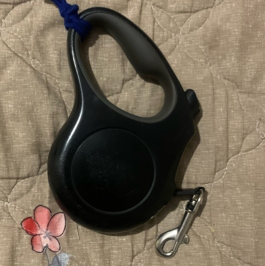
The first design I’ll be talking about is dog leashes. I’m the dog walker in my family and I was curious about how old the design concept is. Surprisingly leashes have been around since egyptian times. Although they are obviously not made with the same material that we use now and were retractable, the purpose is the same.
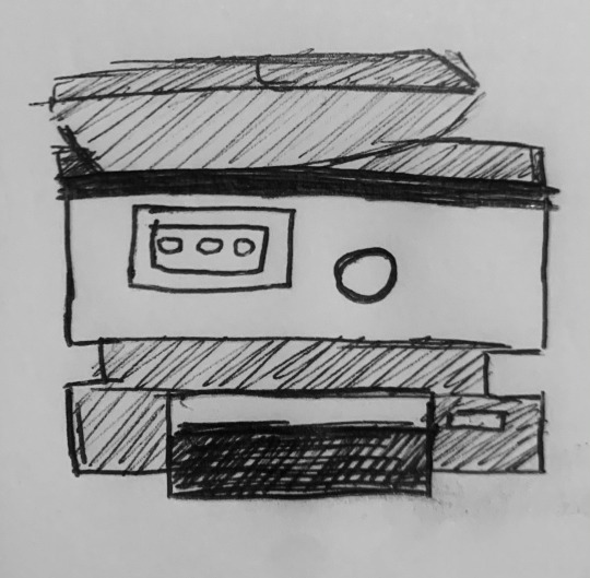
One interesting thing about microwaves is that they weren’t planning for it. The technology for it was thought of before the design. One of the engineers working with different wavelengths to develop something different ended up testing with food. That’s how the microwave concept came to be and was released commercially in 1947.

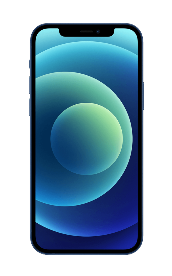
The first iphone, which the phone brand I currently have, was released in 2007 but before that in 1876 Alexander Graham Bell was the first to get a patent on the concept of the phone. Although the design of phones now are completely different and have gone through several different design concepts, the purpose remains similar. Phones main purpose isn’t just calls anymore, it allows for whole different type of communication and entertainment.
It’s obvious that things like purses have existed for a very long time. Although before they were really seen as accessories rather just a simple pouch made of whatever available material to have on the go.

Things that have a similar purpose to toothbrushes have been around for centuries. Although very early on they were simply twigs. They didn’t begin to have objects with bristles until the 1400s in China. Interestingly enough they used hog hairs for the bristles. The more modern type of toothbrush wasn’t made until 1938 and began to be mainly made out of plastic and nylon bristles.

There are so many different styles and size of speakers out there. The best thing about them is how easy it is to transport anywhere in comparison to old type music devices like radios and big stereos.

I’ve been cooking more lately and I have come to appreciate the seasoning organizer that my mom has at home. This just allows for easier access and less crowding in the cabinets.

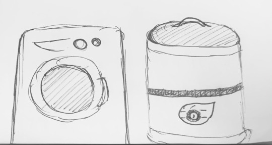
During midterm week I unfortunately had to travel to Mexico for a funeral. One thing I noticed was how different there washing machines are. They’re shaped like big barrel. There obviously washing machines like the ones in the United states over there. But so many people owned the colorful barrel looking machines. I found out that they’re just cheaper to make that way and are better for the type of plumbing system that they have over there. The big difference in how they work in that they dont wring out the water as much, you got to do that by hand.
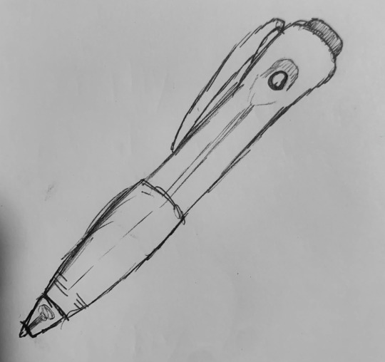
The first ball point pen was made in 1888 which is a lot earlier than I would have ever imagined. Before that they were using quil pens, steel point pens, fountain pens and reed pens. Although it wasn’t until the 1930s when a more successful version of the ballpoint pen came out.
Befor the modern printer came to be it was mainly just a lot of different types of pressing techniques to transer the letters or designs required. In the 1970s the laser printer came to be. Which allowed for equally as quick but more hands free method for printing.
“Alexander Graham Bell.” History , www.google.com/amp/s/www.history.com/.amp/topics/inventions/alexander-graham-bell.
Bellis, Mary. “Where Did the Computer Printer Come From?” ThoughtCo, www.thoughtco.com/history-of-computer-printers-4071175.
“Facts and History of Microwave.” History of Microwave - Invention of Microwave Oven, www.historyofmicrowave.com/.
“The History of Pens: The Journal Shop.” The Journal Shop Store, 20 June 2018, www.thejournalshop.com/thejournal/history-of-pens/.
Howard, Frank. “Horses Uses in the Roman Empire.” Pets on Mom.com, 19 Nov. 2020, animals.mom.com/horses-uses-in-the-roman-empire-12566937.html.
“Who Invented the Toothbrush and When Was It Invented?” The Library of Congress, www.loc.gov/everyday-mysteries/item/who-invented-the-toothbrush-and-when-was-it-invented/.
0 notes
Text
Week 3-History of Design
Post a combination of 10 drawings, photos and/or notes on design observations you see in the world around you since the beginning of this semester. Please refer to your reading for historical elements from design that are showcased in your observed modern design examples
The first object I will be talking about is a toilet. The flush toilet was made in 1596. Although it didn't start becoming a common household thing until the mid 1800s. Before the toilet was made people had little shacks with containers or went outdoor in holes. The design was meant to be cleaner and easier for people.
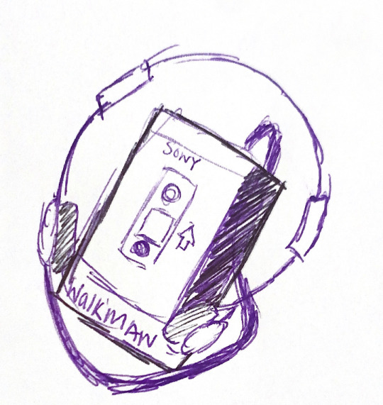
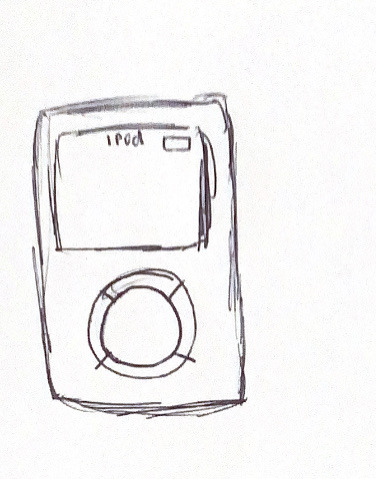
The other day while cleaning somethings I came across my old iPod and a walkman. Both weren't in the best condition so I got rid of them. It's so interesting to think about how different designs for music devices have been over the years. iPods were first brought out in 2001. It had a small and simple design. The main buttons were to skip songs and play and menu. 20 years before the iPod the walkman was made. In it's time people loved it because it's small design and ability to easily take your music anywhere.
Automobiles designs became functional in the 1800s. It has come such a long way since then. There is several brands, colors and types.

Sinks are such a common thing now in kitchens, bathrooms and so on. Before they were designed people simply used containers with water. Although some places still use this method because of lack of resources. Sinks closer to what is know today weren't made until the 1800s.

Stoves have been around for centuries. Although the first record of it was in 1490 and it was made of brick and tile which is very different from the common stove today that is made of sheet iron.
Having fish is such a common thing now a days that it is crazy to think about how aquariums did not become a thing until the 1800s, before that people would have artificial ponds for the fish, which some people still do but it is not that common for the average person.
The first television was made in 1927 and the first tv stations began to appear in the late 20s early 30s.


“Aquarium.” Encyclopædia Britannica, Encyclopædia Britannica, Inc., www.britannica.com/science/aquarium.
Hur, Johnson. “History of the Television.” From The 1800s To Current Time, 4 Dec. 2018, bebusinessed.com/history/history-of-the-television/.
Lanxon, Nate. “The Complete History of Apple's IPod.” CNET, www.cnet.com/pictures/the-complete-history-of-apples-ipod/.
Rod. “A Very Quick History of the Kitchen Sink.” Wholesale Sinks, 2 June 2015, www.wholesale-sinks.com/quick-history-kitchen-sink/.
Stamp, Jimmy. “From Turrets to Toilets: A Partial History of the Throne Room.” Smithsonian, Smithsonian Institution, 20 June 2014, www.smithsonianmag.com/history/turrets-toilets-partial-history-throne-room-180951788/.
0 notes
Text
Week 7
Write out two key principles of Universal Design and give examples of both in objects and environments that surround you.
The 7 principles of Universal Design was made in 1997 by Ronald Mace an architect and industrial designer alongside other architects, product designers and engineers. The purpose of it is it make designs be more inclusive for people with disabilities, special needs or just in general products of easy access. The seven principle are equitable, flexibility, simple and intuitive, perceptible information, tolerance for error, low physical effort, and size and space for approach and use.
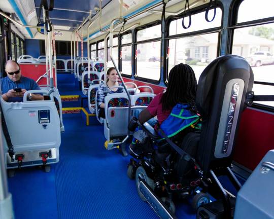
The principle, size and space for approach and use can be seen in several ways on a city bus. It has the ability to lower a ramp for people who are in wheel chairs or have any type of mobility limitation. They also have seats up front that are supposed to be prioritization for elders or pregnant women. The seats at front can also be pulled back and used for attachments for wheel chair. Some buses also have seats with a wider distance from others fro parents with strollers. All these specific designs make public transportation easier for people of all types of needs.

Instructions that come within most products could be considered to be of simple and intuitive use. They have simple instructions with short directions for each step. They also often times include images for each step. This makes it easier for people who have an easier time understanding one way or the other, Most products also include directions or handbooks in several languages for obvious reason. Another example of this can be kitchen appliances such as ovens and microwaves. They have easy to understand labels that make easy for even very young children to use.

Woodward, Sonia. “Universal Design 101: Rick Hansen Foundation.” RSS, www.rickhansen.com/news-stories/blog/universal-design-101.
0 notes
Text
Week 6
post observations, photographs and sketches of architectural elements around Milwaukee
All over Milwaukee there are several creme buildings that have been standing since the 19th century. They were built with those bricks because they were believed to very durable, and appealing. The only downside of these buildings is that the brick is hard to clean and starts to get a darker color as the years pass. One good example of this type of brick is the trinity evangelical lutheran church. As you can see it is a rather dark color due to the fact that it is so hard to clean. This church is one that more than likely anybody who has lived in Milwaukee has seen due to its very tall structure and gothic style.

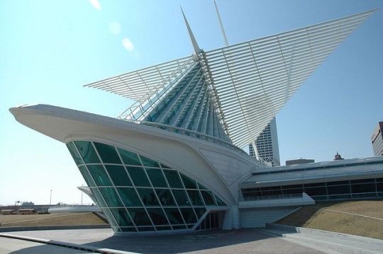
Another well known structure is the Milwaukee Art Museum. Interestingly enough the building itself is a piece of art with its unique style. The most unique part of the design are the wings that move twice a day and have the wingspan of 217 feet. It also looks really delicate due to all the glass .
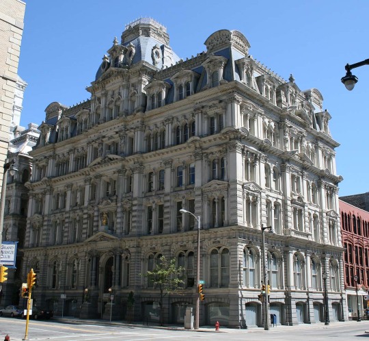
Going back to a more traditional structure is the Mitchell building. I personally really like this building, its one that I can’t help but to take a glance at every time I pass it. It’s part of the second empire architecture style. One of things that most stand out about is all the detail that is put onto the walls of the structure. As well as all the layers and the hoods of the window.
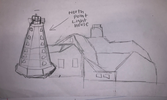
The North Point lighthouse is such a nice looking building and not something you see that often. The thing that makes it stand out is that it is such vibrant white and has cone like shape. The house next to it is also the same color but with a dark red roof that helps distinguishing everything well. The design itself is rather simple with just a few small windows.
0 notes
Text
Week 5
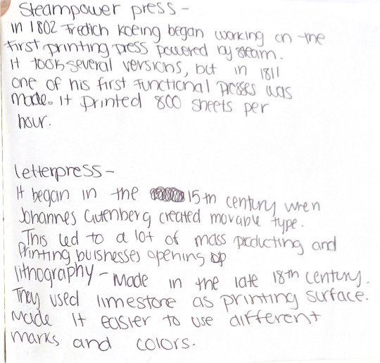
One of the things mentioned in the reading was the rotary steam press that was invented in 1843. It was invented by Richard March Hoe and his invention made it easy to print up to 8,000 sheets per hour. This was made to place the flat bed press that couldn’t work at such a speed. This invention reminds me of the modern printer and how it easy such easy access for anybody. Even though a regular printer is not that quick there is some digital printers that can print around 100 pages a minute . Although there is also printing presses that can print out about 18,000 sheets per hour. These modern inventions have allowed for hundred of fonts and sizes while still giving easy and fast service which people typically look for.


In the reading they also touched on the Bauhaus movement which began in the early 1900s. It put value in the artist value of things as well as its function. The main aim was to bring art to peoples daily life. With the industrial revolution things began to be made quick with more machinery and less hand made stuff than a couple decades back. Although things that are considered to be Bauhaus designs are typically balanced and abstract. Bauhaus designs can be seen a lot in furniture due to their simple yet aesthetically pleasing design. There are also homes that are inspired by this movement. They typically have very simple designs and gave a very open space.

Abdou, Kelly. “Bauhaus: How the Avant-Garde Movement Transformed Modern Art.” My Modern Met, 8 Sept. 2020, mymodernmet.com/what-is-bauhaus-art-movement/.
Eskilson, Stephen. Graphic Design: A New History. United Kingdom: Laurence King, 2007.
“Fast 5 Facts on Presses.” JohnsByrne, 28 Feb. 2020, www.johnsbyrne.com/blog/fast-5-facts-on-presses/.
0 notes
Text
week 4- found Object
I decided to look around for anything while I was walking my dog this week. I didn’t really find anything interesting while walking other than masks and broken glass. I also haven’t gone out much so my neighborhood was my only option. I decided to look at more simple designs around me that are sometimes taken for granted because of how common they are. Things such as speed limit signs, traffic lights and stop and yield signs. I live in front of a busy street so there is plenty of those things. The main things that I noticed about the design of traffic lights are the colors are very vibrant and I assume that is so that they easier to notice and captures attention easier. They are also always at a very high height and have something hovering over each light which I assume is for visual purposes. The Traffic light most similar to what we have now was made in the early 1900s. They used to have police officers operate them through a booth. Although they only had red and green lights, so that means they didn’t have the yellow lights for slowing down. That caused a lot of accidents to happen, as they began to improve the design they added the yellow light and made it fully functional without needing manual control. As previously mentioned I think the vibrant colors are just important because of how easy it is to stand out. The stop and yield signs are similar to traffic lights in the sense that their purpose is similar. Things like speed limit signs are not vibrant like those other signs because they are not as urgent as the others, but that does not mean they aren’t important. The font of it is also quite simple but efficient because in the smaller font it has the words speed limit and in large print the number, which anybody who drives will automatically register the numbers as being the speed limit even if they don’t see the actual letters from afar. Although there’s is not a speed limit while children are present sign in my neighborhood I realized that the top part of those are typically yellow which shows that is more urgent than the other type of sign. Hopefully, sometime soon I have the chance to go out more and look at different forms of design.
0 notes
Text
Week 2 – Design Thinking
As I read Design Thinking in the Harvard Business Review, I realized how much work goes into designing. The average person typically takes for granted all that designers do. So many things that we see around us are influenced by a group of designers. I would define design as a process that requires a great amount of brainstorming and investigating the needs and wants of the consumers, followed by trial and error. I did not realize so many important characteristics are often needed to be a good designer such as empathy, integrative thinking, optimism, experimentalism, and collaboration. The only one I would have been able to instantly say would be collaboration because it’s obvious in a field like that ideas need to bounce off each other. An example that I can think about that uses design thinking is makeup. They really put a lot of thought into the packaging. They also have to think about the target audience and they can base it off age, gender or values. One of things mentioned in this article is bicycles specifically Shimano bikes and their exploration with the designs. A significant point that they made throughout this article is having a good understanding of the customer wants, needs and lives. I believe that is an easy and difficult task that’s why I think having a big group of people to communicate in companies is important. Although research is important, having people of different backgrounds helps understand customers better. That’s why as this article says the most successful companies are those who were able to have a deep understanding of the consumers lives. Another significant point that its so obvious that I forgot about is prototypes and how important it is in the learning process in the first half of any process.
0 notes
Text
Week 1- About Me
Hi, my name is Giselle and I'm a Sophomore at UWM. I was born and raised here in Milwaukee. I was recently a Design major but I changed to Studio Arts. My advisor told me that she recommended me to still take this class so I did. This class seems pretty interesting and making posts like this seems like a fun assignment. I feel like design is such an important thing, its what makes materialistic objects around us interesting. I don't have much experience with design since I was just starting to get into design classes. I feel like I might not have that much knowledge about design like others in this class that have a design related major. Although it might not even be an issue because all the lectures and readings. Moving on from that, I honestly don't think I have this big inspiration like other artists do. I kind of wish I did but for now I just draw whatever pops into my head at the time, which is usually very random. Maybe sometimes I would consider the music I like to be inspiration, only because sometimes I draw the artists. I don't think I have recently bought anything where the design was a major reason it was bought. Which is funny to me because I'm a art major yet right now I don't really care about how things look and comparing them to the competitor. Although that's probably because i'm somewhat broke right now like most college students so I just get whatever is cheaper.
1 note
·
View note