
Hi, I’m Chris Raymond. Designtank is my place to post cool things that inspire creativity, envy, or just simple laughter. The name is a mash-up of “think tank”; and “think design.” See my artwork at chrisaraymond.dunked.com or follow my Twitter feed @imdesigntank.
Don't wanna be here? Send us removal request.
Statistics
We looked inside some of the posts by designtank and here's what we found interesting.
Average Info
Notes Per Post
40
Likes Per Post
34
Reblog Per Post
6
Reply Per Post
0
Time Between Posts
22 days
Number of Posts By Type
Text
8
Photo
8
Link
1
Last Seen Tumblr Blogs


Fun Fact
The most popular pages on Tumblr are about Minecraft, GIFs, and David J. Peterson.
Text
Rotten Apple
When I need to recharge my Mac Air (circa 2018), I plug in the power cable and I can see at a glance when it’s fully charged. When I shut it down, it actually shuts down. The mag safe connector doesn’t require powerful fingers to disconnect it, or precision to re-insert. When I need to move a file to a different folder, I can hold and hover it over a folder in the sidebar, and voilá, the folder springs open.
Then there’s my work Macbook with touch bar, AKA the rotten Apple.
I have no way to know if it’s charged, let alone charging, just by looking at the power cable. No, I have to open the lid. And then, against my will, it auto boots. I have to go through the entire start-up process, including my IT department’s acceptance certificate, just to see how much juice is left in the battery.
For two years, I thought I was actually shutting the Macbook down on Friday afternoon. The screen would go black, I’d shut the lid and put it on a shelf, so I could use my Air to do personal stuff at my desk. I used to wonder how it could possibly be almost instantly ready to go on Monday morning when I reconnected to my monitor and opened the lid.
Turns out, it wasn’t really shutting down. Instead it was draining the battery. Not much of an issue over a weekend. A big issue when I was out on leave for three weeks. Now, the battery needs to be replaced. Which means, because Macs are no longer accessible for DIY things like swapping in RAM or putting in a battery, I have to spend a couple of hours installing Box Sync and backing up all my working files so that I can continue getting work done on a loaner for 4 plus days. I have to drive into the office and drop it off with IT, which then has to give me a loaner and send the Macbook to an Apple store. My employer has to keep several expensive Macs on hand as loaners. For a freaking battery.
And oh, now with Big Sur, no more spring-loaded folders in the sidebar. No matter how I set my preferences, sidebar folders no longer respond to hover. A one-step process now becomes two. But hey, big improvement—I can change the color of the folders from gray to a color sort-of-my-choice. How having all sidebar items the same color is a usability improvement is beyond me. I guess it’s a little better than low contrast gray.
Did I mention how I had to drop out of a video presentation with an external partner because, oops, Big Sur requires me to once again give permissions, app by app by app, to use my camera, permissions I’d already given in the previous OS. Several other coworkers had the same issue, having to drop out of presentations to change permissions and then sign back in. Not to mention, the default in Big Sur is to make sounds for every. single. action. Another online search to figure out how to disable. Why every website, social media platform, and device thinks you want notifications of every mouse click is beyond me.
It’s like having a hyper, un-housebroken puppy dumped at your door. One that doesn’t even warn you before taking a dump on your new carpet.
I’m hanging on to my Air as long as I can, happily running Mojave. Heck, except for the slow speed on my old Macbook, I was happy with Snow Leopard, with multiple ports, and with a DVD drive. So I could get work done. On my computer, not “in the cloud.”
5 notes
·
View notes
Photo
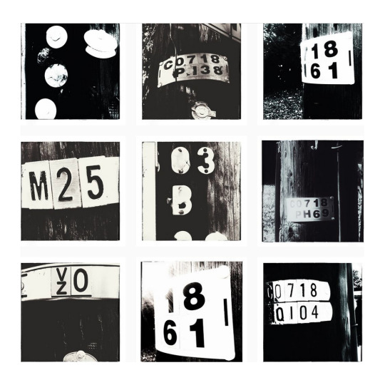
A series of close-up photos of telephone poles in Falls Church City, Va.
3 notes
·
View notes
Photo
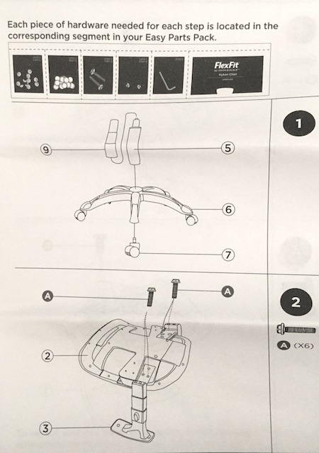
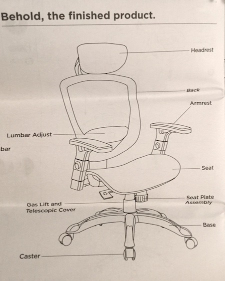

I just put together an awesome chair from Union & Scale from Worklife Brands in 5 easy steps. The instructions are clear and visual. The screws come packaged into their own pouches, labeled by step. The booklet opens with the company’s mission statement, to take some of the stress and frustration out of furniture assembly. Mission: Accomplished.
Bonus for me: a chair designed for a petite body.
2 notes
·
View notes
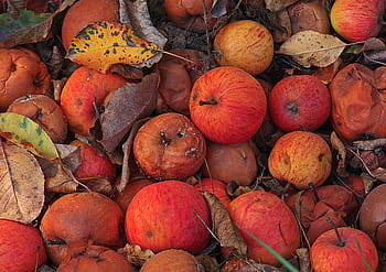
Photo
A set of photos of the concrete art beneath our feet.
3 notes
·
View notes
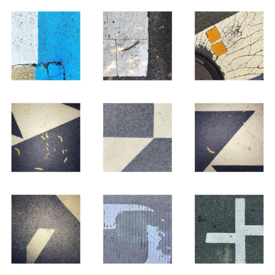
Photo

A collection of my favorite urban op art photos. I took these over several weeks in Crystal City, Va. (Okay, I slipped in the one in the top left. I kind of had to, don’t you think? 😉)
1 note
·
View note
Text


Another home run by Collected Works: an entire design system, packaging, motion, and merch for a contemporary tribute to The Grateful Dead involving dozens of artists reinterpreting the band for a new generation.
3 notes
·
View notes
Text

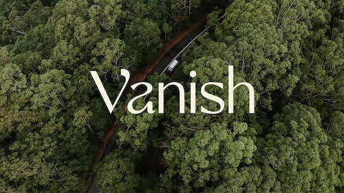
The identity system for Vanish—a new van rental company—makes me want to hit the road. Awesome work by The Collected Works.
3 notes
·
View notes
Text

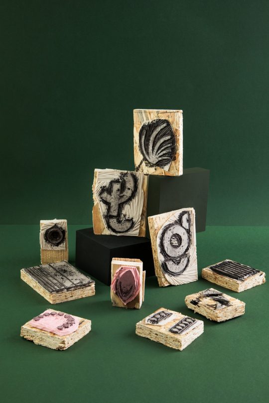
The labels for these wine bottles were created using hand-carved stamps, each shape referencing a poem from which the wine’s name was derived.
The details appear in Identity Designed. 😍🍷
1 note
·
View note
Text

From my other tumblog. The foremost thing I learned, as I do during every year’s 100DayProject, is to just keep going.
1 note
·
View note
Text
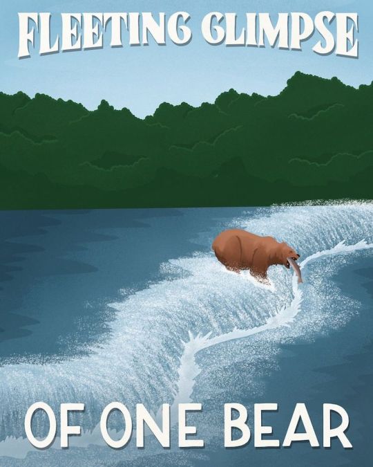
Graphic designer Amber Share created a series of posters sparked by eye-rolling online pans of various national parks—in this case, Katmai National Park and Preserve. Share’s posters appear on her Instagram feed, Subpar Parks and are available for purchase at her shop.
0 notes
Photo

For everyone into hand lettering and comics, Reagan Ray has compiled a compendium of Marvel comics titles over the decades. 👏🏼
3 notes
·
View notes
Link
An excellent curated list of resources put together by David Airey.
0 notes
Text
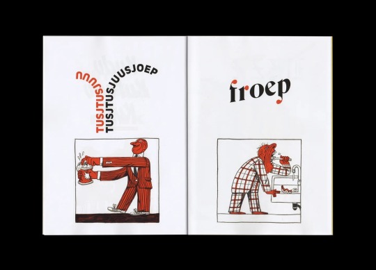
A spread from Onomatopee.
For lovers of type and visual puns, Broos Stoffels and Lukas Verstraete created Onomatopee, which explores the visualization of sound through typography and illustration.
0 notes
Photo

The hover effect on these cards is unusual and well done. It gives the feeling of paper being lifted off a surface. Check it out.
1 note
·
View note
Photo

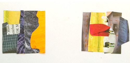
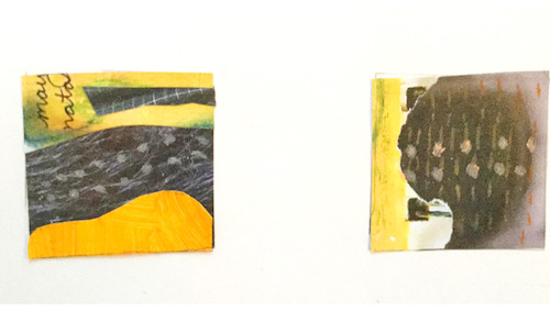
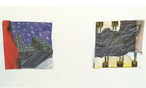
Collage twinchies, October 2020.
Mostly black and white analog collages, each about two inches square. When I’ve awakened much too early during the pandemic, I soothe myself by doing quick collages from paper scraps.
4 notes
·
View notes
Photo
From my other blog.
Series 3.
5 notes
·
View notes
Text
Typography is the poor stepchild of UX design


I started my design career at a studio that put good typography first. That seems to have become a lost art.
Graphic design degrees typically included at least one course in typography. Since digital design took over, I see far too few designers paying much attention, if any, to readability and legibility. Terms like measure, x-height, and baseline grid are seemingly part of a foreign language.
But to me, if visitors to your UX portfolio site can’t actually read your copy, I consider it a user experience fail.
These examples, found from a round-up of “featured” portfolios, just made me sad. If you recognize your site (or even if you don’t!), please keep in mind not everyone has the vision of a 30-year-old.
5 notes
·
View notes