Don't wanna be here? Send us removal request.
Photo

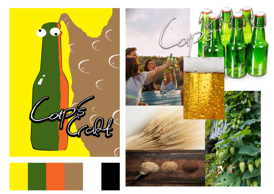
Mood board #2: Mood board from the second project. Much like the first mood board for the first project, this mood board contains both a final, published image and colour palette. One major difference is the presence of more images than sketches. For example, an image of young people clinking their beers, as well as the main ingredients which makes up beer. It should also be noted that, unlike the previous design, I decided to have a much more simplistic approach with the overall design and approach. The first mood board contained a much more colourful and brighter appeal. This mood board shows off a more simple design that could attract a broad spectrum of average, beer consumers.
0 notes
Photo

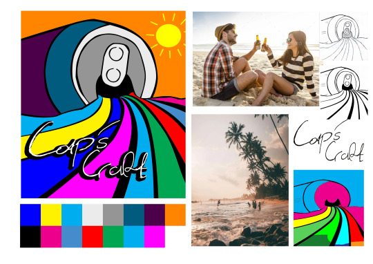
Mood board #1: Mood board with final published image and logo, sketch and a pair of theme images. Owing to this drink being a “beach themed” beverage, I decided to include an image of a tropical beach, complete with a young couple enjoying a drink (Beer). The colours of the image and logo are also meant to represent good times and chilled-out vibes.
0 notes
Photo

For the second mind map, after looking for phrases and text, I came up with a list of 10 words. These words revolved around the project, both its appeal and audience. As you can see above, these are the images for project #2.
0 notes
Photo

For the first mind map, I decided to go for some simplistic ideas, revolving to my first project. After looking over the mood board and eventually the project itself, I came up with 14 words for usage in the eventual project. As you can see above, these are the words for project #1.
0 notes
Photo

Palette of colours, primarily in the second part of the assignment.
0 notes
Photo

After some minor changes, some refined illustrations to complement the image. The blue was changed from blue to brown, to give off the appearance of Beer, instead of Water. Bubbles were also added to the image, in a cartoon style. Eyeballs were also added, at the top of the bottle, to represent an adult sense of humour and branding. As stated in the rational, this drink is clearly, not for children!
0 notes
Photo

The third and final image with a refined yellow background, minus the blue water, this image would become the final image to be used for the second project.
0 notes
Photo

The second refined image, showcasing now - coloured bottled, with a dark - green texture.
0 notes
Photo

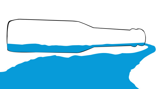
The first refined Image shows the black outline of the bottle, adjacent is a stream of blue water coming out of the bottle!
0 notes
Photo

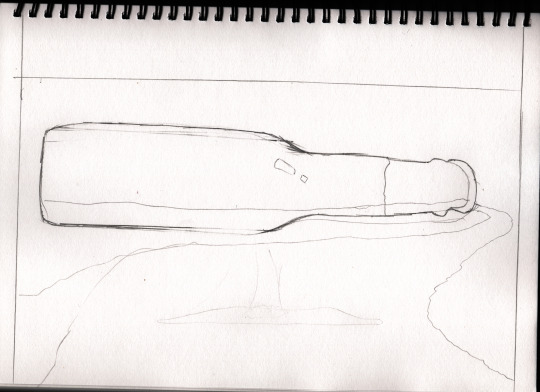
A draft scan of Image 2, this will form the basis of my second part of my assessment. More to come!
0 notes
Photo

Colour palette, pertaining to all colours, used in the illustration.
0 notes
Photo

The follow - up image contains a series of black, bold lines with a white background.
0 notes
Photo

This sketch would form the very basis of my first design, showing off a palette of colour, flowing out of the can (as seen in the follow - up images). After sketching, I eventually ran over the stencil lines with an 0.8 Art pen. A practice that I have utilized in the past, this will help me better create the outlines, ready for eventual colouring and filling in Photoshop and Illustrator.
0 notes
Photo

The second mood board is a conceptional summary of what will be my final concept for submission. Located on the left is a rough sketch of the final product and what it may look like, visually. To the right is a series of images, containing waves and other tropical environments. The main concepts behind this are to set the mood for the type of theme this beverage will be.
0 notes
Photo

The first mood board contains images of beverages, all of the different varieties (mostly alcohol). All of which being sourced from Pinterest!
Some of these images include logos and illustrations. The majority have been handwritten or sketched. The majority of these illustrations also rely upon a broad spectrum of colour, potential to gain the attention of a potential consumer or investor.
0 notes
Photo

The following illustration is a layout for my mood board. Having done multiple illustration drafts in my diary, I felt as though this particular draft would be the perfect blueprint for my final mood board. Rational, coming soon!
0 notes
